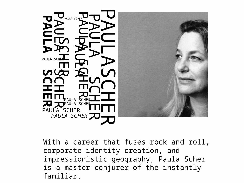
P A U L A S C H E R With a career that fuses rock and roll, corporate identity creation, and impressionistic geography, Paula Scher is a master conjurer of the instantly familiar. P A U L A S C H E R PAULA SCHER P A U L A S C H E R P A U L A S C H E R P A U L A S C H E R P A U L A S C H E R PAULA SCHER PAULA SCHER PAULA SCHER PAULA SCHER PAULA SCHER
Transcript
PA
ULA
SC
HER
With a career that fuses rock and roll, corporate identity creation, and impressionistic geography, Paula Scher is a master conjurer of the instantly familiar.
PA
ULA
SC
HER
PAULA SCHER
PA
ULA
SC
HER
PA
ULA
SC
HER
PA
ULA
SC
HER
PA
ULA
SC
HER PAULA SCHER
PAULA SCHER
PAULA SCHER
PAULA SCHER
PAULA SCHER
THE BACKGROUNDPaula Scher (born in 1948 in Washington D.C.) is an American graphic designer and artist. Paula Scher studied at the Tyler School of Art in Philadelphia and began her graphic design career as a record cover art director at both Atlantic and CBS Records in the 1970s. In 1984 she co-founded Koppel & Scher, and in 1991 she joined Pentagram as a partner.
“When I was young I had this job working in the record business. I was an art director for CBS records and I used to make about 150 records covers a year. About 80 percent of them were terrible.
And that was how I learned to be a designer. I was very lucky. Because most kids don't have the option to really fail like that.That's where I learned the value of the failure.” – Paula Scher
EARLY YEARS
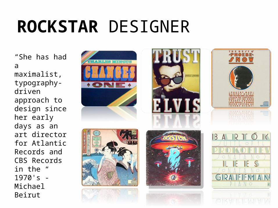
ROCKSTAR DESIGNER
“She has had a maximalist, typography-driven approach to design since her early days as an art director for Atlantic Records and CBS Records in the 1970's”- Michael Beirut
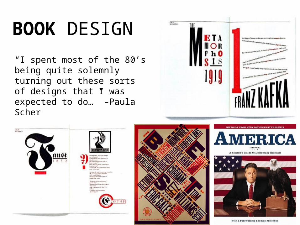
BOOK DESIGN
“I spent most of the 80’s being quite solemnly turning out these sorts of designs that I was expected to do…” –Paula Scher
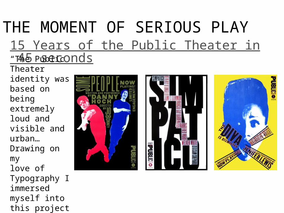
THE MOMENT OF SERIOUS PLAY15 Years of the Public Theater in 45 seconds
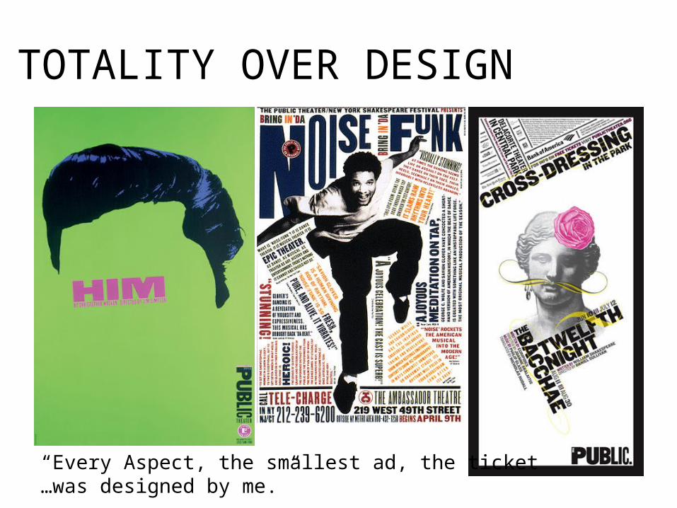
“The Public Theater identity was based on being extremely loud and visible and urban…Drawing on mylove of Typography I immersed myself into this project like I never had before.”-Paula Scher
“Every Aspect, the smallest ad, the ticket…was designed by me.”
CULTURAL IDENTITY
“I love working in New York City…And I like making things for New York City and making Work that lives on the street. I like creatingplaces people can go to and enjoy.” “To be noticed in New York City it’s got to be Big and Loud” –Paula Scher
PLAY WITH LOGOS “I drew the logo for Citibank
on a napkin in the first meeting…and then I spent a year going to long, tedious, boring meetings, trying to sell this logo through to a huge corporation, to the point of tears. I almost went crazy that year. ”
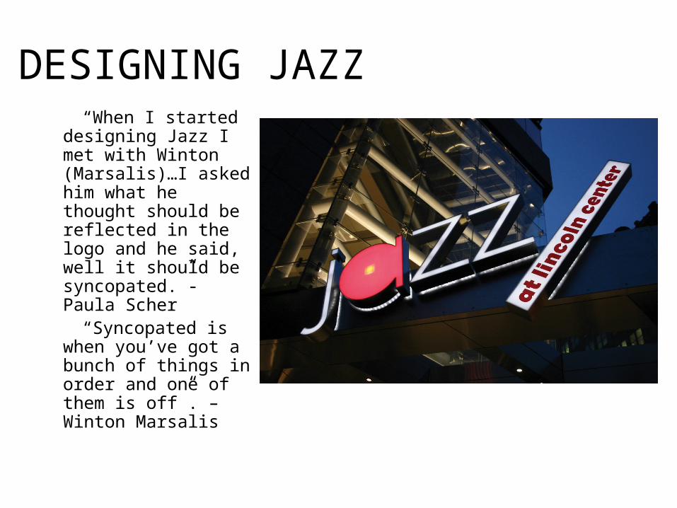
DESIGNING JAZZ “When I started
designing Jazz I met with Winton (Marsalis)…I asked him what he thought should be reflected in the logo and he said, well it should be syncopated.”- Paula Scher
“Syncopated is when you’ve got a bunch of things in order and one of them is off”. –Winton Marsalis
BOLD STROKES “I do those maps and
they’re laborious and they’re the opposite of design and take me 6 months…they’re very important to me because they’re what’s left of the craft.”
“There’s this one moment where you figure it out and you get it and you think it’s gonna be the best thing you ever did… As long as I can feel that you can do it.”