45
Creating Infographics MetaMeta Lenneke Knoop Workshop FBFS April 20th, 09:00 – 12:00

Creating Infographics
MetaMetaLenneke Knoop
Workshop FBFSApril 20th, 09:00 – 12:00

Today’s program1. Introduction2. Infographics: Data visualization3. Infographics: The process4. Infographics: Storytelling5. Creating infographics6. Group work7. Reflections

Researchers and infographics- Everybody likes simple language.. More often
asked in journals.. Is there a trend? - Examples of famous researchers sharing
stories, rather than scientific articles- Visual abstracts

2. Infographics: Data visualization

Data visualisation vs infographic
Datavisualization Infographics

Data visualisation is…- Quantifiable information in the form of numbers - Data visualisation is objective, - created for the purpose of making sense of the data, - or to make data more accessible.- Likely to be created automatically- Transferable process to other data sets- Graphic design is often less important

Infographics…- Contain information presented
within context- Are designed to tell or explain a
specific story - Are intended for a specific
audience- Are subjective- Are content enriched by
illustrations, icons and other graphical flairs - matching your audience and purpose (journal / website / poster)


- Add another good example

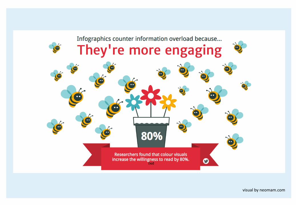
Why do infographics work?
?

The power of images?

visualbyneomam.com

visualbyneomam.com


Informavores
We’re all informavores now, hunting down and consuming data as our ancestors once sought wooly mammoths and witchetty grubs.’’
- Rachel Chalmers

We consume information equivalent to 174 newspapers per day.
(up to only 40 newspapers in 1984)
9Alleyne,R.(11Feb2011).Welcometotheinformationage– 174newspapersaday.TheTelegraph.

Information overload
visualbyneomam.com
visualbyneomam.com

visualbyneomam.com

3. Infographics: The process

Part 1: What to ask?- What is the purpose?- Which data am I going to use?- Why will people share it (who are they?)- How can I maximise that?

Data: make choices- Challenge: find a balance

Find your hook- What is the take away for the header?- Use this as hook / focal point- Build your story around it

Tell your story
introduction / foundation
Ah-Ha!The Main Event
conclusion / call-to-actionClassicexampleofclearstoryline:http://infographicjournal.com/wp-content/uploads/2016/04/Ademero_Impacts-of-a-Paper-Based-System_infographic1.png

Creating Infographics1. Choose a format2. Build a wireframe3. Visualise as much as possible4. Strengthen your hook visually5. Reflect and revise
Be creative

Choose a format

Often used starting points1. Choose a format: most used
visualbyeasel.ly

Build a wireframe- Lay out your concept- Make a sketch of the hierarchy- Use this step to have your concept reviewed

Visualise: basic principlesUnity– harmony
Balance
Hierarchy
Scale- proportion
Dominance- emphasis
Similarity- contrast


Use colours- Limit your colour palette- Stick to 3 to 6 colours- Available tools e.g. www.colourlovers.com

FontsFonts are great to spice up your infographic- Think about (contrast in) style, size, weight- Appropriateness - Avoid small differences- Functionality / interpretation

- Add good / bad examples

Visualize the hook4. Strengthen the hook visually
Smashingmagazine:Do’sanddon’tsofInfographic design - AmyBalliet


Images- Wikimedia- Freepik- Shutterstock- Vector images vs non vector

Style- When you make a series style is important- Create your own

Reflect and revise

Test and revise- Discuss your infographic with others, does it
convey the right message, is the infographicclear?
- Make a test-print- Think about how do you want to publish- Think about file size- See if everything is in place- Clean up the design from small errors- Make sure you include proper credits

Online tools- There are many- THE best tool does not exist- Tools come and go- An (elaborated!) overview can be found here:
http://www.coolinfographics.com/tools/

Work with easel.ly- http://www.easel.ly/- Sign up, create a free account- Help centre: http://help.easel.ly/help_center- Choose formats or start from scratch- If you have data you can insert directly from
excel (note: if exceldata is the majority of your infographic, choose Piktochart)


Our inspiration & references- Americanscientist- Newsilike.in- Piktochart (online tool similar to easel.ly)- Data visualization tools and resources- http://www.landscapes.org/glf-2014/data-landscapes-infographic-data-
visualization-competition/data-visualization-tools-resources/ - Gap minder- http://www.gapminder.org/downloads/- Amazing maps on facebook (rethink conventional maps)- https://www.facebook.com/MapsAreAmazing/- 90 best infographics- http://www.creativebloq.com/graphic-design-tips/information-graphics-
1232836 - https://www.in60seconds.nl/blog/


