Private Briefing The Road Ahead Dominant Investment Themes For 2012 & Beyond By Robert J. Gorman, CFA, Chief Portfolio Strategist, TD Waterhouse Introduction In this document, we outline six major themes that we believe will play out in the short, medium or long term and have far-reaching implications for investors. Several reflect societal shifts while others represent changes in the economic landscape or financial markets. All will likely have profound implications for investors seeking to maximize returns while controlling risk in an uncertain world. Emotion is one of several impediments of successful investing. Currently, the dominant emotion of most investors is fear, which breeds uncertainty and an unwillingness to take action. In the pages that follow, we hope to alleviate uncertainty and help provide direction so investors can take advantage of the opportunities that exist and seek to prosper in the years ahead. Executive Summary • Our view is that we are in what will prove to be a lengthy, credit crisis recovery period characterized by relatively low economic growth, low interest rates and modest investment returns. • The current, convalescent phase of the credit crisis will be characterized by a deleveraging household sector that will likely result in sub-par economic growth as cited above but does not necessarily imply recession. Modest growth, contained inflation and low interest rates in this period should mean equities outperform bonds and cash. • A new fiscal conservatism is taking hold among American households, which will be characterized by falling household debt relative to income along with rising savings. This trend may continue longer and be more pronounced than most expect, due in part to demographics. This environment should favor non-durable goods over durables and financial service providers that focus on the asset side of the household balance sheet. • We believe the 30-year bull market in bonds is over and Treasury bonds will only serve to generate modest income and preserve wealth, not build it. Taxable, fixed-income investors should focus on high-grade municipals and non-taxable clients on corporates to boost income while reducing risk via shorter duration. Investors now need to approach fixed income differently to achieve their income needs. • We believe the era of Price:Earnings (P:E) multiple compression is over. After a decade of compression, P:E multiples are at sustainable levels. Going forward, share prices should reflect earnings growth which may lead to materially stronger performance. • The anticipated rotation into large cap stocks has begun. This shift may be lengthy, profound and reinforced by the growing preference for dividends as a major portion of total return. • While emerging equity markets should continue to be bolstered by strong economic growth, their dramatic outperformance relative to developed countries’ equity markets will likely diminish due to compression of operating margins and Return on Equity (ROE) U.S. companies with emerging market exposure may be an increasingly effective way to benefit from developing countries’ growth. March 2012
Transcript
Private BriefingThe Road AheadDominant Investment Themes For 2012 & BeyondBy Robert J. Gorman, CFA, Chief Portfolio Strategist, TD Waterhouse
IntroductionIn this document, we outline six major themes that we believe will play out in the short, medium or long term and have far-reaching implications for investors. Several reflect societal shifts while others represent changes in the economic landscape or financial markets. All will likely have profound implications for investors seeking to maximize returns while controlling risk in an uncertain world.
Emotion is one of several impediments of successful investing. Currently, the dominant emotion of most investors is fear, which breeds uncertainty and an unwillingness to take action. In the pages that follow, we hope to alleviate uncertainty and help provide direction so investors can take advantage of the opportunities that exist and seek to prosper in the years ahead.
Executive Summary
• Our view is that we are in what will prove to be a lengthy, credit crisis recovery period characterized by relatively low economic growth, low interest rates and modest investment returns.
• The current, convalescent phase of the credit crisis will be characterized by a deleveraging household sector that will likely result in sub-par economic growth as cited above but does not necessarily imply recession. Modest growth, contained inflation and low interest rates in this period should mean equities outperform bonds and cash.
• A new fiscal conservatism is taking hold among American households, which will be characterized by falling household debt relative to income along with rising savings. This trend may continue longer and be more pronounced than most expect, due in part to demographics. This environment should favor non-durable goods over durables and financial service providers that focus on the asset side of the household balance sheet.
• We believe the 30-year bull market in bonds is over and Treasury bonds will only serve to generate modest income and preserve wealth, not build it. Taxable, fixed-income investors should focus on high-grade municipals and non-taxable clients on corporates to boost income while reducing risk via shorter duration. Investors now need to approach fixed income differently to achieve their income needs.
• We believe the era of Price:Earnings (P:E) multiple compression is over. After a decade of compression, P:E multiples are at sustainable levels. Going forward, share prices should reflect earnings growth which may lead to materially stronger performance.
• The anticipated rotation into large cap stocks has begun. This shift may be lengthy, profound and reinforced by the growing preference for dividends as a major portion of total return.
• While emerging equity markets should continue to be bolstered by strong economic growth, their dramatic outperformance relative to developed countries’ equity markets will likely diminish due to compression of operating margins and Return on Equity (ROE) U.S. companies with emerging market exposure may be an increasingly effective way to benefit from developing countries’ growth.
March 2012
TD Waterhouse Private Briefing Page 2
Theme #1 – From Credit Crisis to Convalescence The investment outlook for the years ahead may, in large part, be defined by the economic environment, which in turn reflects the global credit crisis from which we are recovering. To fully appreciate our current position, it is helpful to revisit the nature and history of credit crises, which display six key characteristics:
• Credit crises are nothing new and are actually quite frequent. Since 1930, there have been 32 such events around the globe. More recently, in the early 1990’s, the U.S. Savings & Loan (S&L) crisis wreaked havoc on financial markets and the American economy. In quick succession, we witnessed credit crises in Japan and Sweden, the Asian crisis of 1997 and the Russian episode in 1998.
• Most credit crises have their origins in real estate. Historically, cheap, abundant credit has generated a boom in real estate prices and construction. The construction is financed by bank debt, with the real estate acting as collateral. Typically, the boom turns to bust, real estate loans go bad and a financial crisis ensues.
• Crisis-struck governments devalue their currencies to stimulate their economies. A cheaper currency makes goods less expensive for foreign buyers, resulting in stronger exports. The U.S did this in the early 1990s during the S&L crisis and Asian countries followed suit later in that decade. In the current crisis, there have been charges and counter-charges of currency manipulation and competitive devaluation.
• Governments, regardless of ideology, take action to restore stability. For example, the S&L crisis brought about creation of the Resolution Trust Corporation, a U.S. government agency to take troubled assets off the books of affected institutions. Meanwhile, the Swedes backed their banks’ debt and Asian governments provided major support for their commercial banks. In 2008-2009, the Troubled Asset Relief Program initiative to support the banks and massive fiscal stimulus was implemented in the United States.
• Disinflation emerges. Inflation rises during the period of cheap, plentiful credit that gives rise to a real estate boom. When real estate prices later decline, the rate of inflation also slows, ushering in disinflation. With disinflation comes fear of deflation, widespread longer-term declines in prices like those associated with the Great Depression. These fears have seldom been realized.
• Credit crises typically have two distinct phases. The first is the period of recession and acute pain, characterized by a shrinking GDP and lasting up to two years. In the current context, this extended from mid-2008 through 2009. The second, longer period is that of gradual recovery and convalescence, which often lasts four or five years and is characterized by deleveraging as the excesses of the credit buildup are addressed. We are currently in this second phase, which could have major implications for our economic and market outlook.
These implications, which shape our darker view of the world, are best understood by first examining Table 1, in which the four columns depict different types of recessions or crises and the four rows record their key characteristics. To better define the terms employed, the “Non-Financial Crisis” column on the left refers to recessions that are normal economic retrenchments not caused by issues in the financial markets. The “Financial Crisis” column refers to such crises involving up to nine countries, the “Synchronized Financial Crisis” column covers events in ten or more nations and the right-hand “U.S. 2008-2011” data refers to the current crisis.
Table 1: Business Cycles in Industrialized Countries
Non-FinancialCrisis
Financial Crisis
Synchronized Financial Crisis
U.S. (2008-2011)
Recession Duration (quarters) 3.4 5.7 7.3 6.0
Peak-toTrough (%) -2.6 -3.4 -4.8 -5.1
Recovery Duration (quarters) 3.0 5.6 6.8 9.0
Growth in First Year of Recovery (%) 4.3 2.2 2.8 3.3
Source: IMF, TD Economics
The top row makes the point that financial crises have historically lasted longer than “normal” recessions. Whereas the typical non-financial crisis is 3.4 quarters long, financial crises have been much longer, with the most recent downturn extending six quarters from mid-2008 through 2009. The second line shows that financial crises are often much deeper, as the 2008-2009 recession saw GDP contract 5.1% compared with a 2.6% shrinkage in a typical recession. Line three is especially instructive, indicating that the time required to restore economic output to pre-recession levels took nine quarters after the bottom was reached in 2009 versus only three quarters in non credit-induced downturns. Finally, the fourth line shows that growth coming out of a credit crisis is often more tepid than that when emerging from a garden variety recession. Overall, credit crisis induced recessions are longer and deeper with more protracted, shallower recoveries.
TD Waterhouse Private Briefing Page 3
While Table 1 records what has happened, Chart 1 provides a better idea of what could lie ahead, drawing on data from past credit crises. Under the “Deleveraging” heading are two periods, the first of which is acute pain and recession described above. Depicted as 2-3 years long, this is the stage of declining GDP, accompanied by the initial period of debt reduction or deleveraging. The second stage, 4-5 years long, is the period of gradual recovery and convalescence. Notably, while deleveraging continues as the excesses of the credit crisis are worked off, GDP growth resumes. Deleveraging is sometimes thought of as necessarily inducing recession and, while possible, this is not generally the case.
Chart 1: Real GDP Growth is Significantly Slower in the First 2-3 Years of Deleveraging
In the current context, with deleveraging having already taken place in both corporate America and the financial sector, that same process is now occurring in the household sector (see Theme #2, Extreme Makeover – The Household Edition for details.) As consumer spending represents roughly 70% of GDP, reduction of that spending implies below-average growth during this lengthy convalescent period.
This modest growth, along with modest capacity utilization and persistent high unemployment is expected to keep inflation contained for the foreseeable future and in concert with accommodative monetary policy, will likely mean continued low interest rates.
In summary, this period of credit crisis convalescence is likely to result in low growth, low interest rates and relatively modest investment returns in which equities should outperform both bonds and cash equivalents.
Theme #2 – Extreme Makeover, the Household Edition In 2008, at the peak of the domestic credit crisis, U.S. household debt approached 140% of disposable income (see Chart 2). Since then, that figure has fallen to less than 115%, a sharper decline than most observers had forecast. While some of the reduction represents writedowns of mortgage debt by lenders, U.S. consumers have nonetheless cut debt by over $ 1 trillion over this period.
TD Waterhouse Private Briefing Page 4
Chart 2: U.S. Household Debt Exceeded 130% of Disposable Income
40%
50%
60%
70%
80%
90%
100%
110%
120%
130%
140%
1959
-01-
01
1962
-01-
01
1965
-01-
01
1968
-01-
01
1971
-01-
01
1974
-01-
01
1977
-01-
01
1980
-01-
01
1983
-01-
01
1986
-01-
01
1989
-01-
01
1992
-01-
01
1995
-01-
01
1998
-01-
01
2001
-01-
01
2004
-01-
01
2007
-01-
01
2010
-01-
01
U.S. Household Debt as % of Disposable Income
Source: ST. LOUIS FED as July 1, 2011
Why have households so sharply reduced their indebtedness? To properly address this, we need to determine precisely who borrowed the money in the first place, as the widespread perception does not reflect reality. The popular view is that the dramatic expansion of household debt in the period leading up to the credit crisis was led by lower income households who took out subprime mortgages and credit card debt that they could not support. Chart 3 paints a much different picture and depicts, by income bracket, the changes and level of household debt in the 1999-2007 span plus the changes and level of debt service ratios during that period. The histograms on the far left show the changes in household debt/income in that era for six income groups. The salient point is that the greatest increases in household debt and highest debt burden were shouldered by the upper middle and middle income brackets, with lower income Americans well behind. In a similar fashion, the charts further to the right indicate that the biggest increases in debt service ratios and highest such ratios were also in the same, more affluent households.
Chart 3: Debt / Income Growth (1998 -2007)
TD Waterhouse Private Briefing Page 5
Fortunately, these affluent but indebted Americans, a high proportion of whom are college educated, have an unemployment rate well below the national average and the consequent ability to both make their payments and in many cases, reduce their debt. The result has been a significant decline in mortgage debt and, as shown in Chart 4, a 16% decline in Americans’ proportion of income devoted to meeting their financial obligations.
Chart 4: U.S. Consumer Financial Obligations Ratio
The financial obligations ratio (FOR) adds automobile lease payments, rental payments on tenant-occupied property, homeowners' insurance, and property tax payments to the debt service ratio. Source: Federalreserve.org – as at September 30, 2011
Just as the liability side of the household balance sheet has seen a substantial reduction in debt, the asset side of that balance sheet has also witnessed significant change. The light graph on Chart 5 depicts personal savings as a percentage of disposable income. From the early 1950s until the mid-eighties, the savings rate averaged around eight percent, peaking at the end of that era at over 10%. From that point, falling inflation and bond yields engendered the Reagan bull market and rising home prices, which in turn caused personal net worth to rise relative to income, as shown in the lower graph. In response to rising net worth, households felt a decreased need to save and the savings rate began a long decline, bottoming around 2006 when housing and personal net worth peaked. After housing crashed, consumers felt a renewed need to save and the savings rate rebounded to around six percent, though we have seen some retrenchment very recently.
Chart 5: Personal Net Worth vs. Savings Rate
Rat
io o
f Per
sona
l Net
Wor
th to
D
ispo
sabl
e Pe
rson
al In
com
e Personal Savings as % of
Disposable Incom
e
Source: Bureau of Economics Analysis as at December 31, 2010
Many observers have opined that these two parallel trends of falling household debt and rising savings have likely run their course. We believe this is unlikely, with demographics representing one of the key reasons.
TD Waterhouse Private Briefing Page 6
Chart 6 indicates that forty years ago, an American retiring at age 65 could expect to live nine years in retirement. Today, a newly retired American can anticipate living 18 years in retirement, which means a doubling of the period that must be funded, in part, with retirement savings. After seeing their net worth fall sharply with their homes’ value, a great many Americans, especially boomers closing in on retirement, have responded in a rational manner, pulling in their horns, paying down debt and increasing savings to make up for lost ground. We see these demographics continuing to drive behavior, with the result that household debt will continue to fall as a percentage of household income and drop to below 100%, a figure last seen in the late nineties. While the savings rate is prone to short-term fluctuations, we believe it will drift higher and may ultimately return to the eight percent level last witnessed in the mid-eighties.
Chart 6: Golden years on the rise
Life expectancy for men after retirement has risen dramatically in the past 40 years.
Sources: OECD, The Economist
This anticipated decline in household debt and increase in savings should bode well for the U.S. economy in the medium and long term. However, as mentioned in Theme #1, household consumption comprises about 70% of GDP and the paydown of debt and rising savings rate will detract from GDP growth, which will be below average for an extended period. Consumers will remain cautious and very value conscious as they strengthen their balance sheets, focused on basic goods and services, with a notable absence of conspicuous consumption. As Americans hastily prepare for retirement, managers of 401k plans, IRA’s and other investment vehicles will benefit.
Overall, this rehabilitation of the household balance sheet may continue longer and be more pronounced than most expect. From an investment standpoint, this environment favors non-durable goods over durables and financial service providers which focus on the asset side of the household balance sheet.
Theme #3 – The End of an EraIn August 1979, President Jimmy Carter appointed Paul Volcker as Federal Reserve Chairman. During that year, the Consumer Price Index (CPI) rose 11.2% and the Fed Funds Rate averaged the same 11.2% figure. Mr. Volcker’s appointed task was to bring inflation under control.
Paul Volcker proceeded to tighten monetary policy aggressively, repeatedly raising the Fed Funds Rate until it peaked in June 1981 at 20% (see Chart 7), inducing a sharp economic slowdown and recession. Since there is invariably a significant lag effect with changes in monetary policy, inflation rose apace and also peaked in 1981 at 13.5% (see Chart 7). Inflation ultimately did collapse under the weight of stifling monetary policy and the CPI fell to 3.2% in 1983, ushering in a new era of disinflation.
TD Waterhouse Private Briefing Page 7
Chart 7: Fed Funds Rate & CPI (1970-1985)
Source: Bureau of Labour Statistics, Federal Reserve as at December 31, 1985
Chart 8 illustrates the impact of this disinflationary trend on the bond market, tracking the secular decline in the benchmark 10-year Treasury yield from 15% in 1981 to 2% today. This 30-year period has represented a bull market of historic proportions in which bond investors have generated substantial income plus capital gains as bond yields fell and prices rose.
Chart 8: 10 Year U.S. Treasury Yields (1953 - 2011)
Today, however, with the above-mentioned 10-year Treasury yield of 2% and similar inflation, the real yield is zero, before taxes. As further disinflation seems unlikely to us, real Treasury yields will likely be zero at best and quite possibly negative. The net result is that the great 30-year bull market in Treasuries is likely over and with it, the era in which Treasury investors could build wealth via income and appreciable capital gains.
Henceforth, Treasuries are expected to generate modest income and preserve wealth, not build it. Taxable investors should increasingly focus on high-grade municipals and non-taxable accounts on corporate issues to boost income while reducing risk via shorter durations.
TD Waterhouse Private Briefing Page 8
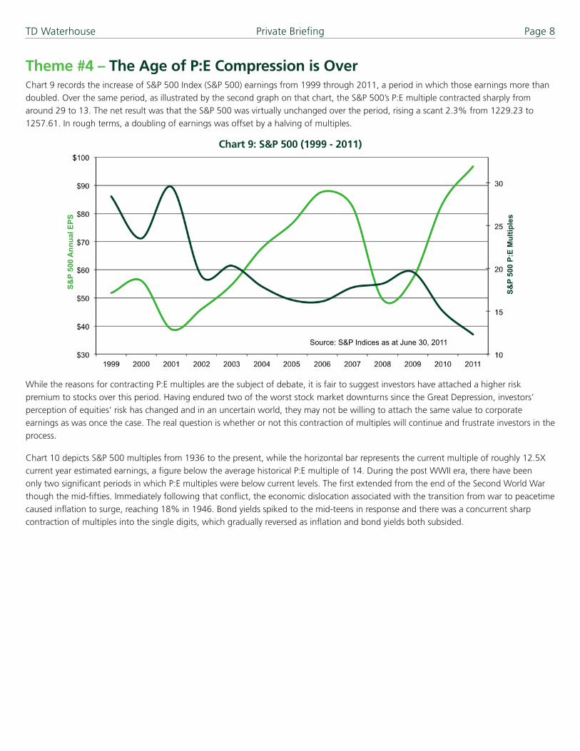
Theme #4 – The Age of P:E Compression is OverChart 9 records the increase of S&P 500 Index (S&P 500) earnings from 1999 through 2011, a period in which those earnings more than doubled. Over the same period, as illustrated by the second graph on that chart, the S&P 500’s P:E multiple contracted sharply from around 29 to 13. The net result was that the S&P 500 was virtually unchanged over the period, rising a scant 2.3% from 1229.23 to 1257.61. In rough terms, a doubling of earnings was offset by a halving of multiples.
Chart 9: S&P 500 (1999 - 2011)
S&P
500
Ann
ual E
PS
S&P
500
P:E
Mul
tiple
s
Source: S&P Indices as at June 30, 2011
While the reasons for contracting P:E multiples are the subject of debate, it is fair to suggest investors have attached a higher risk premium to stocks over this period. Having endured two of the worst stock market downturns since the Great Depression, investors’ perception of equities’ risk has changed and in an uncertain world, they may not be willing to attach the same value to corporate earnings as was once the case. The real question is whether or not this contraction of multiples will continue and frustrate investors in the process.
Chart 10 depicts S&P 500 multiples from 1936 to the present, while the horizontal bar represents the current multiple of roughly 12.5X current year estimated earnings, a figure below the average historical P:E multiple of 14. During the post WWII era, there have been only two significant periods in which P:E multiples were below current levels. The first extended from the end of the Second World War though the mid-fifties. Immediately following that conflict, the economic dislocation associated with the transition from war to peacetime caused inflation to surge, reaching 18% in 1946. Bond yields spiked to the mid-teens in response and there was a concurrent sharp contraction of multiples into the single digits, which gradually reversed as inflation and bond yields both subsided.
TD Waterhouse Private Briefing Page 9
Chart 10: S&P 500 P/E (1936 - 2011)
12.5
0
5
10
15
20
25
30
35
Dec
-11
Sep
-05
Jun-
99
Mar
-93
Dec
-86
Sep
-80
Jun-
74
Mar
-68
Dec
-61
Sep
-55
Jun-
49
Mar
-43
Dec
-36
Source: S&P Indices as at December 31, 2011
The second period with a market multiple below the current 12.5X extended from 1973 through the early eighties. This era began with the initial OPEC oil shock of 1973, a resultant acceleration of inflation, which peaked in 1981 at 13.5%, a rise in bond yields to the mid-teens and a consequent drop of P:E multiples into single digits. The period ended with the aforementioned, Volcker-led tightening of monetary policy and drop in inflation.
Therefore, in the modern era, P:E multiples have been below current levels only during those two periods when inflation and bond yields both reached double digits. This is clearly not the case today and argues against a further contraction of P:Es in the current environment. That said, while the market multiple is relatively low in absolute terms and versus historical data, what about equity valuations relative to fixed income today?
Chart 11 measures the gap between corporate bond yields and stocks’ earnings yield, subtracting the latter from the former. As the graph illustrates, S&P 500 stocks are at their lowest valuations relative to bonds in 30 years. While measures of relative value should not be viewed in isolation, this finding corroborates our view outlined above.
Chart 11: Measuring Relative Value
In summary, we believe the age of P:E multiple compression is over. After a decade of compression, multiples are now at sustainable levels and while a continuing high risk premium attached to stocks will limit P:E expansion, U.S. stocks will no longer see earnings growth offset by a shrinking market multiple. The principal risk to this view would be higher inflation in the wake of current, expansionary fiscal and monetary policies. While possible, we do not believe this is the most likely outcome and are instead of the view that share prices will more fully reflect earnings growth and lead to materially stronger performance than that witnessed during the past decade.
TD Waterhouse Private Briefing Page 10
Theme #5 – Rotation into Large Caps to ContinueIn 2009 and 2010, U.S. small cap stocks led their large cap counterparts by a wide margin, consistent with the historical pattern evident in the early stages of market recoveries. This reflects the fact that smaller companies are more economically sensitive than larger firms, responding more quickly to the economy’s ups and downs.
As illustrated in Chart 12, small caps’ outperformance in 2009-2010 was part of a longer term cycle, with large caps exhibiting strong outperformance from the late eighties until 2000 and small caps outdistancing larger companies’ shares by as wide a margin in the ensuing decade. By the end of 2010, a significant valuation gap had emerged, with the small cap Russell 2000 Index sporting a P:E multiple well above 20 while the S&P 500 multiple approximated 15. This gap, plus investors’ tendency to shift their focus to higher caliber companies as recoveries mature, led us to anticipate a rotation into the large caps in 2011.
Chart 12: Rotation Into Large Cap Stocks Has Begun
Source: Russell Investments Inc. as at December 31, 2010
Chart 13 shows that this unfolded as anticipated, with the S&P 500 outperforming the Russell 2000 by 545 basis points in 2011.
Chart 13: Performance of Large Caps vs. Small Caps (2011 - 2012 YTD)
Source: Russell Investments Inc., S&P Indices as at January 18, 2012
Looking ahead, the still-substantial valuation gap in favor of large caps should be reinforced by yield-hungry investors’ search for income. Investors are increasingly looking for equities in which a substantial portion of total return is generated by reliable dividends as opposed to less reliable capital gains. As illustrated in Chart 14, there is a strong correlation between market capitalization and dividend yield so investors’ focus on income will support the rotation into large cap stocks.
TD Waterhouse Private Briefing Page 11
Chart 14: S&P Dividend Yield Ranking by Market Cap
Market cap ($mm) Dividend Yield
> 50,000 1.9%
25,000-50,000 1.4%
10,000-25,000 1.3%
5,000-10,000 0.8%
< 5,000 0.8%
S&P 500 1.2%
S&P MidCap 400 0.7%
S&P SmallCap 600 0.0%
Source: JP Morgan Note: Market data as of 12/31/10
To sum up, after a decade of small cap outperformance, the shift into large caps that began in 2011 should continue and likely be lengthy and pronounced, consistent with past cycles. This large cap outperformance will be driven by more attractive valuations, the maturing market recovery and investors’ search for yield, mitigated in the near term only by very loose monetary policy, which disproportionately favors smaller companies.
Theme #6 – Role ReversalAs is well known and displayed in Chart 15, emerging market economies have significantly outperformed their developed nation counterparts over the past decade, doubling the latter group’s GDP growth rate. In turn, emerging market equities have generated far higher returns over the same period, as recorded on Table 2. Specifically, the MSCI Emerging Markets Index recorded a return of 11.19% per year over the past decade compared with a modest 0.92% for the S&P 500 and 1.66% for the MSCI World Index.
Chart 15: Global Economic Growth
Source: IMF, Forecast by TD Economics as of December 2011
For Illustration Purposes Only
TD Waterhouse Private Briefing Page 12
Table 2: Emerging Market, U.S. & World Equity Performance (2002 - 2011)
Index (USD) 10 Year*
MSCI Emerging Markets Index 11.19%
S&P 500 Index 0.92%
MSCI World Index 1.66%
*Performance data to December 31, 2011 Source: TD Securities Inc.
While their favorable economic backdrop has been a major reason for emerging markets’ superior equity performance, another, less well known factor has been the marked improvement in emerging market companies’ ROE. Chart 16 shows that while emerging market ROE has been highly cyclical, retreating sharply in recessions, ROE has improved about 50%, rising from 10% to 15% since 1994. Rising ROE has been driven by widening operating margins, which have in turn been a function of both the economies of scale that come with rising volume and cheap, abundant labor. It is the latter point that is now in question.
Chart 16: Emerging Market Return on Equity (1994 - 2011)
Source: ISI as at June 30, 2011
Year
Chart 17 depicts what is to most, a surprising trend in many emerging markets. Pronounced shortages of skilled labor have developed in both Brazil and China, which have in turn caused sharp increases in labor costs. In China, these shortages have been widespread, extending well beyond the more developed coastal region. The result is that in the 2005 – 2010 period, wages rose 19% annually, though from a low base. In the 2011 – 2015 timeframe, wages are expected to surge at a 17% annual rate and while productivity growth is forecast to average 8.5%, that still means an 8.5% increase in unit labor costs.
Chart 17: Skilled Labor Shortages Have Developed in Emerging Markets
Brazil China
IFO World Economic Survey: shortage of skilled labor (1 = no shortage 10 = maximum shortage) Source: ISI as at June 30, 2011
TD Waterhouse Private Briefing Page 13
Since many Chinese factories compete on the basis of price and some of their labor cost advantage is offset by shipping and related logistical expenses, Chinese companies should be unable to pass on their incremental labor costs and instead will have to absorb them. As a result, we can anticipate some compression of operating margins, reduction of ROE and an attendant effect on share price performance. So while emerging markets will continue to benefit from their economies’ strength, erosion of operating margins and ROE will likely detract from their exceptionally strong relative performance versus developed market equities.
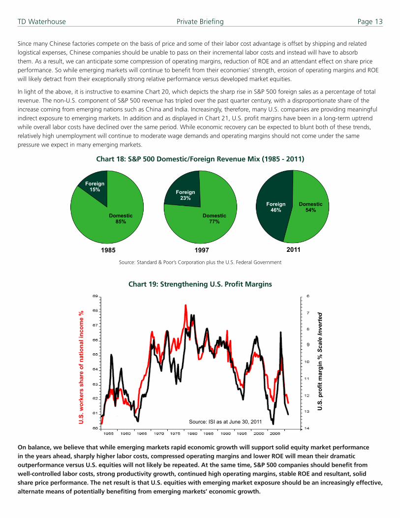
In light of the above, it is instructive to examine Chart 20, which depicts the sharp rise in S&P 500 foreign sales as a percentage of total revenue. The non-U.S. component of S&P 500 revenue has tripled over the past quarter century, with a disproportionate share of the increase coming from emerging nations such as China and India. Increasingly, therefore, many U.S. companies are providing meaningful indirect exposure to emerging markets. In addition and as displayed in Chart 21, U.S. profit margins have been in a long-term uptrend while overall labor costs have declined over the same period. While economic recovery can be expected to blunt both of these trends, relatively high unemployment will continue to moderate wage demands and operating margins should not come under the same pressure we expect in many emerging markets.
Source: Standard & Poor’s Corporation plus the U.S. Federal Government
Chart 19: Strengthening U.S. Profit Margins
U.S
. wor
kers
sha
re o
f nat
iona
l inc
ome
%
U.S
. pro
fit m
argi
n %
Sca
le In
vert
ed
Source: ISI as at June 30, 2011
On balance, we believe that while emerging markets rapid economic growth will support solid equity market performance in the years ahead, sharply higher labor costs, compressed operating margins and lower ROE will mean their dramatic outperformance versus U.S. equities will not likely be repeated. At the same time, S&P 500 companies should benefit from well-controlled labor costs, strong productivity growth, continued high operating margins, stable ROE and resultant, solid share price performance. The net result is that U.S. equities with emerging market exposure should be an increasingly effective, alternate means of potentially benefiting from emerging markets’ economic growth.
TD Waterhouse Private Briefing Page 14
EpilogueIn the preceding pages, we have outlined six key trends we believe will shape the investment landscape in the years ahead. To recap, we are in the second, convalescent phase of the current credit crisis that will be chiefly characterized by deleveraging of the household sector and below-average economic growth, not recession. The rehabilitation of the household balance sheet will go further than most expect and changing behavior will favor non-durables over durables and financial service providers focused on the asset side of the household balance sheet. The bull market in bonds is over and investors have to think differently about the role of Treasuries. A decade of P:E compression is also over and stock prices should start reflecting earnings growth henceforth. The rotation into the large caps should continue and finally, emerging markets will not likely outperform in the dramatic fashion they have and U.S. stocks should be an excellent way of gaining emerging market exposure in the years ahead.
In summary, while fear and uncertainty prevail, real opportunities now exist and investors should act accordingly.
Appendix A – Important Disclosures The information contained herein has been provided by TD Waterhouse Private Client Services and is for information purposes only. The information has been drawn from sources believed to be reliable. Where such statements are based in whole or in part on information provided by third parties, they are not guaranteed to be accurate or complete. Graphs and charts are used for illustrative purposes only and do not reflect future values or future performance of any investment. The information does not provide financial, legal, tax or investment advice. Particular investment or trading strategies should be evaluated relative to each individual’s objectives and risk tolerance. TD Waterhouse Private Client Services, The Toronto-Dominion Bank and its affiliates and related entities are not liable for any errors or omissions in the information or for any loss or damage suffered.
Certain statements in this presentation may contain forward-looking statements (“FLS”) about the model portfolios, including their strategy, risks, expected performance and condition. FLS are based on current expectations and projections about future general economic, political and relevant market factors, such as interest and foreign exchange rates, equity and capital markets, and the general business environment, in each case assuming no changes to applicable tax or other laws or government regulation. Expectations and projections about future events are inherently subject to, among other things, risks and uncertainties, some of which may be unforeseeable and, accordingly, may prove to be incorrect at a future date. FLS are not guarantees of future performance, and actual events could differ materially from those expressed or implied in any FLS made by a model portfolio. A number of important factors can contribute to these digressions, including, but not limited to, general economic, political and market factors in North America and internationally, interest and foreign exchange rates, global equity and capital markets, business competition and catastrophic events. You should consider these and other factors before making any investment decisions and should avoid placing any undue reliance on FLS. Further, you should be aware that the model portfolios have no specific intention of updating any FLS whether as a result of new information, future events or otherwise.
TD Waterhouse Private Client Services represents the products and services offered by TD Waterhouse Private Investment Advice (a division of TD Waterhouse Canada Inc. – Member of the Canadian Investor Protection Fund), TD Waterhouse Private Investment Counsel Inc., TD Waterhouse Private Trust (offered by The CanadaTrust Company) and TD Waterhouse Private Banking (offered by The Toronto-Dominion Bank).
Bloomberg and Bloomberg.com are trademarks and service marks of Bloomberg Finance L.P., a Delaware limited partnership, or its subsidiaries. All rights reserved.
All trademarks are the property of their respective owners.
®/ The TD logo and other trade-marks are the property of The Toronto-Dominion Bank or a wholly-owned subsidiary, in Canada and/or other countries.