22
Reporting Services Tips for the Stephen Few Fan Meagan Longoria August 4, 2012
Reporting Services Tips for the
Stephen Few Fan
Meagan Longoria
August 4, 2012
Presentation Information
A copy of the presentation as well as links to
sources and other helpful articles is posted
on Google+.
Feel free to interrupt me to ask questions or
share your own tips or experiences.
8/4/2012 2
My Background
Originally from Duncanville, Texas
University of Nebraska – Lincoln: Raikes
School of Computer Science and
Management
Started my career at Cerner Corporation
MBA in Information Systems from KU
Currently employed at Zillner in Lenexa, KS
8/4/2012 3
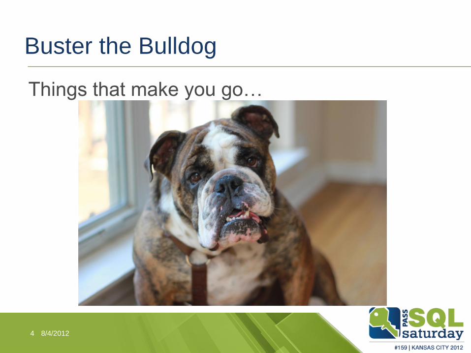
Buster the Bulldog
Things that make you go…
8/4/2012 4
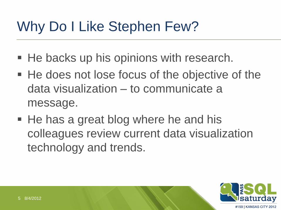
Why Do I Like Stephen Few?
He backs up his opinions with research.
He does not lose focus of the objective of the
data visualization – to communicate a
message.
He has a great blog where he and his
colleagues review current data visualization
technology and trends.
8/4/2012 5
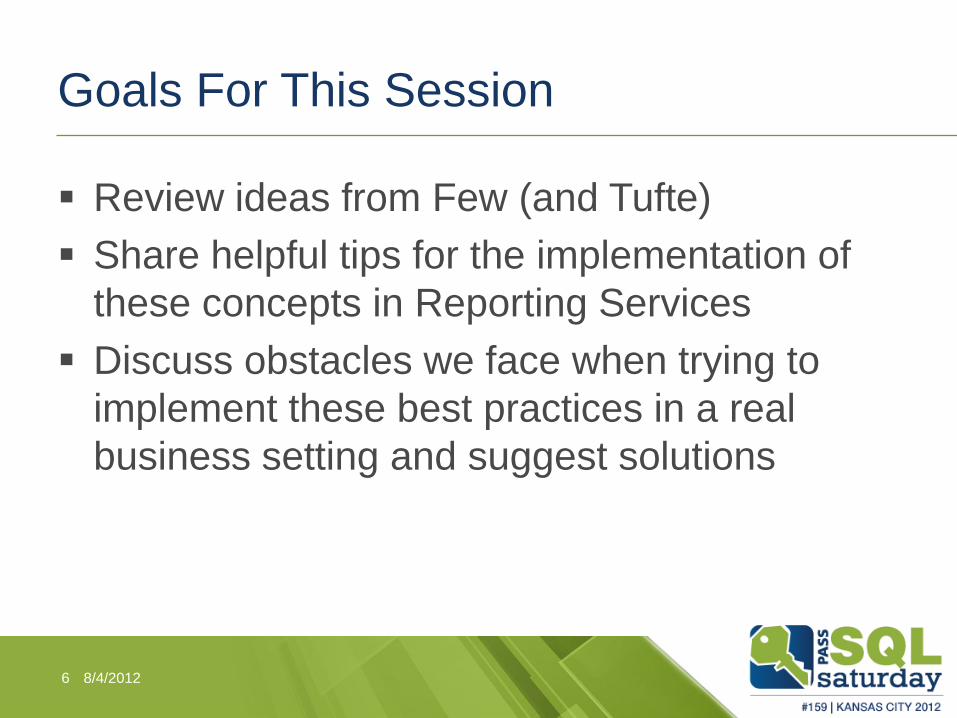
Goals For This Session
Review ideas from Few (and Tufte)
Share helpful tips for the implementation of
these concepts in Reporting Services
Discuss obstacles we face when trying to
implement these best practices in a real
business setting and suggest solutions
8/4/2012 6
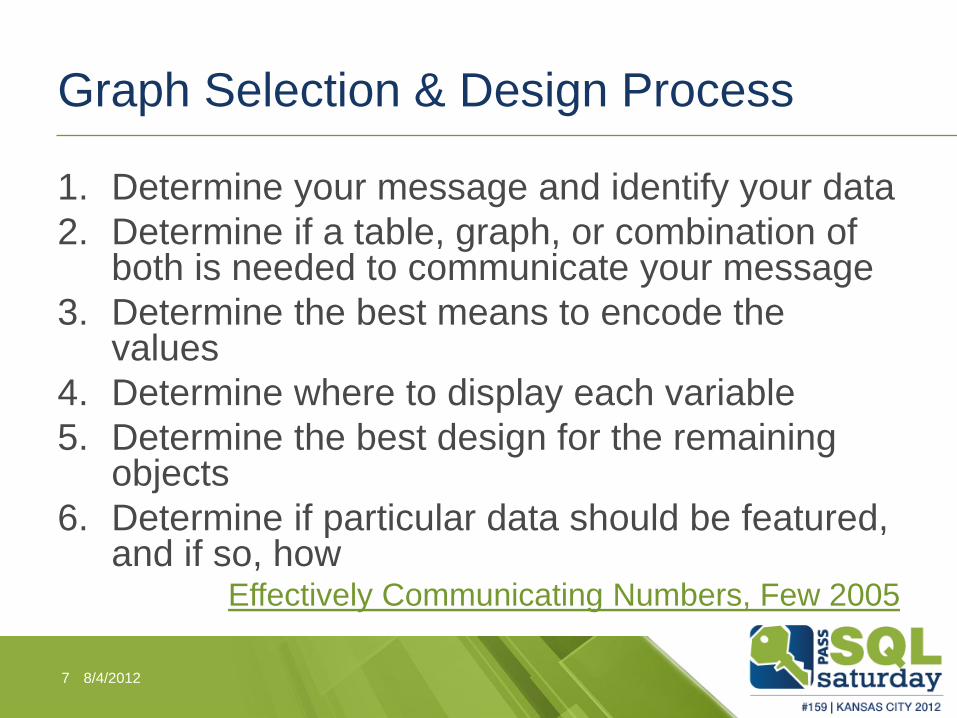
Graph Selection & Design Process
1. Determine your message and identify your data
2. Determine if a table, graph, or combination of both is needed to communicate your message
3. Determine the best means to encode the values
4. Determine where to display each variable
5. Determine the best design for the remaining objects
6. Determine if particular data should be featured, and if so, how
Effectively Communicating Numbers, Few 2005
8/4/2012 7
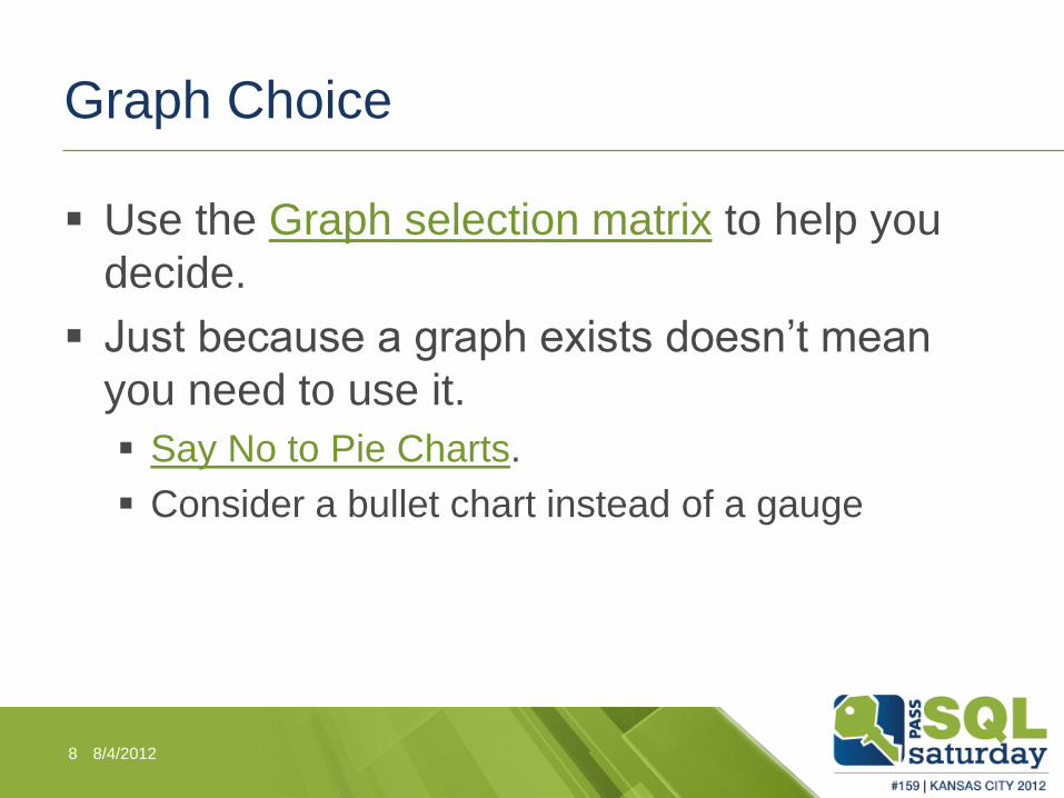
Graph Choice
Use the Graph selection matrix to help you
decide.
Just because a graph exists doesn’t mean
you need to use it.
Say No to Pie Charts.
Consider a bullet chart instead of a gauge
8/4/2012 8
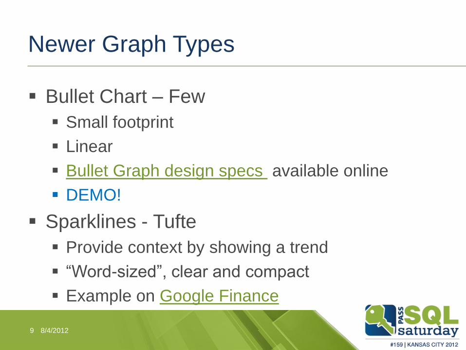
Newer Graph Types
Bullet Chart – Few
Small footprint
Linear
Bullet Graph design specs available online
DEMO!
Sparklines - Tufte
Provide context by showing a trend
“Word-sized”, clear and compact
Example on Google Finance
8/4/2012 9
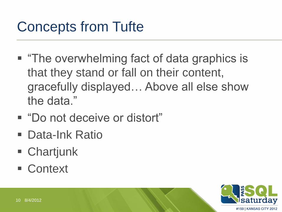
Concepts from Tufte
“The overwhelming fact of data graphics is
that they stand or fall on their content,
gracefully displayed… Above all else show
the data.”
“Do not deceive or distort”
Data-Ink Ratio
Chartjunk
Context
8/4/2012 10
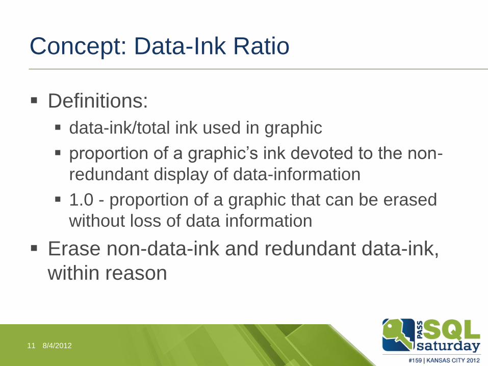
Concept: Data-Ink Ratio
Definitions:
data-ink/total ink used in graphic
proportion of a graphic’s ink devoted to the non-
redundant display of data-information
1.0 - proportion of a graphic that can be erased
without loss of data information
Erase non-data-ink and redundant data-ink,
within reason
8/4/2012 11
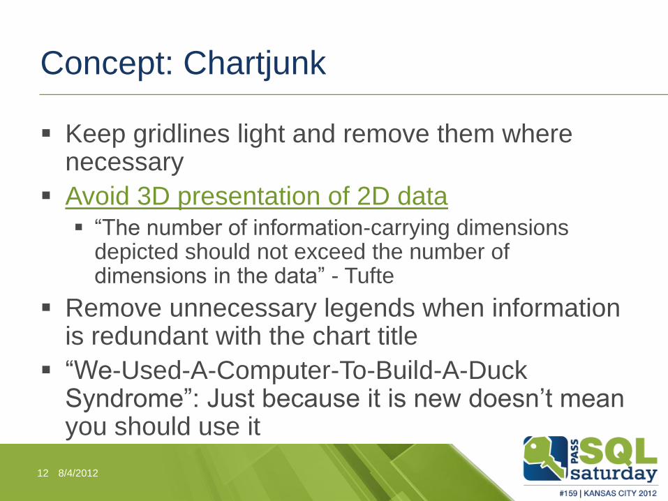
Concept: Chartjunk
Keep gridlines light and remove them where necessary
Avoid 3D presentation of 2D data “The number of information-carrying dimensions
depicted should not exceed the number of dimensions in the data” - Tufte
Remove unnecessary legends when information is redundant with the chart title
“We-Used-A-Computer-To-Build-A-Duck Syndrome”: Just because it is new doesn’t mean you should use it
8/4/2012 12
Concept: Sufficient Context
“graphics must not quote data out of context”
- Tufte
• Real example from a client
DEMO: Repeat columns and row headers on
each page - workaround for 2008 R2
8/4/2012 13
Component Design
Preattentive Processing
Gestalt Principles of Visual Perception
Bar charts:
Start numerical scales at 0
Order bar charts by value
Use a single color in bars of bar charts unless
there is a good reason
Don’t rotate labels
8/4/2012 14
Fonts
Legibility and consistency are the goals of
font choice for data visualizations
Serif or Sans-Serif is acceptable: Arial,
Verdana, Tahoma, Times New Roman,
Palatino
Emphasis and color can be used for grouping
text
8/4/2012 15
Colors
We can distinguish preattentively between no more than about 8 different hues
Colors that are light/pale are useful in tables and graphs for anything you don’t want to stand out above other content. Fully saturated, bright versions of primary hues tend to demand attention and should be used to highlight information.
Practical Rules for Using Color in Charts - Few 2008
Example from Marchex
My favorite tools: Instant Eyedropper
Color Combos
8/4/2012 16
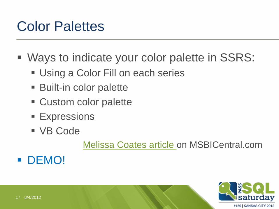
Color Palettes
Ways to indicate your color palette in SSRS:
Using a Color Fill on each series
Built-in color palette
Custom color palette
Expressions
VB Code
Melissa Coates article on MSBICentral.com
DEMO!
8/4/2012 17
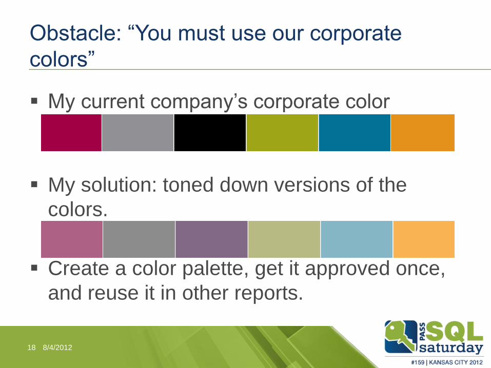
Obstacle: “You must use our corporate
colors”
My current company’s corporate color
palette:
My solution: toned down versions of the
colors.
Create a color palette, get it approved once,
and reuse it in other reports.
8/4/2012 18
Obstacle: “It’s Not Flashy Enough”
Use this as an education point, but be open to suggestions
“What I’m arguing is that, beyond a few basic principles of visual aesthetics, one’s goal when designing a data visualization should not be to make it beautiful (or attractive). The goal is to communicate. If additional focus on visual aesthetics is required for a data visualization to communicate, then it’s appropriate.” – Few, Visual Business Intelligence, 2012
“If the statistics are boring, then you’ve got the wrong numbers…” - Tufte
8/4/2012 19
Obstacle: “I want to know the exact
numbers”
Use hover text to provide precise numbers Demo
Are the precise numbers important, or is the pattern/trend important? Tables work best when the display will be used to look
up individual values or the quantitative values must be precise. Graphs work best when the message you wish to communicate resides in the shape of the data (that is, in patterns, trends, and exceptions). – Few, Effectively Communicating Numbers, 2005
You can have both a graph and a table
8/4/2012 20
Desired State
8/4/2012 21
Contact Me
Find me on Google Plus:
http://goplus.us/meaganlongoria
Materials from this presentation are posted there
Connect on Linked In:
http://www.linkedin.com/in/meaganlongoria
Email me: Longoria.meagan at gmail.com
Twitter: @mmarie
8/4/2012 22


