29
Research talk 1.1 Claudette M. Jones, M.Ed. KAISERSLAUTERN HS APLAC 2014-2015
| Date post: | 28-Dec-2015 |
| Category: |
Documents |
| Upload: | jonas-kelly-dixon |
| View: | 216 times |
| Download: | 2 times |

Research talk 1.1
Claudette M. Jones, M.Ed.
KAISERSLAUTERN HS APLAC2014-2015

Purpose of a research talk
Is not to: Impress the audience Tell them all you
know about a subject Present every little
detail of your work
Is to: Give the audience a
sense of what your topic is about
Explain the basics of what you have learned by researching your topic
Get feedback on your work

Technical details
You have 3-5 minutes to presentPresent the “meat” of your work- not every detailBe confident and knowledgeable Don’t fill up your slides with lots of words or
picturesBe prepared to answer questions by the second
presentation

Avoid researcher bias
Your info should: Give facts about your
topic Give info on more than
one perspective Show that you are
unbiased in your exploration of the topic

Know your audience
Who will be there?ExpertsPersons knowledgeable on your topicPersons unknowledgeable on your topicWho knows?
Most likely a mix so explain your research thoroughly
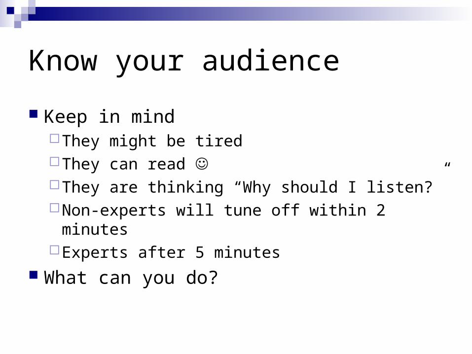
Know your audience
Keep in mindThey might be tiredThey can read They are thinking “Why should I listen?”Non-experts will tune off within 2 minutesExperts after 5 minutes
What can you do?

What can you do?
Early motivation - at the beginning of your talk motivate your audience with easy to understand examples
Spoil the punch line - State your results early and in simple terms
Visuals – Illustrate your research with images and diagrams

Leave audience with these thoughts I understood what the topic was and why it
was important I have an idea of what the research says
about the topic He/ She understands the topic really
well(i.e. interject your thoughts on the topic at the beginning or the end )

As you move forward, keep in mind… Be familiar with related topics Mainly talk about results that are
immediately related to your topic References needed at the end of the talk;
use the citations for the annotated bibliography

Good to know info coming up

Slide layout - Bad
This page contains too many words for a presentation slide. It is not written in point form, making it difficult both for your audience to read and for you to present each point. Although there are exactly the same number of points on this slide as the previous slide, it looks much more complicated. In short, your audience will spend too much time trying to read this paragraph instead of listening to you.

Slide layout – Good
Show one point at a time:Will help audience concentrate on what you
are sayingWill prevent audience from reading aheadWill help you keep your presentation focused

Fonts - Good
Use a decent font size Use different size fonts for main points and
secondary points this font is 24-point, the main point font is 32-
point, and the title font is 44-point Use a standard font like Times New
Roman or Arial

Fonts - Bad
If you use a small font, your audience won’t be able to read what you have written
CAPITALIZE ONLY WHEN NECESSARY. IT IS DIFFICULT TO READ
Don’t use a complicated font

Color - Good
Use font color that contrasts sharply with the background
Blue font on white background
Use color to reinforce the logic of your structure
Ex: light blue title and dark blue text
Use color to emphasize a point But only use this occasionally

Color - Bad
Using a font color that does not contrast with the background color is hard to read
Using color for decoration is distracting and annoying.
Using a different color for each point is unnecessary
Same for secondary points
Trying to be creative can also be bad
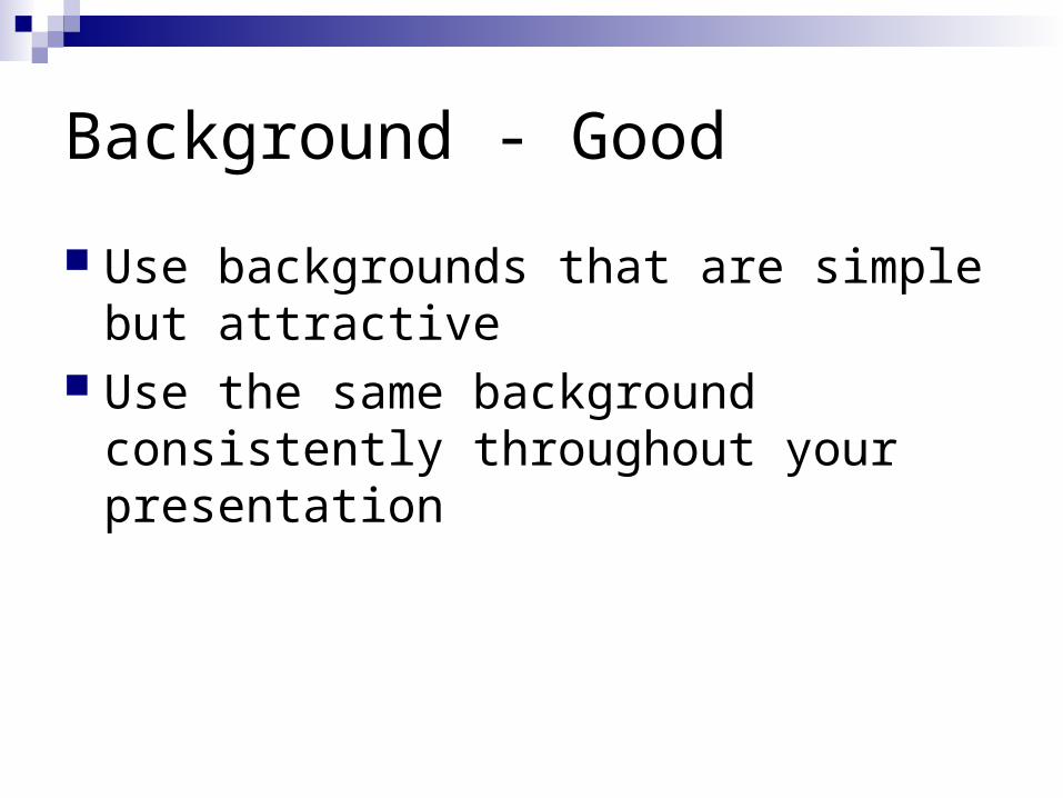
Background - Good
Use backgrounds that are simple but attractive
Use the same background consistently throughout your presentation

Background – Bad
Avoid backgrounds that are distracting or difficult to read from
Always be consistent with the background that you use

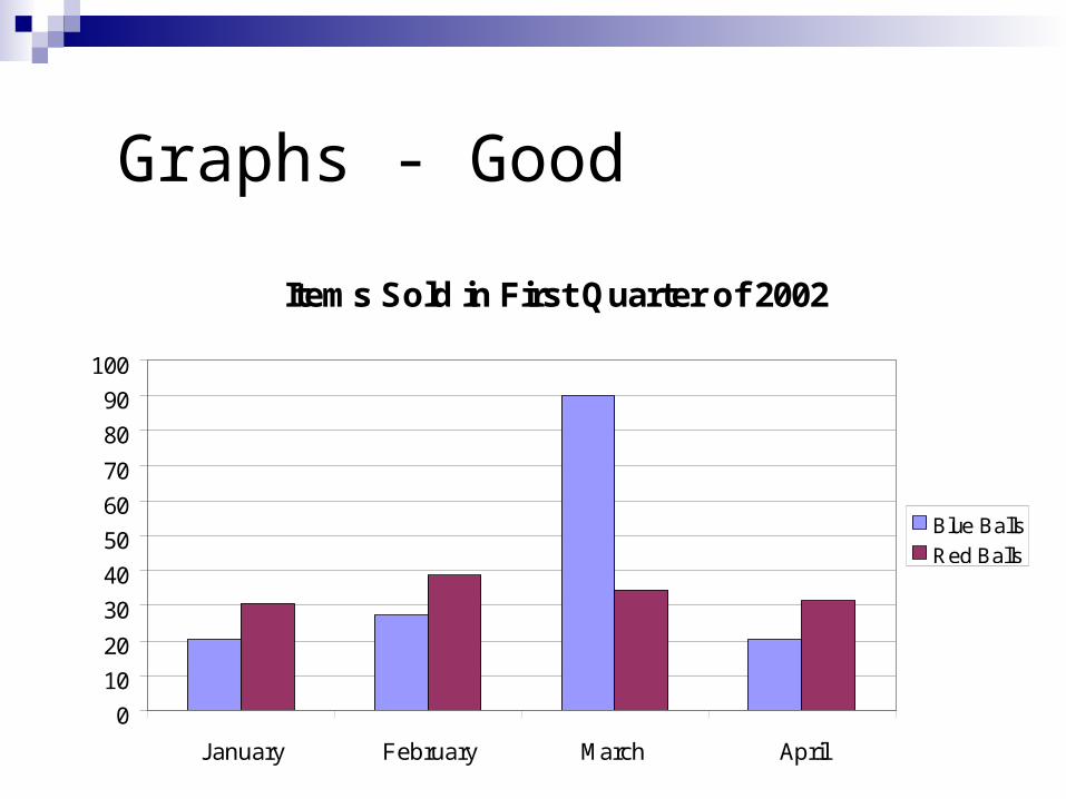
Graphs - Good
Use graphs rather than just charts and wordsData in graphs is easier to comprehend &
retain than is raw dataTrends are easier to visualize in graph form
Always title your graphs

Graphs - Bad
January February March AprilBlue Balls 20.4 27.4 90 20.4Red Balls 30.6 38.6 34.6 31.6
Graphs - Good
Items Sold in First Quarter of 2002
0
10
20
30
40
50
60
70
80
90
100
January February March April
Blue Balls
Red Balls

Graphs - Bad
20.4
27.4
90
20.4
30.6
38.6
34.631.6
0
10
20
30
40
50
60
70
80
90
100
January February March April
Blue Balls
Red Balls
Graphs - Bad
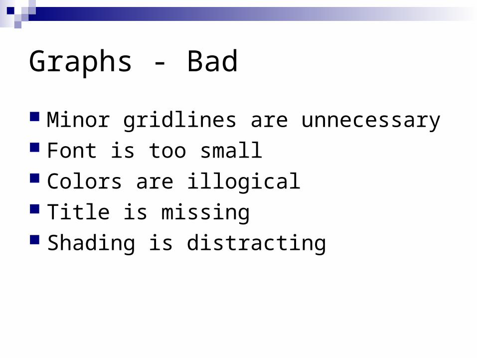
Minor gridlines are unnecessary Font is too small Colors are illogical Title is missing Shading is distracting

Preparing the presentation
Prepare the slides in advance Show them to friends When you think you are done read them
again Check all animations with the sound on

Preparing the presentation
Practice, practice, practiceGive a practice talk to a general audienceGive a practice talk to an audience of expertTime your presentation (allow for speed up
effect caused by nervousness) Always assume technology will fail you.
Have backups.

Delivering the talk
Be enthusiastic! If you aren’t why should the audience be?
Make eye contact with the audience Identify a few “nodders” and speak to them Watch for questions. Be prepare to digress
or brush off when irrelevant

Delivering the talk
Point at the screen not the computer Do not read directly from the PPT or your
notes Have the “spill” for the first couple of slides
memorized in case you go blank Finish in time
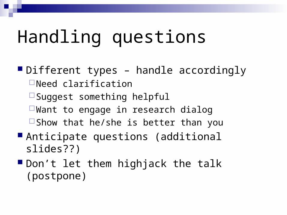
Handling questions
Different types – handle accordinglyNeed clarificationSuggest something helpfulWant to engage in research dialogShow that he/she is better than you
Anticipate questions (additional slides??) Don’t let them highjack the talk (postpone)

How can I get better?
Practice every chance you can Observe others
Steal good presentation ideasNotice all the things that turned you off
Seek comments from friends and mentors


