27
Statistical Analysis with Excel © 2012 Project Lead The Way, Inc. Introduction to Engineering Design
| Date post: | 17-Dec-2015 |
| Category: |
Documents |
| Upload: | leon-wilkinson |
| View: | 218 times |
| Download: | 0 times |

Statistical Analysis with Excel
© 2012 Project Lead The Way, Inc.Introduction to Engineering Design

Spreadsheet Programs
• First developed in 70s– VisiCalc
• Dan Bricklin and
Bob Frankston
– Operated on Apple II– Not patented
• Excel based on earlier spreadsheet
Purpose of a Spreadsheet
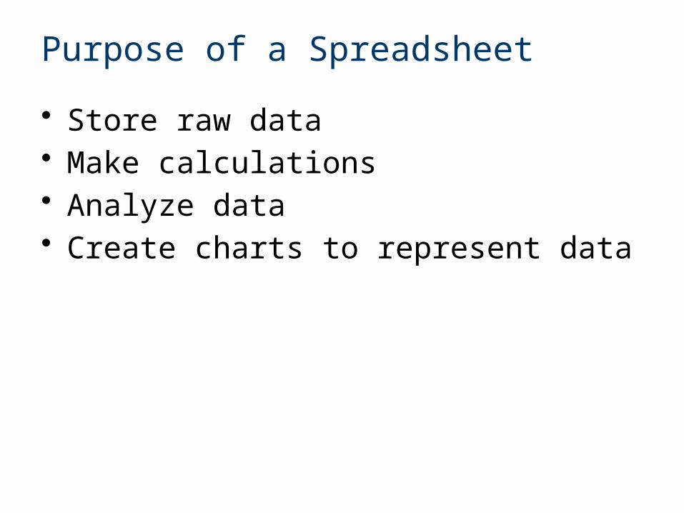
• Store raw data• Make calculations• Analyze data• Create charts to represent data
Basics of Excel
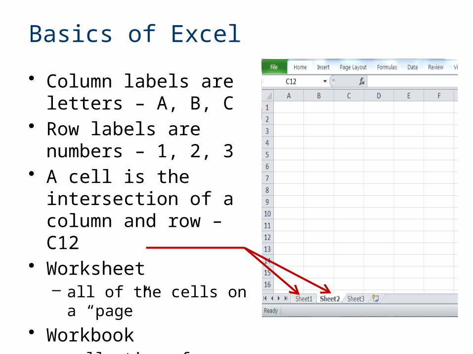
• Column labels are letters – A, B, C
• Row labels are numbers – 1, 2, 3
• A cell is the intersection of a column and row – C12
• Worksheet – all of the cells on a “page”
• Workbook– collection of worksheets– Excel file
Basics of Excel
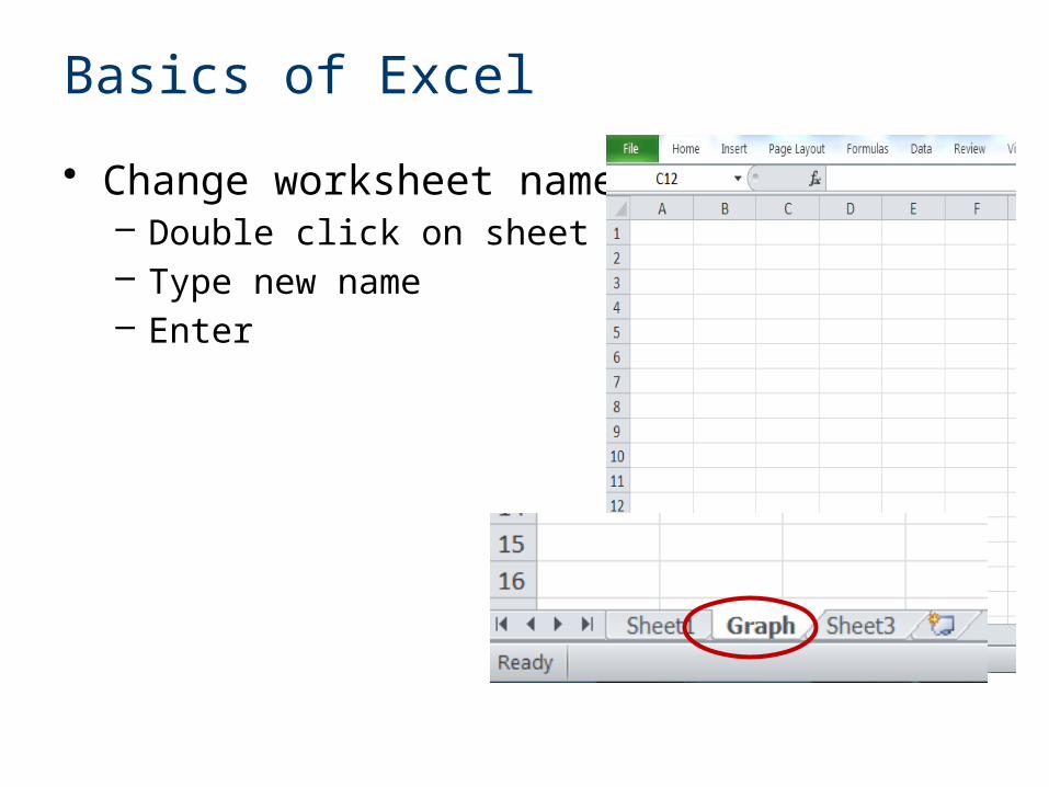
• Change worksheet name– Double click on sheet name– Type new name– Enter
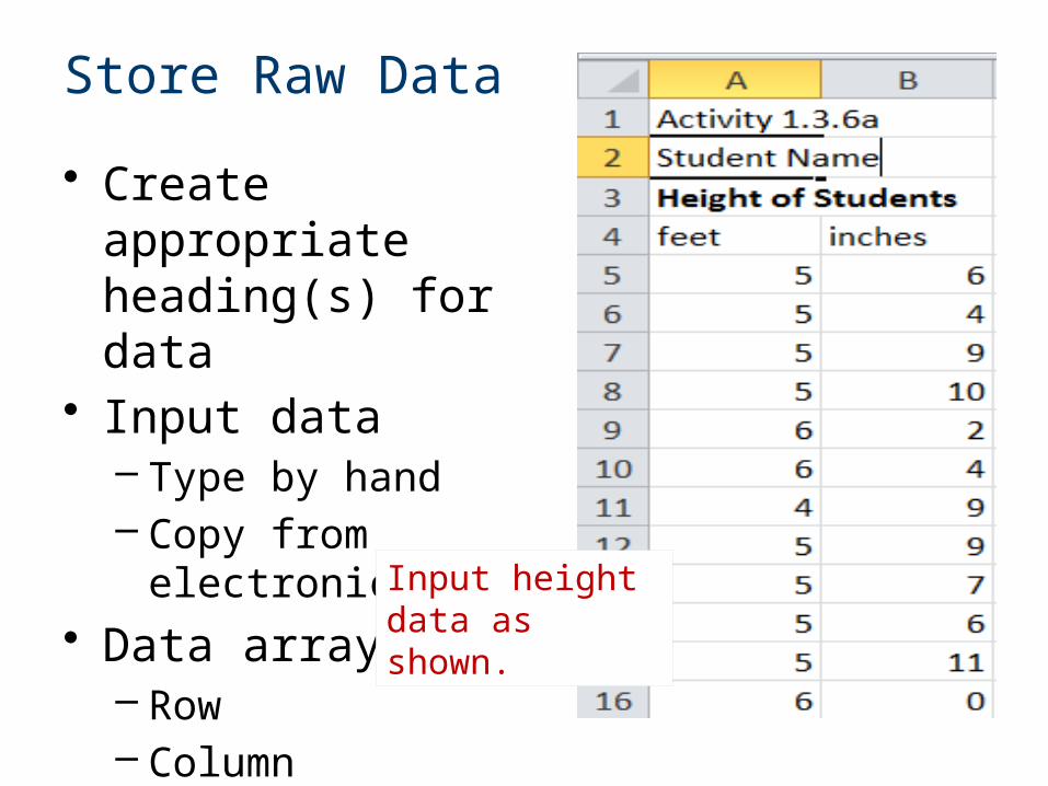
Store Raw Data
• Create appropriate heading(s) for data
• Input data– Type by hand– Copy from electronic
table• Data array
– Row– Column– Table
Input height data as shown.
Calculations
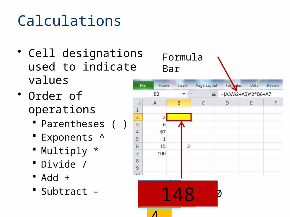
• Cell designations used to indicate values
• Order of operations Parentheses ( ) Exponents ^ Multiply * Divide / Add + Subtract –
Formula Bar
( 62 +1)2
∙3+1003 41648148
Calculations
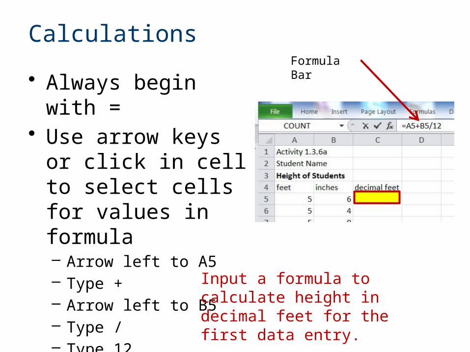
• Always begin with =• Use arrow keys or
click in cell to select cells for values in formula– Arrow left to A5– Type +– Arrow left to B5– Type /– Type 12– Enter
Formula Bar
Input a formula to calculate height in decimal feet for the first data entry.
Calculations
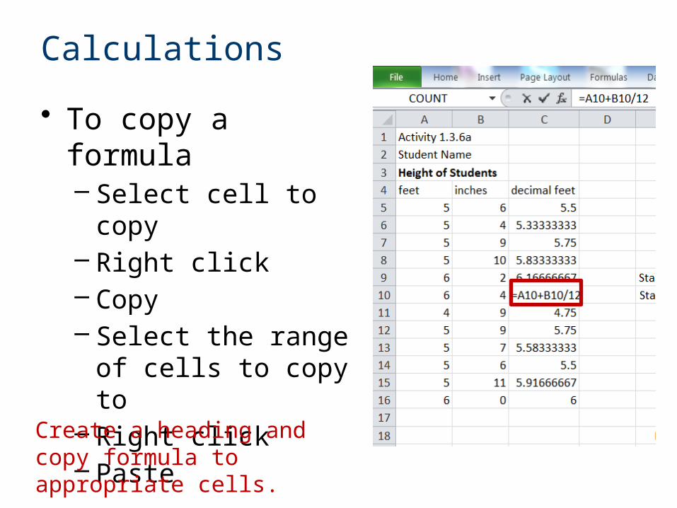
• To copy a formula– Select cell to copy– Right click– Copy– Select the range of
cells to copy to– Right click– Paste
Create a heading and copy formula to appropriate cells.
Raw Data and Calculated Values
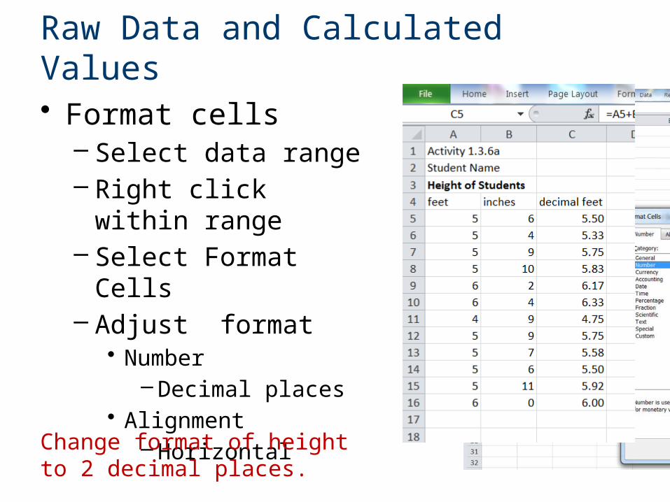
• Format cells– Select data range– Right click within range– Select Format Cells– Adjust format
• Number– Decimal places
• Alignment– Horizontal
Change format of height to 2 decimal places.
Calculations
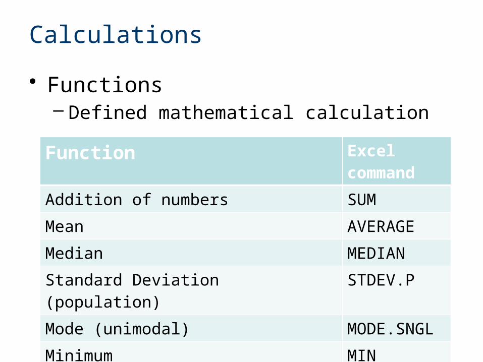
• Functions– Defined mathematical calculation
Function Excel command
Addition of numbers SUM
Mean AVERAGE
Median MEDIAN
Standard Deviation (population) STDEV.P
Mode (unimodal) MODE.SNGL
Minimum MIN
Maximum MAX
Calculations
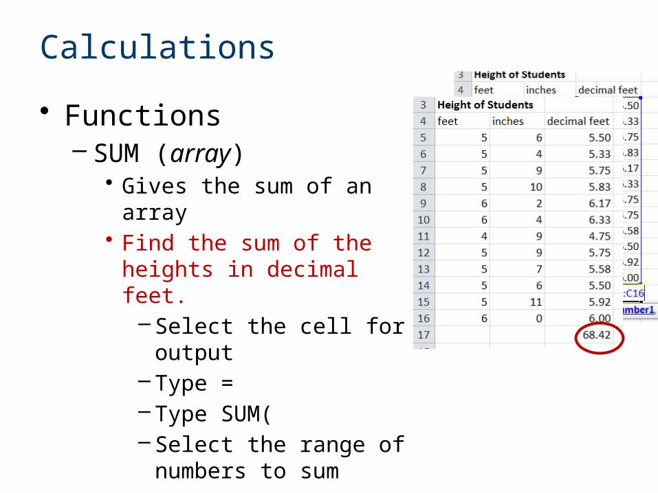
• Functions– SUM (array)
• Gives the sum of an array • Find the sum of the heights
in decimal feet.– Select the cell for output– Type =– Type SUM(– Select the range of
numbers to sum– Enter
Functions
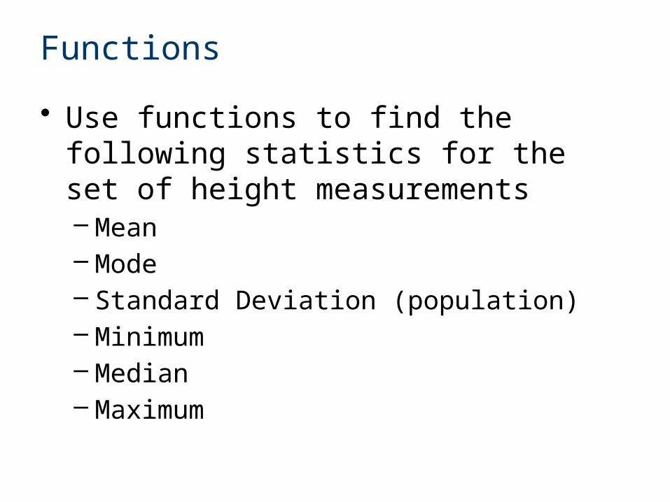
• Use functions to find the following statistics for the set of height measurements– Mean– Mode– Standard Deviation (population)– Minimum– Median– Maximum
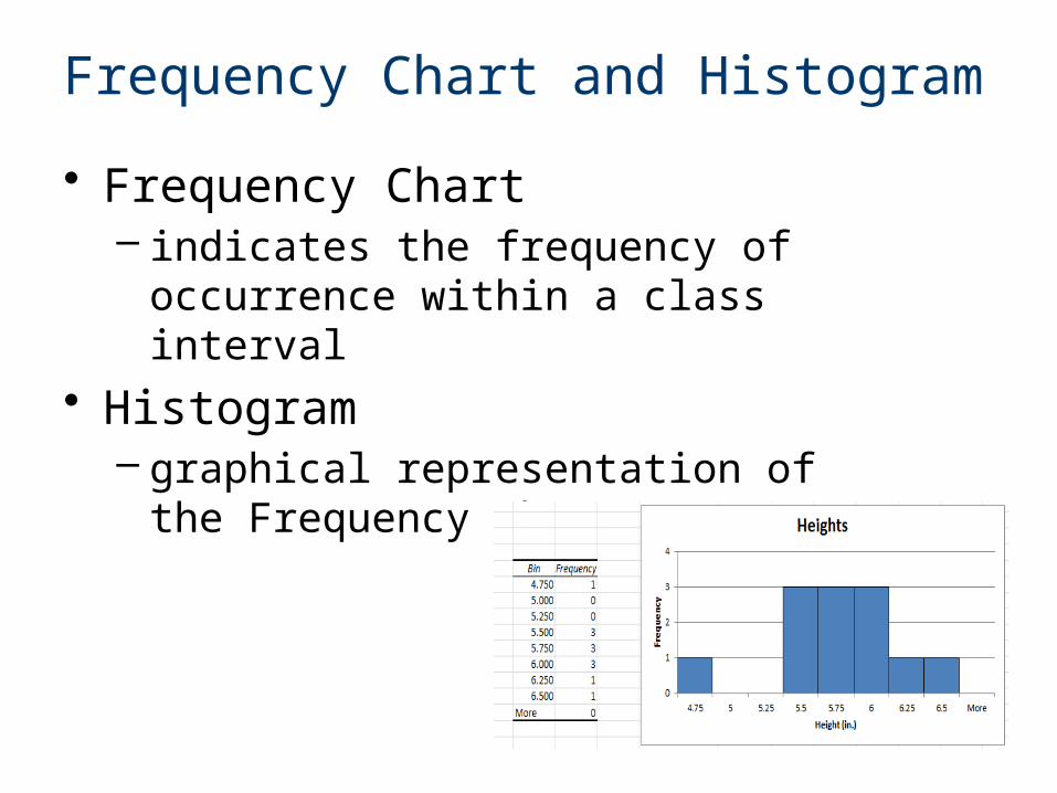
Frequency Chart and Histogram
• Frequency Chart – indicates the frequency of
occurrence within a class interval• Histogram
– graphical representation of the Frequency Chart
Frequency Chart and Histogram
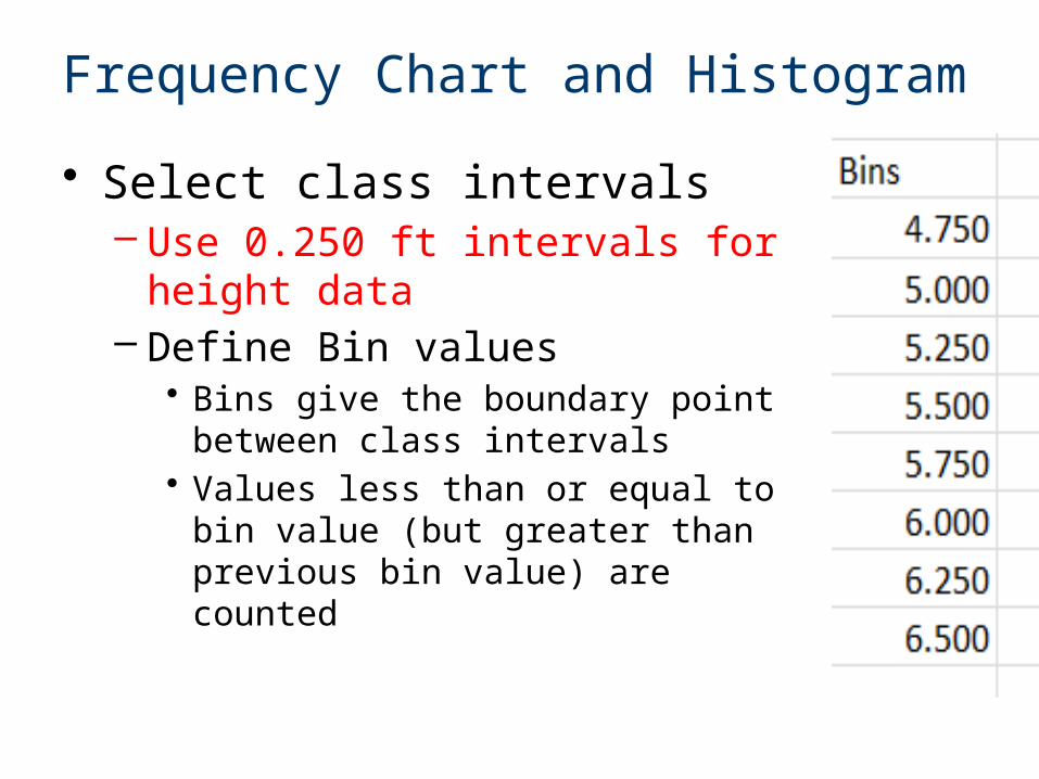
• Select class intervals– Use 0.250 ft intervals for height
data– Define Bin values
• Bins give the boundary point between class intervals
• Values less than or equal to bin value (but greater than previous bin value) are counted
Frequency Chart and Histogram
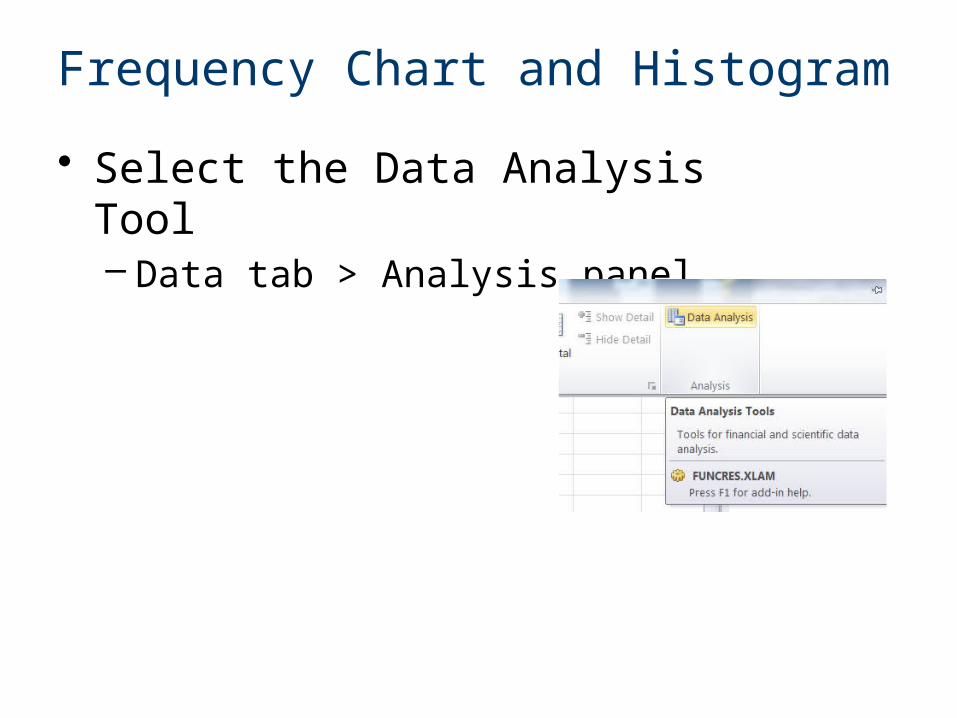
• Select the Data Analysis Tool– Data tab > Analysis panel
Frequency Chart and Histogram
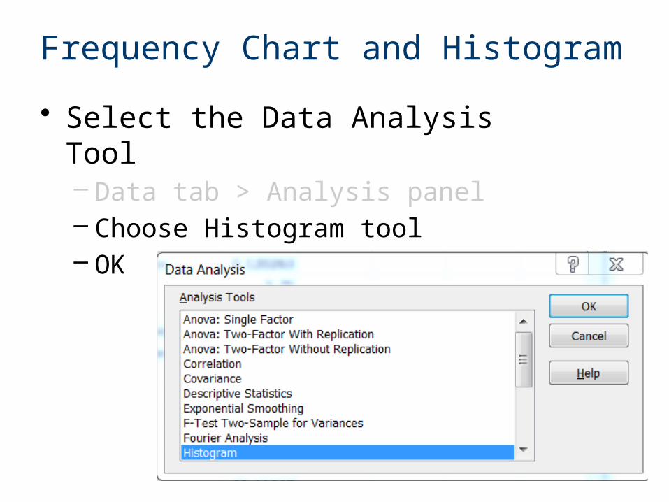
• Select the Data Analysis Tool– Data tab > Analysis panel– Choose Histogram tool– OK
Frequency Chart and Histogram
• Select the Data Analysis Tool– Data tab > Analysis panel– Choose Histogram tool– OK
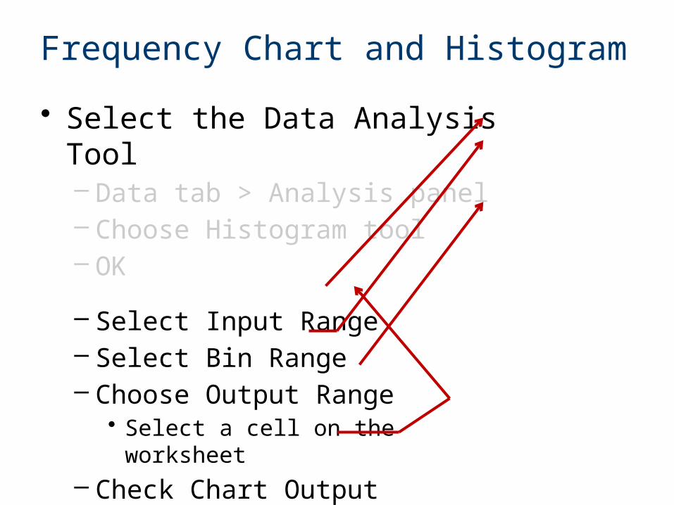
– Select Input Range– Select Bin Range– Choose Output Range
• Select a cell on the worksheet
– Check Chart Output– OK
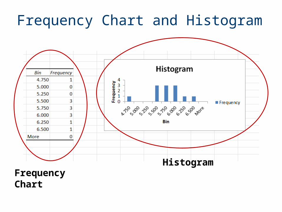
Frequency Chart and Histogram
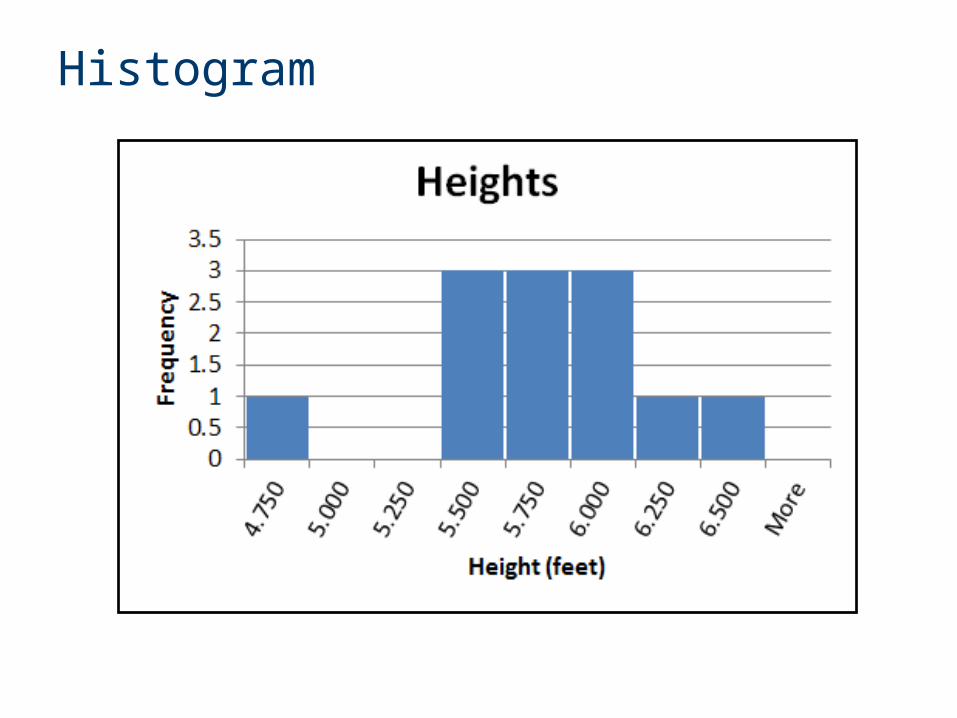
Frequency ChartHistogram
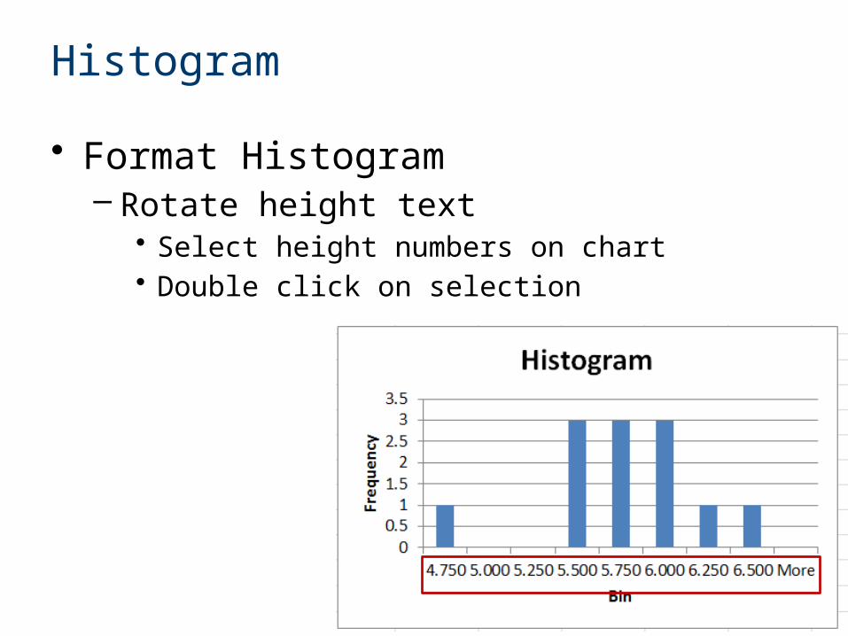
Histogram
• Format Histogram– Rotate height text
• Select height numbers on chart• Double click on selection
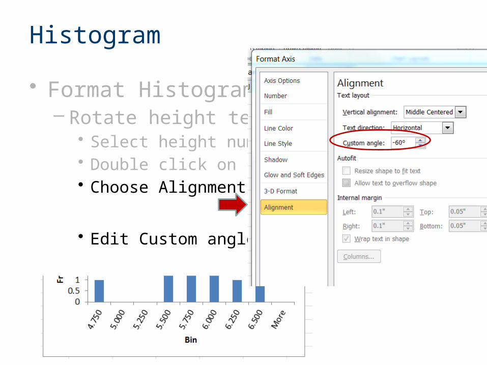
Histogram
• Format Histogram– Rotate height text
• Select height numbers on chart• Double click on selection• Choose Alignment
• Edit Custom angle
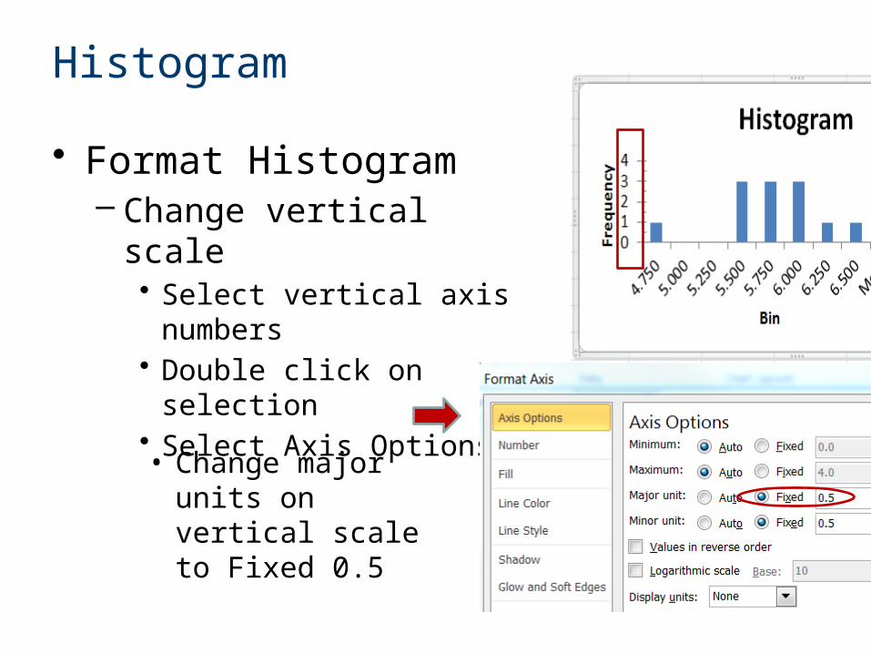
Histogram
• Format Histogram– Change vertical scale
• Select vertical axis numbers • Double click on selection• Select Axis Options
• Change major units on vertical scale to Fixed 0.5
Histogram
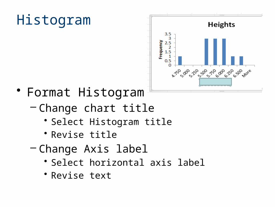
• Format Histogram– Change chart title
• Select Histogram title• Revise title
– Change Axis label• Select horizontal axis label• Revise text
Histogram
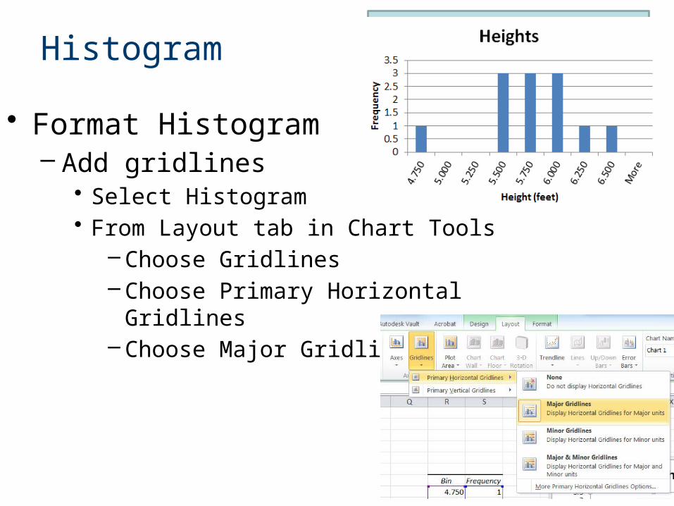
• Format Histogram– Add gridlines
• Select Histogram• From Layout tab in Chart Tools
– Choose Gridlines– Choose Primary Horizontal Gridlines– Choose Major Gridlines
Histogram
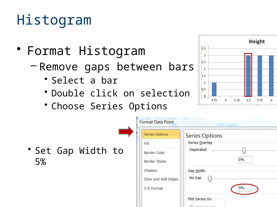
• Format Histogram– Remove gaps between bars
• Select a bar• Double click on selection• Choose Series Options
• Set Gap Width to 5%
Histogram
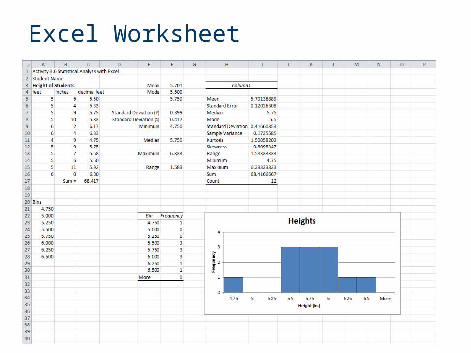
Excel Worksheet


