12
SUPER! Usability Study & Design Recommendations iOS 8.2.3 v1.4.0 Scott Valentine & Gavin Johns February Friday the 13th 2015
| Date post: | 19-Feb-2017 |
| Category: |
Technology |
| Upload: | gavin-johns |
| View: | 23 times |
| Download: | 0 times |

SUPER!Usability Study &
Design RecommendationsiOS 8.2.3 v1.4.0
Scott Valentine & Gavin Johns
FebruaryFriday the 13th
2015
TLDR - Exec Summary
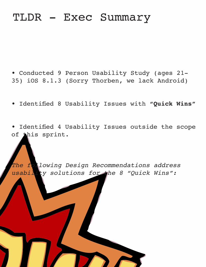
• Conducted 9 Person Usability Study (ages 21-35) iOS 8.1.3 (Sorry Thorben, we lack Android)
• Identified 8 Usability Issues with “Quick Wins”
• Identified 4 Usability Issues outside the scope of this sprint.
The following Design Recommendations address usability solutions for the 8 “Quick Wins”:
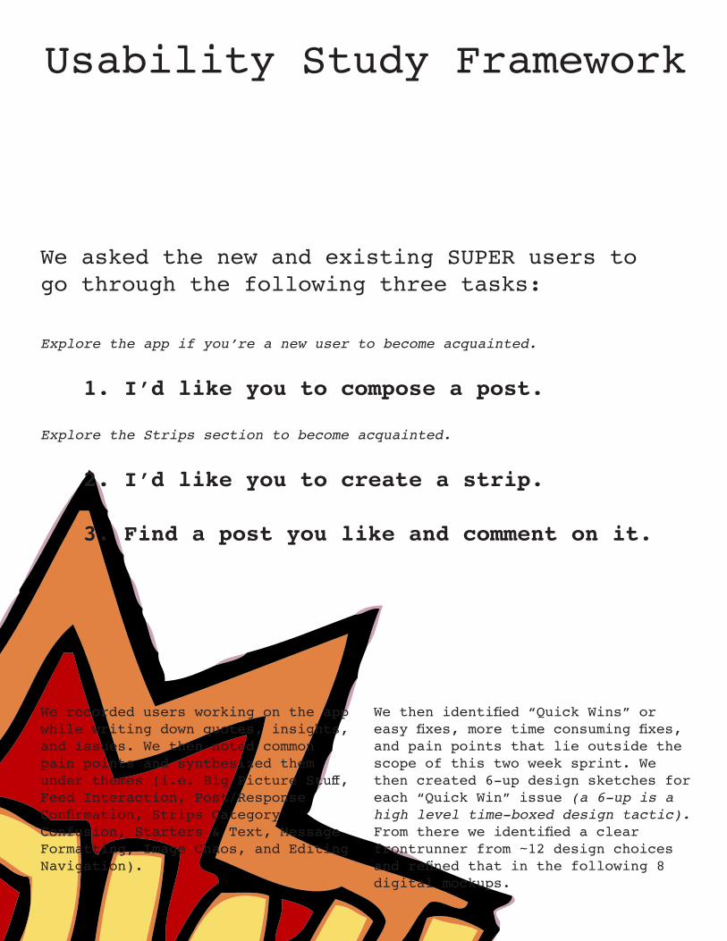
We then identified “Quick Wins” or easy fixes, more time consuming fixes, and pain points that lie outside the scope of this two week sprint. We then created 6-up design sketches for each “Quick Win” issue (a 6-up is a high level time-boxed design tactic). From there we identified a clear frontrunner from ~12 design choices and refined that in the following 8 digital mockups.
We recorded users working on the app while writing down quotes, insights, and issues. We then noted common pain points and synthesized them under themes (i.e. Big Picture Stuff, Feed Interaction, Post/Response Confirmation, Strips Category Confusion, Starters & Text, Message Formatting, Image Chaos, and Editing Navigation).
Usability Study Framework
We asked the new and existing SUPER users to go through the following three tasks:
Explore the app if you’re a new user to become acquainted.
1. I’d like you to compose a post.
Explore the Strips section to become acquainted.
2. I’d like you to create a strip.
3. Find a post you like and comment on it.
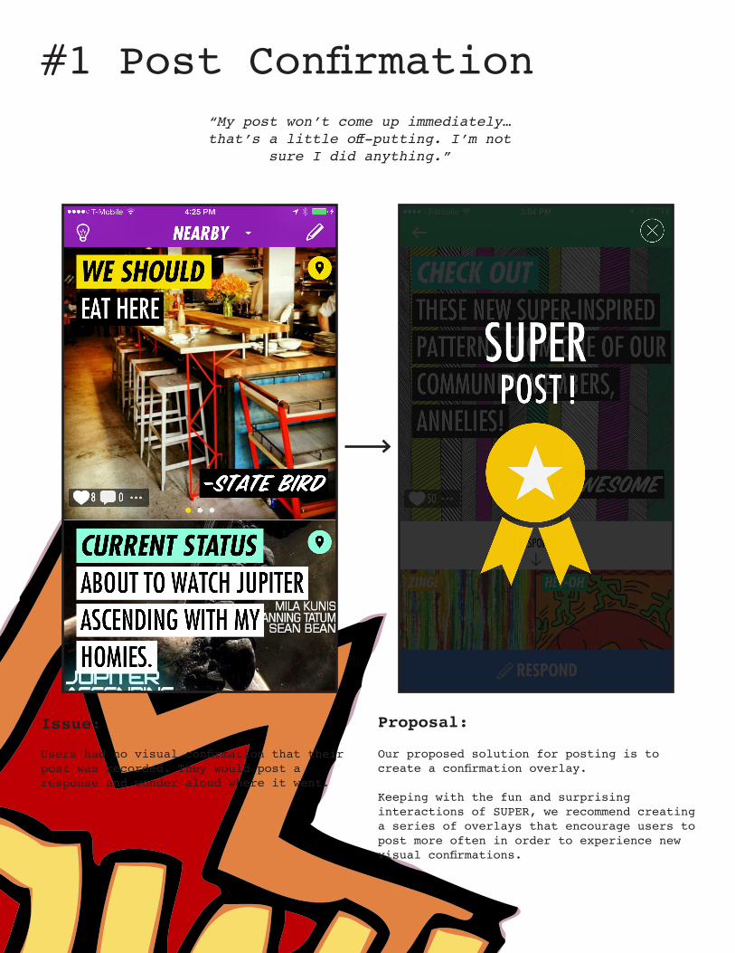
#1 Post Confirmation“My post won’t come up immediately… that’s a little off-putting. I’m not
sure I did anything.”
Proposal:
Our proposed solution for posting is to create a confirmation overlay.
Keeping with the fun and surprising interactions of SUPER, we recommend creating a series of overlays that encourage users to post more often in order to experience new visual confirmations.
Issue:
Users had no visual confirmation that their post was recorded. They would post a response and wonder aloud where it went.

#2 Camera Icon“I want to add my own [photos], but
how?”
Proposal:
Our proposed solution is to increase the visibility of the CAMERA icon.
We suggest a bright color similar to the existing SUPER color palette.
Issue:
Users find the CAMERA icon difficult to see.
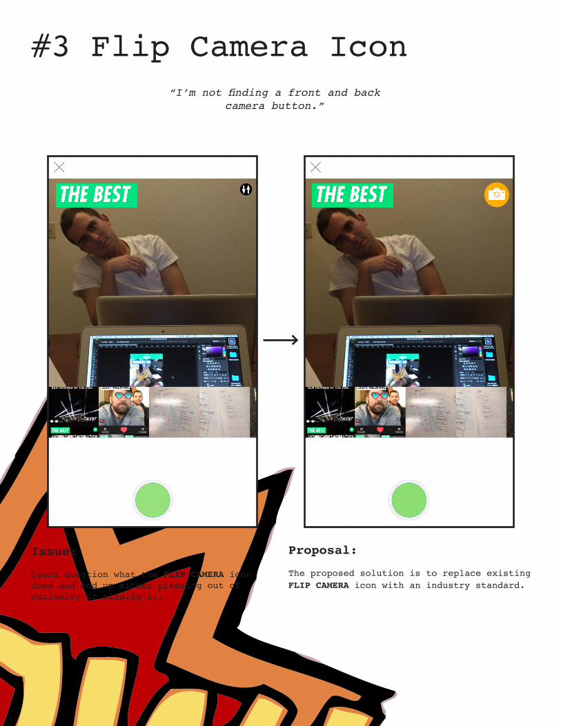
#3 Flip Camera Icon“I’m not finding a front and back
camera button.”
Proposal:
The proposed solution is to replace existing FLIP CAMERA icon with an industry standard.
Issue:
Users question what the FLIP CAMERA icon does and end up either pressing out of curiosity or sliding it.
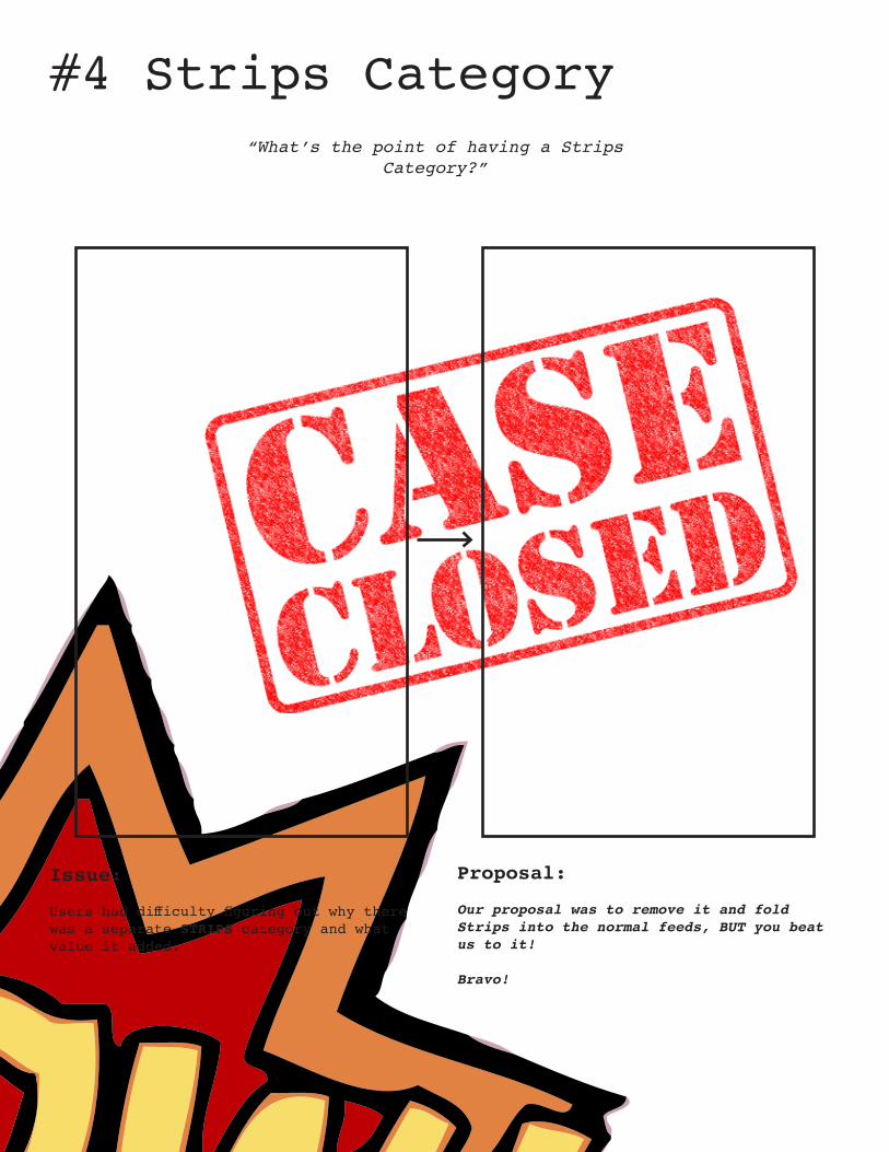
#4 Strips Category“What’s the point of having a Strips
Category?”
Proposal:
Our proposal was to remove it and fold Strips into the normal feeds, BUT you beat us to it!
Bravo!
Issue:
Users had difficulty figuring out why there was a separate STRIPS category and what value it added.

#5 Share Button“A little frustrating that the icons
aren’t separated a little more. I have fat fingers!”
Proposal:
Our usability solution increases the size of the social interaction banner and changes the ELLIPSES icon to a more recognized SHARE icon.
The new SHARE icon highlights that social sharing is important to SUPER and specifically encourages that behavior.
Issue: Users consistently had difficulty physically tapping on the ELLIPSES icon when interacting with a post.
The majority of users were unable to identify the function of the ELLIPSES icon prior to tapping it.
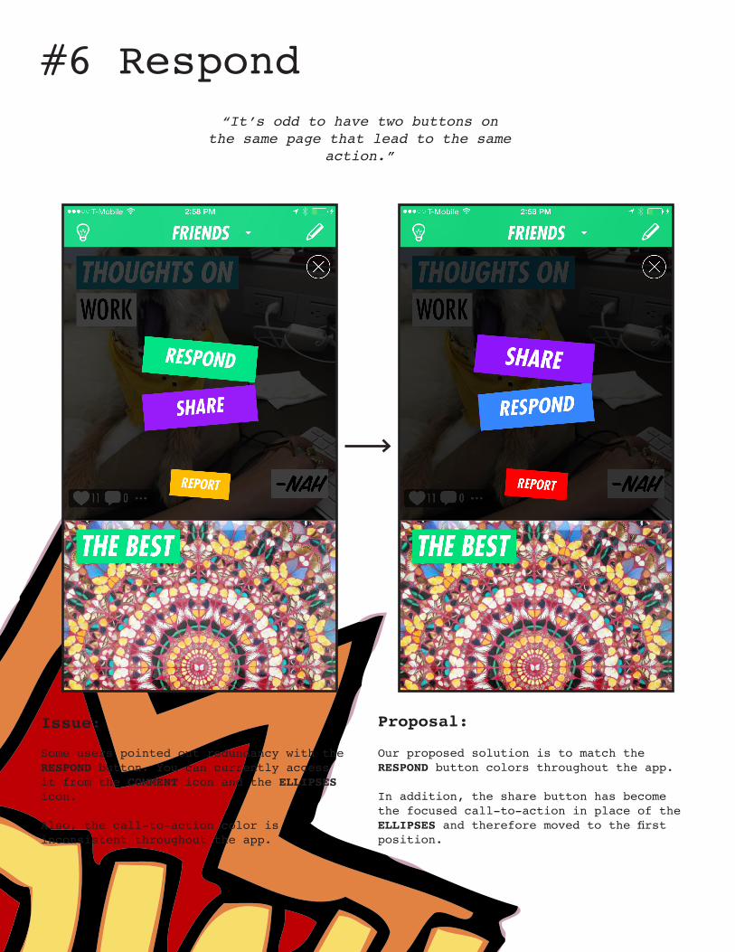
#6 Respond“It’s odd to have two buttons on
the same page that lead to the same action.”
Proposal:
Our proposed solution is to match the RESPOND button colors throughout the app.
In addition, the share button has become the focused call-to-action in place of the ELLIPSES and therefore moved to the first position.
Issue:
Some users pointed out redundancy with the RESPOND button. You can currently access it from the COMMENT icon and the ELLIPSES icon.
Also, the call-to-action color is inconsistent throughout the app.
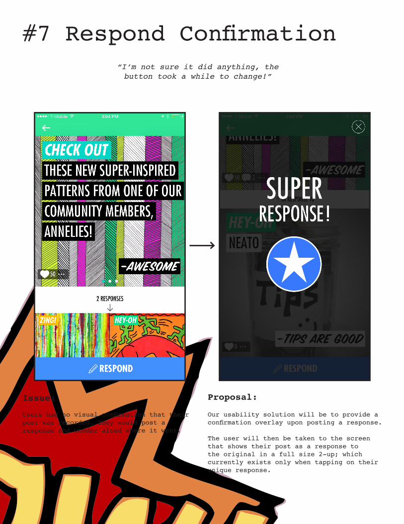
#7 Respond Confirmation“I’m not sure it did anything, the button took a while to change!”
Proposal:
Our usability solution will be to provide a confirmation overlay upon posting a response.
The user will then be taken to the screen that shows their post as a response to the original in a full size 2-up; which currently exists only when tapping on their unique response.
Issue:
Users had no visual confirmation that their post was recorded. They would post a response and wonder aloud where it went.
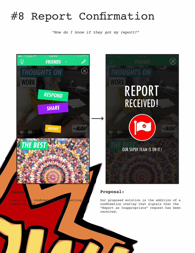
#8 Report Confirmation“How do I know if they got my report?”
Proposal:
Our proposed solution is the addition of a confirmation overlay that signals that the “Report as Inappropriate” request has been received.
Issue:
There is no confirmation for reporting an offensive post.

NEXT STEPS
FEEDBACK: What do you think? Are these known issues? Are there reasons not to implement i.e. Technical, Business, Brand?
THANK YOU!Scott Valentine &
Gavin Johns


