13
Detailed Analysis of a Music Magazine

Detailed Analysis of a Music Magazine

The logo and mast head, is in the right hand corner of the page in the primary optical area, showing it’s the first thing you look at when looking at the cover of the magazine. This is important because it the logo and name of the magazine so is important that it is seen first.
The colour scheme follows in both magazine example I have used, giving it a common house style, with black, white and also red colours used, this appeals to the older audience of ABC1s, as it is sophisticated and doesn't include an overload of colours which are for a younger generation. The colours seem plain and neutral. The logo is an example of this using reds and whites. The black writing on the front is to contrast with the white and red, so it stands out above everything else on the cover. This is so the cover stands out from the other covers which are bold, bright and messy, so that they contrast, and people notice the plain covers in-between all of the dark and bright colours of the magazine covers.
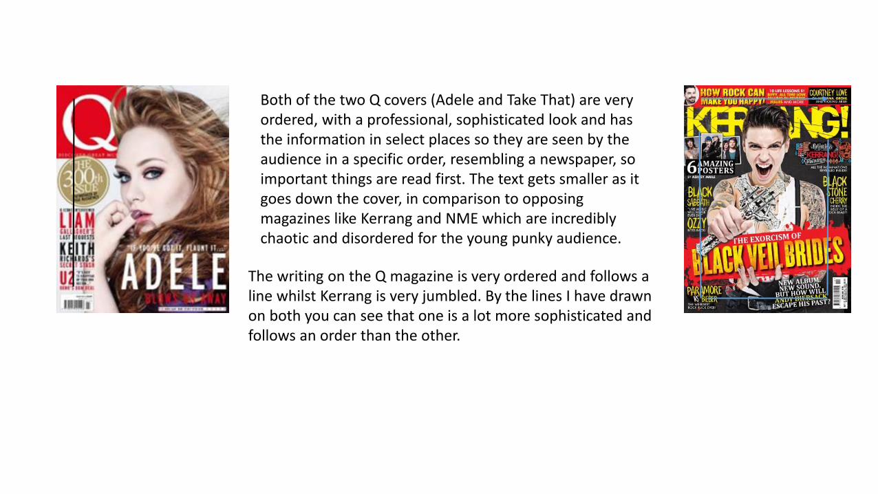
Both of the two Q covers (Adele and Take That) are very ordered, with a professional, sophisticated look and has the information in select places so they are seen by the audience in a specific order, resembling a newspaper, so important things are read first. The text gets smaller as it goes down the cover, in comparison to opposing magazines like Kerrang and NME which are incredibly chaotic and disordered for the young punky audience.
The writing on the Q magazine is very ordered and follows a line whilst Kerrang is very jumbled. By the lines I have drawn on both you can see that one is a lot more sophisticated and follows an order than the other.

The cover lines are in the top right hand corner of the magazine. This top cover featuring Take That also doesn’t have a lot of information on it, although there is some little text on the bottom of the cover which has information about what else is included in the magazine. The bottom cover features the cover lines in the bottom left of the cover, keeping the information well away from the photo, so the audience focus their eyes on the model.
The photo is in the centre of the cover, and takes up the majority of it, showing that it is important and should be in the centre of the cover, with the cover story below or above the image. The white background connotes neutralisation, and resembles negative empty space, so the attention can be drawn to the artists in the much darker colours. Giving more focus on the image of the artist instead of other information. There is also no other images relating to other articles on the cover.
The language used on the magazine cover is straight to the point, and is eye grabbing and catchy. It starts by using the artists name then follows with two or three limited words, for example: Blows us away, A year inside, Last request. This is to pull in people’s attention and to get them to read the magazine without giving away too much information on the cover, so people get interested and want to read on, for example: Keith Richards Secret Stash. This could relate to drugs put could also be a pun, so makes you read on to find out more.

SimilaritiesThe masthead are both in the top left side of the magazine. In the primary optical area.
Both follow a neutral colour scheme of reds, blacks, and whites.
Both are laid out nicely in an ordered way instead of being jumbled and messy.
There are little to no other cover lines on the cover apart from the main articles.
The image of the band is also the main focus for the cover.
DifferencesThe Rolling Stone magazine only includes information of the people on the cover, whilst the Q cover, includes other information from throughout the magazine
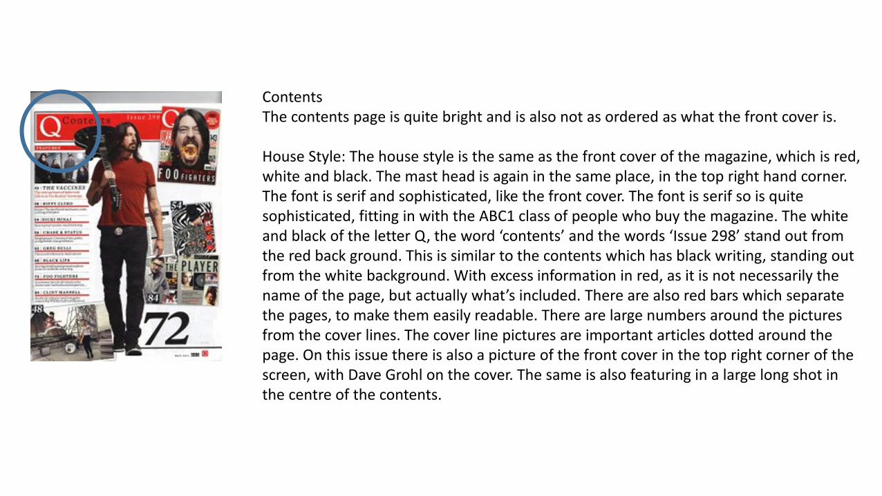
ContentsThe contents page is quite bright and is also not as ordered as what the front cover is.
House Style: The house style is the same as the front cover of the magazine, which is red, white and black. The mast head is again in the same place, in the top right hand corner. The font is serif and sophisticated, like the front cover. The font is serif so is quite sophisticated, fitting in with the ABC1 class of people who buy the magazine. The white and black of the letter Q, the word ‘contents’ and the words ‘Issue 298’ stand out from the red back ground. This is similar to the contents which has black writing, standing out from the white background. With excess information in red, as it is not necessarily the name of the page, but actually what’s included. There are also red bars which separate the pages, to make them easily readable. There are large numbers around the pictures from the cover lines. The cover line pictures are important articles dotted around the page. On this issue there is also a picture of the front cover in the top right corner of the screen, with Dave Grohl on the cover. The same is also featuring in a large long shot in the centre of the contents.
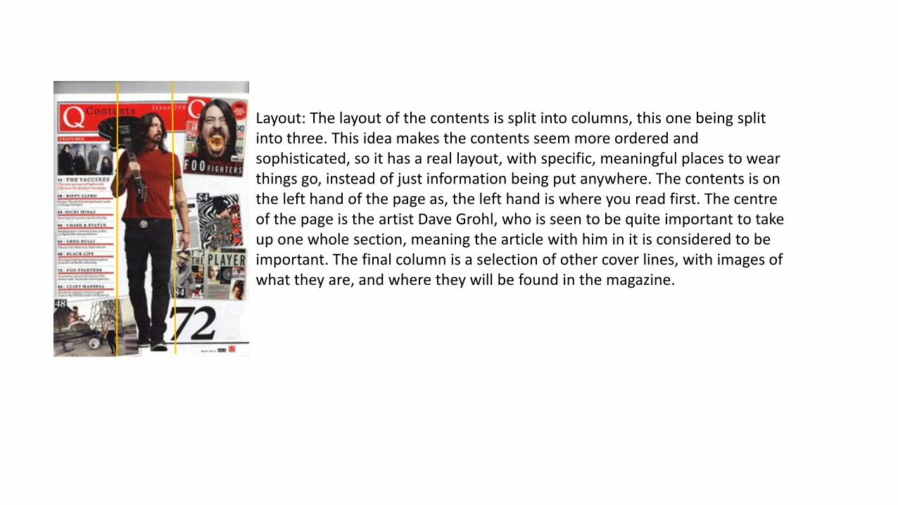
Layout: The layout of the contents is split into columns, this one being split into three. This idea makes the contents seem more ordered and sophisticated, so it has a real layout, with specific, meaningful places to wear things go, instead of just information being put anywhere. The contents is on the left hand of the page as, the left hand is where you read first. The centre of the page is the artist Dave Grohl, who is seen to be quite important to take up one whole section, meaning the article with him in it is considered to be important. The final column is a selection of other cover lines, with images of what they are, and where they will be found in the magazine.

Language: The language is basic but enticing, it doesn't say a lot, so doesn't give anything away of importance. This is to get people to read the magazine forward in the magazine through interest instead of being told everything on the contents page. The image showing Dave Grohl shows him in the appropriate colours for the magazine. He is also holding a bass guitar in a angry, maybe throwing position. This connotes that the main might show thrill in his persona, and can imply that the article would be interesting and exciting.
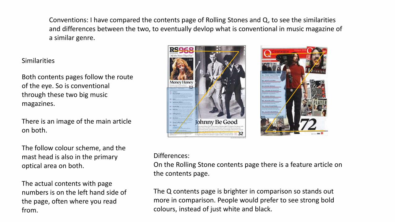
Conventions: I have compared the contents page of Rolling Stones and Q, to see the similarities and differences between the two, to eventually devlop what is conventional in music magazine of a similar genre.
Similarities
Both contents pages follow the route of the eye. So is conventional through these two big music magazines.
There is an image of the main article on both.
The follow colour scheme, and the mast head is also in the primary optical area on both.
The actual contents with page numbers is on the left hand side of the page, often where you read from.
Differences:On the Rolling Stone contents page there is a feature article on the contents page.
The Q contents page is brighter in comparison so stands out more in comparison. People would prefer to see strong bold colours, instead of just white and black.
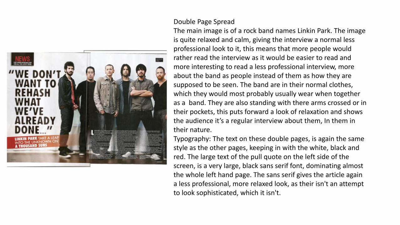
Double Page SpreadThe main image is of a rock band names Linkin Park. The image is quite relaxed and calm, giving the interview a normal less professional look to it, this means that more people would rather read the interview as it would be easier to read and more interesting to read a less professional interview, more about the band as people instead of them as how they are supposed to be seen. The band are in their normal clothes, which they would most probably usually wear when together as a band. They are also standing with there arms crossed or in their pockets, this puts forward a look of relaxation and shows the audience it’s a regular interview about them, In them in their nature.Typography: The text on these double pages, is again the same style as the other pages, keeping in with the white, black and red. The large text of the pull quote on the left side of the screen, is a very large, black sans serif font, dominating almost the whole left hand page. The sans serif gives the article again a less professional, more relaxed look, as their isn't an attempt to look sophisticated, which it isn't.
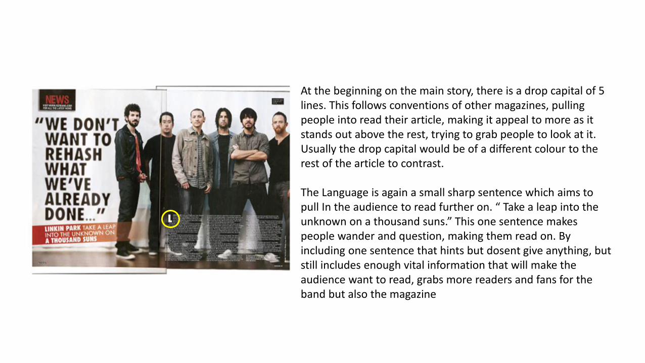
At the beginning on the main story, there is a drop capital of 5 lines. This follows conventions of other magazines, pulling people into read their article, making it appeal to more as it stands out above the rest, trying to grab people to look at it. Usually the drop capital would be of a different colour to the rest of the article to contrast.
The Language is again a small sharp sentence which aims to pull In the audience to read further on. “ Take a leap into the unknown on a thousand suns.” This one sentence makes people wander and question, making them read on. By including one sentence that hints but dosent give anything, but still includes enough vital information that will make the audience want to read, grabs more readers and fans for the band but also the magazine

Layout: When looking at this double page spread, you follow the route of the eye, when glancing at it. The mast head and title of the page is again in the primary optical area, and the article, is in the terminal zone, so after looking at the centre image and pull quote, you read the article. The article is divided up into columns which is similar to how the contents was laid out. This is conventional for magazines, and interview articles are also usually split into columns. This follows the conventional rule of three.
The stand first is in a orange box, different to the basic colour scheme of the magazine, so it stands out above the rest of the double page spread. The stand first is an attention grabbing quote by the journalist to grab attention for the audience, persuading them to read on.

Similarities:In the Rolling Stone magazine the thick, red text in capital letters, stretches across the whole page, showing the importance of the text. This is similar to Q who has their black thick text, contrasting with the white background and dominating the entire left page.
There are drop capitals and stand firsts on both pages, to make the article stand out, and to persuade audiences to keep reading.
Jaz Z, dominates the whole right hand page of his article, whilst the band Linkin Park attempt to dominate the right hand page, though due to there being many of them, the man on the far left appears on the other page.
Differences:The Image of Jay Z, is him in action in a performance instead of a photo shoot, like Linkin Park’s. This attracts the audience to both of them but in different ways. One is a more intimate interview the other features Jay Z on his job, so would be him as you know him.
It also follows the route of the eye in the Rolling Stone magazine, this is due to it being more youthful. You read the cover line, then you follow his eye line, then follow down to the small single block of writing, whilst the top m


