There’s no resting on your laurels where the competitive Photoshop crew is concerned! Here we’ve collected together some of the top creative offerings from fellow imageers P ictures may tell a thousand words, but sometimes you need a thousand words just to get to the bottom of a picture. Here we look at strange and interesting images created by readers and artists and discover how they were executed and the problems encountered along the way. Many of the images featured this issue have been specially selected from the Worth1000 website (www.worth1000.com), a Photoshop contest site, and demonstrate a diverse range of techniques that you’ll find useful in your own work. Like what you see? Then read the accompanying rubric, which details how the image was created. If you’d like to see your own work on these pages, please send us your JPEGs to advancedpshop@imagine- publishing.co.uk and we’ll get back to you if we want to print them. You’ll stand a better chance of seeing your work in print if you adhere to the following criteria: make sure that your images are high-quality TIFFs or JPEGs (RGB or CMYK), 300dpi minimum, and can be printed at 15cm x 15cm minimum. Don’t forget to include a small text file detailing how you created your work, too. Furry Rubik’s NAME: J Michael Kriz Because Mike took the picture of the source image himself, he was able to mess up the Rubik’s Cube in such a way that all the colours were distributed to his liking. “Each colour block is well-defined, so with my Magic Wand tool I selected one of the colour blocks and copied and pasted the selection on a new layer,” explains Mike. “I wanted to make sure there was some definition to the hair at the base, so I added some Noise at about 25-30% (with the Monochromatic box checked to keep the colour in the same tone).” He then used the Eyedropper tool to select two colours in the right tonal range, using a lighter colour for the foreground and a darker colour for the background. “With my Smudge tool set very soft with about 15-20% pressure, I dragged the colours out until they looked like little hairs at the base. Then I selected a brush that I thought would make good longer hair. Luckily, there is one called Dune Brush that ended up working perfectly, as it incorporates both the foreground and background colours, giving depth to the hairs. I painted in the hair until I was satisfied and erased any parts that looked awkward.” The process was repeated for each colour block, as well as for the shadow. “I used a new layer for each block so I could arrange them at the end, making sure the blocks at the foreground overlapped those in the background.” 72 Advanced Photoshop
Transcript
There’s no resting on your laurels where the competitive Photoshop crew is concerned! Here we’ve collected together some of the top creative offerings from fellow imageers
P ictures may tell a thousand words, but sometimes you need a thousand words just to get to the bottom of a picture. Here we look at
strange and interesting images created by readers and artists and discover how they were executed and the problems encountered along the way.
Many of the images featured this issue have been specially selected from the Worth1000 website (www.worth1000.com), a Photoshop contest site, and demonstrate a diverse range of techniques that you’ll find useful in your own work. Like what you see? Then read the accompanying rubric, which details how the image was created.
If you’d like to see your own work on these pages, please send us your JPEGs to [email protected] and we’ll get back to you if we want to print them.
You’ll stand a better chance of seeing your work in print if you adhere to the following criteria: make sure that your images are high-quality TIFFs or JPEGs (RGB or CMYK), 300dpi minimum, and can be printed at 15cm x 15cm minimum.Don’t forget to include a small text file detailing how you created your work, too.
Furry Rubik’sNAME: J Michael Kriz
Because Mike took the picture of the source image himself, he was able to mess up the Rubik’s Cube in such a way that all the colours were distributed to his liking.
“Each colour block is well-defined, so with my Magic Wand tool I selected one of the colour blocks and copied and pasted the selection on a new layer,” explains Mike.
“I wanted to make sure there was some definition to the hair at the base, so I added some Noise at about 25-30% (with the Monochromatic box checked to keep the colour in the same tone).”
He then used the Eyedropper tool to select two colours in the right tonal range, using a lighter colour for the foreground and a darker colour for the background.
“With my Smudge tool set very soft with about 15-20% pressure, I dragged the colours out until they looked like little hairs at the base. Then I selected a brush that I thought would make good longer hair. Luckily, there is one called Dune Brush that ended up working perfectly, as it incorporates both the foreground and background colours, giving depth to the hairs. I painted in the hair until I was satisfied and erased any parts that looked awkward.”
The process was repeated for each colour block, as well as for the shadow. “I used a new layer for each block so I could arrange them at the end, making sure the blocks at the foreground overlapped those in the background.”
72Advanced Photoshop
072-075_APM17_peersp.indd 72 27/3/06 10:55:28
Tech
nique
s
NeedleNAME: Randy McSorleySOURCE: Original photo from www.istockphoto.com
“Sometimes, hair grows where you least expect it,” enthuses Randy McSorley, the artist behind this hairy piece, which is simple yet effective.
“I used a macro photo of a needle, and, with the help of Photoshop CS2 and a Wacom Intuos2 tablet, made hair sprout from metal.”
He began by creating a new layer and naming it ‘hair’. “Then I choose the Smudge tool at 84% strength, Normal blend and Sample All Layers checked. With the stylus and a very small brush, about 2 pixels, I chose the dark edges of the needle, and lightly f licked the dark areas outward in a more or less random fashion to simulate hair.”
What must have seemed like a million strokes later, “the dark areas were hirsute, but the shiny metal areas were still not. So, I created a new layer and named it ‘additional hair’. This time, I used a soft-edged regular brush and varied the colour from dark brown to black.”
Many strokes later and we are introduced to McSorley’s very hairy needle.
Nicotine FairyNAME: Ivo van der EntSOURCE: Original photo from www.istockphoto.com
“After gaining permission from the great photographer Graham Jeffery to let me use this source for my creation I was able to set about starting my image,” artist Ivo van der Ent explains.
“I began by using the Liquifying tool in various ways to stretch and shape the smoke into the body of a man. This is the most elaborate and time-consuming part of the process. It’s like drawing, not with ink but with the white and grey parts from the original image. I didn’t add colour,” Ivo explains. “I just used what was already there, just moving it around.”
The final stage involved making the man-shaped smoke become more than just a mere silhouette, as Ivo explains: “I used a real image of a head and blended it in with high transparency.”
73Advanced Photoshop
072-075_APM17_peersp.indd 73 24/3/06 17:27:21
Discover the thinking behind the art
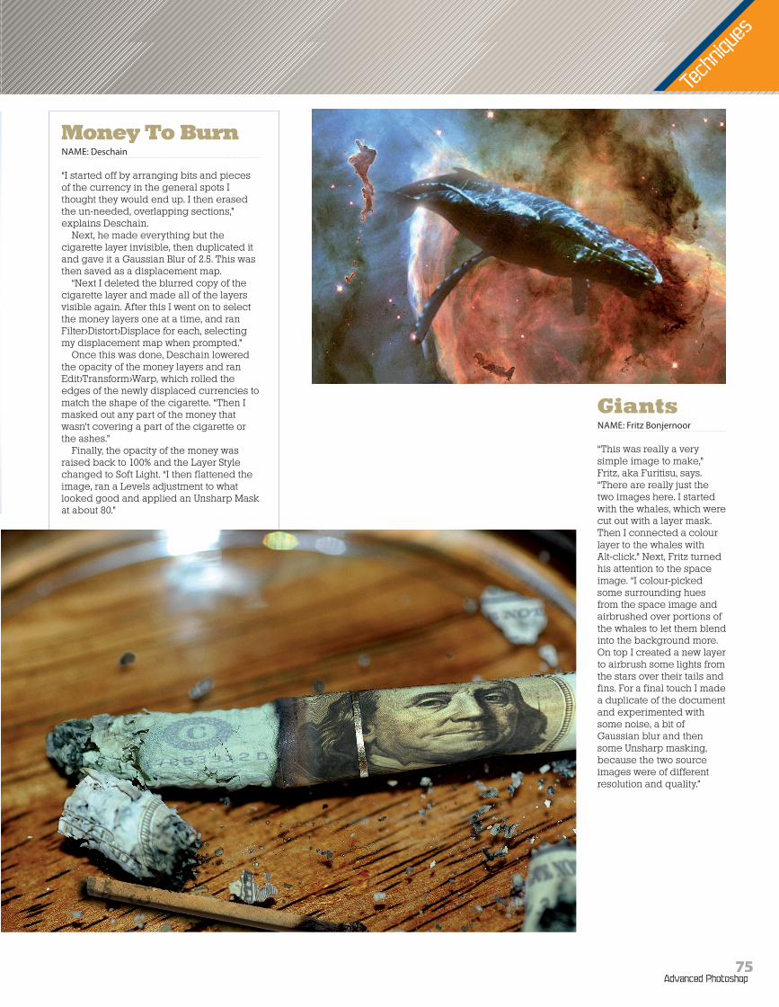
Baseball ChairNAME: Tom Schulzki
“The first thing I had to did was find good picture of a baseball glove, but what to do with it? It took one hour of looking – staring – into this picture until my idea was born: combine this glove with a leather chair! To combine the two sources wasn’t very difficult,” Tom explains. “The lighting, perspective and the leather surface matched in such a way that one can think they really belong together.”
The first thing Tom had to do was to change the properties of the chair in order to match the glove. “It was only the upper section, the leather section, I needed to change. The wooden part on the bottom was the second major part. I used the rubber tool and carefully erased the areas where my two sources met each other. This part was nearly 90 per cent of the work, the other ten per cent was spent shadowing and blending.”
However, that footless chair was not the end result, “The feet of the original chair were only 40 per cent visible because parts were hidden by another chair standing in front of it. Because of this I used the parts that were not hidden and created whole feet with coping, resizing, recolouring, shadowing and cloning until nice wooden feet were produced.”
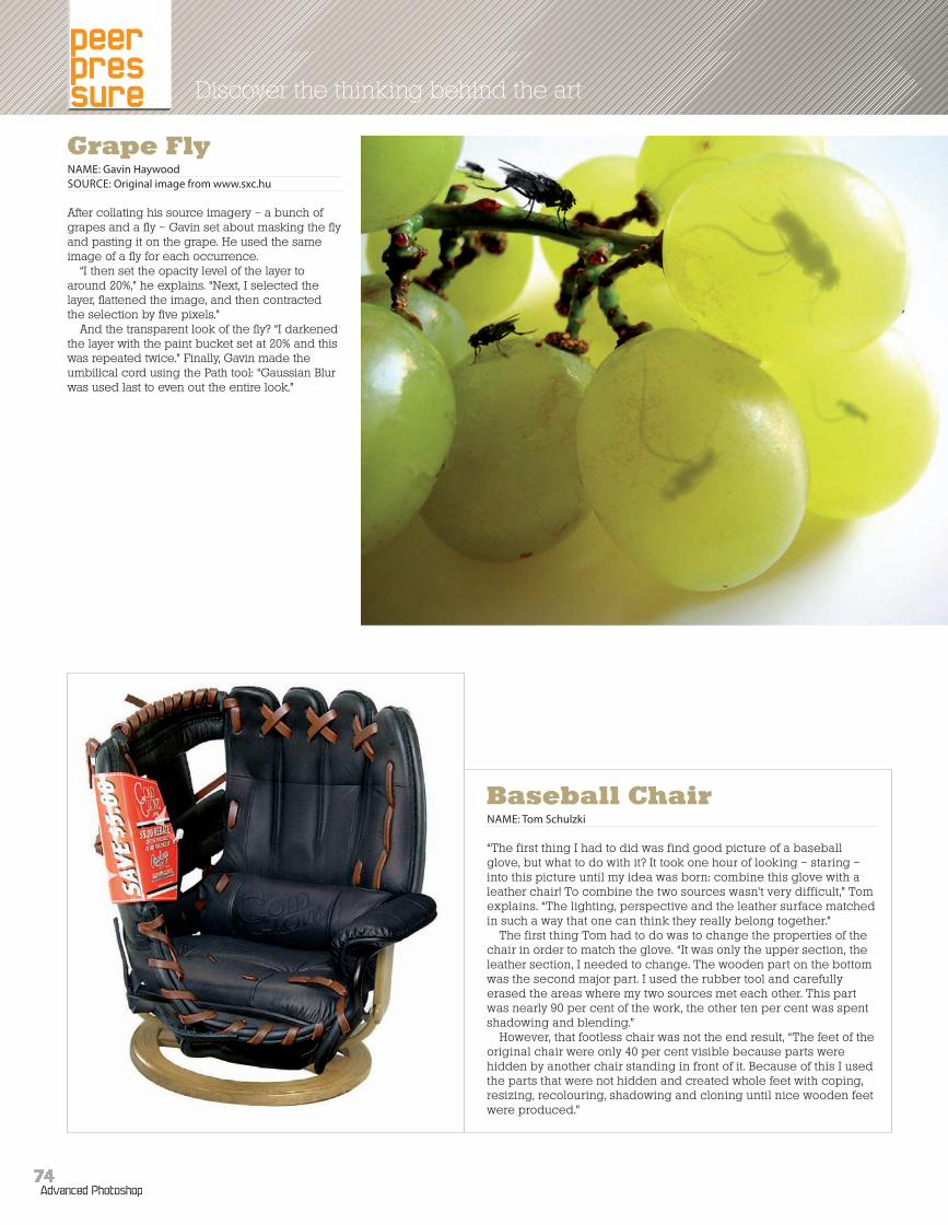
Grape FlyNAME: Gavin HaywoodSOURCE: Original image from www.sxc.hu
After collating his source imagery – a bunch of grapes and a fly – Gavin set about masking the fly and pasting it on the grape. He used the same image of a fly for each occurrence.
“I then set the opacity level of the layer to around 20%,” he explains. “Next, I selected the layer, flattened the image, and then contracted the selection by five pixels.”
And the transparent look of the fly? “I darkened the layer with the paint bucket set at 20% and this was repeated twice.” Finally, Gavin made the umbilical cord using the Path tool: “Gaussian Blur was used last to even out the entire look.”
74Advanced Photoshop
072-075_APM17_peersp.indd 74 24/3/06 17:27:42
Tech
nique
s
GiantsNAME: Fritz Bonjernoor
“This was really a very simple image to make,” Fritz, aka Furitisu, says. “There are really just the two images here. I started with the whales, which were cut out with a layer mask. Then I connected a colour layer to the whales withAlt-click.” Next, Fritz turned his attention to the space image. “I colour-picked some surrounding hues from the space image and airbrushed over portions of the whales to let them blend into the background more. On top I created a new layer to airbrush some lights from the stars over their tails and fins. For a final touch I made a duplicate of the document and experimented with some noise, a bit of Gaussian blur and then some Unsharp masking, because the two source images were of different resolution and quality.”
Money To BurnNAME: Deschain
“I started off by arranging bits and pieces of the currency in the general spots I thought they would end up. I then erased the un-needed, overlapping sections,” explains Deschain.
Next, he made everything but the cigarette layer invisible, then duplicated it and gave it a Gaussian Blur of 2.5. This was then saved as a displacement map.
“Next I deleted the blurred copy of the cigarette layer and made all of the layers visible again. After this I went on to select the money layers one at a time, and ran Filter>Distort>Displace for each, selecting my displacement map when prompted.”
Once this was done, Deschain lowered the opacity of the money layers and ran Edit>Transform>Warp, which rolled the edges of the newly displaced currencies to match the shape of the cigarette. “Then I masked out any part of the money that wasn’t covering a part of the cigarette or the ashes.”
Finally, the opacity of the money was raised back to 100% and the Layer Style changed to Soft Light. “I then flattened the image, ran a Levels adjustment to what looked good and applied an Unsharp Mask at about 80.”