1
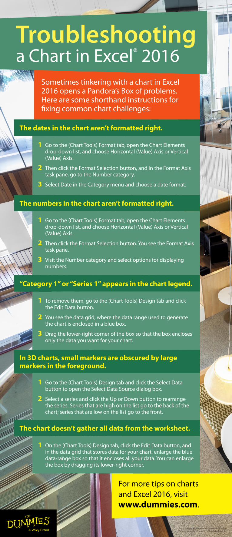
For more tips on charts and Excel 2016, visit www.dummies.com. The chart doesn’t gather all data from the worksheet. 1 Go to the (Chart Tools) Design tab and click the Select Data button to open the Select Data Source dialog box. 2 Select a series and click the Up or Down button to rearrange the series. Series that are high on the list go to the back of the chart; series that are low on the list go to the front. In 3D charts, small markers are obscured by large markers in the foreground. 1 To remove them, go to the (Chart Tools) Design tab and click the Edit Data button. 2 You see the data grid, where the data range used to generate the chart is enclosed in a blue box. 3 Drag the lower-right corner of the box so that the box encloses only the data you want for your chart. “Category 1” or “Series 1” appears in the chart legend. 1 Go to the (Chart Tools) Format tab, open the Chart Elements drop-down list, and choose Horizontal (Value) Axis or Vertical (Value) Axis. 2 Then click the Format Selection button. You see the Format Axis task pane. 3 Visit the Number category and select options for displaying numbers. The numbers in the chart aren’t formatted right. 1 Go to the (Chart Tools) Format tab, open the Chart Elements drop-down list, and choose Horizontal (Value) Axis or Vertical (Value) Axis. 2 Then click the Format Selection button, and in the Format Axis task pane, go to the Number category. 3 Select Date in the Category menu and choose a date format. The dates in the chart aren’t formatted right. Background Image © Matej Pribelsky / Getty Images Dummies is a registered trademark of John Wiley & Sons, Inc. 1 On the (Chart Tools) Design tab, click the Edit Data button, and in the data grid that stores data for your chart, enlarge the blue data-range box so that it encloses all your data. You can enlarge the box by dragging its lower-right corner. Sometimes tinkering with a chart in Excel 2016 opens a Pandora’s Box of problems. Here are some shorthand instructions for fixing common chart challenges: Troubleshooting a Chart in Excel ® 2016