24
UNWRAPPED
| Date post: | 17-Aug-2015 |
| Category: |
Documents |
| Upload: | kamal-sarroff |
| View: | 31 times |
| Download: | 0 times |
U N W R A P P E D
THE BEGINNINGS
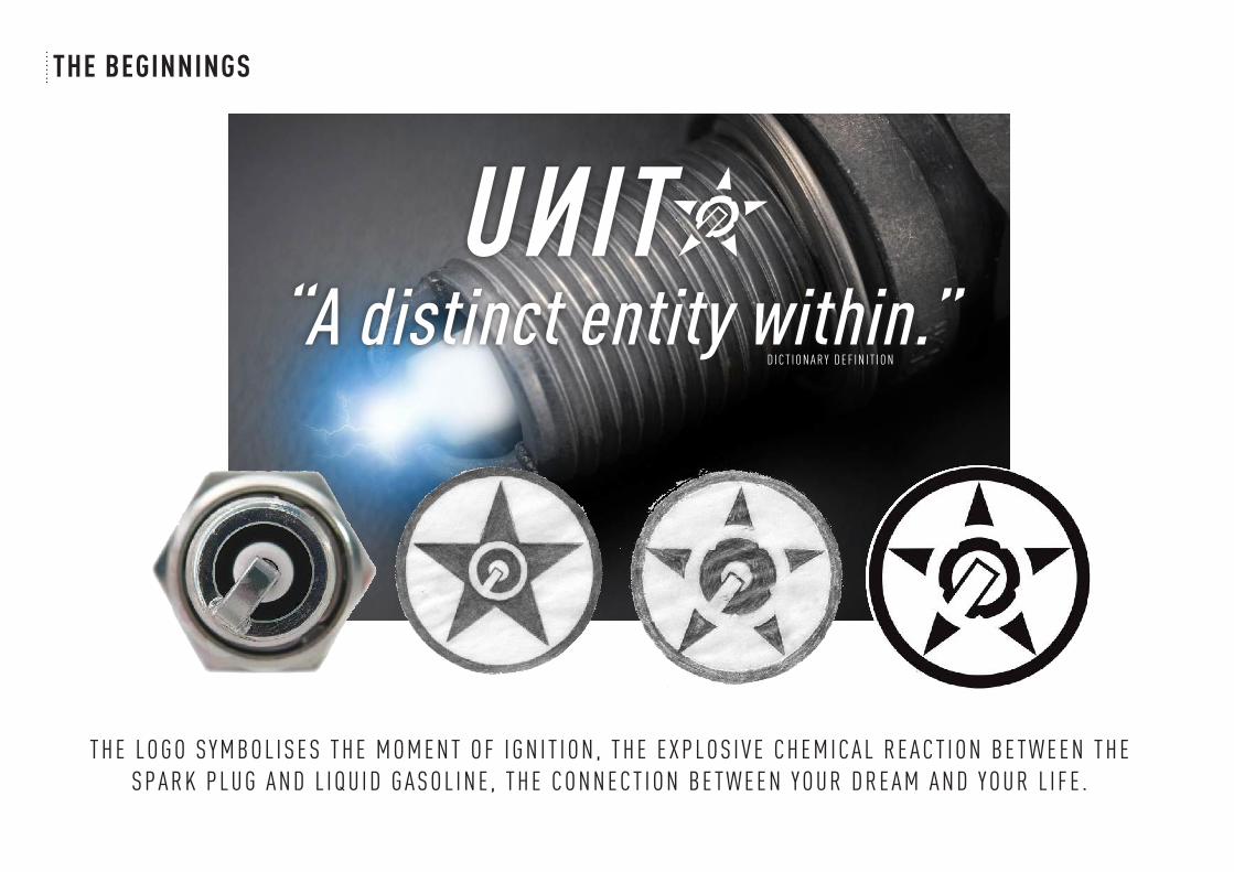
“A distinct entity within.”
T H E L O G O S Y M B O L I S E S T H E M O M E N T O F I G N I T I O N , T H E E X P L O S I V E C H E M I C A L R E A C T I O N B E T W E E N T H E S P A R K P L U G A N D L I Q U I D G A S O L I N E , T H E C O N N E C T I O N B E T W E E N Y O U R D R E A M A N D Y O U R L I F E .
D I C T I O N A R Y D E F I N I T I O N
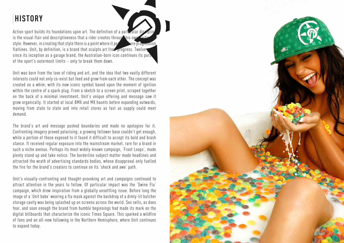
HISTORYAction sport builds its foundations upon art. The definition of a particular discipline is the visual flair and descriptiveness that a rider creates through his own particular style. However, in creating that style there is a point where it peaks, where progression flatlines. Unit, by definition, is a brand that sculpts art from progress. Twelve years since its inception as a garage brand, the Australian-born icon continues its pursuit of the sport’s outermost limits – only to break them down.
Unit was born from the love of riding and art, and the idea that two vastly different interests could not only co-exist but feed and grow from each other. The concept was created on a whim; with its now iconic symbol based upon the moment of ignition within the centre of a spark plug. From a sketch to a screen print, scraped together on the back of a minimal investment, Unit’s unique offering and message saw it grow organically. It started at local BMX and MX haunts before expanding outwards, moving from state to state and into retail stores as fast as supply could meet demand.
The brand’s art and message pushed boundaries and made no apologies for it. Confronting imagery proved polarising; a growing follower base couldn’t get enough, while a portion of those exposed to it found it difficult to accept its bold and brash stance. It received regular exposure into the mainstream market, rare for a brand in such a niche avenue. Perhaps its most widely-known campaign, ‘Froot Loops’, made plenty stand up and take notice. The borderline subject matter made headlines and attracted the wrath of advertising standards bodies, whose disapproval only fuelled the fire for the brand’s creators to continue on its ‘shock and awe’ path.
Unit’s visually-confronting and thought-provoking art and campaigns continued to attract attention in the years to follow. Of particular impact was the ‘Swine Flu’ campaign, which drew inspiration from a globally unsettling issue. Before long the image of a ‘Unit babe’ wearing a flu mask against the backdrop of a dimly-lit butcher storage cavity was being splashed up on screens across the world. Sex sells, as does fear, and soon enough the brand from humble beginnings had made its mark on the digital billboards that characterize the iconic Times Square. This sparked a wildfire of fans and an all-new following in the Northern Hemisphere, where Unit continues to expand today.

OUR LOGO
2002'CONSTRUCT' 'KEY'
2003'SPIN'2005
'RESET'2012
The first ever Unit logo was based upon the Russian constructivism style. The reverse ‘N’ and dotted ‘U’ are directly related to Russian typography.
The ‘Construct’ logo evolved to a more versatile horizontal format to suit multiple uses. The star and circle remain the core component.
Three years after the brand’s inception the new ‘Spin’ logo was introduced. The logo was a more polished representation, created to define the brand alongside its major industry competitors. Exponential growth of the brand and its followers ensued.
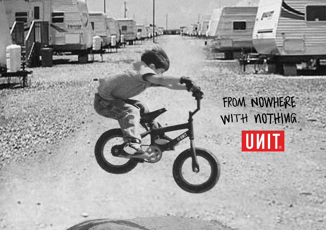
The ‘Reset’ logo was introduced a decade after the brand’s succesful inception. The decision was made to create a fresh new feel and further separate the brand from its competitors. The evolution of the logo bridges the gap from its moto roots to a more refined, street style. The reverse ‘N’ is a nod to the brand’s heritage, assuring fans it remembers where it was made - From Nowhere, With Nothing.
TEENAGE WASTELAND
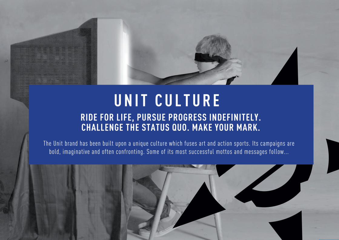
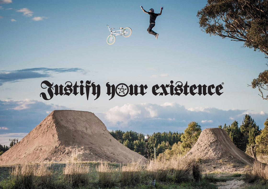
RIDE FOR LIFE, PURSUE PROGRESS INDEFINITELY. CHALLENGE THE STATUS QUO. MAKE YOUR MARK.
The Unit brand has been built upon a unique culture which fuses art and action sports. Its campaigns are bold, imaginative and often confronting. Some of its most successful mottos and messages follow...
U N I T C U L T U R E
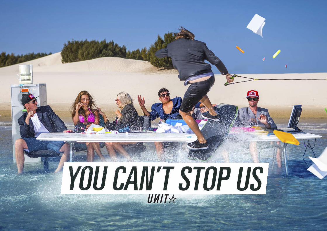
YCSU
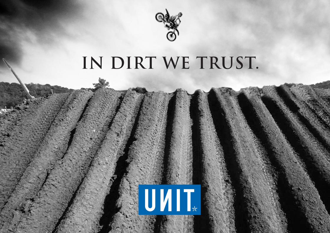
IN DIRT WE TRUST.
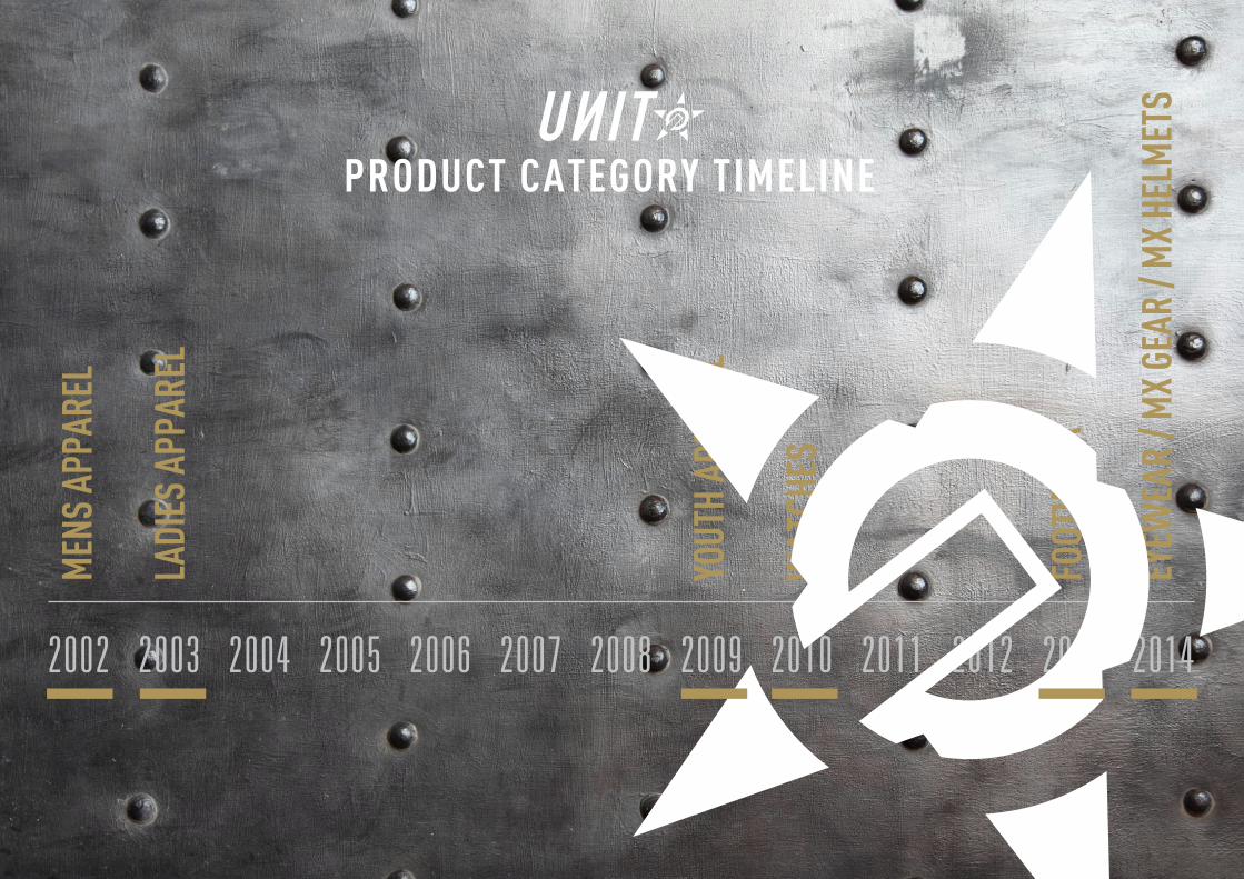
PRODUCT CATEGORY TIMELINE
2002 2003 2004 2005 2006 2007 2008 2009 2010 2011 2012 2013 2014
MEN
S AP
PARE
L
LADI
ES A
PPAR
EL
YOUT
H AP
PARE
L
WAT
CHES
FOOT
WEA
R
EYEW
EAR
/ MX
GEAR
/ M
X HE
LMET
S
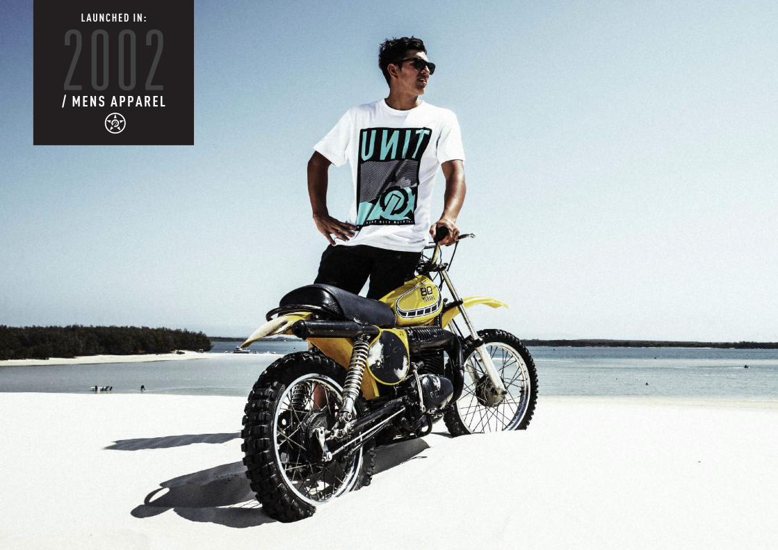
/ M E N S A P P A R E L
L A U N C H E D I N :
2002
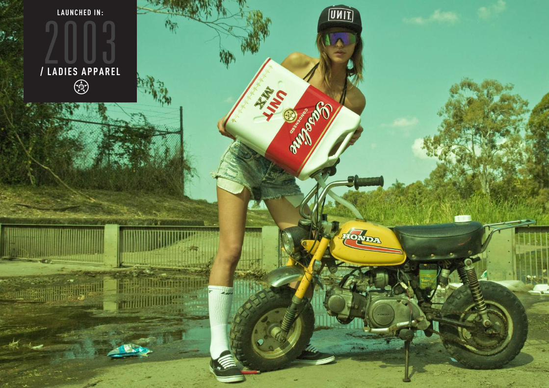
/ L A D I E S A P P A R E L2003
L A U N C H E D I N :
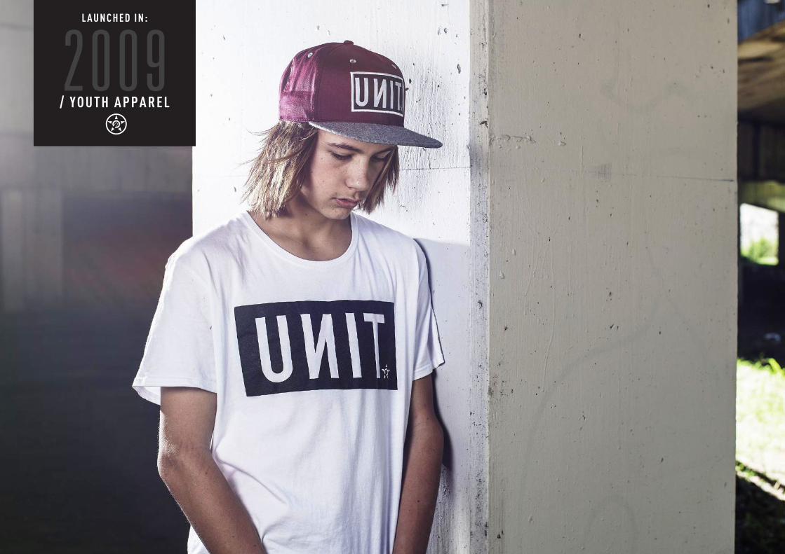
/ Y O U T H A P P A R E L2009
L A U N C H E D I N :
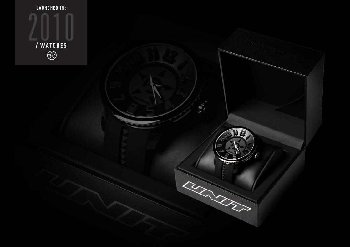
/ W A T C H E S2010
L A U N C H E D I N :
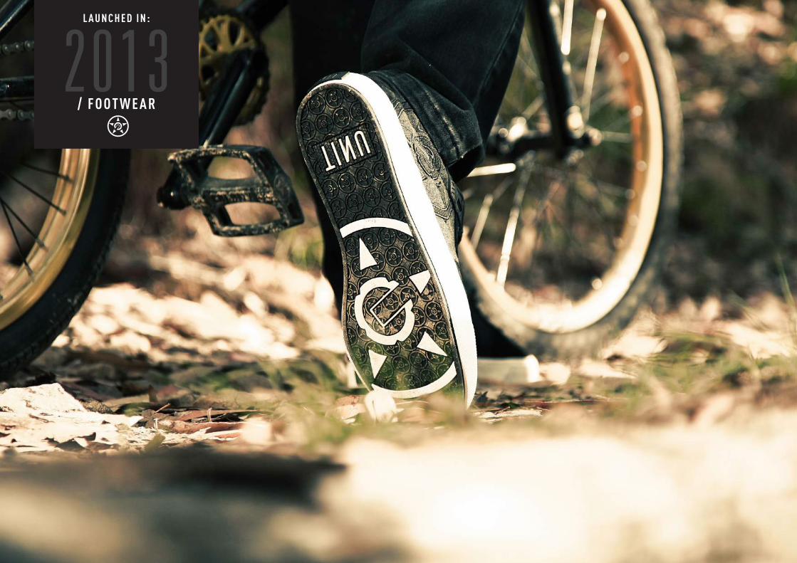
/ F O O T W E A R2013
L A U N C H E D I N :

/ M O T O C R O S S G E A R2014
L A U N C H E D I N :
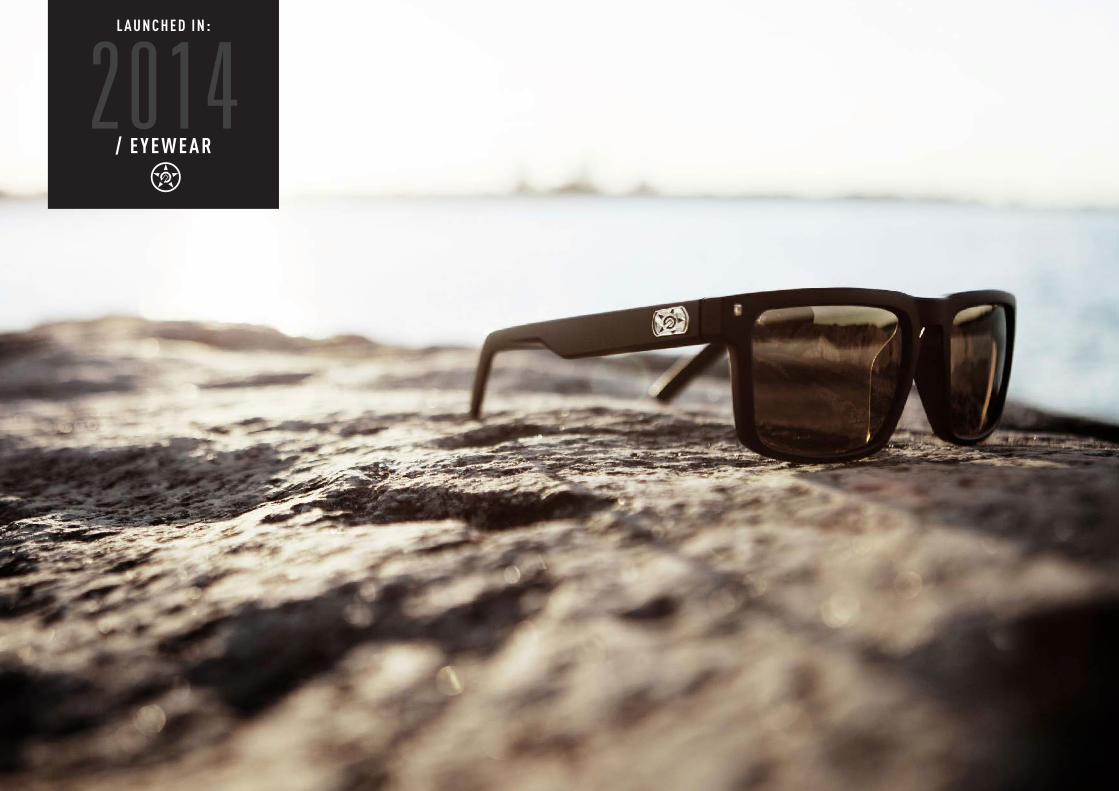
/ E Y E W E A R2014
L A U N C H E D I N :
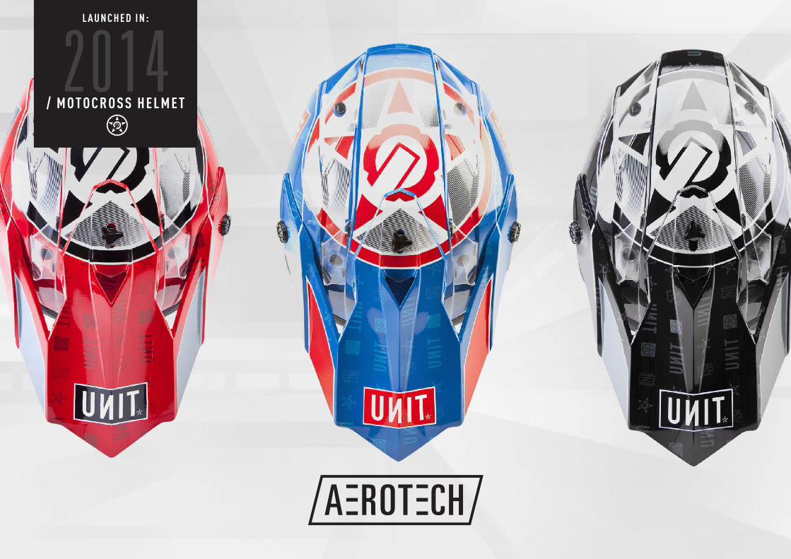
/ M O T O C R O S S H E L M E T2014
L A U N C H E D I N :
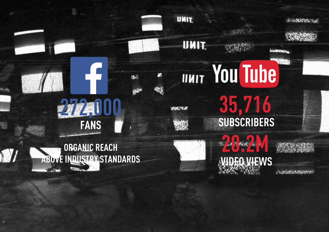
SOCIAL MEDIA REACH
272,000FANS
ORGANIC REACHABOVE INDUSTRY STANDARDS
35,716
20.2MSUBSCRIBERS
VIDEO VIEWS
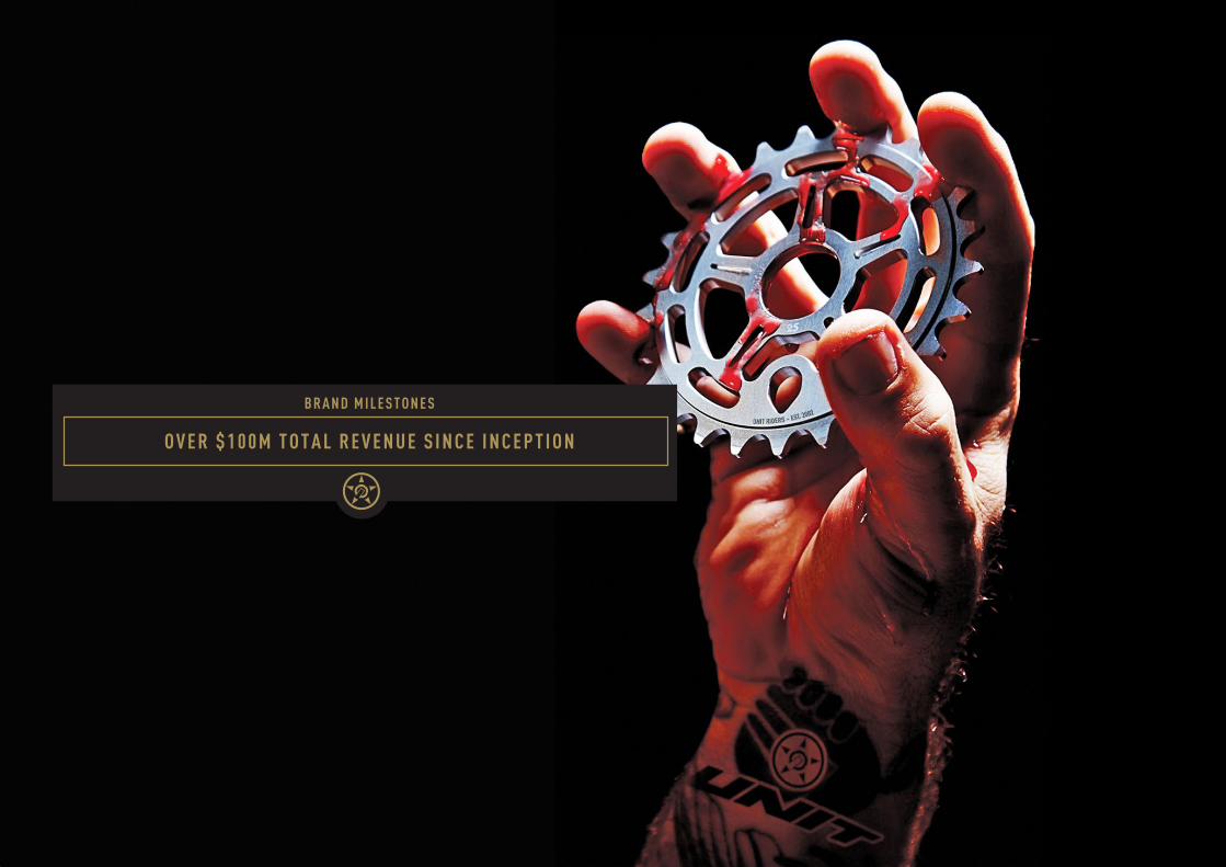
O V E R $ 1 0 0 M T O T A L R E V E N U E S I N C E I N C E P T I O N
B R A N D M I L E S T O N E S
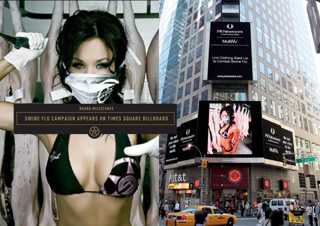
S W I N E F L U C A M P A I G N A P P E A R S O N T I M E S S Q U A R E B I L L B O A R D
B R A N D M I L E S T O N E S
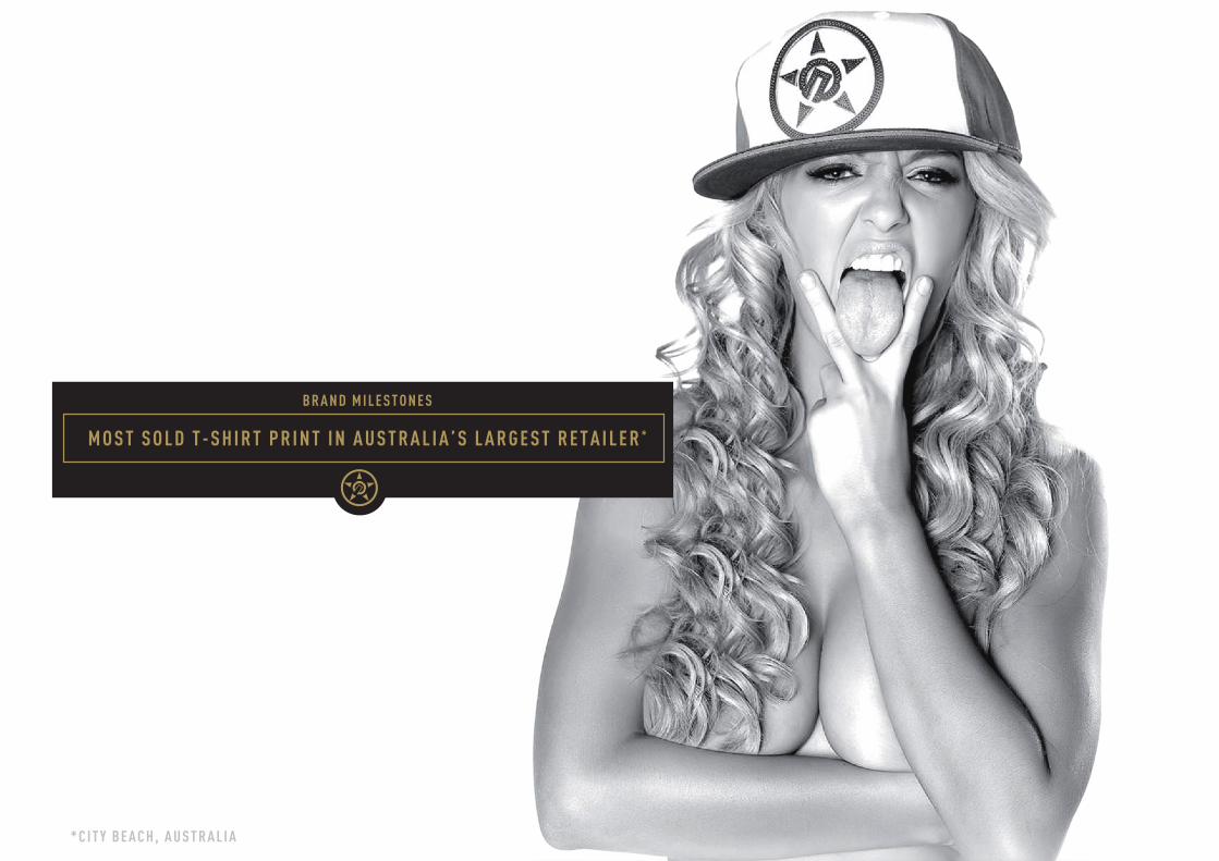
M O S T S O L D T - S H I R T P R I N T I N A U S T R A L I A ’ S L A R G E S T R E T A I L E R *
B R A N D M I L E S T O N E S
* C I T Y B E A C H , A U S T R A L I A
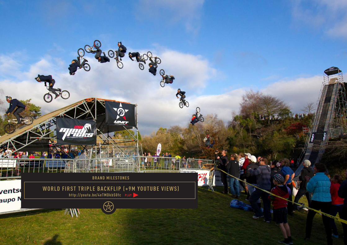
W O R L D F I R S T T R I P L E B A C K F L I P ( + 9 M Y O U T U B E V I E W S )h t t p : / / y o u t u . b e / 4 e T M D k b S 0 f c
B R A N D M I L E S T O N E S
P L A Y
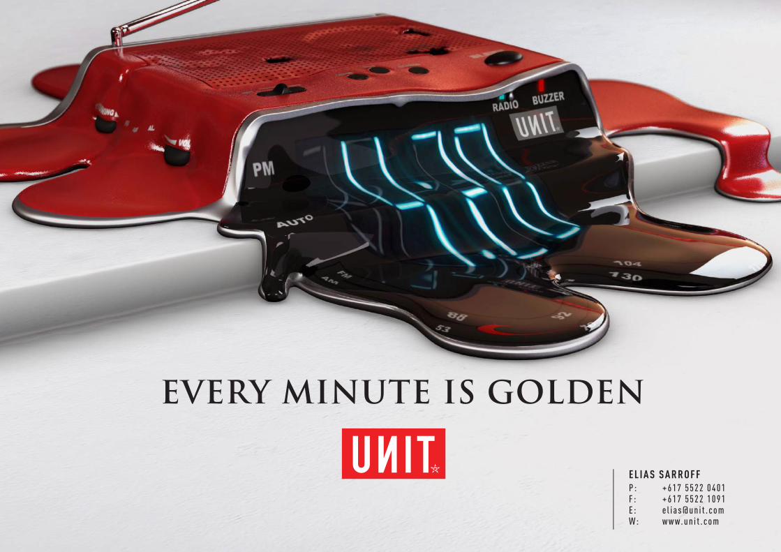
EVERY MINUTE IS GOLDEN
E L I A S S A R R O F FP : + 6 1 7 5 5 2 2 0 4 0 1F : + 6 1 7 5 5 2 2 1 0 9 1E : e l i a s @ u n i t . c o mW: w w w. u n i t . c o m


