52
Bachelor’s thesis Information Technology 2015 Alina Dubinina USABILITY: RESEARCH, TESTING AND DEVELOPMENT OF THE WEBSITE KADUILLA.FI

Bachelor’s thesis
Information Technology
2015
Alina Dubinina
USABILITY: RESEARCH, TESTING AND DEVELOPMENT OF THE WEBSITE KADUILLA.FI

TURKU UNIVERSITY OF APPLIED SCIENCES THESIS | Alina Dubinina
BACHELOR´S THESIS | ABSTRACT TURKU UNIVERSITY OF APPLIED SCIENCES
Degree in Information Technology | Information Technology
May 2015 | 48 pages
Patric Granholm
Alina Dubinina
USABILITY: RESEARCH, TESTING AND DEVELOPMENT OF THE WEBSITE KADUILLA.FI
This Bachelor’s thesis introduces the modern methods of improving web usability and user experience. The study examines the basic principles, the laws and rules of usability, the latest tendencies and research in usability and user experience. The most important elements are considered: colors, text, navigation, placement of the elements.
The purpose of the thesis was to research and improve the existing website, Kaduilla.fi, according to the latest tendencies of web usability and research into user experience. Kaduilla.fi is a local Turku blog portal, where different people write about their lives and different events in Turku. The website is used for marketing: the owners cooperate with cafes, shops or beauty centers.
A questionnaire was used to collect the users’ opinions on the initial design of the website and to identify the most of the disadvantages of the blog portal: weak navigation, a lot of empty space on the page, lack of information.
The improvements were implemented based on the results of the survey. A second survey was conducted in order to compare the results and confirm the positive development of the website. The outcome of the development of Kaduilla.fi was the increased amount of traffic and the higher interest in cooperation.
KEYWORDS:
Web usability, usability testing, usability research, human – computer interaction, blog portal,
usability improvement, web development

TURKU UNIVERSITY OF APPLIED SCIENCES THESIS | Alina Dubinina
LIST OF ABBREVIATIONS (OR) SYMBOLS
HCI Human – Computer Interaction
UX User Experience
PDF Portable Document Format

TURKU UNIVERSITY OF APPLIED SCIENCES THESIS | Alina Dubinina
CONTENTS
LIST OF ABBREVIATIONS (OR) SYMBOLS ............................................................................. 3
1 USABILITY. DEFINITION AND BASIC CONCEPTS........................................................... 5
2 USABILITY TESTING ......................................................................................................... 9
3 GENERAL RULES OF USABILITY: BASIC PRINCIPLES, STRUCTURE OF THE
WEBPAGES, NAVIGATION, CONTENT. ................................................................................. 12
3.1 Basic principles of usability ..................................................................................................... 12
3.2 Webpage structure ................................................................................................................... 16
3.3 Homepage ................................................................................................................................. 20
3.4 Color scheme ............................................................................................................................ 26
3.5 Navigation scheme ................................................................................................................... 31
3.6 Contact forms ............................................................................................................................ 35
4 PRACTICAL RESEARCH ................................................................................................. 39
5 IMPLEMENTED IMPROVEMENTS ................................................................................... 41
6 CONCLUSION................................................................................................................... 45
SOURCE MATERIAL ............................................................................................................... 47
APPENDICES Appendix 1. Screenshot of the website Kaduilla.fi before the modifications Appendix 2. Final screenshot of the website Kaduilla.fi
FIGURES Figure 1. Successful completion of tasks versus number of clicks 16 Figure 2. Thermo-map illustrating the F-shape pattern of scanning the content 19 Figure 3. Gutenberg Diagram 20 Figure 4. Illustration of the way the visitors examine the website if there is more or less information above the page fold 23 Figure 5. Color wheel 27 Figure 6. Eye movement when scanning the contact form 35
PICTURES Picture 1. Tagline of Kaduilla.fi webpage 41
5
TURKU UNIVERSITY OF APPLIED SCIENCES THESIS | Alina Dubinina
1 USABILITY. DEFINITION AND BASIC CONCEPTS
Usability is considered as a discipline, which studies the development user interfaces
for software, oriented to the maximum psychological and aesthetic user convenience
(Nielsen, 2012).
Discipline HCI (human - computer interaction) was a foundation for usability in the
industry. The subject of HCI study is how people use computers and how to develop
computer systems to provide a more effective use. Human-computer interaction, as an
independent branch, began to develop in the late 70's - early 80's. The impetus for this
was the awareness of the problems that began to arise when using complex computer
systems. Back in the 40s, long before the HCI, it was acknowledged that many interface
problems are associated with human psychology. During the Second World War, there
was a study conducted about the attention of radar installations operators (Wickens &
Hollands, 2000). Researchers developed recommendations to improve the design of
monitors for the radar installations. Thanks to the implementation of these
recommendations, operators could concentrate on the monitors and distinguish signals
even in the state of dreaminess and fatigue.
By the end of the 40s there was formed the foundation of knowledge about the
psychological aspects of professional activity. In 1949, the UK adopted the term
"ergonomics", which served as the name of science dealing with the study and creation
of effective systems controlled by man. The main goal of HCI is to improve the links
between computer systems and users by creating computers that will be more
convenient and sensitive to the needs of users.
To sum up, usability is defined as a “measure of effectiveness, efficiency and
satisfaction with which the product can be used by specified users to achieve certain
tasks in a specific context" (Standard ISO 9241-11, 1998).

6
TURKU UNIVERSITY OF APPLIED SCIENCES THESIS | Alina Dubinina
According to Jakob Nielsen (2012), a leading professional in HCI, usability is defined
by 5 quality components:
Learnability: How easy is it for users to accomplish basic tasks the first time they
encounter the design?
Efficiency: Once users have learned the design, how quickly can they perform
tasks?
Memorability: When users return to the design after a period of not using it, how
easily can they reestablish proficiency?
Errors: How many errors do users make, how severe are these errors, and how
easily can they recover from the errors?
Satisfaction: How pleasant is it to use the design?
There are many other criteria that determine the usability of the product. One of the
main usability criteria is whether the product meets the needs of the use. Both usability
and usefulness are equally important: the use of the object does not matter if it does not
interest the user. Neither good is the situation where the system can theoretically do
what the user needs, and in practice, it is so difficult to use that it is simply impossible to
achieve the desired results.
Product effectiveness is defined as "the degree to which something is successful in
producing a desired result" (Simpson and Weiner, 1989). Effectiveness is measured by
the following parameters:
What percentage of user tasks is implemented in the product. The product which
implements more user tasks is considered to be more effective. An example: a
mobile phone can perform functions that are not available when using a
computer or music center or a new version of software solves more problems
than its predecessor.
Ratio of the number of successful actions to errors. The higher the score, i.e. the
fewer mistakes are made by the user, the higher the effectiveness of the product
is.

7
TURKU UNIVERSITY OF APPLIED SCIENCES THESIS | Alina Dubinina
The load on the user (should be minimal). The load of the basic psychological
processes should be taken into consideration, such as memory, attention,
imagination. Web interface should be memorable, not only by external
characteristics, but also by the principles of work in it. It should not have too
many distracting objects from the users' perception of basic information, such as
flashing, moving, pop-up banners, which in most cases the user attempts to
ignore or eliminate out of sight. The site's interface should be intuitive to the user.
"Do not make me think" - is the first law of usability, stated by Krug (2014, 10).
The number of used features and commands (must be high). Not all features and
possibilities inherent in the product are used by the user. If the product
implements at least 10% of them, it can be considered successful.
Efficiency of the product can be described as the resources that a user spends to an
accurately and completely achieve their goal. First of all, the efficiency of the following
parameters is taken into consideration:
The time it takes the user to perform the task (should be minimal).
The time required for pre-training (should be minimal). This figure is very
important for a website - a product intended for a wide audience. Most often, the
user does not have the slightest desire to go to any Internet resource or read
manuals to figure out how to use it. Seminars and workshops are also not
possible. In order to minimize the time for preliminary training of users, the
developers must use the standards that already exist in the industry, first of all, to
use the skills that users were using on the sites of competitors. This is easily
explained in terms of psychology. There is a so-called "baby duck syndrome"
when people long to work with one design, long accustomed to or do not want to
work with a new, even if it is more comfortable (Friedman, 2007).
Time spent on error and problem solving. Most of the actions that the user
performs on the site is unintentional. In this case, the user should be able to
easily exit.
The number of errors committed.
Frequency of use of help and documentation. The frequency of calls to the help
should be minimal, or at least not repeated. If the user once asked for help, it is
not yet a criterion for low usability. If he re-reads over and over again and cannot

8
TURKU UNIVERSITY OF APPLIED SCIENCES THESIS | Alina Dubinina
remember the instructions provided in the certificate, then it is worth paying
attention to and analyze why this is happening.
The number of repeated and erroneous actions. If the user makes a mistake
once - this is normal, it should not be wrong all the time, especially after prior
training.
Satisfaction with the product is defined as "the number of customers, or percentage of
total customers, whose reported experience with a firm, its products, or its services
(ratings) exceeds specified satisfaction goals" (Farris, 2010, 40). It is difficult to
determine it, because it is primarily an emotional component.
The following satisfaction estimates were introduced (Satin, 2007):
Rating the utility of the product or service.
Rating the evaluation of satisfaction on a scale of product functionality.
Number of cases when the user was angry or show discontent when handling the
product.
Rating the manufacturability of the task management without user intervention.
Assessment of how the task corresponds to the technological needs of the user.
These criteria are used to analyze the results of usability testing and usability expertise.

9
TURKU UNIVERSITY OF APPLIED SCIENCES THESIS | Alina Dubinina
2 USABILITY TESTING
In order to determine how well people can use a man-made object for its intended use
usability testing is used. Usability testing is a method of assessing the usability of the
product, based on the involvement of users as testing (Nielsen, 2012).
During the testing, participants perform a series of pre-designed tasks. A team of
researchers observes the process in order to note the difficulties faced by each of the
participants.
This evaluation method allows to identify whether the site meets the goals and also
helps to provide answers to the following questions:
Do the users successfully complete the tasks?
Given the successful completion of the task, how fast did each of them perform?
Given the successful completion of the task, what was the number of pages
(clicks) used by the user to perform each of them?
How satisfied are the users by the site?
What changes should I consider in order to make the site more successful for an
even greater number of users?
Research and evaluation of sites can be carried out by different methods, developed by
experts in usability. A common method is presenting real problems to users, as well as
recording of test results for further analysis. To participate in the usability testing
selected users should correspond to the target audience of the site, they also should not
be too familiar with the development of the site because they will be able to deal with his
device faster than the others, and this can create the illusion that the site is clear and
easy for the targeted visitors. In order to identify and evaluate the greatest number of
problems present on the site, it is recommended to involve real users.
Jakob Nielsen (1995) categorizes the problems of usability by the following three
factors:
the frequency of occurrence of a problem from different users;
the impact of problems on users: if it is a complex or simple decision;

10
TURKU UNIVERSITY OF APPLIED SCIENCES THESIS | Alina Dubinina
the frequency of occurrence of the problem for one of the users; the result is
obtained if the user has to solve the problem the first time, or he faces it every
time when completing the task.
In order to carry out a qualitative usability testing, one needs to prepare a list of specific
questions. For example, if the aim is to test how useful the search function is to find
information on the site, one should focus on the answers to the following questions:
Do users search or just click through the pages?
What words and phrases they do usually search for?
Is the search string is in the right place and what is the size of the input field
queries that users use most often?
How quickly does the user get the answers to their questions from the list?
How relevant are the search results of the user's search query? Are they ordered
by decreasing relevance?
Does the search robot to cope with errors when typing?
What one needs to remember when conducting usability testing of the websites is to:
Test the capabilities of the site, rather than the ability of users.
Pay attention to the way users perform tasks, rather than on how they assess the
site.
Use the results of usability testing as the basis for recommendations to improve
the site.
Look for the best solution to the problems highlighted by different users.
One must test the capabilities of the site, rather than the ability of users. For many
people, the term "test" is associated with a test of their knowledge, which is very often
negatively perceived by them. To convince people that what is being tested is not their
ability but the features of the site, one should explain to them that testing helps find
advantages and disadvantages of the website. The term "testing" should not be used at
all, the people can be invited to conduct an audit of the site. When the users are having
difficulty with an assignment, one needs to fix this as a problem on the site, and not as
user error.

11
TURKU UNIVERSITY OF APPLIED SCIENCES THESIS | Alina Dubinina
The way users perform certain tasks should be considered more than how they
evaluate the tasks and what they prefer. Performance and user preferences can be also
measured. Performance is determined by the success of the assignment errors,
execution time, etc. Preferences are reports of the users about their satisfaction and
comfort when using the site.
There are so many reasons why people evaluate a site higher than expected, judging
by the way they perform their jobs. Often people believe that the problems that arise are
not caused by the site but by their own lack of skills. They may also think that they
would offend the owners, if they put a bad score for the site. The users might also not
notice the problems. All these facts prove that during a usability test it is crucial to pay
attention to how users perform certain tasks.
One must use the results of usability testing to develop recommendations for the further
advancement of the resource. Usability testing is not the final step in terms of the design
of the site, it does not end when the score of its participants. The team that deals with
the analysis, should discuss the findings, highlight the advantages, and make
recommendations for changes or notify the site designer in accordance with what was
found in the testing process.
In the analysis of any project the specialist should take into consideration the different
ways users work with the site and different experience, goals and objectives. Most of
the projects have to deal with time constraints, budget and resources. The balance of
these components is one of the important problems. Only after weighing all the
restrictions and compromise, one can develop a web design or web application that will
successfully meet the requirements of most users. The cost of the user technical
support after the launch of the project is much higher than the cost of fixing it before the
final implementation. Considering the behavior of all participants, and the scenario that
has been allocated in the process of usability testing, it is necessary to find common
solutions to problems of the site in accordance with the requirements and preferences
of the users who participated in the testing.

12
TURKU UNIVERSITY OF APPLIED SCIENCES THESIS | Alina Dubinina
3 GENERAL RULES OF USABILITY: BASIC PRINCIPLES,
STRUCTURE OF THE WEBPAGES, NAVIGATION,
CONTENT.
3.1 Basic principles of usability
The basic rules and principles of usability have been published in Smashing Magazine,
by Vitaly Friedman (2007). He presented some rules and principles of usability,
analyzed the issues that a web-designer should be most aware of, here are the most
important ones:
Rule 7±2
In accordance with the results of the study, which was conducted by George Miller
(1958), short-term memory can contain from 5 to 9 entities simultaneously. This fact is
often used to prove the need to reduce the number of items in the navigation menu to 7.
This rule, however, is a reason for a debate: is it really necessary to consider the short-
time memory capacity if the menu is constantly present on the page? James Kalbach
(2002) argues that the study of George Miller is not relevant anymore. Miller's rule
"reminds us of moderation". Applying limitations to the amount of items in the
navigation in order to avoid the confusion of the user is considered a good practice, but
the main principles would be 'breadth versus depth and the display of information'.
According to Kalbach (2002), the broader structures receive better feedback than
deeper ones in general. His theory is: "The effort it takes to repeatedly choose
categories across many levels of a deep hierarchy outweighs the effort to scan many
items in a broad navigation". Indeed, if a user has to browse a lot of options under every
category, it might cause frustration, even if the navigation is logical and planned very
carefully. To sum up, the rule of 7±2 for planning the menu is good in terms of not
overloading the user with the amount of options to choose from, but it might have
nothing to do with the short-term memory.
13
TURKU UNIVERSITY OF APPLIED SCIENCES THESIS | Alina Dubinina
Rule of 2 seconds
The optimal timeout value by any reaction system is 2 seconds. This value is chosen
arbitrarily, but it seems appropriate. Generally, the less the user has to wait, the better.
Users are impatient: they are less satisfied and reduce the number of clicks if they have
to wait too long.
The Pareto Principle or the 80/20 rule
This rule is based on the fact that 80% of the effect is the result of 20% action. Applied
to web design, the rule can be described as follows: in order to improve the impact of
the website, special attention should be paid to 20% of users, processes, activities,
goods and services, which provide 80% of the profits.
Eight golden rules for developing interfaces
After having studied human-computer interaction, Ben Schneiderman (1998) made a
set of rules that can be used in the development of many types of interfaces.
These principles are relevant for developers of interfaces, as well as for web designers.
1. Strive for consistency.
2. For advanced users, there should be a quick way to use the interface (reduction,
short keys, and macros).
3. The feedback should be informative.
4. Dialogue must be completed.
5. Error handling should be simple.
6. There should be an easy way to undo the action.
7. The user must feel that everything is under his control.
8. The short-term memory load should be as little as possible.
Fitts's law.
The law was published by Paul Fitts (1954, 381-391). The law is the 'model of human
motion' and it determines the time required to move quickly into the target zone as a
function of target distance and target size. Typically, this rule is used when considering
the mouse movements from point A to point B. This can be important when placing
elements, for which it is important to increase the number of clicks.

14
TURKU UNIVERSITY OF APPLIED SCIENCES THESIS | Alina Dubinina
The inverted pyramid
The inverted pyramid is a style of writing, in which the main idea presented in the
beginning of an article.
The article begins with the output, followed by the key points, and ends with the least
important information. Users want to be kept informed as soon as possible, so the
inverted pyramid is the best suited for the web, this opinion is shared by Jakob Nielsen
(1995).
Satisficing
Users do not choose the optimal path in search of the necessary information. They do
not need the best and most reliable solution, on the contrary - they are often willing to
meet the fast and is not the best solution, which would be "good enough". With regard
to the web, satisficing describes precisely this case: users enjoy receiving "good
enough" solution to the problem - even if the alternative solutions fully cover the
requirements for the long term.
Baby-Duck-Syndrome
Members are linked to the first design and are reluctant to use new because they just
do not feel comfortable in it. This should be considered during the site redesign. Only
after some time people get used to the new design, before this there are two possible
outputs: they either drop out of the resource or use it less often than usual. In case of
redesign, it is a good practice to leave a link to the old version of the site.
Banner Blindness
Users ignore everything that looks like an advertisement. What is the reason? The fact
that the human eye responds to all the moving, flashing, bright objects, considering
them as a threat, as a danger on the subconscious level. Therefore, users ignore large,
colorful animated banners, focusing on that part of the page where information they
need can be located: texts, hyperlinks. Thus, the user simply puts the barrier and
doesn't pay attention to advertisements.
Zeigarnik effect

15
TURKU UNIVERSITY OF APPLIED SCIENCES THESIS | Alina Dubinina
This effect is often used in advertising: by asking visitors interesting or provocative
questions advertisers force to read material or click on the link. This is very effective in
marketing. Readers will remember better what was advertised, and even the smallest
details will be kept in memory more clearly and accurately.
The Self-Reference Effect
This effect is particularly important when creating texts for the web, as it can
significantly improve the relationship between the author and the reader. We remember
better the things related to our own experience, than those which are not related to us.
For example, after reading the article, people better remember the characters, stories or
facts with which they were somehow related to.
Three-clicks rule
An unofficial site navigation rule in web design. It assumes that the user should be able
to find any information in no more than 3 mouse clicks. According to the rule, people are
frustrated and often leave the website if they could not find the information within three
clicks. While having little analytical proof, this belief is often held by designers.
Critics of the rule say that the number of clicks is not as important as the use of them.
Jeffrey Zeldman (2001) wrote that the rule of three clicks is "based on the way people
use the Web" and that "the rule can help you create sites with intuitive, logical
hierarchical structures". In fact, the user does not give up just because the result has
been achieved for some certain number of clicks. The number of clicks is not related to
user satisfaction. The research, conducted and published by Joshua Porter (2003)
shows that the user's desire to give up searching does not increase with the number of
clicks. "Hardly anybody gave up after three clicks," argues Porter.

16
TURKU UNIVERSITY OF APPLIED SCIENCES THESIS | Alina Dubinina
Figure 1 - Successful completion of tasks versus number of clicks (Porter, 2003)
According to Joshua Porter, if the rule of three clicks worked, the curve of the
successful completion of tasks would have to go down and would be much lower than
failure rate curve. However, they are arranged on one level. Users may refuse to search
for the desired result at the second click, and can scroll through 25 pages patiently.
3.2 Webpage structure
The best way to make the page easier to understand is to organize the appearance of
page elements so that they clearly and precisely show the relationship between
themselves elements: what elements are linked, which ones are parts of other
elements. In other words, each page should have a clear visual hierarchy of its
elements. Pages with a clear visual hierarchy have two features:
1. The more the important element, the more visible on the page. For example,
important headings are made either larger or highlighted in color or separated by
large indentation.
2. Elements that are logically related to each other must be linked visually. For
example, one can show that some elements are equal by grouping them under
one heading, applying the same style to them, or by placing them in a clearly
separated area on the page.
The next step is to create a user-friendly interface - a clear division of pages. The user
should immediately see: "Here is what you can do on this site", "here are the links to

17
TURKU UNIVERSITY OF APPLIED SCIENCES THESIS | Alina Dubinina
today's most interesting stories", "here a list of what is sold", "here are the most popular
products" and “here you can find the transitions to other sections of the site." Separation
of the pages is important because it allows users to quickly understand what areas they
are interested in the most, and what areas they may omit.
Several studies concerning how users move the eyes when viewing web pages, confirm
that users quickly decide what the page contains useful information for them, and
almost never look at other parts as if they do not exist.
Most of the time Internet users search the places which can be clicked, so it is important
to clearly show which area is clickable and which is not. When the user is forced to think
about something that generally should not cause any issues - he or she might get
frustrated and non-satisfied.
Visual noise is one of the main obstacles to obtain easily perceived web pages. There
are two types of image noise:
1. Congestion. If the page contains a huge number of possible appeals, invitations,
countless exclamation marks and brightly colored discharge, all this has the
effect of pressure.
2. Background noise. Members have a different perception of the page with a
complex layout and a large number of components. Some easily tolerate
overloaded pages and background noise, but for many it is a problem. When
designing web pages it is advisable to assume that everything is visual noise
until proven otherwise.
People have similarities in the way the scan the page in order to search the useful
information. Moreover, the tools for tracking the eye movement help to reveal the
particular patterns that the majority follows while exploring the website.
There are two main patterns that should be explicitly taken into consideration:
1. F-shaped pattern
2. Gutenberg diagram

18
TURKU UNIVERSITY OF APPLIED SCIENCES THESIS | Alina Dubinina
F-shaped pattern
Jakob Nielsen (2006) conducted a research by eye movements when reading web
pages with more than 250 people. The results showed that participants scanned page
view on the F-shaped pattern.
A similar study was carried out by the marketing firms Enquiro and Did-it (2005),
involving a research company Eyetools. Similar results were obtained in the evaluation
of eye movements across the page from Google search among 50 participants. The
resulting figure is the concentration of view is called "Golden Triangle Google", because
attention is concentrated in the upper left corner. Results of the study corresponded to
F-shaped pattern, which were received by Nielsen during independent experiments.
If the center of the page has a bright and large image (for example, a photo of the
goods), the initial view of the visitor will be attracted to it. After that, the user will start to
scan a page on the same F-shaped trajectory, but the information in the upper left
corner will be irretrievably missed. If the left column contains some important elements,
it is better to place a bright image above them.
For designers and web masters the described results of studies indicate that the content
that catches the attention of the visitor must be placed in the upper left corner. Also, the
use of F-shaped pattern when placing content (header, followed by paragraphs or lists)
increases the likelihood to be seen by a customer who browses the page.

19
TURKU UNIVERSITY OF APPLIED SCIENCES THESIS | Alina Dubinina
Figure 2. Thermo-map illustrating the F-shape pattern of scanning the content. (Nielsen, 2006)
However, the F-shape model was analyzed only as a common pattern for pages with a
large text load or for pages with the search results.
Gutenberg diagram
The Gutenberg diagram is described by Wheilden (1995). The graph (see Figure 3) is
used to optimize data output for displays with a limited number of elements. The line
divides the display area into four parts. The primary optical area - the left upper part, the
strong fallow area - right upper part, the weak fallow area - the lower left part, the
terminal area - right lower part. The user starts looking from the primary optical area,
and then glides down to the terminal area.

20
TURKU UNIVERSITY OF APPLIED SCIENCES THESIS | Alina Dubinina
Figure 3. Gutenberg Diagram. Source: www.uxmovement.com, accessed on 5 May
2015.
There are several cases in which this pattern should be taken into consideration. For
example, if there is an action button that a designer would like to place somewhere on
the page-it is better not to place it into the weak fallow area. It is generally not advised
to place important information into the weak fallow area. The best place for the action
button (download software, subscribe to a newsletter, apply to a job etc.) would be the
terminal area, when a user already has an idea of the issue, he or she has examined
the page carefully and has decided whether it is interesting enough.
3.3 Homepage
Jakob Nielsen and Marie Tahir (2002) made a profound research on how to improve the
usability of the homepage. They analyzed different sites and pointed out the important
factors that could be taken into consideration when designing a homepage.

21
TURKU UNIVERSITY OF APPLIED SCIENCES THESIS | Alina Dubinina
According to them, the most crucial role of the main page is to "communicate what the
company is, the value the site offers over the competition and the physical world, and
the products or services offered'.
Nielsen and Tahir stated the following guidelines for creating a good homepage:
Purpose of the website
The name and / or logo of the company must have the appropriate size and placed in a
prominent place on the page. Usually it is the upper left corner (for languages read from
left to right). An advertising slogan should be added to the page that would clearly
indicate, what this company does (or what the site is intended for). Clearly highlighted
primary tasks of the website will help the visitor to understand immediately where he
should start. It is a good practice not to overload this area by visual effects - if all are
selected, the user will not notice anything. The number of key tasks should be small (1-
4), and the area around - blank. The home page should be clearly distinguished from
other pages.
Information about company
When providing the feedback mechanism, it is essential to explain the purpose of the
links and verify the details - who is going to read the received messages: Customer
Service, or web-master, etc.
Style of the content on the site
The section titles and categories must comply with their name from a user perspective,
not the company (for example, a broad concept of "Consumer Information" should be
replaced on "How to save energy at home"). Clever phrases or advertising jargon
should be used with moderation. One must be aware of the use of capital letter and
overall formatting (if all the elements of a list is typed with uppercase and lowercase
letters, and one - only with the capital, it seems that this element is more important than
the other). Formulating tasks for users of the site, the imperative mood should be used,
such as "Enter the name of the city." Avoidance of exclamation marks must also be
taken into consideration.

22
TURKU UNIVERSITY OF APPLIED SCIENCES THESIS | Alina Dubinina
Using examples for an overview of the contents of the site
Examples should tell, not just to describe the contents of the site (the header "Goods"
will say a lot less than a few photos of real goods, together with their prices).
Each sample must be accompanied by a reference to the detailed description of the
product, rather than the category to which it belongs. Links to more information about a
particular product should be different from the reference to the category as a whole.
References and links
The name of the link or group of links should not use the word "link". To show that the
word or phrase is a reference, it should be emphasized and colored. Blue is a standard
color for this purpose.
If the link is different from the ordinary transition to other web-page and is, for example,
downloading the PDF-file, sending an e-mail, audio or video player launch or any other
application, this should be stated explicitly.
Navigation
The names of the navigation elements independently invented or artificial words shall
not be used. The names of the categories should be based on the difference between
them - if users do not understand the invented terminology, they will not be able to
distinguish between categories.
Search
The home page should include direct input field searches, not just a link to the search
page.
Graphics and Animation
The users should be allowed to decide whether they want to see an animated
screensaver on the site - it is recommendable not to start it by default. If it still runs
automatically, regardless of the desire of the user, an easy and intuitive way to turn it off
must be ensured.

23
TURKU UNIVERSITY OF APPLIED SCIENCES THESIS | Alina Dubinina
Interface elements
The interface elements shall be clickable, for instance, if the page is a bulleted list with
graphic markers - the webmaster has to make sure that it is possible to click on the
markers too.
News and press releases
A special summary must be made for each article or press release, which is mentioned
on the main page. (The first paragraph of the article shouldn't be used in this case, it is
clearly not intended for independent "existence").
Graphic design
It is considered a good practice to avoid a horizontal scroll bar for screen resolution of
800 by 600 pixels. It is advisable to use the "responsive" structure of the main page so
that its size could automatically adapt to different screen resolutions.
All the main elements of the home page as possible should be "above the fold" (the first
screen page accessible without vertical scrolling) for the most common screen
resolution, which at the moment is 1024 by 768 pixels. A study conducted by Joe Leach
from the company CX Partners, shows that a small amount of content above the fold
encourages users to continued seeking below (Leech, 2009).
Figure 4. Illustration of the way the visitors examine the website if there is more or less information above the page fold (Leech, 2009)

24
TURKU UNIVERSITY OF APPLIED SCIENCES THESIS | Alina Dubinina
The homepage name
The main page of commercial companies must have an address of the form
www.company.com (or equivalent domain URL for the country or non-top-level domain).
The main page shall be available from both addresses: www.company.com and
company .com. If the content of the site is closely tied to a particular country, the
address should contain the top-level domain of the country.
If possible, one shall register the domain names containing alternative, reduced, and
also the most frequently used incorrect spellings of the name of the company.
Pop-up windows and intermediate pages
Users that type in the address bar of the browser the main URL of the site or come to it
by reference, should get directly to the "real" home page. No spectacular screensavers
and intermediate pages should be made. Exception - if the site contain materials which
are not allowed to be seen by children or some other categories of users - a logo with a
warning about the presence of material specific topic will be even appropriate.
The pop-up windows should be discarded. Additional windows only distract attention
from the main page, and even if these windows contain any valuable information, many
users still accept them as advertisements and try to close faster. Another drawback is
that the pop-up boxes are easy to get rid of - as soon as the user closes a window, it
disappears, and finding it is not possible, even if the user really wants to.
Advertisements
Advertising banners of other companies should be placed at the "offshore" of the page.
The banners shall not be placed near the prime elements of the page - along with
banners visitors will ignore the elements themselves. It is generally not recommended to
place the main information page of advertisements: the majority of users according to
Nielsen "suffer" from "banner blindness", i.e., ignore everything is above the placing
banners. The conventional methods of design of advertising banners in the design of
the main contents of the site shall be avoided.
According to the research of thermal maps held by Poynter University (DeVigal,
Lewenstein, 2000), it was found that various graphics attract 22% of users' attention,

25
TURKU UNIVERSITY OF APPLIED SCIENCES THESIS | Alina Dubinina
and the remaining 78% focuses on the text content. Indeed, people often ignore the
images until the second and third visits, therefore, it is not necessary to give too much
significance to the illustrations that would occupy a large part of the page. Moving
sliders images are perceived as advertising by users and are simply ignored. Most
people do not have enough time to read the content allocated on the slide. Even if users
have time to read something in the circulation of images, it is unlikely they will want to
quickly make the recommended action. Unusual formatting is perceived by users as an
advertisement unit and is again ignored.
Jakob Nielsen (2013) reported about the interesting results of a small experiment:
participants were asked to find a special offer on the website of the company Siemens,
but they failed to do so, despite the fact that it was hard to miss. The reason for the
failure was that the page of this proposal was automatically replaced by the next one.
Currently, many well-known companies are beginning to abandon the automatic sliders
on their websites. It should not be considered as a prohibited element but its use must
be approached more meaningfully.
Reported technical problems and emergency situations
If the website "breaks down" or if important elements of the site stop working, it should
be immediately reported to the home page. One has to estimate at least roughly how
long it will take to troubleshoot - for example, it is not advisable to say, "Try to go to the
site a little later," and "It is expected that the site will earn around 4 pm". It is necessary
to premeditate the plan of work with the site in case of emergency situations. For
example, an alternative home page can be prepared with special areas allocated for
message on the state of emergency, as well as simplified navigation scheme, which
would have consisted of several cross-references and a way to return to home page.
Gratitude
The space should not be spent on the acknowledgements for the page search engine,
design studio, a favorite brand of Internet-browser or applied online technology. This
does not concern the users, and every extra page element only complicates everything
and distracts from the main content.

26
TURKU UNIVERSITY OF APPLIED SCIENCES THESIS | Alina Dubinina
Despite the fact that the main page is considered to be the most important part of the
website, visitors to the site rarely start from the homepage. An important factor is the
search engines that give links to the page of your site relevant to the search criteria. In
accordance with the results of the analysis, held by Gerry McGovern (2010), the
number of page views directed to the main page of the site has reduced dramatically.
He notes the decreased number of clicks from the home page on a large site, created
for research purposes, from 39% in 2003 to 2% in 2010. This trend was confirmed twice
on another site, which he examined.
3.4 Color scheme
Colors play a vital part in creating a positive user experience. There are common
practices for choosing colors and combining them in order to create a pleasant design.
3.4.1 Types of colors
Achromatic colors
White, black and shades of gray are achromatic group - colorless colors, a neutral
group. Achromatic colors can be combined with any other (including each other), but
using only the colors from this group is likely turn out into a boring elusive design.
On a white background color every object will look darker and have more contrast.
White color is not bad for the background, but it is not the best choice.
On a gray background colored objects look clearer and more expressive. With such a
background vivid colors can become "calm", balanced. However, it is not necessary to
use gray as the key color.
Black color is good for contrast. Using it as a background, there is a risk of making the
page too dark and heavy (although if it is used for creating a site for gothic music band,
it would be the perfect choice). The use of black elements brings the sense of saturation
to the design.
Chromatic colors
Chromatic colors have a color tone - red, blue, yellow and so on. They also differ in
saturation. If any color is mixed with white – after reducing its saturation, it will become

27
TURKU UNIVERSITY OF APPLIED SCIENCES THESIS | Alina Dubinina
lighter, passing to the pastel shades and, ultimately, it will become white. Conversely, if
a chromatic color is mixed with black – after increasing intensity, the color will become
darker and in the end it will turn black.
3.4.2 Color wheel and its application when choosing the suitable color combinations
Absolutely any color can be obtained using only three chromatic colors - red, yellow and
blue. These are the primary colors. Mixed together, they give three secondary colors -
green, orange and purple. By continuing to mix, new shades can be obtained. After
adding the division by saturation, the color wheel is created (see Figure 5).
Figure 5. Color wheel. Source: http://www.colorsontheweb.com/colorinformation.asp, accessed on 5 May 2015
Warm and cold colors
All of chromatic colors are divided into two groups. Those in the composition of which
there is more yellow and red, are warm, and those in which structure there is more blue
- cold. Accordingly, for example, green can be both cold and warm tone, since it
consists of a mixture of yellow and blue.
The combination of colors for a site
1. Monochrome combination: the palette, created by choosing a color from one
sector of a circle and combining different saturation.

28
TURKU UNIVERSITY OF APPLIED SCIENCES THESIS | Alina Dubinina
2. Contrast colors: each color in the circle there is a contrast - it is exactly the
opposite. Such pairs of colors will attract the most attention. It is not advisable to
build the design based on two colors, taken in equal amounts.
A better solution would be if one color is made predominant, and its shades of
different saturation are added, another option is to dilute these colors by any
achromatic colors.
3. Extremely remote contrasting colors: to soften the contrast, leaving a
combination of expressive, a color next to the opposite can be chosen.
4. Similar colors: by using the adjacent colors on the wheel, one can create a
harmonious excellent blend. In order not to merge the colors, it is imperative to
dilute them by achromatic color.
5. Similar colors with an emphasis: selecting the color, contrast and a similar color
to it, one can get a harmonious palette of four colors, to which nothing can be
added. The contrast-emphasis color is used to naturally highlight important the
elements and it is should not be used as a background.
6. Triad: three colors, equally spaced in a circle, also form a good, but a bright
combination. It can also be diluted with shades of the base color, more or less
saturated, or achromatic colors. When using the triad, it is important not to
overuse it, all the colors should be used in equal proportions.
There are other methods of constructing palette, for example, a tetrad, but most often
the number of colors for the site will be redundant.
3.4.3 Principles of composition of color to create a site
Number of colors
As a rule, the amount of colors should be limited to three or four primary colors.
Different shades of saturation can be used but no more colors shall be added. Of
course, this rule can be broken, for example, if a circus studio website is created.
Background and text
Using the contrast is considered to be important. The text should certainly be contrasted
with the background, otherwise it will be unreadable. It is generally considered better to

29
TURKU UNIVERSITY OF APPLIED SCIENCES THESIS | Alina Dubinina
use a light background, but sometimes the dark one is valid as well. When choosing the
dark background, it is not advisable to use the little font - it will be difficult to read .Black
text on a white background is a classic combination, but it is not necessarily important to
use it. Any two contrasting colors on the wheel can be used, the background color
should be the one of a low saturation. Moreover, there may be two contrasting shades
of the same color of strong and weak saturation used as a valid combination.
Color and size
Generally, smaller elements should be painted in a dark color and the large ones can be
made in light colors.
Warm or cold?
Warm colors tend to be more active and comfortable. Cold - more serious and official.
Based on the target group and theme of the website, one can decide with the warmth
and the palette.
Color blindness and other vision problems
Varying degrees of color blindness affect 2-8% of men and only 4 out of 1000 women.
At the same time, people who cannot distinguish green and red, are able to distinguish
a variety of other colors, such as shades of green that for people with normal vision
seem to be the same color. Myopia, hyperopia are among the most common diseases
that affect people's perception of the world and in this particular case, the website.
The following steps can be done in order to improve the visibility of the website for the
people with the most common vision problems:
High contrast
Relatively large font
3.4.4 Using the symbolism of colors for selecting the primary color of the website

30
TURKU UNIVERSITY OF APPLIED SCIENCES THESIS | Alina Dubinina
Some colors will still be dominant on the website. Therefore, when selecting them, it is
important to listen to inner feelings and match the color that will be the most appropriate
for the chosen theme of the site.
Each color has associations. The important task is to attract the users by choosing a
good color scheme. Here are some common associations that the colors may cause:
Red
Red symbolizes good luck, gambling, money, passion. However, it is the color of
danger, rage, and aggression, so it is crucial to use it moderately and in conjunction
with the calmer colors. Red is well suited for gaming, youth, women sites, business
development portals.
Blue
Blue symbolizes peace, love, peace, healing. It is appropriate to use it on the sites
related to traveling, healthcare, personal growth.
Yellow
Yellow is a symbol of joy, energy, sun, motion and heat. At the same time it is the color
of warning, so it is better to "smooth it out" by shading colors. This color is suitable for
sites related to entertaining, children and youth portals.
Green
Green is a symbol of neutrality, life, health and peace of mind. This is acceptable on the
sites about nature, animals, plants, health.
Orange
Orange symbolizes concentration and goal. A bright, explosive color, and it therefore
requires a toning or contrast. It looks good at cooking sites and resources with dynamic
youth theme.
Purple

31
TURKU UNIVERSITY OF APPLIED SCIENCES THESIS | Alina Dubinina
It symbolizes spirituality, healing, psychology. Purple is very deep, rich and it is
associated with depressive states. Therefore, it is desirable to use it in a very limited
amount, combined with other colors. Purple is suitable for sites of spiritual and personal
growth, astrological portals, websites with magical and mystical themes.
Pink
Pink is a symbol of tranquility and serenity. This color fits perfectly into the women's
sites, web portals related to kids.
Black
Black symbolizes of power, money and mourning. It is important to be careful while
using this color: its absorption properties have a negative effect on the emotional state
and causes eye strain.
White
White is a symbol of purity, simplicity, clarity. It is a neutral color, when used alone it
looks very poor and unattractive. Therefore, it is most often used as a supplementary.
3.5 Navigation scheme
3.5.1 Planning the navigation of the website.
Navigation is the way how visitors can move rapidly on a site, usually a "menu". The
simpler and more accessibly located "main menu" is, the more people become familiar
with the sections of the site. Any changes to the menu must be simple and easy. Users
will not waste a lot of time trying to find the needed information and to search for active
links. Everything should be visible, easily and conveniently placed on the page.
Beautiful, unusual menu items should be avoided, they do not interest the user. A
navigation element must be simple and clear. The basic principle of site navigation is a
sequence and consistency. Consistent navigation structure of the site makes the
options clear to the user and does not cause confusion.
Various experimenters and fans of creative design sometimes place the navigation in an
unusual place for the user, trying to break stereotypes. The new design might look nice,

32
TURKU UNIVERSITY OF APPLIED SCIENCES THESIS | Alina Dubinina
but users rarely appreciate it, they do not want to learn how to use the new interface
and they go to sites with more familiar and understandably located "menu".
Design changes on different pages of the site also distract the user and lead to the
problem of its use. It is not necessary to frequently change the navigation controls.
Creating a site structure is divided into two stages:
1. Structuring information and providing a visual structure. In the first stage, it is
needed to gather all the information and consider how to classify it into group
materials, create categories and headings with names, familiar to users.
2. After that, the created pages are allocated to the hierarchy, i.e., the main,
secondary and internal pages are highlighted. It is very important to take into
account the logic of the prospective visitors to the site when designing the
structure. This increases the amount of users, which is exactly the aim of a
website usability.
3.5.2 Navigation units
A search box and a rapid transition
Despite the fact that searches and transitions are different, they can be combined into a
single unit because of their similarity and some external similarity in nature. Both
options are input field (editable or not) with the button to perform the entered query.
Most often a search box and a rapid transition are located at the top right of the page.
They are important for navigation, so "hiding" them from the visitor is not recommended,
especially if there is a lot of information on the pages.
Horizontal menu block
The horizontal menu block is one of the most important blocks of a page. Under the
horizontal menu there is a list of hyperlinks leading to the main sections of the site.
Hyperlinks are located on the same horizontal line, and can be decorated or stay as a
plain text (menu), present the text as an image, and as a symbol (a house, basket,
envelope), as well as tabs. They may be of any size and color.
Vertical menu block

33
TURKU UNIVERSITY OF APPLIED SCIENCES THESIS | Alina Dubinina
The vertical menu block links to sections arranged one under one. Because of the
familiarity of users, unit is placed on the left of the page, but it can also be located on
the right, and on both sides simultaneously. This unit can be either static or drop-down
menu, or have a tree structure.
Secondary navigation block
Visually a secondary navigation block is a truncated version of the horizontal or vertical
menu. In terms of site content, this block is not the main one and often contains
information about the company that owns the site.
Navigation by selection
This unit is required when working with a selection of some objects (images, links or
search results) that cannot be displayed entirely. A special navigation is used to move
from one part of the selection to another. For the convenience of the user the current
fragment must be visually highlighted and the adjacent elements must be displayed. If
there is not enough space to display all batches, the arrows or the inscription "Next /
Previous" shall be shown.
Login box
The login box unit is situated on sites where the users must identify themselves to gain
access to certain information or so that the system could recognize the person and build
on the previously entered data (e. g. for the next order in the online store).
Block "Footer"
The "Footer" is used for text links to the main sections of the site. It should load quickly
and be available at a time when the focus is on the bottom of the page.
Navigation bar block
The navigation bar block is a sequence of hyperlinks, which determine the way of the
visitor to the current page. Navigation line indicates where the user is at the current
moment, and allows to quickly go back one or more steps back. If the list of items is too
long, only the first and last few links can be displayed and intermediate replaced by an
ellipsis.

34
TURKU UNIVERSITY OF APPLIED SCIENCES THESIS | Alina Dubinina
3.5.3 Principles of creating a readable and ergonomic menu/navigation
There has been a lot of debate and research about creating a menu or navigation in
general that would go along with the usability principles. One of the most famous UX
(User Experience) professionals, Andy Montgomery (2012) wrote an article entitled
‘Effective Presentation of a Website’s Navigation’. There he discusses the principles of
creating a menu and a website navigation for a positive user experience. He stated
several points that the web developers should take into consideration.
It is necessary to think about the user and conversion
When creating a navigation element it is necessary to put oneself in the place of the
user who will be using the interface for solving the tasks. Furthermore, it is crucial not to
forget about the purpose of business, to pay attention to conversion improvement. The
most important elements for the user and the business should be highlighted on the
page and be intuitive.
Uniformity is not always useful
Montgomery (2012) states that developers of websites and applications should take
example from the creators of copy machines, who do not hesitate to use the big green
button that is not particularly related to the rest of the device interface. The most
important elements should be isolated and not necessarily "fit" under the style of minor
interface elements.
It is necessary to use not only text but also visual language
When there is an opportunity to prompt the user with a quick way to solve his problem
by means of icons representing specific action - it is necessary to use it, says
Montgomery (2012).
Color and size are important

35
TURKU UNIVERSITY OF APPLIED SCIENCES THESIS | Alina Dubinina
To highlight the most important links and buttons one should use the colors that are
different from the rest of the content. In addition, the important elements can be made
more notable by increasing their size.
3.6 Contact forms
Online forms are often an important mission like collecting contacts or details for
payment. Design affects the usability and user's desire and trust to transfer his personal
information
If the labels are placed vertically, the user can more comfortably and quickly complete
the necessary forms by reducing eye movements. A usability expert Matteo Penzo
(2006) conducted a study in which he checked the eye movement of users across the
web forms and the amount of time used to complete the reading. Matteo described his
research and pointed out: “Placing a label right over its input field permitted users to
capture both elements with a single eye movement. In addition, if a label indicated data
that was very familiar to users—for example, their first name or family name—users
did not fixate on the label separately to read it.
Figure 6. Eye movement when scanning the contact form. Source:
www.uxmovement.com, accessed on 5 May 2015.
Descriptions and tips can explain what is necessary to enter in each field, and hence
improve the filling of the form and increase its conversion. There are many ways to
show hints. The most common implementation is to insert placeholders into the field.
Unfortunately, testing on users indicates that the placeholders in the form fields often
harm usability more than help it.
Labels and placeholders

36
TURKU UNIVERSITY OF APPLIED SCIENCES THESIS | Alina Dubinina
Labels tell users what information should be input in the field, and are usually located
outside the field. Placeholder texts are situated inside the form field - this is an
additional hint, description or example of the required data for this field. These prompts
are usually hidden when the user types in the field.
Placeholders replacing labels
In some forms labels are replaced by the placeholder text located inside the input box.
This helps to reduce the chaos on the page or to reduce the size of the form. Despite
the fact that this approach is based on good intentions, it results in a lot of negative
consequences:
1. The disappearance of the placeholder text overloads the short-term memory
If a user forgets a clue, and it often occurs as people fill in the long form, he or she has
to remove what s/he wrote, and in some cases to click anywhere outside this box to
display the placeholder text again. In a perfect world, users will be fully focused on
completing the forms. But in reality, users can perform multiple actions at the same
time. They open several different tabs, or they can be distracted by email or an
incoming phone call. For complex tasks they may need to stop in order to find a
document or an order number. Thus, it is important to help the visitor get back to the
place where he or she left off.
In a simple, commonly used form with one or two fields, such as a search form, the
memory load is less than in the case of complex forms. This is due to the fact that in
ordinary (familiar) forms the user can guess what should be entered. However, even
when working with a simple login form without labels, users cannot remember what they
have to input: username, email or just login.
2. Without labels the user will not be able to check the work before submitting the form
In the absence of labels it becomes impossible for the users to understand, if they really
filled out a form. In addition, if the browser automatically fills in the form, it can fill in the
wrong information. If there are no labels or special instructions are no longer displayed,
users will have to check the value by removing the previously entered text. In fact, many
do not even realize that there is a probability of error, and they will not make an extra
effort to double-check.

37
TURKU UNIVERSITY OF APPLIED SCIENCES THESIS | Alina Dubinina
3. When an error message appears, people do not know how to fix it
If the form has been filled, but there are no labels or instructions outside the form fields,
the user will have to return one by one to each field to open the description and fix the
problem.
4. The disappearance of the placeholder text when the cursor is placed in the form of
annoying users who use the keyboard to navigate
People use the tab button to quickly move from one field to another, and they do not
stop to explore the next field until it reaches him.
5. Users can confuse placeholder with the data that is automatically filled field
When the field already has some text, users may not realize that they need something
there to enter. Some users may find that the text placeholder is the default value and
completely skip this field.
6. Sometimes users have to manually delete the placeholder text
Sometimes placeholders do not disappear when users place the cursor in the field. If
the placeholder is still within the field as editable text, users will have to manually
allocate and delete it. This creates an unnecessary burden on the user and increases
the cost of interaction with fillable forms.
It happens that the placeholder dims when a user places the cursor in the text field.
Unfortunately, this pattern of interaction is quite rare, and users are unfamiliar with it:
some people still believe that they will have to manually delete the text. This usually
leads to a number of unsuccessful attempts and a lot of clicks before they realize that it
is possible to type directly on the faded text.
Using a placeholder in conjunction with labels is a step in the right direction. Labels
outside the form fields make important information visible at all times, while the
placeholder text is left for more information. However, even when using labels the
important tips and guidelines in the form fields still can cause one of the problems
mentioned above, although less that before. If some fields require special importance
for the correct description of form filling, the best solution is to place the text outside the
field so that it is always visible.

38
TURKU UNIVERSITY OF APPLIED SCIENCES THESIS | Alina Dubinina

39
TURKU UNIVERSITY OF APPLIED SCIENCES THESIS | Alina Dubinina
4 PRACTICAL RESEARCH
The website that was used as a platform for the research is called Kaduilla.fi. It is a local
blog portal about Turku, people from Turku and everything that happens in the city.
Right now there are 8 bloggers regularly writing posts about local deals, offers, delicious
food from restaurants and cafés in Turku, as well as about concerts, remarkable
evenings and private facts about their everyday life.
The company needed a clear and attractive homepage and some improvements at the
blog pages. The main concern was the homepage, because it is the 'face' of the
company. Kaduilla.fi needed a good homepage in order to attract customers and other
bloggers to the project. Furthermore, every blogger needs to have an attractive page in
order to build trust for the potential customer.
The website is based on WordPress Multisite. There are 8 websites-blogs, one personal
blog of Kaduilla.fi and a separate website for the homepage. They are all under unified
administration. The themes are fully customized, there are three themes: one for the
main page, another for some bloggers that have large pictures with high resolution and
the third one is for those that did not require wide space for the pictures.
As a start of this usability research, a survey was conducted which consisted of several
questions:
1. What is the purpose of the website?
2. You want to be a new blogger of the website. Find the contact form or contact e-
mail. Was it easy? (1-hard…5-easy)
3. Find the information about the cafes in Turku. Was it easy? (1-hard…5-easy)
4. Is the font clearly visible and pleasant? (1-no…5-absolutely)
5. Are the colors pleasant for the eye? (1-no…5-absolutely)
6. How would you evaluate the graphics on the page? (1-bad…5-great)
7. You don't speak any Finnish but you want to know what the website is about.
How hard was it to find some information in English? (1-hard…5-easy)
8. Any other suggestions to improve the page?

40
TURKU UNIVERSITY OF APPLIED SCIENCES THESIS | Alina Dubinina
The survey was conducted twice: before and after the usability improvements. In the
next section there will be the results of both surveys and the improvements made to the
page described and explained. The amount of participants in each survey was 40
people.
The participants the questionnaire were not familiar with the website. The key to a
successful usability testing is to choose people with different backgrounds, occupation;
the main criterion was the fact that they had never heard about Kaduilla.fi before.
Another important aspect taken into consideration was that the participants should not
be designers: neither working in this field nor interested in design as a hobby. The
problem is that they start evaluating the visual aspect of the webpage, while usability is
not about visual design: it is about communication with the user, creating the navigation
and graphics by prioritizing the information that needs to be shown primarily and
secondarily. The age of the participants was in the range of 15-60, since this is the main
target group of the blog portal. Gender was not taken into consideration in this case
because the target group includes both men and women.
41
TURKU UNIVERSITY OF APPLIED SCIENCES THESIS | Alina Dubinina
5 IMPLEMENTED IMPROVEMENTS
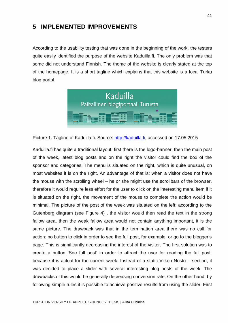
According to the usability testing that was done in the beginning of the work, the testers
quite easily identified the purpose of the website Kaduilla.fi. The only problem was that
some did not understand Finnish. The theme of the website is clearly stated at the top
of the homepage. It is a short tagline which explains that this website is a local Turku
blog portal.
Picture 1. Tagline of Kaduilla.fi. Source: http://kaduilla.fi, accessed on 17.05.2015
Kaduilla.fi has quite a traditional layout: first there is the logo-banner, then the main post
of the week, latest blog posts and on the right the visitor could find the box of the
sponsor and categories. The menu is situated on the right, which is quite unusual, on
most websites it is on the right. An advantage of that is: when a visitor does not have
the mouse with the scrolling wheel – he or she might use the scrollbars of the browser,
therefore it would require less effort for the user to click on the interesting menu item if it
is situated on the right, the movement of the mouse to complete the action would be
minimal. The picture of the post of the week was situated on the left; according to the
Gutenberg diagram (see Figure 4) , the visitor would then read the text in the strong
fallow area, then the weak fallow area would not contain anything important, it is the
same picture. The drawback was that in the termination area there was no call for
action: no button to click in order to see the full post, for example, or go to the blogger’s
page. This is significantly decreasing the interest of the visitor. The first solution was to
create a button ‘See full post’ in order to attract the user for reading the full post,
because it is actual for the current week. Instead of a static Viikon Nosto – section, it
was decided to place a slider with several interesting blog posts of the week. The
drawbacks of this would be generally decreasing conversion rate. On the other hand, by
following simple rules it is possible to achieve positive results from using the slider. First
42
TURKU UNIVERSITY OF APPLIED SCIENCES THESIS | Alina Dubinina
of all it was decided to make the navigation on the slider simple: there are no arrows,
the amount of slides is limited to three. The bars on the bottom show the current page
displayed on the slider. As soon as the user decides to check all the slides – the
carousel stops: the visitor can decide whether to see animation or not. He or she can
see all the pictures presented on the slides and click on the interesting post.
Block of categories was another concern. Whenever the user clicked on any category –
he or she was redirected to the same page with the same set of posts. There was no
header identifying which category is viewed at the moment, which is making the
navigation unclear for the first-time user. Moreover, any link that is not working properly
should be either removed or fixed immediately, another option would be to notify on the
main page that the website is currently under development. Some websites have a
feedback form created for notifying about possible errors occurring or broken links.
Another aspect was that the posts were displayed starting from the oldest one, and the
most actual events or offers were hidden on the bottom of the page. After these issues
had been fixed, the block with the categories was included in the main menu of the
website, thus it would not take too much space on the homepage and it would be visible
all the time when the user checks the homepage.
Kaduilla.fi – webpage had a very minimalistic design, most of it was icons and images,
placed on the plain white background. The website seemed empty, therefore some
visual noise could fill the gap. The clickable areas were just the menu, the contact form,
placed on the bottom of the page, as well as the arrow ‘UP’, by clicking on which the
visitor would be brought to the top of the page. The headers were not highlighted, the
only visually attractive element on the webpage was the MOBILE-box and the banner
with the logo-picture.
The navigation menu at Kaduilla.fi consisted of three main sections: ‘KOTI’ (home), that
lead to the homepage, drop-down section ‘BLOGIT’ (blogs), where the visitor could find
all the active bloggers, ‘INFO’, with three secondary options: ‘Katujen takana-blogi’ (the
blog of the company Kaduilla.fi), ‘Tietoa sivustosta’ (information about the page) and
‘Info in English’. The menu was not overloading the short-term memory, it was not large
and had very limited amount of options. There was a possibility to increase it by adding
4-5 items. The website is made for advertisement. However, all that the visitor sees – is
the pictures of personal blogposts that may or may not include advertisement of some

43
TURKU UNIVERSITY OF APPLIED SCIENCES THESIS | Alina Dubinina
product. There was no information about any cooperation with the local companies on
the homepage.
New items have been added to the menu and old items have been replaced. The first
important change was to add a logo to the menu which would redirect to the homepage.
It is a common practice in webdesign, people are familiar with the feature. The logo
stays on the sliding menu bar, which works as a unifying element: no matter where on
the page or blog the user is – he or she will subconciously know that the webportal is
still Kaduilla.fi and not some other page that the user was redirected to. The INFO –
section was replaced and reorganized. There following changes were implemented:
1. The section ‘YHTEYSTYÖSSÄ/COOPERATION’ was added. This section is
important because the information about possible cooperation should be visible
and easily accessible.
2. The section ‘INFO' was merged with the section 'In English' in order to give some
information for the international people of Turku. It is not necessary to translate
all the website, because the blogs are still in Finnish, only one blog is translated
into English and it is mentioned on the page. Information about the page was
also translated into Swedish and added to the webpage in a form of tabs: one per
each language.
3. A second menu was added with the options ‘postaukset kategorioissa’ (posts
under categories), where the users can choose to browse the posts only under a
specific category.
The menu became wider but it still has a limited number of pages. The reorganization
helped prioritizing the sections; the new order of the menu is the following:
KOTI – INFO – YHTEYSTYÖSSÄ – BLOGIT
As the website is developing, there are constantly new items added to the menu.
However, this does not change the fact that overall any important statement or element
is easy to access in one-two clicks. Contact form, any blog, posts from all the blogs
under the same category or tag, information about the blog-portal or cooperation can be
found intuitively.
44
TURKU UNIVERSITY OF APPLIED SCIENCES THESIS | Alina Dubinina
A very important problem that made navigation hard was the button ‘To Top’, which was
placed in the bottom of the page, right next to the old contact form. Therefore, the user
would be able to scroll all the way up only after reaching the footer of the page. The
solution suggested was to create a dynamic arrow, which appears after scrolling some
pixels down the page, so that the user would be able to return to the top of the page any
time. The perfect location for the button would be bottom right corner, because if a
person does not have a scrolling mouse – he or she would use the scrollbar of the
browser, and it would be very fast to move the cursor to the bottom right corner and
press the arrow button. Furthermore, browsers have status bars on the left, which cover
the lower part of the webpage, which would make any element in that area invisible and
hard to reach. The chosen plugin was Dynamic To Top. It allows to redesign the button
using the WordPress interface as well as choosing the location and the moment of
appearance. As it is seen from the screenshot of the initial version (see Appendix 1) on
the website – there was a lot of white space on the page. White is an achromatic color,
neutral color. White is good when used as a secondary option but not as the main color.
Instead, a shade of the main color was used on the webpage, with little saturation and
high brightness, so that it looks very light but still resembles to the primary color on the
page. The elements were placed on the white boxes and this was done to logically
separate the blocks. The headers were made on the green background in order to
identify the sections of the homepage more clearly.
In the section ‘Suggestions for improvement’ of the usability testing, conducted before
the page development, 10% of the overall amount of contestants stated a very long
loading time, around 5-10 seconds. This may cause serious frustration of the users.
One of the problems was the ‘Infinite scrolling’ – plugin, installed in all the blogs and on
the homepage. When a user chose a certain category or tag, he or she was redirected
to a page with the posts under this category/tag, and since there are large pictures with
high resolution – they slow down the loading process. Another problem was using
banners of high resolution on the main page. This was solved by replacing them. The
pictures had very high resolution and this had to be resolved. The last step was the
CSS code optimization.
Almost 70% of the participants of the survey mentioned that the information in English is
hidden so that it is hard to find it and get an explanation about purposes of the
webpage. This is a drawback that would restrict of the target group: Turku is a

45
TURKU UNIVERSITY OF APPLIED SCIENCES THESIS | Alina Dubinina
multicultural international city, information in English would attract more users, and
therefore the advertisements would reach a wider group of people.
The contact form was very hard to find because it was hidden in the footer, not
highlighted by any tool (color, underline). The user would have to scroll the page all the
way down. The solution to the problem was the plugin Perfect Contact Forms for
WordPress. It was placed on the left, as a toggler button. The form was placed the
contact form on the sliding menu bar – therefore, when a user checks the whole page,
he or she would not have to search for it, it would be always at the same place. The aim
of the blog-portal is advertising. The bloggers are open for any cooperation with the
local cafes, bars, cinemas, restaurants and other places that could interest the citizens.
The blog posts tell the readers about the latest deals, cafes with interesting menus,
concerts and other interesting events and places in Turku. In order to get in touch with
the owners of the page, the user has to have a quick and easy access to the contact
information. If the visitor is familiar with the page and wants to offer the deal at once –
the contact form is situated on top, so as soon as the page loads – the customer will be
able to send an e-mail. The participants of the usability survey conducted in the
beginning were not able to find the contact form. The second survey proved that by
placing the form in the header, the feedback was increased, the number of offers
started rising.
The search bar was the next object implemented on the homepage. It was attached to
the sliding menu in order to leave it visible on all pages and at any moment.
Furthermore, a separate contact form was created on the
YHTEISTYÖSSÄ/COOPERATION page. The purpose of it is to let the user quickly
contact the owners of the website after becoming familiar with the purpose and the
offers of the portal. The labels are placed above the fields according to the pattern
Kaduilla.fi uses responsive design, meaning that the layout changes according to the
size of the screen, the device rotation. In order to follow the usability, all the important
content was placed at the top of the screen.
The second usability testing showed the significant improvement in the overall grades.
The questions were the same, but the group of people was different: usability testing is
more efficient when the person is not familiar with the website.

46
TURKU UNIVERSITY OF APPLIED SCIENCES THESIS | Alina Dubinina
1. What is the purpose of the website?
The purpose of the website was easier to identify because of the new section in
the menu of Kaduilla.fi: INFO, which included information in three languages.
2. You want to be a new blogger of the website. Find the contact form or contact e-
mail. Was it easy? (1-hard…5-easy)
100% of the participants stated that it is very easy to contact the owners of the
website.
3. Find the information about the cafes in Turku. Was it easy? (1-hard…5-easy)
The overall grade for this question was 4.8. Participants had to spend some time
finding the useful information through the menu, but the primary goal for the
website is advertisement, and the most important information about the venues is
listed on the homepage regardless its category. Nevertheless, due to the
implementation of the search field most of the users completed the required task
in a very short time.
4. Is the font clearly visible and pleasant? (1-no…5-absolutely)
The overall grade was 5. All the fonts are considered to be easily readable.
5. Are the colors pleasant for the eye? (1-no…5-absolutely)
The colors got the highest grade. The color scheme is very calm and non-
irritating.
6. How would you evaluate the graphics on the page? (1-bad…5-great)
The graphics were evaluated with a 4.9. The problem on some blogs is the large
banner. Despite the fact that the large banner takes more than a half of the
screen and prevents the users from seeing the really important information, the
preferences of the bloggers were the opposite. According to the rules of
blogging, the welcoming banner should take a lot of space because it is an
identity element, something special that defines what the blog is about and its
style.
7. You don't speak any Finnish but you want to know what the website is about.
How hard was it to find some information in English? (1-hard…5-easy)
The information in English was easy to find due to the new section in the menu.
8. Any other suggestions to improve the page?
No suggestions were made for the webpage. The field was mostly left out empty,
because it was not compulsory to complete it. Some participants mentioned that

47
TURKU UNIVERSITY OF APPLIED SCIENCES THESIS | Alina Dubinina
the test is already enough to figure out the strengths and weaknesses of the
website.

48
TURKU UNIVERSITY OF APPLIED SCIENCES THESIS | Alina Dubinina
6 СONCLUSION
The web usability research highlighted the following important aspects when
considering the web development of the website:
1. When choosing between usability and design, one should consider usability first.
Users are most likely to stay on the page if they are satisfied by the way the
website is planned, not by the chosen font styles or interesting placement of the
menu or other elements. Minimalistic old-style design could sometimes work
better than a new one, creative but unclear.
2. One should take into consideration the thermomap research when placing the
elements on the page: there are several common patterns observed and
documented, such as F-pattern, Gutenberg diagram.
3. Navigation is the key element to the usability improvement. People want the
information to be accessed easily and fast. Primary elements of navigation
should be placed first in order to highlight the most important sections of the
website.
4. Colors shouldn’t be underestimated. People have strong associations with
particular colors: the web designer should consider it when choosing a color
scheme for the website. Color wheel helps when deciding the colors to include to
the website. Important elements can be highlighted by using a specific color, and
the color wheel can help choosing an appropriate and pleasant combination.
5. Contact information must be easily accessible. The user should not be wondering
how to contact the administrators or the company in general. Some people would
like to leave feedback, some – ask for cooperation. Clear contact form or visible
contact information will attract more users and improve the work.
The questionnaire and the analysis of the answers pointed out the weak points of
Kaduilla.fi, helped to plan the future development of the webpage. While the
improvements were being implemented, the amount of bloggers increased by 25%
which proved the necessity of usability research and development for the Kaduilla.fi
blog portal. The navigation was changed significantly in order to provide the users with
a more intuitive interface and improve the satisfaction. Search was implemented, as
well as an arrow for an easier navigation around the website. The menu was

49
TURKU UNIVERSITY OF APPLIED SCIENCES THESIS | Alina Dubinina
reconstructed: some items were brought up to a primary level, some – transferred from
the sidebar. The second survey, conducted after the implemented changes, showed a
positive impact of the development, the feedback improved, which showed a successful
completion of the task. Users could easily contact the administration, find the interesting
information, see all the deals and find out how to cooperate with the company.
The website is constantly under development: new bloggers are being added,
advertisement is increasing. All these factors lead to the following: usability is the key
point for Kaduilla.fi to succeed. I strongly believe that usability is a very dynamic and
interesting field that is not considered enough when an application or a website are
being developed. Considering that, I would like to continue my research in the future
and contribute to the field.
SOURCE MATERIAL
50
TURKU UNIVERSITY OF APPLIED SCIENCES THESIS | Alina Dubinina
Farris, P. (2010). Marketing metrics. Upper Saddle River, N.J.: FT Press.
Fitts, P. M. (1954). The information capacity of the human motor system in controlling the amplitude of
movement. Journal of Experimental Psychology, 47, 381-391
Friedman, V. (2007). 30 Usability Issues To Be Aware Of. Consulted 05.05.2015
http://www.smashingmagazine.com/2007/10/09/30-usability-issues-to-be-aware-of/.
Kalbach, J. (2002). The Myth of "Seven, Plus or Minus 2". Consulted 06.05.2015
http://www.drdobbs.com/web-development/the-myth-of-seven-plus-or-minus-2/184412300
Krug, S. (2014). Don't make me think! Berkeley, Calif: New Riders Pub.
McGovern, G. (2010). The decline of the homepage. Consulted 06.05.2015
http://www.gerrymcgovern.com/new-thinking/decline-homepage
Nielsen, J. (2013). Auto-Forwarding Carousels and Accordions Annoy Users and Reduce Visibility.
Consulted 05.05.2015 http://www.nngroup.com/articles/auto-forwarding/
Nielsen, J. and Tahir, M. (2002). Homepage usability. Indianapolis, Ind.: New Riders.
Nielsen, J. (1996). Inverted Pyramids in Cyberspace. Consulted 17 May 2015
http://www.nngroup.com/articles/inverted-pyramids-in-cyberspace/.
Nielsen, J. (2012). Usability 101: Introduction to Usability. Consulted 05.05.2015
http://www.nngroup.com/articles/usability-101-introduction-to-usability/
Penzo, M. (2006). Label Placement in Forms. Consulted 05.05.2015
http://www.uxmatters.com/mt/archives/2006/07/label-placement-in-forms.php
Porter, J. (2003). Testing the Three-Click Rule. Consulted 05.05.2015
http://www.uie.com/articles/three_click_rule/
Shneiderman, B. (1998). Designing the user interface. Reading, Mass: Addison Wesley Longman.
Simpson, J. and Weiner, E. (1989). The Oxford English Dictionary. Oxford: Clarendon Press.
Wheildon, C. and Warwick, M. (1995). Type & layout. Berkeley, Calif.: Strathmoor Press.
Wickens, C.D., & Hollands, J.G. (2000). Engineering psychology and human performance (3rd ed). Upper
Saddle River, NJ: Prentice Hall
Zeldman, J. (2001). Taking your talent to the Web. Indianapolis, Ind.: New Riders.

Appendix 1
TURKU UNIVERSITY OF APPLIED SCIENCES THESIS | Alina Dubinina
Appendix 1. Screenshot of the website Kaduilla.fi before the
modifications

Appendix 2
TURKU UNIVERSITY OF APPLIED SCIENCES THESIS | Alina Dubinina
Appendix 2. Final screenshot of the website Kaduilla.fi


