LBNL-4283E Using Dashboard to Improve Energy and Comfort in Federal Buildings Kyle Marini California Polytechnic State University, San Luis Obispo Girish Ghatikar, Rick Diamond Lawrence Berkeley National Laboratory February 2011
Transcript
LBNL-4283E
Using Dashboard to Improve Energy and Comfort in Federal Buildings
Kyle Marini
California Polytechnic State University, San Luis Obispo
Girish Ghatikar, Rick Diamond
Lawrence Berkeley National Laboratory
February 2011
Acknowledgments
The authors would like to acknowledge the assistance of the Building 90 monitoring team,
including, Jose (Arturo) Ayala-Navarro, Geoffrey Bell, Nicholas Goodell, Jessica Granderson,
Steve Greenberg, Steven Lanzisera, Dale Sartor, Lonny Simonian, and Dave Watson. We are
particularly grateful to two of our colleagues, Jessica Granderson and Dale Sartor, who made
many helpful comments on an earlier draft of the report.
The authors also acknowledge the dedication of the contractor teams at Federspiel Controls
(project management and measurement devices), Pulse Energy (Energy Information System
software), and Power Standards Laboratory (power meters). We are grateful for the assistance of
the LBNL Facilities electricians, telecommunication services, and the patience of the building
occupants in making this project possible.
The work described in this report was funded by the Assistant Secretary of Energy Efficiency
and Renewable Energy, Federal Energy Management Program, of the U.S. Department of
Energy under Contract No. DE-AC02-05CH11231.
Disclaimer
This document was prepared as an account of work sponsored by the United States Government.
While this document is believed to contain correct information, neither the United States
Government nor any agency thereof, nor The Regents of the University of California, nor any of
their employees, makes any warranty, express or implied, or assumes any legal responsibility for
the accuracy, completeness, or usefulness of any information, apparatus, product, or process
disclosed, or represents that its use would not infringe privately owned rights. Reference herein
to any specific commercial product, process, or service by its trade name, trademark,
manufacturer, or otherwise, does not necessarily constitute or imply its endorsement,
recommendation, or favoring by the United States Government or any agency thereof, or The
Regents of the University of California. The views and opinions of authors expressed herein do
not necessarily state or reflect those of the United States Government or any agency thereof, or
The Regents of the University of California.
Ernest Orlando Lawrence Berkeley National Laboratory is an equal opportunity employer.
Table of Contents
Introduction and Background ......................................................................................................... 4 Purpose ..................................................................................................................................................... 4 Background............................................................................................................................................... 4
Upgrading and Commissioning the EIS Hardware Network.......................................................... 5 Schematic EIS Architecture in LBNL Building 90 .................................................................................. 5
End Users and Uses of a Dashboard ............................................................................................... 7 Dashboard Functions for User Categories ................................................................................................ 7 Dashboard Components............................................................................................................................ 8
Applications of Dashboards............................................................................................................ 9
Lessons Learned and Conclusions ................................................................................................ 13 Conclusions............................................................................................................................................. 13
Appendix: Dashboard Examples Used for Building 90 at LBNL ................................................ 15
Introduction and Background
Federal agencies are taking many steps to improve the sustainability of their operations,
including improving the energy efficiency of their buildings, promoting recycling and reuse of
materials, encouraging carpooling and alternative transit schemes, and installing low flow water
fixture units are just a few of the common examples. However, an often overlooked means of
energy savings is to provide feedback to building users about their energy use through
information dashboards connected to a building’s energy information system.
An Energy Information System (EIS), broadly defined, is a package of performance monitoring
software, data acquisition hardware, and communication systems that is used to collect, store,
analyze, and display energy information. At a minimum, the EIS provides the whole-building
energy-use information (Granderson 2009a). We define a “dashboard” as a display and
visualization tool that utilizes the EIS data and technology to provide critical information to
users. This information can lead to actions resulting in energy savings, comfort improvements,
efficient operations, and more. The tools to report analyzed information have existed in the
information technology as business intelligence (Few 2006). The dashboard is distinguished
from the EIS as a whole, which includes additional hardware and software components to collect
and storage data, and analysis for resources and energy management (Granderson 2009b). EIS
can be used for a variety of uses, including benchmarking, base-lining, anomaly detection, off-
hours energy use evaluation, load shape optimization, energy rate analysis, retrofit and retro-
commissioning savings (Granderson 2009a). The use of these EIS features depends on the
specific users. For example, federal and other building managers may use anomaly detection to
identify energy waste in a specific building, or to benchmark energy use in similar buildings to
identify energy saving potential and reduce operational cost. There are several vendors of EIS
technology that provide information on energy and other environmental variables in buildings.
Purpose
The purpose of this dashboard study was to demonstrate the potential of a dashboard & EIS
retrofit to identify operational energy improvements in a federal building. An additional goal was
to identify specific end users and to learn what EIS information or visualizations are important
from their perspective.
This case study reports on the development and deployment of a dashboard at a federal facility,
and its potential to provide energy feedback, energy savings, and improve occupant comfort.
Background
Researchers at Lawrence Berkeley National Laboratory (LBNL) developed and installed a
comprehensive energy monitoring system connected to an EIS at Building 90, a 90,000 gross
square feet office on the LBNL campus in Berkeley, California. The building, typical of
construction in the 1960s, is a poorly insulated building with inefficient heating, ventilation, and
air-conditioning (HVAC) systems and controls. The building’s poor envelope and HVAC system
has led to elevated energy consumption as well as an uncomfortable work environment for the
building’s occupants. In 2004, the facilities department at LBNL installed air conditioning in the
building in response to numerous complaints about the high indoor temperatures during the
summer months. Following the persistent failure of the new HVAC system to provide comfort
conditions, a research team in the Energy Efficient Technologies Division (EETD), housed
within the building, installed an EIS to monitor the building’s energy consumption and ambient
temperatures, with a goal of improving energy efficiency and occupant comfort.
Upgrading and Commissioning the EIS Hardware Network
While the building had an existing energy management and control system (EMCS), it lacked the
degree of sub metering necessary to disaggregate end-use loads (e.g., lighting, HVAC), high-
resolution of data (e.g., 1 minute interval), and temperatures in offices and cubicles. The LBNL
team needed to add numerous sub meters and additional temperature sensors to improve the
quality of the real-time data collected for analysis by the EIS. The team also had to undertake a
major effort to commission the existing monitoring system and EIS. The first step in the process
was to identify the energy loads in the building and determine how these loads were being
monitored. This work involved tracking down and documenting the location of the energy sub-
meters within the building in order to set up a series of data points within the EIS software that
provide real-time, useful information. After establishing the monitoring network to acquire the
end-use data, the next step was to transfer it into the EIS to display analyzed data to building
occupants using a dashboard. The twin goals were to have building occupants better understand
the energy use and adopt energy-saving opportunities (Lehrer 2009) and building operators
pursue better HVAC operations (Lehrer 2010).
Schematic EIS Architecture in LBNL Building 90
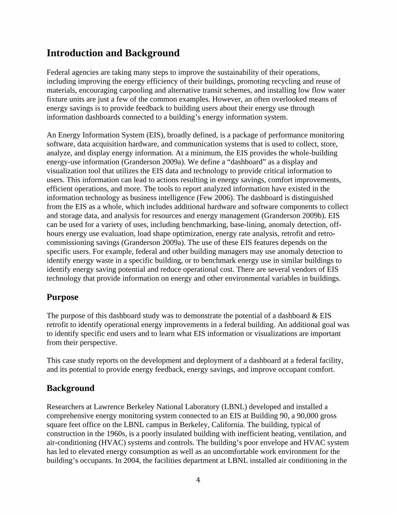
Figure 1 shows the schematic EIS architecture used for the Building 90 project at LBNL. Pulse
Energy, Inc provided the software infrastructure for the dashboard. This dashboard acquires its
data from a number of sources at varying time intervals, and organizes the information in a series
of useful charts showing a number of energy and temperature parameters. Figure 1 also shows a
representation of the network and EIS architecture, which is further explained in the text below.
Several vendors were involved in the development of the EIS. PQube power meters made by
Power Standards Lab, and power meters made by Dent Instruments and Veris Industries are used
to monitor energy through the electrical circuits within Building 90. Other meters include ACme
plug load meters developed at UC Berkeley and we anticipate the addition of smart plug strip
power monitors and controllers made by Infosys Technologies. The data collected from these
meters run through a variety of networks to gateways, which ultimately upload the information
to the data storage and analytical system for display on the dashboard. Some of these networks
upload data directly to the dashboard in real-time; these networks include the AcquiSuite product
from Obvius for data collection system, and can include the databases from plug load meters.
Other wireless networks in Building 90 include temperature and humidity sensors, which
monitor internal conditions to help evaluate comfort conditions within the building. These
monitors include meters produced by Federspiel Controls and a network produced by
Synapsense. Lastly, information from the existing Facilities Management and Controls System
(FMCS), a system term used by LBNL facilities to refer to EMCS, which monitors and controls
zone air temperature and HVAC temperatures, is uploaded onto the EIS dashboard to provide a
thorough, complementary network of energy monitoring in Building 90 (Kircher 2010).
Figure 1 - Schematic of the EIS hardware network and dashboard.
End Users and Uses of a Dashboard
Based on the EIS features and individual functions, we identified five end user categories that
would utilize an EIS dashboard, each with the increasing degree of use:
1) The public
2) Building occupants
3) Corporate managers or building owners
4) Building managers and facilities personnel
5) Researchers
Dashboard Functions for User Categories Each user category has different needs for the EIS dashboard. These users and their intended
functions are described in more detail below and summarized in the following Table 1.
Public viewers of dashboards might be interested in the total costs of operation a building and
the changes over time. The public dashboard may be useful for the agencies to show how
“green” their building is and the energy efficiency measures undertaken to encourage
sustainability, reducing greenhouse gases (GHG) or carbon footprint, and public education on
effectiveness of such actions.
Building occupants are more likely concerned with managing energy use at an individual level
through tools that they control to save energy while maintaining the comfort. If building
occupants could track their individual use, or contribution to total energy use over a day, week,
or month, they could be more energy conscious and may be more apt to adjust their behavior and
routines to be more energy efficient.
Agency administrators or building operators might be concerned with overall building energy
usage for financial reasons and how energy is spread across an agency (e.g., compare buildings
within their portfolio). They might use the EIS dashboard to track consumption from week-to-
week, month-to-month, quarter-to-quarter, etc. and to evaluate energy use of one period to
another, evaluating the economics and opportunities for efficiency, including assessment of
performance metrics for federal or state credits and lowering the carbon footprint or GHG
emissions for reasons of management directives and social responsibility.
Facilities personnel and building managers might use the EIS dashboard to maintain the
building’s systems and identify opportunities for energy saving and comfort improvements for its
occupants. Retro commissioning can also utilize EIS. Anomaly or fault detection – detecting
patterns in a given data set that do not conform to an established normal behavior or indicate
problems (faults) – can be particularly helpful in maintaining the building’s systems.
Researchers may use the EIS dashboard to evaluate measures to improve efficiency and
comfort. The researchers in the B90 study were particularly interested in the lessons from
interoperability of different systems and analysis for effectiveness of EIS and its features on
building performance and sustainability measures – both short- and long-term.
The building managers may want monitoring at several levels of granularity, but typically not at
the individual office level. Multiple levels of granularity allow them to track energy consumption
of a building in its entirety or broken down by floor or zone for energy savings and occupant
comfort. Managers can compare overall buildings, or compare departments within buildings,
while still allowing access to the data with a level of privacy for individual building occupants.
Access to the office level data allows building managers to identify problems or potential
problems in the HVAC system and locate major energy users and counsel occupants on energy
savings practices. Both building managers and researchers can have access to all levels of data
granularity. With access to data, the occupants are able to monitor their energy use, comfort
controls and adjust their behavior to reduce their energy consumption. The researchers can use
the energy consumption data to better understand the performance of the building at all levels.
Dashboard Components The dashboard component of Building 90’s EIS provides three pre-configured main screens in its
software to view energy consumption data. These three screens, labeled “Dashboard,”
“Management Charts,” and “Reporting,” are all geared toward creating customized dashboards
and analytics for use by different user groups, as characterized above.
In the Building 90 scheme, the “Dashboard” screen is the interface intended for the public; it
provides general information about total building energy consumption and compares the
building’s energy load to fun, theoretical, public examples. Specific examples include comparing
User Group Dashboard Functions
Public • Interest in general sustainability in built environment, which
requires evaluation of individual building’s energy consumption.
• Used to gather information in order to demonstrate agencies level
of commitment to energy efficiency, carbon reporting, etc.
Occupants • Track energy consumption and comfort at multiple levels – entire
building, the individual’s floor, department or zone, or the individual’s
own office or cubical and identify energy saving opportunities.
Agency
Administrators or
Building operators
• Track building energy consumption at a building or sub-level and
reward particular departments or buildings that reduce energy
consumption and practice sustainability by reducing carbon footprint.
• Compare buildings’ energy use within the portfolio
Building Managers &
Facilities Personnel
• Track energy consumption, comfort improvements, retro
commissioning, and anomaly detection.
• Identify areas of waste and occupant discomfort and examine
ways to improve those areas.
• EIS can identify s particularly energy efficient buildings and
initiate communication between building managers who can share
knowledge about how energy was saved.
Researchers • Researchers can use EIS to identify wasteful areas and systems of
commercial buildings and initiate research into these particular areas.
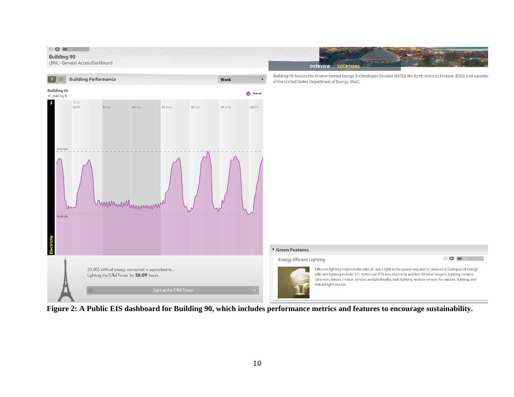
a building energy load to the amount of energy required to light the Eiffel Tower for certain
duration of time, or to run the circumference of the Earth a number of times.
The building managers and facilities managers are likely to make most use of the “Management”
screen. The Management screen is used to create charts, tables, assigns messages, and export
data for external uses (e.g., further processing, analysis). This screen provides real-time data,
which can be organized into charts that display overall energy consumption information as well
as energy data broken down by floor or zone, or by use. This interface can be particularly
beneficial to building managers as they can monitor and manage energy loads and maintain and
commission the facilities when potential problems are observed.
The “Reporting” screen allows users to generate reports based on data that is collected by the
EIS. Possible reports that can be created include charts that evaluate financial costs associated
with energy loads. This top-level and fiscal reporting is also intended for upper corporate
management and building owners. The EIS used in Building 90 provided three screens for three
pre-configured user groups; owners, managers, and the public. The two other user groups,
researchers and building occupants, would have to either use the same dashboard screens used by
the pre-configured users, or create new dashboards and customize them for their intended
functions. In the case of the Building 90 dashboard, researchers fall into the same user group as
building managers, utilizing the same “Management Charts” screen. This requirement is actually
an effective combination of user groups as the information provided by screen and the
capabilities of the software for managers allow researchers to effectively study the building’s
energy consumption. A less effective combination of user groups is including building occupants
in the public user group. Unlike the public, the building occupants would require more detailed
information and would want access to information of higher granularity. They would like access
to the energy consumption data of their individual offices or cubicles, which may not be
available for public access for privacy reasons. The “Configuration” screen is intended for the
EIS administration purposes.
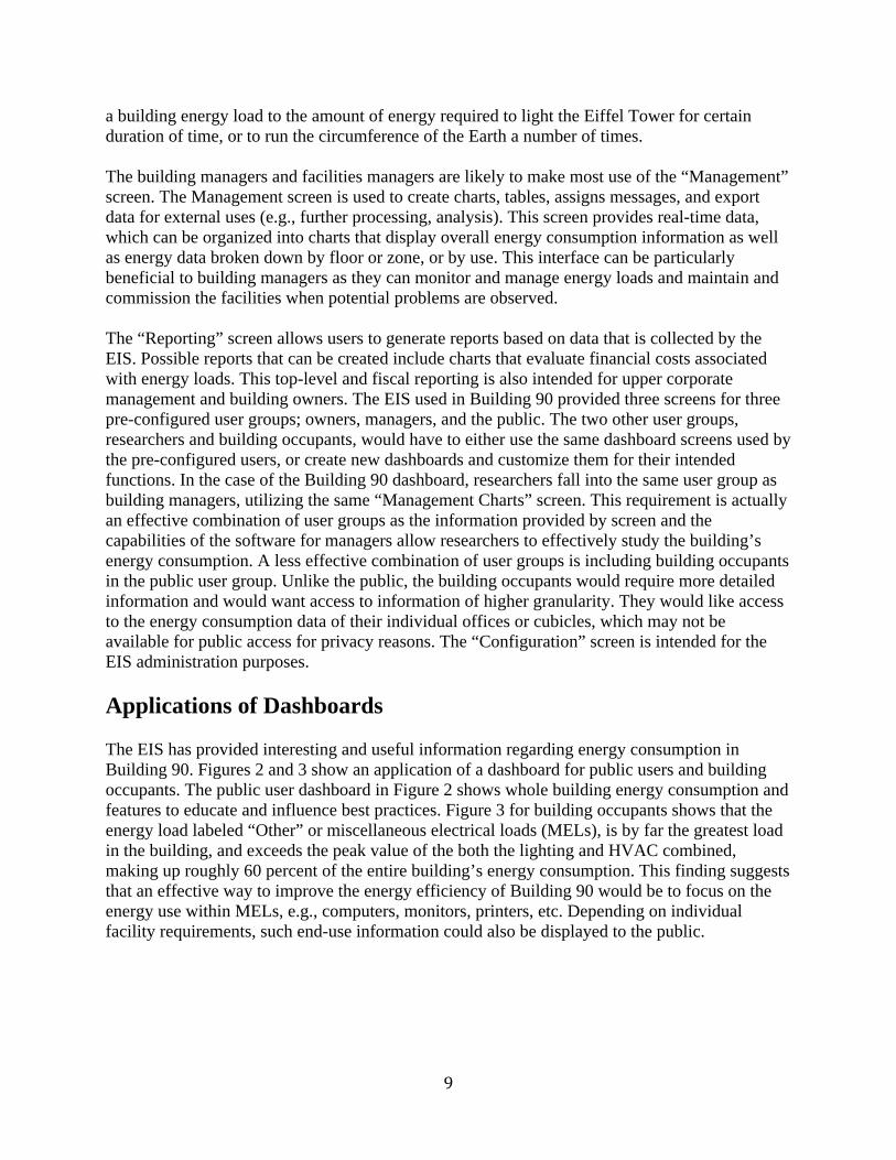
Applications of Dashboards
The EIS has provided interesting and useful information regarding energy consumption in
Building 90. Figures 2 and 3 show an application of a dashboard for public users and building
occupants. The public user dashboard in Figure 2 shows whole building energy consumption and
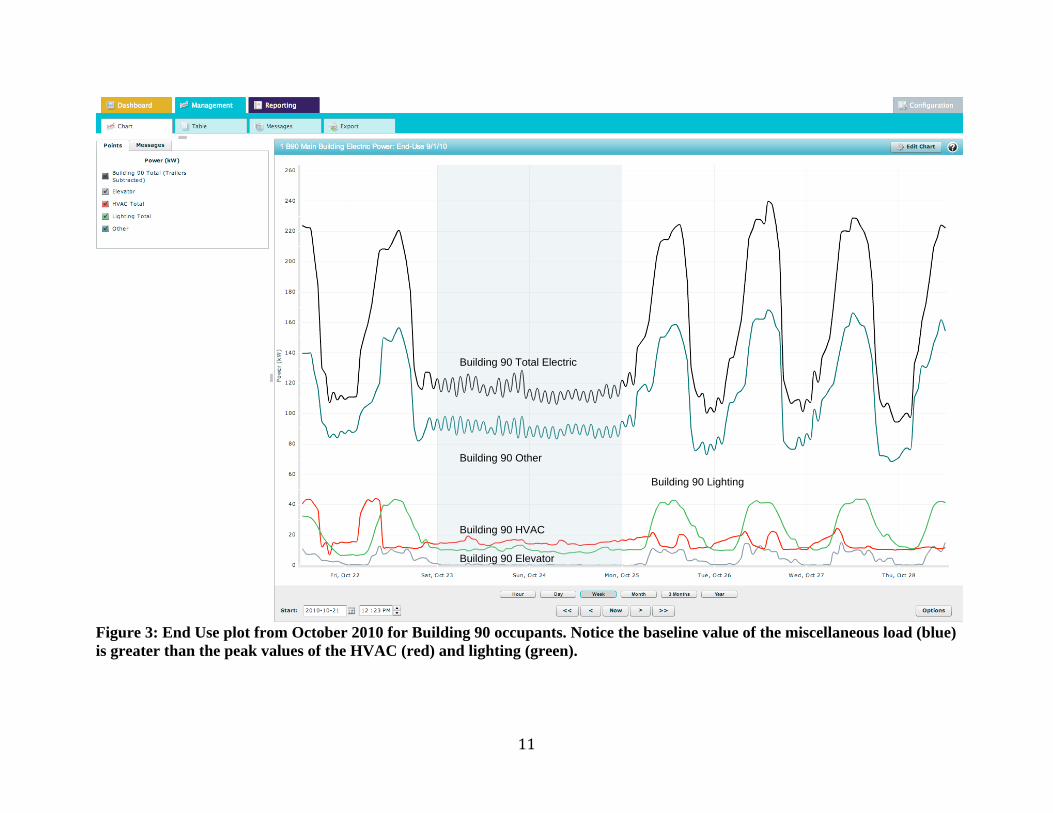
features to educate and influence best practices. Figure 3 for building occupants shows that the
energy load labeled “Other” or miscellaneous electrical loads (MELs), is by far the greatest load
in the building, and exceeds the peak value of the both the lighting and HVAC combined,
making up roughly 60 percent of the entire building’s energy consumption. This finding suggests
that an effective way to improve the energy efficiency of Building 90 would be to focus on the
energy use within MELs, e.g., computers, monitors, printers, etc. Depending on individual
facility requirements, such end-use information could also be displayed to the public.
Figure 2: A Public EIS dashboard for Building 90, which includes performance metrics and features to encourage sustainability.
Figure 3: End Use plot from October 2010 for Building 90 occupants. Notice the baseline value of the miscellaneous load (blue)
is greater than the peak values of the HVAC (red) and lighting (green).
Building 90 Total Electric
Building 90 Other
Building 90 Lighting
Building 90 HVAC
Building 90 Elevator
Reducing the MELs can be difficult however, as a majority of those loads are comprised of plug
loads, which are scattered throughout the building and controlled by individual building
occupants (e.g., computer monitors, task lighting) or shared by a group of occupants (e.g.,
printers, copiers). In order to reduce the value of MELs, the building would need to decrease the
number or period of plug-in devices that are being operated, something that may be out of the
control of building management personnel. Decreasing the energy load from miscellaneous
devices requires occupants to change their behavior, an inherently challenging process. The
occupant dashboards could be useful in such instances as they can provide direct feedback to the
users of the consequences of their actions.
Actions from building management that can reduce energy consumption often have more to do
with a building’s mechanical and electrical systems, such as HVAC and lighting systems.
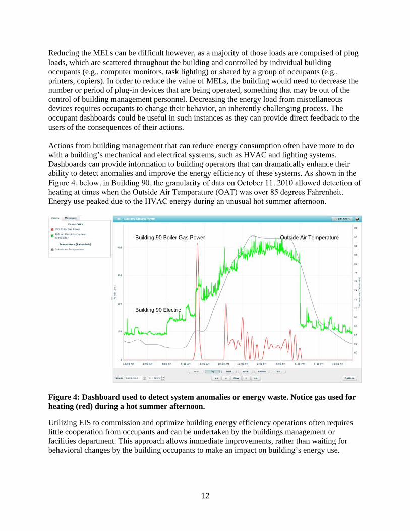
Dashboards can provide information to building operators that can dramatically enhance their
ability to detect anomalies and improve the energy efficiency of these systems. As shown in the Figure 4, below, in Building 90, the granularity of data on October 11, 2010 allowed detection of heating at times when the Outside Air Temperature (OAT) was over 85 degrees Fahrenheit. Energy use peaked due to the HVAC energy during an unusual hot summer afternoon.
Figure 4: Dashboard used to detect system anomalies or energy waste. Notice gas used for
heating (red) during a hot summer afternoon.
Utilizing EIS to commission and optimize building energy efficiency operations often requires
little cooperation from occupants and can be undertaken by the buildings management or
facilities department. This approach allows immediate improvements, rather than waiting for
behavioral changes by the building occupants to make an impact on building’s energy use.
Building 90 Boiler Gas Power
Building 90 Electric
Outside Air Temperature
Lessons Learned and Conclusions
We have several lessons learned from the EIS dashboard case study in Building 90:
Dashboards are dependent from several different building networks and system
components, all of which need to be operating correctly to provide accurate information to
the user. One important lesson learned from the case study is that there are multiple components
that feed an EIS dashboard, and all must be reliable in order to provide data for analysis. A
dense, sturdy network of measurement devices is vital to insure metered data is reliable and to
allow data collection at a required level of granularity.
Dashboards need to match information with specific users. Dashboards operate at different
levels for different users in an organization. The information has to be designed for the needs of
the specific users.
Dashboards need to transform data into knowledge. An EIS dashboard is a tool that can
provide valuable information about a building’s energy use, but only if the information can be
provided in a form that the user can understand and use as a basis for taking action.
Dashboards can help lead from knowledge into action. These systems have the potential to
spark interaction between building occupants, and between facilities managers within an agency,
who share energy use information with one another. If particular buildings are identified by an
EIS as being energy efficient, other facilities’ managers might investigate what procedures,
policies, or other factors are helping a particular building reduce energy use.
Conclusions
EIS and dashboards are a relatively new technology, and there are only a few studies showing
the savings potential resulting from their use. These savings are determined by initial building
performance, level and type of sub-metering, and expertise of users coupled by the quality of EIS
solution for analysis and customization. But as more buildings start installing these systems, we
will learn how effective a tool they are, both for providing feedback to building operators and
managers, as well as informing building users on the energy consumed in their building.
Preliminary findings from the Building 90 study show that MELs are the primary loads, and we
plan to pursue integration of the individual plug loads into the EIS for further analysis.
Our ultimate goal is to show how the performance of several EIS and dashboard case study pilot
demonstrations can help federal agencies save money and improve comfort for their building
occupants.
Bibliography Capehart B, and Capehart L, editors; Allen P, and Green D, associate editors. Web based enterprise energy and building automation systems. Fairmont Press, Inc. 2007. Capehart B, and Capehart L, editors. Web based energy information and control systems: case studies and applications. Fairmont Press, Inc. 2005. Few, S. Information dashboard design: The effective visual communication of data. O’Reilly Media, Inc. 2006. Granderson, J., Piette, M. A., Ghatikar, G., & Price, P. 2009a. Preliminary Findings from an Analysis of Building Energy Information System Technologies. Proceedings of 2009 National Conference on Building Commissioning. LBNL-2224E. Granderson, J., Piette, M. A., Ghatikar, G., & Price, P. 2009b. Building Energy Information Systems: State of the Technology and User Case Studies. Lawrence Berkeley National Laboratory, Environmental Energy Technologies Division Berkeley. LBNL-2899E Kircher, K., Ghatikar, G., Greenberg, S., Watson, D.S., Diamond, R., Sartor, D., Federspiel, C., McEachern, A., & Owen, T. 2010. Toward the Holy Grail of Perfect Information: Lessons Learned Implementing an Energy Information System in a Commercial Building. Proceedings of the Summer Study of the American Council for an Energy Efficient Economy. Washington D.C. Lehrer, D. Research Scoping Report: Visualizing Information in Commercial Buildings. 2009. Berkeley CA: Center for the Built Environment, UC Berkeley. Retrieved from http://www.cbe.berkeley.edu/research/pdf_files/Lehrer2009-IR-Visualizing.pdf Lehrer, D. Visualizing Information to Improve Building Performance: A Study of Expert Users. 2010, 7-151. Proceedings of the Summer Study of the American Council for an Energy Efficient Economy. Washington D.C. Retrieved from http://www.cbe.berkeley.edu/research/pdf_files/Lehrer2010-ACEEE-InfoViz.pdf Motegi N, and Piette M. A. Web-based energy information systems for large commercial buildings. March 29, 2003. Lawrence Berkeley National Laboratory. LBNL-49977. Retrieved from: http://repositories.cdlib.org/lbnl/LBNL-49977. Motegi N, Piette MA, Kinney S, Dewey J. Case studies of energy information systems and related technology: operational practices, costs, and benefits. Proceedings of the Third International Conference for Enhanced Building Operations, Berkeley, California, October 13-15, 2003. Retrieved from: http://txspace.tamu.edu/handle/1969.1/5195. New Buildings Institute. Advanced metering and energy information systems. 2009. White Salmon, Washington: New Buildings Institute.
Appendix: Dashboard Examples Used for Building 90 at LBNL
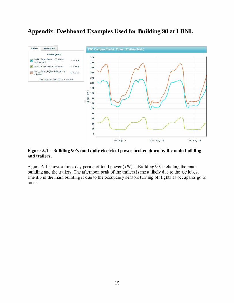
Figure A.1 – Building 90’s total daily electrical power broken down by the main building and trailers. Figure A.1 shows a three-day period of total power (kW) at Building 90, including the main building and the trailers. The afternoon peak of the trailers is most likely due to the a/c loads. The dip in the main building is due to the occupancy sensors turning off lights as occupants go to lunch.
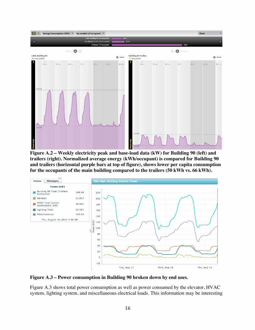
Figure A.2 – Weekly electricity peak and base-load data (kW) for Building 90 (left) and trailers (right). Normalized average energy (kWh/occupant) is compared for Building 90 and trailers (horizontal purple bars at top of figure), shows lower per capita consumption for the occupants of the main building compared to the trailers (50 kWh vs. 66 kWh).
Figure A.3 – Power consumption in Building 90 broken down by end uses.
Figure A.3 shows total power consumption as well as power consumed by the elevator, HVAC system, lighting system, and miscellaneous electrical loads. This information may be interesting
to many people, but it is particularly useful for facilities personnel and researchers as it identifies major energy consumers in buildings, allowing further analysis to be done and actions to be taken to understand and reduce these loads.
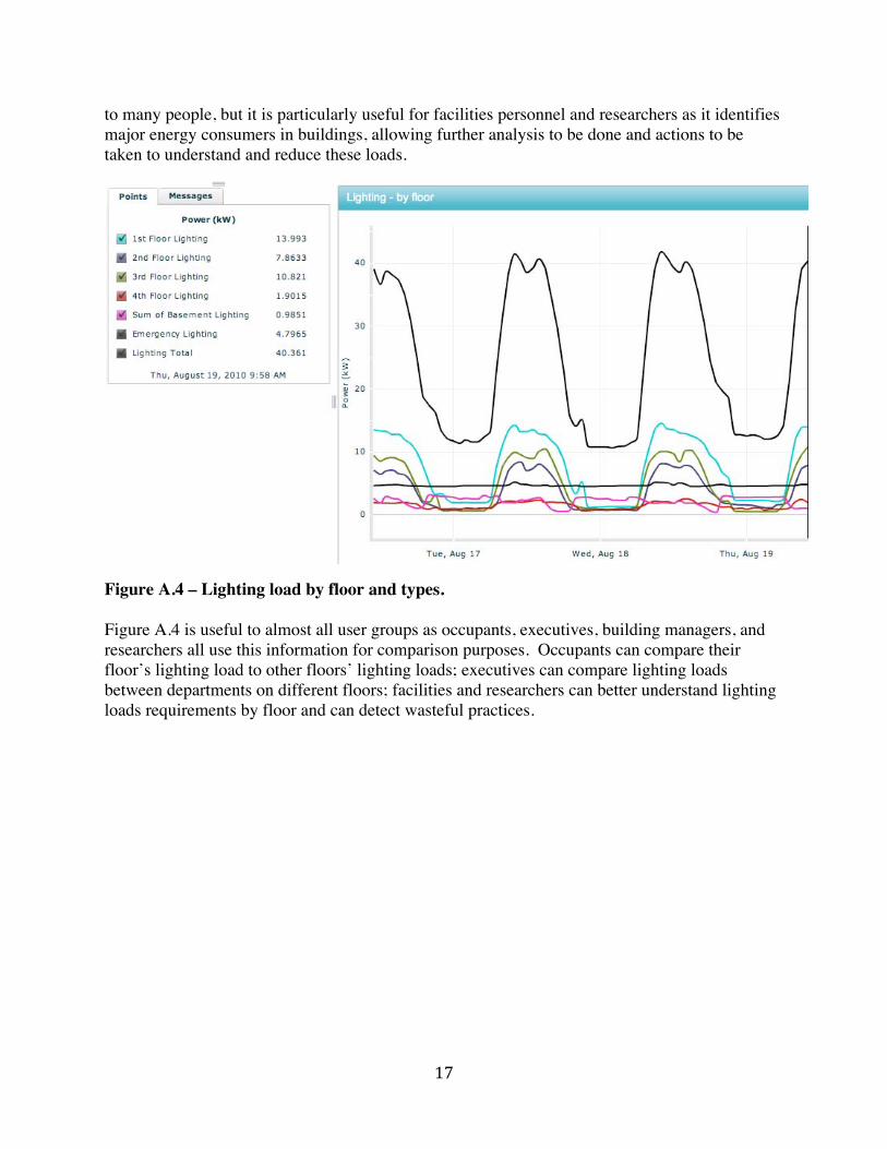
Figure A.4 – Lighting load by floor and types. Figure A.4 is useful to almost all user groups as occupants, executives, building managers, and researchers all use this information for comparison purposes. Occupants can compare their floor’s lighting load to other floors’ lighting loads; executives can compare lighting loads between departments on different floors; facilities and researchers can better understand lighting loads requirements by floor and can detect wasteful practices.
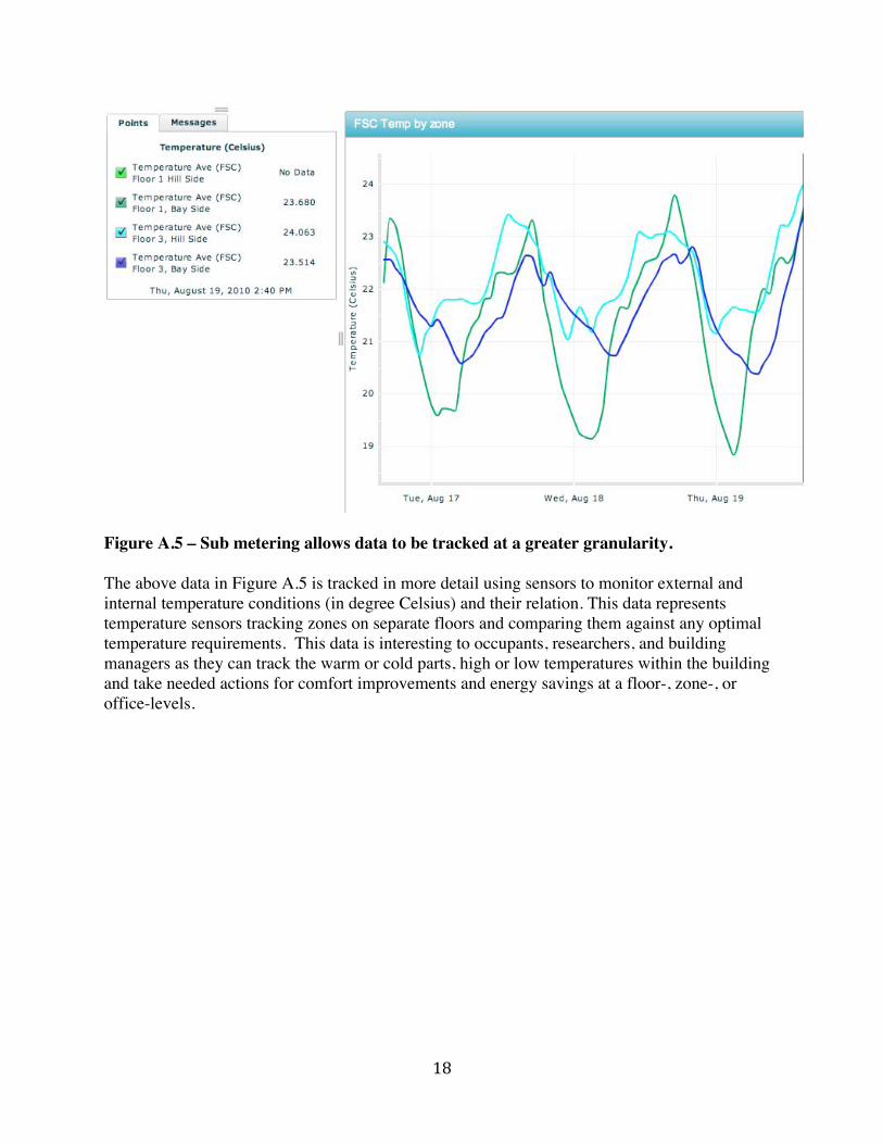
Figure A.5 – Sub metering allows data to be tracked at a greater granularity. The above data in Figure A.5 is tracked in more detail using sensors to monitor external and internal temperature conditions (in degree Celsius) and their relation. This data represents temperature sensors tracking zones on separate floors and comparing them against any optimal temperature requirements. This data is interesting to occupants, researchers, and building managers as they can track the warm or cold parts, high or low temperatures within the building and take needed actions for comfort improvements and energy savings at a floor-, zone-, or office-levels.
Figure A.6 – Individual sensors allow detailed temperature analysis and configure alerts. As shown in Figure A.6, the sensors allow greater data granularity at office-level or detecting outside air temperature (OAT) with ease of accessibility to information. The granular data allows the users to set alerts in EIS to variations in high or low zone area temperatures (ZAT) that fall outside the allowable range or whenever certain standard or user set rules or in reference to OAT. Such rules for alerts are very important as they allow facility managers to take quick actions and can be customized to receive notifications (e.g., receive e-mail).
Figure A.7 – Dashboards that track energy use that are dependent on certain external environmental conditions. With dependency related diagnostic dashboards, the building managers and researchers can track, for example, heating energy use against external environmental conditions. As shown in the dashboard Figure A.7 above, the gas usage to heat the building goes up whenever there is a drop in outside air temperature (OAT). Similarly, such diagnostic dashboards can also be used to track cooling load.
Figure A.8 – HVAC boiler gas energy use compared to heating degree-days (HDD) displayed in weekly averages. Figure A.8 shows the two sets of data trend together; which suggests the HVAC is working properly, though there may be room for improvement when examining more detailed data. This report would be most useful to building managers performing HVAC commissioning work. In the final two summer months (July and August 2010), it can be seen that the data don’t track well. The higher than expected gas use may indicate waste (e.g., re-heat).
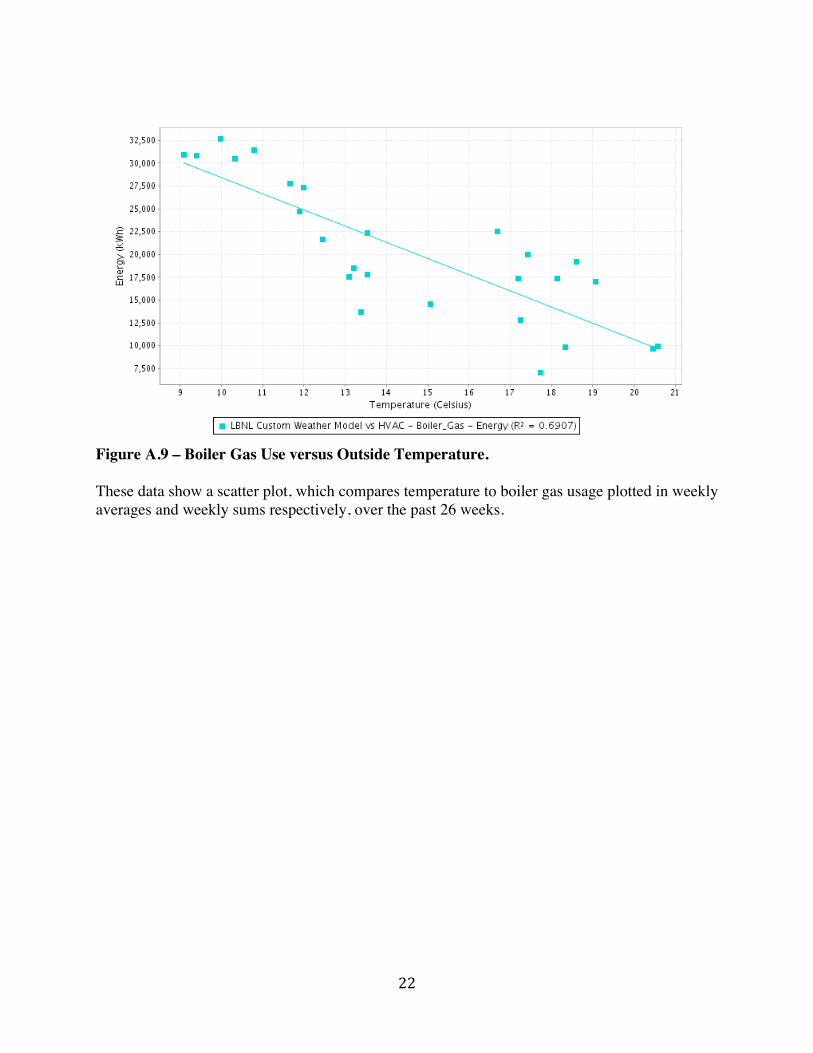
Figure A.9 – Boiler Gas Use versus Outside Temperature. These data show a scatter plot, which compares temperature to boiler gas usage plotted in weekly averages and weekly sums respectively, over the past 26 weeks.