0414/BSc/IT/TY/Pre_Pap/2014/GIS_Soln 1 Vidyalankar T.Y. B.Sc. (IT) : Sem. VI Geographic Information Systems Prelim Question Paper Solution Applications of GIS • The U.S. Geological Survey has the National Map program that provides nationwide geospatial data for applications in natural hazards, risk assessment, homeland security, and many other areas (http://nationalmap.usgs.gov). • The U.S. Census Bureau maintains an On-Line Mapping Resources website, where Internet users can map public geographic data of anywhere in the United States (http://www.census.gov/geo/www/maps/). • The U.S. Department of Housing and Urban Development has a mapping program that combines housing development information with environmental data (http://www.hud.gov/offices/cio/emaps/index.cfm). • The U.S. Department of Health and Human Services warehouse provides access to information about health resources, including community health centers (http:// datawarehouse.hrsa.gov/). In more recent years GIS has been used for crime analysis, emergency planning, land records management, market analysis, and transportation ap- plications. Here are some examples on the Internet: • The Department of Homeland Security's National Incident Management System (NIMS) identifies GIS as a supporting technology for managing domestic incidents (http:/I www.dhs.gov/). Components of GIS Like any other information technology, GIS requires the following four components to work with geospatial data: • Computer System : The computer system includes the computer and the operating system to run GIS. Typically the choices are PCs that use the Windows operating system (e.g., Windows 2000, Windows XP) or workstations that use the UNIX or Linux operating system. Additional equipment may include monitors for display, digitizers and scanners for spatial data input. GPS receivers and mobile devices for fieldwork, and printers and plotters for hard-copy data display. • GIS Software : The GIS software includes the program and the user interface for driving the hardware. Common user interfaces in GIS are menus, graphical icons, command lines, and scripts. • People : People refers to GIS professionals and users who define the purpose and objectives, and provide the reason and justification for using GIS. • Data : Data consist of various kinds of inputs that the system takes to produce information. • Infrastructure : The infrastructure refers to the necessary physical, organizational, administrative, and cultural environments that support GIS operations. The infrastructure includes requisite skills, data standards, data clearinghouses, and general organizational patterns. 1. (a) 1. (b)
Transcript
0414/BSc/IT/TY/Pre_Pap/2014/GIS_Soln 1
Vidyalankar T.Y. B.Sc. (IT) : Sem. VI
Geographic Information Systems Prelim Question Paper Solution
Applications of GIS • The U.S. Geological Survey has the National Map program that provides
nationwide geospatial data for applications in natural hazards, risk assessment, homeland security, and many other areas (http://nationalmap.usgs.gov).
• The U.S. Census Bureau maintains an On-Line Mapping Resources website, where Internet users can map public geographic data of anywhere in the United States (http://www.census.gov/geo/www/maps/).
• The U.S. Department of Housing and Urban Development has a mapping program that combines housing development information with environmental data (http://www.hud.gov/offices/cio/emaps/index.cfm).
• The U.S. Department of Health and Human Services warehouse provides access to information about health resources, including community health centers (http:// datawarehouse.hrsa.gov/). In more recent years GIS has been used for crime analysis, emergency planning, land records management, market analysis, and transportation ap-plications. Here are some examples on the Internet:
• The Department of Homeland Security's National Incident Management System (NIMS) identifies GIS as a supporting technology for managing domestic incidents (http:/I www.dhs.gov/).
Components of GIS Like any other information technology, GIS requires the following four components to work with geospatial data: • Computer System : The computer system includes the computer and the
operating system to run GIS. Typically the choices are PCs that use the Windows operating system (e.g., Windows 2000, Windows XP) or workstations that use the UNIX or Linux operating system. Additional equipment may include monitors for display, digitizers and scanners for spatial data input. GPS receivers and mobile devices for fieldwork, and printers and plotters for hard-copy data display.
• GIS Software : The GIS software includes the program and the user interface for driving the hardware. Common user interfaces in GIS are menus, graphical icons, command lines, and scripts.
• People : People refers to GIS professionals and users who define the purpose and objectives, and provide the reason and justification for using GIS.
• Data : Data consist of various kinds of inputs that the system takes to produce information.
• Infrastructure : The infrastructure refers to the necessary physical, organizational, administrative, and cultural environments that support GIS operations. The infrastructure includes requisite skills, data standards, data clearinghouses, and general organizational patterns.
1. (a)
1. (b)
Vidyalankar : T.Y. B.Sc. (IT) GIS
0414/BSc/IT/TY/Pre_Pap/2014/GIS_Soln 2
Spatial Data Spatial data describe the locations of spatial features, which may be discrete or continuous. Discrete features are individually distinguishable features that do not exist between observations. Discrete features include points (e.g. wells), lines (e.g., roads), and areas (e.g., land use types). Continuous features are features that exist spatially between observations. Examples of continuous features are elevation and precipitation. A GIS represents these spatial features on the Earth's surface as map features on a plane surface. This transformation involves two main issues: the spatial reference system and the data model. The locations of spatial features on the Earth's surface are based on a geographic coordinate system with longitude and latitude values, whereas the locations of map features are based on a plane coordinate system with x-. y-coordinates. Projection is the process that can transform the Earth's spherical surface to a plane surface and bridge the two spatial reference systems. But because the transformation always involves some distortion, hundreds of plane coordinate systems that have been developed to preserve certain spatial properties are in use. To align with one another spatially for GIS operations, map layers must be based on the same coordinate system. A basic understanding of projection and coordinate systems is therefore crucial to users of spatial data. Attribute Data Attribute data describe the characteristics of spatial features. For raster data, each cell has a value that corresponds to the attribute of the spatial feature at that location. A cell is tightly bound to its cell value. For vector data, the amount of attribute data to be associated with a spatial feature can vary significantly. A road segment may only have the attributes of length and speed limit, whereas a soil polygon may have dozens of properties, interpretations, and performance data. How to join spatial and ‘TIGER’ Database An early application of topology in preparing geospatial data is the TIGER (Topologically Integrated Geographic Encoding and Referencing) database from the U.S. Census Bureau (Broome and Meixler 1990). The TIGER database contains legal and statistical area boundaries such as counties, census tracts, and block groups, which can be linked to the census data, as well as roads, railroads, streams, water bodies, power lines, and pipelines. The database also includes the address range on each side of a street segment. In the TIGER database, points are called 0-cells, lines I-cells, and areas 2-cells (Figure 1). Each 1-cell in a TIGER file is a directed line, meaning that the line is directed from a starting point toward an end point with an explicit left and right side. Each 2-cell and 0-cell has knowledge of the 1-cells associated with it. In other words, the TIGER database includes the spatial relationships between points, lines, and areas. Using the built-in spatial relationships, we can associate a block group with the streets or roads that make up its boundary. Likewise, we can identify an address on either the right side or the left side of a street (Figure 2). The TIGER database, with its Census 2000 version, is available for download at the Census Bureau's website (http://www.census.gov/). Topology used in the
1. (c)
1. (d)
Prelim Question Paper Solution
0414/BSc/IT/TY/Pre_Pap/2014/GIS_Soln 3
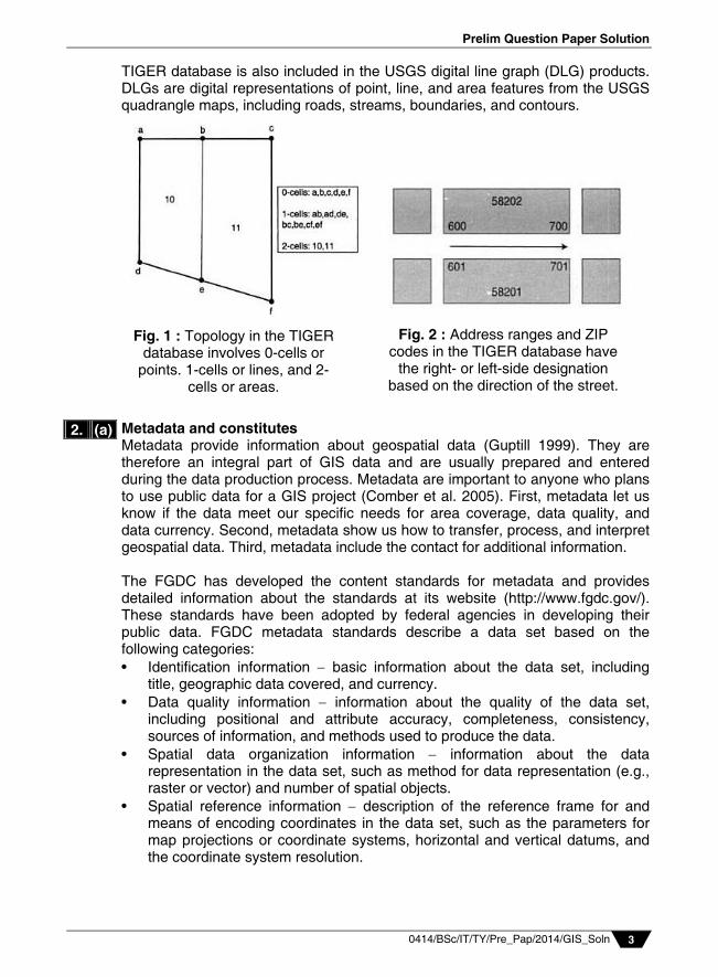
TIGER database is also included in the USGS digital line graph (DLG) products. DLGs are digital representations of point, line, and area features from the USGS quadrangle maps, including roads, streams, boundaries, and contours. Metadata and constitutes Metadata provide information about geospatial data (Guptill 1999). They are therefore an integral part of GIS data and are usually prepared and entered during the data production process. Metadata are important to anyone who plans to use public data for a GIS project (Comber et al. 2005). First, metadata let us know if the data meet our specific needs for area coverage, data quality, and data currency. Second, metadata show us how to transfer, process, and interpret geospatial data. Third, metadata include the contact for additional information. The FGDC has developed the content standards for metadata and provides detailed information about the standards at its website (http://www.fgdc.gov/). These standards have been adopted by federal agencies in developing their public data. FGDC metadata standards describe a data set based on the following categories: • Identification information basic information about the data set, including
title, geographic data covered, and currency. • Data quality information information about the quality of the data set,
including positional and attribute accuracy, completeness, consistency, sources of information, and methods used to produce the data.
• Spatial data organization information information about the data representation in the data set, such as method for data representation (e.g., raster or vector) and number of spatial objects.
• Spatial reference information description of the reference frame for and means of encoding coordinates in the data set, such as the parameters for map projections or coordinate systems, horizontal and vertical datums, and the coordinate system resolution.
2. (a)
Fig. 2 : Address ranges and ZIP codes in the TIGER database have
the right- or left-side designation based on the direction of the street.
Fig. 1 : Topology in the TIGER database involves 0-cells or
points. 1-cells or lines, and 2-cells or areas.
Vidyalankar : T.Y. B.Sc. (IT) GIS
0414/BSc/IT/TY/Pre_Pap/2014/GIS_Soln 4
• Entity and attribute information information about the content of the data set, such as the entity types and their attributes and the domains from which attribute values may be assigned.
• Distribution information information about obtaining the data set. • Metadata reference information information on the currency of the
metadata information and the responsible party. Conversion of Existing Data Public data are delivered in a variety of formats. Unless the data format is compatible with the GIS package in use. we must first convert the data. Data conversion is defined here as a mechanism for converting GIS data from one format to another Data conversion can he easy or difficult: it depends upon the specificity of the data format. Proprietary data formats require special translators for data conversion, whereas neutral or public formats require a GIS package that has translators to work with the formats. Direct Translation Direct translation uses a translator in a GIS package to directly convert geospatial data from one formal to another (Figure1). Direct translation used to be the only method for data conversion before the development of data standards and open GIS. Many users Mill prefer direct translation because it is easier to use than other methods. ArcToolbox in ArcGIS, for example, can translate Arclnfo's interchange files, MGE and Microstation's DGN files. AutoCAD's DXF and DWG files, and Maplnfo files into shapefiles or geodatabases. Likewise, GeoMedia can access and integrate data from ArcGIS. AutoCAD, Maplnfo, MGE, and Microstation. Neutral Format : A neutral format is a public or de facto format for data exchange. For example, DLG is a neutral format originally developed by the USGS for DLG files. The Spatial Data Transfer Standard (SDTS) is a neutral format approved by the Federal Information Processing Standards (FIPS) Program in 1992 (http://mcmcweb.er.usgs .gov/sdts/). Several federal agencies have converted some of their data to SDTS format. They include the USGS, U.S. Army, U.S. Army Corps of Engineers, Census Bureau, and U.S. National Oceanic and Atmospheric Administration. The USGS, for example, has converted many DLG files into SDTS format. These files are sometimes called SDTS/DLG files, GIS vendors such as ESRI. Inc., Intergraph, and Maplnfo provide translators in their software packages for importing SDTS data (Figure 2).
2. (b)
Fig. 1 : The MIF to Shapefile tool in ArcGIS converts a Maplnfo file to a shapefile.
Prelim Question Paper Solution
0414/BSc/IT/TY/Pre_Pap/2014/GIS_Soln 5
In practice, SDTS uses "profiles" to transfer spatial data. Each profile is targeted at a particular type of spatial data. Currently there are five SDTS profiles: • The Topological Vector Profile (TVP) covers DLG, TIGER, and other
topology-based vector data. • The Raster Profile and Extensions (RPE) accommodate DOQ, DEM, and
other raster data. • The Transportation Network Profile (TNP) covers vector data with network
topology. • The Point Profile supports geodetic control point data. • The Computer Aided Design and Drafting Profile (CADD) supports vector-
based CADD data, with or without topology.
USGS 7.5-minute DEMs that can be downloaded online are typically in SDTS format. So are USGS DLG files. Creating an elevation raster from an SDTS raster profile transfer is relatively straightforward. But creating a topology-based vector data set from an SDTS topological vector profile transfer can be challenging because a topological vector profile transfer may contain composite features such as routes and regions in addition to topology. The vector product format (VPF) is a standard format, structure, and organization for large geographic databases that are based on the georelational data model. The National Geospatial-Intelligence Agency (NGA) uses VPF for digital vector products developed at a variety of scales (http://www.nga.mil/). NGA's vector products for drainage systems, transportation, political boundaries, and populated places are also part of the global database that is being developed by the International Steering Committee for Global Mapping (ISCGM) (http://www.iscgm.org/cgi-bin/fswiki/wiki.cgi). Similar to an SDTS topological vector profile, a VPF file may contain composite features of regions and routes. Although a neutral format is typically used for public data from government agencies, it can also be found with "industry standards" in the private sector. A good example is the DXF (drawing interchange file) format of AutoCAD. Another example is the ASCII format. Many GIS packages can import ASCII files, which have point data with x, y-coordinates, into digital data sets.
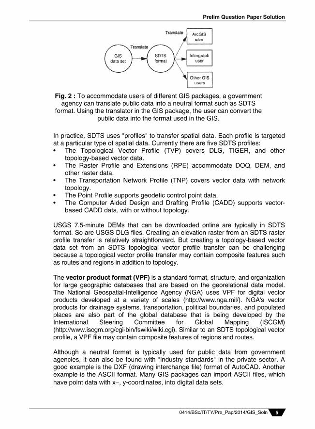
Fig. 2 : To accommodate users of different GIS packages, a government agency can translate public data into a neutral format such as SDTS
format. Using the translator in the GIS package, the user can convert the public data into the format used in the GIS.
Vidyalankar : T.Y. B.Sc. (IT) GIS
0414/BSc/IT/TY/Pre_Pap/2014/GIS_Soln 6
Map-to-Map and Image-to-Map Transformation A newly digitized map, either manually digitized or traced from a scanned file, is based on digitizer units. Digitizer units can be in inches or dots per inch. Geometric transformation converts the newly digitized map into projected coordinates in a process often called map-to-map transformation. Image-to-map transformation applies to remotely sensed data (Jensen 1996; Richards and Jia 1999). The term suggests that the transformation changes the rows and columns (i.e., the image coordinates) of a satellite image into projected coordinates. Another term describing this kind of transformation is georeferencing (Verbyla and Chang 1997; Lillesand et al. 2004). A georeferenced image can register spatially with other feature or raster layers in a GIS database, as long as the coordinate system is the same. Whether map-to-map or image-to-map, a geometric transformation uses a set of control points to establish a mathematical model that relates the map coordinates of one system to another or image coordinates to map coordinates. The use of control points makes the process somewhat uncertain. This is particularly true with image-to-map transformation because control points are selected directly from the original image. Misplacement of the control points can make the transformation result unacceptable. Root Mean Square (RMS) Error The affine transformation uses the coefficients derived from a set of control points to transform a digitized map or a satellite image. The location of a control point on a digitized map or an image is an estimated location and can deviate from its actual location. A common measure of the goodness of the control points is the RMS error, which measures the deviation between the actual (true) and estimated (digitized) locations of the control points. How is an RMS error derived from a digitized map? After the six coefficients have been estimated, we can use the digitized coordinates of the first control point as the inputs (i.e., the x and y values) to Eq. (1) and Eq. (2) and compute the X and Y values, respectively. If the digitized control point were perfectly located, the computed X and Y values would be the same as the control point's real-world coordinates. But this is rarely the case. The deviations between the computed (estimated) X and Y values and the actual coordinates then become errors associated with the first control point on the output. Likewise, to derive errors associated with a control point on the input, we can use the point's real-world coordinates as the inputs and measure the deviations between the computed x and y values and the digitized coordinates. The procedure for deriving RMS errors also applies to GCPs used in an image-to-map transformation. Again, the difference is that columns and rows of a satellite image replace digitized coordinates. Mathematically, the input or output error for a control point is computed by:
2 2act est act est(x x ) + (y y ) (1)
2. (c)
2. (d)
Prelim Question Paper Solution
0414/BSc/IT/TY/Pre_Pap/2014/GIS_Soln 7
where xact, and yact are the x and y values of the actual location, and xest, and yest are the x and y values of the estimated location. The average RMS error can be computed by averaging errors from all control points:
n n
2 2act, i est, i act, i est, i
i = 1 i = 1
(x x ) + (y y ) n
l (2)
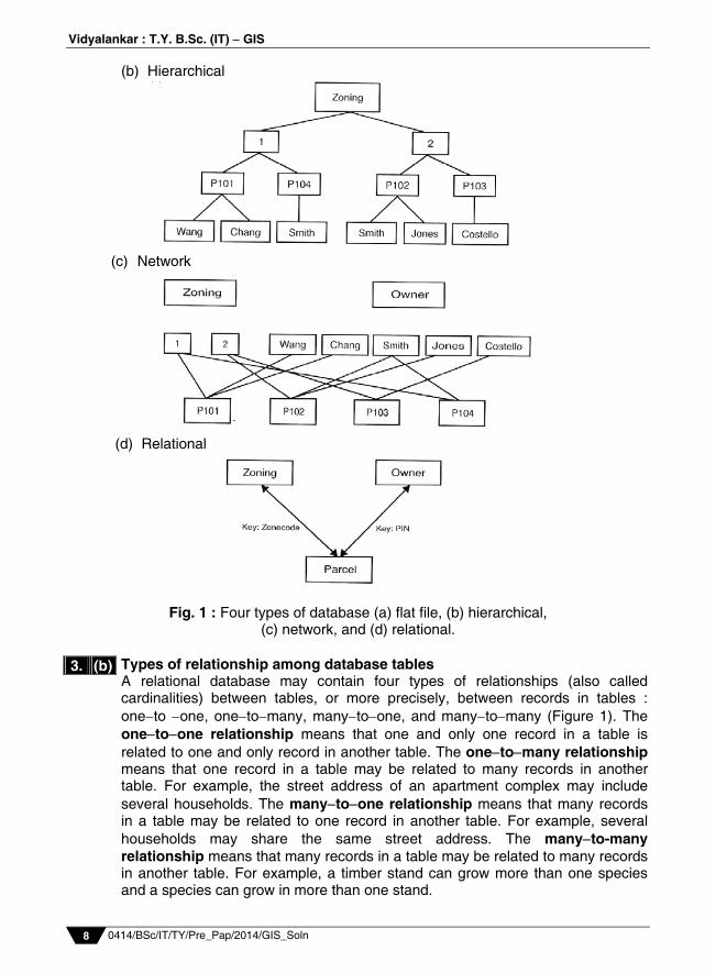
where n is the number of control points, xact, i and yact, i are the x and y values of the actual location of control point i, and xest, i and yest, i are the x and y values of the estimated location of control point i. Relation Model A database is a collection of interrelated tables in digital format. There are at least four types of database designs that have been proposed in the literature: flat file, hierarchical, network, and relational. A flat file contains all data in a large table. A feature attribute table is like a flat file. Another example is a spreadsheet with data only. A hierarchical database organizes its data at different levels and uses only the one-to-many association between levels. The simple example in (Figure 1) shows the hierarchical levels of zoning, parcel, and owner. Based on the one-to-many association, each level is divided into different branches. A network database builds connections across tables, as shown by the linkages between the tables in (Figure 1). A common problem with both the hierarchical and the network database designs is that the linkages (i.e., access paths) between tables must be known in advance and built into the database at design time. This requirement tends to make a complicated and inflexible database and limit the database applications. GIS vendors typically use the relational model for database management. A relational database is a collection of tables, also called relations, which can be connected to each other by keys. A primary key represents one or more attributes whose values can uniquely identify a record in a table. Its counterpart in another table for the purpose of linkage is called a foreign key. Thus a key common to two tables can establish connections between corresponding records in the tables. In, (Figure 1) the key connecting zoning and parcel is the zone code and the key connecting parcel and owner is the PIN (parcel ID number). When used together, the keys can relate zoning and owner. (a) Flat file
PIN Owner ZoningP101 Wang Residential (1)P101 Chang Residential (1)P102 Smith Commercial (2)P102 Jones Commercial (2)P103 Costello Commercial (2)P104 Smith Residential (1)
3. (a)
Vidyalankar : T.Y. B.Sc. (IT) GIS
0414/BSc/IT/TY/Pre_Pap/2014/GIS_Soln 8
(b) Hierarchical
Fig. 1 : Four types of database (a) flat file, (b) hierarchical, (c) network, and (d) relational.
Types of relationship among database tables A relational database may contain four types of relationships (also called cardinalities) between tables, or more precisely, between records in tables : oneto one, onetomany, manytoone, and manytomany (Figure 1). The onetoone relationship means that one and only one record in a table is related to one and only record in another table. The onetomany relationship means that one record in a table may be related to many records in another table. For example, the street address of an apartment complex may include several households. The manytoone relationship means that many records in a table may be related to one record in another table. For example, several households may share the same street address. The manyto-many relationship means that many records in a table may be related to many records in another table. For example, a timber stand can grow more than one species and a species can grow in more than one stand.
3. (b)
(c) Network
(d) Relational
Prelim Question Paper Solution
0414/BSc/IT/TY/Pre_Pap/2014/GIS_Soln 9
Fig. 1 : Four types of data relationships between tables; onetoone,
onetomany, manytoone, and manytomany. Various steps in Attribute Data Entry Field Definition The first step in attribute data entry is to define each held in the table. A field definition usually includes the filed name, data width, data type, and number of decimal digits. The width refers to the number of spaces to lie reserved for a field. The width should be large enough for the largest number, including the sign, or the longest string in the data. The data type must follow data types allowed in the GIS package. The number of decimal digits is part of the definition for the float data type. In ArcGIS, the precision defines the number of digits, and the scale defines the number of decimal digits, for the float data type.
The field definition can be confusing at times. For example, the map unit key in the SSURGO database is defined as text, although it is coded as numbers such as 79522, 79523 and so on. Of course, we cannot perform computations with these map unit key numbers.
3. (c)
Many-to-one relationship
One-to-many relationship
One-to-one relationship
Many-to-many relationship
Vidyalankar : T.Y. B.Sc. (IT) GIS
0414/BSc/IT/TY/Pre_Pap/2014/GIS_Soln 10
Methods of Data Entry Suppose a map has 4000 polygons, each with 50 fields of attribute data. This could require entering 200,000 values. How to reduce time and effort in attribute data entry is of interest to any GIS user. Just as we look for existing spatial data, we should determine if an agency has already entered attribute data in digital format. If yes, we can simply import the digital data file into a GIS. The data format is important for importing. Most GIS packages can import delimited text files and dBASE files as well as data from other database management systems. If attribute data files do not exist, then typing is the only option. But the amount of typing can vary depending on which method or command is used. For example, an editing command in a GIS package works with one record at a time. One way to save time is to follow the relational database design and to take advantage of keys and lookup tables. Attribute Date Verification Attribute data verification has two stops. The first is to make sure that attribute data are properly linked to spatial data: the label or feature ID should be unique and should not contain null (empty) values. The second step is to verify the accuracy of attribute data. Data verification is difficult because inaccuracies can be attributed to a large number of factors including observation errors, outdated data, and data entry errors. There are at least two traditional methods for checking for data entry errors. First, attribute data can be printed for manual verification, This is like using check plots to check the accuracy of spatial data. Second, computer programs can be written to verify data accuracy. For example, a computer program can be written to catch logical errors in soil attribute data such as data type and numeric range. The same program may also test attribute data against a master set of valid attributes to catch logical errors such as having incompatible components in the same soil map unit. Type Variations Type can vary in typeface and form. Typeface refers to the design character of the type. Two main groups of typefaces are serif (with serif) and sans serif (without serif). Serifs are small, finishing touches at the ends of line strokes, which tend to make running text in newspapers and books easier to read. Compared to serif types, sans serif types appear simpler and bolder. Although rarely used in books or other text-intensive materials, a sans serif type stands up well on maps with complex map symbols and remains legible even in small sizes. Sans serif types have an additional advantage in mapmaking because many of them come in a wide range of type variations. Type form variations include type weight (bold, regular, or light), type width (condensed or extended), upright versus slanted (or roman versus italic), and uppercase versus lowercase (Figure 1). A font is a complete set of all variants of a given typeface. Fonts on a computer are those loaded from the printer manufacturer and software packages. They are usually enough for mapping purposes. If necessary, additional fonts can be imported into a GIS package.
3. (d)
Prelim Question Paper Solution
0414/BSc/IT/TY/Pre_Pap/2014/GIS_Soln 11
Selection of Type Variations Type variations for text symbols can function in the same way as visual variables for map symbols. How does one choose type variations for a map? A practical guideline is to group text symbols into qualitative and quantitative classes. Text symbols representing qualitative classes such as names of streams, mountains, parks, and so on can vary in typeface, color, and upright versus italic. In contrast, text symbols representing quantitative classes such as names of different-sized cities can vary in type size, weight, and uppercase versus lowercase. Grouping text symbols into classes simplifies the process of selecting type variations. Besides classification, cartographers also recommend legibility, harmony, and conventions for type selection (Dent 1999). Legibility is difficult to control on a map because it can be influenced not only by type variations but also by the placement of text and the contrast between text and the background symbol. As GIS users, we have the additional problem of having to design a map on a computer monitor and to print it on a larger plot. Experimentation may be the only way to ensure type legibility in all parts of the map. Placement of Text in the Map Body Text elements in the map body, also called labels, are directly associated with the spatial features. In most cases, these labels are names of the spatial features. But they can also be some attribute values such as contour readings or
Helvetica Normal
Helvetica Italic
Helvetica Bold
Helvetica BoldItalic
Times Roman Normal
Times Roman Italic
Times Roman Bold
Times Roman BoldItalic
Fig 1 : Type variations in weight and roman versus italic.
Fig 2 : The look of the map is not harmonious because of too
many typefaces.
Vidyalankar : T.Y. B.Sc. (IT) GIS
0414/BSc/IT/TY/Pre_Pap/2014/GIS_Soln 12
precipitation amounts. Other text elements on a map such as the title and the legend are not tied to any specific locations. Instead, the placement of these text elements (i.e., graphic elements) is related to the layout of the map. As a general rule, a label should be placed to show the location or the area extent of the named spatial feature. Cartographers recommend placing the name of a point feature to the upper right of its symbol, the name of a line feature in a block and parallel to the course of the feature, and the name of an area feature in a manner that indicates its area extent. Other general rules suggest aligning labels with either the map border or lines of latitude, and placing labels entirely on land or on water. 'Data Exploration' with its various aspects Similar to statistics, data exploration in GIS lets the user view the general patterns in the data set, query data subsets, and hypothesize about possible relationships between data sets (Anselin 1999; Andrienko et al. 2001; Haining 2003). But there are two important differences. First, data exploration in a GIS involves both spatial and attribute data. Second, the media for data exploration in GIS include maps and map features. For example, in studying soil conditions, we want to know not only how much of the study area is rated poor but also where those poor soils are distributed on a map. Therefore, besides descriptive statistics and graphics, data exploration in GIS must also cover attribute data query, spatial data query, and map manipulation. Descriptive Statistics Descriptive statistics summarize the values of a data set. They include the following : Range: the difference between the minimum and maximum values. Median: the midpoint value, or the 50th percentile. First quartile: the 25th percentile. Third quartile: the 75th percentile. Mean: the average of data values. The mean can be calculated by
n
ii 1
x n , where xi is the ith value and n is the number of values.
Variance: the average of the squared deviations of each data value about the
mean. The variance can be calculated by n
2i
i 1
x mean n
Standard deviation: the square root of the variance. Z score: a standardized score that can be computed by (x mean)/s, where
s is the standard deviation. Graphs Different types of graphs are used for data exploration. A line graph displays data as a line. The line graph example in figure 1 shows the rate of population change in the United States along the y-axis and the state along the x-axis. Notice a couple of “peaks” in the line graph.
4. (a)
Prelim Question Paper Solution
0414/BSc/IT/TY/Pre_Pap/2014/GIS_Soln 13
A bar chart, also called a histogram, groups data into equal intervals and uses bars to show the number of frequency of values falling within each class. A bar chart may have vertical bars or horizontal bars. Figure 2 uses a vertical bar chart to group rates of population change in the United States into six classes. Notice one bar at the high end of the histogram. A cumulative distribution graph is one type of line graph that plots the ordered data values against the cumulative distribution values. The cumulative distribution value of the ith ordered value is typically calculated as (i 0.5)/n, where n is the number of values. This computational formula converts the values of a data set to within the range of 0.0 to 1.0. Figure 3 show a cumulative distribution graph.
Fig. 2 : A histogram (bar chart)
Fig. 3 : A cumulative distribution graph
Fig. 1 : A line graph
Fig. 4 : A scatterplot plotting percent persons 18 years old in 2000 against percent population
change, 1990-2000. A weak-positive relationship is present
between the two variables.
Fig. 5 : A bubble plot showing percent population change 1990-2000, percent
persons under 18 years old in 2000, and state population in 2000.
Vidyalankar : T.Y. B.Sc. (IT) GIS
0414/BSc/IT/TY/Pre_Pap/2014/GIS_Soln 14
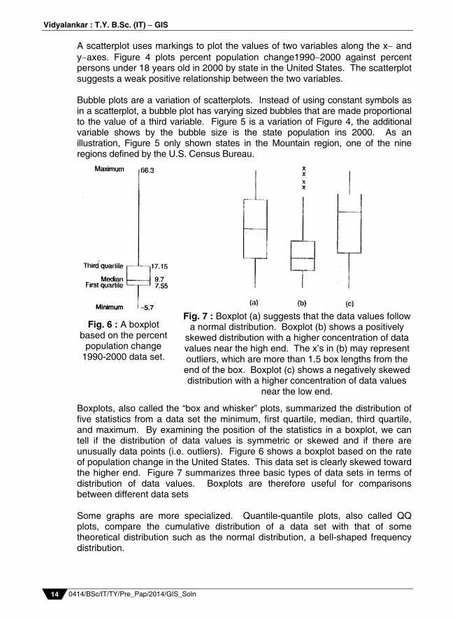
A scatterplot uses markings to plot the values of two variables along the x and yaxes. Figure 4 plots percent population change19902000 against percent persons under 18 years old in 2000 by state in the United States. The scatterplot suggests a weak positive relationship between the two variables. Bubble plots are a variation of scatterplots. Instead of using constant symbols as in a scatterplot, a bubble plot has varying sized bubbles that are made proportional to the value of a third variable. Figure 5 is a variation of Figure 4, the additional variable shows by the bubble size is the state population ins 2000. As an illustration, Figure 5 only shown states in the Mountain region, one of the nine regions defined by the U.S. Census Bureau.
. Boxplots, also called the “box and whisker” plots, summarized the distribution of five statistics from a data set the minimum, first quartile, median, third quartile, and maximum. By examining the position of the statistics in a boxplot, we can tell if the distribution of data values is symmetric or skewed and if there are unusually data points (i.e. outliers). Figure 6 shows a boxplot based on the rate of population change in the United States. This data set is clearly skewed toward the higher end. Figure 7 summarizes three basic types of data sets in terms of distribution of data values. Boxplots are therefore useful for comparisons between different data sets Some graphs are more specialized. Quantile-quantile plots, also called QQ plots, compare the cumulative distribution of a data set with that of some theoretical distribution such as the normal distribution, a bell-shaped frequency distribution.
Fig. 6 : A boxplot based on the percent
population change 1990-2000 data set.
Fig. 7 : Boxplot (a) suggests that the data values follow a normal distribution. Boxplot (b) shows a positively
skewed distribution with a higher concentration of data values near the high end. The x’s in (b) may represent outliers, which are more than 1.5 box lengths from the end of the box. Boxplot (c) shows a negatively skewed distribution with a higher concentration of data values
near the low end.
Prelim Question Paper Solution
0414/BSc/IT/TY/Pre_Pap/2014/GIS_Soln 15
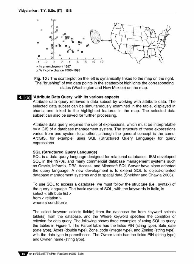
The points in a QQ plot fall along a straight line if the data set follows the theorectical distribution. Figure 8 plots the rate of population change against the standardized value from a normal distribution. It shows that the data set is not normally distributed. The main departure occurs at the two highest values, which are also highlighted in previous graphs. Some graphs are designed for spatial data. Figure 9, for example, shows a plot of spatial data values by raising a bar at each point location so that the height of the bar is proportionate to its value. This kind of plot allows the user to see the general trends among the data values in both the x-dimension (east-west) and y-dimension (north-south). Dynamic Graphics When graphs are displayed in multiple and dynamically linked windows, they become dynamic graphs. We can directly manipulate data points in dynamic graphs. For example, we can pose a query in one windows and get the response in other windows, all in the same visual field. By viewing selected data points highlighted in multiple windows, we can hypothesize any patterns or relationships that may exist in the data. This is why multiple linked views have been described as the optimal framework for posing queries about data (Buja et al. 1996). A common method for manipulating dynamic graphs is brushing, which allows the user to graphically select a subset of points from a scatter plot and views related data points in other graphics (Backer and Cleveland, 1987). Brushing can be extended to maps (Monmonier 1989). Figure 10 illustrates a brushing example that links a scatter plot and a map. May GIS packages including ArcGIS have implemented brushing in the graphical user interface?
Fig. 9 : A 3D plot showing annual precipitation at 105 weather stations in Idaho. A north-to-
south decreasing trend is apparent in the plot.
Fig. 8 : A QQ plot plotting percent population change, 1990-2000 against the standardized value from a normal distribution.
Vidyalankar : T.Y. B.Sc. (IT) GIS
0414/BSc/IT/TY/Pre_Pap/2014/GIS_Soln 16
Fig. 10 : The scatterplot on the left is dynamically linked to the map on the right. The “brushing” of two data points in the scatterplot highlights the corresponding
states (Washington and New Mexico) on the map. 'Attribute Data Query' with its various aspects Attribute data query retrieves a data subset by working with attribute data. The selected data subset can be simultaneously examined in the table, displayed in charts, and linked to the highlighted features in the map. The selected data subset can also be saved for further processing. Attribute data query requires the use of expressions, which must be interpretable by a GIS of a database management system. The structure of these expressions varies from one system to another, although the general concept is the same. ArcGIS, for example, uses SQL (Structured Query Language) for query expressions SQL (Structured Query Language) SQL is a data query language designed for relational databases. IBM developed SQL in the 1970s, and many commercial database management systems such as Oracle. Informix, DB2, Access, and Microsoft SQL Server have since adopted the query language. A new development is to extend SQL to object-oriented database management systems and to spatial data (Shekhar and Chawla 2003). To use SQL to access a database, we must follow the structure (i.e., syntax) of the query language. The basic syntax of SQL, with the keywords in italic, is select < attribute list > from < relation > where < condition > The select keyword selects field(s) from the database the from keyword selects table(s) from the database, and the Where keyword specifies the condition or criterion for data query. The following shows three examples of using SQL to query the tables in Figure 1. The Parcel table has the fields PIN (string type), Sale_date (date type), Acres (double type). Zone_code (integer type), and Zoning (string type), with the data type in parentheses. The Owner table has the fields PIN (string type) and Owner_name (string type).
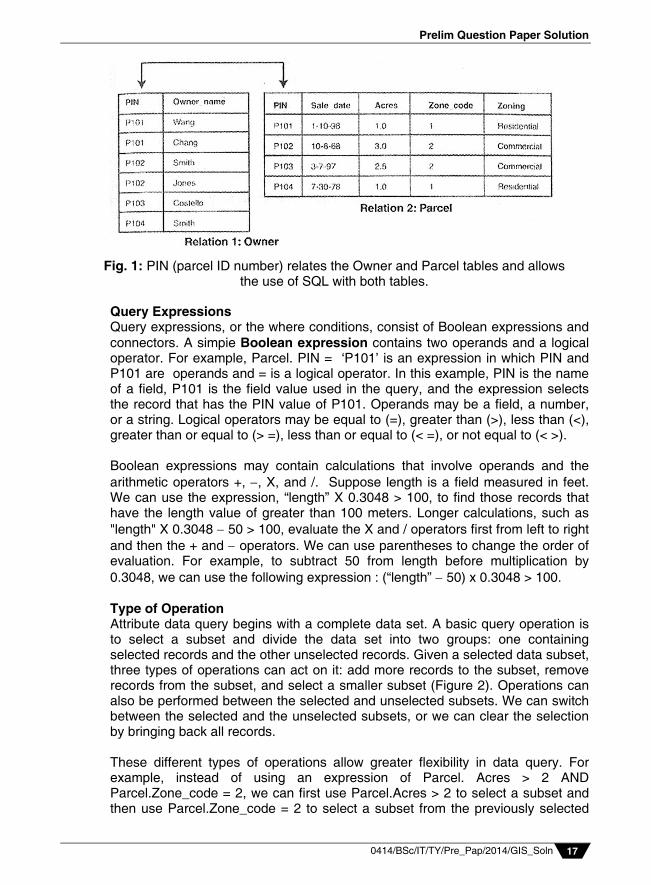
4. (b)
Prelim Question Paper Solution
0414/BSc/IT/TY/Pre_Pap/2014/GIS_Soln 17
Query Expressions Query expressions, or the where conditions, consist of Boolean expressions and connectors. A simpie Boolean expression contains two operands and a logical operator. For example, Parcel. PIN = ‘P101’ is an expression in which PIN and P101 are operands and = is a logical operator. In this example, PIN is the name of a field, P101 is the field value used in the query, and the expression selects the record that has the PIN value of P101. Operands may be a field, a number, or a string. Logical operators may be equal to (=), greater than (>), less than (<), greater than or equal to (> =), less than or equal to (< =), or not equal to (< >). Boolean expressions may contain calculations that involve operands and the arithmetic operators +, , X, and /. Suppose length is a field measured in feet. We can use the expression, “length” X 0.3048 > 100, to find those records that have the length value of greater than 100 meters. Longer calculations, such as "length" X 0.3048 50 > 100, evaluate the X and / operators first from left to right and then the + and operators. We can use parentheses to change the order of evaluation. For example, to subtract 50 from length before multiplication by 0.3048, we can use the following expression : (“length” 50) x 0.3048 > 100. Type of Operation Attribute data query begins with a complete data set. A basic query operation is to select a subset and divide the data set into two groups: one containing selected records and the other unselected records. Given a selected data subset, three types of operations can act on it: add more records to the subset, remove records from the subset, and select a smaller subset (Figure 2). Operations can also be performed between the selected and unselected subsets. We can switch between the selected and the unselected subsets, or we can clear the selection by bringing back all records. These different types of operations allow greater flexibility in data query. For example, instead of using an expression of Parcel. Acres > 2 AND Parcel.Zone_code = 2, we can first use Parcel.Acres > 2 to select a subset and then use Parcel.Zone_code = 2 to select a subset from the previously selected
Fig. 1: PIN (parcel ID number) relates the Owner and Parcel tables and allows the use of SQL with both tables.
Vidyalankar : T.Y. B.Sc. (IT) GIS
0414/BSc/IT/TY/Pre_Pap/2014/GIS_Soln 18
subset. Although this example may be trivial, the combination of query expressions and operations can be quite useful for examining various data subsets in data exploration.
Relational Database Query Relational database query works with a relational database, which may consist of many separate but interrelated tables. A query of a table in a relational database not only selects a data subset in the table but also selects records related to the subset in other tables. This feature is desirable in data exploration because it allows the user to examine related data characteristics from multiple linked tables. To use a relational database, we must be familiar with the overall structure of the database, the designation of keys in relating tables, and a data dictionary listing and describing the fields in each table. For data query involving two or more tables, we can choose to either join or relate the tables. A join operation combines attribute data from two or more tables into a single table. A relate operation dynamically links the tables but keeps the tables separate. When a record in one table is selected, the link will automatically select and highlight the corresponding record or records in the related tables. An important consideration in choosing a join or relate operation is the type of data relationship between tables. A join operation is appropriate for the onetoone or manytoone relationship but inappropriate for the onetomany or manytomany relationship. A relate operation, on the other hand, can be used with all four types of relationships. Table : A Data Set for Query Operation Examples
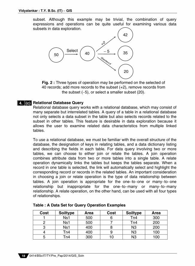
Fig. 2 : Three types of operation may be performed on the selected of 40 records; add more records to the subset (+2), remove records from
the subset (5), or select a smaller subset (20).
Prelim Question Paper Solution
0414/BSc/IT/TY/Pre_Pap/2014/GIS_Soln 19
Geographic Visualization and its various techniques (a) Data Classification :
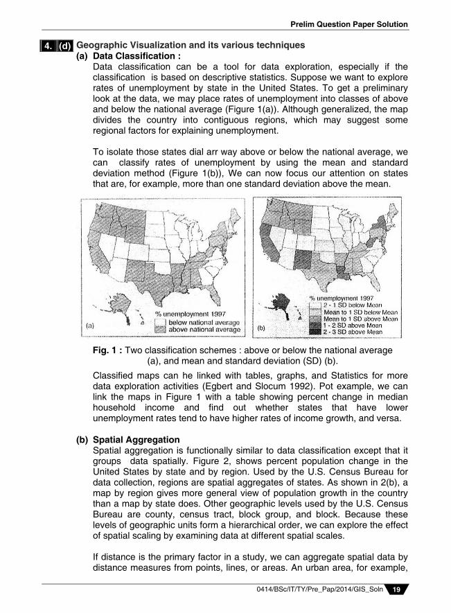
Data classification can be a tool for data exploration, especially if the classification is based on descriptive statistics. Suppose we want to explore rates of unemployment by state in the United States. To get a preliminary look at the data, we may place rates of unemployment into classes of above and below the national average (Figure 1(a)). Although generalized, the map divides the country into contiguous regions, which may suggest some regional factors for explaining unemployment.
To isolate those states dial arr way above or below the national average, we can classify rates of unemployment by using the mean and standard deviation method (Figure 1(b)), We can now focus our attention on states that are, for example, more than one standard deviation above the mean. Classified maps can he linked with tables, graphs, and Statistics for more data exploration activities (Egbert and Slocum 1992). Pot example, we can link the maps in Figure 1 with a table showing percent change in median household income and find out whether states that have lower unemployment rates tend to have higher rates of income growth, and versa.
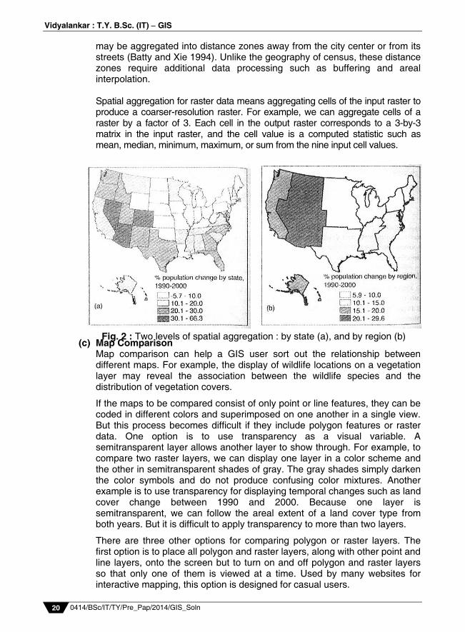
(b) Spatial Aggregation Spatial aggregation is functionally similar to data classification except that it
groups data spatially. Figure 2, shows percent population change in the United States by state and by region. Used by the U.S. Census Bureau for data collection, regions are spatial aggregates of states. As shown in 2(b), a map by region gives more general view of population growth in the country than a map by state does. Other geographic levels used by the U.S. Census Bureau are county, census tract, block group, and block. Because these levels of geographic units form a hierarchical order, we can explore the effect of spatial scaling by examining data at different spatial scales.
If distance is the primary factor in a study, we can aggregate spatial data by
distance measures from points, lines, or areas. An urban area, for example,
4. (d)
Fig. 1 : Two classification schemes : above or below the national average (a), and mean and standard deviation (SD) (b).
Vidyalankar : T.Y. B.Sc. (IT) GIS
0414/BSc/IT/TY/Pre_Pap/2014/GIS_Soln 20
may be aggregated into distance zones away from the city center or from its streets (Batty and Xie 1994). Unlike the geography of census, these distance zones require additional data processing such as buffering and areal interpolation.
Spatial aggregation for raster data means aggregating cells of the input raster to
produce a coarser-resolution raster. For example, we can aggregate cells of a raster by a factor of 3. Each cell in the output raster corresponds to a 3-by-3 matrix in the input raster, and the cell value is a computed statistic such as mean, median, minimum, maximum, or sum from the nine input cell values.
(c) Map Comparison Map comparison can help a GIS user sort out the relationship between
different maps. For example, the display of wildlife locations on a vegetation layer may reveal the association between the wildlife species and the distribution of vegetation covers.
If the maps to be compared consist of only point or line features, they can be coded in different colors and superimposed on one another in a single view. But this process becomes difficult if they include polygon features or raster data. One option is to use transparency as a visual variable. A semitransparent layer allows another layer to show through. For example, to compare two raster layers, we can display one layer in a color scheme and the other in semitransparent shades of gray. The gray shades simply darken the color symbols and do not produce confusing color mixtures. Another example is to use transparency for displaying temporal changes such as land cover change between 1990 and 2000. Because one layer is semitransparent, we can follow the areal extent of a land cover type from both years. But it is difficult to apply transparency to more than two layers.
There are three other options for comparing polygon or raster layers. The first option is to place all polygon and raster layers, along with other point and line layers, onto the screen but to turn on and off polygon and raster layers so that only one of them is viewed at a time. Used by many websites for interactive mapping, this option is designed for casual users.
Fig. 2 : Two levels of spatial aggregation : by state (a), and by region (b)
Prelim Question Paper Solution
0414/BSc/IT/TY/Pre_Pap/2014/GIS_Soln 21
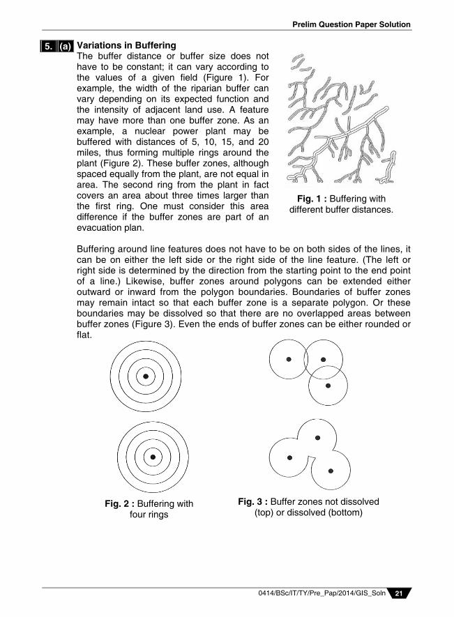
Variations in Buffering The buffer distance or buffer size does not have to be constant; it can vary according to the values of a given field (Figure 1). For example, the width of the riparian buffer can vary depending on its expected function and the intensity of adjacent land use. A feature may have more than one buffer zone. As an example, a nuclear power plant may be buffered with distances of 5, 10, 15, and 20 miles, thus forming multiple rings around the plant (Figure 2). These buffer zones, although spaced equally from the plant, are not equal in area. The second ring from the plant in fact covers an area about three times larger than the first ring. One must consider this area difference if the buffer zones are part of an evacuation plan. Buffering around line features does not have to be on both sides of the lines, it can be on either the left side or the right side of the line feature. (The left or right side is determined by the direction from the starting point to the end point of a line.) Likewise, buffer zones around polygons can be extended either outward or inward from the polygon boundaries. Boundaries of buffer zones may remain intact so that each buffer zone is a separate polygon. Or these boundaries may be dissolved so that there are no overlapped areas between buffer zones (Figure 3). Even the ends of buffer zones can be either rounded or flat.
5. (a)
Fig. 2 : Buffering with four rings
Fig. 3 : Buffer zones not dissolved (top) or dissolved (bottom)
Fig. 1 : Buffering with different buffer distances.
Vidyalankar : T.Y. B.Sc. (IT) GIS
0414/BSc/IT/TY/Pre_Pap/2014/GIS_Soln 22
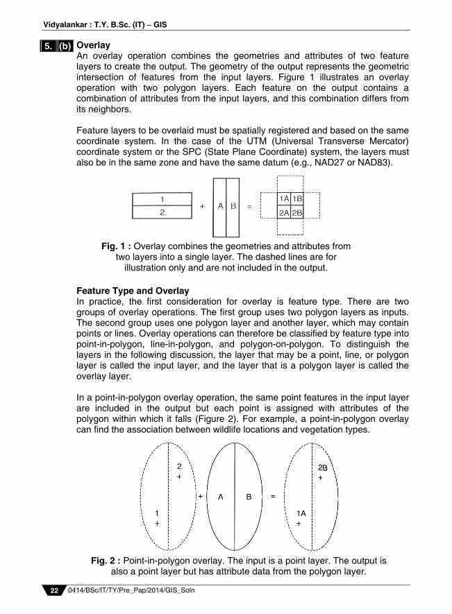
Overlay An overlay operation combines the geometries and attributes of two feature layers to create the output. The geometry of the output represents the geometric intersection of features from the input layers. Figure 1 illustrates an overlay operation with two polygon layers. Each feature on the output contains a combination of attributes from the input layers, and this combination differs from its neighbors. Feature layers to be overlaid must be spatially registered and based on the same coordinate system. In the case of the UTM (Universal Transverse Mercator) coordinate system or the SPC (State Plane Coordinate) system, the layers must also be in the same zone and have the same datum (e.g., NAD27 or NAD83). Feature Type and Overlay In practice, the first consideration for overlay is feature type. There are two groups of overlay operations. The first group uses two polygon layers as inputs. The second group uses one polygon layer and another layer, which may contain points or lines. Overlay operations can therefore be classified by feature type into point-in-polygon, line-in-polygon, and polygon-on-polygon. To distinguish the layers in the following discussion, the layer that may be a point, line, or polygon layer is called the input layer, and the layer that is a polygon layer is called the overlay layer. In a point-in-polygon overlay operation, the same point features in the input layer are included in the output but each point is assigned with attributes of the polygon within which it falls (Figure 2). For example, a point-in-polygon overlay can find the association between wildlife locations and vegetation types.
5. (b)
Fig. 1 : Overlay combines the geometries and attributes from two layers into a single layer. The dashed lines are for
illustration only and are not included in the output.
Fig. 2 : Point-in-polygon overlay. The input is a point layer. The output is also a point layer but has attribute data from the polygon layer.
Prelim Question Paper Solution
0414/BSc/IT/TY/Pre_Pap/2014/GIS_Soln 23
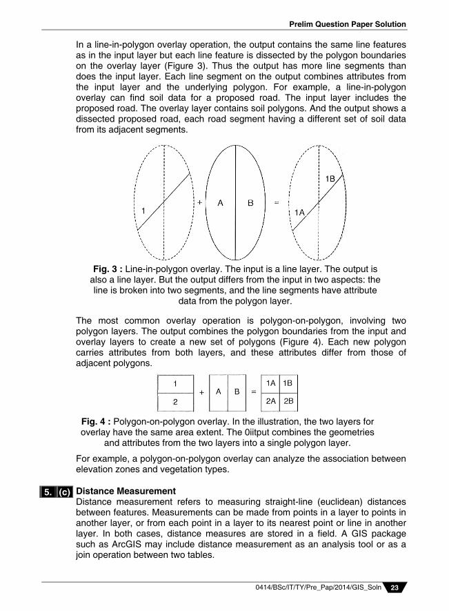
In a line-in-polygon overlay operation, the output contains the same line features as in the input layer but each line feature is dissected by the polygon boundaries on the overlay layer (Figure 3). Thus the output has more line segments than does the input layer. Each line segment on the output combines attributes from the input layer and the underlying polygon. For example, a line-in-polygon overlay can find soil data for a proposed road. The input layer includes the proposed road. The overlay layer contains soil polygons. And the output shows a dissected proposed road, each road segment having a different set of soil data from its adjacent segments. The most common overlay operation is polygon-on-polygon, involving two polygon layers. The output combines the polygon boundaries from the input and overlay layers to create a new set of polygons (Figure 4). Each new polygon carries attributes from both layers, and these attributes differ from those of adjacent polygons. For example, a polygon-on-polygon overlay can analyze the association between elevation zones and vegetation types.
Distance Measurement Distance measurement refers to measuring straight-line (euclidean) distances between features. Measurements can be made from points in a layer to points in another layer, or from each point in a layer to its nearest point or line in another layer. In both cases, distance measures are stored in a field. A GIS package such as ArcGIS may include distance measurement as an analysis tool or as a join operation between two tables.
5. (c)
Fig. 4 : Polygon-on-polygon overlay. In the illustration, the two layers for overlay have the same area extent. The 0iitput combines the geometries
and attributes from the two layers into a single polygon layer.
Fig. 3 : Line-in-polygon overlay. The input is a line layer. The output is also a line layer. But the output differs from the input in two aspects: the line is broken into two segments, and the line segments have attribute
data from the polygon layer.
Vidyalankar : T.Y. B.Sc. (IT) GIS
0414/BSc/IT/TY/Pre_Pap/2014/GIS_Soln 24
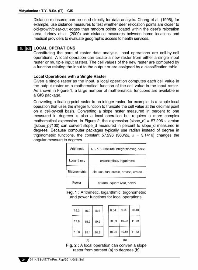
Distance measures can be used directly for data analysis. Chang et al. (1995), for example, use distance measures to test whether deer relocation points are closer to old-growth/clear-cut edges than random points located within the deer's relocation area, fortney et al. (2000) use distance measures between home locations and medical providers to evaluate geographic access to health services. LOCAL OPERATIONS Constituting the core of raster data analysis, local operations are cell-by-cell operations. A local operation can create a new raster from either a single input raster or multiple input rasters. The cell values of the new raster are computed by a function relating the input to the output or are assigned by a classification table. Local Operations with a Single Raster Given a single raster as the input, a local operation computes each cell value in the output raster as a mathematical function of the cell value in the input raster. As shown in Figure 1, a large number of mathematical functions are available in a GIS package.
Converting a floating-point raster to an integer raster, for example, is a simple local operation that uses the integer function to truncate the cell value at the decimal point on a cell-by-cell basis. Converting a slope raster measured in percent to one measured in degrees is also a local operation but requires a more complex mathematical expression. In Figure 2, the expression [slope_d] = 57.296 arctan ([slope_p]/100) can convert slope_d measured in percent to slope_d measured in degrees. Because computer packages typically use radian instead of degree in trigonometric functions, the constant 57.296 (360/2, = 3.1416) changes the angular measure to degrees.
Fig. 1 : Arithmetic, logarithmic, trigonometric
and power functions for local operations.
Fig. 2 : A local operation can convert a slope
raster from percent (a) to degrees (b)
5. (d)
Prelim Question Paper Solution
0414/BSc/IT/TY/Pre_Pap/2014/GIS_Soln 25
Reclassification A local operation, reclassification creates a new raster by classification. Reclassification is also referred to as recoding, or transforming, through lookup tables (Tomlin 1990). Two reclassification methods may be used. The first method is a one-to-one change, meaning that a cell value in the input raster is assigned a new value in the output raster. For example, irrigated cropland in a land-use raster is assigned a value of 1 in the output raster. The second method assigns a new value to a range of cell values in the input raster. For example, cells with population densities between 0 and 25 persons per square mile in a population density raster are assigned a value of 1 in the output raster and so on. An integer raster can be reclassified by either method, but a floating-point raster can only be reclassified by the second method.
Reclassification serves three main purposes. First, reclassification can create a simplified raster. For example, instead of having continuous slope values, a raster can have 1 for slopes of 0 to 10%, 2 for 10 to 20%, and so on. Second, reclassification can create a new raster that contains a unique category or value such as irrigated cropland or slopes of 10 to 20%. Third, reclassification can create a new raster that shows the ranking of cell values in the input raster. For example, a reclassified raster can show the ranking of 1 to 5, with 1 being least suitable and 5 being most suitable.
Local Operations with Multiple Rasters Local operations with multiple rasters are also referred to as compositing, overlaying, or superimposing maps (Tomlin 1990). Another common term for local operations with multiple input rasters is map algebra, a term that refers to algebraic operations with raster map layers Tomlin 1990; Pullar 2001). Because local operations can work with multiple rasters, they are the equivalent of vector-based overlay operations.
A greater variety of local operations have multiple input rasters than have a single input raster. Besides mathematical functions that can be used on individual rasters, other measures that are based on the cell values or their frequencies in the input rasters can also be derived and stored on the output raster. Some of these measures are, however, limited to rasters with numeric data.
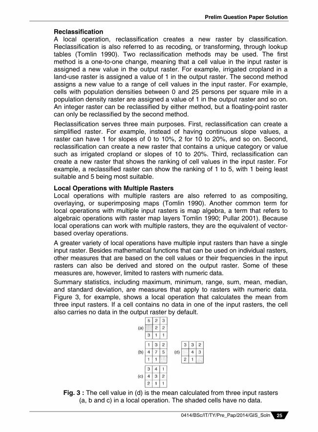
Summary statistics, including maximum, minimum, range, sum, mean, median, and standard deviation, are measures that apply to rasters with numeric data. Figure 3, for example, shows a local operation that calculates the mean from three input rasters. If a cell contains no data in one of the input rasters, the cell also carries no data in the output raster by default.
Fig. 3 : The cell value in (d) is the mean calculated from three input rasters
(a, b and c) in a local operation. The shaded cells have no data.
Vidyalankar : T.Y. B.Sc. (IT) GIS
0414/BSc/IT/TY/Pre_Pap/2014/GIS_Soln 26
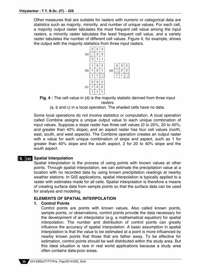
Other measures that are suitable for rasters with numeric or categorical data are statistics such as majority, minority, and number of unique values. For each cell, a majority output raster tabulates the most frequent cell value among the input rasters, a minority raster tabulates the least frequent cell value, and a variety raster tabulates the number of different cell values. Figure 4, for example, shows the output with the majority statistics from three input rasters.
Fig. 4 : The cell value in (d) is the majority statistic derived from three input
rasters (a, b and c) in a local operation. The shaded cells have no data.
Some local operations do not involve statistics or computation. A local operation called Combine assigns a unique output value to each unique combination of input values. Suppose a slope raster has three cell values (0 to 20%, 20 to 40%, and greater than 40% slope), and an aspect raster has four cell values (north, east, south, and west aspects). The Combine operation creates an output raster with a value for each unique combination of slope and aspect, such as 1 for greater than 40% slope and the south aspect, 2 for 20 to 40% slope and the south aspect. Spatial Interpolation Spatial interpolation is the process of using points with known values at other points. Through spatial interpolation, we can estimate the precipitation value at a location with no recorded data by using known precipitation readings at nearby weather stations. In GIS applications, spatial interpolation is typically applied to a raster with estimates made for all cells. Spatial interpolation is therefore a means of creating surface data from sample points so that the surface data can be used for analysis and modeling.
ELEMENTS OF SPATIAL INTERPOLATION 1. Control Points Control points are points with known values. Also called known points,
sample points, or observations, control points provide the data necessary for the development of an interpolator (e.g. a mathematical equation) for spatial interpolation. The number and distribution of control points can greatly influence the accuracy of spatial interpolation. A basic assumption in spatial interpolation is that the value to be estimated at a point is more influenced by nearby known points that those that are father away. To be effective for estimation, control points should be well distributed within the study area. But this ideal situation is rare in real world applications because a study area often contains data-poor areas.
6. (a)
Prelim Question Paper Solution
0414/BSc/IT/TY/Pre_Pap/2014/GIS_Soln 27
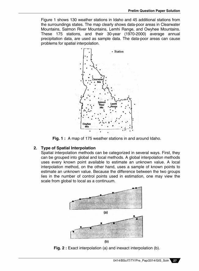
Figure 1 shows 130 weather stations in Idaho and 45 additional stations from the surroundings states. The map clearly shows data-poor areas in Clearwater Mountains, Salmon River Mountains, Lemhi Range, and Owyhee Mountains. These 175 stations, and their 30-year (1970-2000) average annual precipitation data, are used as sample data. The data-poor areas can cause problems for spatial interpolation.
Fig. 1 : A map of 175 weather stations in and around Idaho.
2. Type of Spatial Interpolation Spatial interpolation methods can be categorized in several ways. First, they
can be grouped into global and local methods. A global interpolation methods uses every known point available to estimate an unknown value. A local interpolation method, on the other hand, uses a sample of known points to estimate an unknown value. Because the difference between the two groups lies in the number of control points used in estimation, one may view the scale from global to local as a continuum.
Fig. 2 : Exact interpolation (a) and inexact interpolation (b).
Vidyalankar : T.Y. B.Sc. (IT) GIS
0414/BSc/IT/TY/Pre_Pap/2014/GIS_Soln 28
Conceptually, a global interpolation method is designed to capture the general trend of the surface and a local interpolation method the local or short-range variation. For many phenomena, it is more efficient to estimate the unknown value at a point using a local method than a global method.
Faraway points have little influence on the estimated value; in some cases,
they may even distort the estimated value. A local method is also preferred because it requires much less computation than a global method does.
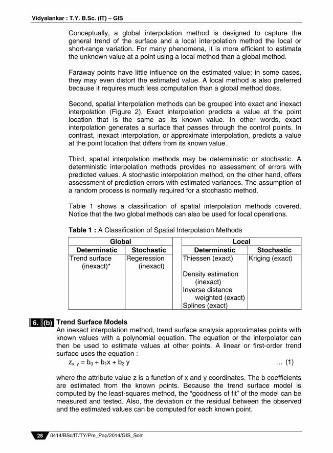
Second, spatial interpolation methods can be grouped into exact and inexact
interpolation (Figure 2). Exact interpolation predicts a value at the point location that is the same as its known value. In other words, exact interpolation generates a surface that passes through the control points. In contrast, inexact interpolation, or approximate interpolation, predicts a value at the point location that differs from its known value.
Third, spatial interpolation methods may be deterministic or stochastic. A
deterministic interpolation methods provides no assessment of errors with predicted values. A stochastic interpolation method, on the other hand, offers assessment of prediction errors with estimated variances. The assumption of a random process is normally required for a stochastic method.
Table 1 shows a classification of spatial interpolation methods covered.
Notice that the two global methods can also be used for local operations. Table 1 : A Classification of Spatial Interpolation Methods
Global LocalDeterminstic Stochastic Determinstic Stochastic
Trend surface (inexact)*
Regeression (inexact)
Thiessen (exact)
Kriging (exact)
Density estimation (inexact)
Inverse distance weighted (exact)
Splines (exact) Trend Surface Models An inexact interpolation method, trend surface analysis approximates points with known values with a polynomial equation. The equation or the interpolator can then be used to estimate values at other points. A linear or first-order trend surface uses the equation : zx, y = b0 + b1x + b2 y (1) where the attribute value z is a function of x and y coordinates. The b coefficients are estimated from the known points. Because the trend surface model is computed by the least-squares method, the “goodness of fit” of the model can be measured and tested. Also, the deviation or the residual between the observed and the estimated values can be computed for each known point.
6. (b)
Prelim Question Paper Solution
0414/BSc/IT/TY/Pre_Pap/2014/GIS_Soln 29
The distribution of most natural phenomena is usually more complex than an inclined plane surface from a first model. Higher-order trend surface models are required to approximate more complex surfaces. A cubic or a third-order model, for example, includes hills and valleys. A cubic trend surface is based on the equation : Zx, y = b0 + b1x + b2y + b3x
2 + b4xy + b5y2 + b6x
3 + b7x2y + b8xy2 + b9y
3 (2)
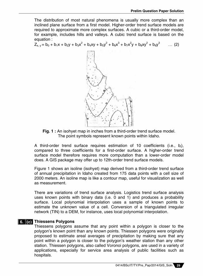
Fig. 1 : An isohyet map in inches from a third-order trend surface model.
The point symbols represent known points within Idaho.
A third-order trend surface requires estimation of 10 coefficients (i.e., bi), compared to three coefficients for a first-order surface. A higher-order trend surface model therefore requires more computation than a lower-order model does. A GIS package may offer up to 12th-order trend surface models. Figure 1 shows an isoline (isohyet) map derived from a third-order trend surface of annual precipitation in Idaho created from 175 data points with a cell size of 2000 meters. An isoline map is like a contour map, useful for visualization as well as measurement. There are variations of trend surface analysis. Logistics trend surface analysis uses known points with binary data (i.e. 0 and 1) and produces a probability surface. Local polynomial interpolation uses a sample of known points to estimate the unknown value of a cell. Conversion of a triangulated irregular network (TIN) to a DEM, for instance, uses local polynomial interpolation. Thiessens Polygons Thiessens polygons assume that any point within a polygon is closer to the polygon’s known point than any known points. Thiessen polygons were originally proposed to estimate areal averages of precipitation by making sure that any point within a polygon is closer to the polygon’s weather station than any other station. Thiessen polygons, also called Voronoi polygons, are used in a variety of applications, especially for service area analysis of public facilities such as hospitals.
6. (c)
Vidyalankar : T.Y. B.Sc. (IT) GIS
0414/BSc/IT/TY/Pre_Pap/2014/GIS_Soln 30
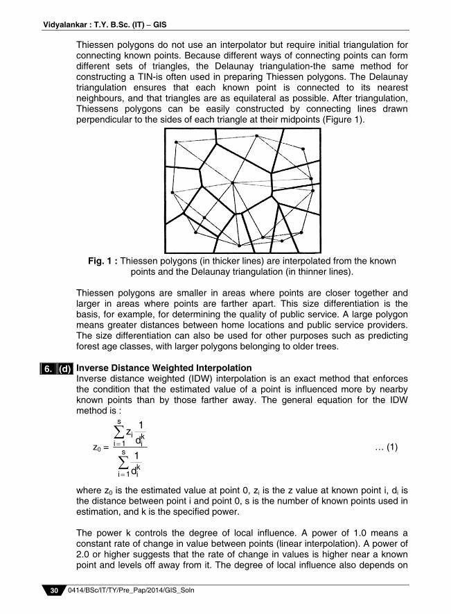
Thiessen polygons do not use an interpolator but require initial triangulation for connecting known points. Because different ways of connecting points can form different sets of triangles, the Delaunay triangulation-the same method for constructing a TIN-is often used in preparing Thiessen polygons. The Delaunay triangulation ensures that each known point is connected to its nearest neighbours, and that triangles are as equilateral as possible. After triangulation, Thiessens polygons can be easily constructed by connecting lines drawn perpendicular to the sides of each triangle at their midpoints (Figure 1).
Fig. 1 : Thiessen polygons (in thicker lines) are interpolated from the known
points and the Delaunay triangulation (in thinner lines). Thiessen polygons are smaller in areas where points are closer together and larger in areas where points are farther apart. This size differentiation is the basis, for example, for determining the quality of public service. A large polygon means greater distances between home locations and public service providers. The size differentiation can also be used for other purposes such as predicting forest age classes, with larger polygons belonging to older trees. Inverse Distance Weighted Interpolation Inverse distance weighted (IDW) interpolation is an exact method that enforces the condition that the estimated value of a point is influenced more by nearby known points than by those farther away. The general equation for the IDW method is :
z0 =
s
i ki 1 i
s
ki 1 i
1zd1
d
… (1)
where z0 is the estimated value at point 0, zi is the z value at known point i, di is the distance between point i and point 0, s is the number of known points used in estimation, and k is the specified power. The power k controls the degree of local influence. A power of 1.0 means a constant rate of change in value between points (linear interpolation). A power of 2.0 or higher suggests that the rate of change in values is higher near a known point and levels off away from it. The degree of local influence also depends on
6. (d)
Prelim Question Paper Solution
0414/BSc/IT/TY/Pre_Pap/2014/GIS_Soln 31
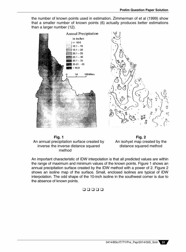
the number of known points used in estimation. Zimmerman of et al (1999) show that a smaller number of known points (6) actually produces better estimations than a larger number (12).
Fig. 1 Fig. 2
An annual precipitation surface created by An isohyet map created by the inverse the inverse distance squared distance squared method
method An important characteristic of IDW interpolation is that all predicted values are within the range of maximum and minimum values of the known points. Figure 1 shows an annual precipitation surface created by the IDW method with a power of 2. Figure 2 shows an isoline map of the surface. Small, enclosed isolines are typical of IDW interpolation. The odd shape of the 10-inch isoline in the southwest corner is due to the absence of known points.