25
Visual Identity Manual Version 2 - January 2009 - English A member of Compass Group PLC
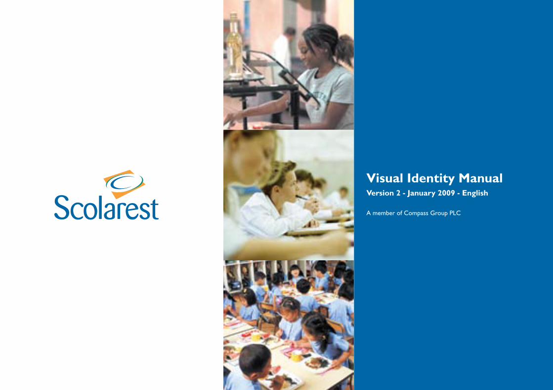
Visual Identity ManualVersion 2 - January 2009 - English
A member of Compass Group PLC
Version 2 - January 2009 - English Contents
Introducing the brand
1 Introduction
1.1 Introduction
1.2 Vision
1.3 Contacts
Brand Elements
2 Basic Elements
2.1 Logos
2.2 Logo rules
2.3 Logo – strapline uses
2.4 Colours
2.5 Typography
2.6 Using endorsements
2.7 Paper
Applications
3 Stationery
3.1 A4 letterhead
3.2 Business card and compliments slip
3.3 Fax header and memo
3.4 Address label and envelope
4 Literature
4.1 Literature covers
4.2 Literature layouts
4.3 Folders and flyers
5 Advertising
5.1 Corporate advertising and sponsorship
5.2 Recruitment advertising
6 Presentations
6.1 Presentation slides
6.2 Internet and intranet
7 Branding
7.1 Signage
7.2 Branded items
IntroductionContents Basic elements Stationery Literature Advertising Presentations Branding
Version 2 - January 2009 - English
Welcome to the visual identity manual for Scolarest.
The manual provides guidance on the way in which the Scolarest identity is used and interpreted in various communications materials.
Visual presentation is an essential element of our service. Through consistent but creative use, the identity fully reflects the Scolarest brand values.
For further information or any other requirements, contact Group Market Development (see Contacts page for details).
All measurements in this document are in millimetres (mm).
Introduction 1.1
IntroductionContents Basic elements Stationery Literature Advertising Presentations Branding
Introduction

Version 2 - January 2009 - English
Our vision is:
‘ To be the most highly regarded, quality company in our market sector.’
Scolarest is dedicated to nurturing a happy, safe and healthy lifestyle, contributing to a sustainable world.
Introduction 1.2
IntroductionContents Basic elements Stationery Literature Advertising Presentations Branding
Vision
Version 2 - January 2009 - English
Logos, templates and brand guidelines which are most regularly used are available for download from Mercury, the Compass Group Intranet site. If you have any queries or questions about this manual and the brand identity elements, please contact Group Market Development in Chertsey, UK. Group Market Development Compass Group PLC Compass House Guildford Street Chertsey Surrey KT16 9BQ Tel: +44 (0)1932 573134 Fax: +44 (0)1932 573174 Email: [email protected]
Only for information on internal communications and guidance on intranet or internet, please contact Group Internal Communications in Chertsey, UK.
Email: [email protected]
Introduction 1.3
IntroductionContents Basic elements Stationery Literature Advertising Presentations Branding
Contacts
Version 2 - January 2009 - English Basic Elements 2.1
Logos
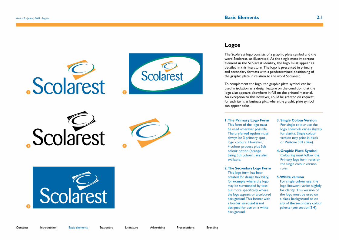
The Scolarest logo consists of a graphic plate symbol and the word Scolarest, as illustrated. As the single most important element in the Scolarest identity, the logo must appear as detailed in this literature. The logo is presented in primary and secondary formats with a predetermined positioning of the graphic plate in relation to the word Scolarest.
To complement the logo, the graphic plate symbol can be used in isolation as a design feature on the condition that the logo also appears elsewhere in full on the printed material. An exception to this however, could be granted on request, for such items as business gifts, where the graphic plate symbol can appear solus.
1. The Primary Logo Form This form of the logo must be used wherever possible. The preferred option must always be 3 primary spot logo colours. However, 4 colour process plus 5th colour option (orange being 5th colour), are also available.
2. The Secondary Logo Form This logo form has been created for design flexibility, for example where the logo may be surrounded by text but more specifically where the logo appears on a coloured background. This format with a border surround is not designed for use on a white background.
3. Single Colour Version For single colour use the logo linework varies slightly for clarity. Single colour version may print in black or Pantone 301 (Blue).
4. Graphic Plate Symbol Colouring must follow the Primary logo form rules or the single colour version rules.
5. White version For single colour use, the logo linework varies slightly for clarity. This version of the logo must be used on a black background or on any of the secondary colour palette (see section 2.4).
1
3
5
2
4
IntroductionContents Basic elements Stationery Literature Advertising Presentations Branding
Version 2 - January 2009 - English Basic Elements 2.2
Logo rules
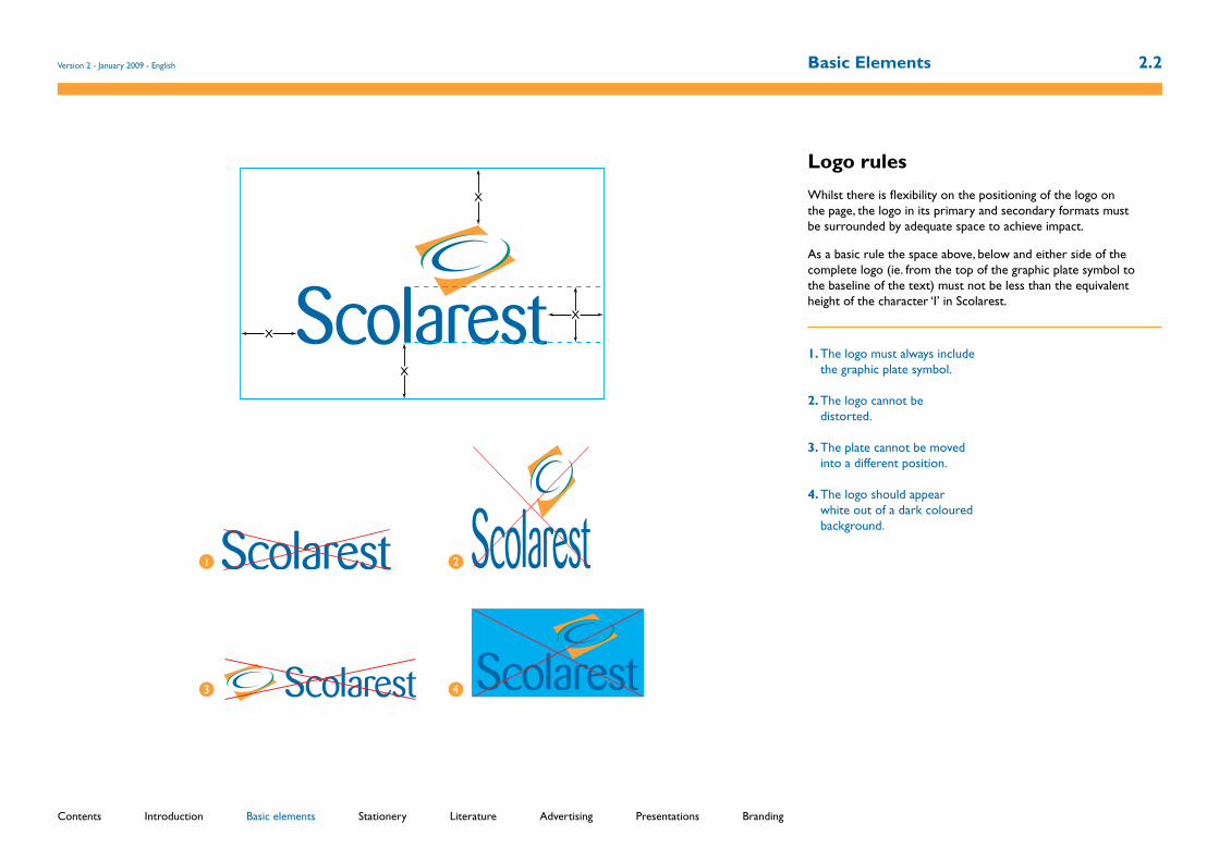
Whilst there is flexibility on the positioning of the logo on the page, the logo in its primary and secondary formats must be surrounded by adequate space to achieve impact.
As a basic rule the space above, below and either side of the complete logo (ie. from the top of the graphic plate symbol to the baseline of the text) must not be less than the equivalent height of the character ‘I’ in Scolarest.
IntroductionContents Basic elements Stationery Literature Advertising Presentations Branding
1. The logo must always include the graphic plate symbol.
2. The logo cannot be distorted.
3. The plate cannot be moved into a different position.
4. The logo should appear white out of a dark coloured background.
1
3
2
4

Version 2 - January 2009 - English Basic Elements 2.3
Logo – strapline uses
The strapline, an example of which is illustrated opposite can appear either reversed out of Scolarest Blue (Pantone 301) or on a white background, in Scolarest Blue. The strapline should be positioned under, and to the full width of the word ‘Scolarest’, as illustrated.
A descriptor may be required, to position Scolarest within, for example, a sub-sector of the market such as universities. The descriptor must be positioned as illustrated, but cannot be introduced without prior discussion and agreement with Group Market Development.
If both a strapline and a descriptor are required, the strapline should be positioned underneath the descriptor.
IntroductionContents Basic elements Stationery Literature Advertising Presentations Branding
The strapline
Descriptor
Example Straplines
Example Only
E D U C AT I O N A L F O O D S E RV I C E F RO M E U R E S T
E D U C AT I O N A L F O O D S E RV I C E F RO M E U R E S T
University Foodservice
If a strapline and/or a descriptor is required, this must appear in 7.5pt upper and lower case, and line up with the character ‘t’ in Scolarest.

Version 2 - January 2009 - English Basic Elements 2.4
Colours
Primary colours The primary colour palette is used for logos and typography and forms the main colour scheme for all communications.
Secondary colours The secondary colours may be used as a background to a ‘white out’ Scolarest logo but must never substitute any of the designated corporate colours within the logo.
Scolarest BlueIn lieu use PANTONE® 301 Scolarest GreenIn lieu use PANTONE® 3288 Scolarest OchreIn lieu use PANTONE® 151
Scolarest GreyIn lieu use PANTONE® 430 Scolarest Ice BlueIn lieu use PANTONE® 277 Scolarest RedIn lieu use PANTONE® 485 Scolarest YellowIn lieu use PANTONE® 109 Scolarest VioletIn lieu use PANTONE® 2597 Scolarest Leaf GreenIn lieu use PANTONE® 554
Scolarest Blue
Cyan 100%Magenta 43%Yellow 0%Black 18%
Scolarest Green
Cyan 100%Magenta 0%Yellow 56%Black 18%
Scolarest Ochre
Cyan 0%Magenta 43%Yellow 87%Black 0%
Scolarest Grey
Cyan 5%Magenta 0%Yellow 0%Black 45%
Scolarest Yellow
Cyan 0%Magenta 10%Yellow 100%Black 0%
Scolarest Ice Blue
Cyan 27%Magenta 7%Yellow 0%Black 0%
Scolarest Violet
Cyan 85%Magenta 100%Yellow 0%Black 0%
Scolarest Red
Cyan 0%Magenta 95%Yellow 100%Black 0%
Scolarest Leaf Green
Cyan 78%Magenta 0%Yellow 63%Black 67%
IntroductionContents Basic elements Stationery Literature Advertising Presentations Branding
Primary colours
Secondary colours
Version 2 - January 2009 - English Basic Elements 2.5
Typography
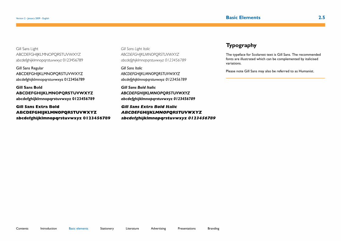
The typeface for Scolarest text is Gill Sans. The recommended fonts are illustrated which can be complemented by italicised variations.
Please note Gill Sans may also be referred to as Humanist.
Gill Sans Light ABCDEFGHIJKLMNOPQRSTUVWXYZ abcdefghijklmnopqrstuvwxyz 0123456789
Gill Sans Regular ABCDEFGHIJKLMNOPQRSTUVWXYZ abcdefghijklmnopqrstuvwxyz 0123456789
Gill Sans Bold ABCDEFGHIJKLMNOPQRSTUVWXYZ abcdefghijklmnopqrstuvwxyz 0123456789
Gill Sans Extra Bold ABCDEFGHIJKLMNOPQRSTUVWXYZ abcdefghijklmnopqrstuvwxyz 0123456789
Gill Sans Light Italic ABCDEFGHIJKLMNOPQRSTUVWXYZ abcdefghijklmnopqrstuvwxyz 0123456789
Gill Sans Italic ABCDEFGHIJKLMNOPQRSTUVWXYZ abcdefghijklmnopqrstuvwxyz 0123456789
Gill Sans Bold Italic ABCDEFGHIJKLMNOPQRSTUVWXYZ abcdefghijklmnopqrstuvwxyz 0123456789
Gill Sans Extra Bold Italic ABCDEFGHIJKLMNOPQRSTUVWXYZ abcdefghijklmnopqrstuvwxyz 0123456789
IntroductionContents Basic elements Stationery Literature Advertising Presentations Branding
Version 2 - January 2009 - English Basic Elements 2.6
Using endorsements
IntroductionContents Basic elements Stationery Literature Advertising Presentations Branding
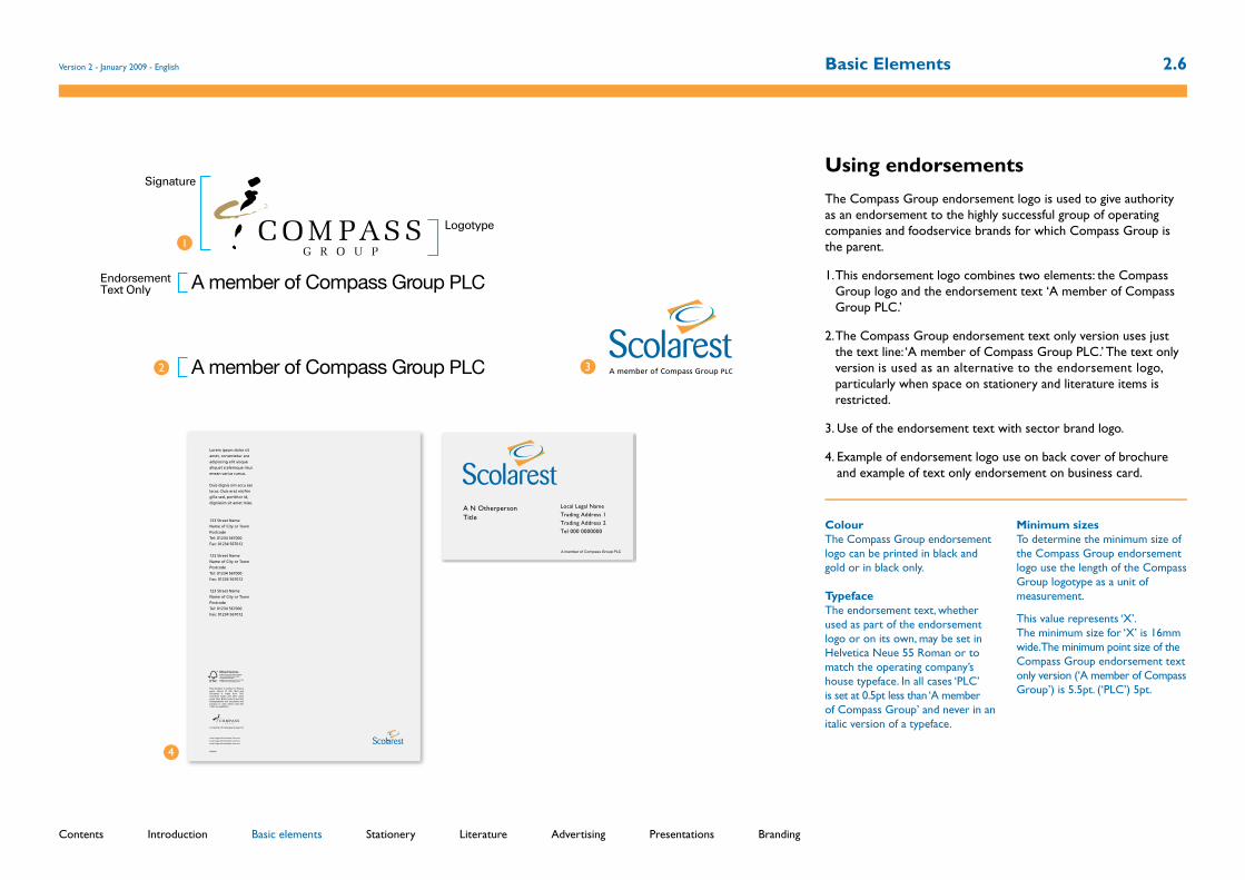
The Compass Group endorsement logo is used to give authority as an endorsement to the highly successful group of operating companies and foodservice brands for which Compass Group is the parent.
1. This endorsement logo combines two elements: the Compass Group logo and the endorsement text ‘A member of Compass Group PLC.’
2. The Compass Group endorsement text only version uses just the text line: ‘A member of Compass Group PLC.’ The text only version is used as an alternative to the endorsement logo, particularly when space on stationery and literature items is restricted.
3. Use of the endorsement text with sector brand logo.
4. Example of endorsement logo use on back cover of brochure and example of text only endorsement on business card.
ColourThe Compass Group endorsement logo can be printed in black and gold or in black only.
TypefaceThe endorsement text, whether used as part of the endorsement logo or on its own, may be set inHelvetica Neue 55 Roman or to match the operating company’s house typeface. In all cases ‘PLC’ is set at 0.5pt less than ‘A memberof Compass Group’ and never in an italic version of a typeface.
Minimum sizesTo determine the minimum size of the Compass Group endorsement logo use the length of the Compass Group logotype as a unit of measurement.
This value represents ‘X’. The minimum size for ‘X’ is 16mm wide. The minimum point size of the Compass Group endorsement text only version (‘A member of Compass Group’) is 5.5pt. (‘PLC’) 5pt.
The Compass Group Endorsement Logo
Signature
Logotype
EndorsementText Only
The Compass Group Endorsement Logo
Signature
Logotype
EndorsementText Only
Lorem ipsum dolor sit
amet, consectetur ans
adipiscing elit uisque
aliquet scelerisque risus
enean varius cursus.
Duis dignis sim accu san
lacus. Duis erat nisifrin
gilla sed, porttitor id,
dignissim sit amet mise.
123 Street Name
Name of City or Town
Postcode
Tel: 01234 567000
Fax: 01234 567012
123 Street Name
Name of City or Town
Postcode
Tel: 01234 567000
Fax: 01234 567012
123 Street Name
Name of City or Town
Postcode
Tel: 01234 567000
Fax: 01234 567012
Local legal information line oneLocal legal information line twoLocal legal information line one
000000
A member of Compass Group PLC
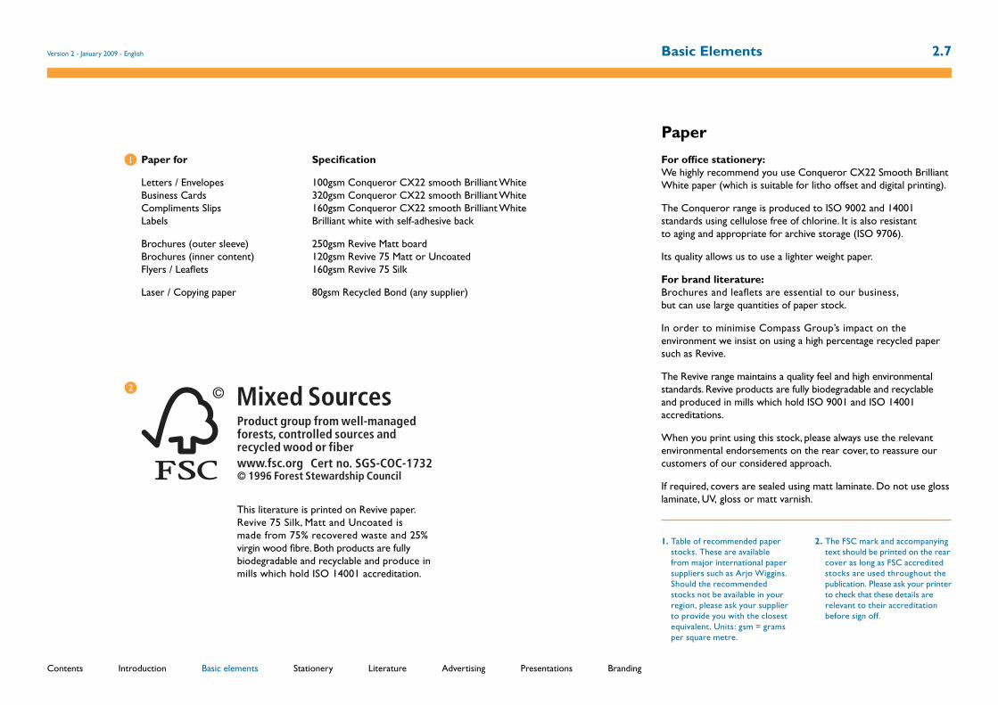
This literature is printed on Revive paper. Revive 75 Silk, Matt and Uncoated is made from 75% recovered waste and 25% virgin wood fibre. Both products are fully biodegradable and recyclable and produce in mills which hold ISO 14001 accreditation.
A member of Compass Group PLC
1
32
4
A N OtherpersonTitle
Local Legal NameTrading Address 1Trading Address 2Tel 000 0000000
A member of Compass Group PLC
Version 2 - January 2009 - English Basic Elements 2.7
Paper
IntroductionContents Basic elements Stationery Literature Advertising Presentations Branding
For office stationery: We highly recommend you use Conqueror CX22 Smooth Brilliant White paper (which is suitable for litho offset and digital printing).
The Conqueror range is produced to ISO 9002 and 14001 standards using cellulose free of chlorine. It is also resistant to aging and appropriate for archive storage (ISO 9706).
Its quality allows us to use a lighter weight paper.
For brand literature: Brochures and leaflets are essential to our business, but can use large quantities of paper stock.
In order to minimise Compass Group’s impact on the environment we insist on using a high percentage recycled paper such as Revive.
The Revive range maintains a quality feel and high environmental standards. Revive products are fully biodegradable and recyclable and produced in mills which hold ISO 9001 and ISO 14001 accreditations.
When you print using this stock, please always use the relevant environmental endorsements on the rear cover, to reassure our customers of our considered approach.
If required, covers are sealed using matt laminate. Do not use gloss laminate, UV, gloss or matt varnish.
Paper for Specification
Letters / Envelopes 100gsm Conqueror CX22 smooth Brilliant White Business Cards 320gsm Conqueror CX22 smooth Brilliant White Compliments Slips 160gsm Conqueror CX22 smooth Brilliant White Labels Brilliant white with self-adhesive back
Brochures (outer sleeve) 250gsm Revive Matt board Brochures (inner content) 120gsm Revive 75 Matt or Uncoated Flyers / Leaflets 160gsm Revive 75 Silk
Laser / Copying paper 80gsm Recycled Bond (any supplier)
This literature is printed on Revive paper. Revive 75 Silk, Matt and Uncoated is made from 75% recovered waste and 25% virgin wood fibre. Both products are fully biodegradable and recyclable and produce in mills which hold ISO 14001 accreditation.
1. Table of recommended paper stocks. These are available from major international paper suppliers such as Arjo Wiggins. Should the recommended stocks not be available in your region, please ask your supplier to provide you with the closest equivalent. Units: gsm = grams per square metre.
2. The FSC mark and accompanying text should be printed on the rear cover as long as FSC accredited stocks are used throughout the publication. Please ask your printer to check that these details are relevant to their accreditation before sign off.
1
2
Version 2 - January 2009 - English Stationery 3.1
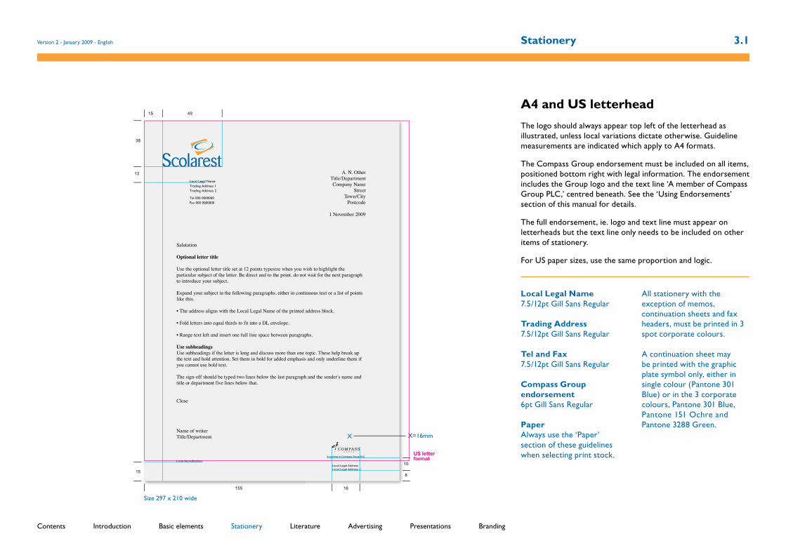
A4 and US letterhead
The logo should always appear top left of the letterhead as illustrated, unless local variations dictate otherwise. Guideline measurements are indicated which apply to A4 formats.
The Compass Group endorsement must be included on all items, positioned bottom right with legal information. The endorsement includes the Group logo and the text line ‘A member of Compass Group PLC,’ centred beneath. See the ‘Using Endorsements’ section of this manual for details.
The full endorsement, ie. logo and text line must appear on letterheads but the text line only needs to be included on other items of stationery.
For US paper sizes, use the same proportion and logic.
Size 297 x 210 wide
X=16mm
Local Legal Name7.5/12pt Gill Sans Regular
Trading Address7.5/12pt Gill Sans Regular
Tel and Fax7.5/12pt Gill Sans Regular
Compass Group endorsement6pt Gill Sans Regular
PaperAlways use the ‘Paper’ section of these guidelines when selecting print stock.
All stationery with the exception of memos, continuation sheets and fax headers, must be printed in 3 spot corporate colours.
A continuation sheet may be printed with the graphic plate symbol only, either in single colour (Pantone 301 Blue) or in the 3 corporate colours, Pantone 301 Blue, Pantone 151 Ochre and Pantone 3288 Green.
Local Legal NameTrading Address 1Trading Address 2
Tel 000 0000000Fax 000 0000000
Local Accreditations
Local Legal AddressLocal Legal Address 2
A. N. OtherTitle/DepartmentCompany Name
StreetTown/City
Postcode
1 November 2009
A member of Compass Group PLC
Salutation
Optional letter title
Use the optional letter title set at 12 points typesize when you wish to highlight theparticular subject of the letter. Be direct and to the point, do not wait for the next paragraphto introduce your subject.
Expand your subject in the following paragraphs, either in continuous text or a list of points like this.
• The address aligns with the Local Legal Name of the printed address block.
• Fold letters into equal thirds to fit into a DL envelope.
• Range text left and insert one full line space between paragraphs.
Use subheadingsUse subheadings if the letter is long and discuss more than one topic. These help break upthe text and hold attention. Set them in bold for added emphasis and only underline them if you cannot use bold text.
The sign-off should be typed two lines below the last paragraph and the sender’s name andtitle or department five lines below that.
Close
Name of writerTitle/Department
38
13
158
10
155 16
15 49
US letterformat
IntroductionContents Basic elements Stationery Literature Advertising Presentations Branding
X
Version 2 - January 2009 - English Stationery 3.2
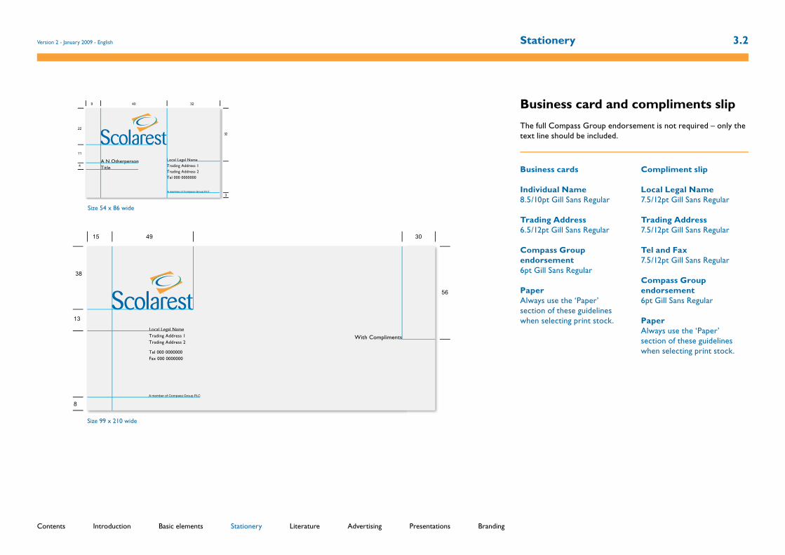
Business card and compliments slip
A N OtherpersonTitle
Local Legal NameTrading Address 1Trading Address 2Tel 000 0000000
A member of Compass Group PLC
32
3
22
11
4
9 40 32
Local Legal NameTrading Address 1Trading Address 2
Tel 000 0000000Fax 000 0000000
With Compliments
A member of Compass Group PLC
38
56
13
8
15 49 30
Size 54 x 86 wide
Size 99 x 210 wide
IntroductionContents Basic elements Stationery Literature Advertising Presentations Branding
Business cards
Individual Name8.5/10pt Gill Sans Regular
Trading Address6.5/12pt Gill Sans Regular
Compass Group endorsement6pt Gill Sans Regular
PaperAlways use the ‘Paper’ section of these guidelines when selecting print stock.
Compliment slip
Local Legal Name7.5/12pt Gill Sans Regular
Trading Address7.5/12pt Gill Sans Regular
Tel and Fax7.5/12pt Gill Sans Regular
Compass Group endorsement6pt Gill Sans Regular
PaperAlways use the ‘Paper’ section of these guidelines when selecting print stock.
The full Compass Group endorsement is not required – only the text line should be included.
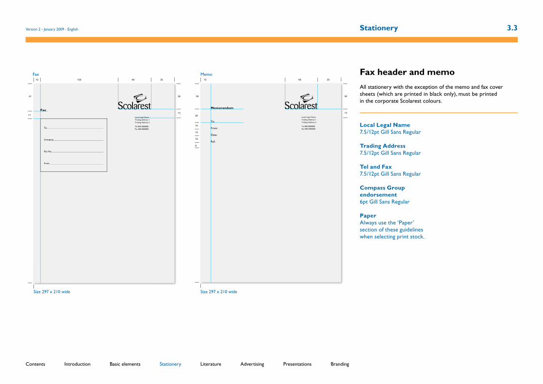
Version 2 - January 2009 - English Stationery 3.3
Fax header and memo
All stationery with the exception of the memo and fax cover sheets (which are printed in black only), must be printed in the corporate Scolarest colours.
IntroductionContents Basic elements Stationery Literature Advertising Presentations Branding
Local Legal Name7.5/12pt Gill Sans Regular
Trading Address7.5/12pt Gill Sans Regular
Tel and Fax7.5/12pt Gill Sans Regular
Compass Group endorsement6pt Gill Sans Regular
PaperAlways use the ‘Paper’ section of these guidelines when selecting print stock.
Fax
To
Company
Fax No
From
Fax
Local Legal NameTrading Address 1Trading Address 2
Tel 000 0000000Fax 000 0000000
41 38
1311
10 100 3549
Size 297 x 210 wide
Memo
To:
From:
Date:
Ref:
Memorandum
Local Legal NameTrading Address 1Trading Address 2
Tel 000 0000000Fax 000 0000000
38 38
1320
10
10
10
8
15 3549
Size 297 x 210 wide
Version 2 - January 2009 - English
Any PersonCompany NameCompany AddressStreet NameCounty Postcode
Any PersonCompany NameCompany AddressStreet NameCounty Postcode
Stationery 3.4
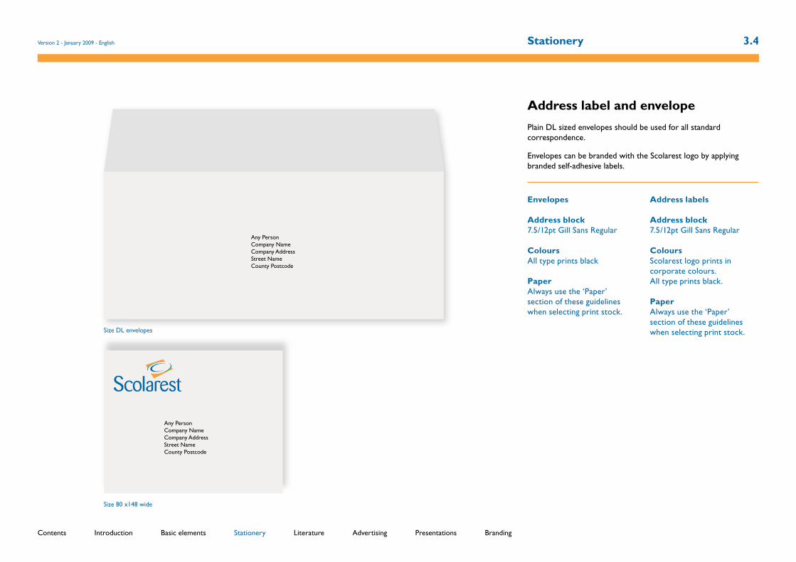
Address label and envelope
Plain DL sized envelopes should be used for all standard correspondence.
Envelopes can be branded with the Scolarest logo by applying branded self-adhesive labels.
IntroductionContents Basic elements Stationery Literature Advertising Presentations Branding
Envelopes
Address block7.5/12pt Gill Sans Regular
ColoursAll type prints black
PaperAlways use the ‘Paper’ section of these guidelines when selecting print stock.
Address labels
Address block7.5/12pt Gill Sans Regular
ColoursScolarest logo prints in corporate colours. All type prints black.
PaperAlways use the ‘Paper’ section of these guidelines when selecting print stock.Size DL envelopes
Size 80 x148 wide
Version 2 - January 2009 - English
Brochure TitleSub-head brochure
description text
Brochure TitleSub-head brochuredescription text
Brochure TitleSub-head brochuredescription text
Brochure TitleSub-head brochure
description text
Literature 4.1
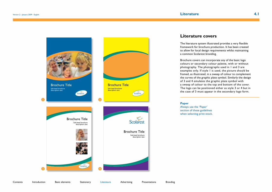
Literature covers
The literature system illustrated provides a very fl exible framework for brochure production. It has been created to allow for local design requirements whilst maintaining a common Scolarest branding.
Brochure covers can incorporate any of the basic logo colours or secondary colour palette, with or without photography. The photographs used in 1 and 3 are examples only. If style 1 is used, the picture should be framed, as illustrated, in a sweep of colour to complement the curves of the graphic plate symbol. Similarly the design of 3 and 4 emulates the graphic plate symbol with a sweep of colour to the top and bottom of the cover. The logo can be positioned either as style 3 or 4 but in the case of 3 must appear in the secondary logo form.
IntroductionContents Basic elements Stationery Literature Advertising Presentations Branding
PaperAlways use the ‘Paper’ section of these guidelines when selecting print stock.
1 2
3 4
Version 2 - January 2009 - English Literature 4.2
Literature layouts
Si meliora dies, ut vina, poemata
reddit, scire velim, chartis pretium
quotus arroget annus. scriptor abhinc
annos centum qui decidit, inter
perfectos veteresque referri debet
an inter vilis atque novos? Excludat
iurgia finis, “Est vetus atque probus,
centum qui perficit annos.” Quid,
qui deperiit minor uno mense vel
anno, inter quos referendus erit?
Veteresne poetas, an quos et prae-
sens et postera respuat aetas?
“Iste quidem veteres inter ponetur
honeste, qui vel mense brevi vel toto
est iunior anno.” Utor permisso,
caudaeque pilos ut equinae paulatim
vello unum, demo etiam unum, dum
cadat elusus ratione ruentis acervi,
qui redit in fastos et virtutem aesti-
mat annis miraturque nihil nisi quod
Libitina sacravit.
Ennius et sapines et fortis et alter
Homerus, ut critici dicunt, leviter
curare videtur, quo promissa cadant
et somnia Pythagorea. Naevius in
manibus non est et mentibus haeret
paene recens? Adeo sanctum est
vetus omne poema. ambigitur quo-
tiens, uter utro sit prior, aufert
Pacuvius docti famam senis Accius
alti, dicitur Afrani toga convenisse
Menandro, Plautus ad exemplar
Siculi properare Epicharmi, vincere
Caecilius gravitate, Terentius arte.
Hos ediscit et hos arto stipata thea-
tro spectat Roma potens; habet hos
numeratque poetas ad nostrum tem-
pus Livi scriptoris ab aevo.
Interdum volgus rectum videt, est
ubi peccat. Si veteres ita miratur
laudatque poetas, ut nihil anteferat,
nihil illis comparet, errat. Si quaedam
nimis antique, si peraque dure dicere
credit eos, ignave multa fatetur, et
sapit et mecum facit et Iova iudicat
aequo.
Non equidem insector delendave
carmina Livi esse reor, memini quae
plagosum mihi parvo Orbilium dic-
tare; sed emendata videri pulchraque
et exactis minimum distantia miror.
Inter quae verbum emicuit si forte
decorum, et si versus paulo concin-
nior unus et alter, iniuste totum
ducit venditque poema.
Interdum volgus rectum videt, est ubi
peccat. Si veteres ita miratur
Non equidem insector delen-
dave carmina Livi esse reor,
memini quae plagosum mihi
parvo Orbilium dictare; sed
emendata videri pulchraque
et exactis minimum distantia
miror. Inter quae
Setting the standard for education
Non equidem insector delen-
dave carmina Livi esse reor,
memini quae plagosum mihi
parvo Orbilium dictare; sed
emendata videri pulchraque
et exactis minimum distantia
miror. Inter quae
Si meliora dies, ut vina, poemata
reddit, scire velim, chartis pretium
quotus arroget annus. scriptor abhinc
annos centum qui decidit, inter
perfectos veteresque referri debet
an inter vilis atque novos? Excludat
iurgia finis, “Est vetus atque probus,
centum qui perficit annos.” Quid,
qui deperiit minor uno mense vel
anno, inter quos referendus erit?
Veteresne poetas, an quos et prae-
sens et postera respuat aetas?
“Iste quidem veteres inter ponetur
honeste, qui vel mense brevi vel toto
est iunior anno.” Utor permisso,
caudaeque pilos ut equinae paulatim
vello unum, demo etiam unum, dum
cadat elusus ratione ruentis acervi,
qui redit in fastos et virtutem aesti-
mat annis miraturque nihil nisi quod
Libitina sacravit.
Ennius et sapines et fortis et alter
Homerus, ut critici dicunt, leviter
curare videtur, quo promissa cadant
et somnia Pythagorea. Naevius in
manibus non est et mentibus haeret
paene recens? Adeo sanctum est
vetus omne poema. ambigitur quo-
tiens, uter utro sit prior, aufert
Pacuvius docti famam senis Accius
alti, dicitur Afrani toga convenisse
Menandro, Plautus ad exemplar
Siculi properare Epicharmi, vincere
Caecilius gravitate, Terentius arte.
Hos ediscit et hos arto stipata thea-
tro spectat Roma potens; habet hos
numeratque poetas ad nostrum tem-
pus Livi scriptoris ab aevo.
Interdum volgus rectum videt, est
ubi peccat. Si veteres ita miratur
laudatque poetas, ut nihil anteferat,
nihil illis comparet, errat. Si quaedam
nimis antique, si peraque dure dicere
credit eos, ignave multa fatetur, et
sapit et mecum facit et Iova iudicat
aequo.
Non equidem insector delendave
carmina Livi esse reor, memini quae
plagosum mihi parvo Orbilium dic-
tare; sed emendata videri pulchraque
et exactis minimum distantia miror.
Inter quae verbum emicuit si forte
decorum, et si versus paulo concin-
nior unus et alter, iniuste totum
ducit venditque poema.
Interdum volgus rectum videt, est
ubi peccat. Si veteres ita miratur
Setting the standard for education
Si meliora dies, ut vina, poema-
ta reddit, scire velim, chartis
pretium quotus arroget annus.
scriptor abhinc annos centum
qui decidit, inter perfectos vet-
eresque referri debet an inter
vilis atque novos? Excludat iurgia
finis, “Est vetus atque probus,
centum qui perficit annos.”
Quid, qui deperiit minor uno
mense vel anno, inter quos ref-
erendus erit? Veteresne poetas,
an quos et praesens et postera
respuat aetas?
“Iste quidem veteres inter ponetur
honeste, qui vel mense brevi vel toto
est iunior anno.” Utor permisso,
caudaeque pilos ut equinae paulatim
vello unum, demo etiam unum, dum
cadat elusus ratione ruentis acervi,
qui redit in fastos et virtutem aesti-
mat annis miraturque nihil nisi quod
Libitina sacravit.
Ennius et sapines et fortis et alter
Homerus, ut critici dicunt, leviter
curare videtur, quo promissa cadant
et somnia Pythagorea. Naevius in
manibus non est et mentibus haeret
paene recens? Adeo sanctum est
vetus omne poema. ambigitur quo-
tiens, uter utro sit prior, aufert
Pacuvius docti famam senis Accius
alti, dicitur Afrani toga convenisse
Menandro, Plautus ad exemplar
Siculi properare Epicharmi, vincere
Caecilius gravitate, Terentius arte.
Hos ediscit et hos arto stipata thea-
tro spectat Roma potens; habet hos
numeratque poetas ad nostrum tem-
pus Livi scriptoris ab aevo.
Interdum volgus rectum videt, est
ubi peccat. Si veteres ita miratur
laudatque poetas, ut nihil anteferat,
nihil illis comparet, errat. Si quaedam
nimis antique, si peraque dure dicere
credit eos, ignave multa fatetur, et
sapit et mecum facit et Iova iudicat
aequo.
Non equidem insector delendave
carmina Livi esse reor, memini quae
plagosum mihi parvo“Iste quidem
veteres inter ponetur honeste, qui
vel mense brevi vel toto est iunior
Setting the standard for education
Nutrition, choice and service
Non equidem insec-
tor delendave car-
mina Livi esse reor,
memini quae pla-
gosum mihi parvo
Orbilium dictare;
sed emendata videri
pulchraque et exactis
minimum distantia
Si meliora dies, ut vina, poemata
reddit, scire velim, chartis pretium
quotus arroget annus. scriptor abhinc
annos centum qui decidit, inter
perfectos veteresque referri debet
an inter vilis atque novos? Excludat
iurgia finis, “Est vetus atque probus,
centum qui perficit annos.” Quid, qui
deperiit minor uno mense vel anno,
inter quos referendus erit? Veteresne
poetas, an quos et praesens et
postera respuat aetas?
“Iste quidem veteres inter ponetur
honeste, qui vel mense brevi vel toto
est iunior anno.” Utor permisso,
caudaeque pilos ut equinae paulatim
vello unum, demo etiam unum, dum
cadat elusus ratione ruentis acervi,
qui redit in fastos et virtutem aesti-
mat annis miraturque nihil nisi quod
Libitina sacravit.
Ennius et sapines et fortis et alter
Homerus, ut critici dicunt, leviter
curare videtur, quo promissa cadant
et somnia Pythagorea. Naevius in
manibus non est et mentibus haeret
paene recens? Adeo sanctum est
vetus omne poema. ambigitur quo-
tiens, uter utro sit prior, aufert
Pacuvius docti famam senis Accius
alti, dicitur Afrani toga convenisse
Menandro, Plautus ad exemplar
Siculi properare Epicharmi, vincere
Caecilius gravitate, Terentius arte.
Hos ediscit et hos arto stipata thea-
tro spectat Roma potens; habet hos
pus Livi scriptoris a
volgus rectum videt, est ubi pec-
cat. Si veteres ita miratur laudatque
poetas, ut nihil anteferat, nihil illis
comparet, errat. Si quaedam nimis
antique, si peraque dure dicere credit
eos, ignave multa fatetur, et sapit et
mecum facit et Iova iudicat aequo.
Non equidem insector delendave
carmina Livi esse reor, memini quae
plagosum mihi parvo Orbilium dic-
tare; sed emendata videri pulchraque
et exactis minimum distantia miror.
Inter quae verbum emicuit si forte
decorum, et si versus paulo concin-
nior unus et alter, iniuste totum
ducit venditque poema.
Interdum volgus rectum videt, est
ubi peccat. Si veteres ita miratur
laudatque poetas, ut nihil anteferat,
nihil “Iste quidem veteres inter
ponetur honeste, qui vel mense brevi
vel toto est iunior anno.” Utor per-
misso, caudaeque pilos ut equinae
paulatim vello unum, demo etiam
unum, dum cadat elusus ratione
ruentis acervi, qui redit in fastos et
virtutem aestimat annis miraturque
nihil nisi quod Libitina sacravit.
Ennius et sapines et fortis et alter
Homerus, ut critici dicunt, leviter
curare videtur, quo promissa cadant
et somnia Pythagorea. Naevius in
manibus non est et mentibus haeret
paene recens? Adeo sanctum est
vetus omne poema. ambigitur quo-
tiens, uter utro sit prior, aufert
Pacuvius docti famam senis Accius
alti, dicitur Afrani toga convenisse
Menandro, Plautus ad exemplar
Siculi properare Epicharmi, vincere
Caecilius gravitate, Terentius arte.
Hos ediscit et hos arto stipata thea-
tro spectat Roma potens; habet hos
numeratque poetas ad nostrum tem-
pus Livi scriptoris ab aevo.
Interdum volgus rectum videt, est
ubi peccat. Si veteres ita miratur
laudatque poetas, ut nihil anteferat,
nihil illis comparet, errat. Si quaedam
nimis antique, si peraque dure dicere
credit eos, ignave multa fatetur, et
sapit et mecum facit et Iova iudicat
aequo.
Non equidem insector delendave
carmina Livi esse reor, memini quae
plagosum mihi parvo Orbilium dic-
tare; sed emendata videri pulchraque
et exactis minimum distantia miror.
Inter quae verbum emicuit si forte
decorum, et si versus paulo c“Iste
quidem veteres inter ponetur hon-
este, qui vel mense brevi vel toto
est iunior anno.” Utor permisso,
caudaeque pilos ut equinae paula-
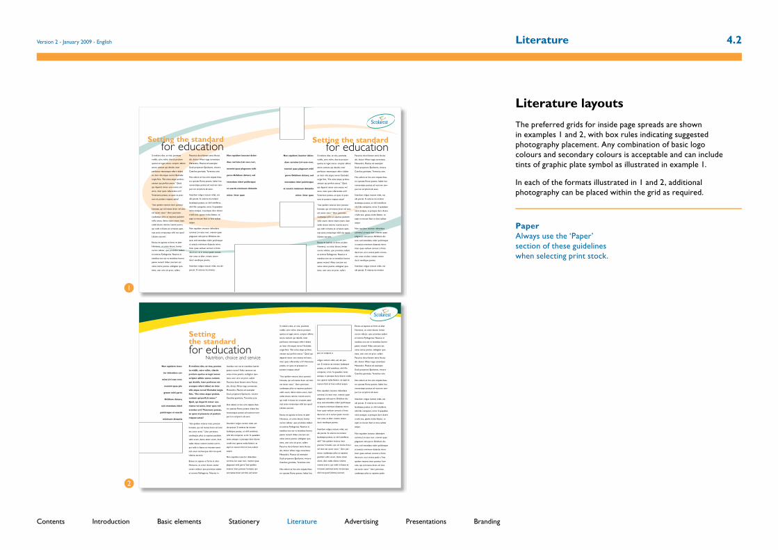
The preferred grids for inside page spreads are shown in examples 1 and 2, with box rules indicating suggested photography placement. Any combination of basic logo colours and secondary colours is acceptable and can include tints of graphic plate symbol as illustrated in example 1.
In each of the formats illustrated in 1 and 2, additional photography can be placed within the grid as required.
IntroductionContents Basic elements Stationery Literature Advertising Presentations Branding
PaperAlways use the ‘Paper’ section of these guidelines when selecting print stock.
1
2
Version 2 - January 2009 - English Literature 4.3
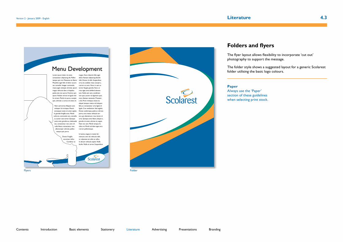
The fl yer layout allows fl exibility to incorporate ‘cut out’ photography to support the message.
The folder style shows a suggested layout for a generic Scolarest folder utilising the basic logo colours.
Folders and fl yers
IntroductionContents Basic elements Stationery Literature Advertising Presentations Branding
Menu DevelopmentLorem ipsum dolor sit amet,
consectetur adipiscing elit. Pellen-
tesque quis nisi. Maecenas et libero.
Phasellus eget felis id dolor accum-
san convallis. Integer commodo,
massa eget volutpat ultricies, ipsum
magna vehicula diam, id dapibus
pede ante non purus. Vivamus quis
ipsum. Nullam vel est et ligula mol-
lis ornare. Morbi mi purus, suscipit
quis, ultricies a, cursus sit amet, mi.
Nam sed tortor. Aliquam erat
volutpat. Ut tristique. Mauris
consequat turpis sit amet sapien.
In gravida fringilla eros. Morbi
nulla est, commodo non, convallis
ut, auctor sed, tortor. Quisque
justo ante, gravida eu, malesuada
nec, consectetur non, sem. Ut
nulla libero, consectetur non,
ullamcorper ultricies, pellen-
tesque quis, purus.
Donec fringilla
accumsan tellus.
Curabitur ac
magna. Nunc lobortis felis eget
dolor. Aenean adipiscing blandit
nibh. Donec id nibh. Suspendisse
urna est, sodales vitae, suscipit a,
rutrum ut, nunc. Nunc in sem ac
tortor feugiat gravida. Nunc at
risus eget ante eleifend elemen-
tum. Nulla sem sem, condimen-
tum quis, auctor id, dignissim quis,
nunc. Aenean venenatis. Praesent
a dui. Proin tristique, massa eu
aliquet tempor, metus nisl aliquam
felis, ac consectetur urna ligula id
ligula. Cras vestibulum. Sed sagittis.
Donec scelerisque, pede ac ultrices
porta, urna metus vehicula tor-
tor, quis elementum risus lorem id
urna. Quisque ante libero, aliquet a,
gravida sit amet, ultrices et, augue.
Nam nec sem. Morbi tempus fa-
cilisis mi. Morbi vel diam eget arcu
rutrum pellentesque.
In lacinia, magna in mattis fer-
mentum, sem dui vehicula nibh,
ut vulputate est odio ac tellus.
In dictum vehicula sapien. Nulla
facilisi. Nulla et tortor. Suspendisse
Flyers Folder
PaperAlways use the ‘Paper’ section of these guidelines when selecting print stock.
Version 2 - January 2009 - English Advertising 5.1
Corporate advertising and sponsorship
HeadlineSub-head, Sub-head
Lorem ipsum dolor sit amet, consectetur adipiscing
elit. Donec lacinia arcu in libero aliquam pharetra.
Donec elementum nulla vel mi. Aliquam erat volut-
pat. Phasellus faucibus felis id orci. Nam lobortis mi
id neque consectetur faucibus. Donec risus tellus,
hendrerit id, lobortis sed, hendrerit ac, lectus. Sed
vestibulum erat sed mi. Vestibulum ultricies enim.
Donec venenatis. Nunc porta elit et justo.
We’re OnYour Side!
Scolarest thefirst choice forhealthy eating
In schools
Local LegalNameTrading
Address Trading Address 2
Address 3Address 4
Tel 000 0000000Fax 000 0000000
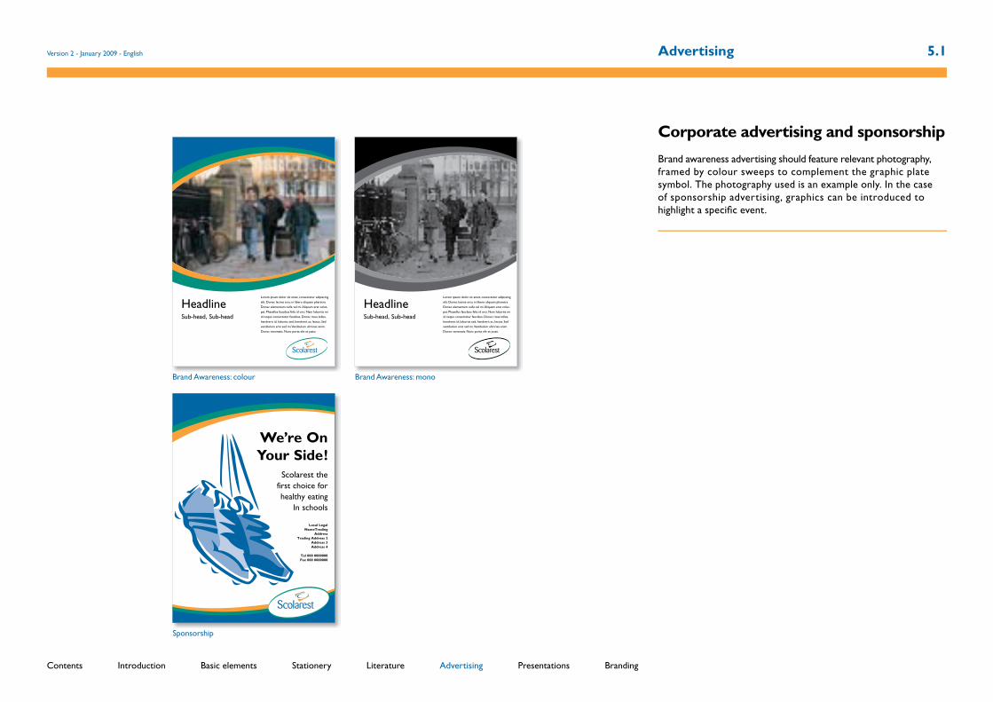
Brand awareness advertising should feature relevant photography,framed by colour sweeps to complement the graphic plate symbol. The photography used is an example only. In the case of sponsorship advertising, graphics can be introduced to highlight a specifi c event.
IntroductionContents Basic elements Stationery Literature Advertising Presentations Branding
Brand Awareness: colour Brand Awareness: mono
Sponsorship
Version 2 - January 2009 - English
The success of Compass Group is dependent on our people. We want to attract people who share our values to join us and develop for the long term.
Our recruitment advertising publicly announces the characteristics we look for in all Compass Group companies. It is seen by our potential employees and clients alike, so it is doubly important to convey a consistent brand message, our brand values, our benefi ts and the real opportunities that exist within Compass Group.
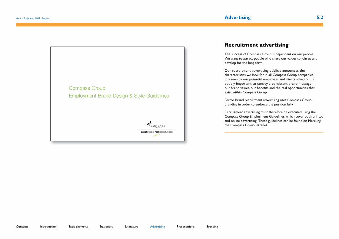
Sector brand recruitment advertising uses Compass Group branding in order to endorse the position fully.
Recruitment advertising must therefore be executed using the Compass Group Employment Guidelines, which cover both printed and online advertising. These guidelines can be found on Mercury, the Compass Group intranet.
Advertising 5.2
Recruitment advertising
IntroductionContents Basic elements Stationery Literature Advertising Presentations Branding

Version 2 - January 2009 - English Presentations 6.1
Presentation slides
The templates illustrated are based on a standard format to create slides in your own software. Bullet point information should be short and simple, with preferably no more than four bullets per slide. Longer bullet text can run onto a second line but should not be longer than three lines. Information should be used sparingly for maximum impact.
Slide Heading
20
0
40
60
80
100
Lorem ipsum dolor sit amet, consectetur adipiscing elit. Pellentesque quis nisi.
Maecenas et libero. Phasellus eget felis id dolor accumsan convallis. Integer com-modo, massa eget volutpat ultricies.
Slide Heading
• Pellentesque vel est nec urna tincidunt ultricies.• Vivamus et purus et nisl laoreet scelerisque.• Nam vel nulla ac nulla eleifend laoreet.• Donec in augue a risus imperdiet elementum.
Presentation titleSubtitle
A member of Compass Group PLC
IntroductionContents Basic elements Stationery Literature Advertising Presentations Branding
Version 2 - January 2009 - English Presentations 6.2
Internet and intranetOur Group’s strategy is to communicate with our clients through our sector brands (e.g. Eurest, Eurest Services, Medirest, Scolarest) and our foodservice brands (e.g. Caffè Liscio, Delimarché, Amigo). All of these brands and services are offered through companies which are members of Compass Group and should follow the relevant guidelines.
Communication to our clients and consumers is managed mainly at a local level, on a country-by-country basis and for consistency follows agreed corporate and brand standards.
At the same time it is extremely important that the Group has a consistent presence on the web, as an international and highly visible means of communication.
Country Websites Larger businesses within the Group that have a sectorised model, will usually have one web site for their business using the group identity and a similar architecture (site map) to the Group site (www.compass-group.com).
Registration of new website domain names and renewal of existing ones should be managed through the Group Legal team based at Chertsey.
Guidelines for Compass Group branded websites are available from Group Internal Communications. These guidelines should be used for all new sites and those existing sites being re-designed after the beginning of 2009.
For countries that have Eurest as their holding company, the Eurest identity should be used.
Note: A link to the Group site should be always be made, rather than extracting or repeating information in the local site. Information for investors MUST only be included on www.compass-group.com, as all investor relations activity is managed centrally for the Group.
Country Intranets Local intranets are produced by an individual country. Best practice examples of intranets within the Group are available from Group Internal Communications.
Should you have any questions on Internet or Intranet sites, please contact Group Internal Communications at Chertsey.
IntroductionContents Basic elements Stationery Literature Advertising Presentations Branding
Version 2 - January 2009 - English
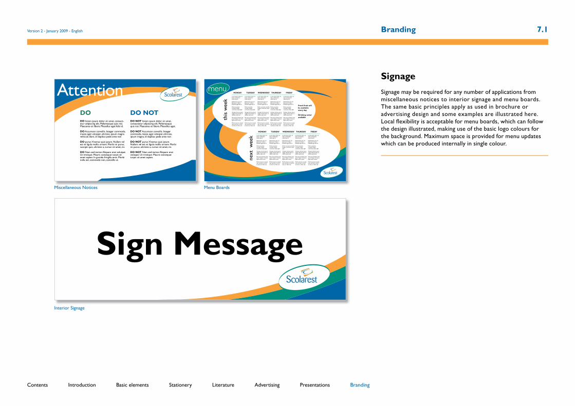
Signage may be required for any number of applications from miscellaneous notices to interior signage and menu boards. The same basic principles apply as used in brochure or advertising design and some examples are illustrated here. Local fl exibility is acceptable for menu boards, which can follow the design illustrated, making use of the basic logo colours for the background. Maximum space is provided for menu updates which can be produced internally in single colour.
Branding 7.1
Signage
IntroductionContents Basic elements Stationery Literature Advertising Presentations Branding
AttentionDODO lorem ipsum dolor sit amet, consect-etur adipiscing elit. Pellentesque quis nisi. Maecenas et libero. Phasellus eget felis id.
DO Accumsan convallis. Integer commodo, massa eget volutpat ultricies, ipsum magna vehicula diam, id dapibus pede ante non
DO purus. Vivamus quis ipsum. Nullam vel est et ligula mollis ornare. Morbi mi purus, suscipit quis, ultricies a, cursus sit amet, mi.
DO Nam sed tortor. Aliquam erat volutpat. Ut tristique. Mauris consequat turpis sit amet sapien. In gravida fringilla eros. Morbi nulla est, commodo non, convallis ut.
DO NOTDO NOT lorem ipsum dolor sit amet, consectetur adipiscing elit. Pellentesque quis nisi. Maecenas et libero. Phasellus eget.
DO NOT Accumsan convallis. Integer commodo, massa eget volutpat ultricies, ipsum magna, id dapibus pede ante non
DO NOT purus. Vivamus quis ipsum. Nullam vel est et ligula mollis ornare. Morbi mi purus, ultricies a, cursus sit amet, mi.
DO NOT Nam sed tortor. Aliquam erat volutpat. Ut tristique. Mauris consequat turpis sit amet sapien.
menu
this
wee
k
MONDAY
Lorem ipsum dolor sit amet, consectetur adipiscing elit.
Pellentesque quis nisi. Maecenas et libero. Phasellus eget felis id.
Dolor accumsan convallis. Integer commodo, massa eget
Volutpat ultricies, ipsum magna vehicula diam, id dapibus pede ante
Non purus. Vivamus quis ipsum. Nullam vel est et ligula mollis ornare.
Morbi mi purus, suscipit quis, ultricies a, cursus sit amet, mi. Nam sed
TUESDAY
Lorem ipsum dolor sit amet, consectetur adipiscing elit.
Pellentesque quis nisi. Maecenas et libero. Phasellus eget felis id.
Dolor accumsan convallis. Integer commodo, massa eget
Volutpat ultricies, ipsum magna vehicula diam, id dapibus pede ante
Non purus. Vivamus quis ipsum. Nullam vel est et ligula mollis ornare.
Morbi mi purus, suscipit quis, ultricies a, cursus sit amet, mi. Nam sed
WEDNESDAY
Lorem ipsum dolor sit amet, consectetur adipiscing elit.
Pellentesque quis nisi. Maecenas et libero. Phasellus eget felis id.
Dolor accumsan convallis. Integer commodo, massa eget
Volutpat ultricies, ipsum magna vehicula diam, id dapibus pede ante
Non purus. Vivamus quis ipsum. Nullam vel est et ligula mollis ornare.
Morbi mi purus, suscipit quis, ultricies a, cursus sit amet, mi. Nam sed
THURSDAY
Lorem ipsum dolor sit amet, consectetur adipiscing elit.
Pellentesque quis nisi. Maecenas et libero. Phasellus eget felis id.
Dolor accumsan convallis. Integer commodo, massa eget
Volutpat ultricies, ipsum magna vehicula diam, id dapibus pede ante
Non purus. Vivamus quis ipsum. Nullam vel est et ligula mollis ornare.
Morbi mi purus, suscipit quis, ultricies a, cursus sit amet, mi. Nam sed
FRIDAY
Lorem ipsum dolor sit amet, consectetur adipiscing elit.
Pellentesque quis nisi. Maecenas et libero. Phasellus eget felis id.
Dolor accumsan convallis. Integer commodo, massa eget
Volutpat ultricies, ipsum magna vehicula diam, id dapibus pede ante
Non purus. Vivamus quis ipsum. Nullam vel est et ligula mollis ornare.
Morbi mi purus, suscipit quis, ultricies a, cursus sit amet, mi. Nam sed
Fresh Fruit willbe availableevery day.
Drinking wateravailable
next
wee
k
MONDAY
Lorem ipsum dolor sit amet, consectetur adipiscing elit.
Pellentesque quis nisi. Maecenas et libero. Phasellus eget felis id.
Dolor accumsan convallis. Integer commodo, massa eget
Volutpat ultricies, ipsum magna vehicula diam, id dapibus pede ante
Non purus. Vivamus quis ipsum. Nullam vel est et ligula mollis ornare.
Morbi mi purus, suscipit quis, ultricies a, cursus sit amet, mi. Nam sed
TUESDAY
Lorem ipsum dolor sit amet, consectetur adipiscing elit.
Pellentesque quis nisi. Maecenas et libero. Phasellus eget felis id.
Dolor accumsan convallis. Integer commodo, massa eget
Volutpat ultricies, ipsum magna vehicula diam, id dapibus pede ante
Non purus. Vivamus quis ipsum. Nullam vel est et ligula mollis ornare.
Morbi mi purus, suscipit quis, ultricies a, cursus sit amet, mi. Nam sed
WEDNESDAY
Lorem ipsum dolor sit amet, consectetur adipiscing elit.
Pellentesque quis nisi. Maecenas et libero. Phasellus eget felis id.
Dolor accumsan convallis. Integer commodo, massa eget
Volutpat ultricies, ipsum magna vehicula diam, id dapibus pede ante
Non purus. Vivamus quis ipsum. Nullam vel est et ligula mollis ornare.
Morbi mi purus, suscipit quis, ultricies a, cursus sit amet, mi. Nam sed
THURSDAY
Lorem ipsum dolor sit amet, consectetur adipiscing elit.
Pellentesque quis nisi. Maecenas et libero. Phasellus eget felis id.
Dolor accumsan convallis. Integer commodo, massa eget
Volutpat ultricies, ipsum magna vehicula diam, id dapibus pede ante
Non purus. Vivamus quis ipsum. Nullam vel est et ligula mollis ornare.
Morbi mi purus, suscipit quis, ultricies a, cursus sit amet, mi. Nam sed
FRIDAY
Lorem ipsum dolor sit amet, consectetur adipiscing elit.
Pellentesque quis nisi. Maecenas et libero. Phasellus eget felis id.
Dolor accumsan convallis. Integer commodo, massa eget
Volutpat ultricies, ipsum magna vehicula diam, id dapibus pede ante
Non purus. Vivamus quis ipsum. Nullam vel est et ligula mollis ornare.
Morbi mi purus, suscipit quis, ultricies a, cursus sit amet, mi. Nam sedAttention
Sign Message
Miscellaneous Notices
Interior Signage
Menu Boards
Version 2 - January 2009 - English
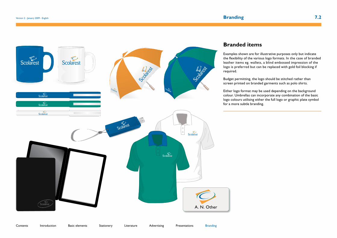
Examples shown are for illustrative purposes only but indicate the fl exibility of the various logo formats. In the case of branded leather items eg. wallets, a blind embossed impression of the logo is preferred but can be replaced with gold foil blocking if required.
Budget permitting, the logo should be stitched rather than screen printed on branded garments such as polo shirts.
Either logo format may be used depending on the background colour. Umbrellas can incorporate any combination of the basic logo colours utilising either the full logo or graphic plate symbol for a more subtle branding.
Branding 7.2
Branded items
IntroductionContents Basic elements Stationery Literature Advertising Presentations Branding
A. N. Other


