13


2
WEB DESIGN BASICS
Lesson overviewIn this lesson, you’ll learn the following:
• The basics of webpage design
• How to create page thumbnails and wireframes
• How to use Adobe Photoshop to generate site image assetsautomatically
This lesson will take about 30 minutes to complete. If you have not already done so, download the project files for this lesson from the Lesson & Update Files tab on your Account page at www.peachpit.com, store them on your computer in a convenient location, and define a new site in Dreamweaver based on this folder, as described in the “Getting Started” section at the beginning of this book. Your Account page is also where you’ll find any updates to the chapters or to the lesson files. Look on the Lesson & Update Files tab to access the most current content.
4
© 2017 Pearson Education, Inc., and Adobe Systems Incorporated and its licensors. All rights reserved.

3
Whether you use thumbnails and wireframes, Photoshop, or just a vivid imagination, Dreamweaver can quickly turn your design concepts into complete, standards-based CSS layouts.
© 2017 Pearson Education, Inc., and Adobe Systems Incorporated and its licensors. All rights reserved.
4 LESSON 4 Web Design Basics
Developing a new websiteBefore you begin any web design project for yourself or for a client, you need to answer three important questions:
• What is the purpose of the website?
• Who is the audience?
• How do they get here?
What is the purpose of the website?Will the website sell or support a product or service? Is your site for entertainment or games? Will you provide information or news? Will you need a shopping cart or database? Do you need to accept credit card payments or electronic transfers? Knowing the purpose of the website tells you what type of content you’ll be devel-oping and working with and what types of technologies you’ll need to incorporate.
Who is the audience?Is the audience adults, children, seniors, professionals, hobbyists, men, women, everyone? Knowing who your audience will be is vital to the overall design and functionality of your site. A site intended for children probably needs more ani-mation, interactivity, and bright, engaging colors. Adults will want serious con-tent and in-depth analysis. Seniors may need larger type and other accessibility enhancements.
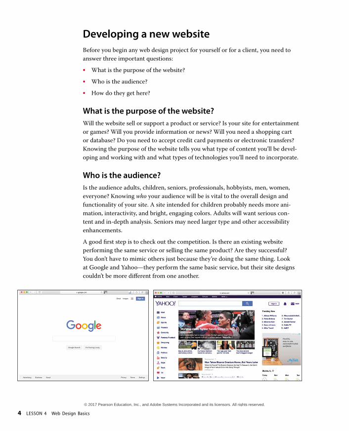
A good first step is to check out the competition. Is there an existing website performing the same service or selling the same product? Are they successful? You don’t have to mimic others just because they’re doing the same thing. Look at Google and Yahoo—they perform the same basic service, but their site designs couldn’t be more different from one another.
© 2017 Pearson Education, Inc., and Adobe Systems Incorporated and its licensors. All rights reserved.

ADOBE DREAMWEAVER CC (2017 RELEASE) CLASSROOM IN A BOOK 5
How do they get here?This sounds like an odd question when speaking of the Internet. But just as with a brick-and-mortar business, your online customers can come to you in a variety of ways. For example, are they accessing your site on a desktop computer, laptop, tablet, or cellphone? Are they using high-speed Internet, wireless, or dial-up ser-vice? What browser are they most likely to use, and what is the size and resolution of the display? These answers will tell you a lot about what kind of experience your customers will expect. Dial-up and cellphone users may not want to see a lot of graphics or video, whereas users with large flat-panel displays and high-speed con-nections may demand as much bang and sizzle as you can send at them.
So where do you get this information? Some you’ll have to get through painstaking research and demographic analysis. Some you’ll get from educated guesses based on your own tastes and understanding of your market. But a lot of it is actually available on the Internet itself. W3Schools, for one, keeps track of tons of statistics regarding access and usage, all updated regularly:
• http://w3schools.com/browsers/default.asp provides information about browserstatistics.
• http://w3schools.com/browsers/browsers_os.asp gives the breakdown on oper-ating systems. In 2011, W3Schools started to track the usage of mobile deviceson the Internet.
• http://w3schools.com/browsers/browsers_display.asp lets you find out the latestinformation on the resolution, or size, of screens using the Internet.
If you are redesigning an existing site, your web-hosting service itself may provide valuable statistics on historical traffic patterns and even the visitors themselves. If you host your own site, you can incorporate third-party tools, such as Google Analytics and Adobe Omniture, into your code to do the tracking for you for free or for a small fee.
As of the fall of 2016, Windows still dominates the Internet (80 to 85 percent), with most users favoring Google Chrome (73 percent), followed by Firefox (16 percent), with various versions of Internet Explorer (5 percent) a distant third. The vast majority of browsers (99 percent) are set to a resolution higher than 1024 pixels by 768 pixels. If it weren’t for the rapid growth in usage of tablets and smartphones for accessing the Internet, these statistics would be great news for most web designers and developers. But designing a website that can look good and work effectively for both flat-panel displays and cellphones is a tall order.
© 2017 Pearson Education, Inc., and Adobe Systems Incorporated and its licensors. All rights reserved.
6 LESSON 4 Web Design Basics
ScenarioFor the purposes of this book, you’ll be working to develop a website for Meridien GreenStart, a fictitious community-based organization dedicated to green invest-ment and action. This website will offer a variety of products and services and require a broad range of webpage types, including dynamic pages using technolo-gies such as jQuery, which is a form of JavaScript.
Your customers come from a wide demographic that includes all ages and educa-tional levels. They are people who are concerned about environmental conditions and who are dedicated to conservation, recycling, and the reuse of natural and human resources.
Your marketing research indicates that most of your customers use desktop com-puters or laptops, connecting via high-speed Internet services. You can expect to get 20 to 30 percent of your visitors exclusively via cellphone and other mobile devices, and much of the rest will be using mobile from time to time.
To simplify the process of learning Dreamweaver, we’ll focus on creating a fixed-width desktop site design first. In Lesson 7, “Designing for Mobile Devices,” you’ll learn how to adapt your fixed-width design to work with smartphones and tablets.
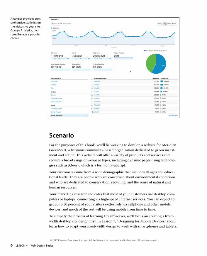
Analytics provides com-prehensive statistics on the visitors to your site. Google Analytics, pic-tured here, is a popular choice.
© 2017 Pearson Education, Inc., and Adobe Systems Incorporated and its licensors. All rights reserved.
ADOBE DREAMWEAVER CC (2017 RELEASE) CLASSROOM IN A BOOK 7
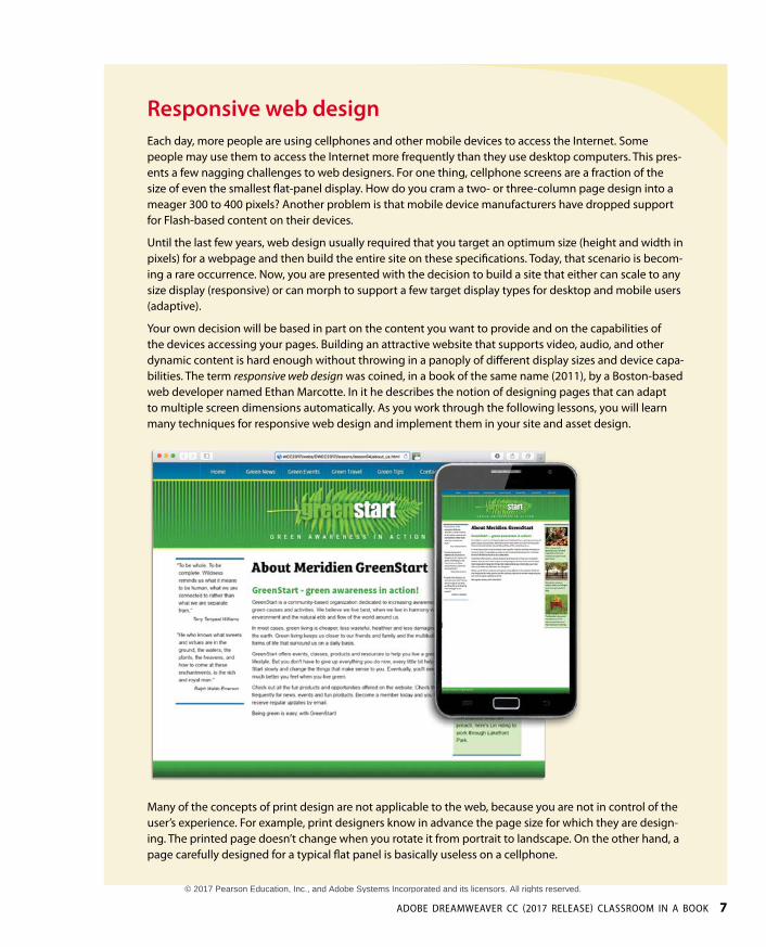
Responsive web designEach day, more people are using cellphones and other mobile devices to access the Internet. Some people may use them to access the Internet more frequently than they use desktop computers. This pres-ents a few nagging challenges to web designers. For one thing, cellphone screens are a fraction of the size of even the smallest flat-panel display. How do you cram a two- or three-column page design into a meager 300 to 400 pixels? Another problem is that mobile device manufacturers have dropped support for Flash-based content on their devices.
Until the last few years, web design usually required that you target an optimum size (height and width in pixels) for a webpage and then build the entire site on these specifications. Today, that scenario is becom-ing a rare occurrence. Now, you are presented with the decision to build a site that either can scale to any size display (responsive) or can morph to support a few target display types for desktop and mobile users (adaptive).
Your own decision will be based in part on the content you want to provide and on the capabilities of the devices accessing your pages. Building an attractive website that supports video, audio, and other dynamic content is hard enough without throwing in a panoply of different display sizes and device capa-bilities. The term responsive web design was coined, in a book of the same name (2011), by a Boston-based web developer named Ethan Marcotte. In it he describes the notion of designing pages that can adapt to multiple screen dimensions automatically. As you work through the following lessons, you will learn many techniques for responsive web design and implement them in your site and asset design.
Many of the concepts of print design are not applicable to the web, because you are not in control of the user’s experience. For example, print designers know in advance the page size for which they are design-ing. The printed page doesn’t change when you rotate it from portrait to landscape. On the other hand, a page carefully designed for a typical flat panel is basically useless on a cellphone.
© 2017 Pearson Education, Inc., and Adobe Systems Incorporated and its licensors. All rights reserved.
8 LESSON 4 Web Design Basics
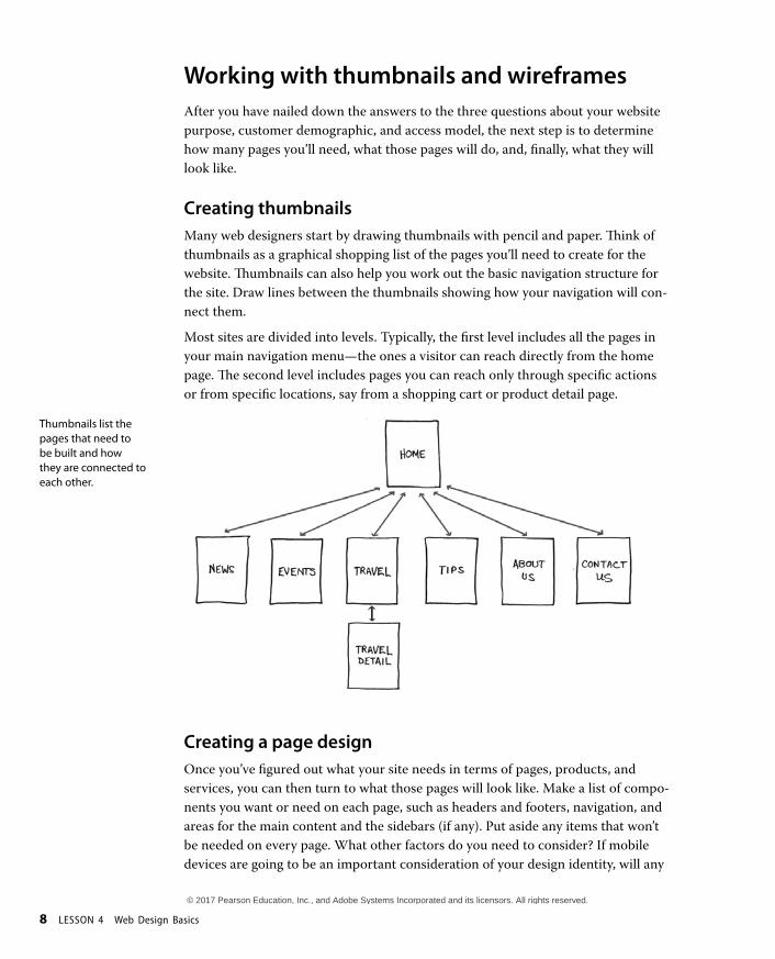
Working with thumbnails and wireframesAfter you have nailed down the answers to the three questions about your website purpose, customer demographic, and access model, the next step is to determine how many pages you’ll need, what those pages will do, and, finally, what they will look like.
Creating thumbnailsMany web designers start by drawing thumbnails with pencil and paper. Think of thumbnails as a graphical shopping list of the pages you’ll need to create for the website. Thumbnails can also help you work out the basic navigation structure for the site. Draw lines between the thumbnails showing how your navigation will con-nect them.
Most sites are divided into levels. Typically, the first level includes all the pages in your main navigation menu—the ones a visitor can reach directly from the home page. The second level includes pages you can reach only through specific actions or from specific locations, say from a shopping cart or product detail page.
Creating a page designOnce you’ve figured out what your site needs in terms of pages, products, and services, you can then turn to what those pages will look like. Make a list of compo-nents you want or need on each page, such as headers and footers, navigation, and areas for the main content and the sidebars (if any). Put aside any items that won’t be needed on every page. What other factors do you need to consider? If mobile devices are going to be an important consideration of your design identity, will any
Thumbnails list the pages that need to be built and how they are connected to each other.
© 2017 Pearson Education, Inc., and Adobe Systems Incorporated and its licensors. All rights reserved.

ADOBE DREAMWEAVER CC (2017 RELEASE) CLASSROOM IN A BOOK 9
of the components be required or optional for these devices? Although many com-ponents can be simply resized for mobile screens, some will have to be completely redesigned or reimagined.
Do you have a company logo, business identity, graphic imagery, or color scheme you want to match or complement? Do you have publications, brochures, or cur-rent advertising campaigns you want to emulate? It helps to gather them all in one place so you can see everything all at once on a desk or conference table. If you’re lucky, a theme will rise organically from this collection.
Desktop or mobile
Once you’ve created your checklist of the components that you’ll need on each page, sketch out several rough layouts that work for these components. Depend-ing on your target visitor demographics, you may decide to focus on a design that’s optimized for desktop computers or one that works best on tablets and smartphones.
Most designers settle on one basic page design that is a compromise between flexibility and sizzle. Some site designs may naturally lean toward using more than one basic layout. But resist the urge to design each page separately. Minimizing the number of page designs may sound like a major limitation, but it’s key to producing a professional-looking site that’s easy to manage. It’s the reason why some profes-sionals, such as doctors and airline pilots, wear uniforms. Using a consistent page design, or template, conveys a sense of professionalism and confidence to your visi-tor. While you’re figuring out what your pages will look like, you’ll have to address the size and placement of the basic components. Where you put a component can drastically affect its impact and usefulness.
In print, designers know that the upper-left corner of a layout is considered one of the “power positions,” a place where you want to locate important aspects of a design, such as a logo or title. This is because in western culture we read from left to right, top to bottom. The second power position is the lower-right corner, because this is the last thing your eyes will see when you’re finished reading.
Unfortunately, in web design this theory doesn’t hold up for one simple reason: You can never be certain how the user is seeing your design. Are they on a 20-inch flat panel or a 3-inch wide smartphone?
Identifying the essential components for each page helps you create a page design and structure that will meet your needs.
© 2017 Pearson Education, Inc., and Adobe Systems Incorporated and its licensors. All rights reserved.

10 LESSON 4 Web Design Basics
In most instances, the only thing you can be certain of is that the user can see the upper-left corner of any page. Do you want to waste this position by slapping the company logo here? Or make the site more useful by slipping in a navigational menu? This is one of the key predicaments of the web designer. Do you go for design sizzle, workable utility, or something in between?
Creating wireframesAfter you pick the winning design, wireframing is a fast way to work out the structure of each page in the site. A wireframe is like a thumbnail, but bigger, that sketches out each page and fills in more details about the components, such as actual link names and main headings, but with minimal design or styling. This step helps to catch or anticipate problems before you smack into them when working in the code.
The wireframe for the final design should identify all components and include specific information about content, color, and dimensions.
Wireframes allow you to experiment with page designs quickly and eas-ily without wasting time with code.
© 2017 Pearson Education, Inc., and Adobe Systems Incorporated and its licensors. All rights reserved.

ADOBE DREAMWEAVER CC (2017 RELEASE) CLASSROOM IN A BOOK 11
Once the basic concepts are worked out, many designers take an extra step and create a full-size mock-up or “proof of concept” using a program like Photoshop or even Adobe Illustrator. It’s a handy thing to do because you’ll find that some clients just aren’t comfortable giving an approval based only on pencil sketches. The advantage here is that all these programs allow you to export the results to full-size images (JPEG, GIF, or PNG) that can be viewed in a browser as if they were fin-ished webpages. Such mock-ups are as good as seeing the real thing but may take only a fraction of the time to produce.
To demonstrate how a graphics program could be used to build such a mock-up, I created a sample webpage layout using Photoshop and saved it into the Lesson 4 resources folder. Let’s take a look.
1 Launch Photoshop CC or higher.
2 Open GreenStart_mockup.psd from the lesson04/resources folder.
The Photoshop file contains a complete mock-up of the GreenStart site design, which is composed of various vector-based design components as well as image assets stored in separate layers. Note the use of colors and gradients in the design.
In addition to creating graphical mock-ups, Photoshop has tricks geared specifi-cally for web designers. So you can see these features firsthand, I’ve provided a bonus online lesson where you can learn how to use Photoshop to create your web image assets from this file. Check out the “Getting Started” section at the beginning of the book to learn how to access the bonus lesson.
P Note: You should be able to open this file with any version of Photoshop CC or higher. Be aware if you use a version different from the one pictured, the panels and menu options may appear different.
P Note: The mock-up uses fonts from Typekit, Adobe’s online font service. To view the final design properly in Photoshop, you will need to download and install these fonts. Type-kit fonts are included in your subscription to Creative Cloud.
© 2017 Pearson Education, Inc., and Adobe Systems Incorporated and its licensors. All rights reserved.

12 LESSON 4 Web Design Basics
Review questions1 What three questions should you ask before starting any web design project?
2 What is the purpose of using thumbnails and wireframes?
3 Why is it important to create a design that takes into account smartphones and tablets?
4 What is responsive design, and why should Dreamweaver users be aware of it?
5 Why would you use Photoshop, Illustrator, or other programs, like Adobe Fireworks to design a website?
Review answers1 What is the purpose of the website? Who is the audience? How did they get here?
These questions, and their answers, are essential in helping you develop the design, content, and strategy of your site.
2 Thumbnails and wireframes are quick techniques for roughing out the design and structure of your site without having to waste lots of time coding sample pages.
3 Mobile device users are one of the fastest-growing demographics on the web. Many visitors will use a mobile device to access your website on a regular basis or exclusively. Webpages designed for desktop computers often display poorly on mobile devices, making the websites difficult or impossible to use for these mobile visitors.
4 Responsive design is a method for making the most effective use of a webpage, and its content, by designing it to adapt to various types of displays and devices automatically.
5 Using Photoshop, Illustrator, or Fireworks, you can produce page designs and mock-ups much faster than when designing in code with Dreamweaver. Designs can even be exported as web-compatible graphics that can be viewed in a browser to get client approval.
© 2017 Pearson Education, Inc., and Adobe Systems Incorporated and its licensors. All rights reserved.

© 2017 Pearson Education, Inc., and Adobe Systems Incorporated and its licensors. All rights reserved.


