11
1751 KEMP, KELLY BOCA RATON HIGH SCHOOL US 818 AICE MEDIA STUDIES 9607/01 My Group: Alex Scherrer and Conor Petrone
| Date post: | 07-Aug-2015 |
| Category: |
Health & Medicine |
| Upload: | kelly-kemp |
| View: | 21 times |
| Download: | 1 times |

1751KEMP, KELLYBOCA RATON HIGH SCHOOLUS 818AICE MEDIA STUDIES9607/01My Group: Alex Scherrer and Conor Petrone

WORLD OF FITNESS
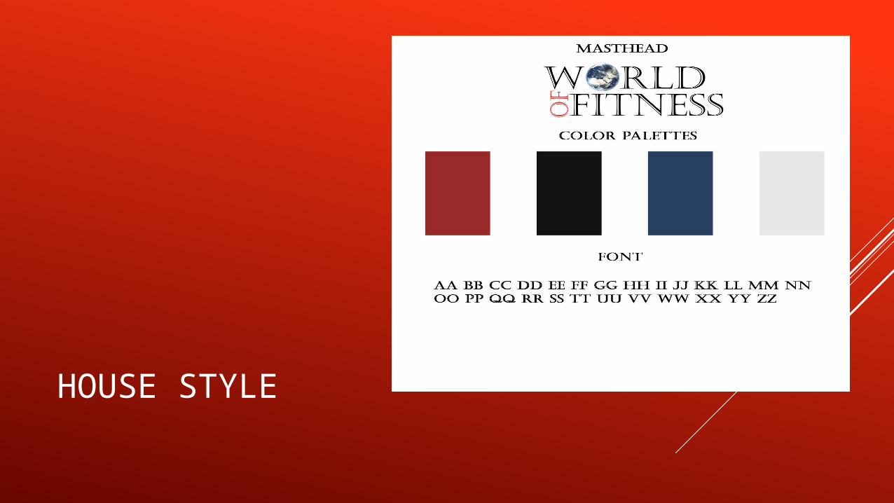
HOUSE STYLE

CRITICAL REFLECTION QUESTIONS #1 #1 How does your product use or challenge conventions and how does it represent social groups or issues?
This is the Masthead. It pops out to the audience and it has both horizontal and vertical typography to enhance it’s appearance.
The whitespace makes the central image stand out a bit more.
The central image is in the mid thirds when using the Rule of Thirds. Seeing as it’s in the middle, it is the direct point of focus.
This is the barcode. It makes the magazine look more legitimate and ready to be purchased.
The issue date is presented here. Seeing as it’s around after New Years and Christmas, people are looking into getting fit, so this magazine’s articles are directed towards those people.
This is the main headline. It’s attached to the central image to make it look the most important. The item he is holding is supposed to be a book and be similar to the “The 10 Commandments”, except it is the 10 commandments for Body Building.
These are the featured articles. They are interesting to the reader because they describe what will be in the magazine and it is directed toward those who want to make some results.
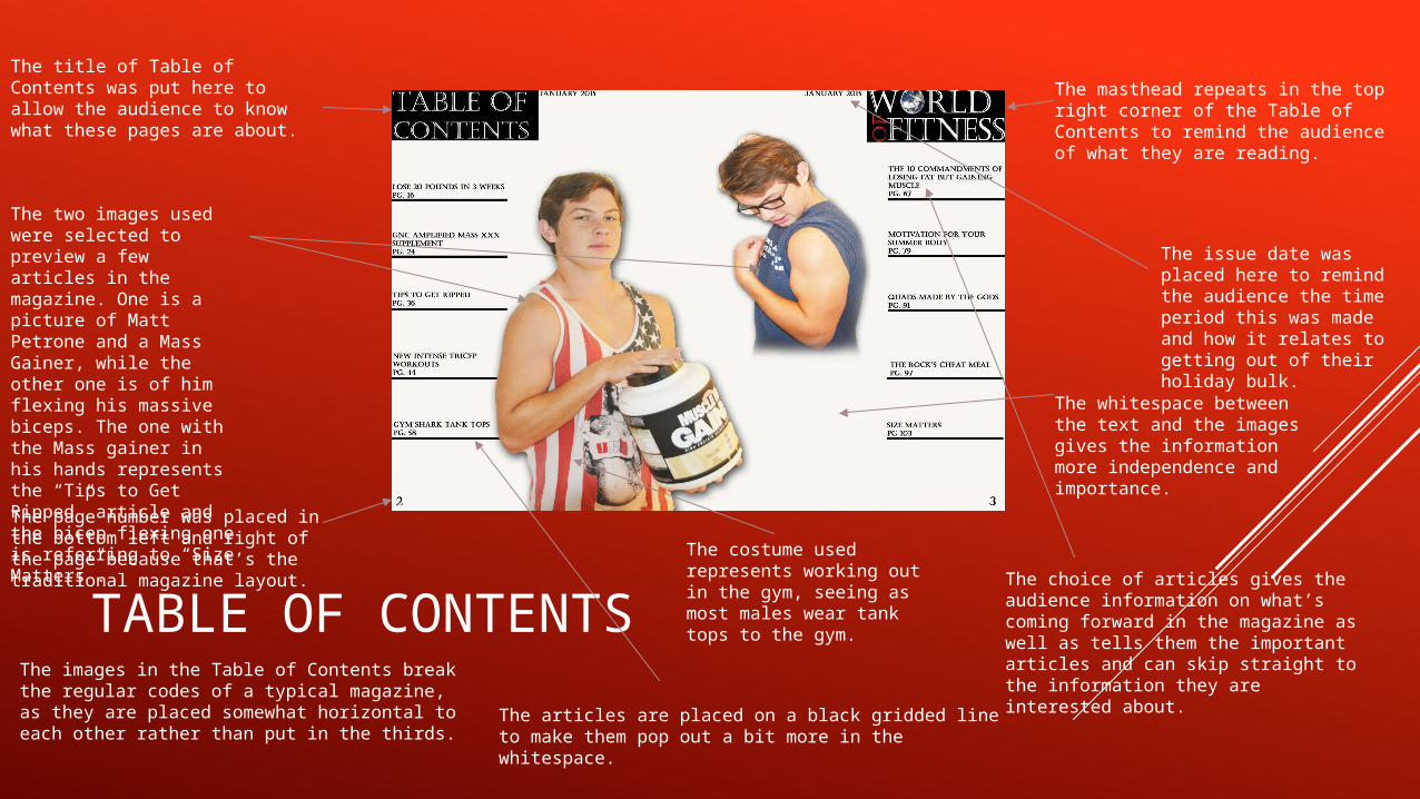
TABLE OF CONTENTS
The title of Table of Contents was put here to allow the audience to know what these pages are about.
The two images used were selected to preview a few articles in the magazine. One is a picture of Matt Petrone and a Mass Gainer, while the other one is of him flexing his massive biceps. The one with the Mass gainer in his hands represents the “Tips to Get Ripped” article and the bicep flexing one is referring to “Size Matters”. The page number was placed in the bottom left and right of the page because that’s the traditional magazine layout.
The masthead repeats in the top right corner of the Table of Contents to remind the audience of what they are reading.
The issue date was placed here to remind the audience the time period this was made and how it relates to getting out of their holiday bulk.
The whitespace between the text and the images gives the information more independence and importance.
The costume used represents working out in the gym, seeing as most males wear tank tops to the gym.
The choice of articles gives the audience information on what’s coming forward in the magazine as well as tells them the important articles and can skip straight to the information they are interested about.
The articles are placed on a black gridded line to make them pop out a bit more in the whitespace.
The images in the Table of Contents break the regular codes of a typical magazine, as they are placed somewhat horizontal to each other rather than put in the thirds.
DOUBLE PAGE SPREAD
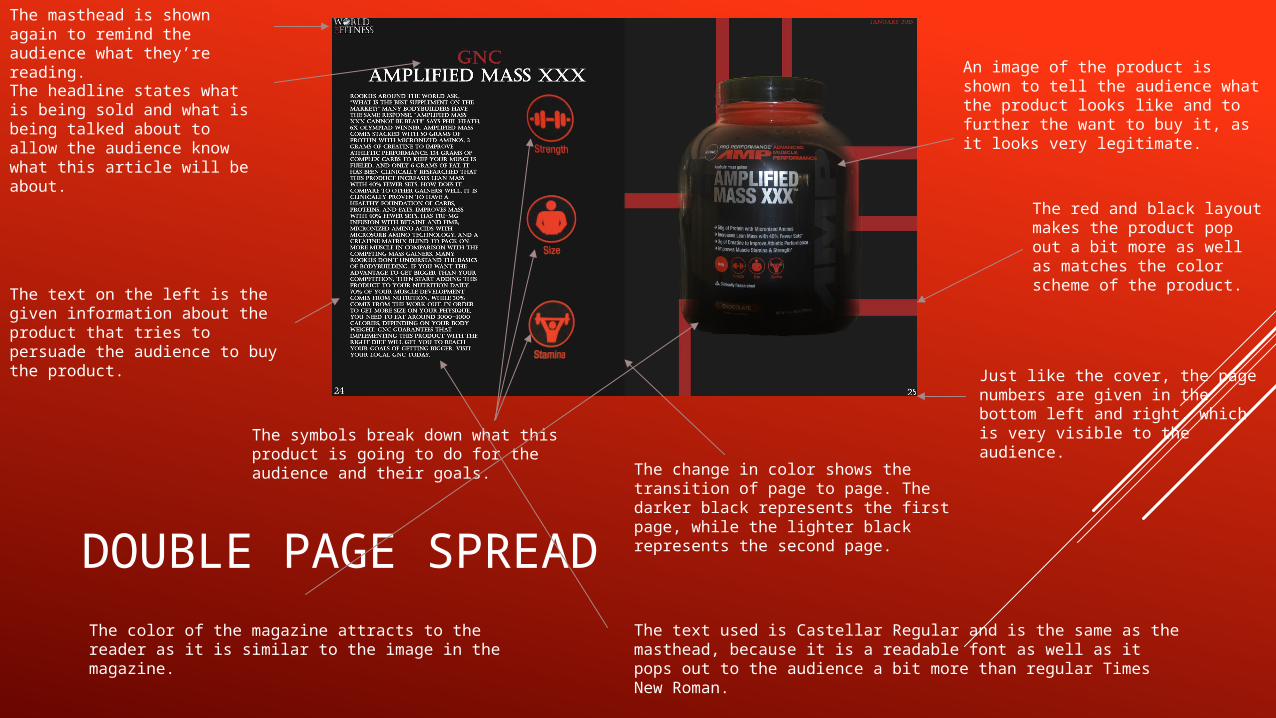
The masthead is shown again to remind the audience what they’re reading.
The headline states what is being sold and what is being talked about to allow the audience know what this article will be about.
The text on the left is the given information about the product that tries to persuade the audience to buy the product.
The symbols break down what this product is going to do for the audience and their goals. The change in color shows the transition of
page to page. The darker black represents the first page, while the lighter black represents the second page.
Just like the cover, the page numbers are given in the bottom left and right, which is very visible to the audience.
The red and black layout makes the product pop out a bit more as well as matches the color scheme of the product.
An image of the product is shown to tell the audience what the product looks like and to further the want to buy it, as it looks very legitimate.
The text used is Castellar Regular and is the same as the masthead, because it is a readable font as well as it pops out to the audience a bit more than regular Times New Roman.
The color of the magazine attracts to the reader as it is similar to the image in the magazine.
#2 HOW DOES YOUR PRODUCT ENGAGE WITH AUDIENCES AND HOW WOULD IT BE DISTRIBUTED AS A REAL MEDIA TEXT?
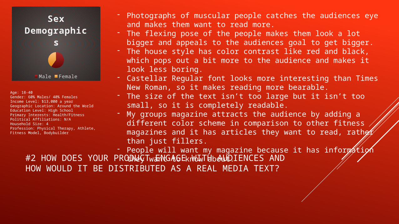
Sex De-mograph-
ics
Male Female
- Photographs of muscular people catches the audiences eye and makes them want to read more.
- The flexing pose of the people makes them look a lot bigger and appeals to the audiences goal to get bigger.
- The house style has color contrast like red and black, which pops out a bit more to the audience and makes it look less boring.
- Castellar Regular font looks more interesting than Times New Roman, so it makes reading more bearable.
- The size of the text isn’t too large but it isn’t too small, so it is completely readable.
- My groups magazine attracts the audience by adding a different color scheme in comparison to other fitness magazines and it has articles they want to read, rather than just fillers.
- People will want my magazine because it has information they want to know about.
Age: 18-40Gender: 60% Males/ 40% FemalesIncome Level: $13,000 a yearGeographic Location: Around the WorldEducation Level: High SchoolPrimary Interests: Health/FitnessPolitical Affiliations: N/AHousehold Size: 4Profession: Physical Therapy, Athlete, Fitness Model, Bodybuilder

#2 HOW DOES YOUR PRODUCT ENGAGE WITH AUDIENCES AND HOW WOULD IT BE DISTRIBUTED AS A REAL MEDIA TEXT?
Time Inc. is one of the highest selling distributors in the world. They don’t have any bodybuilding fitness magazines. They only have sport fitness, so World of Fitness would be a great add to their variety of magazines. My groups magazine stands out from competitors as it has no filler information and contains only information that the audience is interested in, like how to get stronger and how to get more fit as fast as possible.
My magazine would be easy to publish, as the color scheme is very basic yet very eye appealing. The cost would be pretty cheap, especially when our magazine will have high selling rates. Monthly magazines generally work 3 months in advance so I need to plan ahead when producing a magazine for print. The issue dates will refer to the current month and depending on the season, I will tell the audience about how to either get bigger or how to get more toned.

# 3 HOW DID YOUR PRODUCTION SKILLS DEVELOP THROUGHOUT THIS PROJECT?
These are most of my rough drafts leading up to my final product. I believe that as I went along I started to improve. In the beginning, my layouts were not as complex as they are now. The amount of Photoshop I used as well as my mastery of it came around towards the end. My ideas also weren’t as well thought out as they are now. I now have better articles and more towards the interest of my audience. The color scheme of my articles also became a lot more complex. I started to use more contrasting colors like red and black rather than just black and white. Overall, I see a lot of improvement in my work.

4. HOW DID YOU INTEGRATE TECHNOLOGIES SOFTWARE, HARDWARE AND ONLINE IN THIS PROJECT?
- The type of computer I used for the magazines was a Dell Optiplex 3010.
- I used the chart option in PowerPoint to show my demographics of Male and Female audience. This is not the first time that I’ve tried to incorporate a chart into a PowerPoint.
- I used Photoshop mainly throughout my making of the magazines. I tried to use Indesign to make a couple of the two page spreads, but it didn’t come out right so I decided to just stick to Photoshop.
- PowerPoint was used to make slideshows for the research of my magazine genre a few times and to be posted on EduBlogs.
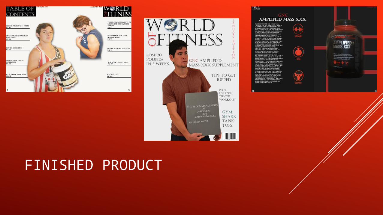
FINISHED PRODUCT


