Page 1
_____________________________________________________________________________________________
STatistics Education Web: Online Journal of K-12 Statistics Lesson Plans 1
http://www.amstat.org/education/stew/
Contact Author for permission to use materials from this STEW lesson in a publication
You and Michael
Stephen Miller
Winchester Thurston School
[email protected]
Published: February 2012
Overview of Lesson
Roman writer, architect, and engineer Marcus Vitruvius proposed, among other relationships,
that a person’s height and their arm span (herein called “wingspan”) are approximately equal. In
this investigation, students will collect data to assess whether or not Vitruvius’s proposal was
reasonable. Scatterplots will be drawn to illustrate the data and a best-fit line will be overlain on
the scatterplot. The equation of the best-fit line will be determined, and the slope interpreted in
context.
GAISE Components
This investigation follows the four components of statistical problem solving put forth in the
Guidelines for Assessment and Instruction in Statistics Education (GAISE) Report. The four
components are: formulate a question, design and implement a plan to collect data, analyze the
data by measures and graphs, and interpret the results in the context of the original question.
This is a GAISE Level B activity.
Common Core State Standards for Mathematical Practice
1. Make sense of problems and persevere in solving them.
2. Reason abstractly and quantitatively.
3. Construct viable arguments and critique the reasoning of others.
4. Model with mathematics.
5. Use appropriate tools strategically.
Common Core State Standards Grade Level Content (Grade 8)
8. SP. 1. Construct and interpret scatter plots for bivariate measurement data to investigate
patterns of association between two quantities. Describe patterns such as clustering, outliers,
positive or negative association, linear association, and nonlinear association.
8. SP. 2. Know that straight lines are widely used to model relationships between two
quantitative variables. For scatter plots that suggest a linear association, informally fit a straight
line, and informally assess the model fit by judging the closeness of the data points to the line.
8. SP. 3. Use the equation of a linear model to solve problems in the context of bivariate
measurement data, interpreting the slope and intercept.
Page 2
_____________________________________________________________________________________________
STatistics Education Web: Online Journal of K-12 Statistics Lesson Plans 2
http://www.amstat.org/education/stew/
Contact Author for permission to use materials from this STEW lesson in a publication
NCTM Principles and Standards for School Mathematics
Data Analysis and Probability Standards for Grades 6-8
Formulate questions that can be addressed with data and collect, organize, and display
relevant data to answer them:
formulate questions, design studies, and collect data about a characteristic shared by two
populations or different characteristics within one population;
select, create, and use appropriate graphical representations of data, including histograms,
box plots, and scatterplots.
Select and use appropriate statistical methods to analyze data:
discuss and understand the correspondence between data sets and their graphical
representations, especially histograms, stem-and-leaf plots, box plots, and scatterplots.
Develop and evaluate inferences and predictions that are based on data:
make conjectures about possible relationships between two characteristics of a sample on
the basis of scatterplots of the data and approximate lines of fit;
use conjectures to formulate new questions and plan new studies to answer them.
Prerequisites
Students will have knowledge of making measurements (in centimeters) using a tape measure.
Students will have knowledge of how to organize data in a table. Students will have knowledge
of how to create a scatterplot of bivariate data. Students will have knowledge of how to draw a
“best-fit” line on the scatterplot.
Learning Targets
Students will be able to collect bivariate data and to create a scatterplot to display the data using
technology. In addition, students will be able to analyze and interpret the data.
Time Required
Approximately one 45-50 minute class period; some discussion time the following class period
might be necessary.
Materials Required
Graphing calculators or computers with spreadsheet or statistical software that can be used to
create and print scatterplots. Centimeter tape measure at least 200 cm long.
Page 3
_____________________________________________________________________________________________
STatistics Education Web: Online Journal of K-12 Statistics Lesson Plans 3
http://www.amstat.org/education/stew/
Contact Author for permission to use materials from this STEW lesson in a publication
Instructional Lesson Plan
The GAISE Statistical Problem-Solving Procedure
I. Formulate Question(s)
Begin the lesson by asking students if they think that student body dimensions (such as height,
arm span) might be related.
Ask students to write some questions that they would be interested in investigating about
students’ height and arm span. Some possible questions might be:
1. What kinds of heights do typical students have? What is the shortest height a typical
student might reasonably have? What is the tallest height a typical student might
reasonably have?
2. What kinds of arm spans (herein called “wingspan”) might a typical student have? What
is the shortest wingspan a typical student might reasonably have? What is the longest
wingspan a typical student might reasonably have?
3. Do you think there is a relationship between students’ height and wingspan?
4. If there is a relationship between height and wingspan, what might that relationship be?
5. What type of graph might be used to display the relationship? What would a graph of the
data look like if a relationship between height and wingspan does exist?
6. Do you think athletes would follow the same relationship between height and wingspan
as typical students? What athletes might follow this relationship? What athletes might
not follow this relationship?
7. Are there other variables that might affect a relationship between height and wingspan?
How might those variables affect the relationship?
8. How might we collect data to study the relationship between height and wingspan?
II. Design and Implement a Plan to Collect the Data
Begin the data collection phase by asking students what measurements should be made.
Continue the discussion asking questions such as who should make the measurements, how the
student being measured should stand, and whether or not shoes should be worn. These questions
form the basis of a measurement protocol. Ask the students why a measurement protocol is
important. By developing a measurement protocol, there can be consistency from measurement
to measurement.
Record the height and wingspan measurements in centimeters in a data table. Sample data are
shown in the table below; a blank data table, including Michael Phelps’ height and wingspan, is
provided on the Activity Sheet on page 9.
Page 4
_____________________________________________________________________________________________
STatistics Education Web: Online Journal of K-12 Statistics Lesson Plans 4
http://www.amstat.org/education/stew/
Contact Author for permission to use materials from this STEW lesson in a publication
Table 1. Sample class data.
Student Height Wingspan
Adam 152 151
Mallory 162 162
Marianne 160 158
Patrick 154 155
Darryl 149 147
Taylor 147 145
Tasha 162 162
Wes 159 160
Amanda 154 152
Dave 163 161
Jason 157 158
Jake 149 149
Darcy 163 162
Marissa 146 147
Paul 148 148
Teal 153 154
Zac 168 166
Ian 159 159
Alan 158 157
Ambreia 148 148
Davis 149 150
Greg 160 159
Michael 193 201
Page 5
_____________________________________________________________________________________________
STatistics Education Web: Online Journal of K-12 Statistics Lesson Plans 5
http://www.amstat.org/education/stew/
Contact Author for permission to use materials from this STEW lesson in a publication
III. Analyze the Data
Have students use appropriate technology (graphing calculator, Excel, statistical software) to
create a scatterplot of height and wingspan data. Do not include Michael Phelps’ data point on
this scatterplot; it will be added later. A scatterplot for the sample data is shown below.
170165160155150145
170
165
160
155
150
145
Height (cm)
Win
gsp
an
(cm
)Relationship between Wingspan (cm) vs Height (cm)
Figure 1. Scatterplot of sample class data.
Have students look carefully at the scatterplot. Ask students if there appears to be evidence of a
relationship between height and wingspan. If there seems to be a relationship, what type of
relationship is it? How would you describe the relationship (is it linear or non-linear)? Discuss
what constitutes a “best fit” line, and have students draw a best fit line through the data, and
write the equation of their best-fit line. Note that “best-fit” lines for this scatterplot may vary
somewhat from student to student; they should all have a positive slope and the line should be
positioned such that approximately an equal number of points lie above and below the line.
IV. Interpret the Results
Ask the students to consider the slope of their best fit line and interpret that value in context.
The slope determined for the least-squares regression line on the sample data is approximately
0.95, which indicates that for a one-centimeter increase in height, the wingspan increases by
approximately 0.95 cm on average. Note that the slope may differ from this value depending on
the choice of the best-fit line.
Have students consider what would happen to the best fit line if Michael Phelps’ height and
wingspan were added to the dataset. Without changing the best fit line on the scatterplot, add
Michael’s data point, and discuss where Michael’s data point is located on the scatterplot. The
new scatterplot, including Michael’s data point, is shown below.
Page 6
_____________________________________________________________________________________________
STatistics Education Web: Online Journal of K-12 Statistics Lesson Plans 6
http://www.amstat.org/education/stew/
Contact Author for permission to use materials from this STEW lesson in a publication
190180170160150140
200
190
180
170
160
150
140
Height (cm)
Win
gsp
an
(cm
)
Relationship between Wingspan (cm) vs Height (cm)
Figure 2. Scatterplot of sample class data including data for Michael Phelps.
Page 7
_____________________________________________________________________________________________
STatistics Education Web: Online Journal of K-12 Statistics Lesson Plans 7
http://www.amstat.org/education/stew/
Contact Author for permission to use materials from this STEW lesson in a publication
Assessment
1. How well does a line fit the wingspan vs. height data? What does that mean?
2. Can we claim that the scatterplot represents the relationship between height and “wingspan”
in the general population? Why or why not?
3. What about Michael Phelps – is he like us or is he different? How?
4. How do your measurements compare to Michael Phelps?
Page 8
_____________________________________________________________________________________________
STatistics Education Web: Online Journal of K-12 Statistics Lesson Plans 8
http://www.amstat.org/education/stew/
Contact Author for permission to use materials from this STEW lesson in a publication
Answers
1. The data points do seem to cluster closely to the best-fit line; there is not a lot of deviation
between the line and the points.
2. No, we cannot claim that the scatterplot represents the relationship between height and
wingspan in the general population. These data values were collected for students; there is no
guarantee that as adults or younger children this same relationship between height and wingspan
holds true.
3. Although Michael seems to follow the same general trend, his wingspan seems to be
somewhat longer compared to his height than typical students.
4. Answers may vary. One possible answer is “My height and wingspan are closer to each other
than are Michael’s height and wingspan.”
Possible Extensions
Vitruvius postulated other relationships between body measurements, such as the length of the
hand is one-ninth of the height or that the kneeling height is three-fourths of the standing height.
Research other relationships postulated by Vitruvius, and design an activity to verify or refute his
postulates.
References
Adapted from an activity created by Paul J. Fields, Ph.D. for the American Statistical
Association Meeting Within a Meeting Program for Middle School Teachers (2008).
Page 9
_____________________________________________________________________________________________
STatistics Education Web: Online Journal of K-12 Statistics Lesson Plans 9
http://www.amstat.org/education/stew/
Contact Author for permission to use materials from this STEW lesson in a publication
You and Michael Activity Sheet
Roman writer, architect, and engineer Marcus Vitruvius proposed, among other relationships,
that a person’s height and their arm span (herein called “wingspan”) are approximately equal. In
this investigation, you will collect data to assess whether or not Vitruvius’s proposal was
reasonable.
1. What kinds of heights do typical students have? What is the shortest height a typical student
might reasonably have? What is the tallest height a typical student might reasonably have?
2. What kinds of arm spans (herein called “wingspan”) might a typical student have? What is
the shortest wingspan a typical student might reasonably have? What is the longest wingspan a
typical student might reasonably have?
3. Do you think there is a relationship between students’ height and wingspan?
4. If there is a relationship between height and wingspan, what might that relationship be?
5. What type of graph might be used to display the relationship? What would a graph of the
data look like if a relationship between height and wingspan does exist?
6. Do you think athletes would follow the same relationship between height and wingspan as
typical students? What athletes might follow this relationship? What athletes might not follow
this relationship?
7. Are there other variables that might affect a relationship between height and wingspan? How
might those variables affect the relationship?
Page 10
_____________________________________________________________________________________________
STatistics Education Web: Online Journal of K-12 Statistics Lesson Plans 10
http://www.amstat.org/education/stew/
Contact Author for permission to use materials from this STEW lesson in a publication
8. How might we collect data to study the relationship between height and wingspan?
9. Using the measurement protocol developed in class, record the height and wingspan
measurements of you and your classmates in centimeters in the data table below.
Data Collection Table
Student Name Height (cm) Wingspan (cm)
Michael Phelps 193 201
Page 11
_____________________________________________________________________________________________
STatistics Education Web: Online Journal of K-12 Statistics Lesson Plans 11
http://www.amstat.org/education/stew/
Contact Author for permission to use materials from this STEW lesson in a publication
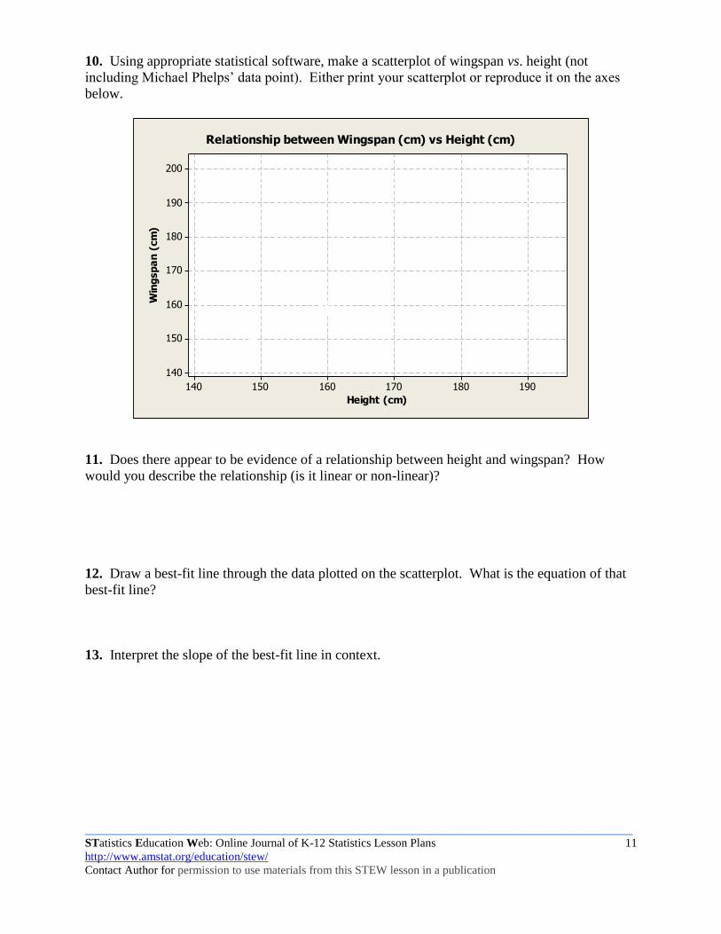
10. Using appropriate statistical software, make a scatterplot of wingspan vs. height (not
including Michael Phelps’ data point). Either print your scatterplot or reproduce it on the axes
below.
190180170160150140
200
190
180
170
160
150
140
Height (cm)
Win
gsp
an
(cm
)
Relationship between Wingspan (cm) vs Height (cm)
11. Does there appear to be evidence of a relationship between height and wingspan? How
would you describe the relationship (is it linear or non-linear)?
12. Draw a best-fit line through the data plotted on the scatterplot. What is the equation of that
best-fit line?
13. Interpret the slope of the best-fit line in context.
Page 12
_____________________________________________________________________________________________
STatistics Education Web: Online Journal of K-12 Statistics Lesson Plans 12
http://www.amstat.org/education/stew/
Contact Author for permission to use materials from this STEW lesson in a publication
14. What do you think would happen to the best-fit line if Michael Phelps’ data point was added
to the scatterplot? Add his data point to your scatterplot above.
15. Does Michael seem to have the same relationship between wingspan and height as the
students in your class? How is it similar? How is it different?