

Typography Day 2015 1
Experimental Typography
http://www.typoday.in
The dichotomic tension of experimental typography
Gavin Ambrose, University of Brighton, [email protected]
Beth Salter, University of Brighton, [email protected]
Abstract:
This paper is written from the perspective of exploring two key words,
‘experimental’ and typography’ and their apparent dichotomic relationship and
tension. It looks at the historical context of ‘typography’ being linked to the
Modernist ideals of form following function and ‘experimental’ type relating to
Postmodernism, as new technology contradicted and questioned Modernist ideals.
This paper looks at the pedagogic teaching of typography as one of a binary
position and explores how best to teach young learners in relation to current
movements in the arts and philosophy – the zeitgeist. It concludes that a continued
development of graphic design theory is imperative to the education of future
graphic designers, as well as an in-depth understanding of the history of the
subject through joined-up teaching of theory and practice.
It is imperative learners are taught and respect the values of typographic history
and the many cannons of thought that have been developed around the discipline.
However, we would argue that it is just as important to embrace a more
Typography Day 2015 2
speculative approach, and this should be at the forefront of design education as
we develop design future facing curriculums.
Key words: Experimental, Typography, Pedagogy, Technology, Media,
Transferable Skills, Ontology, Speculative, Zeitgeist.
Where we are now?
A cursory search for the word typography results in a description of order and
semblance ‘Typography is the art and technique of arranging type to make written
language legible, readable, and appealing when displayed.’1 An equally lazy
definition of ‘experimental’ is as follows, ‘… a new invention or product, based on
untested ideas or techniques and not yet established or finalized’.2
The starting position therefore of experimental typography, and indeed the
pedagogic teaching of it as a craft and activity is one of binary opposition, and for
a young learner not one of a natural, harmonious, symbiotic relationship. It is
important to understand where these definitions come from and their relation to
the history of typography and graphic design.
Jeffery Keedy in his essay Style is not a Four Letter Word identified this binary
distinction of typographic practice as being a failing of the contemporary designer
as they relinquish ‘ownership’ of the experimental in their pursuit of order.
‘Unfortunately, the single-minded pursuit of structural meaning and authenticity,
decorated only with irony in the aesthetics of the twentieth century, has left
style, ornamentation, and beauty in the hands of amateurs.’ (J. Keedy, 2004)
This tension of typographic legibility and experimentation has been an ongoing,
and sometimes contentious debate in the emerging field of Graphic Design theory.
Graphic Designer Neville Brody and editor Jon Wozencroft created FUSE in 1991 as
a vehicle for exploring the boundaries of typographic practice. Arguably, its
1 Google search, accessed February 2019 2 Ibid

Typography Day 2015 3
concerns were rooted in the development of a culture of experimentation and
celebration of the emerging interest in vernacular design. Each edition featured a
series of designers responding to a theme, through the medium of typography. The
resulting typefaces, for example Truth by Darren Scott or Linear Konstrukt by Max
Kisman are explorations of typographic practice often foregoing the ‘conventions’
of typography including legibility and readability in favor of aesthetics, form and
embedded meaning.
Figure 1. Max Kisman – Linear Konstrukt
Whilst Fuse help redefine the topography of the typographic landscape for a new
wave of Graphic Designers it wasn’t universally well received as cited by design
critic Steven Heller ‘Vernacular carried to stupidity …It ain’t funny. There are
certain extremes that are unnecessary, or too ingrown. Design for design, and so
what?’(S. Heller. 1994)
It could be argued the ‘so what?’ questioned by Heller is the dichotomic
relationship and tension inherent in experimental typography. It’s safe to assume
many of the typefaces created over the 18 editions of Fuse were never really
intended to be used as body-copy typefaces and to communicate language. Their
purpose was to establish new thoughts on typographic practice and to present
typeface design as a discipline in its own right as opposed to a purely functional
set of marks serving the ‘master’ of language. At the heart of this type of
experimental typography are two key facets, rigor and experimentation. However
experimental a typeface design is, it still takes rigor to develop that into a working
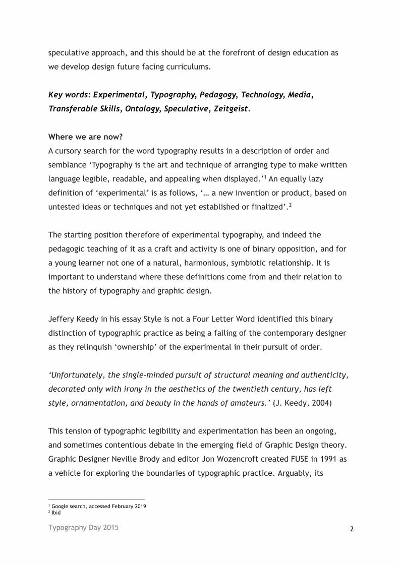
font, as evidenced in the detailed and ordered sketches of Truth by Darren Scott.
Typography Day 2015 4
Figure 2. Truth Sketches by Darren Scott
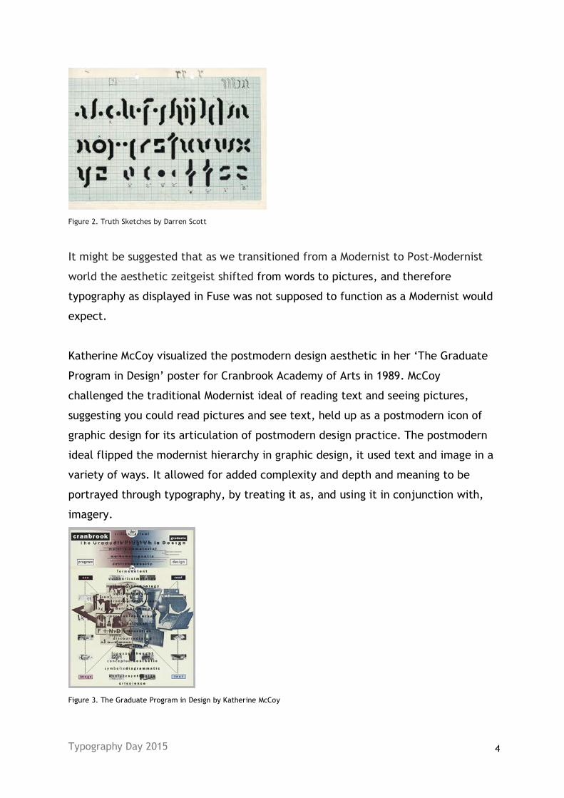
It might be suggested that as we transitioned from a Modernist to Post-Modernist
world the aesthetic zeitgeist shifted from words to pictures, and therefore
typography as displayed in Fuse was not supposed to function as a Modernist would
expect.
Katherine McCoy visualized the postmodern design aesthetic in her ‘The Graduate
Program in Design’ poster for Cranbrook Academy of Arts in 1989. McCoy
challenged the traditional Modernist ideal of reading text and seeing pictures,
suggesting you could read pictures and see text, held up as a postmodern icon of
graphic design for its articulation of postmodern design practice. The postmodern
ideal flipped the modernist hierarchy in graphic design, it used text and image in a
variety of ways. It allowed for added complexity and depth and meaning to be
portrayed through typography, by treating it as, and using it in conjunction with,
imagery.
Figure 3. The Graduate Program in Design by Katherine McCoy

Typography Day 2015 5
Ultimately, some of the greatest graphic design work of the post-modernist era has
been forged through rigor and experimentation, reflecting and challenging
modernist ideals of universal truths and objective reality, the development of new
technologies enhancing and enabling constant experimentation. With
Postmodernism typography became a tool that was not only functional but was
used to layer, to have depth and be seen as well as read.
The use of text as both readable and yet as part of image is perhaps best shown
through the work of British graphic artist Chris Ashworth, who describes his
approach as ‘Swiss Grit’, Editor of Raygun magazine in 1997, he worked at the end
of the postmodern era. Ashworth’s work is deeply rooted in the historically
tradition of Swiss Modernism, and indeed exhibits lots of the traits of this era,
hierarchy and reduced colour palette; yet it is also experimental and challenging,
referencing and challenging Modernist ideals. It often plays with notions of
legibility and readability in its creation, text merges with image, engages its
audience on a purely surface level before drawing them into meaning first
engaging and then informing and merging typography with imagery.
Figure 4. Raygun Magazine Issue 58 by Chris Ashworth
At the heart of our teaching are two seemingly binary opposite approaches, rigour
and experimentation. We teach a program with two distinct parts, that as the
course progresses we actively try and converge. The basic principles of design can
be taught even if the technology is arguably all but redundant. Our students learn
typography through amongst other things, letterpress, a traditional modernist tool
for design. The chances are most of them in the commercial world will have little,

Typography Day 2015 6
if any exposure to letterpress – but the principles remain paramount. As designer
Brian Webb said ‘letterpress isn’t made of rubber, you can’t cheat it’ (Ambrose
Harris, Bloomsbury, 2015) – in other words there is a rigor to it. Conversely, we
actively encourage experimentation and deconstruction of typography through
workshops using a variety of analogue skills; collage, hand lettering, mark making.
We also develop digital skills to encourage students to consider both what they are
saying through typography, yet importantly not to abandon aesthetics in favor of
the universal reasoning of modernity.
David Wolske is a letterpress designer who has ‘developed new letterpress
methodologies and techniques’ (D. Wolske. 2006). Wolske pushes the boundaries,
experimenting with overlay and letterforms, deconstructing the assumed
conventional use of letterpress. Wolske experiments and abstracts letters,
overlaying and subverting long established processes in new exciting ways. This
challenging of letterpresses traditional rigour epitomizes in a simple process how
we now see modernist ideals.
Figure 5. Paraphrasing 1124 & 0707 by David Wolske
‘David Wolske pushes the medium of printmaking in exciting new ways, urging it
to interact with different technologies and experimenting with the different
possibilities… The clean lines and simple shapes of his letters and words belie a
complex approach to image making.’ (N. B. Abrams, 2018)

Typography Day 2015 7
An important contextual understanding of postmodernism was its need to
challenge not just the aesthetic rules of modernism but its fundamental philosophy
as well. Design and typography is used to convey meaning, be that brand, political
or emotive and this relates to the current philosophical leaning of the world
around us, be that global or local.
As we question, ontologically, how we perceive the world, how should we best
prepare design students to respond to these open-ended questions through
typography. One proposed theory of the next creative and philosophical movement
is ‘Metamodernism’ as introduced by theorists Vermeulen and van den Akker in
2010:
‘… if the modern suggests temporal ordering, and the postmodern implies spatial
disordering, then the metamodern should be understood as a spacetime that is
both – neither ordered and disordered.’ And ‘ontologically, metamodernism
oscillates between the modern and the postmodern. It oscillates between a
modern enthusiasm and a postmodern irony, between hope and melancholy,
between naïveté and knowingness, empathy and apathy, unity and plurality,
totality and fragmentation, purity and ambiguity.’
(T. Vermeulen and R. Akker, 2010).
In order to visually represent these oscillating poles and everything in between,
one might suggest that the designer’s understanding of modernist and postmodern
ideals is paramount in creating design that speaks to and articulates the current
zeitgeist – design theory a necessity in creating innovative future designers. The
world now sits between positive Modernism and negative Postmodernism in an
indecisive manner, we have ever increasing choice made possible through
technological developments in every aspect of our lives on earth. As designers, we
challenge, question and embrace technological possibilities in equal amounts. As
teachers of young designers, it is important to share the historical rigour of graphic
design through lectures, seminars and most importantly, practice-based learning.
From this base knowledge of design, informed by modernism, and later, through
postmodernism, we as educators should continue to build and develop graphic

Typography Day 2015 8
design theories, facilitating speculative environments in which students can work
and consider their practice in relation to the current zeitgeist.
The current acceleration of technological developments affords designers
continual innovation, speculation and experimentation. Metamodernism as a
theory states this as ‘a process of never reaching a goal’ (T. Vermeulen and R.
Akker, 2010). It enables constant innovation and experimentation to occur. It
allows the field of graphic design to consistently grow and evolve, expanding into
new areas through a variety of processes, for example 3D printing, creative-coding
and moving image.
Teaching through a combination of historical rigour with technological
development (or experimentation) is key to challenging how typography is
perceived, students need to understand the rigour, yet they also need to consider
typography (and design) for a wide range of media and applications that continue
to develop and challenge. In order to create engaged and successful designers we
need to teach students to be critically engaged and adaptable in their approach.
We cannot teach students technologies that are yet to exist – but we can prepare
them to be responsive, engaged and active in developing skills when they present
themselves.
Figure 6. A23D Typeface using a combination of traditional and the most modern printing techniques. New North Press & A2
Type
A23D is a contemporary letterpress alphabet commissioned by Richard Ardagh at
New North Press utilizing both the future and past design technologies. Working in
conjunction with Chalk Studios who created the 3-D type, it used both the oldest
and newest forms of printing technology – letterpress and 3-D printing to create a
font that resonates technological advance and nostalgia in one. This project and its
developments achieved accuracy through trialling of new materials and
Typography Day 2015 9
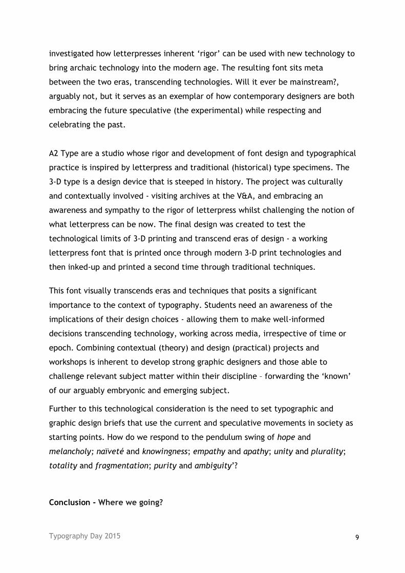
investigated how letterpresses inherent ‘rigor’ can be used with new technology to
bring archaic technology into the modern age. The resulting font sits meta
between the two eras, transcending technologies. Will it ever be mainstream?,
arguably not, but it serves as an exemplar of how contemporary designers are both
embracing the future speculative (the experimental) while respecting and
celebrating the past.
A2 Type are a studio whose rigor and development of font design and typographical
practice is inspired by letterpress and traditional (historical) type specimens. The
3-D type is a design device that is steeped in history. The project was culturally
and contextually involved - visiting archives at the V&A, and embracing an
awareness and sympathy to the rigor of letterpress whilst challenging the notion of
what letterpress can be now. The final design was created to test the
technological limits of 3-D printing and transcend eras of design - a working
letterpress font that is printed once through modern 3-D print technologies and
then inked-up and printed a second time through traditional techniques.
This font visually transcends eras and techniques that posits a significant
importance to the context of typography. Students need an awareness of the
implications of their design choices - allowing them to make well-informed
decisions transcending technology, working across media, irrespective of time or
epoch. Combining contextual (theory) and design (practical) projects and
workshops is inherent to develop strong graphic designers and those able to
challenge relevant subject matter within their discipline – forwarding the ‘known’
of our arguably embryonic and emerging subject.
Further to this technological consideration is the need to set typographic and
graphic design briefs that use the current and speculative movements in society as
starting points. How do we respond to the pendulum swing of hope and
melancholy; naïveté and knowingness; empathy and apathy; unity and plurality;
totality and fragmentation; purity and ambiguity’?
Conclusion - Where we going?

Typography Day 2015 10
It could be argued that this balance, this dichotomy of rigor and tradition,
combined with challenging experimentation through technological advance is the
aim of contemporary design. Informing and engaging audiences with the movement
of society in mind, a movement that encourages consistent and never-ending
experimentation continually swinging between two poles, one a stationary
modernist past (rigour), and the other a movable, evolving future of technological
development (experimentation) can’t be seen as being separate entities.
Pedagogically, we need to teach both graphic design theory (historical and
speculative) alongside practical application of design to allow students to engage,
question and challenge the current status quo.
So where does typography sit within this proposed vision of future possibilities?
Ultimately, modernism was always poised to fail. Initial intentions of universality
and the grand narratives ultimately became inward looking and self-referential.
The value of experimentation suppressed by the desire for a universal truth. In
manifested in a very rule driven approach, reflective of the notion that the world
is narratable entity and typography merely a vehicle for telling these stories,
nothing more and nothing less. This led to the rise of the ubiquitous sans serif,
asymmetrical designs that removed local vernacular and nuances.
“Eventually there emerged the notion that modernist art is practised entirely
within a closed formalist sphere, necessarily separated from, so as not to be
contaminated by, the real world.” (Witcombe. C 1997)
The promise of postmodernism
Post modernism offered a counter to the prevailing universality of modernism.
Dissatisfied with, and disenfranchised from the earlier promises and visions of
universality post modernism saw a resurgence in the specific, the ordinary, the
unique.
“Postmodernism was not a style, but a group of approaches motivated by some
common understandings. It wasn’t a theory, but a set of theoretical positions,
which have at their core a self-reflexive awareness of the tentativeness, the

Typography Day 2015 11
slipperiness, the ambiguity, and complex interrelations of culture and meaning”
(Hall)
Postmodernism countered the notion that the world is easily narratable, and
indeed many designers actively rejected these notions. David Carson famously set
an interview of musician Bryan Ferry entirely in Zapf Dingbats, rendering it
illegible by modernist values, though in the postmodern tradition it still
communicated. Arguably it is very succinctly communicated that there is little, if
anything worth reading in this article. Carson also stresses ‘Don’t mistake legibility
for communication’ and we could all, as designers, do well to consider this.
Carson, with his lack of formal training was arguably never concerned with the
positioning of graphic design in either a modern or postmodern framing, and this
would have afforded a freedom from any such classification or restriction. Early
proponents of modernism also latterly moved away from the rigidity and binary
positioning. Jan Tschichold, an early modernist convert, later denounced his book,
Die neue Typographie as ‘too extreme’ and he reverted to more classical
approaches to typography, including using roman typefaces for body copy instead
of the modernists sans serif. Weingart, also a advocate of modernism, through the
so called Swiss Style, also later rejected this in favor of more immediate and
experimental approaches to typographic design, pioneering what became known as
Swiss Punk.
‘Ideology and rules collapsed in the face of his (Weingart’s) boundless energy.’
(Meggs).
Referring back to the quote by Vermeulen and Akker earlier in this article and their
proposition that ‘metamodern should be understood as a spacetime that is both –
neither ordered and disordered’, perhaps now is the time that this will come into
being. Typographic practice is just that, a practice. But it isn’t independent, it is
part of the wider range of cultural practices, for example dance, music and
performance that constitute culture, and in turn shape society. It both drives and
is reflective of the desires of a given time and zeitgeist. The future of typographic
development lies in this intersection, the ordered and the disordered, offering

Typography Day 2015 12
both communication and personal expression without having to compromise on
either.
Bibliography
Wikipedia contributors. (2019, January 16). Typography. In Wikipedia, The Free Encyclopedia. Retrieved 17:03, February 18, 2019, from https://en.wikipedia.org/w/index.php?title=Typography&oldid=878787168 Keedy. J. (2004) Style is not a Four Letter Word. Emigré No. 67. Princeton Architectural Press. Oxford University Dictionary. (2019). Definition of experimental in English: Retrieved 17:07, February 18, 2019. https://en.oxforddictionaries.com/definition/experimental Heller. S. (1994) An Interview with Steven Heller. M. Dooley. Emigre #30. Sacramento, California, USA. Ambrose. G. & Harris. P. (2015). Design Genius. Bloomsbury. London. Wolske. D. (2006) Meet David Wolske. In Voyage Dallas. Retrieved 17:29, February 18, 2019. http://voyagedallas.com/interview/meet-david-wolske-david-wolske-typographic-designer-artist-denton/ Abrams. N. B. (2019). David Wolske Profile. Retrieved 12:32, February 18, 2019. http://www.david-wolske.com/about-dw Vermeulen. T & Akker. R (2010) Notes on Metamodernism. Journal of Aesthetics & Culture,2:1, DOI: 10.3402/jac.v2i0.5677 Witcombe. C. (1997). Art for Art’s Sake. On Art History Resources. Retrieved 17:39, February 18, 2019. http://arthistoryresources.net/modernism/artsake.html Hall. (No Date) Postmodernism (New Wave). Influence/Impact. N.p., n.d. Web. Retrieved 17:44, February 18, 2019. http://designseminar8.blogspot.com/p/influenceimpact.html Meggs. P. B. & Purvis. A. W. (2016) Meggs' History of Graphic Design. John Wiley and Sons. New Jersey


