
Unit 13 1
GUI Layout Managers and Components, Continue
• Card Layout
• Borders
• More GUI components• Menu
• List
• Sliders
• Combo Boxes
• Scroll Panes
• Split Panes
• Special Features of Swing components
• Further GUI Programming Examples
• Exercises
Unit 13 2
Introduction
• This is our concluding session on GUIs and event-driven programming.
• In our discussion on GUI-based programs so far, we have covered:
– GUI design issues, GUI components and containers.
– Basic event handling.
– Basic layout management.
• We are going to cover:
• More GUI components.
• More layout managers.
• Special Features of Swing components
• With this coverage the student's knowledge base of the basics would be broadened.
Unit 13 3
• A CardLayout object is a layout manager for a container. It treats each component in the container as a card.
• Only one card is visible at a time, and the container acts as a stack of cards.
• The first component added to a CardLayout object is the visible component when the container is first displayed.
• The ordering of cards is determined by the container's own internal ordering of its component objects.
• CardLayout defines a set of methods that allow an application to flip through these cards sequentially, or to show a specified card.
• Card Layout has two constructors:• CardLayout(): Creates a new card layout with gaps of size zero.• CardLayout(int hgap, int vgap) Creates a new card layout with
the specified horizontal and vertical gaps.
Card Layout Manager
Unit 13 4
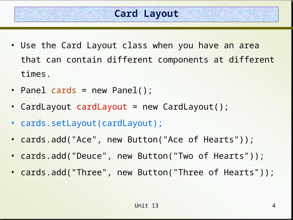
Card Layout
• Use the Card Layout class when you have an area that can contain
different components at different times.
• Panel cards = new Panel();
• CardLayout cardLayout = new CardLayout();
• cards.setLayout(cardLayout);
• cards.add("Ace", new Button("Ace of Hearts"));
• cards.add("Deuce", new Button("Two of Hearts"));
• cards.add("Three", new Button("Three of Hearts"));
Unit 13 5
Introduction to Borders
• A border can be put around any Swing component to define how the edges of the component should be drawn.
• The BorderFactory class is useful for creating border objects.
• It has methods for creating specific types of borders.
• A border is applied to a component using the setBorder method:
JPanel myPanel = new JPanel();
Border myBorder = BorderFactory.createEtchedBorder();
myPanel.setBorder(myBorder);

Unit 13 6
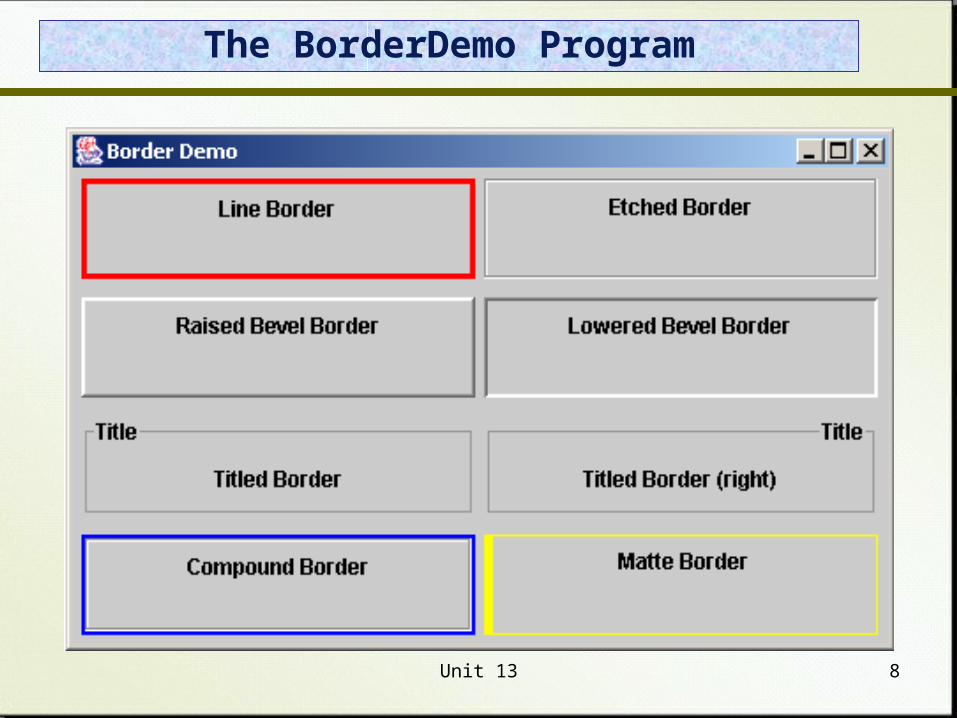
Borders
• A line border
– Surrounds the component with a simple line
– The line's color and thickness can be specified
• An etched border
– Creates the effect of an etched groove around a component
– Uses colors for the highlight and shadow
• A bevel border
– Can be raised or lowered
– Uses colors for the outer and inner highlights and shadows
Unit 13 7
Borders
• A compound border
– Is a combination of two borders
– One or both of the borders can be a compound border
• A titled border
– Places a title on or around the border
– The title can be oriented in many ways
• A matte border
– Specifies the sizes of the top, left, bottom, and right edges of the border separately
– Uses either a solid color or an image.
Unit 13 8
The BorderDemo Program
Unit 13 9
MenuBar and Menu
• A menu offers options to user.• Menus are not generally added to user interface.• Menu usually appears either in a menu bar or as a popup
menu.• A JFrame often has a menu bar containing many menus;
and each menu can contain many choices.• Menu bar can be added to a JFrame with the method
setJMenuBar.
JFrame window = new JFrame("Some Application");
JMenuBar menuBar = new JMenuBar();
window.setJMenuBar(menuBar);
Unit 13 10
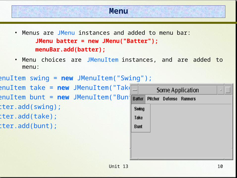
Menu
• Menus are JMenu instances and added to menu bar:
JMenu batter = new JMenu("Batter");
menuBar.add(batter);
• Menu choices are JMenuItem instances, and are added to menu:
JMenuItem swing = new JMenuItem("Swing");
JMenuItem take = new JMenuItem("Take");
JMenuItem bunt = new JMenuItem("Bunt");
batter.add(swing);
batter.add(take);
batter.add(bunt);
Unit 13 11
Lists
• The Swing Jlist class represents a list of items from which the user can choose.
• The contents of a JList object can be specified using an array of objects.
• A JList object generates a list selection event when the current selection changes.
• A JList object can be set so that multiple items can be selected at the same time. It can be one of three options:
– Single selection – only one item can be selected at a time.– Single interval selection – multiple, contiguous items can be selected
at a time.– Multiple interval selection – any combination of items can be
selected.
• The list selection mode is defined by a ListSelectionModel object.
Unit 13 12
Declaring a JList
String[] items = {“A", “B", “C", "D"};
JList list = new JList(items);
list.setSelectionMode(DefaultListSelectionModel.SINGLE_SELECTION);
// Set the item width
int cellWidth = 200;
list.setFixedCellWidth(cellWidth);
// Set the item height
int cellHeight = 18;
list.setFixedCellHeight(cellHeight);
// Get number of items
in the list int size = list.getModel().getSize();
Unit 13 13
List Example
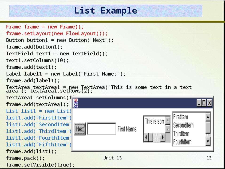
Frame frame = new Frame(); frame.setLayout(new FlowLayout()); Button button1 = new Button("Next"); frame.add(button1); TextField text1 = new TextField(); text1.setColumns(10); frame.add(text1); Label label1 = new Label("First Name:"); frame.add(label1); TextArea textArea1 = new TextArea("This is some text in a text area"); textArea1.setRows(2); textArea1.setColumns(10); frame.add(textArea1); List list1 = new List(); list1.add("FirstItem"); list1.add("SecondItem"); list1.add("ThirdItem"); list1.add("FourthItem"); list1.add("FifthItem"); frame.add(list1); frame.pack(); frame.setVisible(true);
Unit 13 14
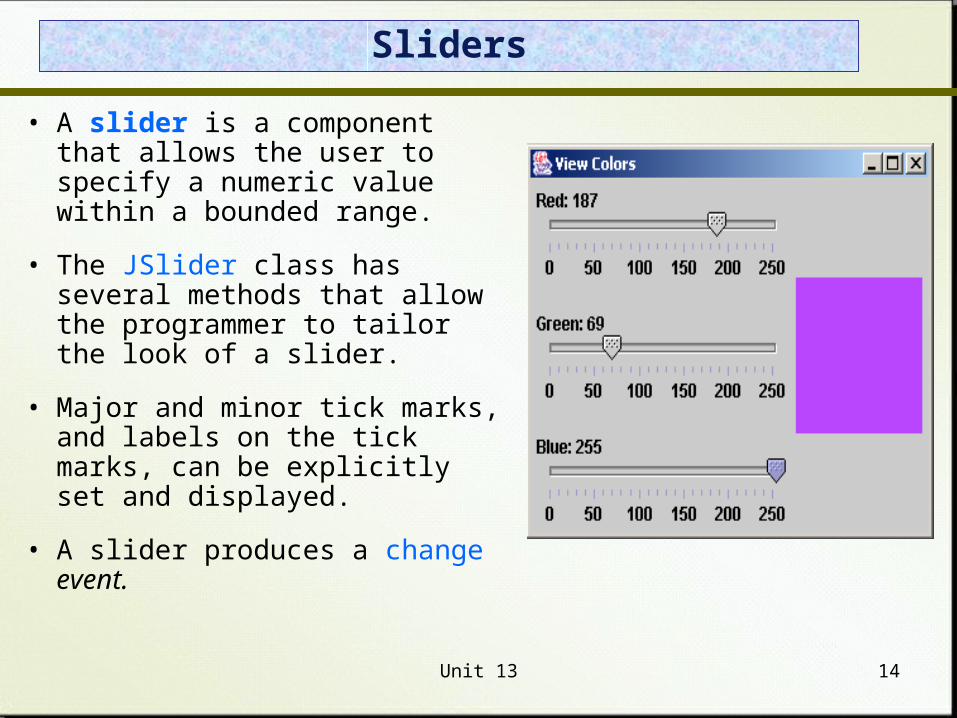
Sliders
• A slider is a component that allows the user to specify a numeric value within a bounded range.
• The JSlider class has several methods that allow the programmer to tailor the look of a slider.
• Major and minor tick marks, and labels on the tick marks, can be explicitly set and displayed.
• A slider produces a change event.
Unit 13 15
Sliders Declaration
// Create a horizontal slider with min=0, max=100, value=50
JSlider slider = new JSlider();
// Create a horizontal slider with custom min and max; value is set to the middle
int minimum = -255;
int maximum = 256;
slider = new JSlider(minimum, maximum);
// Create a horizontal slider with custom min, max, and value
int initValue = 0;
slider = new JSlider(minimum, maximum, initValue);
// Create a vertical slider with min=0, max=100, value=50
slider = new JSlider(JSlider.VERTICAL);
// Create a vertical slider with custom min, max, and value
slider = new JSlider(JSlider.VERTICAL, minimum, maximum, initValue);
Unit 13 16
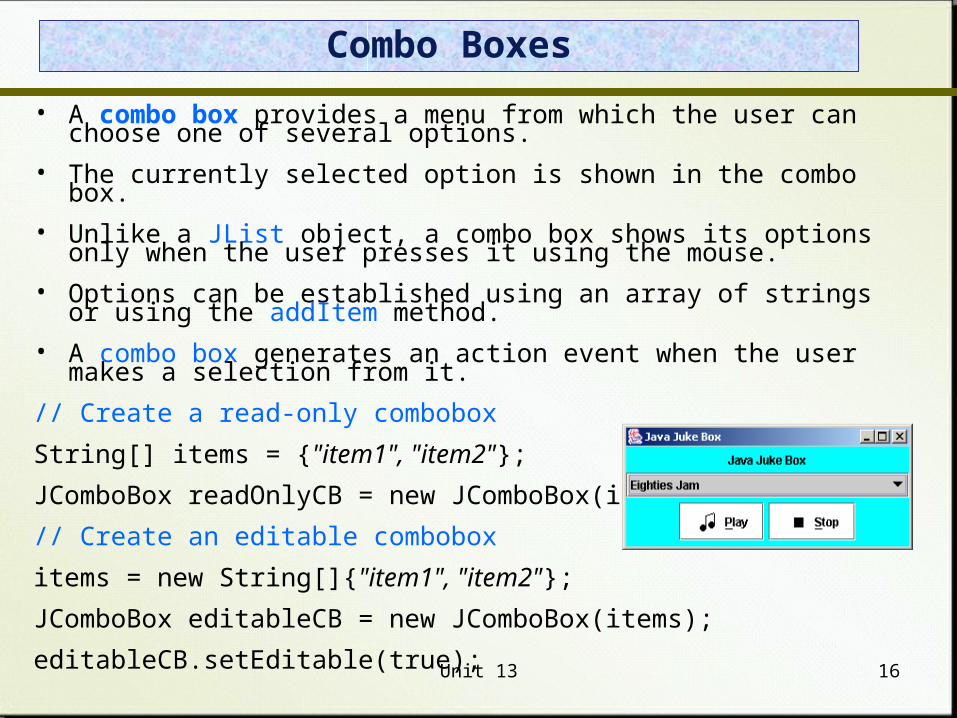
Combo Boxes
• A combo box provides a menu from which the user can choose one of several options.
• The currently selected option is shown in the combo box.
• Unlike a JList object, a combo box shows its options only when the user presses it using the mouse.
• Options can be established using an array of strings or using the addItem method.
• A combo box generates an action event when the user makes a selection from it.
// Create a read-only combobox
String[] items = {"item1", "item2"};
JComboBox readOnlyCB = new JComboBox(items);
// Create an editable combobox
items = new String[]{"item1", "item2"};
JComboBox editableCB = new JComboBox(items);
editableCB.setEditable(true);
Unit 13 17
Scroll Panes
• A scroll pane is useful for images or information too large to fit in a reasonably-sized area.
• A scroll pane offers a limited view of the component it contains.
• It provides vertical and/or horizontal scroll bars that allow the user to scroll to other areas of the component.
• No event listener is needed for a scroll pane.
// Create a scrollable text area
JTextArea textArea = new JTextArea();
JScrollPane scrollableTextArea = new JScrollPane(textArea);
// Create a scrollable list
JList list = new JList();
JScrollPane scrollableList = new JScrollPane(list);
Unit 13 18
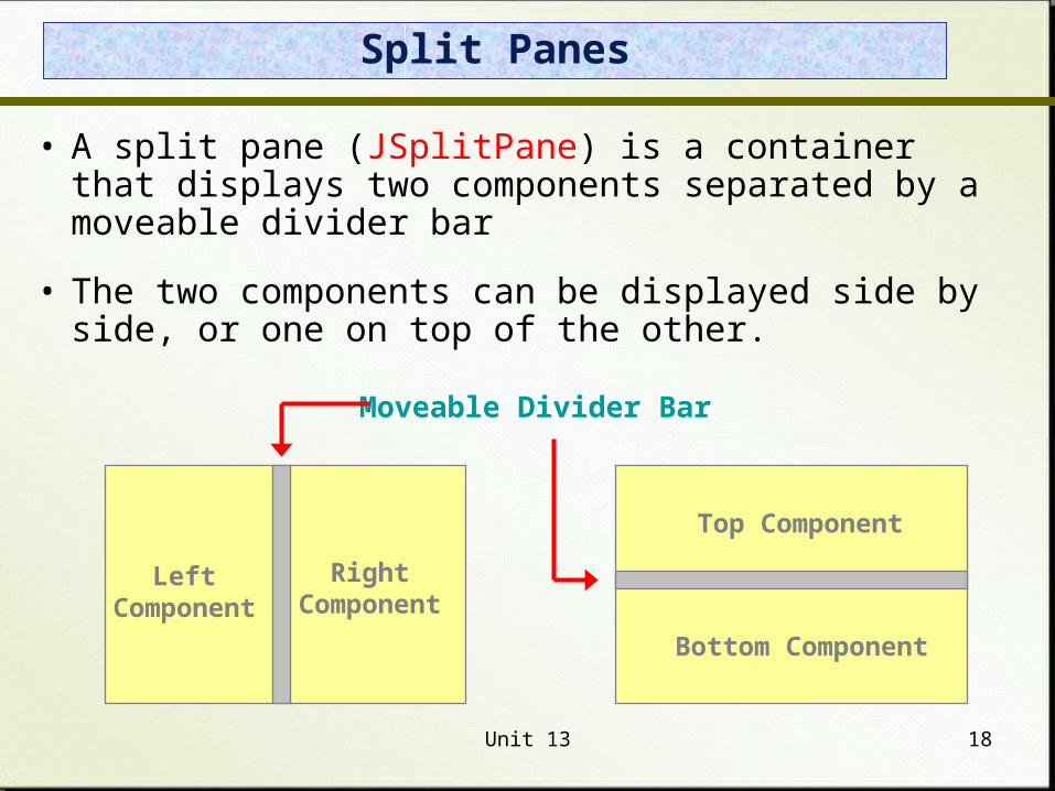
Split Panes
• A split pane (JSplitPane) is a container that displays two components separated by a moveable divider bar
• The two components can be displayed side by side, or one on top of the other.
Moveable Divider Bar
LeftComponent
RightComponent
Top Component
Bottom Component
Unit 13 19
Split Panes
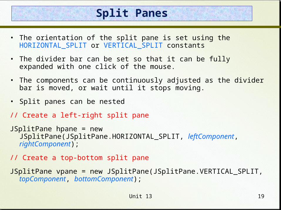
• The orientation of the split pane is set using the HORIZONTAL_SPLIT or VERTICAL_SPLIT constants
• The divider bar can be set so that it can be fully expanded with one click of the mouse.
• The components can be continuously adjusted as the divider bar is moved, or wait until it stops moving.
• Split panes can be nested
// Create a left-right split pane
JSplitPane hpane = new JSplitPane(JSplitPane.HORIZONTAL_SPLIT, leftComponent, rightComponent);
// Create a top-bottom split pane
JSplitPane vpane = new JSplitPane(JSplitPane.VERTICAL_SPLIT, topComponent, bottomComponent);
Unit 13 20
Special Features
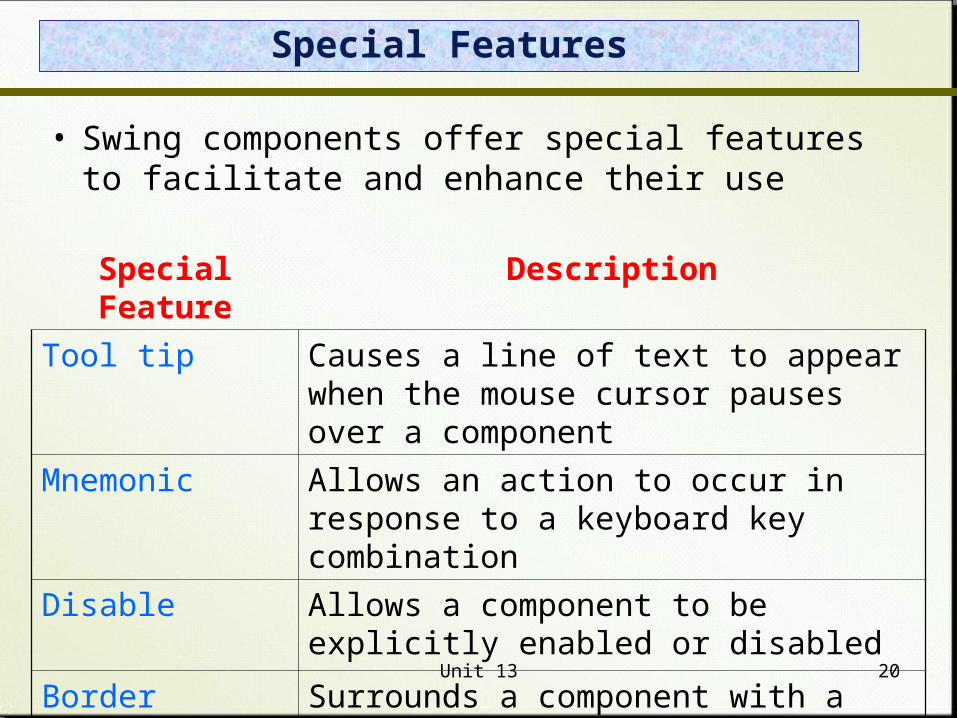
• Swing components offer special features to facilitate and enhance their use
Special Feature Description
Tool tip Causes a line of text to appear when the mouse cursor pauses over a component
Mnemonic Allows an action to occur in response to a keyboard key combination
Disable Allows a component to be explicitly enabled or disabled
Border Surrounds a component with a border
Unit 13 21
Tool Tips
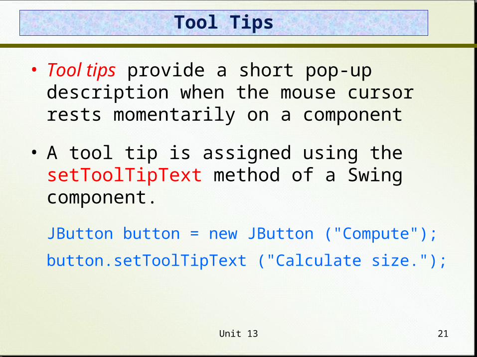
• Tool tips provide a short pop-up description when the mouse cursor rests momentarily on a component
• A tool tip is assigned using the setToolTipText method of a Swing component.
JButton button = new JButton ("Compute");
button.setToolTipText ("Calculate size.");
Unit 13 22
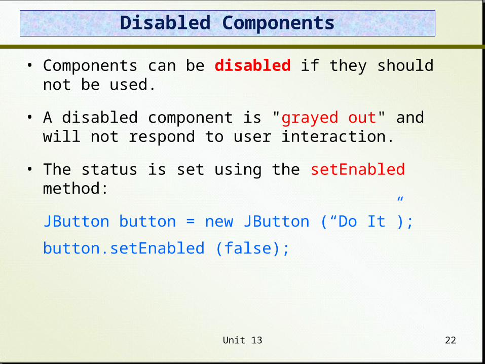
Disabled Components
• Components can be disabled if they should not be used.
• A disabled component is "grayed out" and will not respond to user interaction.
• The status is set using the setEnabled method:
JButton button = new JButton (“Do It”);
button.setEnabled (false);


