The Font used is blurred, which makes you think that something disturbing . The lighting is very low-key which gives us a sense of horror. The Facial expression on her face shows concern and her fear is portrayed through her face and body language. The “inspired by true events” is the usp The sub horror is horror- slasher
Transcript
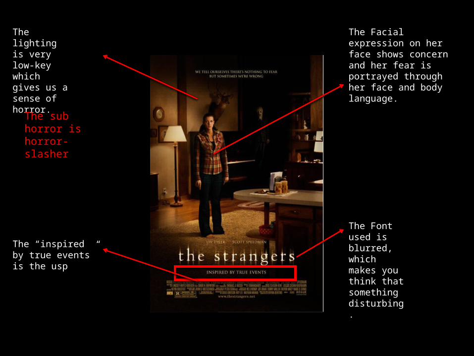
The Font used is blurred, which makes you think that something disturbing.
The lighting is very low-key which gives us a sense of horror.
The Facial expression on her face shows concern and her fear is portrayed through her face and body language.
The “inspired by true events” is the usp
The sub horror is horror-slasher
The use of red font is very popular in horror poster
The sub horror is horror – supernatural
Similar to the strangers this film poster uses dark lighting
Her facial expression and the fact that she is pointing will promote the film and the genre.
The reviews also promotes the film because people’s opinion’s matter.
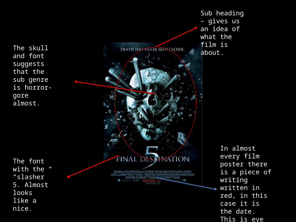
Sub heading – gives us an idea of what the film is about.
The font with the “slasher” 5. Almost looks like a nice.
The skull and font suggests that the sub genre is horror- gore almost.
In almost every film poster there is a piece of writing written in red, in this case it is the date. This is eye catching.
The title is very different compared to other film posters.
A usual horror film trailer has a dark background, differently this film trailer is nothing but light. There is no red font or any special effect on the font like other film posters.
The screaming face is common on a horror poster, suggests a killing or a death which will buy the audience’s attention.
The date is big and boldWhich attracts the audienceEyes.