7
Generic Conventions of Horror Film Posters Brina Johnson
| Date post: | 15-Apr-2017 |
| Category: |
Education |
| Upload: | brinajohnson |
| View: | 267 times |
| Download: | 2 times |
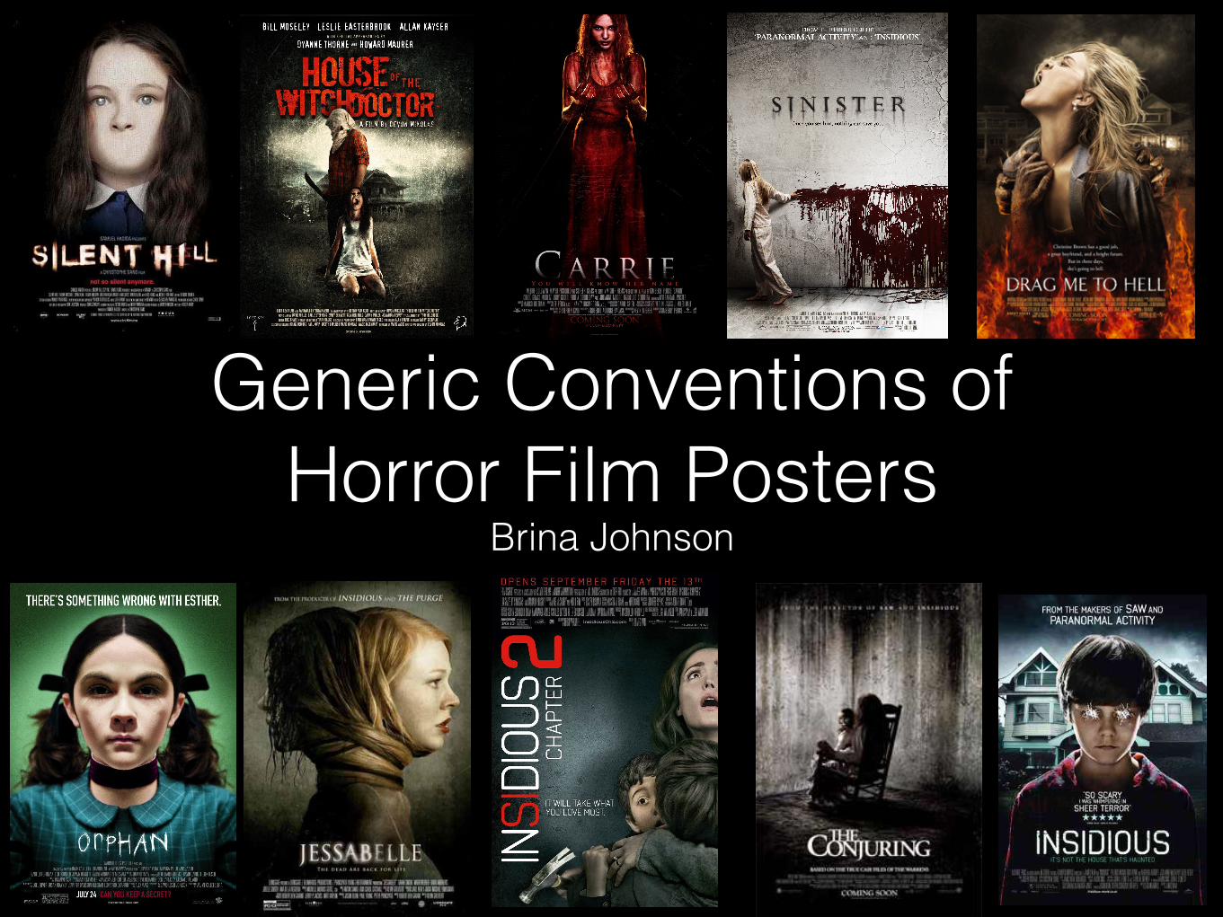
Generic Conventions of Horror Film Posters
Brina Johnson

The Image • The main focus of typical horror film posters is usually a character or can sometimes
be an object. The character shown on the poster is always a significant character who has high importance to the film’s narrative.
• It is usually the film’s antagonist who appears on the poster, and this is to create mystery and make the audience feel scared but intrigued. This is done through the mies-en-scene because the antagonist is usually made to appear out of the ordinary and sometimes supernatural through the use of editing. This is common for films such as Orphan and Insidious (images on the right) when the main character does not begin in the film’s narrative as the obvious antagonist, but instead they develop into a dangerous antagonist as the film progresses. This is conveyed on the poster through editing the images of the characters to look sinister to give the audience a hint that the character is potentially dangerous, encouraging them to watch the film to find out more. For example the boy on the Insidious poster has his eyes etched out which appears mysterious and unnerving. Likewise the girl on the Orphan poster has very dark eyes and there is a lot of shadow on her cheekbones, emphasising her stern facial expression and suggesting that there is something not normal about this girl.
• Another generic convention of horror film posters is to have direct- mode- of - address with the audience through the image of the main character on the poster. By having the character stare intensely at the camera, it draws the audiences attention to the poster and can create an unnerving and anxious atmosphere. It can make the antagonist seem very intimidating and can also make the audience feel as as if the antagonist is threatening them to watch the film to find out more.

The Image • The image of the character is usually in the middle of the poster
to give a main point of focus and to grab the audiences attention. The image of character often gives the most hints about the film’s narrative so it can be something which is important in tempting the audience to watch the film.
• The image on the poster usually has some typical mies-en-scene which makes it generic to the horror genre. The lighting is usually very low to put emphasis on the character, also creating mystery and making the character seem isolated. The dark lighting creates a dark atmosphere and suggests that dark, sinister things happen in the film.
• The image often has editing which distorts the image, making it clear to the audience that the genre of the film is horror. This distortion can include the addition of blood or gore such as in the Carrie poster, or manipulating the image to suggest the theme of the film such as in the Silent Hill and Jessabelle poster. The Jessabelle poster suggests that the female character develops a second personality or perhaps gets possessed, similarly the Silent Hill poster suggests that the girl gets silenced perhaps by some supernatural force.
• Another form of mise-en-scene which can help convey the genre of the film, and is typically used on horror film posters is props. Props such as weapons or tools are used to make the audience feel fear and they already become worried for the characters as it is clear danger lies ahead. This applies to the House of the Witchdoctor poster (on the right) for example.
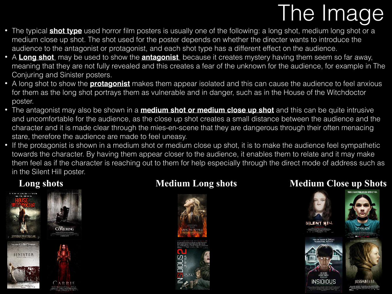
The Image
Long shots Medium Long shots Medium Close up Shots
• The typical shot type used horror film posters is usually one of the following: a long shot, medium long shot or a medium close up shot. The shot used for the poster depends on whether the directer wants to introduce the audience to the antagonist or protagonist, and each shot type has a different effect on the audience.
• A Long shot may be used to show the antagonist because it creates mystery having them seem so far away, meaning that they are not fully revealed and this creates a fear of the unknown for the audience, for example in The Conjuring and Sinister posters.
• A long shot to show the protagonist makes them appear isolated and this can cause the audience to feel anxious for them as the long shot portrays them as vulnerable and in danger, such as in the House of the Witchdoctor poster.
• The antagonist may also be shown in a medium shot or medium close up shot and this can be quite intrusive and uncomfortable for the audience, as the close up shot creates a small distance between the audience and the character and it is made clear through the mies-en-scene that they are dangerous through their often menacing stare, therefore the audience are made to feel uneasy.
• If the protagonist is shown in a medium shot or medium close up shot, it is to make the audience feel sympathetic towards the character. By having them appear closer to the audience, it enables them to relate and it may make them feel as if the character is reaching out to them for help especially through the direct mode of address such as in the Silent Hill poster.
The Credits and release date
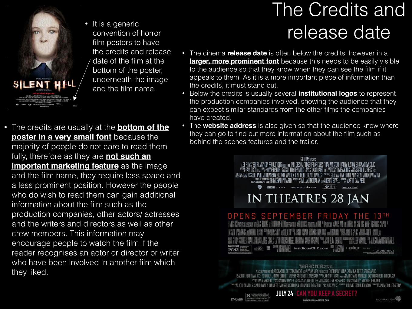
• The credits are usually at the bottom of the poster in a very small font because the majority of people do not care to read them fully, therefore as they are not such an important marketing feature as the image and the film name, they require less space and a less prominent position. However the people who do wish to read them can gain additional information about the film such as the production companies, other actors/ actresses and the writers and directors as well as other crew members. This information may encourage people to watch the film if the reader recognises an actor or director or writer who have been involved in another film which they liked.
• It is a generic convention of horror film posters to have the credits and release date of the film at the bottom of the poster, underneath the image and the film name.
• The cinema release date is often below the credits, however in a larger, more prominent font because this needs to be easily visible to the audience so that they know when they can see the film if it appeals to them. As it is a more important piece of information than the credits, it must stand out.
• Below the credits is usually several institutional logos to represent the production companies involved, showing the audience that they can expect similar standards from the other films the companies have created.
• The website address is also given so that the audience know where they can go to find out more information about the film such as behind the scenes features and the trailer.
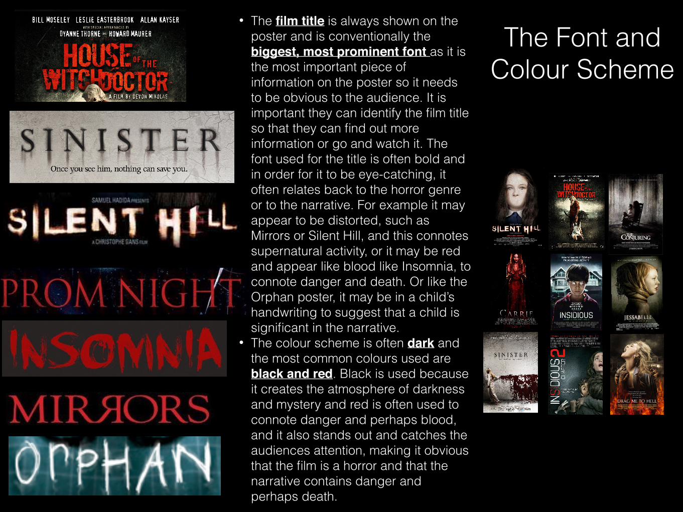
The Font and Colour Scheme
• The film title is always shown on the poster and is conventionally the biggest, most prominent font as it is the most important piece of information on the poster so it needs to be obvious to the audience. It is important they can identify the film title so that they can find out more information or go and watch it. The font used for the title is often bold and in order for it to be eye-catching, it often relates back to the horror genre or to the narrative. For example it may appear to be distorted, such as Mirrors or Silent Hill, and this connotes supernatural activity, or it may be red and appear like blood like Insomnia, to connote danger and death. Or like the Orphan poster, it may be in a child’s handwriting to suggest that a child is significant in the narrative.
• The colour scheme is often dark and the most common colours used are black and red. Black is used because it creates the atmosphere of darkness and mystery and red is often used to connote danger and perhaps blood, and it also stands out and catches the audiences attention, making it obvious that the film is a horror and that the narrative contains danger and perhaps death.

Tagline • Horror film posters typically include a
tagline which is usually a few words or a sentence which catches the audience’s attention and becomes memorable and something they associate with the film.
• It’s purpose is to give the audience a slight hint about the film’s narrative but not giving too much away. It tempts them to go and see the film after giving a slight suggestion of what the film may be about.
• It usually appears either below the film title, or at the very top of the poster but in a smaller font so that it is one of the first things the audience sees after the image and the title, drawing them into the poster and making them become intrigued about the film.


