10
Conventions used in film posters Emilia Byrne
| Date post: | 14-Apr-2018 |
| Category: |
Documents |
| Upload: | 321emmybyrne123 |
| View: | 216 times |
| Download: | 0 times |

7/30/2019 What Are the Conventions of Horror Film Posters
http://slidepdf.com/reader/full/what-are-the-conventions-of-horror-film-posters 1/10
Conventions used in film posters
Emilia Byrne
7/30/2019 What Are the Conventions of Horror Film Posters
http://slidepdf.com/reader/full/what-are-the-conventions-of-horror-film-posters 2/10
Film posters
• Originally, film posters were produced for the exclusive use by thetheaters exhibiting the film the poster was created for, and thecopies of the posters were required to be returned to thedistributor after the film left the theater. In the United States, filmposters were usually returned to a nationwide operation called the
National Screen Service (NSS) which printed and distributed most of the film posters for the studios between 1940 and 1984. As aneconomy measure, the NSS regularly recycled posters that werereturned, sending them back out to be used again at anothertheater
• Film posters are displayed inside and on the outside of movie
theaters, and elsewhere on the street or in shops. The same imagesappear in the film exhibitor's pressbook and may also be used onwebsites, DVD (and historically VHS) packaging, flyers,advertisements in newspapers and magazines,
7/30/2019 What Are the Conventions of Horror Film Posters
http://slidepdf.com/reader/full/what-are-the-conventions-of-horror-film-posters 3/10
Conventions used in film posters• Main image - from looking at the main image on the film poster the consumer
is usually able to tell the genre of the film, by looking at the colour scheme,actors, costume, facial expressions, and also the camera angle, it is veryimportant for the consumer to be able to tell the genre of the film, beforewatching it.
• Tag line - In entertainment, a tagline is a small amount of text which serves toclarify a thought for, or designed with a form of, dramatic effect. Many taglineslogans are reiterated phrases associated with an individual, social group, orproduct. As a variant of a branding slogan, taglines can be used in marketingmaterials and advertising.
• Billing block - Billing is a performing arts term used in referring to the orderand other aspects of how credits are presented for plays, films, television, orother creative works. Information given in billing usually consists of thecompanies, actors, directors, producers, and other crew members.
•Mise-en-scene - Mise-en-scène is an expression used to describe the designaspects of a theatre or film production, which essentially means "visualtheme" or "telling a story"—both in visually artful ways throughstoryboarding, cinematography and stage design, and in poetically artful waysthrough direction. Mise-en-scène has been called film criticism's "grandundefined term".

7/30/2019 What Are the Conventions of Horror Film Posters
http://slidepdf.com/reader/full/what-are-the-conventions-of-horror-film-posters 4/10
Conventions used in film posters
• Release date – when the film will be released in thecinema, usually placed at the bottom of the poster.
• Masthead - the title of the film, usually placed at the topof the page, depending on the genre of the film is.
• Typography - is the art and technique of arranging type inorder to make language visible. The arrangement of typeinvolves the selection of typefaces, point size, line length,leading, adjusting the spaces between groups of letters andadjusting the space between pairs of letters. Type design isa closely related craft, which some consider distinct and
others a part of typography; most typographers do notdesign typefaces, and some type designers do not considerthemselves typographers

7/30/2019 What Are the Conventions of Horror Film Posters
http://slidepdf.com/reader/full/what-are-the-conventions-of-horror-film-posters 5/10
Comedy – Step BrothersStep Brothers was released on the 25th of Jul, in 2008, the film is an American
witty comedy film starring Will Ferrell and John C. Reilly. Directed by AdamMckay and produced by Jimmy Miler and Judd Asptow.
Step Brothers stars very well known actors like Will Ferrell, John C. Reilly,
Richard Jenkins, Mary Steenburgen, Adam Scott and Kathryn Hahn, all of
these well know actors would each appeal to a large audience.
Overall the film Step Brothers was a huge successes this would be due to thefact that including DVD sales the film made a profit of $181,807,642!
Target audience – the target audience for Step Brothers would be a
stereotypical male audience, who have a very witty sense of humour that
other people may find immature, the age group I would say would be very
young, as I believe that this film is targeted at teenagers, due to the fact that
the film Step Brothers is based on two middle aged man nothing being able to
grow up, even when looking at the main image of the two men fighting like
teenagers would be humorous to a young male audience.

7/30/2019 What Are the Conventions of Horror Film Posters
http://slidepdf.com/reader/full/what-are-the-conventions-of-horror-film-posters 6/10
Comedy genre – Step Brothers
Main image - when studying the
main image of this film poster, the
two men on the poster are very well
known actors who are, Will Ferrell
and John C. Reilly, which would
instantly appeal to a large audience.From this image I am able to see
that these two men don’t like each
other as they’re fighting, however,
they look very childish considering
their age, from this image you can
instantly guess the narrative of the
film which is ‘two stepbrothers at
war’
Masthead – the masthead is very
bright and energetic, the two
colours that have been used is red
and white, the colour white
symbolises youth and freshness,
and the colour red symbolisesexcitement, energy and power,
overall I believe the colours
strongly relates to the two middle
aged men, due to the fact the they
are very confident and still see
themselves as youthful
Actors names – the actors
names have been placed over
their heads, this would be
because that it is easy to tell
who the actors are, the twoactors are very well known
within the comedy film genre,
the typography that has been
used is very bold, and energetic
and instantly stands out.
Tag line – the tag line that has
been used states “They may
have grown up but they
haven't matured” I believe that
this tag line sums up the film
poster as a comedy, which
could be appealing to a large
audience, I believe that the tag
line is also very light-hearted.
Credits - film poster credits
are the legal lines that appear
in movie posters giving credit
to the cast and crew that made
the film, as well as the
producers, distributor and
financier behind it
7/30/2019 What Are the Conventions of Horror Film Posters
http://slidepdf.com/reader/full/what-are-the-conventions-of-horror-film-posters 7/10
Romance – P.S. I love youThe film P.S. I love you was originally based on a book written by Cecelia Ahern, the
film was released on December 21st
, 2007, and is a overall American drama, P.S. I loveyou was directed by Richard LaGravenese, and produced by Wendy Finerman,
Broderick Johnson, Andrew Kosove and Molly Smith, the film is also dedicated to the
memory of producer Molly Smith's sister Windland Smith Rice.
P.S. I love you stars very stereotypical actors that would appeal to the romance film
genre like, Hilary Swank, Gerard Butler, Lisa Kudrow, Gina Gershon, Jeffrey Dean
Morgan, Kathy Bates, Harry Connick Jr. and Nellie McKay.P.S. I love you was globally famous and made an extremely large profit of
$156,835,339, including the sales of DVDs.
Target audience - the target audience for P.S. I love you would be young females, this
would be because when studying the film poster its is overall very light hearted andinnocent.
When the colour scheme that was used was very passionate and pure, which relates
to a very stereotypical female audience and can or want to relate to that.

7/30/2019 What Are the Conventions of Horror Film Posters
http://slidepdf.com/reader/full/what-are-the-conventions-of-horror-film-posters 8/10
Romance – P.S. I love you
Masthead – the colour of the
typography that is used is red, red
symbolises passion and love, which
instantly relates to the film as the
genre is romance.
The style of the typography looks
like its been hand written and the
“P.S.” Almost looks like a letter, this
could be seen as romantic, due to
the fact of proliferation within
technology, writing letters is veryold fashion, and it could be seen as
sending a message on a mobile
device or on the computer, is easier
and quicker, so the letter styled
writing shows time and effort.
Main Image – the overall main
image looks extremely pure as a
lot of lighting has been used when
the actually image was taken,
the two actors look very natural
and happy, almost like a
stereotypical couple, you are able
to tell that these two characters
are a couple, because when
looking at the woman's hand she
is wearing an engagement ring,
when looking at this main image
you would instantly be able to tell
that the genre is romance.
Tag line - the tag line of this film
poster states “ Sometimes there’s
only one thing left to say” I
believe that overall this logo
sounds very passionate and
willing, which could be seen as
romantic, which would then
appeal to the young feminine
target audience.
Actors names - the title of the
actors is just under the main image,
the typography that was used was
quite small, however, due to the
fact that this film poster is quite
plain, the actors names are
noticeable, also due to the contrast
of the black typography against the
white background the actors namesstand out even more
Release date - the film was released on the
21st of December, which is very close to
Christmas and new years, which are times to
celebrate with your loved ones, so this would
appeal to a large audience of families andcouple all wanting to watch a light hearted film.

7/30/2019 What Are the Conventions of Horror Film Posters
http://slidepdf.com/reader/full/what-are-the-conventions-of-horror-film-posters 9/10
Horror – ScreamScream is a 1996 American gruesome slasher film written by Kevin Williamson
and directed by Wes Craven. The film stars Neve Campbell, Courteney Cox,
Drew Barrymore, and David Arquette. Released on December 20th , 1996.
Based partly on the real-life case of the Gainesville Ripper, Scream was inspired
by Williamson's passion for horror films, especially Halloween (1978). The film
went on to financial and critical acclaim, earning $173 million worldwide, and
became the highest-grossing slasher film in the US in unadjusted dollars. It
received several awards and award nominations. The soundtrack by Marco
Beltrami was also acclaimed, and was cited as "[one] of the most intriguing
horror scores composed in years".
Target audience - in my opinion the targeted audience for Scream would be
young teenagers, my reasons for this would be because that all the actors in the
film are all very young, which would appeal to a young audience because they
young audience could almost relate to the young actors.
Due to all the action and violence within this film I believe that this film is more
targeted at the male audience, this would because when looking at the film poster
there is nothing stereotypically feminine on the poster that would appeal to a feminine
audience.
7/30/2019 What Are the Conventions of Horror Film Posters
http://slidepdf.com/reader/full/what-are-the-conventions-of-horror-film-posters 10/10
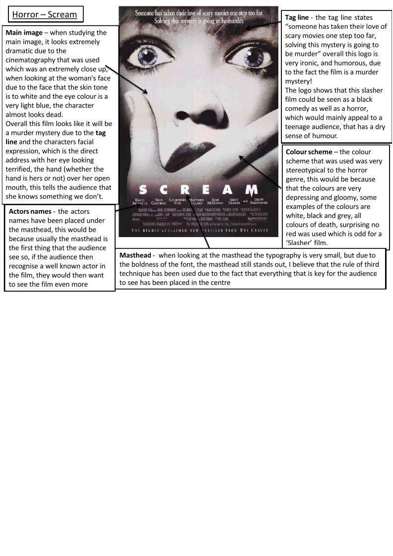
Horror – Scream Tag line - the tag line states
“someone has taken their love of
scary movies one step too far,
solving this mystery is going to
be murder” overall this logo is
very ironic, and humorous, due
to the fact the film is a murdermystery!
The logo shows that this slasher
film could be seen as a black
comedy as well as a horror,
which would mainly appeal to a
teenage audience, that has a dry
sense of humour.
Main image – when studying the
main image, it looks extremely
dramatic due to the
cinematography that was used
which was an extremely close up,when looking at the woman's face
due to the face that the skin tone
is to white and the eye colour is a
very light blue, the character
almost looks dead.
Overall this film looks like it will be
a murder mystery due to the tag
line and the characters facial
expression, which is the direct
address with her eye looking
terrified, the hand (whether the
hand is hers or not) over her open
mouth, this tells the audience that
she knows something we don’t.
Colour scheme – the colour
scheme that was used was very
stereotypical to the horror
genre, this would be because
that the colours are very
depressing and gloomy, some
examples of the colours arewhite, black and grey, all
colours of death, surprising no
red was used which is odd for a
‘Slasher’ film.
Masthead - when looking at the masthead the typography is very small, but due to
the boldness of the font, the masthead still stands out, I believe that the rule of third
technique has been used due to the fact that everything that is key for the audienceto see has been placed in the centre
Actors names - the actors
names have been placed under
the masthead, this would be
because usually the masthead is
the first thing that the audience
see so, if the audience then
recognise a well known actor in
the film, they would then wantto see the film even more


