5
Horror Poster Analysis By Jemima Wright
| Date post: | 19-Feb-2017 |
| Category: |
Design |
| Upload: | jemimawright97 |
| View: | 167 times |
| Download: | 0 times |
Horror Poster Analysis
By Jemima Wright
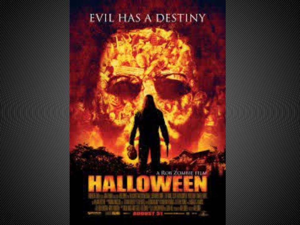
TypographyThe Title is highly prominent, this is mainly due to the boldness of the font and the fact that it is in capitals. Another aspect which makes it eye-catching is that the colouring is rather striking, the vibrancy of the orange immensely stands out from the background and due to the fiery pattern it creates connotations of destruction, danger and fear. This definitively reinforces the genre of horror as those are common themes throughout. The size of the title may reflect the antagonist of whom seems to be big and threatening. This is then juxtaposed by the Tagline “Evil has a destiny” By using the conflicting colour of white , which usually has connotations of innocence and purity and using a daintier and less significant font, this could lead us as audience to assume this resembles the helpless victim.
Image/IconographyThe first picture the audience is drawn to is the silhouette of the man, this is due to contrasting colours of the background which allow the figure to be clearly defined. we are then left to make assumptions of whom it may be. The big build, dominant posture and lethal weapon suggest that the character is dangerous. However this could be challenged as we depict that the background is actually a large overpowering face filled with numerous objects. Such as clowns which are frequently involved within horror as the longer you look at their smiling face the more it transforms into something more sinister. And A crucifixes is also apparent, this is a connotation of religion which is ironically used within horrors. As a result this almost belittles the figure, and the knife we initially assumes was for attacking, may actually be used for defence. The male figure is also holding a mask, this suggest that he is hiding one identity with another, this is used in horror as it leave the audience futile. All of the above create an enigma for the film as they leave the audience wondering why these objects are there, as a result it may urge them to watch the film.
Technical CodesThere are various technical codes which have been incorporated into this poster. Firstly the longshot is used to identify a few things, for instance it allows us to see that the man is on his own, this instantly creates a sense of fear as it puts him in a vulnerable position. This shot also classifies a house surrounded by woods, this helps us realise that the character is isolated. The close-up of the male in the background allows there to be more depth to the poster, the use of editing to merge different objects associated to film has been successful in portraying fear and danger. The low key lighting has been used as it initiates the fear of the unknown this could create a sense of panic.
Symbolic Codesof the We are unable to see the identity of the figure also suggested by the mask it is clear that he doesn’t want to be seen this creates a sense of mystery. Though we can depict bravery through his upright stance. The facial expression of the character in the background looks very sinister and due to the eyes being essentially blacked out, implies that he is evil.

Image/IconographyTypography
Technical Codes
Symbolic codes
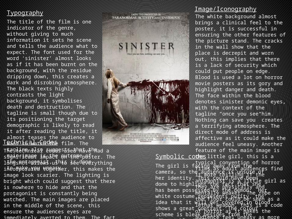
The title of the film is one indicator of the genre, without giving to much information it sets he scene and tells the audience what to expect. The font used for the word ‘sinister’ almost looks as if it has been burnt on the background, with the residue dripping down, this creates a dark and disrobing atmosphere. The black texts highly contrasts the light background, it symbolises death and destruction. The tagline is small though due to its positioning the target demographic is likely to read it after reading the title, it almost teases the audience to want to watch the film. The tagline also suggests that the main image is the outcome of the antagonist, this is done to make you uneasy.
The white background almost brings a clinical feel to the poster, it is successful in ensuring the other features of the picture stand. The cracks in the wall show that the place is decrepit and worn out, this implies that there is a lack of security which could put people on edge. Blood is used a lot on horror movie posters as its gory and highlight danger and death. The face within the blood denotes sinister demonic eyes, with the context of the tagline “once you see him. Nothing can save you” creates a terrifying atmosphere. The direct mode of address is affective as it could make the audience feel uneasy. Another feature of the main image is the little girl, this is a typical convention of horror films as adult audiences find it more chilling if the antagonist is a little girl as they are physically and mentally weaker. The rope on the floor could be seen as a lethal weapon, this is a code of horror as it makes the audience feel uneasy as more damage can be done.The technical codes used have had a significant
impact on the poster. The longshot allows us to see everything incorporated together, this makes the image look scarier. The lighting is bright which could suggest that there is nowhere to hide and that the protagonist is constantly being watched. The main images are placed in the middle of the scene, this ensure the audiences eyes are immediately averted to them. The fact that there is space above and below makes the girl look more isolated.
The girl is facing away from the camera, so the audience is unsure of her identity. This could have been done to highlight the fact that she has been possessed by the demon. Her white costume represents purity, the idea that it will get covered in blood shows a great contrast. The colour scheme is bleak besides from the vibrant blood, these colours are frequently used in horror due to there conflicting representations.


