Policy Paper July 2021 Designing Against Dark Patterns Caroline Sinders Washington, DC Ankara Belgrade Berlin Brussels Bucharest Paris Warsaw Washington, DC Ankara Belgrade Berlin Brussels Bucharest Paris Warsaw
Transcript
Policy Paper
July 2021
Designing Against Dark PatternsCaroline Sinders
Washington, DC Ankara Belgrade Berlin Brussels Bucharest Paris WarsawWashington, DC Ankara Belgrade Berlin Brussels Bucharest Paris Warsaw
July 2021
Policy Paper
2Sinders : Designing Against Dark Patterns
Policy that seeks to regulate the Internet must reckon with its design. As recent regulatory efforts—including the European Union’s General Data Protection Regu-lation (GDPR) and Germany’s Network Enforcement Act (NetzDG) law—have demonstrated, well-inten-tioned interventions into the digital world can have negative consequences if critical questions of design and implementation are neglected. Rather than augment user agency, GDPR interstitials and NetzDG reporting processes have spawned their own genre of dark patterns, omitting important information, misleading citizens, and undermining the principles of consent they were created to preserve.
This paper and a companion piece by Ellen Goodman and Karen Kornbluh traces foundational design precepts, highlighting the shared vocabulary of different design experts to arrive at some funda-mental design principles. It explores how design principles can be exploited to manipulate rather than inform, and how they might instead be used to empower users. In particular, this paper details ways in which past policies, paying particular attention to the GDPR and the NetzDG, have failed to incorpo-
rate essential design principles and therefore enabled the deployment of dark patterns. It examines the creation of consent interstitials—a key hallmark of the post-GDPR world—and identifies strategies used to subvert the law’s requirements, by failing to offer true choices, overwhelming users with information, or sending them on a multi-page journey that does more to confuse than to clarify.
The paper surveys different methods for using design to defeat disinformation and increase privacy, and it concludes with design suggestions for poli-cymakers to keep in mind when writing legislation for the digital world. Key recommendations include implementing frictive measures that reflect human psychology; mandating that privacy settings take up main “real estate” on a webpage; standardizing the language, font, color, and hierarchy of consent inter-stitials; updating labels placed on disputed pieces of content after their veracity or accuracy has been estab-lished; and suggesting that policymakers collaborate with standard-setting bodies like the World Wide Web consortium.
Summary
July 2021
Policy Paper
3Sinders : Designing Against Dark Patterns
IntroductionDesign shapes our online lives, from the information we see to how visible our images are, to what data we give up, to whether we report harmful content. Processes designed to protect consumers may be more or less laborious and legible depending on the decisions made by companies and their design teams. These design decisions may exploit behavioral economics and psychology to nudge consumers toward beneficial or detrimental decisions, without their being aware of what is happening.1
Some of these design decisions that nudge users can be called “dark patterns.” These are design choices and user interfaces that confuse users, make it difficult for users to express or choose their actual preferences, or manipulate users into taking certain actions.2 Some of these patterns nudge users to surrender their data without providing them easy alternatives, even in the face of laws that require users to have more choice and agency. Policymakers and regulators who fail to account for how companies actually use design can find that well-intentioned regulations are subverted by design.
This paper distills fundamental design principles and illustrates how their misapplication has under-mined a variety of online regulatory efforts, pointing toward the urgent need for regulators to take design into account in order to address societal concerns about the information disorder. It concludes with recommendations for how to move forward.
Understanding Digital Design Norms and Design PrinciplesWhat is design, what are its principles, and what effect do design norms have on the discipline as a medium and methodology? At its core, design is the process of conceptualizing and creating products, whether phys-ical, digital, or some hybrid of the two. It is concerned
1 Jennifer Blumenthal-Barby and Hadley Burroughs, “Seeking better health care outcomes: the ethics of using the ‘nudge’,” American Journal of Bioethics 12(2), 2012.
2 Jamie Luguri and Lior Jacob Strahilevitz, “Shining a Light on Dark Patterns,” Journal of Legal Analysis 13(43), 2021.
with how things work, the sequence of their develop-ment, and how they are ultimately controlled by users. Most broadly, this process can be broken down into principles that guide how designers go about creating the physical and digital objects that make up our world.
Don Norman’s 1988 Design of Everyday Things helped popularize the term “User-Centered Design.”3 His six design principles have since become founda-tional in the product design space.4 They are:
• Visibility, refering to how apparent functions are. The more visible functions within a product, the more likely it is for a user to be able to figure out what to do next.
• Feedback, creating information about an action and what was accomplished.
• Constraints, refering to how to restrict or select what kinds of interactions a user can do at any particular moment within a product.
• Mapping, refering to the relationship between users, controls, and the effects of controls in the world. Almost all products have a relationship between controls and effects, be it a light switch, an e-commerce platform, a car, or a flashlight.
• Consistency, refering to designing interfaces or design choices that have similar operations, interactions, and elements for specific tasks. For example, consistency can be a back button and a forward button placed in the same place throughout a digital experience.
• Affordance, refering to the attributes of prod-ucts and how those attributes guide or allow users to know how to use the object. A computer mouse invites touching with buttons but is also constrained to fit into one’s hand.5
3 Don Norman, The Design of Everyday Things, Basic Books, 2013. 4 Christopher Sirk, “The Godfather of UX: Don Norman & User-Centered
Design,” CRM.org, July 11, 2020. 5 Norman Herr, “Summary of Don Norman’s Design Principles,” The
Sourcebook for Teaching Science; adapted from Jenny Preece, Yvonne Rogers, and Helen Sharp, Interaction Design: Beyond Human-Computer Interaction, Wiley, 2002, p. 21.
Norman’s canonical precepts can be seen as a broad rubric of design principles. They exist along-side other efforts to articulate fundamental aspects of design—work by Ben Schneiderman, Jakob Nielsen, Debbie Stone, and Jeff Johnson similarly stresses the importance of consistency, affordance, visibility, and feedback, as well as additional areas such as error prevention and recovery, simplicity, and user testing.6 While specific terminology across design texts may differ, they share a common concern with centering the user and building toward their needs. This conver-gence exists for a reason, as Jeff Johnson notes in the introduction to the second edition of his Designing with the Mind in Mind: instead of serving as a template for scholarly differentiation or a springboard for competing schools of thought, design rules appear similar because at their core all are based upon the constant of human psychology.7 Rather than a rigid
6 See Ben Schneiderman et al, Designing the User Interface: Strategies for Effective Human-Computer Interaction, sixth edition, Pearson, 2016; Jakob Nielsen and Rolf Molich, “Heuristic Evaluation of User Interfaces,” CHI ’90: Proceedings of the SIGCHI Conference on Human Factors in Computing Systems, March 1990; Debbie Stone et al, User Interface Design and Evaluation, Morgan Kaufmann, 2005; and Jeff Johnson, Designing with the Mind in Mind: Simple Guide to Understanding User Interface Design Guidelines, third edition, Elsevier, 2020.
7 Johnson, Designing with the Mind in Mind.
focus on the product, these scholars and practitioners emphasize the process.
Preceding the earliest of these design manifestos by a decade, the famed industrial designer Dieter Rams introduced his Ten Commandments for Timeless Design.8 These set the coordinates for what we think of when we conceptualize effective design. They tended to favor flat, minimal, and easy design that was unob-trusive and usable. This philosophy of design has gone on to inspire Apple’s hardware design,9 as well as other technology firms to design products to be as cogni-tively intuitive as possible—ideally to the point where the consumer is unaware of the conscious design deci-sions—resulting in a product that is easy to use and moves the consumer swiftly through tasks.10 Trans-lated to digital design, these design norms include the use of white space to help make content more readable,11 reducing clicks necessary to engage with
8 Muriel Garreta Domingo, “Dieter Rams: 10 Timeless Commandments for Good Design,” Interaction Design Foundation, June 2020.
9 The Design Museum, “What is ‘Good’ Design? A quick look at Dieter Rams’ Ten Principles.”
10 Jamal Nichols, “Great Design Vs Good Design: What’s The Difference? Here’s The Truth,” Truth About Design, March 24, 2019.
11 Jamahl Johnson, “What is digital design? An in-depth look at a complex field,” 99designs, 2020.
Designing for User Psychology“Web designers and usability professionals have spent a lot of time over the years debating how many times you can expect users to click (or tap) to get what they want without getting too frustrated. Some sites even have design rules stating that it should never take more than a specified number of clicks (usually three, four, or five) to get to any page in the site. On the face of it, “number of clicks to get anywhere” seems like a useful metric. But over time I’ve come to think that what really counts is not the number of clicks it takes me to get to what I want (although there are limits), but rather how hard each click is—the amount of thought required and the amount of uncertainty about whether I’m making the right choice. In general, I think it’s safe to say that users don’t mind a lot of clicks as long as each click is painless and they have continued confidence that they’re on the right track— following what’s often called the ‘scent of information.’ Links that clearly and unambiguously identify their target give off a strong scent that assures users that clicking them will bring them nearer to their ‘prey.’ Ambiguous or poorly worded links do not.”
Steve Krug, Don’t Make Me Think, third edition, New Riders, 2014, p. 43.
content, making content easy to find,12 creating intui-tive design for apps for ease of use, using specific color choices (blue was extremely popular for a few years),13 creating fast and easy user engagement, and creating malleable design that can be flexible for a variety of uses. Designers and the broader design community are almost always optimizing to make products easier to use.14 The idea is to be subtle and flexible, presenting as few clicks and choices as possible. This ethos can be defined as frictionless or unambiguous design.15 This form of design allows users to easily and intentionally use a product and make decisions within that product.
That said, design as a medium allows for varia-tions, with different firms following distinct trends and patterns16 that become mainstream design norms. Google follows material design17 and Apple uses flat design,18 and both publish guidelines and suggestions for building Android or iOS products. Other large companies like IBM and Microsoft also have design languages, methodologies, and specialized guides focusing on topics like inclusivity and AI.19 Generally, these norms and guidelines have developed as software and hardware designers have shared best practices.
12 The Web Content Accessibility Guidelines recommend not sending users to different pages or new tabs as this can make it confusing for them to find information. World Wide Web Consortium, “G200: Opening new windows and tabs from a link only when necessary,” Techniques and Failures for Web Content Accessibility Guidelines 2.0.
13 Natasha Lomas, “Blue Apps Are All Around But Blue Tones Get Less Of A Role In iOS 7’s Psychedelic Redesign,” TechCrunch, June 15, 2013.
14 Interaction Design Foundation, “Ease of Use.” 15 Friction is “any barrier that acts as an extra step users have to go through
to access a service,” Shubham Agarwal, “Technology is easier than ever to use — and it’s making us miserable,” Digital Trends, October 25, 2020. See also Krug, Don’t Make Me Think, and Agarwal, “Technology is easier than ever to use.”
16 A design pattern is a repeating or reusable solution to a design problem or design area. Sourcemaking, “Design Patterns.”
17 Google, “Design,” Material Design. 18 Dan Seifert, “Apple announces iOS 7, ‘biggest change’ since the intro-
duction of the iPhone, coming this fall,” The Verge, June 10, 2013. See also Apple, “Human Interface Guidelines,” and Apple, “Introducing SF Symbols 2.”
19 See IBM, “IBM Design Language” Microsoft, “Fluent Design System,”; Microsoft, “Inclusive Design,”; and IBM, “Design for AI.”
The diversity of design choices taken by different firms underscores the fact that digital design does not have measurable formal standards, and even defini-tions and accounts of design principles are contextual to the problem and relate specifically to the commu-nities that are using or are impacted by the end prod-ucts. Designers themselves maintain the status quo of design norms, as the industry exists without external institutions to provide pressure. Whereas other indus-tries have ethical review boards or independent inves-tigative bodies,20 digital design does not. It is these design norms, combined with internal research and choices within companies and the specific teams, making decisions that are often the driving forces for design and product decision making.
Manipulative Design for Malign PurposesThe term “dark patterns” was created by designer Harry Brignull in 2010 to describe design choices and software characteristics that, accidentally or intention-ally, nudge users into making decisions they normally would not make.21 Dark patterns can happen in any context, on e-commerce sites, social networks, news-letter websites, or any other website. Examples of some dark patterns are:
• Burying choices within multiple steps. Some labels responsive to regulatory requirements are designed to secure consent in ad tracking but are hard to find. For example, some website labels designed to comply with the European Union’s General Data Protection Regulation (GDPR) hide “reject” buttons underneath multiple steps.22
• Confusion within sign-up and unsubscribe features. This can be seen in sign-up flows on websites where the user intends to sign up for one subscription but is tricked into signing up for multiple subscriptions and/or products.23
• Scarcity timers. Some e-commerce websites will display “scarcity timers,” which are countdown timers that make a product seem like it is selling out or that a deal will end (even when it will not).24
• Misrepresenting payment options. For example, suggesting a consumer sign up for a free option that turns into a paid process later, presenting different product choices at different prices in a confusing way, or presenting a free option online but then forcing consumers into paying. 25
Policy Without Design Leads to Manipulative DesignDesign can subvert or thwart policy intentions. If we look to Norman’s principles for guidance in building a product, then design should clearly represent how a product functions, with user feedback, clear constraints as to what a product can do, and consis-tency across interfaces. Dark patterns serve as oppo-site examples of such principles at work, causing confusion and inconsistency in interfaces, while often not accurately presenting what a product or design is capable of. The unsatisfactory implementation history of recent regulations offers examples of how dark patterns can subvert policy.
Under the GDPR, companies and firms have been required to create opt-in or consent notifications for users with regards to tracking. However, some of these requirements when implemented have created confusing design choices and dark patterns. Recent research has found that when given a clear choice, less than 1percent of users would consent to cookie tracking online.26 However, the problem lies in how cookie-tracking choices are laid out for users. Cook-
24 Arunesh Mathur et al, “Dark Patterns at Scale: Findings from a Crawl of 11K Shopping Websites,” Proceedings of the ACM on Human-Computer Interactions 3, CSCW, Article 81, November 2019.
25 Justin Elliot and Lucas Waldron, “Here’s How TurboTax Just Tricked You Into Paying to File Your Taxes,” ProPublica, April 22, 2019.
26 Christine Utz et al, “(Un)informed Consent: Studying GDPR Consent Notices in the Field,” in CCS ’19: Proceedings of the 2019 ACM SIGSAC Conference on Computer and Communications Security, November 11–15, 2019.
ie-tracking dark patterns can undermine the exer-cise of that choice by creating confusing and unclear choices by using different sized buttons and different colors to create confusion, or can place choices in less obvious or more obscure locations, as shown further below.
In order for a user to give permission for their data to be collected, they must receive a consent notice, and such notices vary widely by company.27 However, a study examining the design of 6,000 cookie banners implemented in popular websites in the EU in 2018 found that 57 percent of them used design elements to nudge or encourage users to agree to share as much data as possible.28 This kind of nudging can be done by creating buttons of different sizes and colors, the placement of buttons, using different sized fonts, or even creating choices that are stylistically different.
Design can subvert or thwart policy intentions.
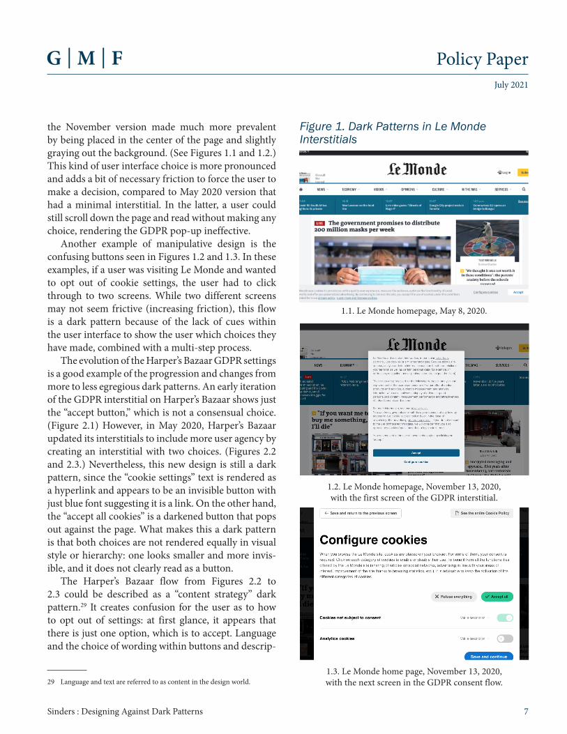
The screenshots presented here are of GDPR inter-stitials (popups asking users to provide consent for data tracking purposes) across a multitude of websites, such as Harper’s Bazaar, Le Monde, and BuzzFeed, taken between May 2019 and November 2020. They are illustrative of similar patterns across different websites like the Daily Beast, VICE Germany, the Washington Post, Elle UK, and others. These screen-shots show a variety of dark patterns, from user flow confusion to user interface/micro-design choices, like color and button size, and to content strategy dark patterns, in which language, text, and design create misinterpretations of actions.
Le Monde and Harper’s Bazaar provide examples of the (mis)design of buttons, the (mis)placement of buttons, and the excessive number of screens inserted into a decision flow. Between May and November 2020, Le Monde’s GDPR interstitials changed, with
27 Sebastian Rieger and Caroline Sinders, “Dark Patterns: Regulating Digi-tal Design,” Stiftung Neue Verantwortung, May 2020.
the November version made much more prevalent by being placed in the center of the page and slightly graying out the background. (See Figures 1.1 and 1.2.) This kind of user interface choice is more pronounced and adds a bit of necessary friction to force the user to make a decision, compared to May 2020 version that had a minimal interstitial. In the latter, a user could still scroll down the page and read without making any choice, rendering the GDPR pop-up ineffective.
Another example of manipulative design is the confusing buttons seen in Figures 1.2 and 1.3. In these examples, if a user was visiting Le Monde and wanted to opt out of cookie settings, the user had to click through to two screens. While two different screens may not seem frictive (increasing friction), this flow is a dark pattern because of the lack of cues within the user interface to show the user which choices they have made, combined with a multi-step process.
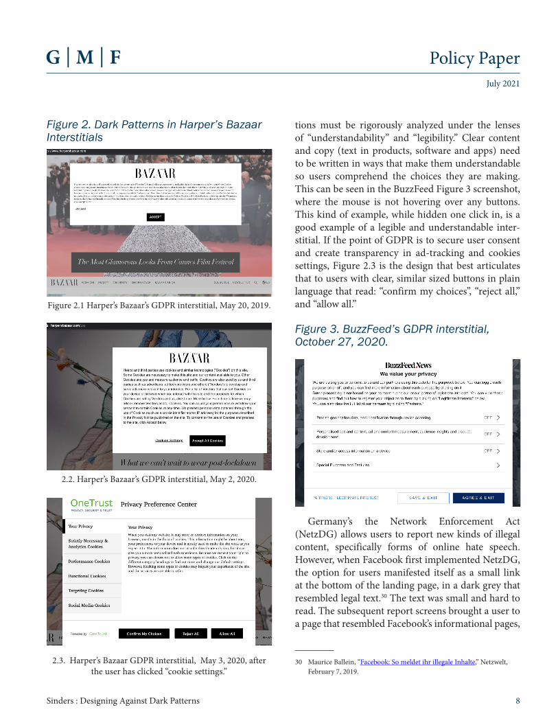
The evolution of the Harper’s Bazaar GDPR settings is a good example of the progression and changes from more to less egregious dark patterns. An early iteration of the GDPR interstitial on Harper’s Bazaar shows just the “accept button,” which is not a consensual choice. (Figure 2.1) However, in May 2020, Harper’s Bazaar updated its interstitials to include more user agency by creating an interstitial with two choices. (Figures 2.2 and 2.3.) Nevertheless, this new design is still a dark pattern, since the “cookie settings” text is rendered as a hyperlink and appears to be an invisible button with just blue font suggesting it is a link. On the other hand, the “accept all cookies” is a darkened button that pops out against the page. What makes this a dark pattern is that both choices are not rendered equally in visual style or hierarchy: one looks smaller and more invis-ible, and it does not clearly read as a button.
The Harper’s Bazaar flow from Figures 2.2 to 2.3 could be described as a “content strategy” dark pattern.29 It creates confusion for the user as to how to opt out of settings: at first glance, it appears that there is just one option, which is to accept. Language and the choice of wording within buttons and descrip-
29 Language and text are referred to as content in the design world.
Figure 1. Dark Patterns in Le Monde Interstitials
1.2. Le Monde homepage, November 13, 2020, with the first screen of the GDPR interstitial.
1.3. Le Monde home page, November 13, 2020, with the next screen in the GDPR consent flow.
1.1. Le Monde homepage, May 8, 2020.
July 2021
Policy Paper
8Sinders : Designing Against Dark Patterns
tions must be rigorously analyzed under the lenses of “understandability” and “legibility.” Clear content and copy (text in products, software and apps) need to be written in ways that make them understandable so users comprehend the choices they are making. This can be seen in the BuzzFeed Figure 3 screenshot, where the mouse is not hovering over any buttons. This kind of example, while hidden one click in, is a good example of a legible and understandable inter-stitial. If the point of GDPR is to secure user consent and create transparency in ad-tracking and cookies settings, Figure 2.3 is the design that best articulates that to users with clear, similar sized buttons in plain language that read: “confirm my choices”, “reject all,” and “allow all.”
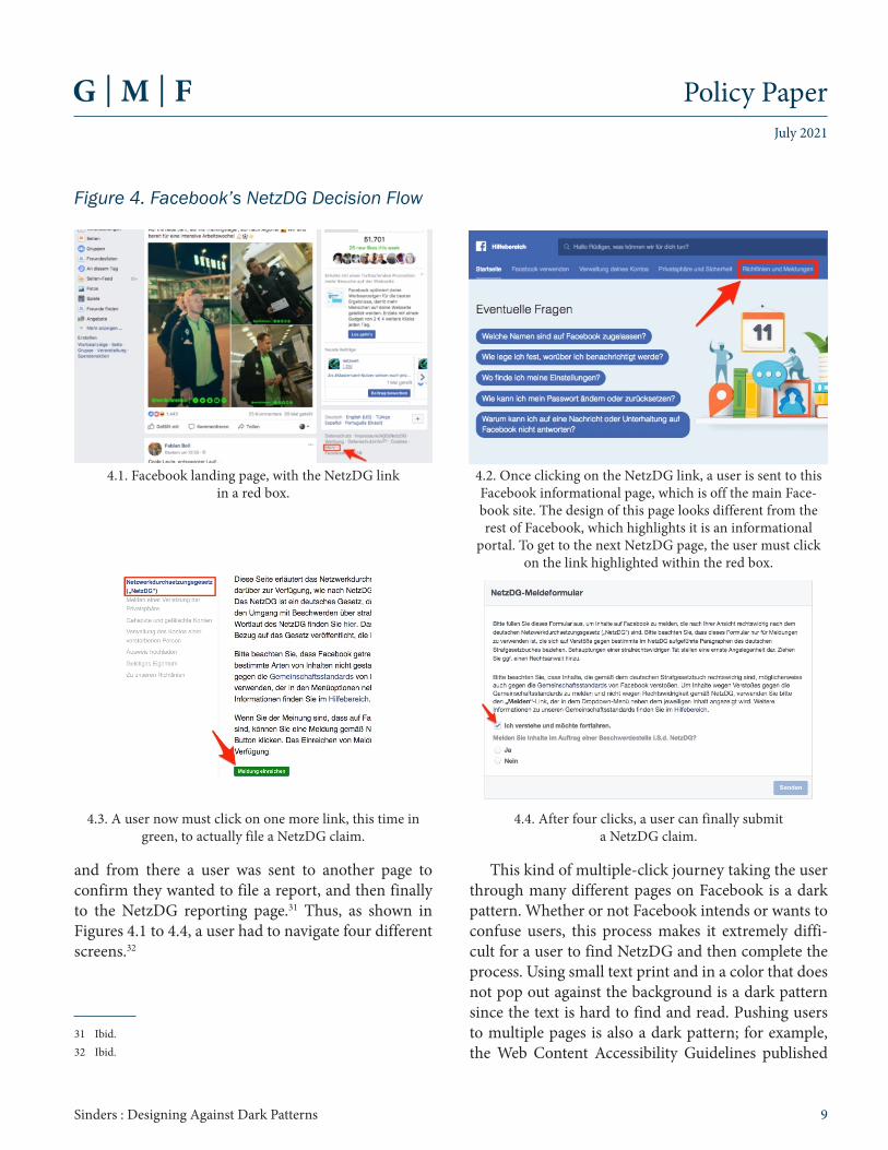
Germany’s the Network Enforcement Act (NetzDG) allows users to report new kinds of illegal content, specifically forms of online hate speech. However, when Facebook first implemented NetzDG, the option for users manifested itself as a small link at the bottom of the landing page, in a dark grey that resembled legal text.30 The text was small and hard to read. The subsequent report screens brought a user to a page that resembled Facebook’s informational pages,
30 Maurice Ballein, “Facebook: So meldet ihr illegale Inhalte,” Netzwelt, February 7, 2019.
Figure 3. BuzzFeed’s GDPR interstitial, October 27, 2020.
Figure 2. Dark Patterns in Harper’s Bazaar Interstitials
2.2. Harper’s Bazaar’s GDPR interstitial, May 2, 2020.
2.3. Harper’s Bazaar GDPR interstitial, May 3, 2020, after the user has clicked “cookie settings.”
Figure 2.1 Harper’s Bazaar’s GDPR interstitial, May 20, 2019.
and from there a user was sent to another page to confirm they wanted to file a report, and then finally to the NetzDG reporting page.31 Thus, as shown in Figures 4.1 to 4.4, a user had to navigate four different screens.32
31 Ibid. 32 Ibid.
This kind of multiple-click journey taking the user through many different pages on Facebook is a dark pattern. Whether or not Facebook intends or wants to confuse users, this process makes it extremely diffi-cult for a user to find NetzDG and then complete the process. Using small text print and in a color that does not pop out against the background is a dark pattern since the text is hard to find and read. Pushing users to multiple pages is also a dark pattern; for example, the Web Content Accessibility Guidelines published
4.1. Facebook landing page, with the NetzDG link in a red box.
4.2. Once clicking on the NetzDG link, a user is sent to this Facebook informational page, which is off the main Face-book site. The design of this page looks different from the rest of Facebook, which highlights it is an informational
portal. To get to the next NetzDG page, the user must click on the link highlighted within the red box.
4.4. After four clicks, a user can finally submit a NetzDG claim.
4.3. A user now must click on one more link, this time in green, to actually file a NetzDG claim.
Figure 4. Facebook’s NetzDG Decision Flow
July 2021
Policy Paper
10Sinders : Designing Against Dark Patterns
by the World Wide Web Consortium has a standard against sending users to new pages, since this can be confusing or hard to navigate.33
Privacy by Design and Combatting Disinformation through Design Large technology companies have started to focus on privacy design principles. However, even with new guidelines and design requirements, it is hard to know how successful these changes are until plat-forms disclose any findings from new labels or how successful they were in product building. For example, Facebook has created privacy guidelines,34 separate from their general design guidelines.35 These include:
• Comprehensiveness: privacy notifications should be complete enough to provide a comprehensive reflection of an organization’s data practices.
• Comprehensibility: notifications should be written in a way that prioritizes the most important information and is easy for people to understand.
• Prominence: notifications should be presented in a way that is clear and conspicuous, or that attracts people’s attention.
• Standardized: information should be presented in a way that is consistent across products and services to make it easier for people to eval-uate information and make choices in different contexts.
• Contextual: notifications should be designed in a way that is consistent with their environment to make them more intuitive and to enable quicker and more effective decision-making.
But it is hard to determine if Facebook is following the privacy principles it has created. While increasing the prominence and comprehensiveness of notifica-tions is commendable, the platform has come under scrutiny for its privacy policy, which the journalist
33 World Wide Web Consortium, “G200: Opening new windows and tabs from a link only when necessary.”
34 Erin Egan, “Communicating About Privacy: Towards People Centered and Accountable Design,” Facebook, July 2020.
35 Facebook, “User Experience Design.”
Shoshana Wodinsky has described as “loaded with dead ends and tech tangents designed to give you the illusion of control.”36 Apple and Facebook are currently in a dispute over the former’s new policy prohibiting web tracking for personalized advertise-ments, a possibly existential threat to the latter’s profit margins.37 Additionally, starting on December 8, 2020 Apple has required a “nutritional label” in regards to privacy to articulate to users what information an app collects and why, and how the app uses their data before a user downloads it.38 Apple’s decisions can help set the tone in the industry, but only if more companies follow in its footsteps, and if it releases any metrics and information on the performance of the “nutritional labels.”
It is important to note how the role of privacy manifests itself (or does not) within mainstream tech’s design guidelines. For example, Apple’s design stan-dards, the Human Interface Guidelines,39 has one page on security out of 99 pages. This page features some suggestions, such as to avoid relying solely on pass-words for authentication, to store sensitive informa-tion in a keychain, and to make assumptions wisely. Apple has a separate page on privacy,40 which covers iOS privacy settings and standards across Apple prod-ucts like passwords and Face ID. However, none of these documents focuses on designing with privacy in mind. This problem exists across the industry—Apple’s Human Interface Guidelines are similar in structure and content to other design guides published by companies like Google and IBM. Some of these
37 Mike Isaac and Daisuke Wakabayashi, “Facebook Said to Consider Suing Apple Over App Store Practices,” New York Times, January 28, 2021, updated April 26, 2021.
38 Lily Hay Newman, “Apple’s App ‘Privacy Labels’ Are Here—and They’re a Big Step Forward,” WIRED, December 14, 2020. This information is provided by the app developers themselves; but it is unclear to what extent the privacy information is checked and verified by Apple. For a critical account, see Geoffrey Fowler, “I checked Apple’s new privacy ‘nutrition labels.’ Many were false,” Washington Post, January 29, 2021.
39 Apple, “Human Interface Guidelines”.40 The author found this page explicitly by googling “Apple Privacy design”.
companies publish privacy guides, but these are usually separate and not linked to the general design documents. None of them implements “privacy by design,” a design methodology that has gained traction and popularity over the last few years, especially with the introduction of the GDPR. 41 The design discipline also has failings, as privacy is a domain expertise (like harassment or misinformation), and it is an adjacent expertise that designers have to learn in addition to product design or user experience design since general design processes do not necessarily focus on privacy by design protocols.
Design Principles for PolicymakersBuilding on the design principles outlined above and including suggestions from the Partnership on AI with First Draft News,42 alongside the initial steps taken by Facebook and Apple on privacy and disinformation, policymakers might consider the following principles:
• Platform policies and settings should take plat-form “main real estate”43 and be easy to find.
• Platforms should privilege plain language and frictive elements that allow users to understand and act on information.
• There should be increased cross-platform stan-dardization to aid user agency in completing tasks and editing settings.
• Policymakers should require consistent and legible user interface design, which would display consent-based choices equally in a visual hier-archy and would ensure consistent color and design choice in interstitials to avoid confusion.
41 Digital.gov.nz, “Privacy by Design,” last updated November 11, 2020. See also Deloitte, “Privacy by Design: Setting a new standard for privacy certification,” 2015; Privacy Guy, “7 Principles of Privacy By Design,” Medium, November 20, 2017; Ann Cavoukian, “Privacy by Design: The 7 Foundational Principles,” International Association of Privacy Profes-sionals, January 2011; Intersoft Consulting, “GDPR: Privacy by Design,” and European Union Agency for Cybersecurity, “Privacy by Design.”
42 Emily Saltz et al, “It matters how platforms label manipulated media. Here are 12 principles designers should follow,” Partnership on AI, June 9, 2020.
43 Easy-to-find examples linked from user profiles or the platform’s main landing pages.
Such a requirement avoids undue influence on a user by suggesting a company’s perceived prefer-ence for a specific choice.
Future regulatory regimes will need to marry design-based research and policymaking initiatives. For example, research can inform policy by making specific recommendations when it comes to design choices, and it can outline how labels or systems could look by providing wireframes—two-dimensional illus-trations used within the technology industry to lay out and design apps, software, and products. A wireframe “specifically focuses on space allocation and prioritiza-tion of content, functionalities available, and intended behaviors ... [and] also help[s] establish relationships between a website’s various templates.”44 Product-fo-cused research can help create baselines of knowl-edge and understanding when designing to enhance user agency and consent. Perhaps a wireframe model written into a law is too restrictive or narrow, but this is where a deep understanding of design language and norms can be folded into regulation to fruitfully augment existing policy expertise.
One thing is certain: this kind of translation across design and policy is urgently needed, particularly as platforms involve themselves in critical design deci-sions by creating a mix of nutritional labels for privacy and warning labels for misinformation, disinforma-tion, and harmful content.
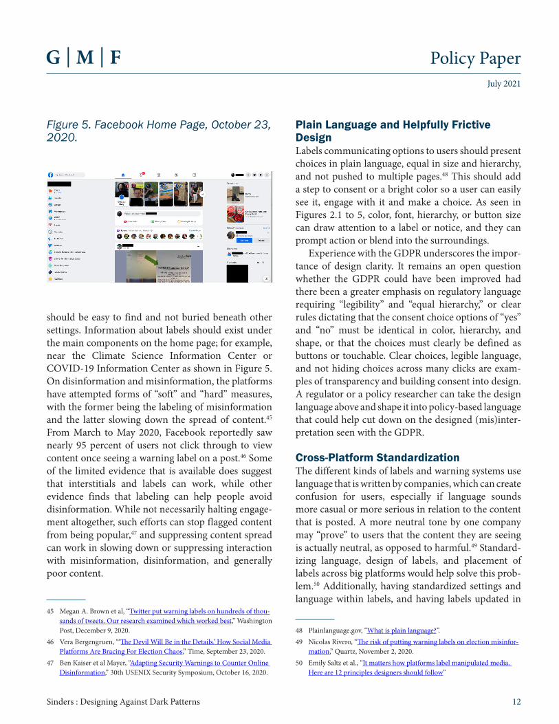
Settings and Information on PoliciesGenerally, regulatory changes such as NetzDG or a regulation on labeling political content, misinforma-tion, or disinformation should be easy to find, take up platform “main real estate”, and should be keyword searchable. Settings or information should be easily findable within the platform itself, such as on the home page, with an awareness of mobile usability. A user should not have to go to a search engine to find a page within a platform. As mentioned above, sending a user to different tabs or new places can be confusing. In addition, interstitials and warning labels
should be easy to find and not buried beneath other settings. Information about labels should exist under the main components on the home page; for example, near the Climate Science Information Center or COVID-19 Information Center as shown in Figure 5. On disinformation and misinformation, the platforms have attempted forms of “soft” and “hard” measures, with the former being the labeling of misinformation and the latter slowing down the spread of content.45 From March to May 2020, Facebook reportedly saw nearly 95 percent of users not click through to view content once seeing a warning label on a post.46 Some of the limited evidence that is available does suggest that interstitials and labels can work, while other evidence finds that labeling can help people avoid disinformation. While not necessarily halting engage-ment altogether, such efforts can stop flagged content from being popular,47 and suppressing content spread can work in slowing down or suppressing interaction with misinformation, disinformation, and generally poor content.
45 Megan A. Brown et al, “Twitter put warning labels on hundreds of thou-sands of tweets. Our research examined which worked best,” Washington Post, December 9, 2020.
46 Vera Bergengruen, “‘The Devil Will Be in the Details.’ How Social Media Platforms Are Bracing For Election Chaos,” Time, September 23, 2020.
47 Ben Kaiser et al Mayer, “Adapting Security Warnings to Counter Online Disinformation,” 30th USENIX Security Symposium, October 16, 2020.
Plain Language and Helpfully Frictive DesignLabels communicating options to users should present choices in plain language, equal in size and hierarchy, and not pushed to multiple pages.48 This should add a step to consent or a bright color so a user can easily see it, engage with it and make a choice. As seen in Figures 2.1 to 5, color, font, hierarchy, or button size can draw attention to a label or notice, and they can prompt action or blend into the surroundings.
Experience with the GDPR underscores the impor-tance of design clarity. It remains an open question whether the GDPR could have been improved had there been a greater emphasis on regulatory language requiring “legibility” and “equal hierarchy,” or clear rules dictating that the consent choice options of “yes” and “no” must be identical in color, hierarchy, and shape, or that the choices must clearly be defined as buttons or touchable. Clear choices, legible language, and not hiding choices across many clicks are exam-ples of transparency and building consent into design. A regulator or a policy researcher can take the design language above and shape it into policy-based language that could help cut down on the designed (mis)inter-pretation seen with the GDPR.
Cross-Platform Standardization The different kinds of labels and warning systems use language that is written by companies, which can create confusion for users, especially if language sounds more casual or more serious in relation to the content that is posted. A more neutral tone by one company may “prove” to users that the content they are seeing is actually neutral, as opposed to harmful.49 Standard-izing language, design of labels, and placement of labels across big platforms would help solve this prob-lem.50 Additionally, having standardized settings and language within labels, and having labels updated in
48 Plainlanguage.gov, “What is plain language?”.49 Nicolas Rivero, “The risk of putting warning labels on election misinfor-
mation,” Quartz, November 2, 2020. 50 Emily Saltz et al., “It matters how platforms label manipulated media.
language or color with regards to changing political events or new information could create cohesion and better user understanding of labels. Labels should be understandable and visible to users, as seen in some of the more successful GDPR interstitials.51 Currently, social media companies have different kinds of labels for fact checking (similar to the different kinds of GDPR interstitials different companies have made).
Such standardization should be achieved collab-oratively. Similar to the trustworthy definitions on artificial intelligence published by the European Commission—which it created with multi-stake-holder input—policymakers and researchers should cooperate when writing stricter recommendations for the design of interstitials and labels. In this way, the community would agree on best practices and design principles, ensuring that online empowerment is considered from the outset. Furthermore, creating multidisciplinary, shared agreements with input from many stakeholders on standardized definitions of the different categories of harm, along with the type of actions that can be taken to moderate content, will provide benchmarks for regulators, action plans for platforms, and clarity for users.
Policymakers and regulators could start by creating collaborations with some of the design and software groups that publish public findings. While these groups are not legal standardizing bodies, they do help shift and influence design culture and design trends. Researchers could start looking toward stan-dardization by citing and following research done by bodies like the National Institute of Standards and Technology, the World Wide Web Consortium’s Web Content Accessibility Guidelines (WCAG), and the Interaction Design Foundation and also collaborate with these research groups and nonprofits in transpar-ency, consent, and privacy-focused design and poli-cy-focused research.
For example, in 2017 Facebook implemented a consent notice with substantially more friction to view sensitive content on Instagram. Instagram created a
51 Ibid.
blurred interstitial over “sensitive content” that users had to click to consent to see.52 The blurring hides the content and then clicking on the image to see that image reinforces consent for the user to see the hidden content. This is a frictive protective element that could be used in other kinds of harmful content, like text or images related to misinformation, disinforma-tion, or violence online. In 2020, Twitter introduced a user interface element to help slowdown retweets on content and a label to push users to read content if they were sharing a link they had not read. This kind of frictive element could be applied to tweets where facts are disputed.
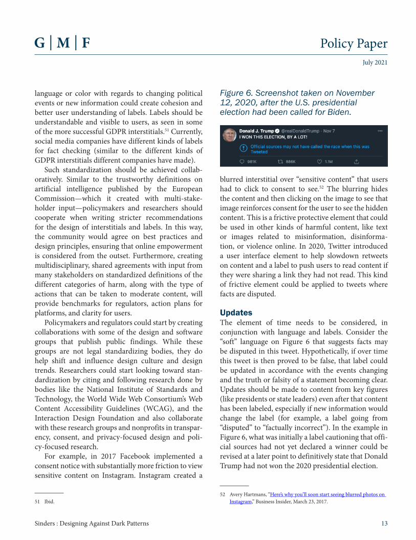
UpdatesThe element of time needs to be considered, in conjunction with language and labels. Consider the “soft” language on Figure 6 that suggests facts may be disputed in this tweet. Hypothetically, if over time this tweet is then proved to be false, that label could be updated in accordance with the events changing and the truth or falsity of a statement becoming clear. Updates should be made to content from key figures (like presidents or state leaders) even after that content has been labeled, especially if new information would change the label (for example, a label going from “disputed” to “factually incorrect”). In the example in Figure 6, what was initially a label cautioning that offi-cial sources had not yet declared a winner could be revised at a later point to definitively state that Donald Trump had not won the 2020 presidential election.
52 Avery Hartmans, “Here’s why you’ll soon start seeing blurred photos on Instagram,” Business Insider, March 23, 2017.
Figure 6. Screenshot taken on November 12, 2020, after the U.S. presidential election had been called for Biden.
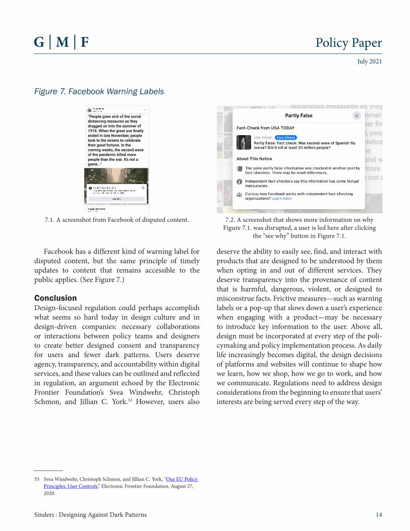
Facebook has a different kind of warning label for disputed content, but the same principle of timely updates to content that remains accessible to the public applies. (See Figure 7.)
ConclusionDesign-focused regulation could perhaps accomplish what seems so hard today in design culture and in design-driven companies: necessary collaborations or interactions between policy teams and designers to create better designed consent and transparency for users and fewer dark patterns. Users deserve agency, transparency, and accountability within digital services, and these values can be outlined and reflected in regulation, an argument echoed by the Electronic Frontier Foundation’s Svea Windwehr, Christoph Schmon, and Jillian C. York.53 However, users also
53 Svea Windwehr, Christoph Schmon, and Jillian C. York, “Our EU Policy Principles: User Controls,” Electronic Frontier Foundation, August 27, 2020.
7.1. A screenshot from Facebook of disputed content. 7.2. A screenshot that shows more information on why Figure 7.1. was disrupted, a user is led here after clicking
the “see why” button in Figure 7.1.
Figure 7. Facebook Warning Labels
deserve the ability to easily see, find, and interact with products that are designed to be understood by them when opting in and out of different services. They deserve transparency into the provenance of content that is harmful, dangerous, violent, or designed to misconstrue facts. Frictive measures—such as warning labels or a pop-up that slows down a user’s experience when engaging with a product—may be necessary to introduce key information to the user. Above all, design must be incorporated at every step of the poli-cymaking and policy implementation process. As daily life increasingly becomes digital, the design decisions of platforms and websites will continue to shape how we learn, how we shop, how we go to work, and how we communicate. Regulations need to address design considerations from the beginning to ensure that users’ interests are being served every step of the way.
Ankara • Belgrade • Berlin • Brussels • BucharestParis • Warsaw • Washington, DC
www.gmfus.org
About GMFThe German Marshall Fund of the United States (GMF) is a non-par-tisan policy organization committed to the idea that the United States and Europe are stronger together. GMF champions the prin-ciples of democracy, human rights, and international cooperation, which have served as the bedrock of peace and prosperity since the end of World War II, but are under increasing strain. GMF works on issues critical to transatlantic interests in the 21st century, including the future of democracy, security and defense, geopolitics and the rise of China, and technology and innovation. By drawing on and fostering a community of people with diverse life experiences and political perspectives, GMF pursues its mission by driving the policy debate through cutting-edge analysis and convening, fortifying civil society, and cultivating the next generation of leaders on both sides of the Atlantic. Founded in 1972 through a gift from Germany as a tribute to the Marshall Plan, GMF is headquartered in Washington, DC, with offices in Berlin, Brussels, Ankara, Belgrade, Bucharest, Paris, and Warsaw.
This work represents solely the opinion of the author and any opinion expressed herein should not be taken to represent an official position of the institution to which the author is affiliated.
About the Author(s)Caroline Sinders is a design researcher and artist. For the past few years, she has been examining the intersections of technology, machine learning, abuse, and harms in design and digital conver-sational spaces. She has worked with the United Nations, Amnesty International, IBM Watson, the Wikimedia Foundation, the Harvard Kennedy School, the Mozilla Foundation, and others.
About GMF DigitalThe German Marshall Fund’s Digital Innovation and Democracy Initiative (GMF Digital) works to support democracy in the digital age. GMF Digital leverages a transatlantic network of senior fellows to develop and advance strategic reforms that foster innovation, create opportunity, and advance an equitable society.
About GMFThe German Marshall Fund of the United States (GMF) is a non-par-tisan policy organization committed to the idea that the United States and Europe are stronger together. GMF champions the prin-ciples of democracy, human rights, and international cooperation, which have served as the bedrock of peace and prosperity since the end of World War II, but are under increasing strain. GMF works on issues critical to transatlantic interests in the 21st century, including the future of democracy, security and defense, geopolitics and the rise of China, and technology and innovation. By drawing on and fostering a community of people with diverse life experiences and political perspectives, GMF pursues its mission by driving the policy debate through cutting-edge analysis and convening, fortifying civil society, and cultivating the next generation of leaders on both sides of the Atlantic. Founded in 1972 through a gift from Germany as a tribute to the Marshall Plan, GMF is headquartered in Washington, DC, with offices in Berlin, Brussels, Ankara, Belgrade, Bucharest, Paris, and Warsaw.