56
Cascading Style Sheets Dr Kevin McManus http://staffweb.cms.gre.ac.uk/~mk05/w eb/CSS/
| Date post: | 19-Dec-2015 |
| Category: |
Documents |
| View: | 216 times |
| Download: | 0 times |
Cascading Style Sheets
Dr Kevin McManushttp://staffweb.cms.gre.ac.uk/~mk05/web/CSS/

© KMc University of Greenwich2
CSS
CSS• A way of specifying how a web page looks• Significantly extends the control over web page
appearance• compared with just using HTML 4• e.g. precise positioning of images and text
• In strict XHTML (almost) all presentation tags and attributes have been deprecated.• use of CSS becomes necessary to control page presentation
• One of the “enabling technologies” of Dynamic HTML (DHTML)
• Can be used in conjunction with XML• other XML based languages

© KMc University of Greenwich3
CSS
History
• Developed to be used with HTML• allows developers to improve site consistency and
maintainability
• W3C approved CSS level 1 standard in late 1996
• Browser support appeared in IE version 3 and
Navigator version 4
• W3C approved CSS level 2 standard in May 1998• 2.1 and 3 still under development
• The newest browsers claim to support CSS level 2• but it is not easy to ascertain how fully
© KMc University of Greenwich4
CSS
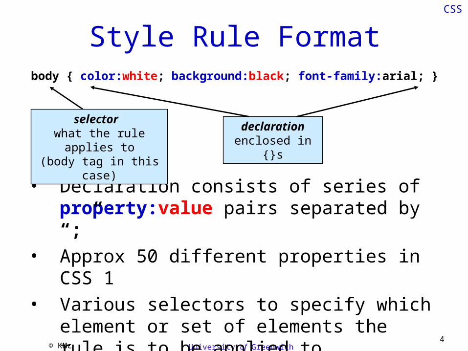
Style Rule Formatbody { color:white; background:black; font-family:arial; }
• Declaration consists of series of property:value pairs separated by “;”
• Approx 50 different properties in CSS 1• Various selectors to specify which element or
set of elements the rule is to be applied to
selector what the rule applies to(body tag in this case)
declarationenclosed in {}s

© KMc University of Greenwich5
CSS
Types of Style Sheet Properties• Font
font-family default seriffont-sizefont-style e.g. normal, italic
• Colourcolor text colour (default black)background-color synonymous with background (default white)background-imagebackground-attachment scroll or fixed
• Textletter-spacingtext-align left (default), right, center (sic)text-transform e.g. uppercase, lowercaselist-style-type e.g. disk, square, lower-roman
• Positioning and layoutpositiontop - y co-ordinate of element topleft - x co-ordinate of element left z-index - control which elements appear on top of otherswidthheightmarginfloat - text alignment around another elementborder

© KMc University of Greenwich6
CSS
first.html
<?xml version="1.0" encoding="UTF-8"?><!DOCTYPE html PUBLIC "-//W3C//DTD XHTML 1.1//EN" "http://www.w3.org/TR/xhtml11/DTD/xhtml11.dtd"><html xmlns="http://www.w3.org/1999/xhtml"><head><title>First CSS Example</title><style type="text/css">body { font-family:sans-serif; margin:15px; }h1 { color:white; background:blue; }</style></head><body><h1>First CSS Example</h1><p>Both the heading and this paragraph inherit the font-family defined for the body element.</p></body></html>
A style element in the document head contains
style rules. Note the mandatory attribute
type which must have the value text/css
A rule for the body element defines the font-family and the page margin
A rule for the level 1 header defines the text color and
the background colour

© KMc University of Greenwich7
CSS
Cascading Style Rules
Here we see a style rule for the font family defined for the body element being inherited by the level 1 header and the paragraph

© KMc University of Greenwich8
CSS
Cascading Style Rules• They aren't called CASCADING style sheets for nothing!
• Style rules cascade• from parent element to child element
• down the document object model
• apart from some intuitive (sic) exceptions
• apart from IE which exhibits some cascading bugs
• until they are overruled by a closer style rule• in the previous example
• the default rules for black text on a white background are overruled by the foreground and background colour rules defined for a level 1 header
• the algorithm proposed by W3C is rather complicated
http://www.w3.org/TR/CSS1/#cascading-order

© KMc University of Greenwich9
CSS
External, Embedded and Inline• Style rules may be defined in 3 places
• the rule that is closest to the element is applied
1. In an external style sheet• allows one stylesheet to be used on several pages• or one page can use several style sheets• improves consistency, efficiency and maintainability
2. Embedded in the head of the HTML document• embedded rules add to and overrule external rules
3. Inline as an attribute of an HTML element• inline rules add to and overrule embedded and
external rules

© KMc University of Greenwich10
CSS
Inline Style Rule
• HTML elements can include a style attribute
• The style attribute value contains a style declaration• adds to or overrules any other style rules that
may apply to the element
<h4 style="font-size:12px; color:blue">header text</h4>
© KMc University of Greenwich11
CSS
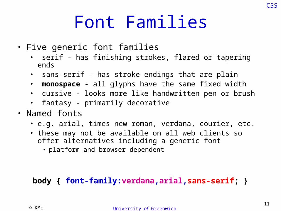
Font Families• Five generic font families
• serif - has finishing strokes, flared or tapering ends • sans-serif - has stroke endings that are plain • monospace - all glyphs have the same fixed width • cursive - looks more like handwritten pen or brush • fantasy - primarily decorative
• Named fonts• e.g. arial, times new roman, verdana, courier, etc.• these may not be available on all web clients so offer
alternatives including a generic font• platform and browser dependent
body { font-family:verdana,arial,sans-serif; }

© KMc University of Greenwich12
CSS
fontFamily.html<snip><h1>Font Families</h1><h2>Generic Fonts</h2><p><span style="font-family:serif">ABCD wxyz serif</span><br /><span style="font-family:sans-serif">ABCD wxyz sans-serif</span><br /><span style="font-family:monospace">ABCD wxyz monospace</span><br /><span style="font-family:cursive">ABCD wxyz cursive</span><br /><span style="font-family:fantasy">ABCD wxyz fantasy</span><br /></p><h2>Named Fonts</h2><p><span style="font-family:arial">ABCD wxyz arial</span><br /><span style="font-family:verdana">ABCD wxyz verdana</span><br /><span style="font-family:tahoma">ABCD wxyz tahoma</span><br /><span style="font-family:helvetica">ABCD wxyz helvetica</span><br /><span style="font-family:times new roman">ABCD wxyz times new roman</span><br /><span style="font-family:bookman old style">ABCD wxyz bookman old style</span><br /><span style="font-family:garamond">ABCD wxyz garamond</span><br /><span style="font-family:courier">ABCD wxyz courier</span><br /><span style="font-family:lucida console">ABCD wxyz lucida console</span><br /></p></snip>
sans-serif
Usual markup has been removed for clarity
serif
fixed pitch

© KMc University of Greenwich13
CSS
Variation in rendering is less for named fonts
Expect greater variation for browsers running on
different platforms

© KMc University of Greenwich14
CSS
Colour
There are two ways of specifying colour
1. 8bit hexadecimal RGB (red, green, blue) triplet• range from 00 to FF• 256 possible values for each of R, G & B• approximately 16 million colours! (2563 - 24bit)
e.g. #FF30DC is FF – Red 30 – Green DC - Bluemay also be expressed as rgb(255,48,220)
2. Named colours• 16 widely compatible with browsers
e.g. red, black, aqua, green, white, … • 140 more exotic colours
e.g. papayawhip, lemonchiffon, cornsilk, …

© KMc University of Greenwich15
CSS
ColourMixing light of the three primary colours red, green and blue in varying proportions can fool a human eye into perceiving all possible colours.
This is because the human eye ordinarily contains sensors (cones) only for red, green and blue light.
Here we are adding light. The more light we add the brighter the colour.
thanks to http://editorz.narod.ru/prepress/color.html for the image

© KMc University of Greenwich16
CSS
Colour
Mixing the three pigment primary colours magenta, cyan and yellow can fool the human eye into perceiving all possible colours
Here we are using pigments to subtract light. The more pigment we use the less light we see.
thanks to http://www.colorcodehex.com/color-model.html the image

© KMc University of Greenwich17
CSS
Colour Perception• Not everybody sees colour the same
• some people lack one or more of the red, green or blue retina cones
• Colour blindness reduces an individual’s ability to differentiate colour
• The two main forms of colour blindness are:• red- green
• affects approximately 8 percent of men and 0.5 percent of women
• blue-yellow• affects approximately 0.01% of people
• The Ishihara test is used to detect colour blindness
© KMc University of Greenwich18
CSS
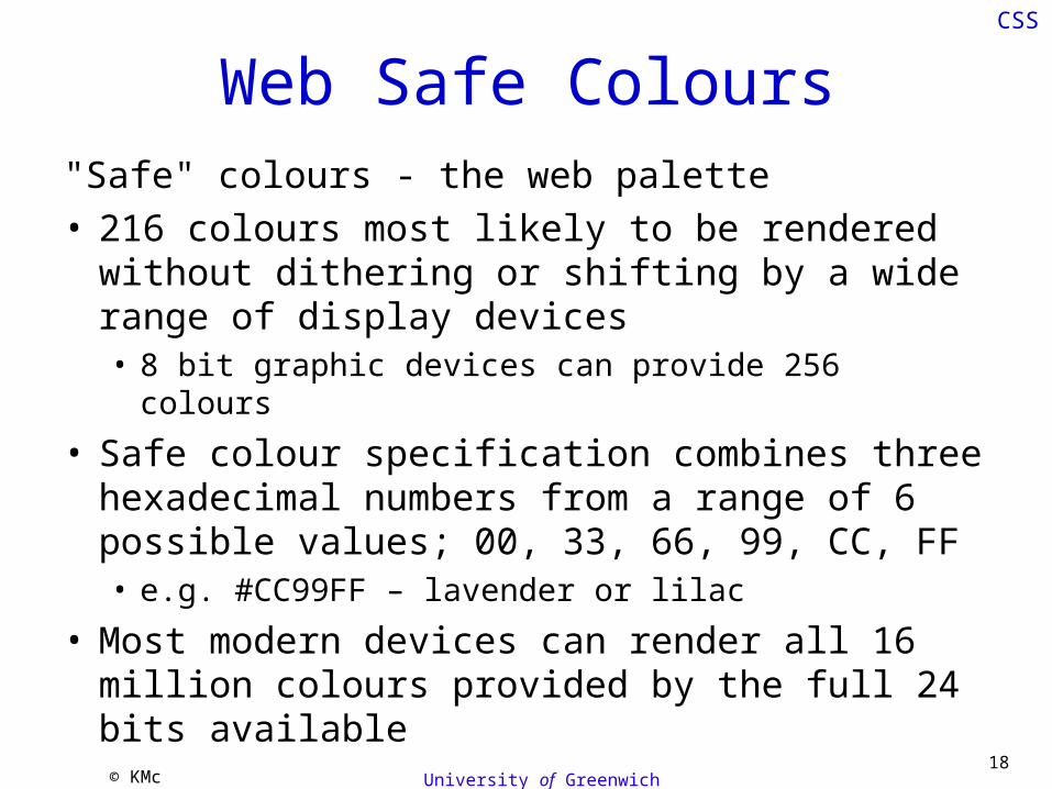
Web Safe Colours"Safe" colours - the web palette• 216 colours most likely to be rendered without
dithering or shifting by a wide range of display devices• 8 bit graphic devices can provide 256 colours
• Safe colour specification combines three hexadecimal numbers from a range of 6 possible values; 00, 33, 66, 99, CC, FF• e.g. #CC99FF – lavender or lilac
• Most modern devices can render all 16 million colours provided by the full 24 bits available
© KMc University of Greenwich19
CSS
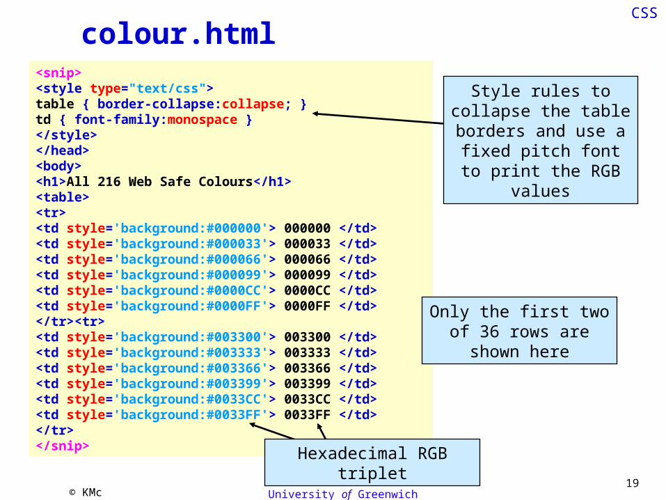
colour.html<snip><style type="text/css">table { border-collapse:collapse; }td { font-family:monospace }</style></head><body><h1>All 216 Web Safe Colours</h1><table><tr><td style='background:#000000'> 000000 </td><td style='background:#000033'> 000033 </td><td style='background:#000066'> 000066 </td><td style='background:#000099'> 000099 </td><td style='background:#0000CC'> 0000CC </td><td style='background:#0000FF'> 0000FF </td></tr><tr><td style='background:#003300'> 003300 </td><td style='background:#003333'> 003333 </td><td style='background:#003366'> 003366 </td><td style='background:#003399'> 003399 </td><td style='background:#0033CC'> 0033CC </td><td style='background:#0033FF'> 0033FF </td></tr></snip>
Only the first two of 36 rows are shown here
Style rules to collapse the table borders and
use a fixed pitch font to print the RGB values
Hexadecimal RGB triplet

© KMc20
CSS
The appearance of a colour depends upon its
adjacent colours
This table looks very different if the 216
colours are arranged in a different order
white #FFFFFF
black #000000
yellow #FFFF00
red #FF0000 magenta #FF00FF
blue #0000FF
cyan #00FFFF
green #00FF00
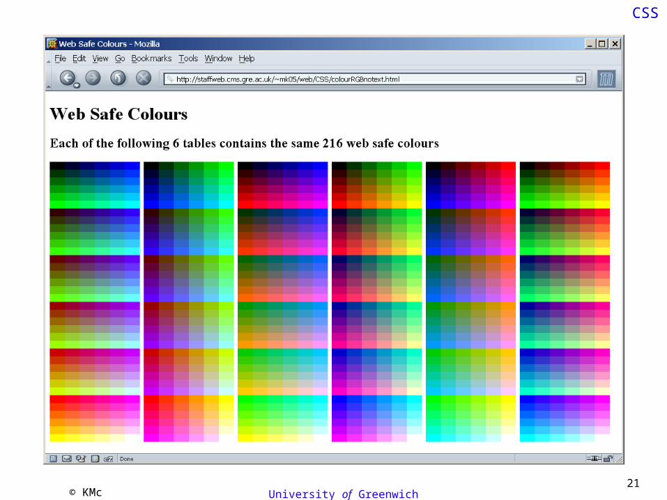
© KMc University of Greenwich21
CSS

© KMc University of Greenwich22
CSS
CSS1 Selectors• Element
• applies to all matching elementsh2,h3,h4 { color:blue; }
• Class• applies to all elements with a matching class attribute value
.centre { text-align:center; }• ID
• applies to the element with a matching id attribute value#para6 { font-family:serif; }
• Pseudoclass• applies only to anchor elements
a:hover { color:red; }• Pseudoelement
• inserts a fictional tag sequencep:first-letter { font-size:200%; }
• Contextual• combines selectors
p em.tty { font-family:monospace; font-weight:bold; }

© KMc University of Greenwich23
CSS
Units of Measurement• Absolute screen units
px – pixels
• Font unitspt – point size
pc – pica
• Page units• inch - inches• mm - millimetres• cm - centimetres
• Relative units% - percentage of container
size or percentage of current font size
em - height of an “M” in the current font
ex - height of an “x” in the current font
All quantities must have units.
Relative units allow greater elasticity under browser resizing and zooming and allows the
browser to apply user style rules.

© KMc University of Greenwich24
CSS
Boxes
• Each element in a document is considered to be in a (possibly invisible) box.
• You have control over the box’s:
border - can make it visible and choose its width, style and colour
padding - the space between the border (visible or not) and the contents
margin - the space between the border and other elements on the page

25
CSS
box.html<snip><style type="text/css">.notice { border:solid 4px blue; background:#CCCCFF; text-align:center; width:50%; margin:20px auto 20px auto; padding:20px;}.centre { text-align:center; background:#33FFFF;}</style></head><body><div class="notice">This box ends up in the wrong place if you use Internet Explorer.</div><div class="centre"><div class="notice">This box ends up in the right place in most browsers.</div></div></snip>
Style rules for class notice
Style rules for class centre
Use nested div elements to circumvent IE
rendering problems

© KMc University of Greenwich26
CSS
box.html
• Sets all the border properties in one rule• solid line• 4 pixels wide• coloured blue
• Sets all of the margin properties in one rule• top right bottom left
border:solid 4px blue;
margin:20px auto 20px auto;

CSS
box.html
Not only does the first box end up in the wrong place when using IE but the box sizes are wrong
What happened to the margins around the
second notice box?

© KMc University of Greenwich28
CSS
Box Model Bug• Internet Explorer
implements an intuitive approach to handling the width of boxes• although not the margin
• Unfortunately this is not as described in the W3C CSS specification
• A workaround for this bug is to avoid using padding and margins• use nested div elements
instead

© KMc University of Greenwich29
CSS
Positioning
• Key properties:top – position of the element’s top edgeleft - position of the element’s left edge
• Relative versus absolute positioning
position:relative• element’s position is relative to where it would
have been.
position:absolute• element’s position is relative to the page top left

© KMc University of Greenwich30
CSS
Positioning
<p>I feel I am <span style="position:absolute;top:100px; left:30px">falling</span></p>
100 pixels
30 pixels
What would happen if this was
position:relative instead of
position:absolute?

© KMc University of Greenwich31
CSS
Floating
• Using the float property, an element can be declared to be outside the normal flow of elements• it is then formatted as a block-level element• surrounding content flows around the floating
element

© KMc University of Greenwich32
CSS
float.html<snip><style type="text/css">#cyan { background:#66FFFF; }#magenta { background:#FF33FF; width:40%; float:right; margin:20px; padding:1em; }p { padding:10px; }p:first-letter { font-size:300%; color:blue; float:left; padding-right:4px; }</style></head><body><div id="cyan"><div id="magenta">fuba</div><p>Lorem ipsum dolor sit amet, consectetuer adipiscing elit, sed diam nonummy nibh euismod tincidunt ut laoreet dolore magna aliquam erat volutpat. Ut wisi enim ad minim veniam, quis nostrud exerci tation ullamcorper suscipit lobortis nisl ut aliquip ex ea commodo consequat. </p></div></body></snip>
Pseudoelement for the first letter
of each paragraph
Using the float property

© KMc University of Greenwich33
CSS
float.html
Pseudoelement applied to the first
letter
Box model bug has affected this margin

© KMc University of Greenwich34
CSS
Linking to an External Style Sheet<link rel="stylesheet" href="ss1.css" type="text/css"/>
• Use an HTML link element to include an external stylesheet
• in the document head
• Browser sends an HTTP request to fetch the stylesheet from the web server
• if the stylesheet is used on more than one page the browser will use its cached copy rather than downloading the CSS for each page it is used on
URL of the style sheet mime type

© KMc University of Greenwich35
CSS
css.css
/* CSS used for CSS teaching material */
body { font-family:verdana,arial,sans-serif; padding: 0px 1em 0px 1em; }h1 { color:#FFFFFF; background:#BBCC00; padding:0.6em; }h2,h3,h4 { font-weight:100; color:#3333FF; }h3 { font-size:1.1em; margin-left:15px; }p { margin:2ex 1em 2ex 1em; }img { border:none; }a:link { color:#0033CC; text-decoration:none; } a:hover { color:#FF0000; text-decoration:underline; } a:visited { color:#884488; text-decoration:none; } a:visited:hover { color:#0088FF; text-decoration:underline; } .centre { text-align:center; }.right { text-align:right; }.valid { width:88px; height:31px; position:relative; top:-4ex; }.dot { color:#EEEEFF; }#menu { text-align:center; font-size:0.9em; }#moz { font-size:0.9em; }#sig { font-family:"Times New Roman",serif; font-style:italic; font-size:0.9em; }
Element rules
Pseudoclass rules
Class rules
ID rules

CSS

CSS
W3C CSS Validation Service

© KMc University of Greenwich38
CSS
W3C CSS Validation Service

© KMc University of Greenwich39
CSS
CSS Level 2• Extends the possibilities of selectors• Distinguishes between children, descendents, parents
and ancestors• implements document object model relationships as
pseudoelements, e.g. p:first-child
• Any attribute can be used• not just class
• Pseudoclasses can be applied to any element• div#betty:hover { color:red; }
• Introduces language rules• support internationalisation
• Media type selectors• improved accessibility, e.g. @media embossed

© KMc University of Greenwich40
CSS
CSS2 SelectorsPattern Meaning
* Matches any element.
E Matches any E element (i.e., an element of type E).
E F Matches any F element that is a descendant of an E element.
E > F Matches any F element that is a child of an element E.
E:first-child Matches element E when E is the first child of its parent.
E:linkE:visited
Matches element E if E is the source anchor of a hyperlink of which the target is not yet visited (:link) or already visited (:visited).
E:activeE:hoverE:focus
Matches E during certain user actions.
E:lang(c) Matches element of type E if it is in (human) language c (the document language specifies how language is determined).
E + F Matches any F element immediately preceded by an element E.
E[foo] Matches any E element with the "foo" attribute set (whatever the value).
E[foo="warning"] Matches any E element whose "foo" attribute value is exactly equal to "warning".
E[foo~="warning"] Matches any E element whose "foo" attribute value is a list of space-separated values, one of which is exactly equal to "warning".
E[lang|="en"] Matches any E element whose "lang" attribute has a hyphen-separated list of values beginning (from the left) with "en".
DIV.warning HTML only. The same as DIV[class~="warning"].
E#myid Matches any E element ID equal to "myid".

© KMc University of Greenwich41
CSS
The Acid Test
• W3C developed a test suite for CSS1 and CSS2• all popular browsers pass these CSS1 tests• including IE• it would be quite easy to design a tests that produced
less consistent results
• The Web Standards Project have produced a CSS2 test page• somewhat artificial• few browsers pass the test• some are better than others

© KMc University of Greenwich42
CSS
Table Free Page Layout• HTML tables have traditionally been used to
arrange the layout of content on a page• page layouts involving complex nested tables are
discouraged• difficult to navigate using assistive technology
• CSS positioning provides an alternative• not as easy as using tables• difficult to achieve elastic behaviour• content can be arranged so that it is:
• arranged graphically• read sensibly by a screen reader

© KMc43
CSS
Layout and Positioning
.navbuttons { position:absolute; background:white; border:5px outset; margin:10px; z-index:7;}
.button { border:5px outset #339933; margin:4px;}
.headerText { position:absolute; top:10px; left:30%; background:black; color:white; padding:0.5ex 0.5em; text-align:center; font-weight:bold; font-size:1.2em; z-index:1;}
.caption { position:relative; top:-2.5ex; left:1em; font-style:italic; z-index:3;}
.picture { position:absolute; top:20%; left:5%; z-index:2;}
.text { position:absolute; top:15%; left:55%; width:45%; height:80%; border:10px ridge; padding:5%; background-image:url(backgr.gif); background-attachment:fixed; overflow:auto; z-index:4;}

© KMc University of Greenwich44
CSS
Layout and Positioning.picture { position:absolute; top:20%; left:5%; z-index:2;}.caption { position:relative; top:-2.5ex; left:1em; font-style:italic; z-index:3;}
<div class="picture"><img src="skullsmall.gif" width="372"height="318" alt="The skull"><br /><div class="caption">Fig 3 - Skull</div></div>
The relative positioning of the caption makes it overlap the same space as the picture. The higher z-index ensures it appears on top of, rather than hidden by the picture.Extract from the
HTML document
Extract from the style sheet skel.css

© KMc University of Greenwich
CSS
.navbuttons { position:absolute; background:white; border:5px outset; margin:10px; z-index:7;}.button { border:5px outset #339933; margin:4px;}
<div class="navbuttons"><a href="dummy.html"><img class="button" src="back.gif" alt="back" width="38" height="38"></a><a href="dummy.html"><img class="button" src="forward.gif" alt="next" width="38" height="38"></a><a href="dummy.html"><img class="button" src="home.gif" alt="home" width="38" height="38"></a></div>
Extract from the HTML document
Extract from the style sheet skel.css
The navigation panel is assembled from
three basic gifs
The panel of navigation buttons

© KMc University of Greenwich46
CSS
<div class="text"><p>The Skull</p><p>The skull is one of the principle groups of bones in the human anatomy. The skull consists of twenty-six bones: eight bones form the <a href="dummy.html">cranium</a>, which houses the brain and <a href="dummy.html">ear ossicles</a>, plus fourteen facial bones, which form the front of the ...</div>
.text { position:absolute; top:15%; left:55%; width:45%; height:80%; border:10px ridge; padding:5%; overflow:auto; background-image:url(backgr.gif); background-attachment:fixed; z-index:4;}
overflow:auto means that when the contents do not all fit in the box a scroll bar will appear to allow them to be viewedbackground-attachment:fixed means that the background image will not scroll with the contents.
47
CSS
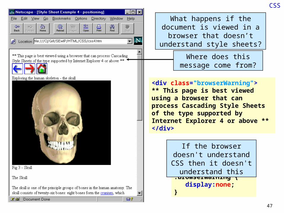
<div class="browserWarning">** This page is best viewed using a browser that can process Cascading Style Sheets of the type supported by Internet Explorer 4 or above **</div>
What happens if the document is viewed in a browser that doesn’t
understand style sheets?
.browserWarning { display:none;}
Where does this message come from?
If the browser doesn't understand CSS then it doesn't understand this
© KMc University of Greenwich48
CSS
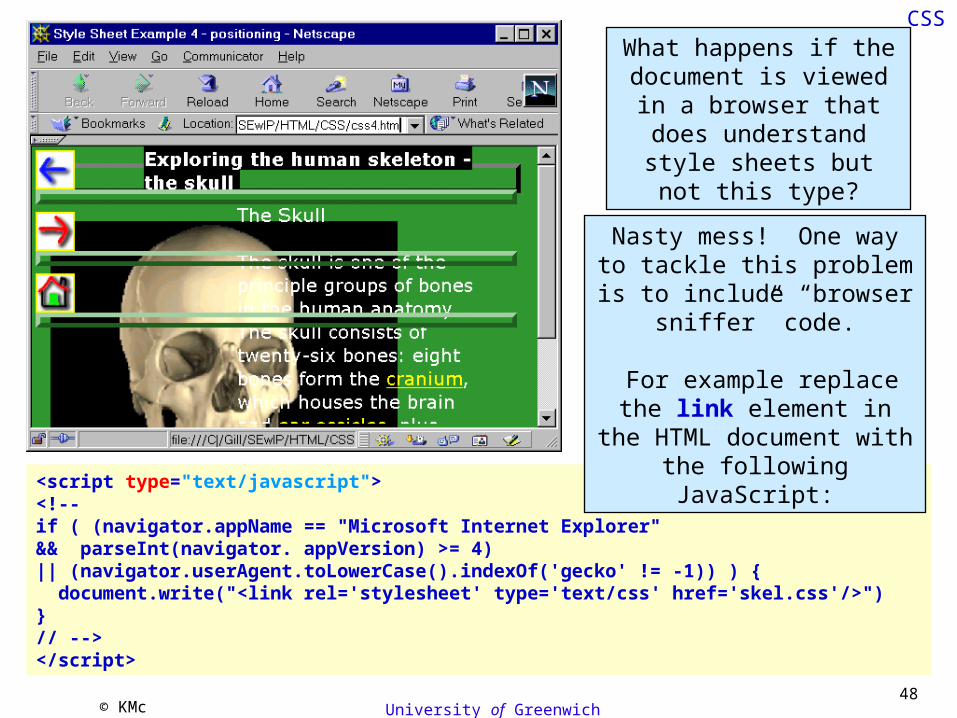
<script type="text/javascript"><!--if ( (navigator.appName == "Microsoft Internet Explorer" && parseInt(navigator. appVersion) >= 4) || (navigator.userAgent.toLowerCase().indexOf('gecko' != -1)) ) { document.write("<link rel='stylesheet' type='text/css' href='skel.css'/>")}// --></script>
What happens if the document is viewed in a
browser that does understand style sheets
but not this type?
Nasty mess! One way to tackle this problem is to
include “browser sniffer” code.
For example replace the link element in the HTML document with the following
JavaScript:

© KMc University of Greenwich49
CSS
Semantically Rich Documents• Semantic markup can be used by assistive
technologies to improve the user experience• pages can become visually dull
• Use CSS to re-arrange page content• instead of HTML tables• three column CSS layout - the holy grail
• Without CSS the page still works• content will remain in a sensible order
• Not easy to implement• a number of browser compatibility issues
• situation is slowly improving

© KMc University of Greenwich50
CSS
Conclusions
Good bits• Enhanced control over the appearance of pages
• table free page payouts
• Clear separation of content and formatting information• XHTML can be kept simple and uncluttered• enhanced compatibility with assistive technologies
• Style can be stored separately from a page• shared between several pages• consistent presentation across an entire site• easy to change and maintain
• Enables DHTML• rich internet applications

© KMc University of Greenwich51
CSS
ConclusionsNot so good bits
• Browser support• not supported by older browsers• inconsistent support by current browsers
• especially with CSS level 2
• weak implementation in the most widely used browser• possible accessibility issues
• Authoring tool support• Complexity
• while strict XHTML is far simpler than previous technology it forces developers to use potentially complex CSS
• some behaviours are less than intuitive• not surprising that browsers and authoring tools have difficulty coping
• No algebraic facilities• have to use scripts to alter the CSS properties

© KMc University of Greenwich52
CSS
Summary• XHTML 1.1 + CSS 1 is the best choice for
development of all new web sites• CSS2 is good but do not use it
• browser problems• it's quite complicated
• Pure CSS layouts are good• but don't work with older browsers• using HTML tables is a lot easier
• if in doubt use tables• but keep them simple
• avoid nesting tables

© KMc University of Greenwich53
CSS
And Finally
• Today we have looked at• what is CSS?• how should we use CSS?
• We have made little attempt to learn CSS• W3Schools provide excellent teaching material
for learning CSS
http://www.w3schools.com

© KMc University of Greenwich54
CSS
Any Questions?
© KMc University of Greenwich55
CSS
Further Reading
• W3Chttp://www.w3.org/Style/CSS
http://www.w3.org/TR/CSS1
http://www.w3.org/TR/CSS2
• W3Schoolshttp://www.w3schools.com/css
• Wikipediahttp://en.wikipedia.org/wiki/Cascading_Style_Sheets
http://en.wikipedia.org/wiki/Box_model_bug
• CSS acid testhttp://www.webstandards.org/action/acid2

© KMc University of Greenwich56
CSS
Exercises
• Make sure that you understand the examples from these slides• copy them to your server and alter the CSS
properties to see the change in results• view the results in as many different browsers
a you can• observe what happens when you
• resize the browser• zoom in the browser
• Follow the tutorial given in the notes• Read the three column layout material


![Fractional Cascading Fractional Cascading I: A Data Structuring Technique Fractional Cascading II: Applications [Chazaelle & Guibas 1986] Dynamic Fractional.](https://static.documents.pub/doc/80x56/56649ea25503460f94ba64dd/fractional-cascading-fractional-cascading-i-a-data-structuring-technique-fractional.jpg)


