8
TALAL ZEIANI Evaluation (2) HOW EFFECTIVE IS THE COMBINATION OF YOUR MAIN PRODUCT AND ANCILLARY TEXTS?
| Date post: | 06-Aug-2015 |
| Category: |
Data & Analytics |
| Upload: | talalzeiani |
| View: | 23 times |
| Download: | 0 times |

TALAL ZEIANI
Evaluation (2)
HOW EFFECTIVE IS THE COMBINATION OF YOUR MAIN PRODUCT AND ANCILLARY
TEXTS?
DIGIPAK FRONT COVER
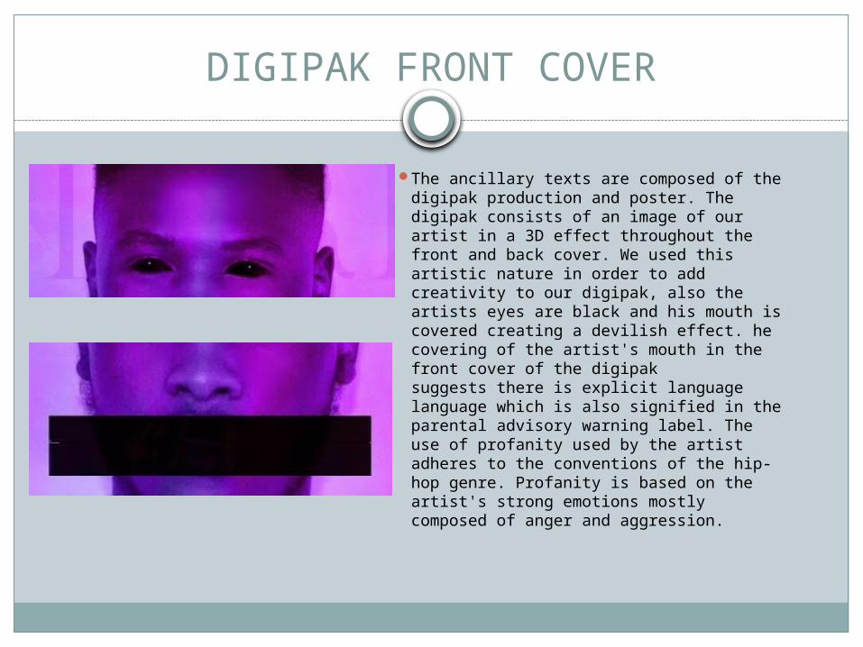
The ancillary texts are composed of the digipak production and poster. The digipak consists of an image of our artist in a 3D effect throughout the front and back cover. We used this artistic nature in order to add creativity to our digipak, also the artists eyes are black and his mouth is covered creating a devilish effect. he covering of the artist's mouth in the front cover of the digipak suggests there is explicit language language which is also signified in the parental advisory warning label. The use of profanity used by the artist adheres to the conventions of the hip-hop genre. Profanity is based on the artist's strong emotions mostly composed of anger and aggression.
POSTER
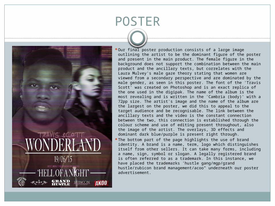
Our final poster production consists of a large image outlining the artist to be the dominant figure of the poster and present in the main product. The female figure in the background does not support the combination between the main product and the ancillary texts, but correlates with the Laura Mulvey's male gaze theory stating that women are viewed from a secondary perspective and are dominated by the male gender, as seen in this poster. The font of the 'Travis Scott' was created on Photoshop and is an exact replica of the one used in the digipak. The name of the album is the most revealing and is written in the 'Cambria (body)' with a 72pp size. The artist's image and the name of the album are the largest on the poster, we did this to appeal to the target audience and be recognisable. The link between the ancillary texts and the video is the constant connection between the two, this connection is established through the colour scheme and use of editing present throughout, also the image of the artist. The overlays, 3D effects and dominant dark blue/purple is present right through.
The bottom part of the page highlights the use of brand identity. A brand is a name, term, logo which distinguishes itself from other sellers. It can take many forms, including a name, sign, symbol or slogan. A legally registered brand is often referred to as a trademark. In this instance, we have placed the trademarks 'hustle gang/mgp/grand hustle/rubicon brand management/acoo" underneath our poster advertisement.

ADVERTISEMENT
I think that my advert will sell my digipak to my target audience as the image on the advert is similar to the one presented on the digipak. This allows my target audience to recognise who the artist is and the name of the album. The Arial font on the title of the album is also replicated on the digipak. The image on the advert promotes a creative element within it, therefore making the advert more appealing. The creative element is also shown through the Smokey effect layer under the main image portraying the colour purple which is the dominant colour scheme used throughout our production. The colour scheme on the advert is similar to the colour scheme presented on the digipak, this then makes it more recognisable for the target audience for when they come to buy the album. The covering of his mouth suggests that there will be profanity used in the album, profanity is based on the artist's strong emotion and aggression which is something the target audience would like to see. This also resembles the covering of the mouth on the digipak front cover making it more recognisable. Furthermore, the use of profanity adheres to the hip-hop convention therefore it would be something the target audience would expect. The three key elements of the advert which will help the digipak sell are; the image of the artist (for the audience to easily recognise), the name of the album and the release date (to inform the audience when the album will come out).
DIGIPAK DESIGN
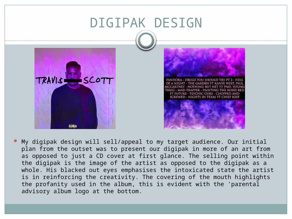
My digipak design will sell/appeal to my target audience. Our initial plan from the outset was to present our digipak in more of an art from as opposed to just a CD cover at first glance. The selling point within the digipak is the image of the artist as opposed to the digipak as a whole. His blacked out eyes emphasises the intoxicated state the artist is in reinforcing the creativity. The covering of the mouth highlights the profanity used in the album, this is evident with the 'parental advisory album logo at the bottom.
COLOUR
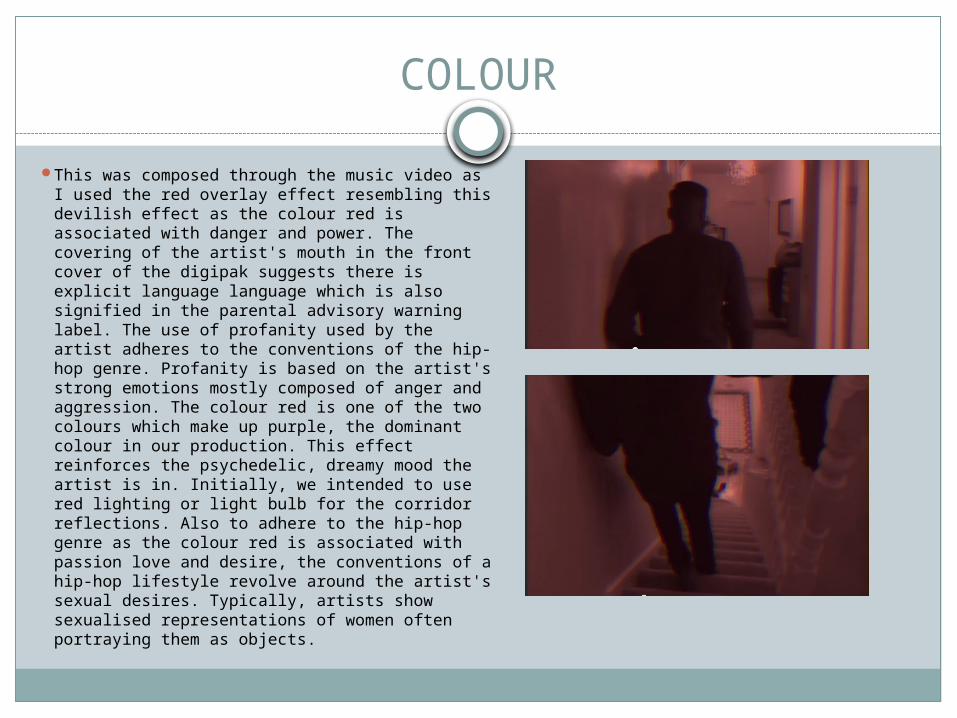
This was composed through the music video as I used the red overlay effect resembling this devilish effect as the colour red is associated with danger and power. The covering of the artist's mouth in the front cover of the digipak suggests there is explicit language language which is also signified in the parental advisory warning label. The use of profanity used by the artist adheres to the conventions of the hip-hop genre. Profanity is based on the artist's strong emotions mostly composed of anger and aggression. The colour red is one of the two colours which make up purple, the dominant colour in our production. This effect reinforces the psychedelic, dreamy mood the artist is in. Initially, we intended to use red lighting or light bulb for the corridor reflections. Also to adhere to the hip-hop genre as the colour red is associated with passion love and desire, the conventions of a hip-hop lifestyle revolve around the artist's sexual desires. Typically, artists show sexualised representations of women often portraying them as objects.
HOUSE STYLE
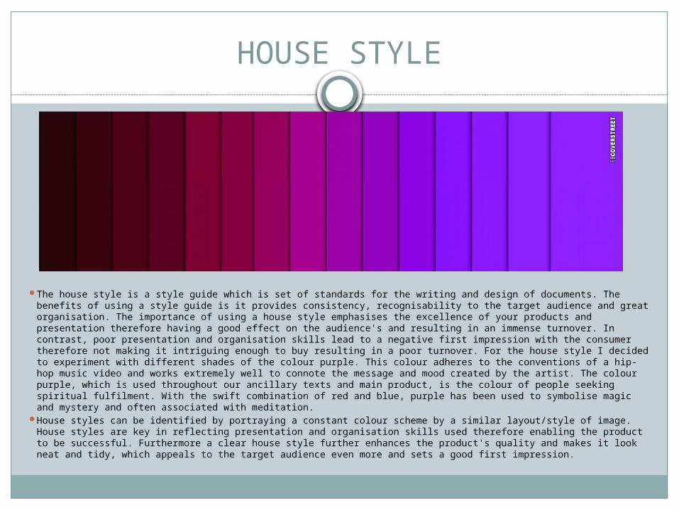
The house style is a style guide which is set of standards for the writing and design of documents. The benefits of using a style guide is it provides consistency, recognisability to the target audience and great organisation. The importance of using a house style emphasises the excellence of your products and presentation therefore having a good effect on the audience's and resulting in an immense turnover. In contrast, poor presentation and organisation skills lead to a negative first impression with the consumer therefore not making it intriguing enough to buy resulting in a poor turnover. For the house style I decided to experiment with different shades of the colour purple. This colour adheres to the conventions of a hip-hop music video and works extremely well to connote the message and mood created by the artist. The colour purple, which is used throughout our ancillary texts and main product, is the colour of people seeking spiritual fulfilment. With the swift combination of red and blue, purple has been used to symbolise magic and mystery and often associated with meditation.
House styles can be identified by portraying a constant colour scheme by a similar layout/style of image. House styles are key in reflecting presentation and organisation skills used therefore enabling the product to be successful. Furthermore a clear house style further enhances the product's quality and makes it look neat and tidy, which appeals to the target audience even more and sets a good first impression.
BRAND IDENTITY Brand identity is often consistently displayed within the media products, this is a way of getting the target audience to recognise this by the use of font, logo, image or colour schemes. The importance of branding is a way of separating or helping your product stand out from other competitors in order to sell to your target audience.
The importance of brand identity is ensuring our multiple media products link together in order for it to proficiently link back to our main product. This is key, as it enables our target audience to easily recognise our product therefore benefiting both popularly and financially. Throughout my production, I have used the constant colour of purple throughout my advertisement poster and digipaks; my focus on the colour scheme was important as it was a common convention often used throughout all media based products. The constant colour scheme throughout my media product proved to be effective as it links well with the main product. Also the constant colour scheme enhances the product quality subsequently making my product look appealing and professional. In our music video, the correlation between the colour scheme and the artist's face enhances the effectiveness of the combination of our main product and ancillary texts. The shade of purple is evident in our multiple media products gaining the recognisability from the audience. Also the distorted lighting effects used throughout our main product and ancillary texts. This effect, along with our entire music video, was created on Final Cut Pro where the 'directional blur' and 'gaussian blur' are used to create a blurring streaking affect.
![Evaluation [2]](https://static.documents.pub/doc/80x56/545295a1af7959ce7f8b5544/evaluation-2-5584b58a47ea0.jpg)


