10
Evaluation on questions 1, 6 and 7 for my foundation portfolio. Tiffany Malcolm
| Date post: | 28-Jul-2015 |
| Category: |
Education |
| Upload: | tiffanyvanessah0512 |
| View: | 58 times |
| Download: | 1 times |

Evaluation on questions 1, 6 and 7for my foundation portfolio.
Tiffany Malcolm
Question 1- In what ways does your media product use, develop or challenge forms and conventions of real media products?
To follow the conventions is when you go along with the flow, follow the rules and to do what everyone else is doing. Challenging the convention is when you do something different to create an effect such as interest and or surprise.
The ways I decided to follow the conventions is by looking at two ‘pop’ magazines. The two magazines I decided to focus on were, ‘Top Of The Pops (TOTP) and We <3 POP’. From both of these magazines I looked at the front cover, contents page and double page spreads. The reason I decided to look at more than one music magazine was so that I could look at the different structures. By doing this I decided it would enable me to have more options and maybe even make my music layout better then what I was looking at in the magazines.
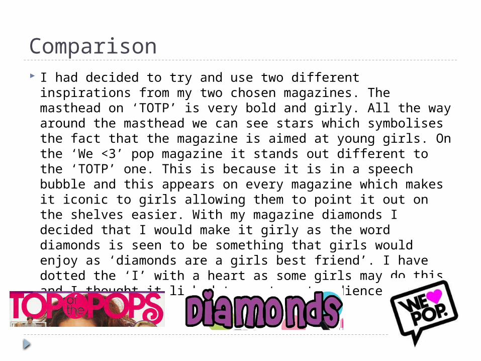
Comparison I had decided to try and use two different inspirations
from my two chosen magazines. The masthead on ‘TOTP’ is very bold and girly. All the way around the masthead we can see stars which symbolises the fact that the magazine is aimed at young girls. On the ‘We <3’ pop magazine it stands out different to the ‘TOTP’ one. This is because it is in a speech bubble and this appears on every magazine which makes it iconic to girls allowing them to point it out on the shelves easier. With my magazine diamonds I decided that I would make it girly as the word diamonds is seen to be something that girls would enjoy as ‘diamonds are a girls best friend’. I have dotted the ‘I’ with a heart as some girls may do this and I thought it linked to my target audience well.
Front Cover Colour scheme: the main colour scheme is very girly as it mainly has
the colour purple. The bar at the bottom and the main masthead are both purple which creates a link and it shows it has a house-style.
Style of photography: this is a mid-shot, a mid-shot is when it cuts off at the waist. I chose this sort of image because I think that it works well. If I had used a full body shot I don’t think that it would have worked as well. A closer shot is a lot more personal as though it is directed to you. By the main photo looking at you in your eyes it makes it look like she is looking directly at you. The other image of Harry Patterson is a close shot which is cut off at the shoulders. If it was any larger it wouldn’t look in proportion to the rest of the page. I think that it works well because it is close and suits the style.
Pull Quotes: one quote which I find good is ‘Its amazing I have been in the same room as people I have watched on the TV; Rita Ora being one of them!’ this is very direct because even if you haven’t heard of Rhi, you will know who Rita Ora is. This will make you want to know why she has been mentioned.
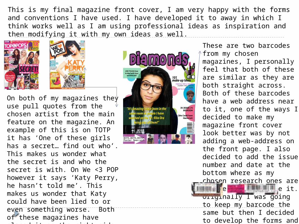
This is my final magazine front cover, I am very happy with the forms and conventions I have used. I have developed it to away in which I think works well as I am using professional ideas as inspiration and then modifying it with my own ideas as well.
On both of my magazines they use pull quotes from the chosen artist from the main feature on the magazine. An example of this is on TOTP it has ‘One of these girls has a secret… find out who’. This makes us wonder what the secret is and who the secret is with. On We <3 POP however it says ‘Katy Perry, he hasn’t told me’. This makes us wonder that Katy could have been lied to or even something worse. Both of these magazines have placed it on the right side which is similar. I went against this convention and placed mine on the left hand side; this is one stage of me developing the forms.
These are two barcodes from my chosen magazines, I personally feel that both of these are similar as they are both straight across. Both of these barcodes have a web address near to it, one of the ways I decided to make my magazine front cover look better was by not adding a web-address on the front page. I also decided to add the issue number and date at the bottom where as my chosen research ones are at the side or above it. Originally I was going to keep my barcode the same but then I decided to develop the forms and turn it onto the side.
Question 6- What have you learnt about technologies from the process of constructing this product? Just before I started on my full music magazine product I didn't really
have much experience using manipulation programmes such as In-design and Photo-shop While I was constructing the music magazine I learnt a lot about these two programmes as I thought that they would be really useful and it would help me create the best music magazine possible. For the main image on my front cover I took the photo myself and used the magic wand tool. I then decided to smooth the edges out using the rubber tool on a low opacity. The way I got into photo-shop and in-design was by playing with all the different tools and figuring out what each tool did. I also watched a lot of You-tube video which enabled me to figure out what was going on during this process and I could work along side with it. I used basic things such as shape and different photos to make it look like my chosen artists groups. I used the same method as the one I did on my front cover which was cutting around the photo with the magic wand tool then smoothing over the edges. Another thing I learnt how to do was by using many different fonts from dafonts.com this website was very useful as it gave me a selection to chose from which would suit my magazine better.
Question 6 Many other things I learnt how to do was take photos on a
professional camera. These images I took to use on my front cover, contents page and double page spread. I learnt how important the different angle an all the different shot types as well as how I should portray them in my magazine.
During the whole of my coursework portfolio I had to update my personal blog. My personal blog address of http://0512tiffanymalcolm.blogspot.co.uk/
This is a way that my media teachers could keep an eye on my work and they could see the progress I was making. However the first time I used blogger I didn't know how to post things and how I checked who viewed my profile However I got used to it and did research online and I also asked my media teachers for help. I finally learnt how to update, add photos, files just using blogger alone.
However for longer pieces of work I used “Scribd” few times. I think this was more effective as it allowed me to upload it easier.
Question 7- Looking back at your preliminary task, what do you feel you have learnt in the progression from it to the full project? 7) My front cover on my preliminary task was very basic as I had never used
photo-shop before so it was done unprofessionally because I had no idea how to use these design programmes so I used Microsoft word instead. I think that it looks very basic and unprofessional as my knowledge about magazine front covers and contents pages where very minimal I think that I have made a lot of progression on both pieces. On my front cover for the final production I had to think about layouts, colour scheme, images and loads of other points. However on my preliminary task I didn't take any of these into consideration and just flung a photo on there and thought it looked good. I think that the main progression from my preliminary task to my final piece was very significant as I took a lot more time on it and a lot more care rather then just throwing it together in one hour.
I have learnt many different things for example the significant of conventions of music magazines. Another one I learnt was about all the different house styles and all the codes and conventions of a certain magazine. By me understanding these aspects and many more it helped me make my full front cover and contents page look a lot more professional rather then a magazine that looks like it was made by 12 year olds.
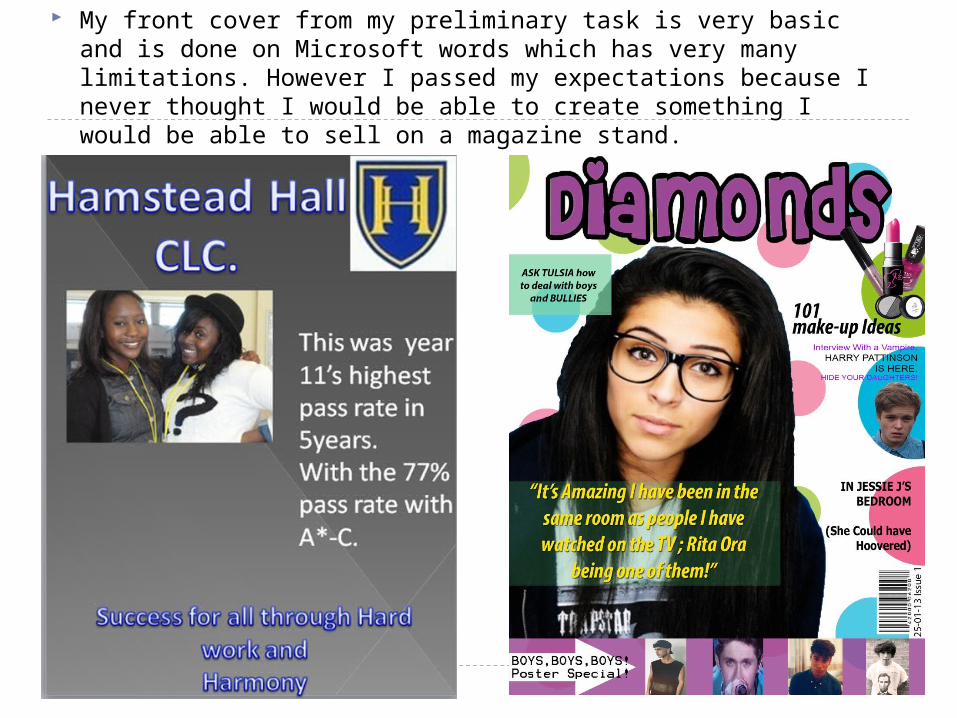
My front cover from my preliminary task is very basic and is done on Microsoft words which has very many limitations. However I passed my expectations because I never thought I would be able to create something I would be able to sell on a magazine stand.

This is the difference from my preliminary task contents page and my final piece contents page. I think that I have made a huge improvement as it looks a lot more professional.


