OCR Media Studies – AS Level Unit G321: Foundation Portfolio in Media Evaluation Name: Yunus Kasim Candidate Number: 6570 Center Name: St. Paul’s Catholic College Center Number: 64770 Set Brief - Print Music Magazine – Production Preliminary Task, Log Book and Evaluation
For my model across the 4 pages, I decided to communicate with a few people through messaging, to see who would want to be my model for my music magazine. Once I decided on my model, I had to make sure he dressed exactly like the artist as well as imitated his facial expressions and body language. For instance, ‘Eminem’ has a hard look on his face, so my model had to also take on the hard look. Furthermore, I decided to pick Eminem as he is an artist that young men look up to and want to become, and therefore I had to make sure my model carried them traits whilst taking pictures.
To begin with, I created three main aspects within my magazine: front cover, contents page and double page spread. My magazine is known as ‘Swizstar’, which is part of the R&B genre and targets young men aged 17-21. My music magazine of inspiration is ‘vibe’ magazine as its considered as one of the most dominant R&B magazines in the US. I have repeated the placements of the cover line, as well as the masthead and the web address. Likewise, the use of repetition (Steve Neale) allowed my magazine to reach its maximum potential in terms of the quality as well as the professional outlook of the magazine in general. I have also replicated codes and conventions from my magazine of inspiration (Vibe). An example, is the layout as well as the structure of my front cover, have similarities with ‘Vibe’ magazine. On the other hand, I have included a range of ‘difference’ within my music magazine when compared with my music magazine of inspiration. For example, within my double page I have made a distinct separation between the question and answer, by the contrasting colours of red and black. One other ‘difference’ within my music magazine when compared with my music magazine of inspiration, is the colour use, as I have used ‘dark red’ rather than the colour of light grey. The use of difference is illustrated in my magazines main image, as Eminem has a contrasting body language when compared with Von. Also, the convergent (social networks) informs (Katz theory) the audience how they can access more magazine content via the internet.
Ultimately, the use of repetition as well as difference has allowed me to create a music magazine that is unique, creative and inspirational towards my allocated audience. The use of repetition allowed my magazine to have some traits of my magazine of inspiration, however the differences made my magazine stand out more and give the genre of R&B a more unique outlook as a whole.
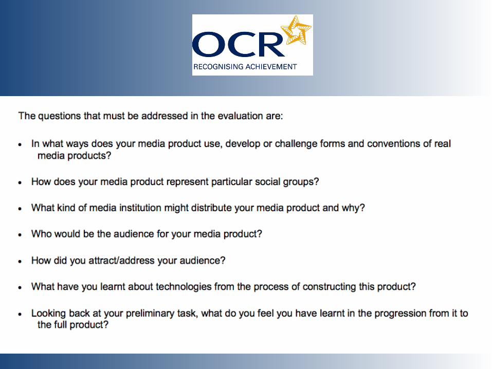
Q1) In what way does your media product use, develop or challenge forms and conventions of real media products?
Throughout my magazine ‘Swizstar’, the denotation of my music magazine are young men aged 17-21 years, who are usually looked down upon within society, as they are deemed as being troubled, irresponsible and dangerous. Therefore, my magazine looks to inspire young men, as they see Eminem as a role model that they want to imitate and follow. This is because young men stereotypically feel attached with strong opinionated artists such as Eminem. Hence why my magazine would be appealing to my particular social group, who are young men. The interview from my double page spread uses colloquial language to allow the audience to understand and follow my magazine in an easy manner. My main images across the 3 pages denote Von (represented as Eminem) as having a serious facial expression throughout, this connotes the hardship Eminem has been through whilst he was young, and therefore reflects the hardship young men are going through now in modern society. Additionally, ‘Vibe’ include many women who hold authority over many aspects such as being a male gaze (Laura Mulvey) towards the male audience. This therefore integrates well with my music magazine as my cover line include feminine artists of which will immediately attract young men to buy my ‘Swizstar’ magazine. The props (Watch and chain) used within my double page spread is representative towards my target audience, as young men use them as symbols for R&B music, and therefore in essence my music magazine represents the social group in a very effective way. Furthermore, artists such as Eminem have attributes that appeal to young women, and this is known as being a female gaze (Diana Saco), he therefore attracts some women to listen to his music; however the majority of his social group are young men who look at his music content rather than his looks.
Q2) How does your media product represent particular social groups?
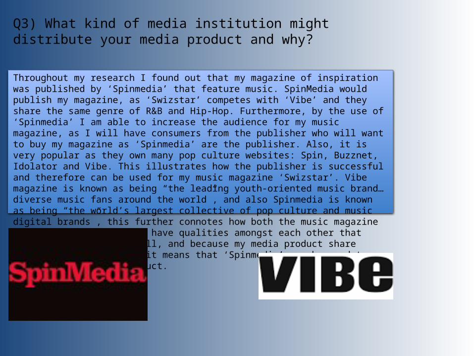
Throughout my research I found out that my magazine of inspiration was published by ‘Spinmedia’ that feature music. SpinMedia would publish my magazine, as ‘Swizstar’ competes with ‘Vibe’ and they share the same genre of R&B and Hip-Hop. Furthermore, by the use of ‘Spinmedia’ I am able to increase the audience for my music magazine, as I will have consumers from the publisher who will want to buy my magazine as ‘Spinmedia’ are the publisher. Also, it is very popular as they own many pop culture websites: Spin, Buzznet, Idolator and Vibe. This illustrates how the publisher is successful and therefore can be used for my music magazine ‘Swizstar’. Vibe magazine is known as being “the leading youth-oriented music brand…diverse music fans around the world”, and also Spinmedia is known as being “the world’s largest collective of pop culture and music digital brands”, this further connotes how both the music magazine as well as the publisher have qualities amongst each other that make them link really well, and because my media product share similarities with Vibe, it means that ‘Spinmedia’ can be used to distribute my media product.
Q3) What kind of media institution might distribute your media product and why?
My media audience are targeted at young men aged 17-21, and this links with Hartley’s seven subjectivities, of which is used to categories the media audience. My audience are young men, as they enjoy R&B and Hip Hop music. Its believed that rap as a genre include many swear words as well as slang language, and therefore in society this links directly with young men. For example, the colour of dark red and black is significant as it is portrayed as being stereotypically masculine colours, hence why I included these colours within my magazine, as its what catches the audiences attention. My magazine is mostly for students who would be intrigued to read an R&B magazine and have an interest of aspiring like certain R&B artists. The price is also convenient as its only £1.50, and therefore its affordable for my target audience, as young men are usually still at school.
Alternatively, one theory that can be included with my music magazine is Katz theory (Informed and educated) as it connotes that audiences can build a personal relationship with the editor of the magazine, through the editors letter. This initially allow the audience to form a strong bond with the magazine and therefore become loyal readers when it comes to reading further issues. The use of convergence such as social networking is a great way in terms of keeping the audience updated about the magazines contents plus finding out more about the magazines history.
Moreover, another theory that can be integrated within my music magazine is Maslow’s Hierarchy of needs, as my magazine has a huge impact on social climbers. My target audience (young men) would constantly want to be updated and aware of what’s happening to their favorite artists. Not only this, but people who are part of the target audience may want to witness a new arisen star of R&B music. This is similar with my magazine as page 71 of ‘Exclusives’, demonstrates how there is a new star and therefore it appeals to explores. Ultimately, young men tend to try and keep up to date at all times when it comes to music, and therefore to improve their status in society group, they know the latest music, of which is provided within my first issue.
Q4) Who would be your media audience and why?
To start with, to attract my allocated audience for my ‘Swizstar’ magazine, I had to take a main image that is different, unique and creative. I personally believe I have included three effective images, especially my double page. As I have included an extremely unique image of Von torn out of a newspaper, this differentiates from other magazines and makes it eye catching towards my audience. Furthermore, I chose the name ‘Swizstar’ as my masthead for my music magazine as it has a positive correlation with my chosen genre, and gives the audience a glimpse of what to expect within the R&B magazine. I have also used an interesting as well as exciting puff ‘ Win a chance to record with the king of rap Eminem’, this attracts my audience as young men would love to meet their idol and inspiration Eminem. Furthermore, the quote used “ I need drama… keep making music”, is essential for the attraction of the audience as it foreshadows the drama they are about to see inside the music magazine. Similarly, the interview of the artist is used to appeal the audience, so they can acknowledge how their life is and have a feel how its like to be an artist. The cover line feature major artists such as Iggy Azalea and Ariana Grande that can attract the male gaze (Laura Mulvey) as they find women artists attractive. I have also included a drop capital of ‘E’ on my DPS to attract the audience in a more effective way. Additionally, the interview used reveals the audience with information about Eminem’s past, present and future. The contrasting colours used within my ‘Swizstar’ magazine are primarily: dark red, white and black. These colours blend in very well and therefore attract the audience as it looks professional and appealing.
Q5) How did you attract/ address your audience?
Male gaze (Laura Mulvey)
I have learnt many new skills in Photoshop such as the use of changing colours, to more advanced tools ‘pen tool’. By the use of Photoshop I was able to construct my ‘Swizstar’ music magazine. With the support of my teacher I became more knowledgeable of how to use different tools to make aspects such as main image or masthead. I had to edit my main images across the three pages and make sure they look professional. For instance, I used the quick selection tool to get rid of the background, or I would use the rubbing tool to get rid of the background. This allowed me to make images that are clear and noticeable. I used a range of fonts through Photoshop, for each page of my magazine, to make it more exciting to read, however I did make sure the masthead had the same front as its essential for the audience to see consistency at the front of each page. Additionally, I incorporated the use of a drop capital to extend the professionalism of my magazine and to give it the letter ‘E’ more emphasis. I used different fonts throughout my three pages to ensure that the reader has a range of fonts to look at, rather than having one ordinary font. An example on my magazine was when I used a font for my masthead, and then changed it up for my cover lines, so that the audience takes time to look at each part of my magazine.
Q6) What have you learnt about technologies from the process of constructing this product?
Swizstar magazine analysis
Front Page Double page spread Contents Page
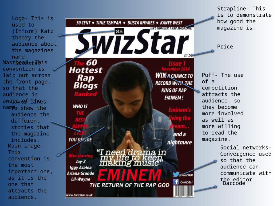
Masthead- This convention is laid out across the front page, so that the audience is aware of the name.
Strapline- This is to demonstrate how good the magazine is.
Barcode
Price
Main image- This convention is the most important one, as it is the one that attracts the audience.
Puff- The use of a competition attracts the audience, so they become more involved as well as more willing to read the magazine.
Logo- This is used to (Inform) Katz theory the audience about the magazines name ‘Swizstar’
Cover lines- To show the audience the different stories that the magazine includes.
Social networks- Convergence used so that the audience can communicate with the editor.
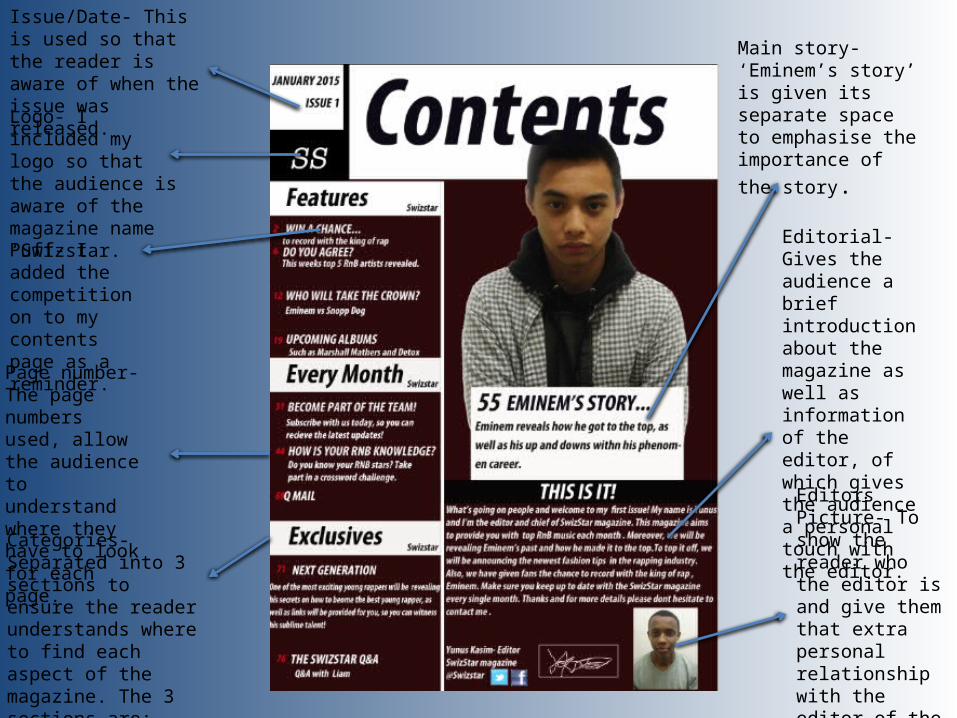
Puff- I added the competition on to my contents page as a reminder.
Page number- The page numbers used, allow the audience to understand where they have to look for each page.
Logo- I included my logo so that the audience is aware of the magazine name ‘Swizstar.
Editorial- Gives the audience a brief introduction about the magazine as well as information of the editor, of which gives the audience a personal touch with the editor.
Issue/Date- This is used so that the reader is aware of when the issue was released.
Main story- ‘Eminem’s story’ is given its separate space to emphasise the importance of the story.
Editors Picture- To show the reader who the editor is and give them that extra personal relationship with the editor of the music magazine ‘Swizstar’.
Categories- Separated into 3 sections to ensure the reader understands where to find each aspect of the magazine. The 3 sections are: ‘Features’, ‘Every month’ and ‘Exclusives’.
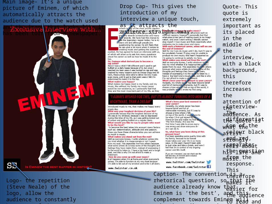
Main image- It’s a unique picture of Eminem, of which automatically attracts the audience due to the watch used and the image that looks like it has been torn from a newspaper.
Interview- The differentiation of the colour black and red, separates the question from the response. This therefore makes it easier for the audience to read and understand.
Logo- the repetition (Steve Neale) of the logo, allow the audience to constantly be aware of the magazine name ‘Swizstar’.
Caption- The convention is a rhetorical question, so that the audience already know that Eminem is ‘the best’, and this complement towards Eminem will make the audience ask questions about whether its true.
Drop Cap- This gives the introduction of my interview a unique touch, as it attracts the audience straight away.
Quote- This quote is extremely important as its placed in the middle of the interview, with a black background, this therefore increases the attention of the audience. As the quote is what the artist strongly feels about his life and music.
Q7) looking back at the preliminary task, what do you feel you have learnt in the progression of it from the full product?
When I think back to my preliminary task, I personally feel that it enabled me to make mistakes and correct them as I went along (Trial and Error). I have also learnt what the essential expectations of my target audiences and have tried to include these factors on my ‘Swizstar’ magazine. For example, the differentiation of my preliminary front cover and music front cover illustrates how I have progressed in quality of my main image, as well as the general layout. Likewise, the colour scheme of my music magazine has improved dramatically after doing the preliminary task as its more consistent throughout.
At the beginning, I was unable to use Photoshop in the correct manner for my preliminary task, as I was unable to use the tools properly. An example of this is the ‘Quick mask tool’ as at first I found it very difficult to use and apply on to my music magazine. However, my music magazine became better, as I learnt how to use the tool effectively, and therefore made it more quality and in a more high standard. My time management improved, once I became more able to use Photoshop, and this initially benefited me as I was able to complete my work quicker and at a better standard.
As a whole, all the positives and negatives of my preliminary task gave me a fundamental step towards creating the best possible music magazine I could have created. Therefore I personally feel happy with my step from the preliminary to my music magazine.