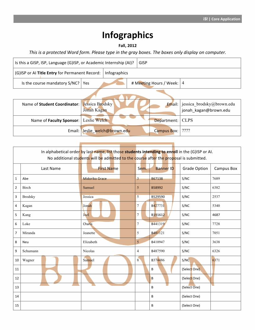
iS! | Core Application Infographics Fall, 2012 This is a protected Word form. Please type in the gray boxes. The boxes only display on computer. Is this a GISP, ISP, Language (G)ISP, or Academic Internship (AI)? GISP (G)ISP or AI Title Entry for Permanent Record: Infographics Is the course mandatory S/NC? Yes # Meeting Hours / Week: 4 Name of Student Coordinator: Jessica Brodsky Jonah Kagan Email: [email protected][email protected]Name of Faculty Sponsor: Leslie Welch Department: CLPS Email: [email protected]Campus Box: ???? In alphabetical order by last name, list those students intending to enroll in the (G)ISP or AI. No additional students will be admitted to the course after the proposal is submitted. Last Name First Name Sem. Banner ID Grade Option Campus Box 1 Abe Midoriko Grace 3 B67138 S/NC 7689 2 Birch Samuel 5 B58992 S/NC 6382 3 Brodsky Jessica 5 B529590 S/NC 2537 4 Kagan Jonah 7 B427731 S/NC 5340 5 Kang Joel 7 B191612 S/NC 4687 6 Loke Charis 7 B441319 S/NC 7728 7 Miranda Jeanette 5 B481121 S/NC 7051 8 Neu Elizabeth 5 B410947 S/NC 3638 9 Schumann Nicolas 4 B487590 S/NC 6326 10 Wagner Samuel 8 B374486 S/NC 6371 11 B (Select One) 12 B (Select One) 13 B (Select One) 14 B (Select One) 15 B (Select One)
Transcript
iS! | Core Application
Infographics Fall, 2012
This is a protected Word form. Please type in the gray boxes. The boxes only display on computer.
Is this a GISP, ISP, Language (G)ISP, or Academic Internship (AI)? GISP
(G)ISP or AI Title Entry for Permanent Record: Infographics
Is the course mandatory S/NC? Yes # Meeting Hours / Week: 4
Name of Student Coordinator: Jessica Brodsky Jonah Kagan
In alphabetical order by last name, list those students intending to enroll in the (G)ISP or AI. No additional students will be admitted to the course after the proposal is submitted.
Last Name First Name Sem. Banner ID Grade Option Campus Box
1 Abe Midoriko Grace 3 B67138 S/NC 7689
2 Birch Samuel 5 B58992 S/NC 6382
3 Brodsky Jessica 5 B529590 S/NC 2537
4 Kagan Jonah 7 B427731 S/NC 5340
5 Kang Joel 7 B191612 S/NC 4687
6 Loke Charis 7 B441319 S/NC 7728
7 Miranda Jeanette 5 B481121 S/NC 7051
8 Neu Elizabeth 5 B410947 S/NC 3638
9 Schumann Nicolas 4 B487590 S/NC 6326
10 Wagner Samuel 8 B374486 S/NC 6371
11
B
(Select One)
12
B
(Select One)
13
B
(Select One)
14
B
(Select One)
15
B
(Select One)
iS! | Core Application
Independent Study | Proposal Outline Before filling out this proposal, please consult the Independent Study Information Packet, schedule an appointment with the Independent Study Coordinators at the Curricular Resource Center (email [email protected]), and look through the past (G)ISP and AI proposals on file at the CRC.
This is a protected Word form. Please provide the requested information in the spaces provided.
1. What – Provide an explanation and rationale for the proposed (G)ISP or AI • Describe the goals of the study and the questions, topics, or issues the project will address (at least 1 page). • (G)ISPs and AIs are academic courses; be sure to highlight the broader scholarly context of the study. • Note: Especially if the course does not follow a traditional format, students should submit a separate cover
letter including any additional information that will help the committee evaluate the proposal.
Humans rely primarily on sight to take in information about the world. Unfortunately, much of the complexity of today’s world cannot be accessed visually without the use of an intermediary form. For instance, our eyes cannot see the difference between two political ideologies. Instead, we read articles and essays that describe the concepts, relying on written language as a intermediary. Written language, however, is not always the most efficient or effective way to visually communicate information. Often, graphic representations of information – known as infographics – can convey complex information in a manner more suitable to consumption by the human eye and mind. Thus, the study of infographics is the study of efficient, effective communication using a graphic medium, or in other words, the study of visual language. Just as the study of written language can span from questions of meaning (as in the study of literature) to concerns of craft (as in the literary arts) to inquiries into perception (as in the field of linguistics), the study of visual language is relevant to a variety of disciplines. For instance, infographics are often used to convey large amounts of quantitative information that cannot be easily expressed otherwise. Therefore, questions about the meaning of infographics are particularly pertinent to the field of applied math, a discipline that focuses on extracting meaning from large amounts of information. In order to create infographics, vast quantities of data must be distilled down to core concepts. Once data is processed, the principles of graphic design, which apply to topics like typography, layout, and composition, provide critical insight into the creation of infographics. Graphic design techniques can illuminate best ways to use visuals to convey information and communicate a message. Cognitive science explains the scientific underpinnings of these graphic design techniques. Scientists who study visual perception explore the mechanisms within the human mind that contribute to the way we process visual data. Research in this area informs the evaluation and creation of infographics. In this GISP, we will take a holistic approach to the study of infographics, informed by our study of data analysis, graphic design, and cognitive science. Our learning goals are:
1. To improve our ability to communicate using visual language
iS! | Core Application
2. To develop our ability to evaluate the efficacy of infographics 3. To understand the cognitive processes that contribute to visual perception, and learn how to apply these
principles in the creation of infographics 4. To understand the basic theories and techniques of graphic design, and learn how to apply these
principles in the creation of infographics 5. To develop a facility using graphical tools and software 6. To gain an appreciation for the breadth of applications for infographics
We will approach these goals through a combination of theory and praxis, learning analytically (through reading and discussion) and creatively (by making our own infographics). By using these two approaches in tandem, we hope that each one will provide insight into the other. Most importantly, we hope that participants in the GISP will develop their skills as producers and consumers of visual language. Like written language, the skills of visual language are critical to facilitating better communication in any field of study.
2. When – Provide a detailed course syllabus • For each week include the topics to be covered, the analytical question(s) that will frame the discussion, and
the required assignments and materials. A potential syllabus template is provided below. • Social Science and Humanities (G)ISPs are expected to read 150-‐200 pages per week; other (G)ISPs should
involve comparable workloads; AIs should include internship hours and 30-‐100 pages of reading per week. • Work outside the box. Adapt this and experiment with pedagogy. IS provides lots of room for creativity!
Expected Weekly Meeting Day(s) and Time(s): Mondays and Wednesdays, 5:30-‐7:30pm
• List All Readings with Page Numbers, Materials, Meetings with Faculty or Agency Sponsor(s), Speakers, Activities, Deadlines, Exams, Hours for AIs, etc.
• Provide brief explanations for any materials whose titles do not obviously relate to the weekly theme.
Class Structure
The work for the GISP will consist of weekly readings, homework projects, and a final project. We will meet for two hours on Mondays and Wednesdays each week. The Monday meeting will consist of a lecture (if applicable) and discussion regarding the reading for the week. The Wednesday meeting will be a lab section, where we will critique each other’s work, give short tutorials on useful graphics tools and software, and work collaboratively on projects. Reading will be assigned every Monday and due the following Monday. Each participant must contribute to a collaborative reading response document, both positing their own ideas and responding to the ideas of others. Since this GISP is focused on developing a facility with visual language, reading responses will not be limited to written language. The document will be created using online collaborative whiteboard software (which is like Google Documents, but also allows users to add drawings and images in a non-‐linear format – for example, see http://www.twiddla.com). The reading response document for each week will become a collaborative infographic, communicating the thoughts of the entire class. Ideally, we would like to find a small amount of
iS! | Core Application
funding to buy drawing tablets for participants so that they can draw easily in their reading responses. Homework projects will be assigned on Wednesdays and due the following Wednesday. Projects will be critiqued by the entire class. The project requirements will be specified in the appropriate week of the syllabus. The final project will be assigned after the eighth week of the semester. Participants will work individually or in small groups to create an infographic (or multiple infographics) of their choosing. Participants will find and process the information, create the infographic, and give scientific justification for their choices in an accompanying 2 page paper. The final infographics and other work demonstrating the progress of the class will be displayed at the end of the semester as an exhibit open to the public.
Week 1: What are infographics?
Leaders: Jonah Kagan, Jessica Brodsky We will begin the semester by trying to better define our subject area. What exactly do we mean by the term infographics? What fundamental characteristics do all infographics share? 1.1 Wednesday, 9/5 Discussion: What are the defining characteristics of infographics and how are infographics different from other visual representations? Develop a working definition of an infographic that will be subject to change as the semester progresses. Push the boundaries of the traditional definition of an infographic: Do signage and words count as infographics? Discuss the purpose of infographics and the differences between “good” and “bad” infographics. Homework DUE Monday 9/10: Create an online collection of infographics and explain how they satisfy our working definition. Readings:
• Jacobson, Robert. Information Design. Cambridge: The MIT Press. 1-‐376. • Chen, C. 2002 . “Information Visualization”. Information Visualization 1 (1):1-‐4
http://ivi.sagepub.com/content/1/1/1.full.pdf+html • Pulak, I. and M. Wieczorek-‐Tomaszewska. Infographics -‐ The carrier of educational content.
Leaders: Sam Birch, Jeanette Miranda Before we can start making infographics, we need to be able to understand the information ourselves. This week will focus on the actual information represented by infographics. During this week we will:
• Explore information collection, including quantitative information gathering, data cleaning, and qualitative processing.
• Examine the ethical treatment of data, false statistical manipulations & dangers of machine learning.
iS! | Core Application
• Look at what can be done with quantitative data, including statistical treatments, automatic summarization by way of machine learning, removing outliers.
• Consider challenges with high dimensionality, low signal, and scale. • Discuss examples of non-‐quantitative information through “cheatsheets”, algorithmic animations, and the
site http://www.jasondavies.com/animated-‐bezier/. • Discuss the place of machine learning and statistics. What is a reasonable amount of manipulation? (e.g.
climate change statistics controversy.)
2.1 Monday 9/10/12 Speaker(s): Professor Eric Sudderth (CSCI) or Professor Matt Harrison (APMA) Discussion: See points above. Reading:
• A taxonomy of data science. Hilary Mason and Chris Wiggins. http://www.dataists.com/2010/09/a-‐taxonomy-‐of-‐data-‐science/
• What is data science? Mike Loukides. http://radar.oreilly.com/2010/06/what-‐is-‐data-‐science.html • What if academics were as dumb as quacks with statistics? Ben Goldacre in The Guardian.
http://www.badscience.net/2011/10/what-‐if-‐academics-‐were-‐as-‐dumb-‐as-‐quacks-‐with-‐statistics/ • On Chomsky and the Two Cultures of Statistical Learning. Peter Norvig. http://norvig.com/chomsky.html • Privacy measured via entropy: https://panopticlick.eff.org/ • The Elements of Statistical Learning. Hastie, Tibshirani, & Friedman. (p. 1-‐9, 22, 37) • Programming Collective Intelligence. Toby Segaran. (1-‐7, 29-‐53, 226-‐248) • Mean shift: A robust approach toward feature space analysis. D. Comaniciu, P. Meer. • The Bootstrap. Cosma Shalizi. http://www.americanscientist.org/libraries/documents/201048159157846-‐
2010-‐05Shalizi.pdf • How not to sort by average rating. Evan Miller. http://www.evanmiller.org/how-‐not-‐to-‐sort-‐by-‐average-‐
rating.html
2.2 Wednesday, 9/12 Lab: Tutorial on processing data. We will learn how to find a data set and glean meaning from it. Homework DUE 9/19: Choose whichever option your are less comfortable with:
• Option 1: Pick a dataset, scrape/process it, perform some statistical manipulations, and present a draft infographic. For example, use Google Books n-‐grams viewer or anything on OKTrends.
• Option 2: Take some concept or body of knowledge you understand well and create an infographic which compresses as much as possible of it into one page.
Week 3: Graphics from a Design Perspective
Leaders: Charis Loke, Grace Abe We will begin to learn the craft of infographics, drawing from the field of graphic design. We will use these three classes to:
• Learn graphic design principles • Deconstruct these principles with famous graphics
iS! | Core Application
• Learn how to use a digital drawing tool • Survey graphics on campus to identify successful and unsuccessful graphic design • Practice creating “thumbnails”
3.1 Monday, 9/17 Lecture: Professor Krysztof Lenk or Professor Douglass Scott from RISD Discussion: See points above. Homework DUE Monday 9/24: Survey the multitude of posters currently pasted on campus walls and identify successful/ unsuccessful graphic design principles in a few. Why do those principles work? How do they work? What do they convey? Looking at a wide variety of images of different styles and media, determine the design principles that they all adhere to. Readings:
• Cleveland, W. S. and R. McGill. Sep 1984. Graphical Perception: Theory, Experimentation, and Application to the Development of Graphical Methods.
• Journal of the American Statistical Association 79 (387):531-‐554. http://www.jstor.org/stable/10.2307/2288400.
• How Pictures Work (Molly Bang)
3.2 Wednesday, 9/19 Lab: Tutorial on a digital drawing tool such as Photoshop or Illustrator. Homework DUE Wednesday 9/26: Create an infographic representing your education at Brown using a digital drawing tool. 3.3 Monday 9/24 Discussion: Review and discuss findings from the campus poster critique. In-‐class Activity: Distill existing images into simple graphic shapes that retain the meaning that the original image conveys. Create sets of thumbnail images in which a different principle is explored each time (contrast, colour, value, harmony, etc). Learn to thumbnail as a means of rapidly prototyping, exploring and honing ideas. Readings:
• Moere, V.A. and H. Purchase. (Oct 2011). On the role of design in information visualization. Information Visualization 10 (4):356-‐371. http://ivi.sagepub.com/content/10/4/356.full.pdf+html
• http://digitalnewsgathering.wordpress.com/2010/04/24/10-‐tips-‐for-‐designing-‐infographics/ • Danzinger, Michael. Information Visualization for the People:
3.4 Wednesday, 9/26 Lab: Work more with digital drawing tools. Workshop and iterate on previous homework assignment.
Week 4: Graphics from a Scientific Perspective
Leaders: Sam Wagner, Joel Kang
iS! | Core Application
This part of the course seeks to provide us with a scientific understanding of perception and how perception informs the creation of effective infographics. 4.1 Monday, 10/1 Lecture: Professor Leslie Welch (CLPS) will lecture about feature perception (shape, color, orientation, etc.) and object perception (whole objects, motion, depth). Discussion: This discussion will focus on how feature perception and object perception inform good design in infographics. We will consider questions such as:
• How do you make good color choices? • How does the media choice (print vs. screen) affect the way we perceive/design an infographic? What are
the benefits and detriments of each type? For example, how are color choices affected by the medium? How does screen resolution affect the shapes, sizes and orientations of graphic elements in digital infographics?
• How can these be used to mislead consumers of infographics?
Readings:
• Blake, R. & R. Sekuler. 2005. Perception, 5th. ed. Mcgraw-‐Hill: Chp 2 -‐ 4 (Optional) and 5 -‐ 8. • Mol, L. 2011. The potential role for infographics in science communication. Unpublished Thesis.
http://www.sg.uu.nl/academie/infographics/Laura%20Mol%20Master%20Thesis%20SC%20Final-‐small.pdf • Anne M. Treisman, Garry Gelade, A feature-‐integration theory of attention, Cognitive Psychology, Volume
12, Issue 1, January 1980, Pages 97-‐136,http://www.distancelearningcentre.com/access/materials/cog_psych/Treisman_Gelade_1980_Feature_Integration_Theory.pdf
• Bartram, L., Cheung, B., Stone, M.C., "The Effect of Colour and Transparency on the Perception of Overlaid Grids", Visualization and Computer Graphics, IEEE Transactions on, On page(s): 1942 -‐ 1948 Volume: 17, Issue: 12, Dec. 2011. http://ieeexplore.ieee.org/stamp/stamp.jsp?tp=&arnumber=606495
• Helen C. Purchase. 1997. Which Aesthetic has the Greatest Effect on Human Understanding?. In Proceedings of the 5th International Symposium on Graph Drawing (GD '97), Giuseppe Di Battista (Ed.). Springer-‐Verlag, London, UK, 248-‐261. https://secure.cs.uvic.ca/twiki/pub/Research/Chisel/ComputationalAestheticsProject/purchase-‐understanding.pdf.
4.2 Wednesday 10/3 Lab: Improve 2-‐3 bad infographics as a class. Brainstorm what’s wrong with the infographic and how it could be improved based on what we learned this week. These changes may include graphical representation and color scheme. Execute the changes using a digital drawing tool. Homework DUE 10/10: Find an infographic on your own and improve it. Write a short paragraph about what you improved, how you improved it, and how it relates to the way we perceive infographics. Monday, 10/8 -‐ No class, Fall Weekend 4.3 Wednesday, 10/10 Lecture: Professor Bill Warren (CLPS) will lecture about semantic perception (metaphors, symbols, icons, and how we derive meaning from them, Gestalt theories etc.) and how these features help us understand infographics (including visual search of elements, discrimination of sections of information, and eye tracking as a means of testing and research).
iS! | Core Application
Discussion: This discussion will focus on how semantic perception informs good design in infographics. We will consider questions such as:
• When is it appropriate to represent categories of information with metaphors, icons or symbols? Are there certain situations in which one is preferred over the others?
• What elements of Gestalt theory can we use to make better infographics? • How can these be used to mislead consumers of infographics?
Readings:
• Visual Perception from a Computer Graphics Perspective. Thompson, Fleming, Creem-‐Regehr, and Stefanucci p. 303-‐413
• Lengler, R., and Moere, A. V. 2009. Guiding the Viewer’s Imagination: How Visual Rhetorical Figures Create Meaning in Animated Infographics. 2009 13th International Conference Information Visualisation p.585-‐591 http://ieeexplore.ieee.org/stamp/stamp.jsp?tp=&arnumber=5190830
• Kirsch, D. 2004. Metacognition, Distributed Cognition and Visual Design. In Cognition, Education and Communication Technology (eds.) Peter Gardinfors & Petter Johansson, Lawrence Erlbaum. http://adrenaline.ucsd.edu/kirsh/articles/metacognition/metacognition.pdf (sections IV and onward)
• Now You See It: Simple Visualization Techniques for Quantitative Analysis. Stephen Few. p.29-‐55 (section called “Thinking With Our Eyes”)
Self-‐evaluation progress report 1 due by Friday, 10/12.
Week 5: Data Visualization
Leaders: Jeanette Miranda, Nic Schumann During this week we will focus on infographics that display large amounts of quantitative data. Topics will include scaling, dimensionality, and programmatically generated graphics. 5.1 Monday, 10/15 Lecture: Professor David Laidlaw (CSCI) Discussion: How to pick an appropriate unit/scale for a graph or chart. When is it beneficial to purposefully distorting scale (e.g. using logarithmic axes)? What are different ways to represent population density on a maps of the US? Reading:
• Scale: passage from Bill Bryson’s A Short History of Nearly Everything • The Visual Display of Quantitative Information by Edward Tufte (13-‐138) • Show Me the Numbers: Designing Tables and Graphs to Enlighten by Stephen Few (15-‐46, 55-‐116, 237-‐
238) • “Multiscale Visualization Using Data Cubes” by Chris Stolte, Diane Tang, Pat Hanrahan
http://graphics.stanford.edu/papers/pan_zoom/paper.pdf • “Visual Discoveries: Enabling Discoveries at Extreme Scale”
http://www.scidacreview.org/0902/pdf/ultravis.pdf • “Understanding Scale: Powers of 10” (191-‐202)
iS! | Core Application
http://www.springerlink.com/content/g5964u74t2005j10/fulltext.pdf • Scale in terms of importance: http://marumushi.com/projects/newsmap • http://pingmag.jp/2007/03/23/infosthetics-‐form-‐follows-‐data/
5.2 Wednesday, 10/17 Lab: Tutorial on a data processing tool -‐ Data Wrangler (http://www.computerworld.com/s/article/9215504/22_free_tools_for_data_visualization_and_analysis#wrangler) and and data visualization tool -‐ D3 http://mbostock.github.com/d3/ Homework DUE 10/24: Use the data visualization tool from lab to work with the data you processed during Week 2.
Week 6: Concept Communication
Leaders: Jessica Brodsky, Grace Abe Infographics can communicate more than just quantitative information. They can also be used to convey concepts and as educational tools. During this week, we will explore the role of the infographic in concept communication and associated issues. 6.1 Monday, 10/22 Lecture: Professor Casey Dunn (BIOL) Discussion: How can infographics be used to tell a story or explain a concept, or as narrative aids? How do infographics engage an audience of different backgrounds and ages? How do we use infographics to make information accessible? Reading:
• Segel, E.; Heer, J.; , "Narrative Visualization: Telling Stories with Data," Visualization and Computer Graphics, IEEE Transactions on , vol.16, no.6, pp.1139-‐1148, Nov.-‐Dec. 2010. http://ieeexplore.ieee.org/stamp/stamp.jsp?tp=&arnumber=5613452&isnumber=5613414
• McCloud, Scott. Understanding Comics. New York: Harper Collins, 1994. • Barbara L. Dutrow. “Visual Communication: Do You See What I See?”. Elements. April 2007 v. 3 no. 2 119-‐
126. • Barbara Tversky, Julie Morrison, Mireille Betrancourt. “Animation: Can It Facilitate?” International Journal
of Human Computer Studies. v57. 247-‐262. 2002. • Visual Cultures of Science: Rethinking Representational Practices in Knowledge Building and Science
Communication. Luc Pauwels, ed. New Hampshire: Dartmouth College Press, 2006.
6.2 Wednesday, 10/24 Lab: Work on HW assignment due 10/31. Homework DUE 10/31/12: Work with a professor to redesign or create a poster about the research they are conducting. The goal is to apply the concepts we have covered to non-‐quantitative data and to potentially create a narrative that engages the viewer while also informing them. Another option would be to create an infographic as an educational tool -‐ see www.creaturecast.org or the http://flamechallenge.org/ for inspiration.
Week 7: 3-‐D Infographics
iS! | Core Application
Leaders: Liz Neu, Sam Wagner Most infographics are two-‐dimensional – i.e. they are flat graphics printed on paper or displayed on a screen. This week will explore the consequences of adding a third dimension, using either sculpture or computer graphics. 7.1 Monday, 10/29 Lecture: Professor Ian Gonsher (VISA) Discussion: Develop a definition of 3D infographics. What constitutes a 3D infographic (sculpture, 3D computer model, photograph)? Discuss the advantages and disadvantages of three-‐dimensional graphics and the appropriate use of this form of representation. Determine the attributes of successful and unsuccessful infographics. Reading:
• Ware, Colin. Designing with a 2 1/2D Attitude. (pdf) • Ware, Colin. Task-‐Based Space Perception. Information Visualization: Perception for Design. 283-‐294. • Jun Rekimoto and Mark Green. The Information Cube: Using Transparency in 3D Information Visualization.
http://www.sonycsl.co.jp/person/rekimoto/rekimoto/papers/cube.pdf • Stuart K. Card, Jock D. Mackinlay, Ben Shneiderman. Readings in Information Visualization: Using Vision to
Think o Chapter 2.2: 1D, 2D, 3D (p 57-‐93) o Chapter 5.3: Text in 3D (p 441-‐451) o Chapter 5.4: Text in 3D + Time (451-‐463)
7.2 Wednesday, 10/31 Critique: Review HW Project due 10/31. Lab: Make a sculpture representing data with clay, to potentially be printed later with a 3D printer. Homework DUE 11/7:
• Option 1: Make 3D infographics in the real world. Choose objects and place them in a meaningful way, then take pictures from multiple angles to get different perspectives.
• Option 2: Take one of the 2D infographics we’ve seen so far and make it 3D. What could you add/change in a 3rd dimension that would better represent the data given? For inspiration, see http://www.archimag.org/2010/12/30/inception-‐and-‐infographics-‐3d-‐competition/.
Week 8: Interactivity
Leaders: Nic Schumann, Sam Birch Interactivity allows consumers of infographics to manipulate the information displayed and thus glean further insight from it. In addition, interactivity can give information a certain tangibility that creates deeper understanding. Interactivity can be a powerful tool, so its implications must be considered carefully. 8.1 Monday, 11/5 Lecture: Bret Victor Discussion: How does an interface differ from an infographic? How do users and designers approach interactive infographics as opposed to their static siblings, and how do these methods affect their programs (“program” in
iS! | Core Application
the architectural sense, not the computer science sense). How does the paradigm of manipulation change data representation? We’ll discuss all of these questions while analyzing examples of interactive infographics and information interfaces and gateways. We’ll finish by brainstorming projects, design goals, & tools for the lab section. Readings:
• Victor, Bret: Magic Ink. http://worrydream.com/#!/MagicInk. • Cooper, Alan, Robert Reimann, and David Cronin. About Face: The Essentials of Interaction
Design. Indianapolis, IN: Wiley. pp. 223-‐259, 287-‐321.
8.2 Wednesday, 11/7 Lab: The tools for creating interactive systems generally involve a working knowledge of programming, which some students may not be familiar with, so, for the first half of lab, we’ll “disect” an interactive graphic; we’ll look at how it’s structured and compiled programmatically. For the second half of lab, we’ll break off into pairs and begin work on our own interactive infographics, to be completed as the week’s project. Homework 1 DUE 11/14: In pairs of small groups, build an information interface or interactive infographic for your chosen dataset. Homework 2 DUE 11/14: Come up with ideas for your final project. Sketch out a few potential infographics and be prepared to discuss your ideas with the class.
Self-‐evaluation progress report 2 due by Friday, 11/9.
Week 9: Maps & Graphs
Leaders: Sam Birch, Jonah Kagan Maps and graphs (network graphs, not bar graphs) are two classes of infographics that relate spatial and connective information. This type of representation is not limited to geographical data, so we will explore applications to other types of information. 9.1 Monday, 11/12 Lecture: Professor Radu Jianu (CS) or Professor Roberto Tamassia (CS). Discussion: We will compare geographic and non-‐geographic maps and examine graphs as a representation of networks. We will discuss what should be represented as a graph and techniques for laying out graphs. Reading:
• Ben Fry, Visualizing Data. Chapter 3, 8. (31-‐54, 220-‐262) • Graph Theory With Applications. Bondy & Murty. (1-‐21) • Introduction to social network methods. Robert A. Hanneman and Mark Riddle. (sections titled Connection
& Distance, Centrality & Power, and Cliques & Subgroups) • “Small World Networks”: http://worrydream.com/#!/ScientificCommunicationAsSequentialArt & original
paper in Nature • “Google Maps & Label Readability”:
9.2 Wednesday, 11/14 Lab: Tutorial on Google Maps mash-‐ups. Tutorial on getting social graph data from Facebook. Homework Project: DUE 11/21: Outline the specifications for your final project. Create a prototype or proof-‐of-‐concept.
Week 10: 4-‐D Infographics (Videos)
Leaders: Joel Kang, Jonah Kagan Having already examined three-‐dimensional infographics, we will finally consider adding in the fourth dimension – the dimension of time. 10.1 Monday, 11/19 Lecture: Professor Anthony Cokes (MCM) or Mark Tribe (MCM). Discussion: During this meeting, we will examine:
• The advantages and disadvantages of representing information with animation and video versus static images in terms of content and design elements
• The differences between the genres of motion infographics (animation, cartoon, stop-‐motion, film) with respect to information presentation, form, and appropriateness.
• Are videos more captivating than static images? Is there behavioural / neural evidence to support either point of view?
• What are the trade-‐offs in cognitive load when viewing a moving/static inforgraphic? E.g. processing motion information vs. ease of information accessbility.
• What is the role of visual attention in watching a video infographic compared with reading a static one?
Readings:
• Blake, R. & R. Sekuler. 2005. Perception, 5th. ed. Mcgraw-‐Hill: Chp 9. • Farrugia, M. and A. Quigley. 2011. “Effective Temporal Graph Layout: A Comparative Study of Animation
versus Static Display Methods.” Information Visualization 10 (1):47-‐64. http://ivi.sagepub.com/content/10/1/47.full.pdf+html.
• McGrath, C. and J. Blythe. 2004. Do You See What I Want You to See? The Effects of Motion and Spatial Layout on Viewers' Perceptions of Graph Structure. Journal of Social Structure 5 (2). http://www.cmu.edu/joss/content/articles/volume5/McGrathBlythe/
• George Robertson, Roland Fernandez, Danyel Fisher, Bongshin Lee, and John Stasko. 2008. Effectiveness of Animation in Trend Visualization. IEEE Transactions on Visualization and Computer Graphics 14, 6 (November 2008), 1325-‐1332. http://ieeexplore.ieee.org/stamp/stamp.jsp?tp=&arnumber=4658146
• Tversky, B., J. B. Morrison and M. Betrancourt. October 2002. “Animation: can it facilitate?” International Journal of Human-‐Computer Studies 57 (4):247-‐262. http://faculty.washington.edu/farkas/TC510/TverskyAnimationCanItFacilitate.pd
Videos:
• The Girl Effect: http://www.youtube.com/watch?v=1e8xgF0JtVg
iS! | Core Application
• http://vimeo.com/29684853 • David McCandless: The beauty of data visualization.
http://www.ted.com/talks/david_mccandless_the_beauty_of_data_visualization.html • Did you know / shift happens video: http://www.dangerouslyirrelevant.org/2007/01/gone_fischin.html cf.
versions 1, 2 and beyond. • http://cartography.web.auth.gr/Maplibrary/New/e_Perimetron/Vol_1_1/Livieratos_2/1_1_Livieratos2.ht
m • Commoncraft stop animation videos: http://www.commoncraft.com/
Wednesday, 11/21 -‐ No class, Thanksgiving Break 10.2 Monday, 11/26 Lab: Tutorial on creating video / animation. Homework DUE 11/21, by email:
• Option 1: Find a static infographic and create a short video / animation clip version of the data (or vice versa). Include a write-‐up comparing the two forms of representation.
• Option 2: Find a set of data that is presented in both static and video form, comparing and critiquing the two presentations.
Week 11: Data Manipulation and Misrepresentation
Leaders: Liz Neu, Charis Loke Data manipulation and misrepresentation is a serious concern when creating infographics. Therefore, we hope to increase our awareness of these issues. 11.1 Wednesday, 11/28 Lecture: Caroline Klivens (APMA) or Lucien J. E. Bienenstock (APMA) Discussion: Case studies of existing cases of important infographics which were found to have misrepresented data. How much does the “prettiness” of an infographic affect how much we believe about the information it conveys? How much does “shock value” affect pur understanding and emotional response to information, and how do/ can infographics contribute to this “shock”? With the rise of computers and the internet, data is no longer presented by experts for experts, but rather available to the public through a vast range of sources, both reputable (“expert”) and not. How has the shift to ‘public’ information affected how that information has been presented? Reading:
• Smith, Josh. The Good and Evil of Infographics. http://idsgn.org/posts/good-‐and-‐evil-‐of-‐infographics/ • Scher, Paula. Who Gives the Best Info? A Short History of Information Design.
http://www.huffingtonpost.com/paula-‐scher/fauxinfo-‐its-‐all-‐around-‐y_b_812397.html • Kuang, Cliff. A Case Study In How Inforgraphics Can Bend the Truth.
http://www.fastcodesign.com/1669222/a-‐case-‐study-‐in-‐how-‐infographics-‐can-‐bend-‐the-‐truth • Huff, Darrell. How to Lie with Statistics. • De Wolf, Nele; Wannes Van der Gucht; Liesbeth Vansteenvoort; Marijke Brondeel and Philippe De
Maeyer. The Quality of Newspaper Cartography in Wartime: The United States of America Against Iraq.
iS! | Core Application
http://www.cartesia.org/geodoc/icc2005/pdf/oral/TEMA17/Session%202/NELE%20DE%20WOLF.pdf • Lester, Paul Martin. Visual Communication: Images with Messages (p 67-‐92, 182-‐197)
11.2 Monday, 12/3 Lab: Take an existing infographic/create a new one based off a data set and present the data in a way that is somehow misleading. Do a quick survey with this infographic to see how people respond to it. Create two different representations of the same information, asking people to compare the two -‐-‐ judge which one appears more accurate vs. is actually accurate. Homework DUE 12/5: Finish up the final project!
Wednesday, 12/5: Install exhibit. 3. How – Provide a well-‐researched bibliography including all of the materials from the syllabus
“Small World Networks”: http://worrydream.com/#!/ScientificCommunicationAsSequentialArt. A taxonomy of data science. Hilary Mason and Chris Wiggins. http://www.dataists.com/2010/09/a-‐taxonomy-‐of-‐
data-‐science/. Anne M. Treisman, Garry Gelade, A feature-‐integration theory of attention, Cognitive Psychology, Volume 12,
Issue 1, January 1980, Pages 97-‐136, http://www.distancelearningcentre.com/access/materials/cog_psych/Treisman_Gelade_1980_Feature_Integration_Theory.pdf
Barbara L. Dutrow. “Visual Communication: Do You See What I See?”. Elements. April 2007 v. 3 no. 2 119-‐126. Barbara Tversky, Julie Morrison, Mireille Betrancourt. “Animation: Can It Facilitate?” International Journal of
Human Computer Studies. v57. 247-‐262. 2002. Bartram, L., Cheung, B., Stone, M.C., "The Effect of Colour and Transparency on the Perception of Overlaid Grids",
Visualization and Computer Graphics, IEEE Transactions on, On page(s): 1942 -‐ 1948 Volume: 17, Issue: 12, Dec. 2011. http://ieeexplore.ieee.org/stamp/stamp.jsp?tp=&arnumber=606495
Ben Fry, Visualizing Data. Chapter 3, 8. (31-‐54, 220-‐262). Blake, R. & R. Sekuler. 2005. Perception, 5th. ed. Mcgraw-‐Hill. Chen, C. 2002 . “Information Visualization”. Information Visualization 1 (1):1-‐4
http://ivi.sagepub.com/content/1/1/1.full.pdf+html. Cleveland, W. S. and R. McGill. Sep 1984. Graphical Perception: Theory, Experimentation, and Application to the
Development of Graphical Methods. Cooper, Alan, Robert Reimann, and David Cronin. About Face: The Essentials of Interaction Design. Indianapolis,
IN: Wiley. pp. 223-‐259, 287-‐321. Danzinger, Michael. Information Visualization for the People:
http://cms.mit.edu/research/theses/MichaelDanziger2008.pdf De Wolf, Nele; Wannes Van der Gucht; Liesbeth Vansteenvoort; Marijke Brondeel and Philippe De Maeyer. The
Quality of Newspaper Cartography in Wartime: The United States of America Against Iraq. http://www.cartesia.org/geodoc/icc2005/pdf/oral/TEMA17/Session%202/NELE%20DE%20WOLF.pdf.
Farrugia, M. and A. Quigley. 2011. “Effective Temporal Graph Layout: A Comparative Study of Animation versus Static Display Methods.” Information Visualization 10 (1):47-‐64. http://ivi.sagepub.com/content/10/1/47.full.pdf+html.
George Robertson, Roland Fernandez, Danyel Fisher, Bongshin Lee, and John Stasko. 2008. Effectiveness of Animation in Trend Visualization. IEEE Transactions on Visualization and Computer Graphics 14, 6
iS! | Core Application
(November 2008), 1325-‐1332. http://ieeexplore.ieee.org/stamp/stamp.jsp?tp=&arnumber=4658146. Graph Theory With Applications. Bondy & Murty. (1-‐21). Helen C. Purchase. 1997. Which Aesthetic has the Greatest Effect on Human Understanding?. In Proceedings of
the 5th International Symposium on Graph Drawing (GD '97), Giuseppe Di Battista (Ed.). Springer-‐Verlag, London, UK, 248-‐261. https://secure.cs.uvic.ca/twiki/pub/Research/Chisel/ComputationalAestheticsProject/purchase-‐understanding.pdf.
How not to sort by average rating. Evan Miller. http://www.evanmiller.org/how-‐not-‐to-‐sort-‐by-‐average-‐rating.html.
http://digitalnewsgathering.wordpress.com/2010/04/24/10-‐tips-‐for-‐designing-‐infographics/ http://pingmag.jp/2007/03/23/infosthetics-‐form-‐follows-‐data/ http://www.gazehawk.com/blog/beyond-‐heatmaps-‐visualizing-‐eye-‐tracking-‐data/ http://www.informationdesign.org/downloads/Infographic_Handout.pdf Huff, Darrell. How to Lie with Statistics. Introduction to social network methods. Robert A. Hanneman and Mark Riddle. (sections titled Connection &
Distance, Centrality & Power, and Cliques & Subgroups) Jacobson, Robert. Information Design. Cambridge: The MIT Press. 1-‐376. Journal of the American Statistical Association 79 (387):531-‐554. http://www.jstor.org/stable/10.2307/2288400. Jun Rekimoto and Mark Green. The Information Cube: Using Transparency in 3D Information Visualization.
http://www.sonycsl.co.jp/person/rekimoto/rekimoto/papers/cube.pdf. Kirsch, D. 2004. Metacognition, Distributed Cognition and Visual Design. In Cognition, Education and
Communication Technology (eds.) Peter Gardinfors & Petter Johansson, Lawrence Erlbaum. http://adrenaline.ucsd.edu/kirsh/articles/metacognition/metacognition.pdf.
Kuang, Cliff. A Case Study In How Inforgraphics Can Bend the Truth. http://www.fastcodesign.com/1669222/a-‐case-‐study-‐in-‐how-‐infographics-‐can-‐bend-‐the-‐truth
Lengler, R., and Moere, A. V. 2009. Guiding the Viewer’s Imagination: How Visual Rhetorical Figures Create Meaning in Animated Infographics. 2009 13th International Conference Information Visualisation p.585-‐591 http://ieeexplore.ieee.org/stamp/stamp.jsp?tp=&arnumber=5190830.
Lester, Paul Martin. Visual Communication: Images with Messages (p 67-‐92, 182-‐197) McCloud, Scott. Understanding Comics. New York: Harper Collins, 1994. McGrath, C. and J. Blythe. 2004. Do You See What I Want You to See? The Effects of Motion and Spatial Layout on
Viewers' Perceptions of Graph Structure. Journal of Social Structure 5 (2). http://www.cmu.edu/joss/content/articles/volume5/McGrathBlythe/
Mean shift: A robust approach toward feature space analysis. D. Comaniciu, P. Meer. Moere, V.A. and H. Purchase. (Oct 2011). On the role of design in information visualization. Information
Visualization 10 (4):356-‐371. http://ivi.sagepub.com/content/10/4/356.full.pdf+html. Mol, L. 2011. The potential role for infographics in science communication. Unpublished Thesis.
Now You See It: Simple Visualization Techniques for Quantitative Analysis. Stephen Few. p.29-‐55. On Chomsky and the Two Cultures of Statistical Learning. Peter Norvig. http://norvig.com/chomsky.html. Programming Collective Intelligence. Toby Segaran. (1-‐7, 29-‐53, 226-‐248) Pulak, I. and M. Wieczorek-‐Tomaszewska. Infographics -‐ The carrier of educational content.
Scale in terms of importance: http://marumushi.com/projects/newsmap. Scale: passage from Bill Bryson’s A Short History of Nearly Everything. Scher, Paula. Who Gives the Best Info? A Short History of Information Design.
iS! | Core Application
http://www.huffingtonpost.com/paula-‐scher/fauxinfo-‐its-‐all-‐around-‐y_b_812397.html. Segel, E.; Heer, J.; , "Narrative Visualization: Telling Stories with Data," Visualization and Computer Graphics, IEEE
Transactions on , vol.16, no.6, pp.1139-‐1148, Nov.-‐Dec. 2010. http://ieeexplore.ieee.org/stamp/stamp.jsp?tp=&arnumber=5613452&isnumber=5613414.
Show Me the Numbers: Designing Tables and Graphs to Enlighten by Stephen Few Smith, Josh. The Good and Evil of Infographics. http://idsgn.org/posts/good-‐and-‐evil-‐of-‐infographics/ Stuart K. Card, Jock D. Mackinlay, Ben Shneiderman. Readings in Information Visualization: Using Vision to Think. The Bootstrap. Cosma Shalizi. http://www.americanscientist.org/libraries/documents/201048159157846-‐2010-‐
05Shalizi.pdf. The Elements of Statistical Learning. Hastie, Tibshirani, & Friedman. (p. 1-‐9, 22, 37). The Visual Display of Quantitative Information by Edward Tufte. Victor, Bret: Magic Ink. http://worrydream.com/#!/MagicInk. Visual Cultures of Science: Rethinking Representational Practices in Knowledge Building and Science
Communication. Luc Pauwels, ed. New Hampshire: Dartmouth College Press, 2006. Visual Perception from a Computer Graphics Perspective. Thompson, Fleming, Creem-‐Regehr, and Stefanucci p.
303-‐413. Ware, Colin. Designing with a 2 1/2D Attitude. Ware, Colin. Task-‐Based Space Perception. Information Visualization: Perception for Design. 283-‐294. What if academics were as dumb as quacks with statistics? Ben Goldacre in The Guardian.
http://www.badscience.net/2011/10/what-‐if-‐academics-‐were-‐as-‐dumb-‐as-‐quacks-‐with-‐statistics/. What is data science? Mike Loukides. http://radar.oreilly.com/2010/06/what-‐is-‐data-‐science.html.
4. Evaluation – Describe the plan for student assessment and grading • Each student enrolled in a (G)ISP or AI must submit an individual mid-‐term AND final paper/project/exam to
the Faculty Sponsor for evaluation, even if the GISP includes a joint project in which all members participate. • In 1-‐2 paragraphs, describe the work to be submitted by each student for evaluation. Indicate the proposed
nature, length, and the evaluation questions and criteria for the work. • At the end of each (G)ISP or AI, a joint student-‐faculty evaluation report of the accomplishments of the project
must be submitted to the Dean of (G)ISPs.
The evaluation strategy for the GISP seeks to fulfill two purposes: 1. Evaluation should assess how well each student met the standards of the GISP. This type of evaluation
can be summarized on the student’s transcript to communicate to others that the student achieved certain learning goals (the student should be aware of these goals and able to describe how well they were met).
2. Evaluation should help each student achieve the learning goals of the GISP. This type of evaluation should provide the student with constructive feedback on their learning, enabling the student to continuously improve his or her work, and thus better achieve the learning goals. This type of evaluation should occur frequently, so that the student can be well informed about his or her progress in the GISP.
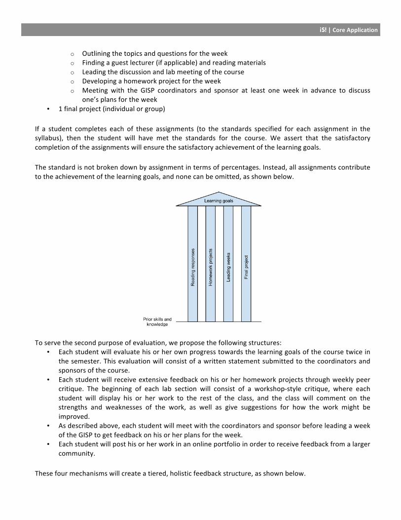
Therefore, we propose the following system of evaluation for the GISP: To serve the first purpose of evaluation, we establish standards for satisfactory completion of learning goals, as described in the introduction. Each student must complete the following assignments:
• 12 weekly reading responses • 10 homework projects • 2 weeks leading the GISP. Leading a week of the GISP consists of
iS! | Core Application
o Outlining the topics and questions for the week o Finding a guest lecturer (if applicable) and reading materials o Leading the discussion and lab meeting of the course o Developing a homework project for the week o Meeting with the GISP coordinators and sponsor at least one week in advance to discuss
one’s plans for the week • 1 final project (individual or group)
If a student completes each of these assignments (to the standards specified for each assignment in the syllabus), then the student will have met the standards for the course. We assert that the satisfactory completion of the assignments will ensure the satisfactory achievement of the learning goals. The standard is not broken down by assignment in terms of percentages. Instead, all assignments contribute to the achievement of the learning goals, and none can be omitted, as shown below.
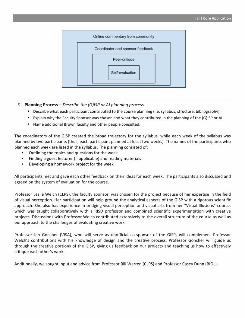
To serve the second purpose of evaluation, we propose the following structures: • Each student will evaluate his or her own progress towards the learning goals of the course twice in
the semester. This evaluation will consist of a written statement submitted to the coordinators and sponsors of the course.
• Each student will receive extensive feedback on his or her homework projects through weekly peer critique. The beginning of each lab section will consist of a workshop-‐style critique, where each student will display his or her work to the rest of the class, and the class will comment on the strengths and weaknesses of the work, as well as give suggestions for how the work might be improved.
• As described above, each student will meet with the coordinators and sponsor before leading a week of the GISP to get feedback on his or her plans for the week.
• Each student will post his or her work in an online portfolio in order to receive feedback from a larger community.
These four mechanisms will create a tiered, holistic feedback structure, as shown below.
iS! | Core Application
5. Planning Process – Describe the (G)ISP or AI planning process • Describe what each participant contributed to the course planning (i.e. syllabus, structure, bibliography). • Explain why the Faculty Sponsor was chosen and what they contributed in the planning of the (G)ISP or AI. • Name additional Brown faculty and other people consulted.
The coordinators of the GISP created the broad trajectory for the syllabus, while each week of the syllabus was planned by two participants (thus, each participant planned at least two weeks). The names of the participants who planned each week are listed in the syllabus. The planning consisted of:
• Outlining the topics and questions for the week • Finding a guest lecturer (if applicable) and reading materials • Developing a homework project for the week
All participants met and gave each other feedback on their ideas for each week. The participants also discussed and agreed on the system of evaluation for the course. Professor Leslie Welch (CLPS), the faculty sponsor, was chosen for the project because of her expertise in the field of visual perception. Her participation will help ground the analytical aspects of the GISP with a rigorous scientific approach. She also has experience in bridging visual perception and visual arts from her “Visual Illusions” course, which was taught collaboratively with a RISD professor and combined scientific experimentation with creative projects. Discussions with Professor Welch contributed extensively to the overall structure of the course as well as our approach to the challenges of evaluating creative work. Professor Ian Gonsher (VISA), who will serve as unofficial co-‐sponsor of the GISP, will complement Professor Welch’s contributions with his knowledge of design and the creative process. Professor Gonsher will guide us through the creative portions of the GISP, giving us feedback on our projects and teaching us how to effectively critique each other’s work. Additionally, we sought input and advice from Professor Bill Warren (CLPS) and Professor Casey Dunn (BIOL).
iS! | Core Application
6. Technical Details – Statements regarding finances and (G)ISPs duplicating regular courses • (G)ISPs must not duplicate previous (G)ISPs or regular course offerings. If your project appears similar to
another (G)ISP or a regular Brown course, please explain how it differs substantively from the course. • No (G)ISPS or AIs will be approved that require the payment of funds for instruction. Have you or anyone else
made financial commitments to the sponsor or assisting instructor?
David Laidlaw’s course CS2370, “Scientific Visualization,” covers a similar subject area. One GISP participant, Sam Birch, has taken the course, and said the following: “This GISP will differ in at least the following areas: 1) First and foremost, Laidlaw’s course is focused on scientific visualization. This leads to a strong emphasis on the science: the final projects have scientists as sponsors, the class readings are based on papers in the literature, and it is focused on evaluation from a scientific standpoint (e.g. this visualization leads to a 10% improvement in recognizing tumors with this type of data). Hence, the subject area of CS2370 is a subset of the content covered in this offering. 2) The GISP will be much more focused on creation and the creative process. Most of the week-‐to-‐week work for CS2370 was choosing papers, presenting, and discussion. The exception was one creative final project. This offering will have creative work nearly every week, along with critique. This is reflected in the entire second class period devoted to work.” We have not made any financial commitments. We are, however, interested in trying to find a small amount of funding to purchase drawing tablets for participants to use in their multimedia reading responses.
7. Faculty Sponsor Statement(s) + Optional Instructor Co-‐Sponsor Statement • The Faculty Sponsor and optional Instructor Co-‐Sponsor statement forms can be found on the CRC website.
The Faculty Sponsor statement must be included with any (G)ISP or AI proposal.
8. Supplements – Additional supplements are required for Language GISPs and AIs • The Language GISP Supplement form can be found on the CRC website. • The AI Supplement form can be found on the CRC website. Note that the Agency Sponsor Form (included in
the AI Supplement) is mandatory for AIs. • These supplements should be submitted along with this application.
iS! | Faculty Sponsor Statement
Independent Study | Faculty Sponsor Statement
This statement must accompany the core application for all (G)ISPs and AIs.
Title of (G)ISP:
A (G)ISP or AI is sponsored by an instructor holding a teaching appointment at Brown who has some knowledge
or expertise with the proposed topic. The Faculty Sponsor assesses the proposal, advises the project, attends at
least 5 GISP sessions or hour-‐long individual meetings, and is responsible for evaluating each student's work.
If the Faculty Sponsor’s teaching appointment is not clearly relevant to the topic of a proposed (G)ISP or
AI, the proposal should explain what knowledge or expertise the faculty member brings to the topic. In cases
where other faculty would seem to be a logical choice, the proposal should explain why the faculty member(s) are
not listed as sponsor(s).
Under exceptional circumstances, a graduate student with appropriate expertise and teaching experience
may be eligible to sponsor a (G)ISP or AI. In such cases, the proposal must explain why a Faculty Sponsor has not
been chosen. The proposal must be accompanied by the graduate student’s Curriculum Vitae, a statement of his
or her qualifications, and a recommendation from the Chair of the graduate student's department. The Chair
assumes ultimate responsibility for the academic quality of a GISP sponsored by a graduate student. In the case of
Language (G)ISPs with graduate student sponsors, the Director of the Center for Language Studies will act as the
“Department Chair.”
What will be your role as Faculty Sponsor/Advisor? How often will you meet with the participants?
My primary role will be as a facilitator and not as a class leader; this course is primarily the students’, not
mine. My expertise is in the science of visual perception, and I can provide scientific grounding to the
exploration of visual representations of information. Some aspects of perception are shaped by how the brain
is designed, and this is where I can contribute the most knowledge. I am also interested in artistic and creative
processes, and I’m excited to be able to learn more in these areas so part of my role will be as a learner. I will
meet with the GISP coordinators and the students who will be leading class to provide guidance and feedback
on class presentations. And I will evaluate students’ work based on the course guidelines. I plan to attend
every class meeting.
iS! | Faculty Sponsor Statement
Please describe the work that each student will submit to you for evaluation.
Each week students will write responses to the readings (12) and responses to each others comments.
Homework projects (10) will be evaluated primarily by the students. My evaluation of reading responses and
homework will be to confirm the work has been completed. Twice during the semester, each student will
submit a written evaluation of her/his own progress toward the course learning goals to the coordinators and
sponsors. Students will receive feedback and any guidance needed. Each student (in a pair) will lead 2
topics/weeks of class. Prior to their presentation, they will meet with the coordinators and sponsors for help
and guidance. After the first presentation, we will be able to provide individualized guidance to help students
improve their second presentations. The final project will be an individual or small-‐group effort to create an
infographic (or several infographics) along with a short paper to justify scientifically the choices they made for
their creations. This work will be evaluated by the coordinators and sponsors based on how well the work
satisfies the course goals.
Have you seen the final copy of the proposal? yes
The faculty sponsor's signature on this form attests to his or her knowledge of the CCC Guidelines for independent study
and approval of the academic content and procedures of the proposed project.
If the sponsor is a graduate student, the signature of the sponsor's department Chair is required below.
Department Chair Signature: Date:
Sponsor’s Signature
Date: 4/16/12
Sponsor’s Title: Associate Professor Department: CLPS