40
a Aaron Nicholls GRD2 Personal Design Project
| Date post: | 22-Mar-2016 |
| Category: |
Documents |
| Upload: | aaron-nicholls |
| View: | 212 times |
| Download: | 0 times |

aAaron Nicholls GRD2 Personal Design Project
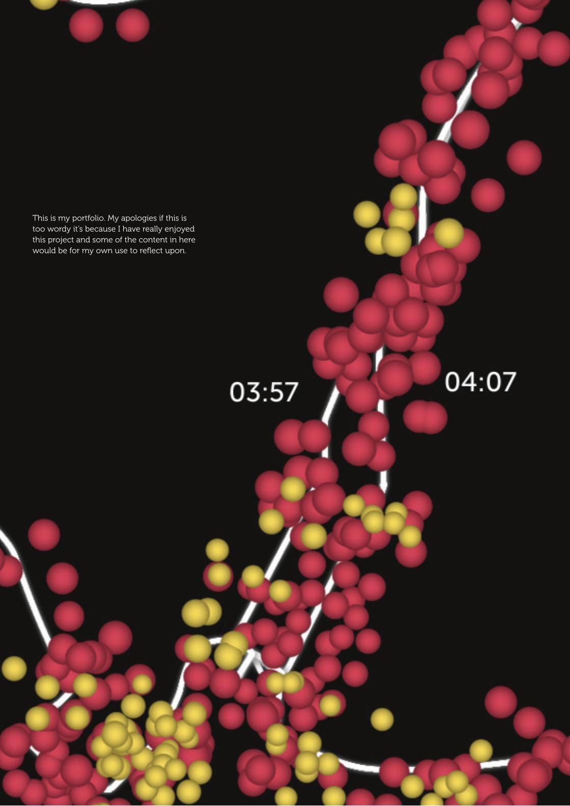
This is my portfolio. My apologies if this is too wordy it’s because I have really enjoyed this project and some of the content in here would be for my own use to reflect upon.

STUDENT LEARNING AGREEMENTSTUDENT NAME: AARON NICHOLLS
TITLE OF PERSONAL DESIGN PROJECT: MOTION & MOVEMENT
Project Proposal.
Through my interest of typography I intend to investigate this aspect of Graphic Design further. I aim to produce a large body of work that should enhance my skills as a creative. Also, I will focus on what I believe my strengths of practices are in terms of the way I think to generate quality work.
As a general theme for this project, me and Ben are going to focus on things that move. This maybe technologically, or biologically, or anything else. We will challenge this theme and create an interesting body of work. Things like speed, sound and other aspects of ‘things that move’ as an expample. Through combining my interest of typography along with Ben’s interest with photography, the idea is that although we have our own specified fields, if we combine the together we should come up with some interesting work.
Through this investigation, I/we will aim to produce a set of visuals, of some sort that summarise and communicate what we have learnt. These visuals should show a stronger improved skill set along with interesting quality ideas.
How I will fill these Learning Outcomes and meet my own needs and career direction.
I have more of an idea that I like print, publication, and typography. It stems down in the family and is something I’m passionate about. I am also interested in other aspects as well so don’t want to have only one specified skill, but for this project I will mainly investigate typography and it’s surroundings.
I will research, create, explore and idea generate, challenge myself, showing that I can communicate ‘message and meaning’ further through experimentation. My skills should improve mainly with typography but learning other unexpected things along the way by collaborating with Ben whom has an alternate skill set.
Research Plans.
• Research into typography, layout and craftsmanship (books, internet, getting out there, asking people) • Research into photography? • Primary research and experimentation • Challenge ideas and concepts via the use of typography/photography • Research into the aspects of the theme • Challenge my thinking and practice for improvement and development
the first sla
3
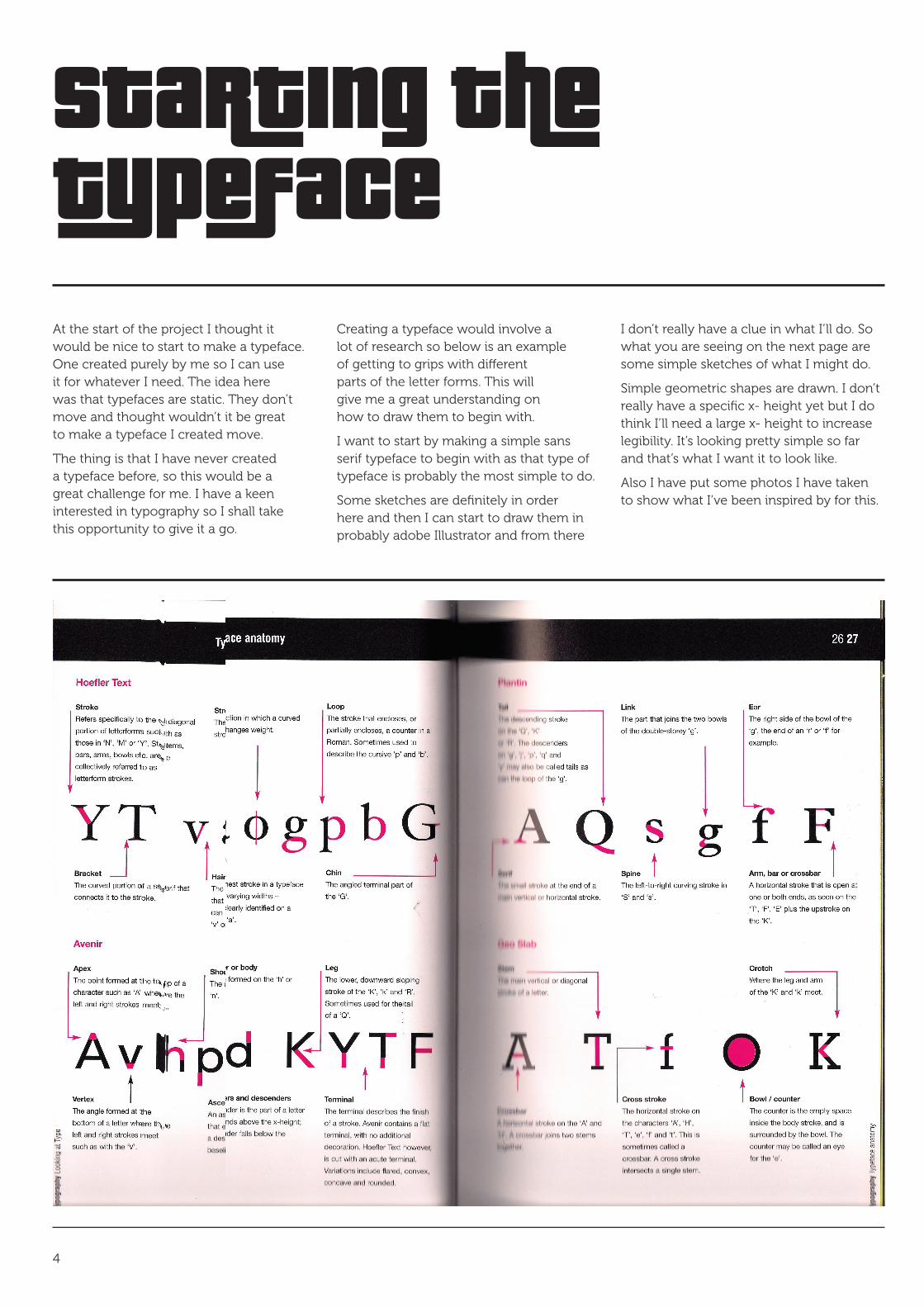
Starting the typefaceAt the start of the project I thought it would be nice to start to make a typeface. One created purely by me so I can use it for whatever I need. The idea here was that typefaces are static. They don’t move and thought wouldn’t it be great to make a typeface I created move.
The thing is that I have never created a typeface before, so this would be a great challenge for me. I have a keen interested in typography so I shall take this opportunity to give it a go.
Creating a typeface would involve a lot of research so below is an example of getting to grips with different parts of the letter forms. This will give me a great understanding on how to draw them to begin with.
I want to start by making a simple sans serif typeface to begin with as that type of typeface is probably the most simple to do.
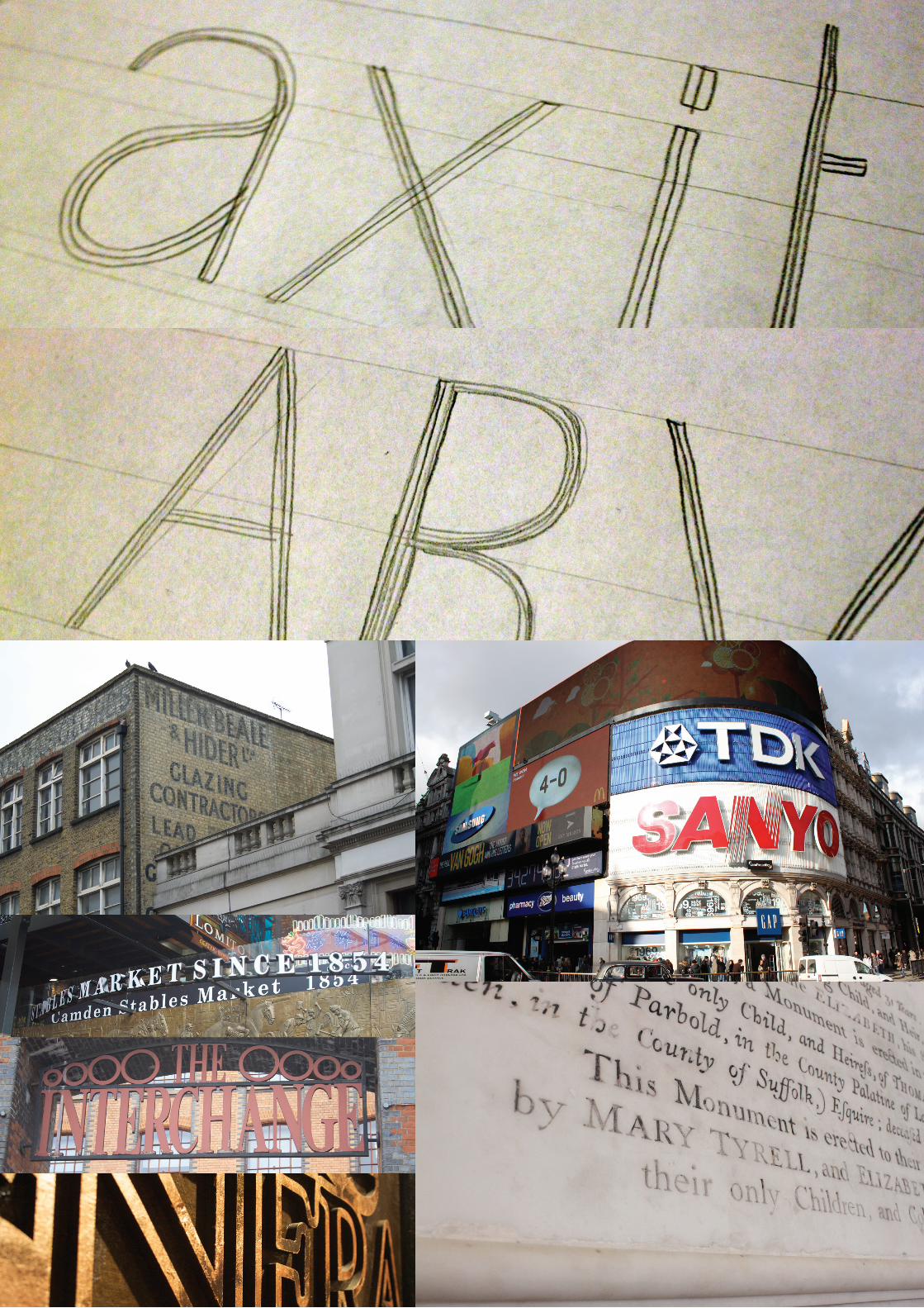
Some sketches are definitely in order here and then I can start to draw them in probably adobe Illustrator and from there
I don’t really have a clue in what I’ll do. So what you are seeing on the next page are some simple sketches of what I might do.
Simple geometric shapes are drawn. I don’t really have a specific x- height yet but I do think I’ll need a large x- height to increase legibility. It’s looking pretty simple so far and that’s what I want it to look like.
Also I have put some photos I have taken to show what I’ve been inspired by for this.
4
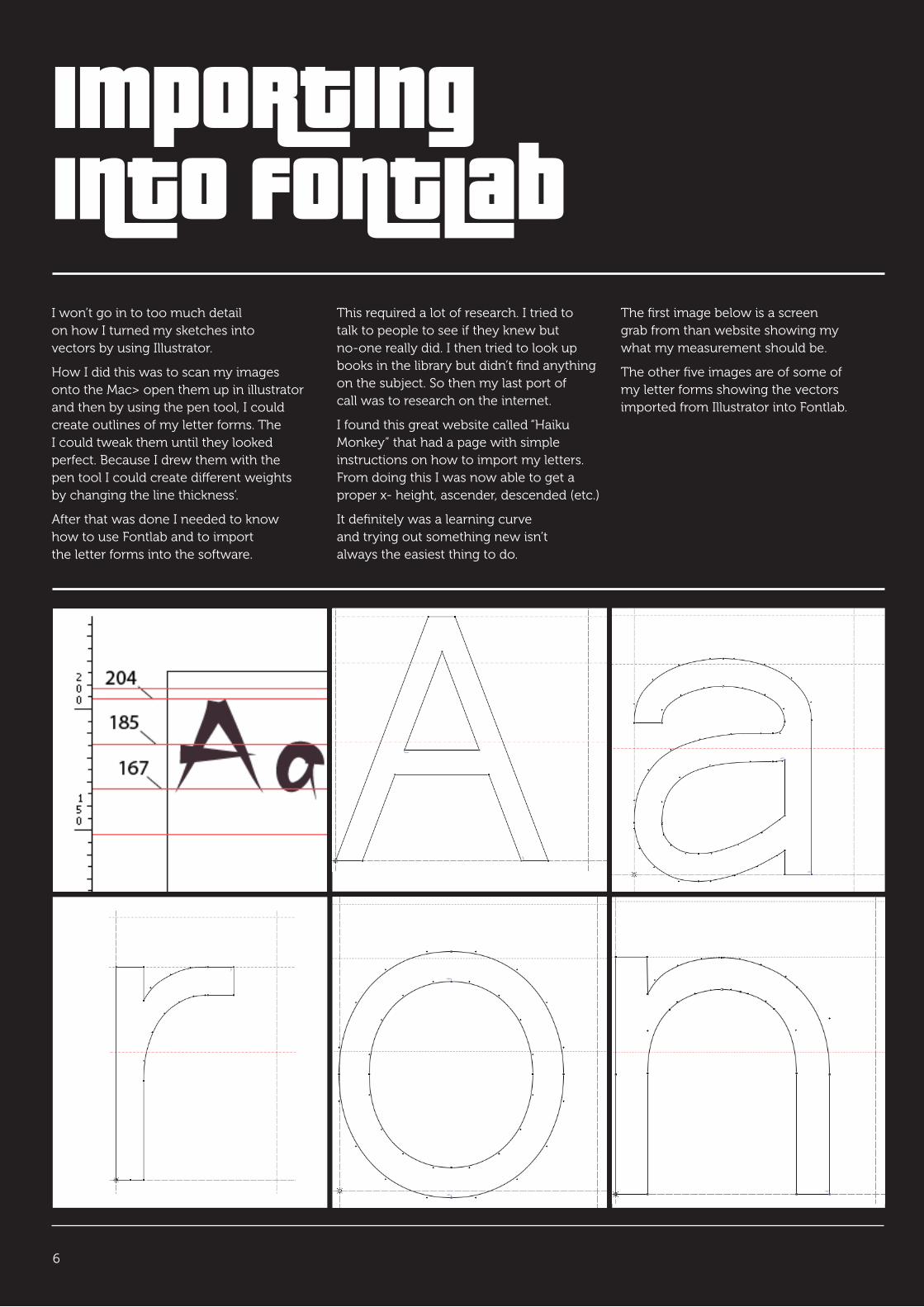
Importing into FontLabI won’t go in to too much detail on how I turned my sketches into vectors by using Illustrator.
How I did this was to scan my images onto the Mac> open them up in illustrator and then by using the pen tool, I could create outlines of my letter forms. The I could tweak them until they looked perfect. Because I drew them with the pen tool I could create different weights by changing the line thickness’.
After that was done I needed to know how to use Fontlab and to import the letter forms into the software.
This required a lot of research. I tried to talk to people to see if they knew but no-one really did. I then tried to look up books in the library but didn’t find anything on the subject. So then my last port of call was to research on the internet.
I found this great website called “Haiku Monkey” that had a page with simple instructions on how to import my letters. From doing this I was now able to get a proper x- height, ascender, descended (etc.)
It definitely was a learning curve and trying out something new isn’t always the easiest thing to do.
The first image below is a screen grab from than website showing my what my measurement should be.
The other five images are of some of my letter forms showing the vectors imported from Illustrator into Fontlab.
6
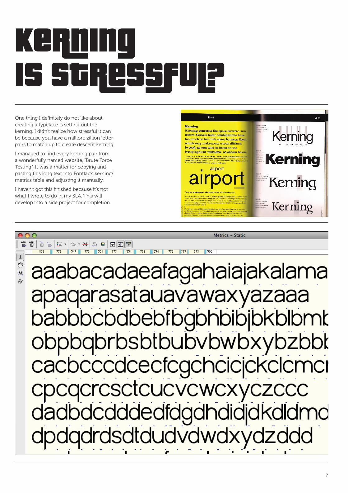
Kerning is Stressful?One thing I definitely do not like about creating a typeface is setting out the kerning. I didn’t realize how stressful it can be because you have a million; zillion letter pairs to match up to create descent kerning.
I managed to find every kerning pair from a wonderfully named website, “Brute Force Testing”. It was a matter for copying and pasting this long text into Fontlab’s kerning/metrics table and adjusting it manually.
I haven’t got this finished because it’s not what I wrote to do in my SLA. This will develop into a side project for completion.
7

TO BE CONTINUED...
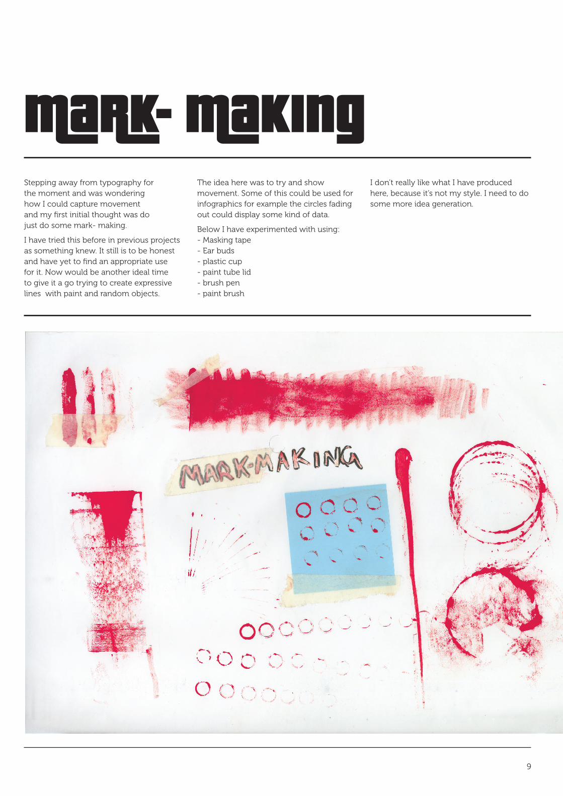
Mark- MakingStepping away from typography for the moment and was wondering how I could capture movement and my first initial thought was do just do some mark- making.
I have tried this before in previous projects as something knew. It still is to be honest and have yet to find an appropriate use for it. Now would be another ideal time to give it a go trying to create expressive lines with paint and random objects.
The idea here was to try and show movement. Some of this could be used for infographics for example the circles fading out could display some kind of data.
Below I have experimented with using: - Masking tape - Ear buds - plastic cup - paint tube lid - brush pen - paint brush
I don’t really like what I have produced here, because it’s not my style. I need to do some more idea generation.
9

FarrariFarrariFarrariFarrari
Farrari FarrariFarrari
Farr
ariFa
rrariFa
rrariFarrariFarrariFarrariFarrariFarrariFarrariFarrariFarrar
iFarrar
iFar
Farr
ariFa
rrariFa
rrariFarrariFarrariFarrariFarrariFarrariFarrariFarrariFarrar
iFarrar
iFar
Farr
ariFa
rrariF
arrariFarrariFarrariFarrariFarrariFarrariFarrariFarrariFarrariFarrar
iFa
rrariF
arra
rF o
Farrar
i
Farrari
Farrar
i
Farrari Farrari
Farrar
i
Farrar
i ar
iFa
rrari riFarrariF riFarrariF riFarra
arrar
F
ar
rari FarrariF arrariF Farra
arra
a
rrar
arrariF rrariF arraFarrar
i ar
iFarra
ri ariFarrariF riFarrariF rariFarr
FarrariFarrari
Farrar
iF rra
riFarra
ariFarrariF riFarrariF arriFarra
FarrariFarrariFarrari
FarrariFarrariFarrari
Farra
ri
FarrariFarrari
Farrari Farrari
Farrari
Farrari
Farrari
Farrari
FarrariFarrari
FarrariFarrariFarrari
FarrariFarrariFarrari
Farrari
FarrariFarrariFarrariFarra
ri
Farrari
FarrariFarrariFarrariFarrari
FarrariFarrari
Farrari
FarrariFarrariFarrari
FarrariFarrari
Farrar
iFarrariFarrariFarrari
FarrariFar
rari
Farrari
Farrar
iFarrari
Farrari
FarrariF
arrariFar
rari
Farrari
Farrari Farrari Farrari
FarrariFarrariFarrariFarrariFarrariFarrariFarrari
Farrari
FarrariFarrari
FarrariFarrari Farrari
FarrariFarrari
FarrariFarrariFarrariFarrariFarrariFarrariFarrari
Farra
ri
Farra
riFarrar
iFarrari FarrariFarrariFarrari
FarrariFarrari FarrariFarrari
Farrari
FarrariFarrari
FarrariFarrariFarrariFarrari
Farrari
Farrari
Farrari
FarrariFarrari
FarrariFarrari
Farrari FarrariFarrari
Farrari
FarrariFarrariFarrariFarrariFarrariFarrariFarrariFarrariFarrariFarrariFarrari
FarrariFarrariFarrariFarrari
Farrar
iFa
rrariFa
rrariFarrariFarrariFarrariFarrariFarrariFarrariFarrariFarra
riFar
rariF
arFa
rrar
iFa
rrariFa
rrariFarrariFarrariFarrariFarrariFarrariFarrariFarrariFarra
riFar
rariF
ar
Farrar
iFarra
riFarrariFarrariFarrariFarrariFarrariFarrariFarrariFarrariFarrariFarr
ariF
arra
riFar
rarF o
Farra
ri
Farrari
Farrari Farrari
Farrar
i
Farrar
i ar
iFarra
ri riFarrariF riFarrariF riFarra
arrar
F
arrar
i FarrariF arrariF Farra
arra
a
rrar arrariF rrariF arraFa
rrar
i ar
iFarrar
i ariFarrariF riFarrariF rariFarr
Farrar
iF rra
riFarra
ariFarrariF riFarrariF arriFarra
Farr
ariFa
rrariFa
rrariFarrariFarrariFarrariFarrariFarrariFarrariFarrariFarrar
iFarrar
iFar
Farr
ariFa
rrariFa
rrariFarrariFarrariFarrariFarrariFarrariFarrariFarrariFarrar
iFarrar
iFar
Farr
ariFa
rrariF
arrariFarrariFarrariFarrariFarrariFarrariFarrariFarrariFarrariFarrar
iFa
rrariF
arra
rF o
Farrar
i
Farrari
Farrari Farrari
Farrar
i
Farrar
i ar
iFa
rrari riFarrariF riFarrariF riFarra
arrar
F
ar
rari FarrariF arrariF Farra
arra
a
rrar
arrariF rrariF arraFarrar
i ar
iFarra
ri ariFarrariF riFarrariF rariFarr
Farrar
iF rra
riFarra
ariFarrariF riFarrariF arriFarra
Farrar
iFa
rrariFa
rrariFarrariFarrariFarrariFarrariFarrariFarrariFarrariFarra
riFar
rariF
arFa
rrar
iFa
rrariFa
rrariFarrariFarrariFarrariFarrariFarrariFarrariFarrariFarra
riFar
rariF
ar
Farrar
iFarra
riFarrariFarrariFarrariFarrariFarrariFarrariFarrariFarrariFarrariFarr
ariF
arra
riFar
rarF o
Farra
ri
Farrari
Farrari Farrari
Farrar
i
Farrar
i ar
iFarra
ri riFarrariF riFarrariF riFarra
arrar
F
arrar
i FarrariF arrariF Farra
arra
a
rrar arrariF rrariF arraFa
rrar
i ar
iFarrar
i ariFarrariF riFarrariF rariFarr
Farrar
iF rra
riFarra
ariFarrariF riFarrariF arriFarra
Farra
ri
Farra
riFar
rari
Farrar
iFarrariFar
rari
458 Italia
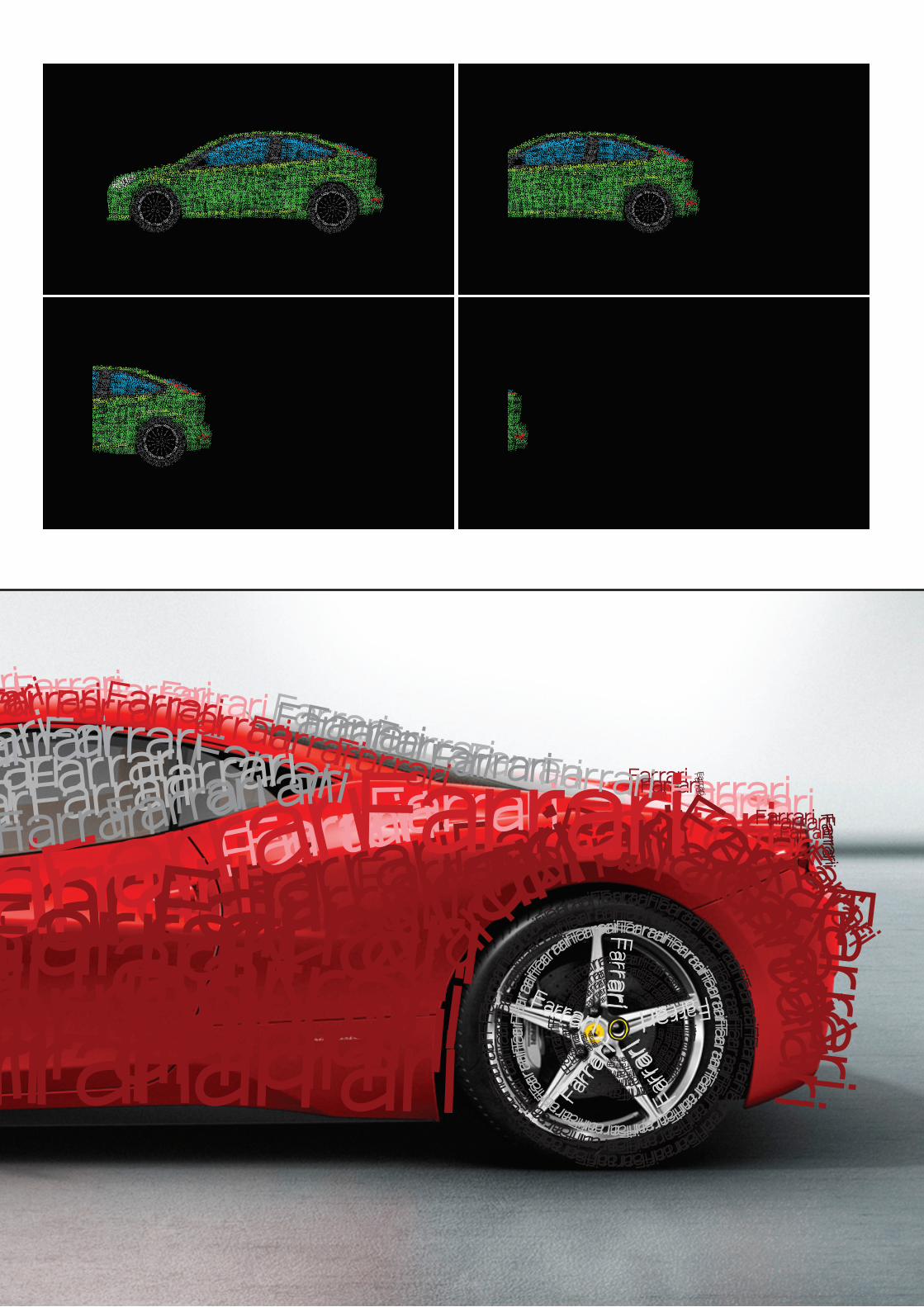
Creating a car out of a typefaceFrom creating my typeface (basic) I thought that I would to apply this to a car. I wanted to draw a car out of type.
The first car that I tried to draw was the Ferrari 458 Italia below that after proof reading the one word afterwards I realized I had spelt it wrong. The idea was to cover my found image off of google and draw the Ferarri with just my typeface.
The outcome I think looks really cool but although I wanted to merge type and cars together it’s a bit literal.
The next step was to try to animate a car made out of type. So I drew my next car using the same principles as the Ferrari. I then put the Ford Focus into Flash and tried to animate it by making the wheels move and for it to travel off of screen.
Using Flash was something completely knew and I’m glad I’ve use it because now I know it’s not the most user friendly software you can use. Just to create that animation I had to make a painstaking 140 odd frames.
This idea has wheels but I think I need to come up with more ideas first before I can focus on something great. Also the animation is not smooth, because my skills with animating is poor.
FarrariFarrariFarrariFarrari
Farrari FarrariFarrari
Farr
ariFa
rrariFa
rrariFarrariFarrariFarrariFarrariFarrariFarrariFarrariFarrar
iFarrar
iFar
Farr
ariFa
rrariFa
rrariFarrariFarrariFarrariFarrariFarrariFarrariFarrariFarrar
iFarrar
iFar
Farr
ariFa
rrariF
arrariFarrariFarrariFarrariFarrariFarrariFarrariFarrariFarrariFarrar
iFa
rrariF
arra
rF o
Farrar
i
Farrari
Farrar
i
Farrari Farrari
Farrar
i
Farrar
i ar
iFa
rrari riFarrariF riFarrariF riFarra
arrar
F
ar
rari FarrariF arrariF Farra
arra
a
rrar
arrariF rrariF arraFarrar
i ar
iFarra
ri ariFarrariF riFarrariF rariFarr
FarrariFarrari
Farrar
iF rra
riFarra
ariFarrariF riFarrariF arriFarra
FarrariFarrariFarrari
FarrariFarrariFarrari
Farra
ri
FarrariFarrari
Farrari Farrari
Farrari
Farrari
Farrari
Farrari
FarrariFarrari
FarrariFarrariFarrari
FarrariFarrariFarrari
Farrari
FarrariFarrariFarrariFarra
ri
Farrari
FarrariFarrariFarrariFarrari
FarrariFarrari
Farrari
FarrariFarrariFarrari
FarrariFarrari
Farrar
iFarrariFarrariFarrari
FarrariFar
rari
Farrari
Farrar
iFarrari
Farrari
FarrariF
arrariFar
rari
Farrari
Farrari Farrari Farrari
FarrariFarrariFarrariFarrariFarrariFarrariFarrari
Farrari
FarrariFarrari
FarrariFarrari Farrari
FarrariFarrari
FarrariFarrariFarrariFarrariFarrariFarrariFarrari
Farra
ri
Farra
riFarrar
iFarrari FarrariFarrariFarrari
FarrariFarrari FarrariFarrari
Farrari
FarrariFarrari
FarrariFarrariFarrariFarrari
Farrari
Farrari
Farrari
FarrariFarrari
FarrariFarrari
Farrari FarrariFarrari
Farrari
FarrariFarrariFarrariFarrariFarrariFarrariFarrariFarrari
FarrariFarrariFarrariFarrariFarrariFarrariFarrari
Farrar
iFa
rrariFa
rrariFarrariFarrariFarrariFarrariFarrariFarrariFarrariFarra
riFar
rariF
arFa
rrar
iFa
rrariFa
rrariFarrariFarrariFarrariFarrariFarrariFarrariFarrariFarra
riFar
rariF
ar
Farrar
iFarra
riFarrariFarrariFarrariFarrariFarrariFarrariFarrariFarrariFarrariFarr
ariF
arra
riFar
rarF o
Farra
ri
Farrari
Farrari Farrari
Farrar
i
Farrar
i ar
iFarra
ri riFarrariF riFarrariF riFarra
arrar
F
arrar
i FarrariF arrariF Farra
arra
a
rrar arrariF rrariF arraFa
rrar
i ar
iFarrar
i ariFarrariF riFarrariF rariFarr
Farrar
iF rra
riFarra
ariFarrariF riFarrariF arriFarra
Farr
ariFa
rrariFa
rrariFarrariFarrariFarrariFarrariFarrariFarrariFarrariFarrar
iFarrar
iFar
Farr
ariFa
rrariFa
rrariFarrariFarrariFarrariFarrariFarrariFarrariFarrariFarrar
iFarrar
iFar
Farr
ariFa
rrariF
arrariFarrariFarrariFarrariFarrariFarrariFarrariFarrariFarrariFarrar
iFa
rrariF
arra
rF o
Farrar
i
Farrari
Farrari Farrari
Farrar
i
Farrar
i ar
iFa
rrari riFarrariF riFarrariF riFarra
arrar
F
ar
rari FarrariF arrariF Farra
arra
a
rrar
arrariF rrariF arraFarrar
i ar
iFarra
ri ariFarrariF riFarrariF rariFarr
Farrar
iF rra
riFarra
ariFarrariF riFarrariF arriFarra
Farrar
iFa
rrariFa
rrariFarrariFarrariFarrariFarrariFarrariFarrariFarrariFarra
riFar
rariF
arFa
rrar
iFa
rrariFa
rrariFarrariFarrariFarrariFarrariFarrariFarrariFarrariFarra
riFar
rariF
ar
Farrar
iFarra
riFarrariFarrariFarrariFarrariFarrariFarrariFarrariFarrariFarrariFarr
ariF
arra
riFar
rarF o
Farra
ri
Farrari
Farrari Farrari
Farrar
i
Farrar
i ar
iFarra
ri riFarrariF riFarrariF riFarra
arrar
F
arrar
i FarrariF arrariF Farra
arra
a
rrar arrariF rrariF arraFa
rrar
i ar
iFarrar
i ariFarrariF riFarrariF rariFarr
Farrar
iF rra
riFarra
ariFarrariF riFarrariF arriFarra
Farra
ri
Farra
riFar
rari
Farrar
iFarrariFar
rari
458 Italia
FarrariFarrariFarrariFarrari
Farrari FarrariFarrari
Farr
ariFa
rrariFa
rrariFarrariFarrariFarrariFarrariFarrariFarrariFarrariFarrar
iFarrar
iFar
Farr
ariFa
rrariFa
rrariFarrariFarrariFarrariFarrariFarrariFarrariFarrariFarrar
iFarrar
iFar
Farr
ariFa
rrariF
arrariFarrariFarrariFarrariFarrariFarrariFarrariFarrariFarrariFarrar
iFa
rrariF
arra
rF o
Farrar
i
Farrari
Farrar
i
Farrari Farrari
Farrar
i
Farrar
i ar
iFa
rrari riFarrariF riFarrariF riFarra
arrar
F
ar
rari FarrariF arrariF Farra
arra
a
rrar
arrariF rrariF arraFarrar
i ar
iFarra
ri ariFarrariF riFarrariF rariFarr
FarrariFarrari
Farrar
iF rra
riFarra
ariFarrariF riFarrariF arriFarra
FarrariFarrariFarrari
FarrariFarrariFarrari
Farra
ri
FarrariFarrari
Farrari Farrari
Farrari
Farrari
Farrari
Farrari
FarrariFarrari
FarrariFarrariFarrari
FarrariFarrariFarrari
Farrari
FarrariFarrariFarrariFarra
ri
Farrari
FarrariFarrariFarrariFarrari
FarrariFarrari
Farrari
FarrariFarrariFarrari
FarrariFarrari
Farrar
iFarrariFarrariFarrari
FarrariFar
rari
Farrari
Farrar
iFarrari
Farrari
FarrariF
arrariFar
rari
Farrari
Farrari Farrari Farrari
FarrariFarrariFarrariFarrariFarrariFarrariFarrari
Farrari
FarrariFarrari
FarrariFarrari Farrari
FarrariFarrari
FarrariFarrariFarrariFarrariFarrariFarrariFarrari
Farra
ri
Farra
riFarrar
iFarrari FarrariFarrariFarrari
FarrariFarrari FarrariFarrari
Farrari
FarrariFarrari
FarrariFarrariFarrariFarrari
Farrari
Farrari
Farrari
FarrariFarrari
FarrariFarrari
Farrari FarrariFarrari
Farrari
FarrariFarrariFarrariFarrariFarrariFarrariFarrariFarrari
FarrariFarrariFarrariFarrariFarrariFarrariFarrari
Farrar
iFa
rrariFa
rrariFarrariFarrariFarrariFarrariFarrariFarrariFarrariFarra
riFar
rariF
arFa
rrar
iFa
rrariFa
rrariFarrariFarrariFarrariFarrariFarrariFarrariFarrariFarra
riFar
rariF
ar
Farrar
iFarra
riFarrariFarrariFarrariFarrariFarrariFarrariFarrariFarrariFarrariFarr
ariF
arra
riFar
rarF o
Farra
ri
Farrari
Farrari Farrari
Farrar
i
Farrar
i ar
iFarra
ri riFarrariF riFarrariF riFarra
arrar
F
arrar
i FarrariF arrariF Farra
arra
a
rrar arrariF rrariF arraFa
rrar
i ar
iFarrar
i ariFarrariF riFarrariF rariFarr
Farrar
iF rra
riFarra
ariFarrariF riFarrariF arriFarra
Farr
ariFa
rrariFa
rrariFarrariFarrariFarrariFarrariFarrariFarrariFarrariFarrar
iFarrar
iFar
Farr
ariFa
rrariFa
rrariFarrariFarrariFarrariFarrariFarrariFarrariFarrariFarrar
iFarrar
iFar
Farr
ariFa
rrariF
arrariFarrariFarrariFarrariFarrariFarrariFarrariFarrariFarrariFarrar
iFa
rrariF
arra
rF o
Farrar
i
Farrari
Farrari Farrari
Farrar
i
Farrar
i ar
iFa
rrari riFarrariF riFarrariF riFarra
arrar
F
ar
rari FarrariF arrariF Farra
arra
a
rrar
arrariF rrariF arraFarrar
i ar
iFarra
ri ariFarrariF riFarrariF rariFarr
Farrar
iF rra
riFarra
ariFarrariF riFarrariF arriFarra
Farrar
iFa
rrariFa
rrariFarrariFarrariFarrariFarrariFarrariFarrariFarrariFarra
riFar
rariF
arFa
rrar
iFa
rrariFa
rrariFarrariFarrariFarrariFarrariFarrariFarrariFarrariFarra
riFar
rariF
ar
Farrar
iFarra
riFarrariFarrariFarrariFarrariFarrariFarrariFarrariFarrariFarrariFarr
ariF
arra
riFar
rarF o
Farra
ri
Farrari
Farrari Farrari
Farrar
i
Farrar
i ar
iFarra
ri riFarrariF riFarrariF riFarra
arrar
F
arrar
i FarrariF arrariF Farra
arra
a
rrar arrariF rrariF arraFa
rrar
i ar
iFarrar
i ariFarrariF riFarrariF rariFarr
Farrar
iF rra
riFarra
ariFarrariF riFarrariF arriFarra
Farra
ri
Farra
riFar
rari
Farrar
iFarrariFar
rari
458 Italia

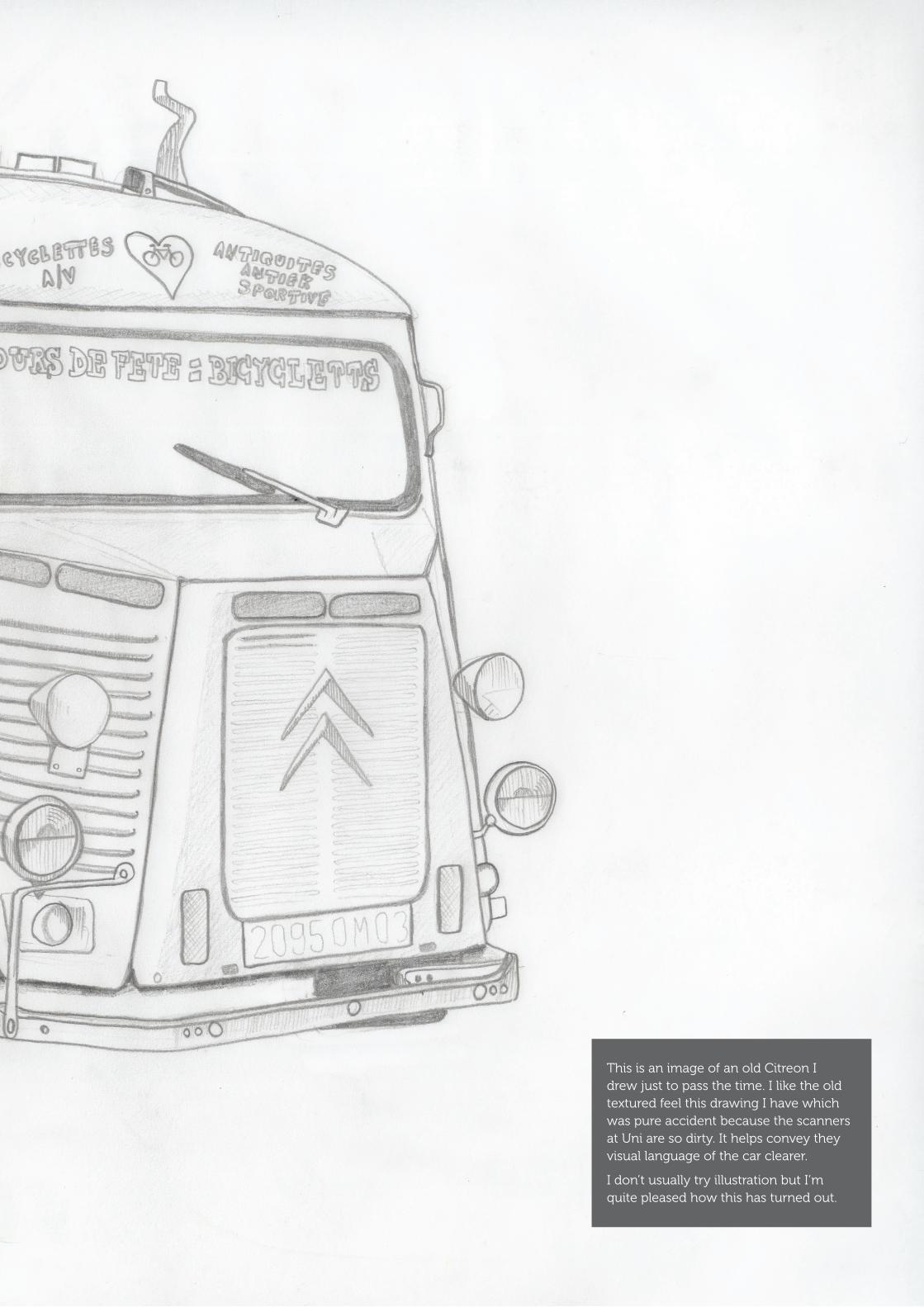
This is an image of an old Citreon I drew just to pass the time. I like the old textured feel this drawing I have which was pure accident because the scanners at Uni are so dirty. It helps convey they visual language of the car clearer.
I don’t usually try illustration but I’m quite pleased how this has turned out.

Using the Camcorder
7 am
6 pm 11 pm
3 pm
14

Using the camcorder was interesting because we thought why don’t we try this out and see what happens?
We can collect data from this. For example the mount of people, the amount of cars and things like sign posts and traffic lights could be observed. This opens up many avenues for exploration and could create a great narrative.
Using the camcorder in this way, we haven’t done before. What you are seeing to the left are four screenshots of four different videos. We attached a HDV Mini camcorder to the car (just outside the window) and recorded a journey at different times of the day.
It was a spare of the moment thing and later on in this portfolio you’ll be able to see how this, although many ideas proved to be the best.
Below is a photographed image of the camcorder that we used to create these videos.
11 pm
3 pm

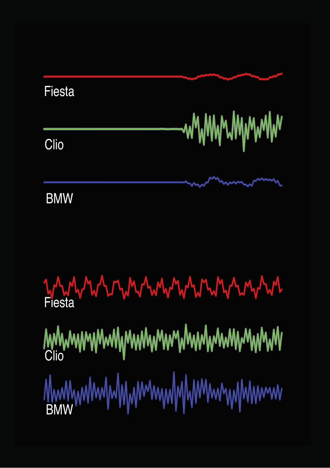
Time for some audio graphicsI then had the idea to maybe compare the different sounds of different car engines. This idea came from one of my past projects where I recorded the sounds of various vegetables for information graphics.
First of all Ben and his friends went to record the different sounds of their cars. We then put this data into a free software called WavePad that is great for editing samples and abstracting audio information such as pitch and frequencies.
16
The next step was to make them visually better so with After Effects (a brand new software I had never used before) I was able to compile an animation with the soundwaves to compare the sounds.
This creates nice data and visuals for people to see. For example if someone wanted to buy the less or more noisier car. They can obviously here it but see it to.
This idea is nice but I don’t think in this case that it’s that strong to progress, because the only aspect of the car we’re dealing with here is sound. And I’ve used this idea before.

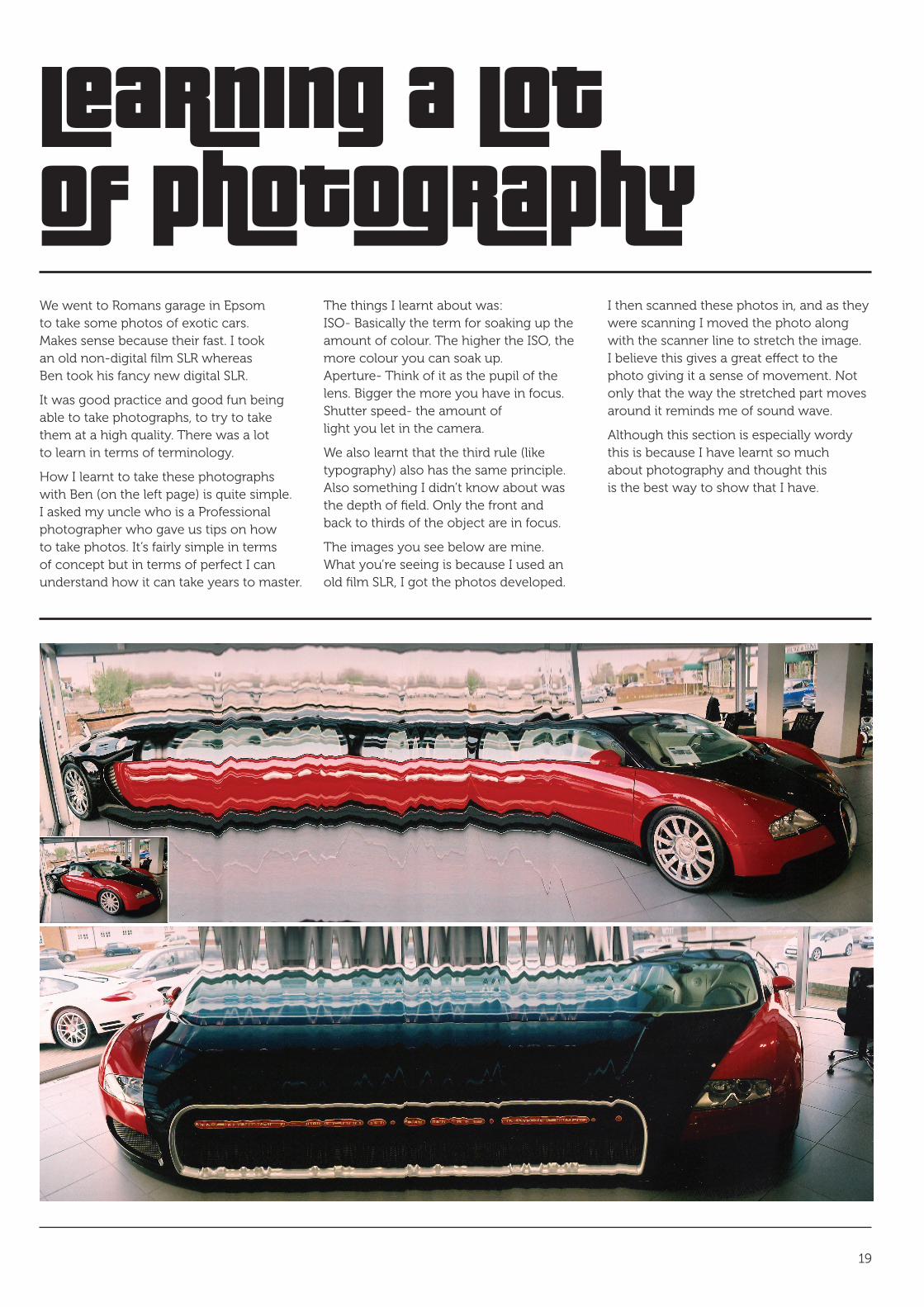
Learning a lot of photographyWe went to Romans garage in Epsom to take some photos of exotic cars. Makes sense because their fast. I took an old non-digital film SLR whereas Ben took his fancy new digital SLR.
It was good practice and good fun being able to take photographs, to try to take them at a high quality. There was a lot to learn in terms of terminology.
How I learnt to take these photographs with Ben (on the left page) is quite simple. I asked my uncle who is a Professional photographer who gave us tips on how to take photos. It’s fairly simple in terms of concept but in terms of perfect I can understand how it can take years to master.
The things I learnt about was: ISO- Basically the term for soaking up the amount of colour. The higher the ISO, the more colour you can soak up. Aperture- Think of it as the pupil of the lens. Bigger the more you have in focus. Shutter speed- the amount of light you let in the camera.
We also learnt that the third rule (like typography) also has the same principle. Also something I didn’t know about was the depth of field. Only the front and back to thirds of the object are in focus.
The images you see below are mine. What you’re seeing is because I used an old film SLR, I got the photos developed.
I then scanned these photos in, and as they were scanning I moved the photo along with the scanner line to stretch the image. I believe this gives a great effect to the photo giving it a sense of movement. Not only that the way the stretched part moves around it reminds me of sound wave.
Although this section is especially wordy this is because I have learnt so much about photography and thought this is the best way to show that I have.
19
aaron koblin
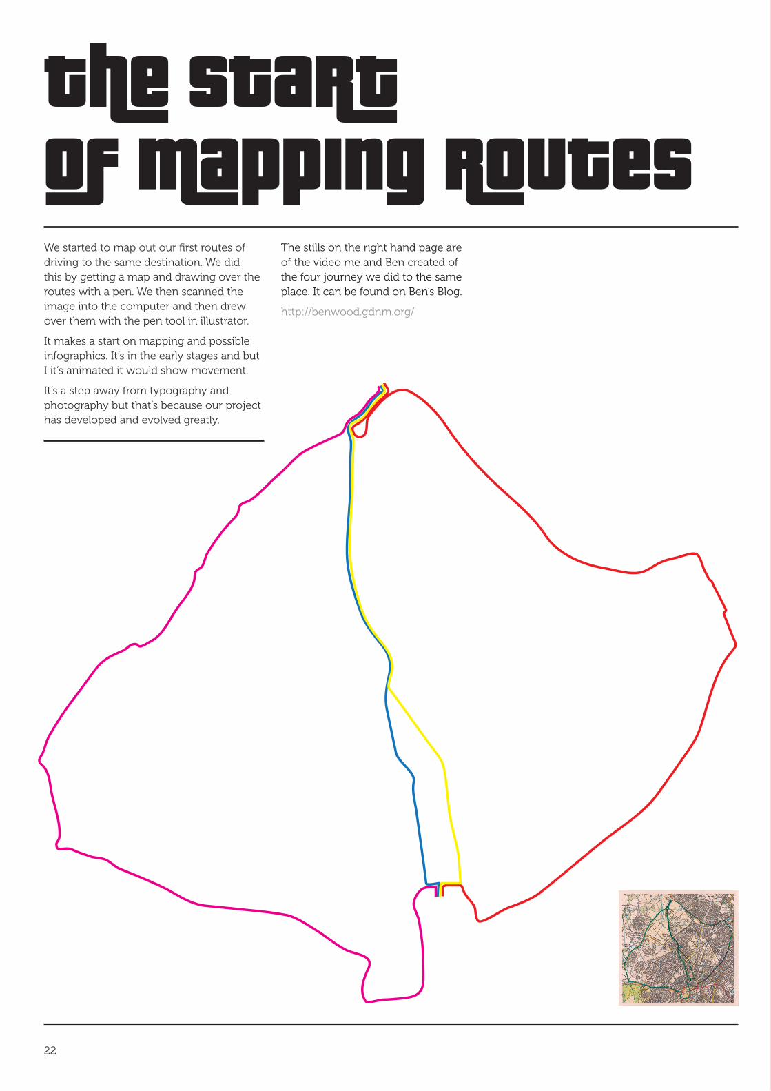
The startof mapping routesWe started to map out our first routes of driving to the same destination. We did this by getting a map and drawing over the routes with a pen. We then scanned the image into the computer and then drew over them with the pen tool in illustrator.
It makes a start on mapping and possible infographics. It’s in the early stages and but I it’s animated it would show movement.
It’s a step away from typography and photography but that’s because our project has developed and evolved greatly.
22
The stills on the right hand page are of the video me and Ben created of the four journey we did to the same place. It can be found on Ben’s Blog.
http://benwood.gdnm.org/

how thesla has changed
STUDENT LEARNING AGREEMENTSTUDENT NAME: AARON NICHOLLS
TITLE OF PERSONAL DESIGN PROJECT: MOTION & MOVEMENT
Project Proposal.
Developing from studying typography and photography my focus is now on animation and video. I aim to produce a large body of work that should enhance my skills as a creative. Also, I will focus on what I believe my strengths of practices are in terms of the way I think to generate quality work.
As a general theme for this project, me and Ben are going to focus on things that move. This maybe technologically, or biologically, or anything else. We will challenge this theme and create an interesting body of work. Things like speed, sound and other aspects of ‘things that move’ as an expample. If we collaborate together we should come up with new interesting work.
Through this investigation, I/we will aim to produce a set of visuals, of some sort that summarise and communicate what we have learnt. These visuals should show a stronger improved skill set along with interesting quality ideas.
How I will fill these Learning Outcomes and meet my own needs and career direction.
I have more of an idea that for this project an animation will end up being the final outcome. From studying typography and photography I will now use this new found knowledge to use these elements contributing into the animation.
I will research, create, explore and idea generate, challenge myself, showing that I can communicate ‘message and meaning’ further through experimentation. My skills should improve dramitically with animation that I didn’t think I would do. This is because by collaborating with Ben whom has an alternate skill set, we have come up with different ideas.
Research Plans.
• Research into typography, layout and craftsmanship (books, internet, getting out there, asking people) • Research into photography? • Primary research and experimentation • Challenge ideas and concepts via the use of typography/photography • Research into the aspects of the theme • Challenge my thinking and practice for improvement and development • Research into animation/video, and use this to practice
24

here’s some mappingThe emphasis of the SLA has definitely shifted, evolved, developed. From now on we’re more focused on developing our mapping idea by using the data we had collected. Meaning the videos we produced with the camcorder.
Travel Time is an interesting read, it talks about mainly semiotics and how you can use symbols to depict different distances and times. I like the old style of this and the simplicity. The symbols read easily and is simple, but if you where to look at symbols in general, two or more could
make the message a lot more complex. I’m saying this because symbols play a huge role in mapping and infographics.
The second image is a front cover of a book. I like this because of the art direction making it look a lot more digitalized and modern. Also looking at it, you can ask yourself questions like for example. What do the colours represent? and What do the pink lines represent? They maybe completely different concepts because it’ a front cover, but it’s inspiring for generating ideas.
The final image has the same principles as the middle book cover, but this time it’s hand made giving it a different feel.
This is a sample of inspiration I collected and from here it starts to get exiting on what me and Ben are going to produce.
25
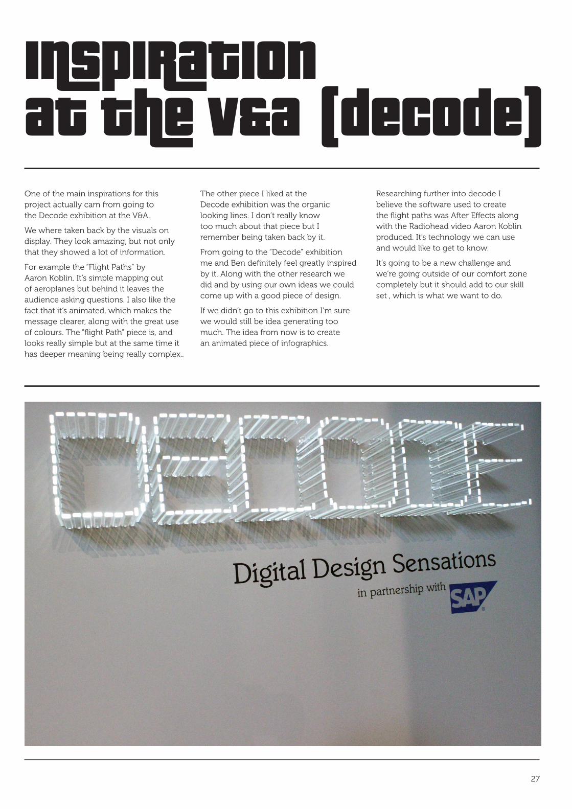
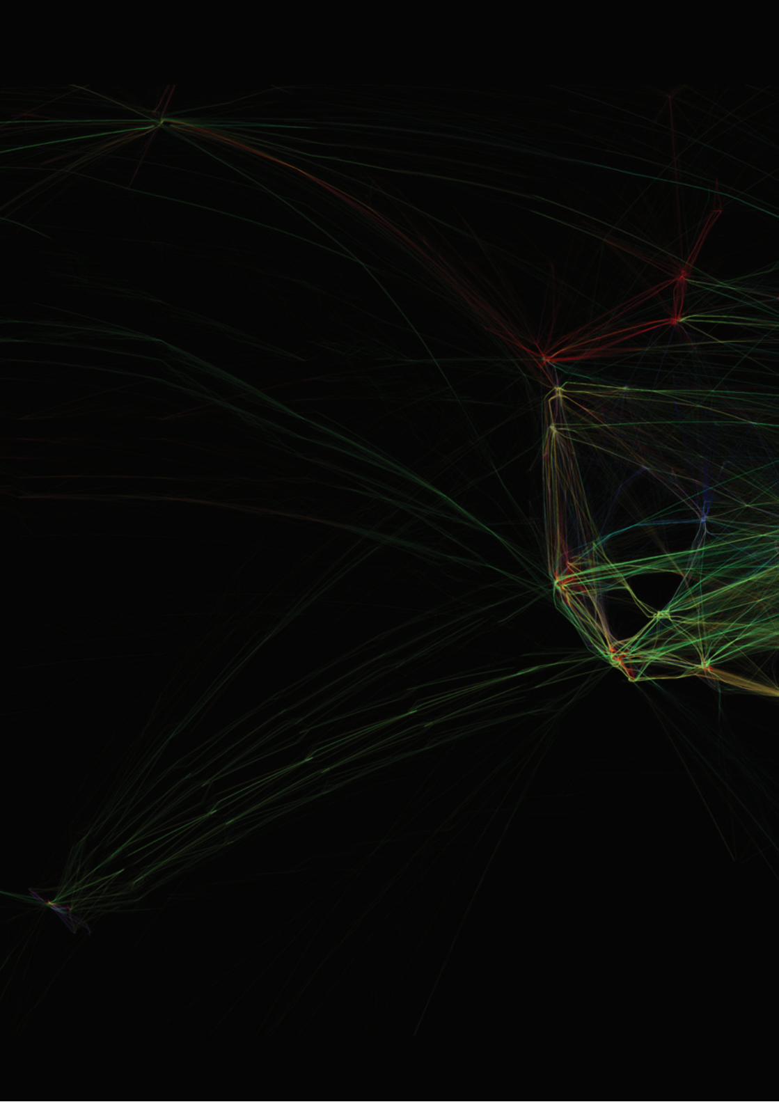
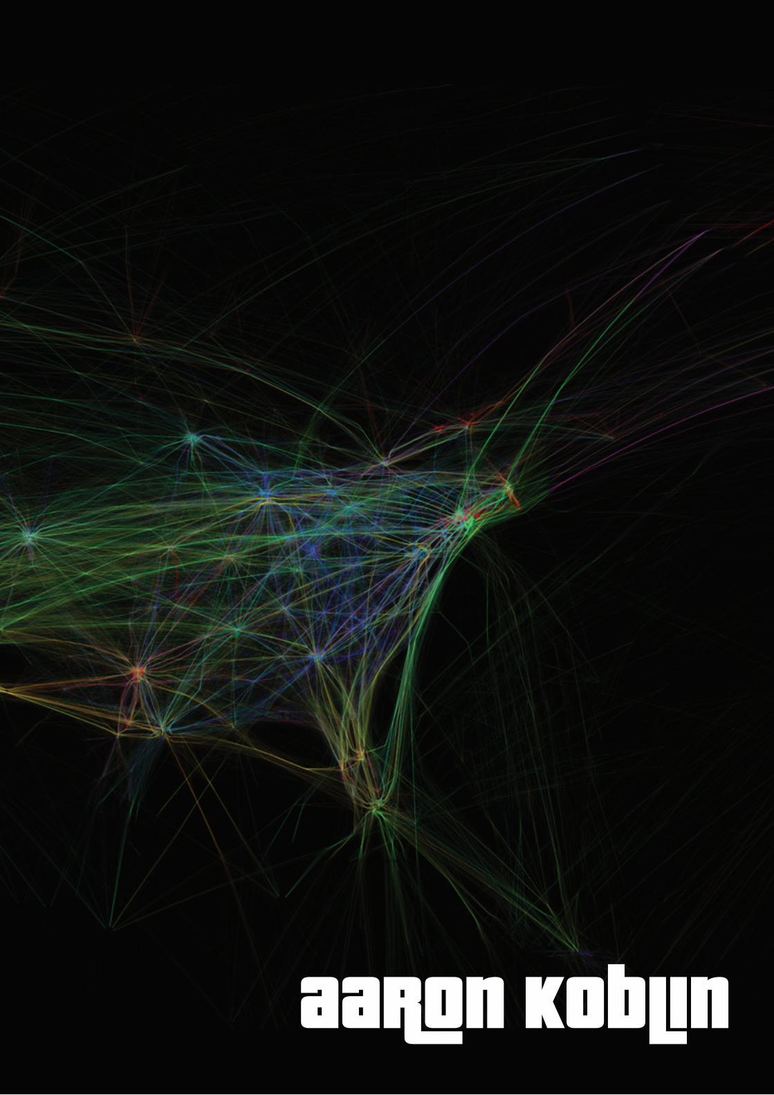
Inspirationat the v&a (decode)One of the main inspirations for this project actually cam from going to the Decode exhibition at the V&A.
We where taken back by the visuals on display. They look amazing, but not only that they showed a lot of information.
For example the “Flight Paths” by Aaron Koblin. It’s simple mapping out of aeroplanes but behind it leaves the audience asking questions. I also like the fact that it’s animated, which makes the message clearer, along with the great use of colours. The “flight Path” piece is, and looks really simple but at the same time it has deeper meaning being really complex..
The other piece I liked at the Decode exhibition was the organic looking lines. I don’t really know too much about that piece but I remember being taken back by it.
From going to the “Decode” exhibition me and Ben definitely feel greatly inspired by it. Along with the other research we did and by using our own ideas we could come up with a good piece of design.
If we didn’t go to this exhibition I’m sure we would still be idea generating too much. The idea from now is to create an animated piece of infographics.
Researching further into decode I believe the software used to create the flight paths was After Effects along with the Radiohead video Aaron Koblin produced. It’s technology we can use and would like to get to know.
It’s going to be a new challenge and we’re going outside of our comfort zone completely but it should add to our skill set , which is what we want to do.
27

Ben’s
Starting to animate the linesThe first thing I did was to take the four routes we did and try to turn it into an animation. This actually was quite difficult.
It was my first attempt with using After Effects. To find out how to make the lines move I had research this on the internet by doing tutorials. This was quite time consuming.
Never having used After Effects before this was proving quite a struggle. The images with the black backgrounds are my attempt to make the lines follow the journey, and the white one at the bottom is Ben’s that he did. It’s more or less the same but we can learn off of each other. It’s not great but it’s a start.
28
These videos are on mine and Ben’s blog and shows a natural process trail of how we’re developing our idea.
http://anicholls2.gdnm.org/ http://benwood.gdnm.org/

Ben’s
Developingthe visual language
29
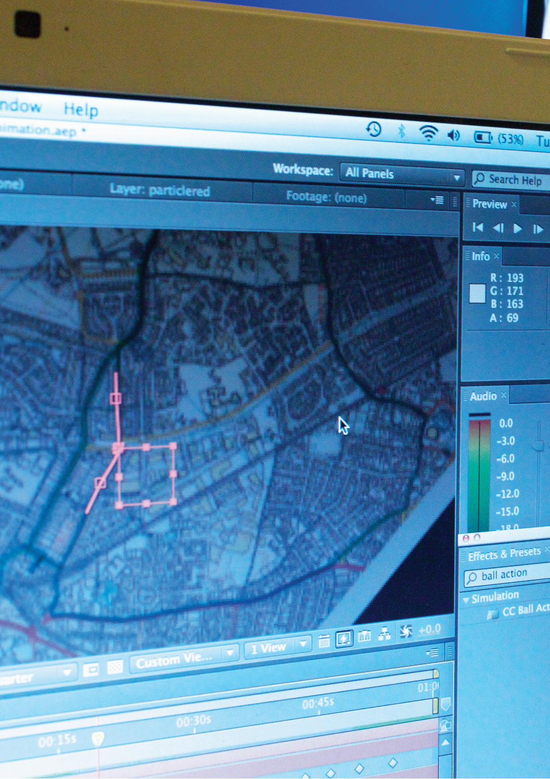
Just messing around with After Effects here. I just want to convey a clearer visual language to show more energy and a sense of fast movement. I wanted to try and capture the more organic/biological side of movement by creating moving particles. I Think the 3d looks too much on screen. It’s confusing and doesn’t show much context.
Combining this with Ben’s idea of using time to map out the different journey times. We should be able to come up with some great graphics. If we can get the visual language right it will make the communication a lot easier.
The top still is the video of mine and the white still is a video of Ben’s.
These videos are on mine and Ben’s blog and shows a natural process trail of how we’re developing our idea.
http://anicholls2.gdnm.org/ http://benwood.gdnm.org/

final practicewith after effectsTrying to merge together Ben’s ideas with mine. The idea is that the dots that appear could be the amount of people you pass by on a specific route, (data can be collected accurately) amongst other information that can be added. For example speed, traffic lights, sign posts, speed cameras etc. The final piece could develop into an animated infographics. Final practice with after effects me thinks.
After this practice it’s time to collect data, it may be a long process but it’ll be satisfying having accurate data to work with.
Now at this stage me and Ben are satisfied with the amount of skill we have with the software and it’s time to start producing our final piece. It looks better to look at and communicating the information can be easier. The black stills are of my video and the white video is a still from Ben’s video.
These videos are on mine and Ben’s blog and shows a natural process trail of how we’re developing our idea.
http://anicholls2.gdnm.org/ http://benwood.gdnm.org/
Ben’s
30

accuracyis everythingAccuracy is a big part of this, as it’s infographics. We counted every single moving car and person throughout the video.
It took a long time but once it was done we had really accurate first hand data to work with.
The hardest part was probably to assign the right amount of people and cars to the dots. It was definitely a time consuming process but satisfying at the same time. The double page spread after should show also that we matched the exact speed of the car
to the map. This means that when the lines move, speed up and slow down it’s exactly timed with the videos that we recorded.
I think that this was the most accurate way to get the data and even the timing of the lines is satisfying to watch.
31

accuracy withthe infographics
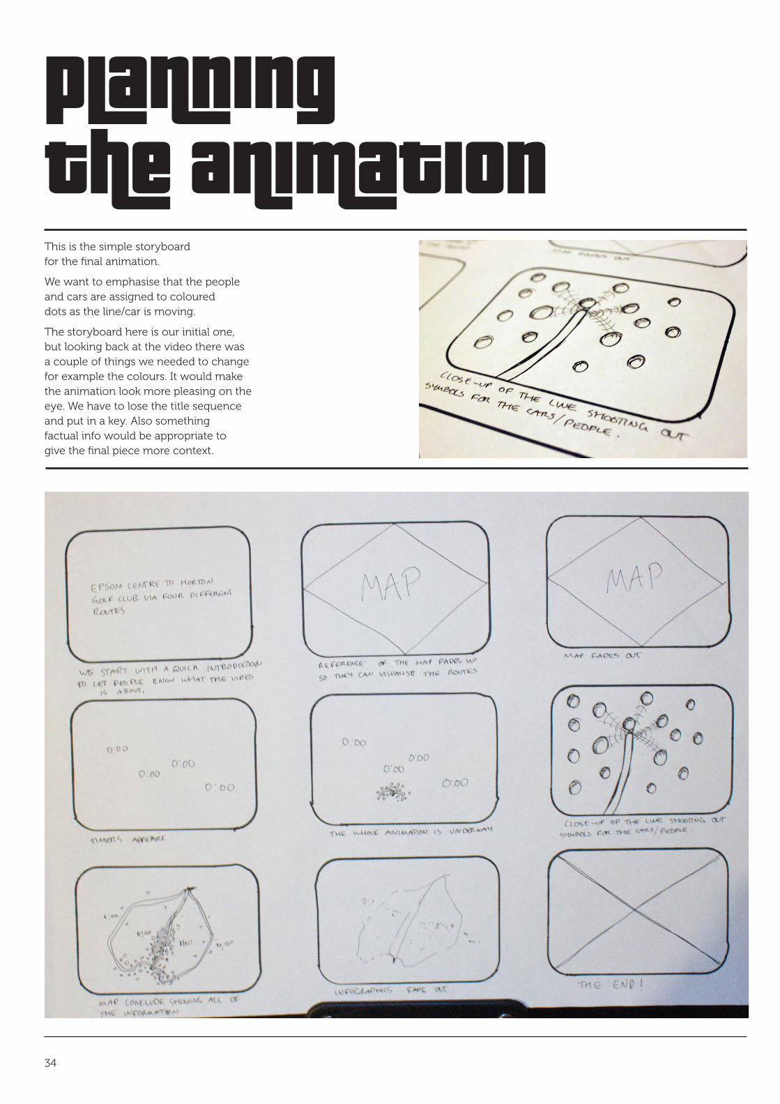
planningthe animationThis is the simple storyboard for the final animation.
We want to emphasise that the people and cars are assigned to coloured dots as the line/car is moving.
The storyboard here is our initial one, but looking back at the video there was a couple of things we needed to change for example the colours. It would make the animation look more pleasing on the eye. We have to lose the title sequence and put in a key. Also something factual info would be appropriate to give the final piece more context.
34
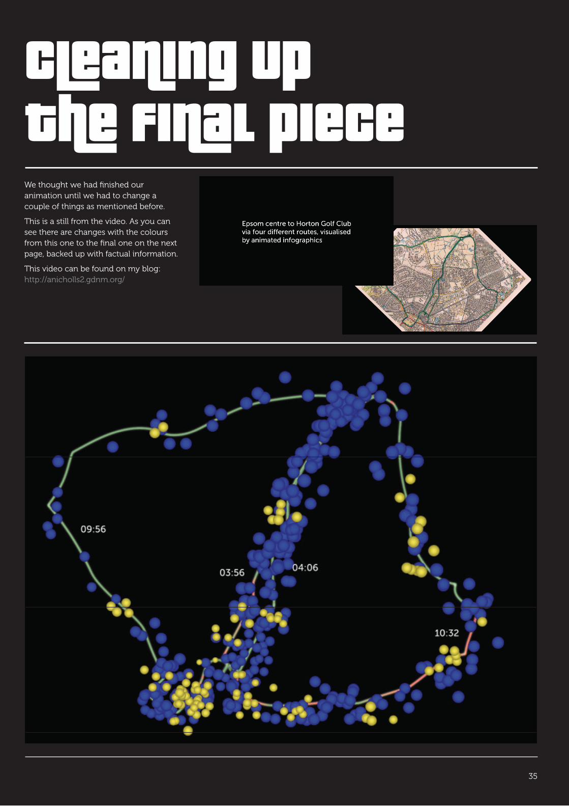
cleaning upthe final pieceWe thought we had finished our animation until we had to change a couple of things as mentioned before.
This is a still from the video. As you can see there are changes with the colours from this one to the final one on the next page, backed up with factual information.
This video can be found on my blog: http://anicholls2.gdnm.org/
35

THIS IS THE FINAL PIECE. Everything that was advised to change was and now I think it’s complete. We have our Key and fact now to give the piece more meaning.
I really like this and can only say it can be improved on or applied to different concepts. For example we were thinking around nature and how ant colonies work with the different type of ants. Also maybe bees. It could go anywhere to be honest and really enjoyed this project.
This Final piece can be found on my blog: http://anicholls2.gdnm.org/


other Ways of working
38
Some other ways of working I forgot to mention was that I like to keep a journal. I can record things such as a ‘Process Matrix’ and other ideas to reflect on.
Also as I was collaborating with Ben on this project emails ws a useful tool for when we where apart we could send files and links to each other.
Places
London V&A, Decode show London V&A, Decode Workshop
Online
http://www.adobe.com/designcenter/video_workshop/ http://ae.tutsplus.com/tutorials/vfx/create-an-illuminating-light-painting-effect/ http://www.typophile.com/node/30960 http://www.vam.ac.uk/microsites/decode/ http://haikumonkey.net/?p=42 http://www.aaronkoblin.com/work.html anicholls2.gdnm.org/ benwood.gdnm.org/
Books
Area 2, Ellen Lupton, 512 pages, Phaidon Press Ltd (2 Mar 2008) pages 20, 56, 232, 395
Left to Right: The Cultural Shift from Words to Pictures, David Crow, 192 pages, AVA Publishing (23 Oct 2006) pages 78, 90
Basic Design:Typography, Gavin Ambrose & Paul Harris, 176 pages, AVA Publishing (4 July 2005)
Mapping Graphical Navigational Systems, Roger Fawcett-Tang, 208 pages, Rotovision; Revised edition edition (1 Sep 2008) page 1, 124
I’ll keep this evaluation brief because I’ve evaluated throughout the workbook.
I think that this project has been great. It’s been a real bridge into new territory and has given me a lot of confidence to go outside of my comfort zone more. I have fulfilled my brief as to trying to increase my skill set, along with producing something around movement.
The final piece I am pleased with and hope that it’s portfolio standard. If not then this project has definitely got legs to develop a lot further. The idea of the final piece and not forgetting to complete my typeface that I’m really excited about.
I have gained loads of skill using software, especially in After Effects (because I have never used it before my project). Other software includes Toon Boom, Photoshop (rotoscoping) and using softwares together for example
evaluation & bibliography
how Illustrator with After Effects.
Also I believe that this project is great reference for myself in the future.
I’m really looking forward to the next project because I think I work better collaborating with someone. It’s easier to bounce off ideas and to be continuously motivated throughout the project.
39

Aaron Nicholls © 2010. All rights reserved


