Matt 1 My site: Autoweek.com WEBSITE OVERVIEW Content Analysis When beginning to navigate through AutoWeek.com, my first impression is that it is primarily meant for frequent auto enthusiasts, although it is also still very welcoming for the occasional visitor. From just viewing the homepage, the site seems to have great depth, as they show that they have news on all different types of cars – the site is broken out in many different sections to make the different types very easy for people to find. There seems to be two different navigation menus, one main menu on the top directly under the logo and another to the left (although the left menu only appears as a full menu on the full desktop version of the site, it turns into a drop down menu when shrunken down). The main, top menu is their primary navigation bar and houses the main sections of the site, which are: News, Reviews, Racing, Photos, Videos, and Store. I believe it is logical to assume that the News and Reviews section of the site are its most important, as most of the visitor would come to the site to read a review of a new car or read the most recent auto news, additionally these are also the stories that they placed on the homepage, which further proves my point. Briefly skimming through a recent review, they seem to be extensive and in depth, often written by more than one person, which gives multiple perspectives of the cars. The reviews all have a full gallery of photos along with them, which just further entices people to read a review from AutoWeek. At the beginning of each review, before the long form writing, they have a quick synopsis of the car that is being reviewed. The synopsis contains information like the price, fuel economy, a brief pros and cons of the car and much more. This, in my opinion, is crucial to the review of the car and AutoWeek made a fantastic choice putting it at the very beginning of the article, as this is the information people want to
Transcript
Matt 1
My site: Autoweek.com WEBSITE OVERVIEW
Content Analysis
When beginning to navigate through AutoWeek.com, my first impression is that it is
primarily meant for frequent auto enthusiasts, although it is also still very welcoming for the
occasional visitor. From just viewing the homepage, the site seems to have great depth, as they
show that they have news on all different types of cars – the site is broken out in many different
sections to make the different types very easy for people to find. There seems to be two different
navigation menus, one main menu on the top directly under the logo and another to the left
(although the left menu only appears as a full menu on the full desktop version of the site, it turns
into a drop down menu when shrunken down). The main, top menu is their primary navigation
bar and houses the main sections of the site, which are: News, Reviews, Racing, Photos, Videos,
and Store. I believe it is logical to assume that the News and Reviews section of the site are its
most important, as most of the visitor would come to the site to read a review of a new car or
read the most recent auto news, additionally these are also the stories that they placed on the
homepage, which further proves my point. Briefly skimming through a recent review, they seem
to be extensive and in depth, often written by more than one person, which gives multiple
perspectives of the cars. The reviews all have a full gallery of photos along with them, which just
further entices people to read a review from AutoWeek. At the beginning of each review, before
the long form writing, they have a quick synopsis of the car that is being reviewed. The synopsis
contains information like the price, fuel economy, a brief pros and cons of the car and much
more. This, in my opinion, is crucial to the review of the car and AutoWeek made a fantastic
choice putting it at the very beginning of the article, as this is the information people want to
Matt 2
know first before they dive into the long form review. The placement of this information does
change due to the responsive design of the site. In the full desktop version it appears to the right
of the photo gallery at the top of the review, when slightly shrunken down it appears directly
under the photo gallery, which would most likely be the tablet view and when shrunken down to
its smallest form, which would be the mobile view, it moves within the article, similar to a large
pull quote, it goes into the third paragraph. Every review also contains just about every different
popular social media icon, giving you the ability to share the review or article on your social
network of choice as well as email it. These same social icons and more (their purpose now
being to follow them on social media) also appear on the homepage, although in my opinion are
too low and would often be missed. In the desktop version of the site the icons appear in the
sidebar on right of the featured stories about half way down the homepage, on the tablet and
mobile version the icons more all the way to the bottom of the site, which again could be missed
by most people viewing the site. Another social feature is a Twitter feed, which appears on the
top of the social media icons, further proving that AutoWeek views social media as the
incredibly important resource that it is. The top navigation also shows they have photos and
videos, which could be an extremely valuable resource for anyone looking at new cars. When
navigating to the photos section of the site, right away you see multiple different galleries of
photos for all the new and most recent vehicles on the market. The videos section is very similar,
whether it is a new ad from a car company, a car test, or a popular new auto related video, it
appears as if it would be on the site. The navigation bar to the left, which is altered by to the
responsive design, of the site seems to be meant for more temporary and popular sections of the
site that can be easily changed (for example, “Frankfurt Motor Show” is an option is this menu,
Matt 3
which I assume is not always occurring, so it leads me to believe that theses options are changed
for popular events or categories).
For my beginning analysis of AutoWeek, before deeply diving into the other factors of
the website that come later in the paper, I would say that it seems to be a very good website. I
believe it is a very good website from the first analysis because of it has an easy and clean design
as well as what appears to be quality, extensive auto news and review, along endless photos and
videos for more content for the user to stay on their website and come back often. They have
integrated social media very well into the site, as it part of the homepage and on every article
they publish, encouraging people to follow them and share their work. It’s is apparent they know
their audience, because most article, namely auto reviews, highlight important information right
away and make it stand out from the long form review.
General Company Information
AutoWeek’s first issue was published on July 16, 1958, then called Competition Press
and was “the twice-monthly journal of motor sports.”1 AutoWeek.com is part of AutoWeek
Media Group, which controls AutoWeek.com, the AutoWeek magazine, as well as AutoWeek
apps for iPhone and iPad. According to the AutoWeek Media Kit, it states:
“DISTINGUISHING LEADERSHIP AMONG ENTHUSIAST BRANDS Authenticity, credibility and grit define the Autoweek mission. Autoweek Media Group delivers world-class content to automotive enthusiasts and industry influencers across multiple platforms (print, online, mobile, video, television, events, audio and video content, custom podcasts, interviews, vehicle profiles and more). Our leadership team of experts shares perspective, insight, news and data, guiding core enthusiasts - and those who seek this wisdom - in their automotive quests. Autoweek Magazine is the nation’s only fortnightly automotive enthusiast title, which has critiqued new vehicles, reported the latest news and trends, and covered motorsports for 56 years. With the 2014 re-
launch of autoweek.com, our refined look and responsive web design delivers breaking news and fresh content in a distinctive format to a thought-leading consumer 24/7.”2
This gives a great look into AutoWeek Media Group, both the type of business they are now and
the type of business they have been in the past. Most important, they specifically point out that
they recently re-launched their website, with a “refined look and responsive webs design.” The
presence of this information in the Media Kit, out to the public, shows that AutoWeek.com is
becoming increasing more important to the AutoWeek Media Group and they are dedicated to
creating a good online presence and one auto enthusiasts will continually visit. AutoWeek’s
employees3 include:
• KC Crain, Jr. Executive Vice President/Director of Corporate Operations/Group Publisher
• Dutch Mandel, Publisher • Rory Carroll, Executive Editor • Ken Ross, Executive Creative Director • Wes Raynal, Editor • Andrew Stoy, Digital Editor • Mark Vaughn, Senior Editor (West Coast) • Natalie Neff, Editorial Content Manager • Jake Lingeman, Road Test Editor • Graham Kozak, Associate Editor • Jay Ramey, Associate Editor • Mike Pryson, Associate Motorsport Editor
AutoWeek’s parent company and publisher is Crain Communications Inc. Crain is the publisher
to twenty-two different brands, such as Advertising Age, Automotive News, InvestmentNews,
and Modern Healthcare, just to name a few. According to Crain’s website:
“Crain Communications Inc is a privately held media company producing trusted and relevant news publications, lead generation, research and data products, custom publishing and events with uncompromising integrity. Reaching more than 3.5 million business decision makers and consumers across the United States and in select markets
2 2015 Media Kit, AutoWeek Media Group: http://autoweek.com/resources/media-kit/pdf/2015_AboutAW.pdf 3 http://autoweek.com/bios
Matt 5
in Europe and Asia, the company’s portfolio includes many of the most influential media properties in the verticals they serve including Automotive News, Autoweek, Advertising Age, Modern Healthcare, Plastics News, Business Insurance and Pensions & Investments. Headquartered in Detroit, Michigan, the company’s 825 employees in 13 locations publishes 25 vertical news print and online publications and the multimedia content and product extensions related to each, contributing to the success of its readers and its clients.”4
This shows how big Crain’s reach really is in the publications industry, with AutoWeek being
just a small part of their collection. Their collection of brands do not just reach the United States
market, they publish throughout the whole world, establishing a truly global reach. They have a
fairly large company as well, with over 800 employees and 13 different locations. The work
published by their brands come in many different variations, from print to web to multimedia
content as well as products within their various brands.
Competing Site
For my competing site, I chose automobilemag.com. One of the biggest reasons why I
chose Automobile as my competing site to AutoWeek is because they both were not started in
the digital space; rather both of them started as print magazines. I believe this is important aspect
to both of these companies and more than likely causes similar decisions to be made by both,
meaning they both have to be thinking of their magazine and their website in making decisions.
In my opinion, the biggest items to look at when comparing websites are: design and content. For
design, looking at the layout and over design of each site and for content, looking at the pieces
that are put out to their users. Design is very important for websites today, mainly for getting
users to websites and getting them to stay and come back often, but the most important is
content. With good content, users will come back to the site and often recommend a website to
4 http://www.crain.com/about/index.html
Matt 6
others. Both of these sites have a focus on auto news and reviews and that is more than likely the
most important content to both of them. Although there are differences in design between the
two sites, they are both putting out very similar news and reviews. The differences between each
are merely the ways each is able to stand apart from the competition.
AUTOWEEK
AUTOMOBILE
FIGURE 1
Matt 7
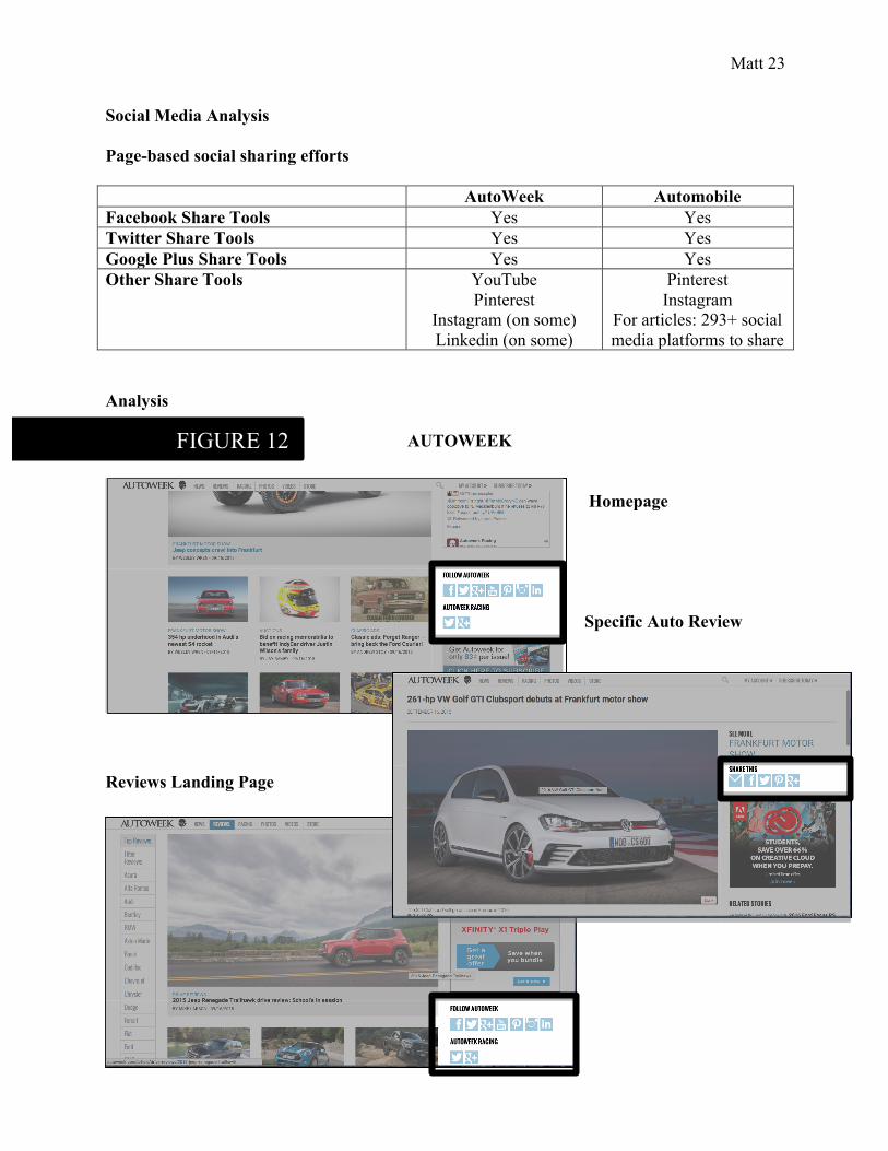
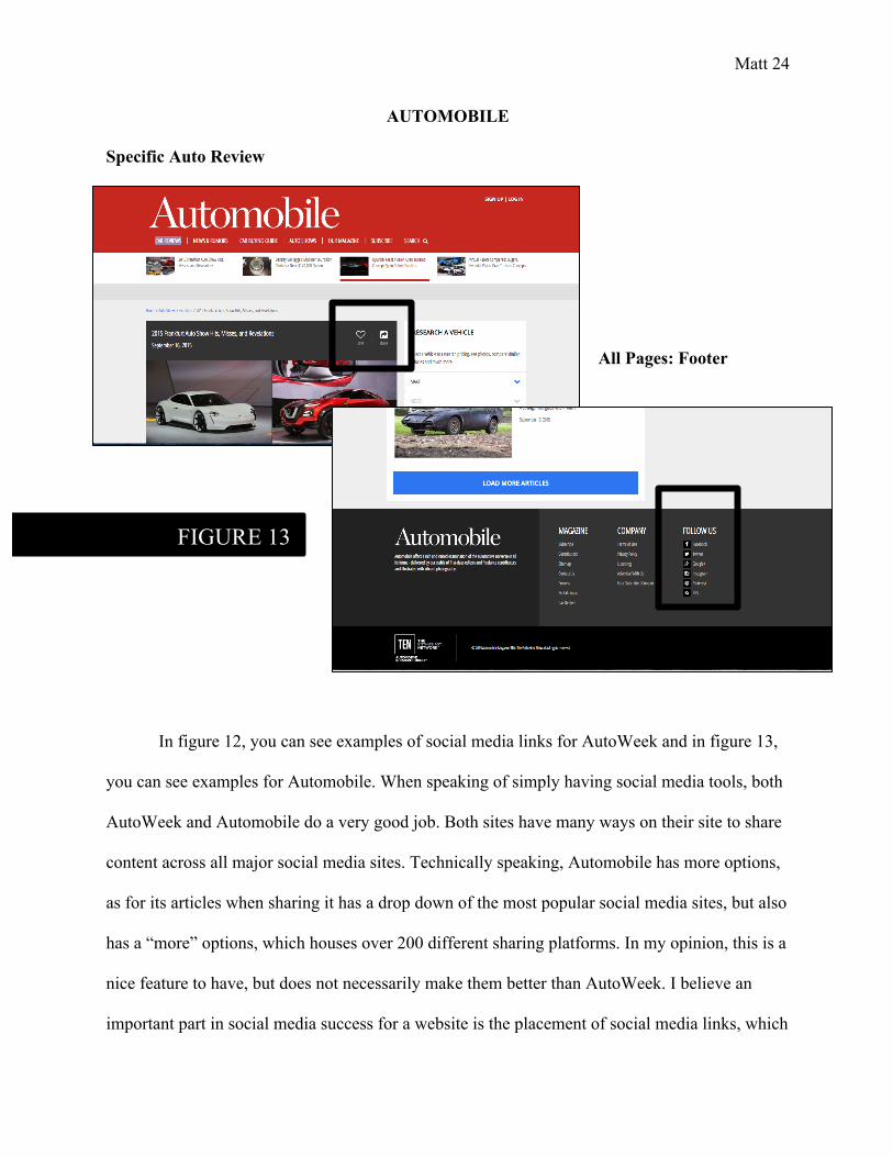
In figure 1, it shows an example of an auto review from both sites. Although there are
differences in design and layout of the review, the content they provide is very similar. Both sites
pull out information from the long form review, making it easy for users to find and read through
quickly. Both have images for the car that is being reviewed. Finally, both include a long form
text review about the car.
DESIGN & LAYOUT ANALYSIS
Responsive/Mobile
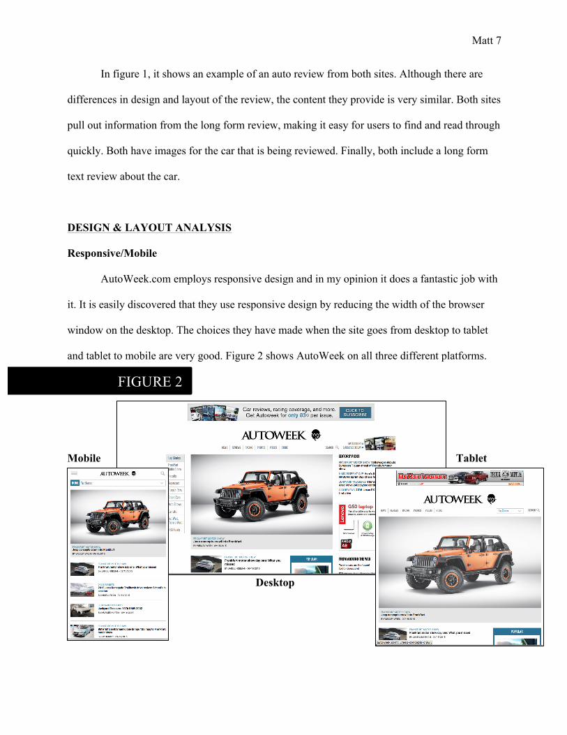
AutoWeek.com employs responsive design and in my opinion it does a fantastic job with
it. It is easily discovered that they use responsive design by reducing the width of the browser
window on the desktop. The choices they have made when the site goes from desktop to tablet
and tablet to mobile are very good. Figure 2 shows AutoWeek on all three different platforms.
Mobile Tablet
Desktop
FIGURE 2
Matt 8
In the desktop version sidebars and menu automatically show up when you go to the website,
differed from when it is shrunken down to the tablet, elements are moved in a good, easily
accessible way. For instance, see figure 3, when the homepage is viewed on a desktop and
changed to the tablet version the menu they call “Top Stories” goes from permanently on the left
FIGURE 3 DESKTOP
TABLET
Matt 9
side to a drop down menu along with the main navigation bar. This keeps the menu very easily
seen by users and incredibly easy to use. The right sidebar that appears on the desktop, which
contains items like “Editors Picks” or “From Around the Web,” get moved to the bottom of the
site before the footer. I believe this was a great choice for the design, as these types of elements
are just added links on the desktop version to entice users to stay and read more, but are not at all
the most important content on the site. Those are just two examples of well-informed, user-
focused decisions they have made in the responsive design of the site. These types of decisions
remain throughout the entire site, on all platforms – desktop, tablet, and mobile. It is very
apparent to me that AutoWeek is understand the how important the digital experience is for
users. A positive experience for users across all platforms will cause them to continually come
back and recommend it to other, which is ultimately the goal of a website like AutoWeek. For a
company that was not originally created for the digital world, rather the print, it is fantastic that
they see their website as [potentially] equally important as their print counter part.
Matt 10
Layout
Full desktop homepage
FIGURE 4
Matt 11
Page Elements
On page 26 of the textbook, it shows the typical layout of a website. AutoWeek uses this layout
extensively in their website. In figure 5 it shows one example of the use of this layout. This is the
Header
Navigation
Sidebar
Feature
Body/Content
FIGURE 5
FIGURE 6
Matt 12
dedicated page for all the reviews on the site. In figure 6 it shows a specific auto review, which is
also a great example of this layout. According to the textbook and class lecture, our eyes are first
attracted to the upper left of a website. This type of layout is perfect for that fact; the layout is
meant for the user to start at the top and work our way down.
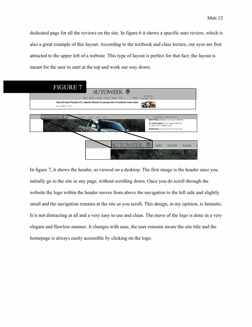
In figure 7, it shows the header, as viewed on a desktop. The first image is the header once you
initially go to the site or any page, without scrolling down. Once you do scroll through the
website the logo within the header moves from above the navigation to the left side and slightly
small and the navigation remains at the site as you scroll. This design, in my opinion, is fantastic.
It is not distracting at all and a very easy to use and clean. The move of the logo is done in a very
elegant and flawless manner. It changes with ease, the user remains aware the site title and the
homepage is always easily accessible by clicking on the logo.
FIGURE 7
Matt 13
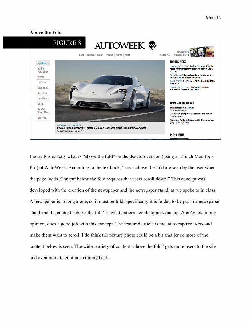
Above the Fold
Figure 8 is exactly what is “above the fold” on the desktop version (using a 13 inch MacBook
Pro) of AutoWeek. According to the textbook, “areas above the fold are seen by the user when
the page loads. Content below the fold requires that users scroll down.” This concept was
developed with the creation of the newspaper and the newspaper stand, as we spoke to in class.
A newspaper is to long alone, so it must be fold, specifically it is folded to be put in a newspaper
stand and the content “above the fold” is what entices people to pick one up. AutoWeek, in my
opinion, does a good job with this concept. The featured article is meant to capture users and
make them want to scroll. I do think the feature photo could be a bit smaller so more of the
content below is seen. The wider variety of content “above the fold” gets more users to the site
and even more to continue coming back.
FIGURE 8
Matt 14
Upper Left
AutoWeek uses concept of “upper left” and seems to know that the users eyes naturally drawn to
that area. When first loading the site, we see the header and navigation, these organize the
website for user and directs them to the content they desire. Next, we see the featured content,
which is generally the most popular or most important content at the time of viewing. Finally, we
see the body content, which is what is seen last and when the featured content entices people to
the page, the body content keep people on the page.
FIGURE 9
1
2
3
Matt 15
Ads
The advertisements on AutoWeek are traditional sizes of most sites. Figure 10 shows various ads
on the site. These ads constantly change, meaning they have them on rotation for each spot, so
every time the site is loaded, it could be a different ad (although they would eventually repeat if
it was done enough). In my opinion, they have done a great job in the minimal ads as it keeps the
site clean looking, rather than ugly and intrusive, as we discussed in class lecture.
FIGURE 10
Matt 16
Along with traditional advertisements, like the ones in figure 10, AutoWeek also has ads for
themselves. Figure 11 shows two different examples of ads, which promote their own brands and
products. They are trying to attract people to purchase the print magazine, as well as asking for
email addresses in exchange for a free auto newsletter. Although the first one, asking for email
addresses, can be annoying and intrusive at times, since it comes up on the page right away when
it is loaded, these ads also remain clean looking and do not distract from the content on the site.
FIGURE 11
Matt 17
TRAFFIC ANALYSIS
Traffic Sources: Compete.com and Quantcast.com
AutoWeek Automobile Average Monthly Uniques: Compete 476,333 415,526 Average Monthly Uniques: Quantcast 495,798 518,107 *The results above were gathered from an average for each month from March to July of 2015. This choice was made because data for Automobilemag.com on Quantcast would only go back to March of 2015, so I wanted to keep the timeframe the same.
Analysis of AutoWeek.com
Looking at the traffic data for AutoWeek, the average monthly uniques comes out to quite close,
with a difference of only 19,465. The traffic data from Quantcast shows that there was a spike in
April and a dip in June and those two months show the highest amount and the lowest amount
between the five months that were apart of the average, with a difference close to 150,000. These
types of differences show AutoWeek what types of content users are attracted towards. With the
spike in June there was more than likely content published that was of more intriguing and
relevant to the sites audience than content of previous months.
Analysis of Automobilemag.com
Looking at the traffic data for Automobile, there is a very large differences between the two
results, nearly 100,000. I am not sure why this would be the case, but I would assume each
source gathers their data differently. According to Quantcast the results from each month are all
relatively similar from April to July. March is the only drastic difference with only 31,000
compared to the other month being around 550,000 to 650,000, with some slight spikes and dips.
The number for March is so drastically different I question Quantcast’s result rather than
wondering if is was Automobilemag.com. Now it is possible it was the site, but that drastic of a
Matt 18
difference is unlikely. Unfortunately I was unable to find a reason. Besides March, the lowest
month is April and the highest month is July, with a difference close to 200,000. Similar to the
differences seen with AutoWeek, these types of differences are also seen with Automobile in the
fact that is shows the employees of Automobile what types of content users are attracted towards
and the types they are not.
Traffic Source: Media Kit
AutoWeek Average Monthly Uniques Visitors 1,236,226* *Number comes from Google Analytics, Jan. 2015 – March 2015
Analysis
According to the 2015 Media Kit5 from AutoWeek Media Group, it states:
“Autoweek.com is best-in-class, device-agnostic content experience for our audience • Mobile usage continues to explode – up 13% YoY • Jan. 2015 – March 2015, 12,465,003 page views average age of 50 • 1,236,226 average unique monthly visitors
Within the automotive enthusiast category… • Autoweek’s audience ranks highest with a mean income of $106,507 • Autoweek ranks first with the highest average minutes per visitor at 6.8 minutes”
In terms of traffic, the most important data from the Media Kit is “1,236,226 average unique
monthly visitors.” From first glance this number seems very high, especially comparing it to the
data received from Compete.com and Quantcast.com, but in the sources of the Media Kit, you
learn that they combined unique visitors for January, February, and March. The decision to
52015 Media Kit, AutoWeek Media Group: http://autoweek.com/resources/media-kit/pdf/2015_AboutAW.pdf
Matt 19
combine the three months, rather than just putting the average of one month, was a good choice.
The bigger number pulls people in and, in their hopes, pulls advertisers in.
Traffic Source: Alexa.com
AutoWeek Automobile Bounce Rate % 59.60% 53.90% Page Views Per Visitor 1.99 1.97 Daily Time on Site 3:20 3:06
Analysis of AutoWeek.com
The data gathered from Alexa.com for AutoWeek are good for the site. This data is good for the
site because all three of the data points collected have increased from the past collection.
Looking at each data point specifically, a bounce rate of 59.60% is very good, since the average
is 50%. As we learned in class lecture, the bounce rate is when a visitor leaves a website after
only viewing one page. For AutoWeek, this means a lot of people are viewing more than one
page and really exploring the content on the site. For daily page views per visitor, with the
number at 1.99, this means on average each user is viewing nearly two pages on the site daily. In
my opinion, that is a good number for the site to be at, especially since it increased from the last
collection. For daily time on site, meaning the amount of time a user spends on the site, with
three minutes and twenty second, it is good especially compared to the competing site and that it
has also increased from the last collection. Moreover, looking at even more auto sites, AutoWeek
stays right with them.
Matt 20
Analysis of Automobilemag.com
Comparing the data for AutoWeek to Automobile, they have very similar numbers. Automobile
does have a better bounce rate at 53.90%, which gets even closer to the average of 50% and just
like AutoWeek means people are viewing more than one page and really exploring the content
on the site. The daily page views per visitor is incredibly similar, with a difference of only 0.02.
This shows that the users visiting Automobile and AutoWeek are typically viewing the same
amount of content. The daily time on site for Automobile is fourteen seconds less than that of
AutoWeek. This shows people are spending just a slightly increased amount of time on
AutoWeek than Automobile.
Traffic Conclusions
When looking at the traffic data for both AutoWeek and Automobile, most of the differences lie
in the collection of the data, mainly when it comes to the unique visitors. On one of site it
appears that AutoWeek is performing above Automobile and on the other it is performing below.
Various dips and spikes were seen in this data and it can be assessed that it shows the two sites
what types of content users are attracted towards. These dips and spikes are seen on both sites, in
different months, showing that each site is constantly fighting to be on top and have the best,
most relevant, up-to-date and intriguing content. Luckily the data collected from Alexa.com was
great to see between the two sites. This was the data that really showed they the two sites are
competing, because it was so similar. Both sites have great bounce rates and their page views per
visitor and daily time on site is improving. This data shows that the users coming to the site are
enjoying the content, because they are spending the time on the sites and often enjoying more
than one piece of content.
Matt 21
POPULARITY ANALYSIS
Link Popularity Analysis
AutoWeek Automobile No. of Referring Domains 19,513 16,517 No. of External Backlinks 2,235,437 673,172
Analysis of AutoWeek.com
The top ten referring domains for AutoWeek, according to MajesticSEO, are: