This presentation summarizes the most common suggestions from the the YSM2 peer-feedback exercise. Additional context is provided in the Notes section for each slide. Compiled by Caroline Cleroux, Ines Hessler, and Alberto Reyes
Transcript
This presentation summarizes the most common suggestions from the the YSM2 peer-feedback exercise.
Additional context is provided in the Notes section for each slide.
Compiled by Caroline Cleroux, Ines Hessler, and Alberto Reyes
The objective of this slide is to show that:
Readers appreciate a clear statement of objectives
A common feature of well-received posters (and talks) was that…
… they followed a logical progression to…
…a clear, concise, and easy-to-find summary statement.
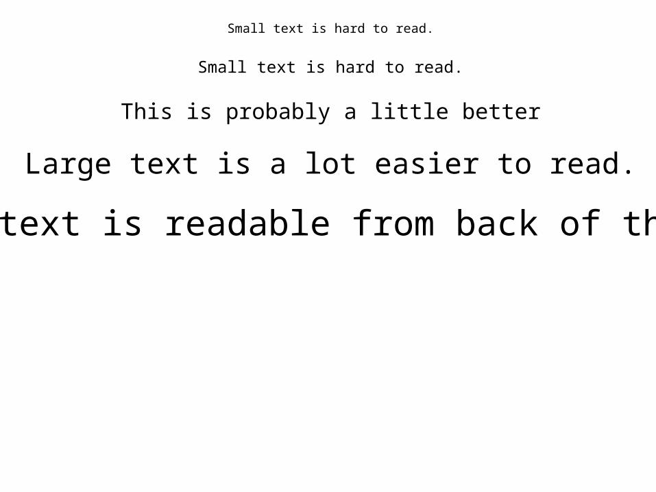
Small text is hard to read.
Small text is hard to read.
This is probably a little better
Large text is a lot easier to read.
Large text is readable from back of the room
Your message gets lost when there’s too much text. Readers got lost in the details and the language, so by the time they get to the important points about 87Sr/86Sr clearly reflecting a shift in provenance, they’ve already lost interest and have moved on to another element of the poster, in a vain search for meaning. Posters are easier to read when there’s less text. This is particularly critical when you can’t be at your poster to “talk” a reader through.
• Messages get lost when there’s too much text.
• 87Sr/86Sr clearly reflects a shift in provenance.
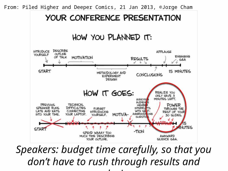
Do you REALLY need to show six plots on one slide?