26
Q1. how does your product challenge the conventions of real media products?
| Date post: | 19-Jul-2015 |
| Category: |
Food |
| Upload: | freddie-carus |
| View: | 153 times |
| Download: | 7 times |
Q1. how does your
product challenge the
conventions of real
media products?
Characters
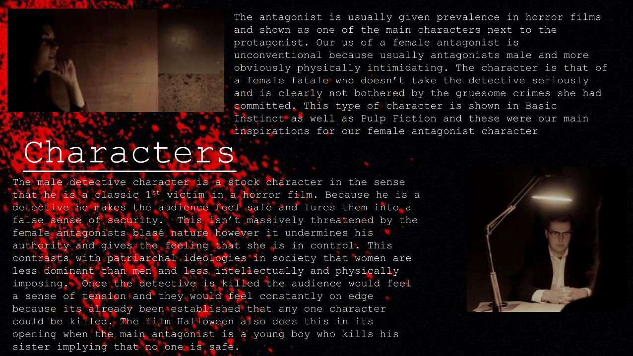
The antagonist is usually given prevalence in horror films
and shown as one of the main characters next to the
protagonist. Our us of a female antagonist is
unconventional because usually antagonists male and more
obviously physically intimidating. The character is that of
a female fatale who doesn’t take the detective seriously
and is clearly not bothered by the gruesome crimes she had
committed. This type of character is shown in Basic
Instinct as well as Pulp Fiction and these were our main
inspirations for our female antagonist character
The male detective character is a stock character in the sense
that he is a classic 1st victim in a horror film. Because he is a
detective he makes the audience feel safe and lures them into a
false sense of security. This isn’t massively threatened by the
female antagonists blasé nature however it undermines his
authority and gives the feeling that she is in control. This
contrasts with patriarchal ideologies in society that women are
less dominant than men and less intellectually and physically
imposing. Once the detective is killed the audience would feel
a sense of tension and they would feel constantly on edge
because its already been established that any one character
could be killed. The film Halloween also does this in its
opening when the main antagonist is a young boy who kills his
sister implying that no one is safe.
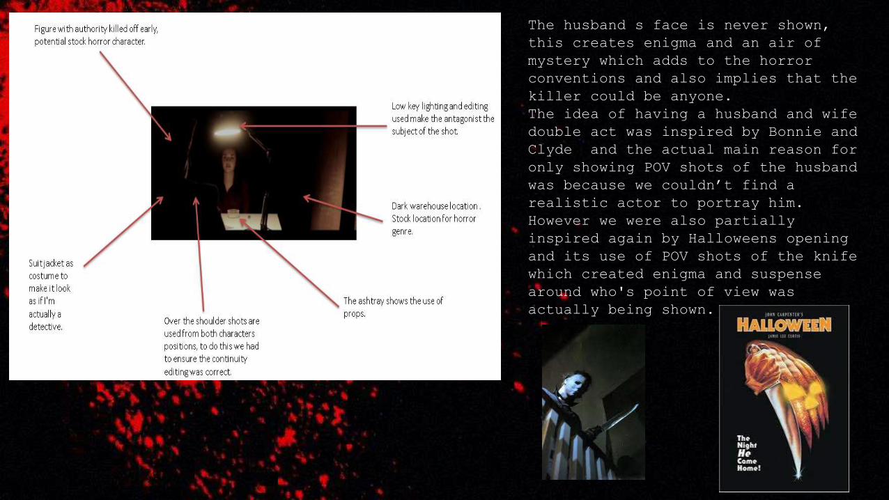
The husband s face is never shown,
this creates enigma and an air of
mystery which adds to the horror
conventions and also implies that the
killer could be anyone.
The idea of having a husband and wife
double act was inspired by Bonnie and
Clyde and the actual main reason for
only showing POV shots of the husband
was because we couldn’t find a
realistic actor to portray him.
However we were also partially
inspired again by Halloweens opening
and its use of POV shots of the knife
which created enigma and suspense
around who's point of view was
actually being shown.
Mise-en-scene
Aswell as the cigarette we
used a bloody knife which
can be seen in all three
locations. This type of
prop is makes it obviously
that the opening is that of
a horror film, this was
important to emphasise
because the interrogation
scene might lead the
audience to think they were
watching a thriller film.
We used a single desk lamp for
lighting, this gave the shots an
eerie feel and single lamps are
also widely used for
interrogations in movies. We
took inspiration for our low key
lighting on the two characters
from The Dark Knight (Jackson,
2010) we also thought it would
be a good idea because we didn’t
want it to be to be too obvious
that I’m 16 because the
detective in the film is meant
to be much older.
We used a cigarette as a prop, we were
inspired by the character of Mia Wallace
from Pulp Fiction (Tarantino, 1994). The
cigarette gives the image of a female
fatale, we included this because we
wanted her to be laid back and calm in
the face of being interrogated. The
dominant female character wasn’t
conventional of horror and it challenged
residual ideologies that women are less
intimidating than men.
Our title was a plain serif font in
white on a black back ground. This
wasn’t massively conventional of
horror because a lot of horror films
will include references to the plot
in their titles.
soundFree sound and YouTube were two sites we used when looking for sound to use in our
opening. One of the most unusual features of our project was the inclusion of a semi-
continuous clicking noise which showed that time was passing. It was non-diegetic and its
main use other than showing that time had passed was to suspend the sense of tension that
is present during the opening
Getting the various sound levels correct was
important. We lowered the volume during the parts
where the actor was speaking because this made it
easy to hear clearly what was being said. We also
used the sound effect of a camera flash as a photo
is taken. The noise was old fashioned and added to
the openings noir nature, it also reinforced to the
audience that the police were involved and it was
an official investigation.
In horror films there tends to be a slow beat
throughout with sound focussed on action
areas that release visceral pleasure. Our
production did this as well so it was in this
respect conventional of the horror genre.
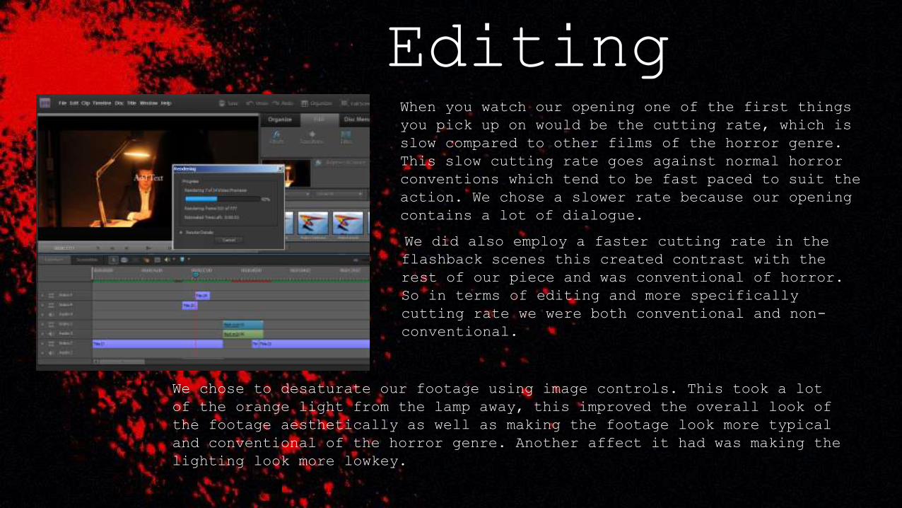
EditingWhen you watch our opening one of the first things
you pick up on would be the cutting rate, which is
slow compared to other films of the horror genre.
This slow cutting rate goes against normal horror
conventions which tend to be fast paced to suit the
action. We chose a slower rate because our opening
contains a lot of dialogue.
We did also employ a faster cutting rate in the
flashback scenes this created contrast with the
rest of our piece and was conventional of horror.
So in terms of editing and more specifically
cutting rate we were both conventional and non-
conventional.
We chose to desaturate our footage using image controls. This took a lot
of the orange light from the lamp away, this improved the overall look of
the footage aesthetically as well as making the footage look more typical
and conventional of the horror genre. Another affect it had was making the
lighting look more lowkey.
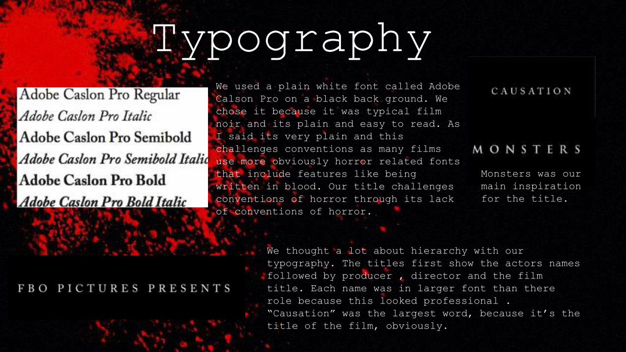
TypographyWe used a plain white font called Adobe
Calson Pro on a black back ground. We
chose it because it was typical film
noir and its plain and easy to read. As
I said its very plain and this
challenges conventions as many films
use more obviously horror related fonts
that include features like being
written in blood. Our title challenges
conventions of horror through its lack
of conventions of horror.
We thought a lot about hierarchy with our
typography. The titles first show the actors names
followed by producer , director and the film
title. Each name was in larger font than there
role because this looked professional .
“Causation” was the largest word, because it’s the
title of the film, obviously.
Monsters was our
main inspiration
for the title.
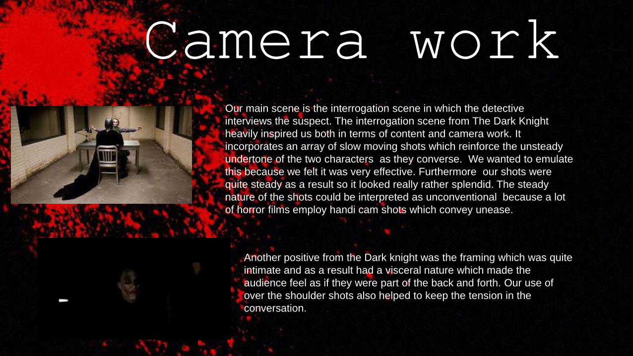
Camera workOur main scene is the interrogation scene in which the detective
interviews the suspect. The interrogation scene from The Dark Knight
heavily inspired us both in terms of content and camera work. It
incorporates an array of slow moving shots which reinforce the unsteady
undertone of the two characters as they converse. We wanted to emulate
this because we felt it was very effective. Furthermore our shots were
quite steady as a result so it looked really rather splendid. The steady
nature of the shots could be interpreted as unconventional because a lot
of horror films employ handi cam shots which convey unease.
Another positive from the Dark knight was the framing which was quite
intimate and as a result had a visceral nature which made the
audience feel as if they were part of the back and forth. Our use of
over the shoulder shots also helped to keep the tension in the
conversation.
How our opening is not
conventional
The role of our antagonist is portrayed by a female
actress; this challenges dominant ideologies because in
most horror films the antagonist is a male character.
Horror films are usually associated with high
cutting rates to build tension, however our
opening has a slower cutting rate and we build
tension through other mediums like dialogue
which is cool.
We used a plain pretty standard white text font
for a lot of the titles. We chose it because it
stood out clearly and was visible against the
background but didn't take attention away from
what was happening on screen. The text wasn't
conventional because most horror films use bold
bright fonts to impose themselves upon the
audience.
Our opening featured a lot of
dialogue, this isn't normal for
horror openings because they
usually don't contain much speech.
Not many close ups are used in our
piece, usually horror films use
many close ups to intensify a scene
or put the focus on one particular
prop like a bloody knife or dead
body. We convey horror through
tracking shots and over the
shoulder shots.
We used a clock and had the
time clicking down which is
rather unusual and quite
innovative I think.
In terms of costume the characters
are wearing normal clothes that
don't particularly reflect that
the opening is a horror opening.
We altered the colour for some of our shots slightly to
give the scenes more of an eerie feeling. We also
wanted the overall colour scheme of our opening to
consist mainly of three colours.
How our opening is
conventional
The locations is an isolated and
desolate ware house with low key
lighting, this is typical of a
horror film.
The main colours
we use are red and
black which convey
danger and death.
The exaggerated non-diegetic sound of the clock
ticking helps build tension and also conveys
that time is passing. Exaggerated sound is a
convention of horror. We also used it in the
flash back where we showed montage editing.
Props like the bloody
knife that featured
in our opening are
conventional to
horror.
The location of our
typography is quite
conventional and its
positioning is similar to
the True Detective
opening.
We establish enigma by hinting through
dialogue that there are two serial
killers involved. In terms of plot, our
piece centres on people being killed by
serial killers. This idea is quite
conventional to the horror genre.
Q.2 How does your
media product
represent particular
social groups?
Social groups that are represented
and how they are represented
The social groups that we do cover
are not accurately represented in
my opinion because that would imply
that many women in their 20’s have
a tendency to commit murders.
There is a binary opposition
between the male and female
character as he questions her and
she gives flimsy answers before her
husband murders him.
The antagonist in our piece is meant to
be a female in her 20’s.
Both the characters given prevalence in
our piece are white and you can’t
really tell what class group they
belong to. Although they are both
relatively well spoken which could lead
to you saying they are middle or upper
class.
social status isn’t a key feature in
the opening and because only four
people come into the scenes not many
social classes are represented nor
ideologies reflected.
How are representations
technically structured?
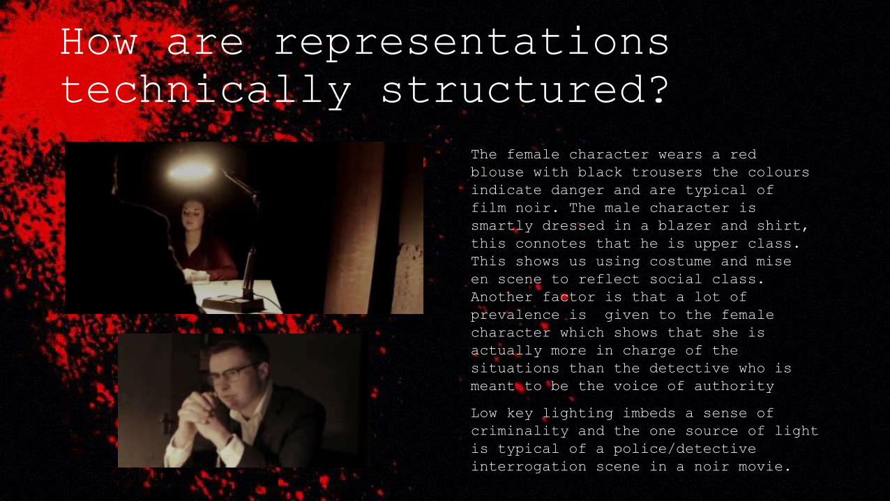
The female character wears a red
blouse with black trousers the colours
indicate danger and are typical of
film noir. The male character is
smartly dressed in a blazer and shirt,
this connotes that he is upper class.
This shows us using costume and mise
en scene to reflect social class.
Another factor is that a lot of
prevalence is given to the female
character which shows that she is
actually more in charge of the
situations than the detective who is
meant to be the voice of authority
Low key lighting imbeds a sense of
criminality and the one source of light
is typical of a police/detective
interrogation scene in a noir movie.
Representations of gender.
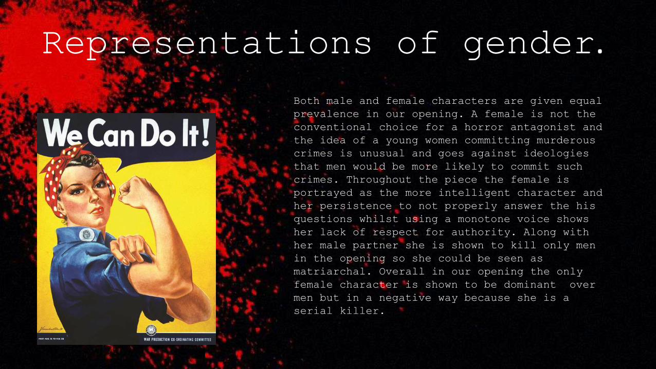
Both male and female characters are given equal
prevalence in our opening. A female is not the
conventional choice for a horror antagonist and
the idea of a young women committing murderous
crimes is unusual and goes against ideologies
that men would be more likely to commit such
crimes. Throughout the piece the female is
portrayed as the more intelligent character and
her persistence to not properly answer the his
questions whilst using a monotone voice shows
her lack of respect for authority. Along with
her male partner she is shown to kill only men
in the opening so she could be seen as
matriarchal. Overall in our opening the only
female character is shown to be dominant over
men but in a negative way because she is a
serial killer.
We challenged gender
associated ideologies with
our use of sound, mostly in
terms of conversation.
Although the male character
is asking the questions the
female is controlling the
conversation by answering in
a monotone voice and not
giving anything away. This
becomes more clear at the end
when the male character is
killed because the audience
realise that the female was
just stalling until her
accomplished arrived. The way
in which she ignores the
questions shows she is cold
hearted, its like Drake said
“you know a girl is hurt,
when she ignores you”.
Q3. What type
of institution
might
distribute your
film?
What type of distribution company
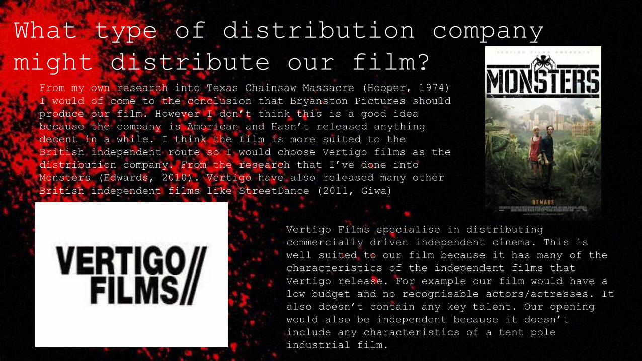
might distribute our film?From my own research into Texas Chainsaw Massacre (Hooper, 1974)
I would of come to the conclusion that Bryanston Pictures should
produce our film. However I don’t think this is a good idea
because the company is American and Hasn’t released anything
decent in a while. I think the film is more suited to the
British independent route so I would choose Vertigo films as the
distribution company. From the research that I’ve done into
Monsters (Edwards, 2010). Vertigo have also released many other
British independent films like StreetDance (2011, Giwa)
Vertigo Films specialise in distributing
commercially driven independent cinema. This is
well suited to our film because it has many of the
characteristics of the independent films that
Vertigo release. For example our film would have a
low budget and no recognisable actors/actresses. It
also doesn’t contain any key talent. Our opening
would also be independent because it doesn’t
include any characteristics of a tent pole
industrial film.
Vertigo have made use of innovative release strategies in the past to increase buzz and
revenue. Ideally our film would appeal to a mass audience but it might only appeal to a
niche audience because it’s a low budget independent horror, because of this I think it
could be trailed at some cinemas to get feedback and then if it does well it could be
released to further cinemas.
In terms of synergistic promotional activity I don’t think our film would be
able to attract a lot of interest because of its content. Other companies might not want
to be associated with horror content involving murders. Furthermore films like The
Hobbit (Jackson, 2012) were able to partake in synergistic activity with New Zealand Air
because the movie is internationally renowned and was shot in New Zealand. Our film
isn’t an internationally renowned tent pole film so I doubt it would attract such large
investments from companies like New Zealand Air.
A trailer would obviously be made and released because trailers cost very little
due to the content already being made. As well as this the film could be shown at film
festivals, independent films gain a lot of publicity as a result of being shown at these
festivals especially if they win awards. Utilising the opportunity that film festivals
present for a film like ours makes sense because one of the main purposes of film
festivals is to help the independent film making industry.
Guerrilla film distribution is a low budget way
of distributing promoting and marketing a film.
Vertigo have used Guerrilla film distribution in
the past on Monsters which was a huge success as
a British independent film. Moreover Guerrilla
distribution typically involves methods like
flyers, stickers posters and graffiti. However in
recent times it has developed and expanded and it
is now widely used on the internet. Instead of
just drawing attention locally, the film can be
networked through individual groups on Web 2.0.
In terms of using the internet for Guerrilla
distribution events can also be organised to
promote the film, like flash mobs for example.
Due to these factors a think Vertigo films could
use a viral campaign as a really useful way of
distributing the film and making it appeal to the
target audience and even people outside the
target age groups. Linking into earlier points
the use of Web 2.0 and a viral campaign could
attract a wider range of mainstream cinemas who
are prepared to show the film. Which would
broaden the films radius for being exhibited.
In the modern film industry social media
is very important for distributing both
industrial and independent films. Most modern
films have social media pages and do things like
run competitions, social media is used because
its free and its particularly useful for horror
films because most of the target audience will be
on at least one social media site.
Q6. What have you
learnt about
technologies from
the process of
constructing this
product?
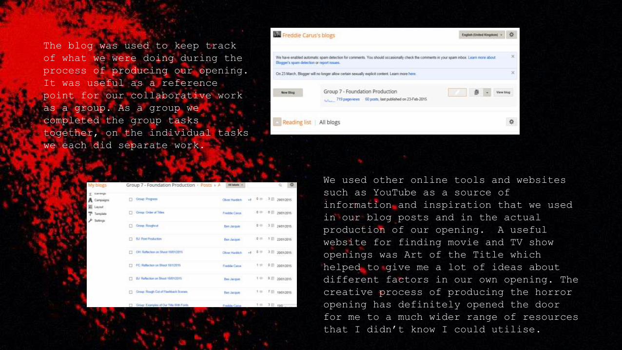
The blog was used to keep track
of what we were doing during the
process of producing our opening.
It was useful as a reference
point for our collaborative work
as a group. As a group we
completed the group tasks
together, on the individual tasks
we each did separate work.
We used other online tools and websites
such as YouTube as a source of
information and inspiration that we used
in our blog posts and in the actual
production of our opening. A useful
website for finding movie and TV show
openings was Art of the Title which
helped to give me a lot of ideas about
different factors in our own opening. The
creative process of producing the horror
opening has definitely opened the door
for me to a much wider range of resources
that I didn’t know I could utilise.
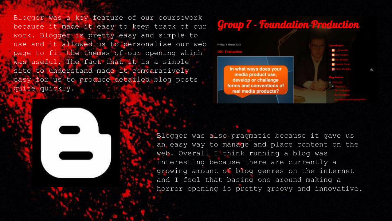
Blogger was a key feature of our coursework
because it made it easy to keep track of our
work. Blogger is pretty easy and simple to
use and it allowed us to personalise our web
page to fit the themes of our opening which
was useful. The fact that it is a simple
site to understand made it comparatively
easy for us to produce detailed blog posts
quite quickly.
Blogger was also pragmatic because it gave us
an easy way to manage and place content on the
web. Overall I think running a blog was
interesting because there are currently a
growing amount of blog genres on the internet
and I feel that basing one around making a
horror opening is pretty groovy and innovative.
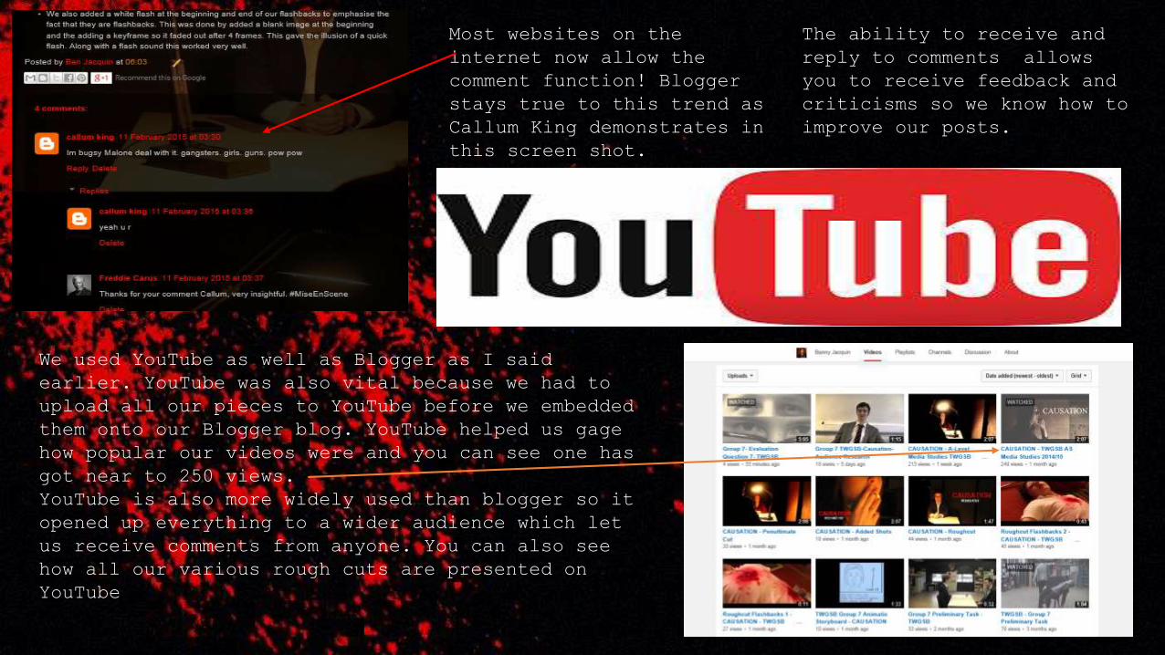
Most websites on the
internet now allow the
comment function! Blogger
stays true to this trend as
Callum King demonstrates in
this screen shot.
The ability to receive and
reply to comments allows
you to receive feedback and
criticisms so we know how to
improve our posts.
We used YouTube as well as Blogger as I said
earlier. YouTube was also vital because we had to
upload all our pieces to YouTube before we embedded
them onto our Blogger blog. YouTube helped us gage
how popular our videos were and you can see one has
got near to 250 views.
YouTube is also more widely used than blogger so it
opened up everything to a wider audience which let
us receive comments from anyone. You can also see
how all our various rough cuts are presented on
YouTube
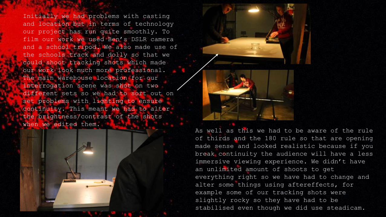
Initially we had problems with casting
and location but in terms of technology
our project has run quite smoothly. To
film our work we used Ben’s DSLR camera
and a school tripod. We also made use of
the schools track and dolly so that we
could shoot tracking shots which made
our work look much more professional.
The main warehouse location for our
interrogation scene was shot on two
different sets so we had to sort out on
set problems with lighting to ensure
continuity. This meant we had to alter
the brightness/contrast of the shots
when we edited them.
As well as this we had to be aware of the rule
of thirds and the 180 rule so that are opening
made sense and looked realistic because if you
break continuity the audience will have a less
immersive viewing experience. We didn’t have
an unlimited amount of shoots to get
everything right so we have had to change and
alter some things using aftereffects, for
example some of our tracking shots were
slightly rocky so they have had to be
stabilised even though we did use steadicam.
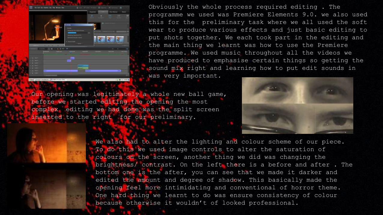
Obviously the whole process required editing . The
programme we used was Premiere Elements 9.0. we also used
this for the preliminary task where we all used the soft
wear to produce various effects and just basic editing to
put shots together. We each took part in the editing and
the main thing we learnt was how to use the Premiere
programme. We used music throughout all the videos we
have produced to emphasise certain things so getting the
sound mix right and learning how to put edit sounds in
was very important.
Our opening was legitimately a whole new ball game,
before we started editing the opening the most
complex editing we had done was the split screen
inserted to the right for our preliminary.
We also had to alter the lighting and colour scheme of our piece.
To do this we used image controls to alter the saturation of
colours on the screen, another thing we did was changing the
brightness/ contrast. On the left there is a before and after . The
bottom one is the after, you can see that we made it darker and
edited the amount and degree of shadow. This basically made the
opening feel more intimidating and conventional of horror theme.
One hard thing we learnt to do was ensure consistency of colour
because otherwise it wouldn’t of looked professional.
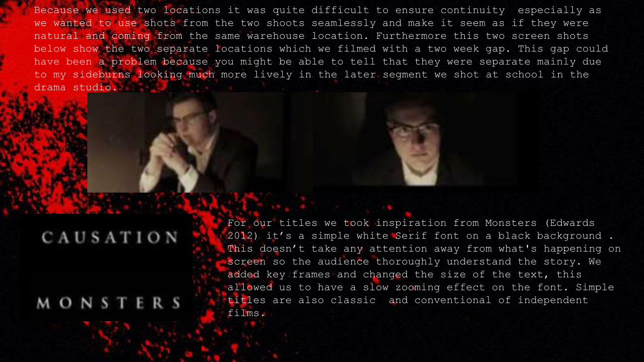
Because we used two locations it was quite difficult to ensure continuity especially as
we wanted to use shots from the two shoots seamlessly and make it seem as if they were
natural and coming from the same warehouse location. Furthermore this two screen shots
below show the two separate locations which we filmed with a two week gap. This gap could
have been a problem because you might be able to tell that they were separate mainly due
to my sideburns looking much more lively in the later segment we shot at school in the
drama studio.
For our titles we took inspiration from Monsters (Edwards
2012) it’s a simple white Serif font on a black background .
This doesn’t take any attention away from what's happening on
screen so the audience thoroughly understand the story. We
added key frames and changed the size of the text, this
allowed us to have a slow zooming effect on the font. Simple
titles are also classic and conventional of independent
films.


