44
SPSS Session I Preparing your data for statistical analysis ASK WEEK February 2010 Christine Gregory
SPSS
Session I Preparing your data for statistical analysis
ASK WEEK
February 2010
Christine Gregory
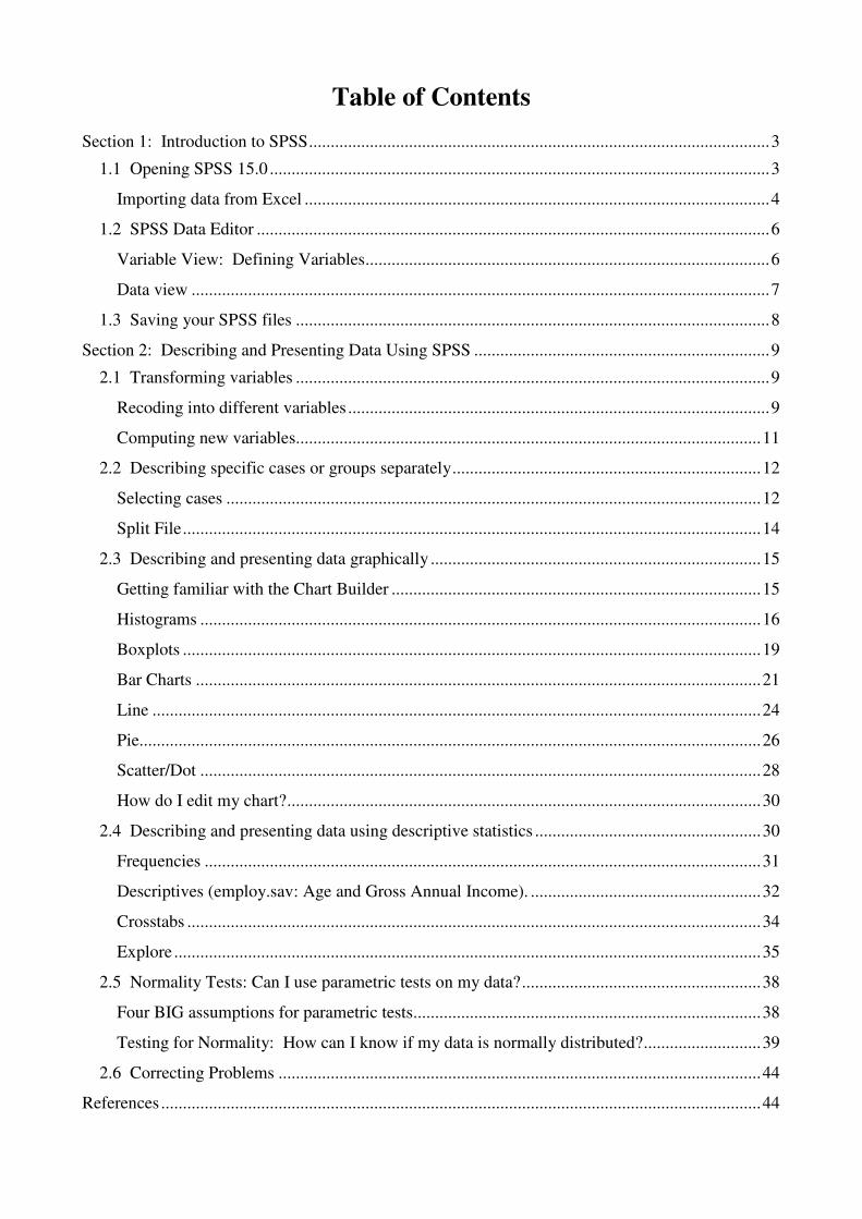
Table of Contents
Section 1: Introduction to SPSS .......................................................................................................... 3
1.1 Opening SPSS 15.0 ................................................................................................................... 3
Importing data from Excel ........................................................................................................... 4
1.2 SPSS Data Editor ...................................................................................................................... 6
Variable View: Defining Variables ............................................................................................. 6
Data view ..................................................................................................................................... 7
1.3 Saving your SPSS files ............................................................................................................. 8
Section 2: Describing and Presenting Data Using SPSS .................................................................... 9
2.1 Transforming variables ............................................................................................................. 9
Recoding into different variables ................................................................................................. 9
Computing new variables........................................................................................................... 11
2.2 Describing specific cases or groups separately ....................................................................... 12
Selecting cases ........................................................................................................................... 12
Split File ..................................................................................................................................... 14
2.3 Describing and presenting data graphically ............................................................................ 15
Getting familiar with the Chart Builder ..................................................................................... 15
Histograms ................................................................................................................................. 16
Boxplots ..................................................................................................................................... 19
Bar Charts .................................................................................................................................. 21
Line ............................................................................................................................................ 24
Pie............................................................................................................................................... 26
Scatter/Dot ................................................................................................................................. 28
How do I edit my chart? ............................................................................................................. 30
2.4 Describing and presenting data using descriptive statistics .................................................... 30
Frequencies ................................................................................................................................ 31
Descriptives (employ.sav: Age and Gross Annual Income). ..................................................... 32
Crosstabs .................................................................................................................................... 34
Explore ....................................................................................................................................... 35
2.5 Normality Tests: Can I use parametric tests on my data? ....................................................... 38
Four BIG assumptions for parametric tests................................................................................ 38
Testing for Normality: How can I know if my data is normally distributed? ........................... 39
2.6 Correcting Problems ............................................................................................................... 44
References .......................................................................................................................................... 44
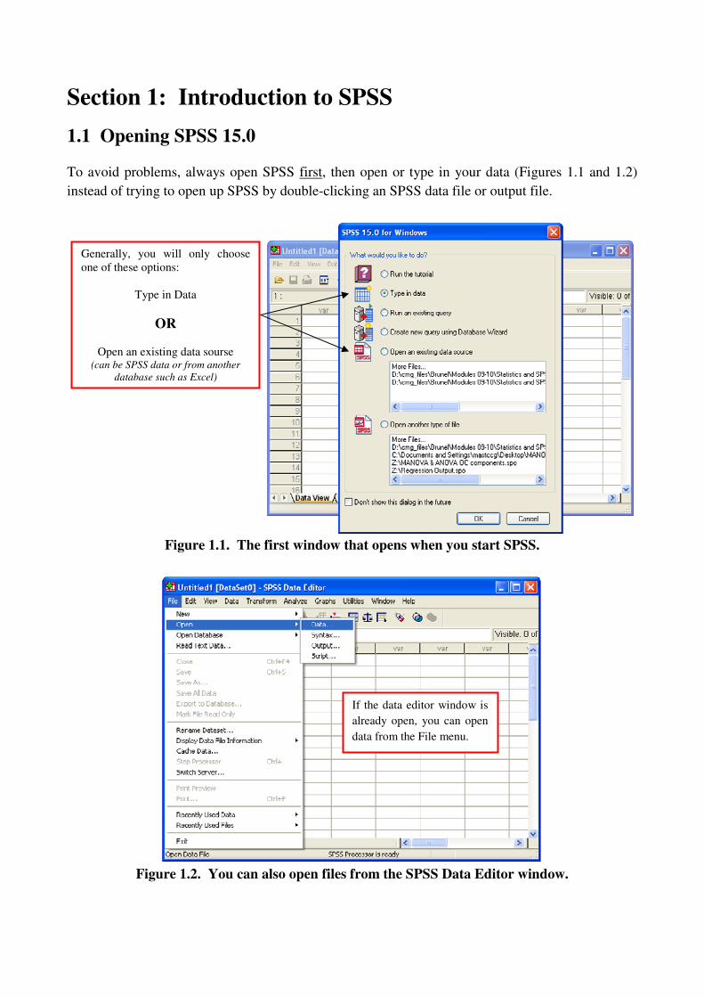
Section 1: Introduction to SPSS
1.1 Opening SPSS 15.0
To avoid problems, always open SPSS first, then open or type in your data (Figures 1.1 and 1.2)
instead of trying to open up SPSS by double-clicking an SPSS data file or output file.
Figure 1.1. The first window that opens when you start SPSS.
Figure 1.2. You can also open files from the SPSS Data Editor window.
If the data editor window is
already open, you can open
data from the File menu.
Generally, you will only choose
one of these options:
Type in Data
OR
Open an existing data sourse (can be SPSS data or from another
database such as Excel)

After you have either opened an existing data file or you save a new file, SPSS automatically opens
an output file (Figure 1.3). This is where SPSS keeps a record of everything you do (called a log);
it is also where all analysis are stored and can be viewed. If you have an existing output file you
would like to use, then close the new output file created by SPSS and open your output via the File
menu (see Figure 1.2).
Figure 1.3. Output file automatically created by SPSS.
Importing data from Excel
Say some data has been stored in an Excel file named employ.xls, as shown in Figure 1.3 (the file
extension must be .xls as SPSS will NOT read an Excel 2007 file, .xlsx or .xlsm). In employ.xls the
column headings are the variable names. Note that variable names MUST NOT contain any spaces
or special characters (except _ ) and MUST begin with a letter (whether imported or typed directly
into SPSS).
Using either method above (Figure 1.1 or 1.2), choose the option to open an existing data source. In
the dialog box (Figure 1.5) make sure that you select “All Files (*.)” from the Files of Type drop-
down menu, then find your Excel file and click Open.
Figure 1.4. An example of an excel data file (employ.xls) ready to be imported into SPSS.
I saved a data file called test.sav and
it was recorded in the log here. Everything I do will be
seen in outline form in
this left window.

Figure 1.5. Locate your excel file (.xls ONLY).
From the next dialog box (Figure 1.6), check Read variable names from the first row of data and
identify the Worksheet which contains your data. If the range which SPSS shows (e.g. [A1:AC71]
in Figure 1.6) is different from the range of your data, then specify the correct Range in the space
provided; otherwise leave it blank. Click OK.
Figure 1.6. Specify where your data is (worksheet and range) in your excel file.
The data should appear in the SPSS Data Editor, with the variable names as the column headings.
Figure 1.7 shows the Data View (which should look similar to the Excel spreadsheet) and the
Variable View after importing. We will look at the Data View and Variable View in the Section 1.2.
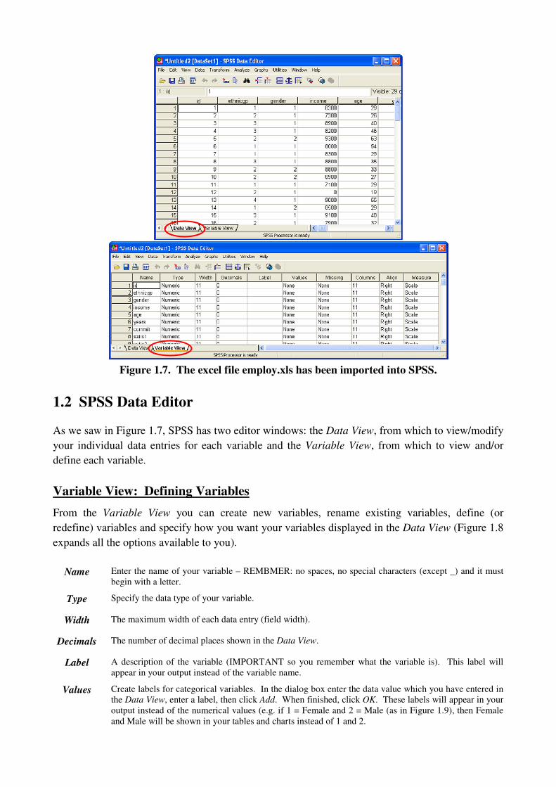
Figure 1.7. The excel file employ.xls has been imported into SPSS.
1.2 SPSS Data Editor
As we saw in Figure 1.7, SPSS has two editor windows: the Data View, from which to view/modify
your individual data entries for each variable and the Variable View, from which to view and/or
define each variable.
Variable View: Defining Variables
From the Variable View you can create new variables, rename existing variables, define (or
redefine) variables and specify how you want your variables displayed in the Data View (Figure 1.8
expands all the options available to you).
Name Enter the name of your variable – REMBMER: no spaces, no special characters (except _) and it must
begin with a letter.
Type Specify the data type of your variable.
Width The maximum width of each data entry (field width).
Decimals The number of decimal places shown in the Data View.
Label A description of the variable (IMPORTANT so you remember what the variable is). This label will
appear in your output instead of the variable name.
Values Create labels for categorical variables. In the dialog box enter the data value which you have entered in
the Data View, enter a label, then click Add. When finished, click OK. These labels will appear in your
output instead of the numerical values (e.g. if 1 = Female and 2 = Male (as in Figure 1.9), then Female
and Male will be shown in your tables and charts instead of 1 and 2.
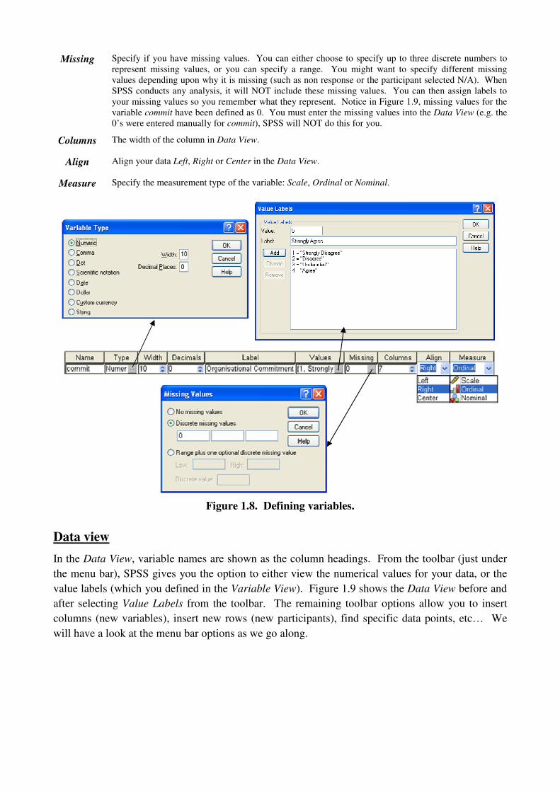
Missing Specify if you have missing values. You can either choose to specify up to three discrete numbers to
represent missing values, or you can specify a range. You might want to specify different missing
values depending upon why it is missing (such as non response or the participant selected N/A). When
SPSS conducts any analysis, it will NOT include these missing values. You can then assign labels to
your missing values so you remember what they represent. Notice in Figure 1.9, missing values for the
variable commit have been defined as 0. You must enter the missing values into the Data View (e.g. the
0’s were entered manually for commit), SPSS will NOT do this for you.
Columns The width of the column in Data View.
Align Align your data Left, Right or Center in the Data View.
Measure Specify the measurement type of the variable: Scale, Ordinal or Nominal.
Figure 1.8. Defining variables.
Data view
In the Data View, variable names are shown as the column headings. From the toolbar (just under
the menu bar), SPSS gives you the option to either view the numerical values for your data, or the
value labels (which you defined in the Variable View). Figure 1.9 shows the Data View before and
after selecting Value Labels from the toolbar. The remaining toolbar options allow you to insert
columns (new variables), insert new rows (new participants), find specific data points, etc… We
will have a look at the menu bar options as we go along.
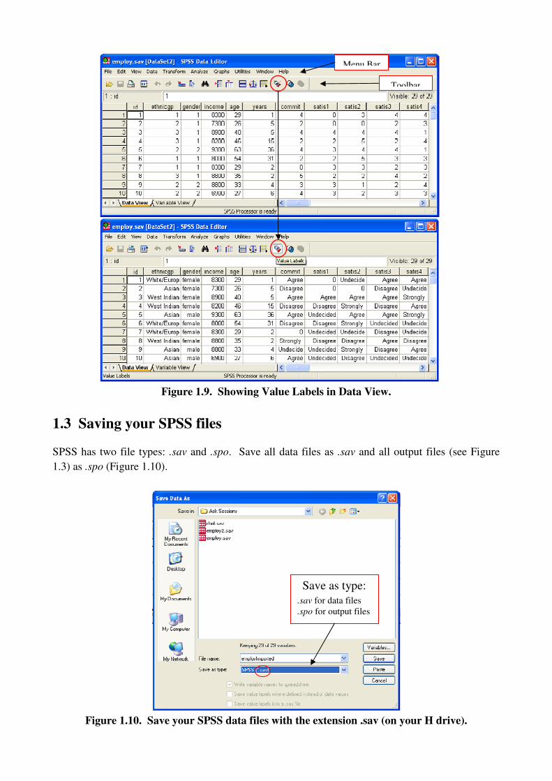
Figure 1.9. Showing Value Labels in Data View.
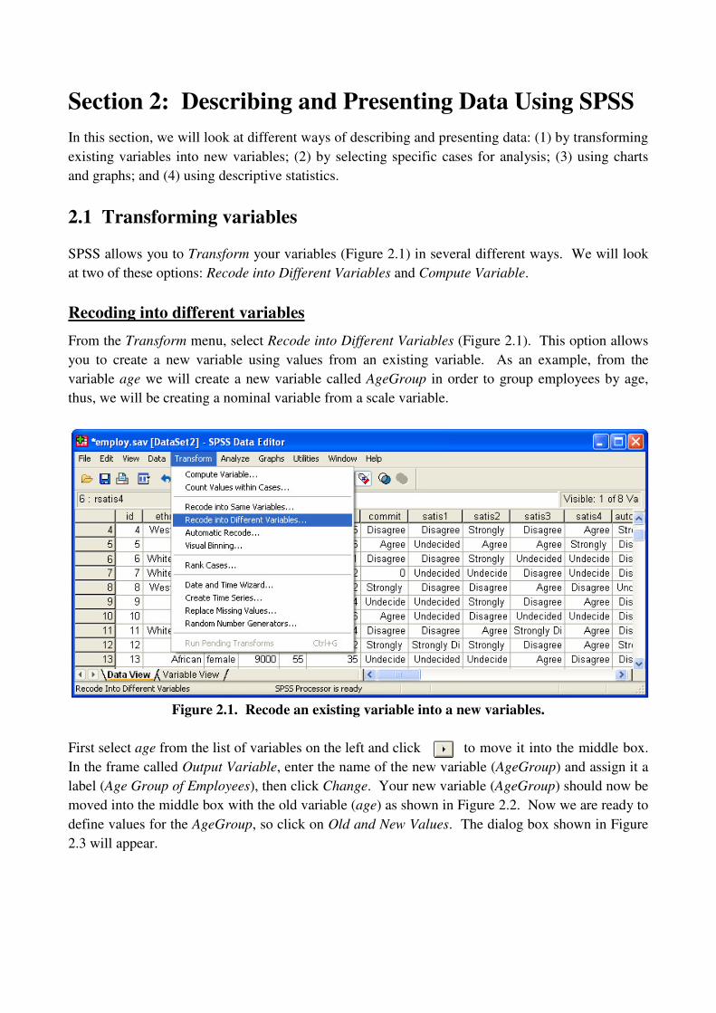
1.3 Saving your SPSS files
SPSS has two file types: .sav and .spo. Save all data files as .sav and all output files (see Figure
1.3) as .spo (Figure 1.10).
Figure 1.10. Save your SPSS data files with the extension .sav (on your H drive).
Save as type:
.sav for data files
.spo for output files
Menu Bar
Toolbar
Section 2: Describing and Presenting Data Using SPSS
In this section, we will look at different ways of describing and presenting data: (1) by transforming
existing variables into new variables; (2) by selecting specific cases for analysis; (3) using charts
and graphs; and (4) using descriptive statistics.
2.1 Transforming variables
SPSS allows you to Transform your variables (Figure 2.1) in several different ways. We will look
at two of these options: Recode into Different Variables and Compute Variable.
Recoding into different variables
From the Transform menu, select Recode into Different Variables (Figure 2.1). This option allows
you to create a new variable using values from an existing variable. As an example, from the
variable age we will create a new variable called AgeGroup in order to group employees by age,
thus, we will be creating a nominal variable from a scale variable.
Figure 2.1. Recode an existing variable into a new variables.
First select age from the list of variables on the left and click to move it into the middle box.
In the frame called Output Variable, enter the name of the new variable (AgeGroup) and assign it a
label (Age Group of Employees), then click Change. Your new variable (AgeGroup) should now be
moved into the middle box with the old variable (age) as shown in Figure 2.2. Now we are ready to
define values for the AgeGroup, so click on Old and New Values. The dialog box shown in Figure
2.3 will appear.

Figure 2.2. Assign a name to the new variable (AgeGroup),
label it (Age Group of Employees) and select Change.
Figure 2.3. Assign values to the new variable (or reassign values to an existing variable).
In this dialog box (Figure 2.3) we will convert our scale variable (age) into a nominal (categorical)
variable (AgeGroup) by creating age groups. First, select Range, LOWEST through value (marked
1). In the space provided enter 25, select Value from the New Value frame and enter 1, then click
Add. You’ve just created the first age group and defined it as 25 years or younger. The next age
group will be a range (ages 26 through 25). Select Range (marked 2) and enter 26 in the first space
and 35 in the space below. Select Value and enter 2, then click Add. Repeat that step to create
groups 3 (ages 36 through 45) and 4 (ages 46 through 55). Finally, select Range, value through
HIGHEST (marked 3) and enter 56 in the space provided (this group will be defined as age 56 or
older). Select Value and enter 5, then click Add. Once you have all five age groups defined and
visible in the box labelled Old -> New, click Continue (note that in Figure 2.3 the age group 5 has
not been added to the list yet). You will be sent back to the first dialog box (Figure 2.2); click OK.
From the Variable View we can define AgeGroup (Figure 2.6). SPSS automatically defines the new
variable as scale, so make sure to change the Measure if your new variable is Nominal or Ordinal
and to assign Value Labels if appropriate.
1
2
3

Computing new variables
From the Transform menu (Figure 2.4) select Compute Variable. The dialog box shown in Figure
2.5 allows you to compute a new variable from an existing variable based on a user-defined
formula.
Figure 2.4. Compute a new Variable.
First, in the space labelled Target Variable specify the name of the new variable you wish to
compute. Define how the new variable will be computed in the space labelled Numeric Expression
by using any of the functions selected from Function group and Functions and Special Variables.
A textbox below the number pad gives a brief description of the function you’ve selected.
Figure 2.5. Compute a new variable called ‘MeanSatisScore’ as the mean of all four
satisfaction scores, for each of N participants. Thus, MeanSatisScore will have N rows.

As an example, we will compute a new variable to be the mean of all four satisfaction score
variables. In other words, for each participant, we will compute the average of their four
satisfaction scores. First, let’s name the new variable MeanSatisScore. From the Function group
list select Statistical, then select Mean from Functions and Special Variables and click . The
function MEAN(?,?) should now be in the Numeric Expression box. This function has two ?’s
separated by commas because it requires AT LEAST two variables, and each variable must be
separated by a comma. We want four variables. Remove ?,? from the argument of MEAN and
select satis1 from the list of variables on the left, then click . Repeat this last step for each of
satis2, satis3 and satis4, separating each variable by a comma. Now click OK. From Variable
View we can define the variable MeanSatisScore which we just computed (make sure to label it).
Figure 2.6. New variables AgeGroup and MeanSatisScore.
2.2 Describing specific cases or groups separately
Selecting cases
What if you just want to look at a specific category of a nominal or ordinal variable or a specific
range of a scale variable? SPSS allows you to select certain cases using Select Cases from the Data
menu (Figure 2.7).
Figure 2.7. Select Cases (or rows) of the data to work with.
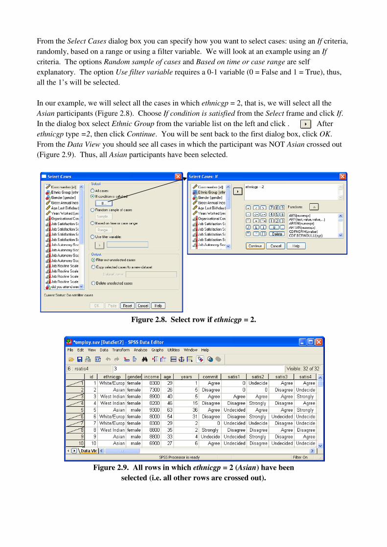
From the Select Cases dialog box you can specify how you want to select cases: using an If criteria,
randomly, based on a range or using a filter variable. We will look at an example using an If
criteria. The options Random sample of cases and Based on time or case range are self
explanatory. The option Use filter variable requires a 0-1 variable (0 = False and 1 = True), thus,
all the 1’s will be selected.
In our example, we will select all the cases in which ethnicgp = 2, that is, we will select all the
Asian participants (Figure 2.8). Choose If condition is satisfied from the Select frame and click If.
In the dialog box select Ethnic Group from the variable list on the left and click . After
ethnicgp type =2, then click Continue. You will be sent back to the first dialog box, click OK.
From the Data View you should see all cases in which the participant was NOT Asian crossed out
(Figure 2.9). Thus, all Asian participants have been selected.
Figure 2.8. Select row if ethnicgp = 2.
Figure 2.9. All rows in which ethnicgp = 2 (Asian) have been
selected (i.e. all other rows are crossed out).
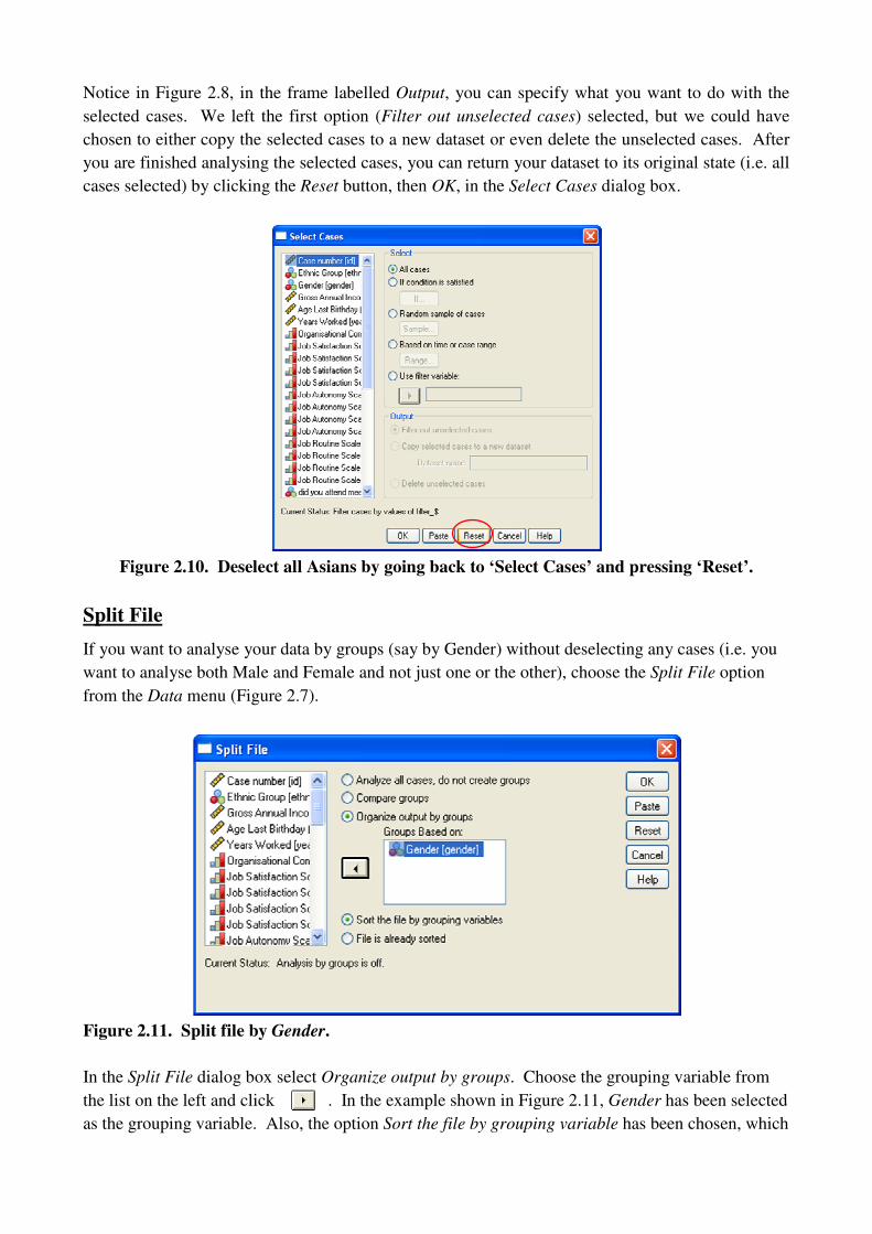
Notice in Figure 2.8, in the frame labelled Output, you can specify what you want to do with the
selected cases. We left the first option (Filter out unselected cases) selected, but we could have
chosen to either copy the selected cases to a new dataset or even delete the unselected cases. After
you are finished analysing the selected cases, you can return your dataset to its original state (i.e. all
cases selected) by clicking the Reset button, then OK, in the Select Cases dialog box.
Figure 2.10. Deselect all Asians by going back to ‘Select Cases’ and pressing ‘Reset’.
Split File
If you want to analyse your data by groups (say by Gender) without deselecting any cases (i.e. you
want to analyse both Male and Female and not just one or the other), choose the Split File option
from the Data menu (Figure 2.7).
Figure 2.11. Split file by Gender.
In the Split File dialog box select Organize output by groups. Choose the grouping variable from
the list on the left and click . In the example shown in Figure 2.11, Gender has been selected
as the grouping variable. Also, the option Sort the file by grouping variable has been chosen, which

means that SPSS will do just that, i.e. group all the Females together (all the 1’s), followed by all
the Males (all the 2’s) in the Data View. If you DON’T want SPSS to sort your data by the
grouping variable then choose File is already sorted, then click OK.
2.3 Describing and presenting data graphically
In this section we will look at (most of) the ways in which SPSS allows you to describe and present
data graphically using the Chart Builder. Before you get started with graphs and charts, consider
these helpful tips on presenting data from Tuft (2001) (cited in [1], p.88):
Charts and graphs should…
1. Show/reveal the data. In particular, help make sense of large data sets.
2. Get the reader thinking critically about your data.
3. Not misrepresent the data.
4. Display the maximum information with minimum ink.
In other words, keep it simple and straight forward. Don’t get too crazy with colours, patterns and
designs. You want to reader to be able to focus on your data, with minimal distractions.
Getting familiar with the Chart Builder
From the Graphs menu select Chart Builder (Figure 2.12). In the Chart Builder window (Figure
2.13), just to the right of the list of variables is the window in which you build your chart by
selecting from the available options. In this tutorial, we will be building charts using the chart
Gallery. From the Gallery, from the available charts, we will be looking at those you are most
likely to use: Histogram, Boxplot, Bar, Line, Pie and Scatter/Dot. For each type of chart, we will
look at an example; the data file (.sav) and variables used will be specified in ( ). We will finish off
by looking at how we can edit the charts we create.
Figure 2.12. Chart Builder.

Figure 2.13. Getting familiar with the chart builder.
Histograms
SPSS offers four types of Histograms (Figure 2.14). We will be looking at three: the Simple
Histogram, Stacked Histogram and the Population Pyramid.
Figure 2.14. Histogram Chart Gallery.
Simple Histogram Stacked Histogram
Frequency Polygon Population Pyramid
The “Element Properties”
window differs depending
upon the chart selected.
We will see it in more detail
as we go along.

Simple Histogram (employ.sav: Gross Annual Income).
x-axis: Continuous variable (Gross Annual Income).
y-axis: Select from statistic drop-down menu in “Element Properties” (Figure 2.16); for this
example, choose Histogram.
Other options:
Bar Style: Here, Bar has been selected.
Display normal curve: Check this if you want to display the normal curve with your
histogram.
Set Parameters: Either let SPSS create bins for your histogram automatically, or define them
yourself.
* After changing Element Properties make sure to click Apply.
Figure 2.15. Simple histogram before (Gallery view) and after (SPSS output).
Figure 2.16. Element Properties window for a Simple Histogram.

Stacked Histogram (employ.sav: Gross Annual Income by Ethnic Group).
x-axis: Continuous variable (Gross Annual Income).
y-axis: Select from statistic drop-down menu in “Element Properties” (Figure 2.17); for this
example, choose Histogram.
Set color: Categorical variable (Ethnic Group).
Other options: Same as for the Simple Histogram.
Figure 2.17. Stacked histogram before (Gallery view) and after (SPSS output).
Population Pyramid (employ.sav: Gross Annual Income split by Gender).
Distribution Variable: Continuous variable (Gross Annual Income)
Split Variable: Chose a dichotomous variable (fancy term for categorical variable with ONLY
2 categories) (Gender).
Other Options:
Display normal curve.
Other Element Properties: View the Element Properties window to see all of your options.
Figure 2.18. Population pyramid before (Gallery view) and after (SPSS output).
Boxplots
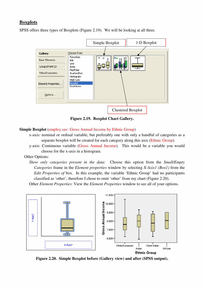
SPSS offers three types of Boxplots (Figure 2.19). We will be looking at all three.
Figure 2.19. Boxplot Chart Gallery.
Simple Boxplot (employ.sav: Gross Annual Income by Ethnic Group)
x-axis: nominal or ordinal variable, but preferably one with only a handful of categories as a
separate boxplot will be created for each category along this axis (Ethnic Group).
y-axis: Continuous variable (Gross Annual Income). This would be a variable you would
choose for the x-axis in a histogram.
Other Options:
Show only categories present in the data: Choose this option from the Small/Empty
Categories frame in the Element properties window by selecting X-Axis1 (Box1) from the
Edit Properties of box. In this example, the variable ‘Ethnic Group’ had no participants
classified as ‘other’, therefore I chose to omit ‘other’ from my chart (Figure 2.20).
Other Element Properties: View the Element Properties window to see all of your options.
Figure 2.20. Simple Boxplot before (Gallery view) and after (SPSS output).
Simple Boxplot 1-D Boxplot
Clustered Boxplot

Clustered (employ.sav: Gross Annual Income by Ethnic Group, clustered by Gender)
x-axis: Categorical variable (Ethnic Group).
y-axis: Continuous variable (Gross Annual Income). This would be a variable you would
choose for the x-axis in a histogram.
Cluster: Categorical variable (Gender).
Other Options:
Show only categories present in the data: In this example this option has been selected as
before.
Other Element Properties: View the Element Properties window to see all of your options.
Figure 2.21. Clustered Boxplot before (Gallery view) and after (SPSS output).
1-D Boxplot (employ.sav: Age)
A 1-D Boxplot is essentially an alternative to a histogram.
x-axis: Continuous variable (Age). This would be a variable you would choose for the x-axis
in a histogram.
Figure 2.22. 1-D Boxplot before (Gallery view) and after (SPSS output).

Bar Charts
SPSS offers eight types of Bar charts (Figure 2.22). We will be looking at four of them: Simple
Bar, Simple Error Bar, Clustered Bar and Stacked Bar.
Figure 2.23. Bar Chart Gallery.
Simple Bar
A simple bar chart can be used to describe and present data in which the variables are either
independent or related. We will see the difference between independent and related variables as we
go along.
Independent Variables (chol.sav: cholesterol level grouped by smoker).
In this case, there will be one grouping variable on the x-axis. In this example, cholesterol level
(grouped by smoker) is independent because the same participant cannot be both a smoker and a
non-smoker.
x-axis: Independent, categorical variable (smoker).
y-axis: Dependent variable (cholesterol level). Select the statistic to be plotted for this
variable from the Statistic drop-down menu in the Element Properties window. Be
mindful of the statistic you select for your dependent variable – use common sense.
That is, don’t try to chart the mean of a dichotomous variable like gender.
Other Options:
Display Error Bars: If you have chosen a measure of central tendency as the Statistic for the
variable along the y-axis, then you can choose to display error bars at a specified
confidence level for that Statistic. In this example, the Mean was selected; the error
bars represent the 95% confidence level for the mean.
Other Element Properties: View the Element Properties window to see all of your options.
Clustered Bar Stacked Bar
Simple Bar Simple Error Bar

Figure 2.24. Simple Bar (Independent) before (Gallery view) and after (SPSS output).
Related Variables (Hiccups.sav: Drinking, Gargling, Breath and Sugar (data file adapted from [1])).
In this case, there will be multiple variables along the x-axis, where the same group of participants
was used to collect the data for each variable. This will hopefully become more clear as we do an
example. In our hypothetical example, the same group of participants tried all four methods to try
and get rid of their hiccups (drinking water from a cup backwards, gargling saltwater, holding their
breath and eating a spoonful of sugar). After each method, the number of hiccups per minute were
recorded.
x-axis: Leave this axis alone, it will take care of itself.
y-axis: Select multiple, related, variables (Drinking, Gargling, Breath and Sugar). A box will
pop up that shows SUMMARY along the y-axis and INDEX along the x-axis, just
click OK.
Other Options:
Statistic: Select the summary statistic from the Statistic drop down menu in the Element
Properties window (for this example Mean was selected).
Display Error Bars: The same as described for independent variables.
Other Element Properties: View the Element Properties window to see all of your options.
Figure 2.25. Simple Bar (Related) before (Gallery view) and after (SPSS output).
Simple Error Bar
An alternative representation of a Simple Bar chart. Thus, follow the same steps as above.
Clustered Bar
Just as with the simple bar, a clustered bar chart can be used to describe and present data in which
the variables are either independent or related. Again, we will see the difference between
independent and related variables as we go along.
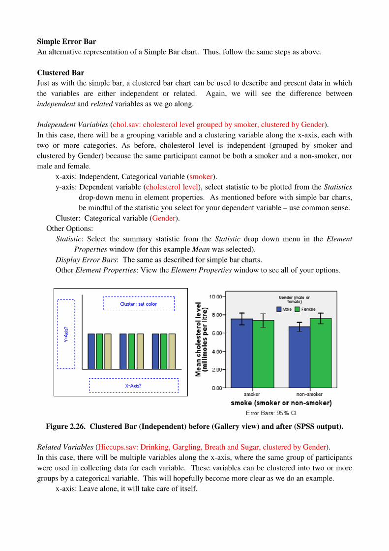
Independent Variables (chol.sav: cholesterol level grouped by smoker, clustered by Gender).
In this case, there will be a grouping variable and a clustering variable along the x-axis, each with
two or more categories. As before, cholesterol level is independent (grouped by smoker and
clustered by Gender) because the same participant cannot be both a smoker and a non-smoker, nor
male and female.
x-axis: Independent, Categorical variable (smoker).
y-axis: Dependent variable (cholesterol level), select statistic to be plotted from the Statistics
drop-down menu in element properties. As mentioned before with simple bar charts,
be mindful of the statistic you select for your dependent variable – use common sense.
Cluster: Categorical variable (Gender).
Other Options:
Statistic: Select the summary statistic from the Statistic drop down menu in the Element
Properties window (for this example Mean was selected).
Display Error Bars: The same as described for simple bar charts.
Other Element Properties: View the Element Properties window to see all of your options.
Figure 2.26. Clustered Bar (Independent) before (Gallery view) and after (SPSS output).
Related Variables (Hiccups.sav: Drinking, Gargling, Breath and Sugar, clustered by Gender).
In this case, there will be multiple variables along the x-axis, where the same group of participants
were used in collecting data for each variable. These variables can be clustered into two or more
groups by a categorical variable. This will hopefully become more clear as we do an example.
x-axis: Leave alone, it will take care of itself.
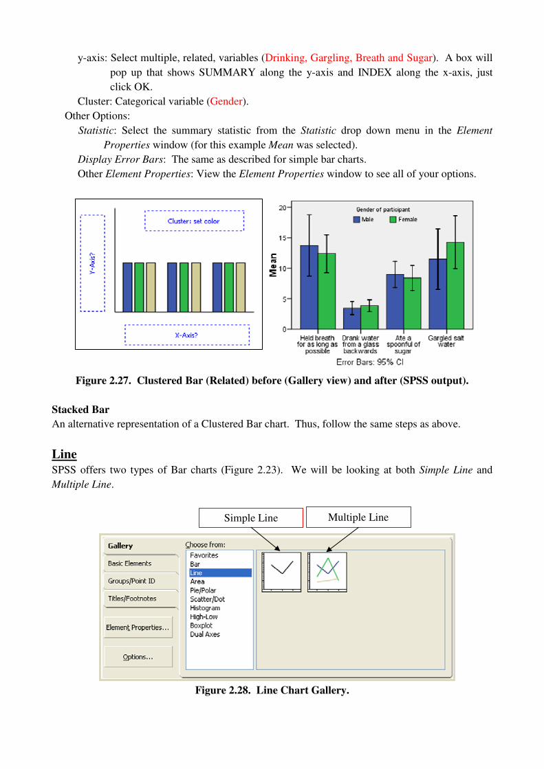
y-axis: Select multiple, related, variables (Drinking, Gargling, Breath and Sugar). A box will
pop up that shows SUMMARY along the y-axis and INDEX along the x-axis, just
click OK.
Cluster: Categorical variable (Gender).
Other Options:
Statistic: Select the summary statistic from the Statistic drop down menu in the Element
Properties window (for this example Mean was selected).
Display Error Bars: The same as described for simple bar charts.
Other Element Properties: View the Element Properties window to see all of your options.
Figure 2.27. Clustered Bar (Related) before (Gallery view) and after (SPSS output).
Stacked Bar
An alternative representation of a Clustered Bar chart. Thus, follow the same steps as above.
Line
SPSS offers two types of Bar charts (Figure 2.23). We will be looking at both Simple Line and
Multiple Line.
Figure 2.28. Line Chart Gallery.
Simple Line Multiple Line
Line charts are an alternative representation of bar charts, thus, they can be used to describe and
present data in which the variables are either independent or related. As the process is almost
identical, it will not be explained in detail. Line charts are preferred to bar charts when the
grouping variable along the x-axis has a larger number of categories. The precise value of “larger
number” is up to you. Looking variables you want to plot, what do you think represents the data
better, a bar chart or a line chart? If you don’t know, do both and consider using the one which
communicates the data most clearly for the reader.
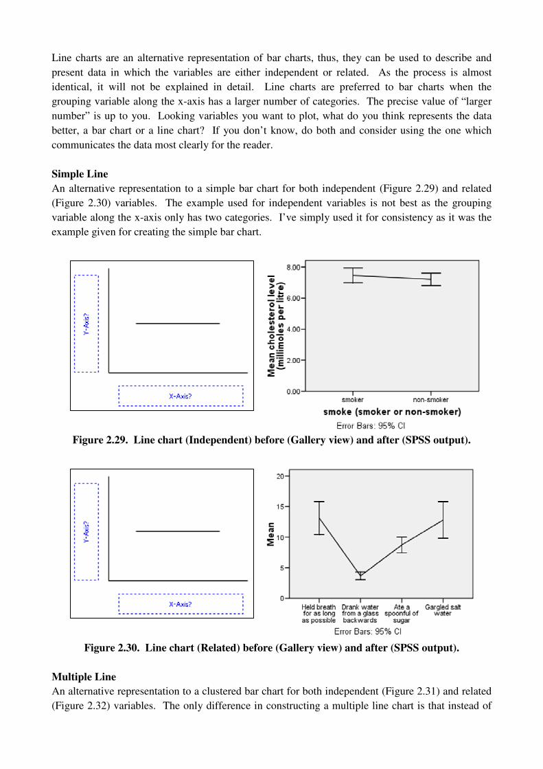
Simple Line
An alternative representation to a simple bar chart for both independent (Figure 2.29) and related
(Figure 2.30) variables. The example used for independent variables is not best as the grouping
variable along the x-axis only has two categories. I’ve simply used it for consistency as it was the
example given for creating the simple bar chart.
Figure 2.29. Line chart (Independent) before (Gallery view) and after (SPSS output).
Figure 2.30. Line chart (Related) before (Gallery view) and after (SPSS output).
Multiple Line
An alternative representation to a clustered bar chart for both independent (Figure 2.31) and related
(Figure 2.32) variables. The only difference in constructing a multiple line chart is that instead of
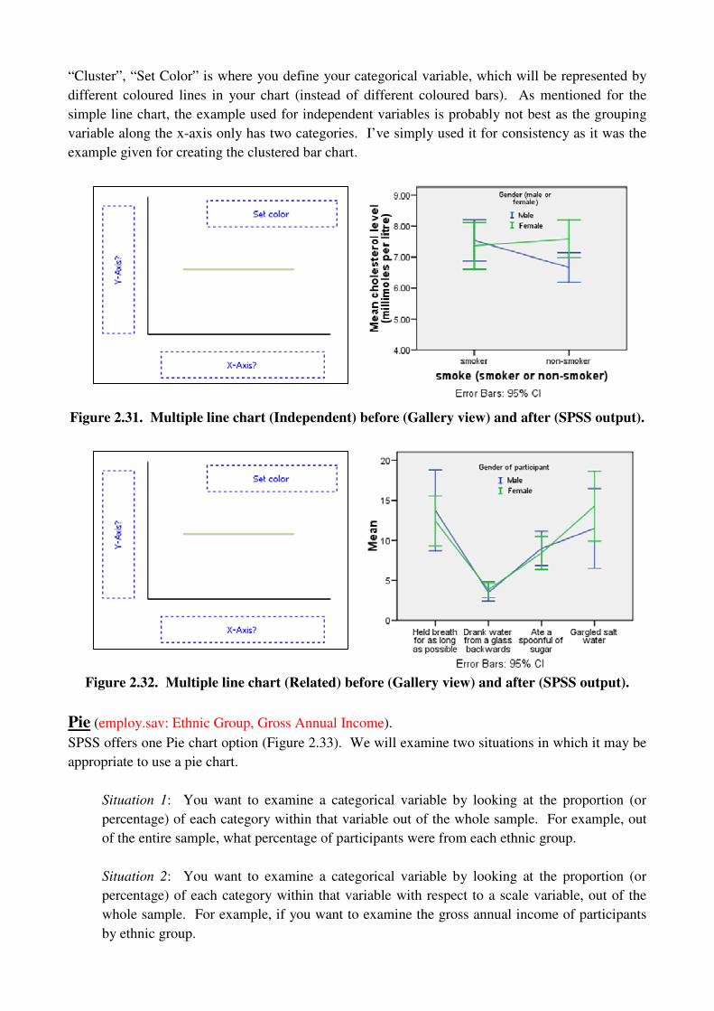
“Cluster”, “Set Color” is where you define your categorical variable, which will be represented by
different coloured lines in your chart (instead of different coloured bars). As mentioned for the
simple line chart, the example used for independent variables is probably not best as the grouping
variable along the x-axis only has two categories. I’ve simply used it for consistency as it was the
example given for creating the clustered bar chart.
Figure 2.31. Multiple line chart (Independent) before (Gallery view) and after (SPSS output).
Figure 2.32. Multiple line chart (Related) before (Gallery view) and after (SPSS output).
Pie (employ.sav: Ethnic Group, Gross Annual Income).
SPSS offers one Pie chart option (Figure 2.33). We will examine two situations in which it may be
appropriate to use a pie chart.
Situation 1: You want to examine a categorical variable by looking at the proportion (or
percentage) of each category within that variable out of the whole sample. For example, out
of the entire sample, what percentage of participants were from each ethnic group.
Situation 2: You want to examine a categorical variable by looking at the proportion (or
percentage) of each category within that variable with respect to a scale variable, out of the
whole sample. For example, if you want to examine the gross annual income of participants
by ethnic group.
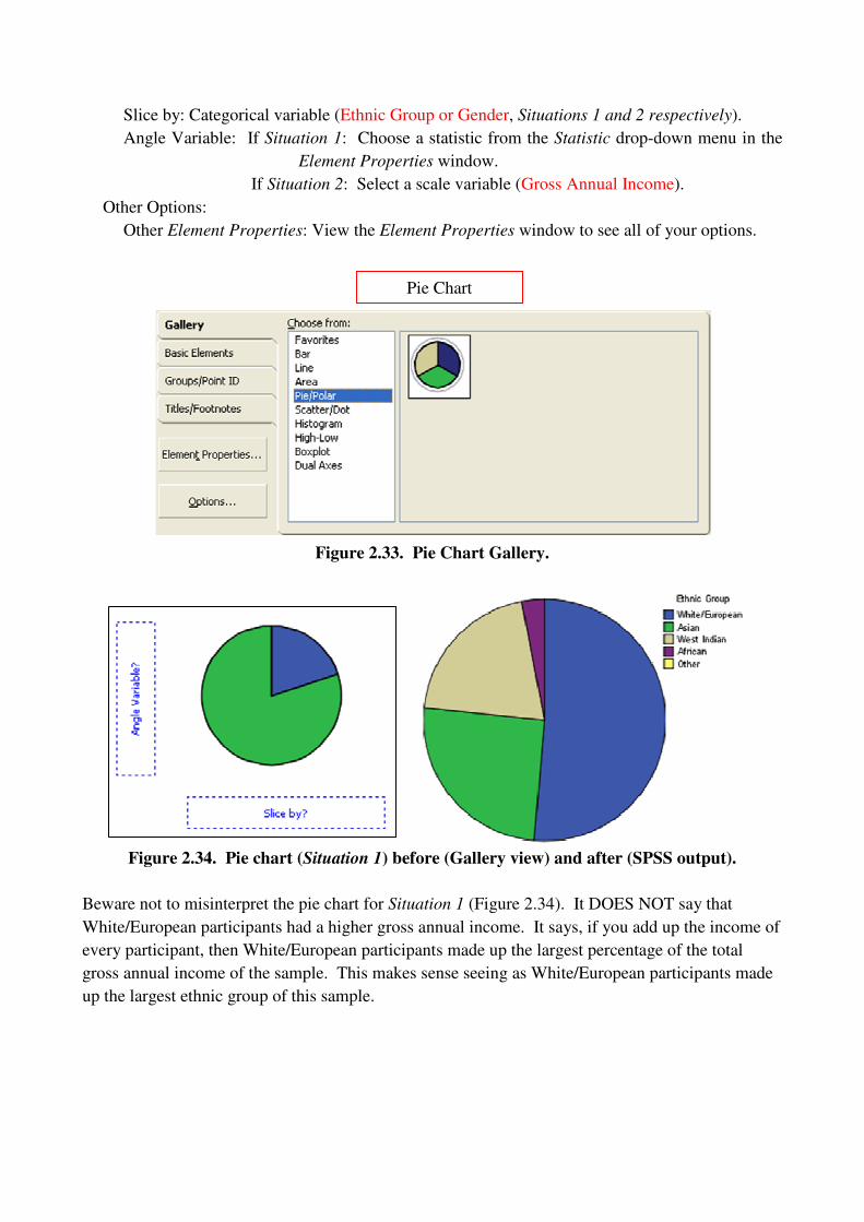
Slice by: Categorical variable (Ethnic Group or Gender, Situations 1 and 2 respectively).
Angle Variable: If Situation 1: Choose a statistic from the Statistic drop-down menu in the
Element Properties window.
If Situation 2: Select a scale variable (Gross Annual Income).
Other Options:
Other Element Properties: View the Element Properties window to see all of your options.
Figure 2.33. Pie Chart Gallery.
Figure 2.34. Pie chart (Situation 1) before (Gallery view) and after (SPSS output).
Beware not to misinterpret the pie chart for Situation 1 (Figure 2.34). It DOES NOT say that
White/European participants had a higher gross annual income. It says, if you add up the income of
every participant, then White/European participants made up the largest percentage of the total
gross annual income of the sample. This makes sense seeing as White/European participants made
up the largest ethnic group of this sample.
Pie Chart

Figure 2.35. Pie chart (Situation 2) before (Gallery view) and after (SPSS output).
Scatter/Dot
SPSS offers eight Scatter/Dot chart options (Figure 2.36). We will look at three of these options:
Simple Scatter, Grouped Scatter and Matrix Scatter (you can choose to display a regression line
with your plot, for all types of scatter plot, by choosing Fit Line from Element Properties. We will
look at scatter plots again in Session II when we discuss correlation coefficients and regression.
Figure 2.36. Scatter/Dot Chart Gallery.
Simple scatter plot (Exam Anxiety.sav: Revision Time and Exam Performance)
x-axis: Independent (predictor) and scale variable (Revision Time).
y-axis: Dependent (outcome) and scale variable (Exam Performance).
Other Options:
Other Element Properties: View the Element Properties window to see all of your options.
Simple Scatter Grouped Scatter
Matrix Scatter
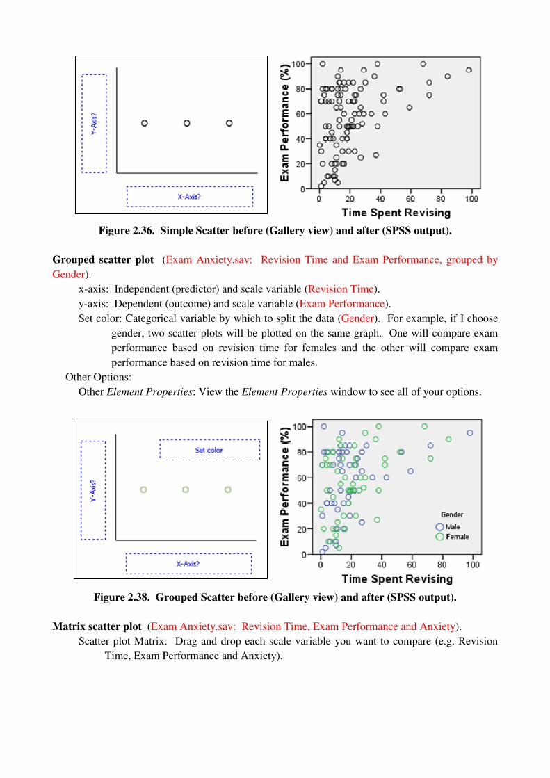
Figure 2.36. Simple Scatter before (Gallery view) and after (SPSS output).
Grouped scatter plot (Exam Anxiety.sav: Revision Time and Exam Performance, grouped by
Gender).
x-axis: Independent (predictor) and scale variable (Revision Time).
y-axis: Dependent (outcome) and scale variable (Exam Performance).
Set color: Categorical variable by which to split the data (Gender). For example, if I choose
gender, two scatter plots will be plotted on the same graph. One will compare exam
performance based on revision time for females and the other will compare exam
performance based on revision time for males.
Other Options:
Other Element Properties: View the Element Properties window to see all of your options.
Figure 2.38. Grouped Scatter before (Gallery view) and after (SPSS output).
Matrix scatter plot (Exam Anxiety.sav: Revision Time, Exam Performance and Anxiety).
Scatter plot Matrix: Drag and drop each scale variable you want to compare (e.g. Revision
Time, Exam Performance and Anxiety).
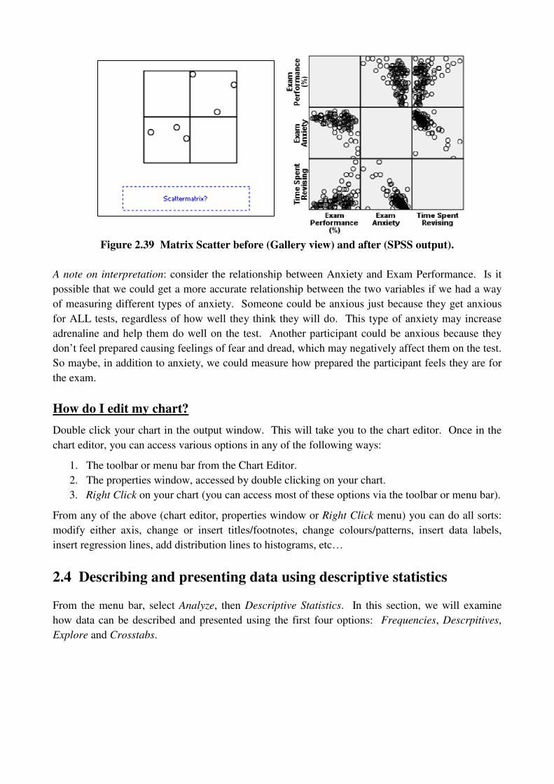
Figure 2.39 Matrix Scatter before (Gallery view) and after (SPSS output).
A note on interpretation: consider the relationship between Anxiety and Exam Performance. Is it
possible that we could get a more accurate relationship between the two variables if we had a way
of measuring different types of anxiety. Someone could be anxious just because they get anxious
for ALL tests, regardless of how well they think they will do. This type of anxiety may increase
adrenaline and help them do well on the test. Another participant could be anxious because they
don’t feel prepared causing feelings of fear and dread, which may negatively affect them on the test.
So maybe, in addition to anxiety, we could measure how prepared the participant feels they are for
the exam.
How do I edit my chart?
Double click your chart in the output window. This will take you to the chart editor. Once in the
chart editor, you can access various options in any of the following ways:
1. The toolbar or menu bar from the Chart Editor.
2. The properties window, accessed by double clicking on your chart.
3. Right Click on your chart (you can access most of these options via the toolbar or menu bar).
From any of the above (chart editor, properties window or Right Click menu) you can do all sorts:
modify either axis, change or insert titles/footnotes, change colours/patterns, insert data labels,
insert regression lines, add distribution lines to histograms, etc…
2.4 Describing and presenting data using descriptive statistics
From the menu bar, select Analyze, then Descriptive Statistics. In this section, we will examine
how data can be described and presented using the first four options: Frequencies, Descrpitives,
Explore and Crosstabs.

Figure 2.40. The Descriptive Statistics menu accessed via the Analyze menu.
Frequencies (employ.sav: Ethnic Group and Job Satisfaction Scale 1)
From the list on the left (Figure 2.41), select the variable(s) of interest, then click to move to
the list on the right (Ethnic Group and Job Satisfaction Scale 1).
Figure 2.41. Frequencies via the Descriptive Statistics menu.
Display frequency tables: Check this option to output a frequency table for each variable (see
Figure 2.42). These are useful for analysing nominal and ordinal data (Gender, Ethnic Group),
however, they are not recommended for scale data, particularly continuous scale data.
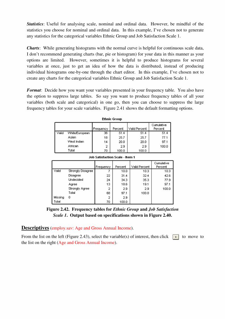
Statistics: Useful for analysing scale, nominal and ordinal data. However, be mindful of the
statistics you choose for nominal and ordinal data. In this example, I’ve chosen not to generate
any statistics for the categorical variables Ethnic Group and Job Satisfaction Scale 1.
Charts: While generating histograms with the normal curve is helpful for continuous scale data,
I don’t recommend generating charts (bar, pie or histogram) for your data in this manner as your
options are limited. However, sometimes it is helpful to produce histograms for several
variables at once, just to get an idea of how the data is distributed, instead of producing
individual histograms one-by-one through the chart editor. In this example, I’ve chosen not to
create any charts for the categorical variables Ethnic Group and Job Satisfaction Scale 1.
Format: Decide how you want your variables presented in your frequency table. You also have
the option to suppress large tables. So say you want to produce frequency tables of all your
variables (both scale and categorical) in one go, then you can choose to suppress the large
frequency tables for your scale variables. Figure 2.41 shows the default formatting options.
Figure 2.42. Frequency tables for Ethnic Group and Job Satisfaction
Scale 1. Output based on specifications shown in Figure 2.40.
Descriptives (employ.sav: Age and Gross Annual Income).
From the list on the left (Figure 2.43), select the variable(s) of interest, then click to move to
the list on the right (Age and Gross Annual Income).

Figure 2.43. Descriptives via the Descriptive Statistics menu.
Options: Chose the desired statistics and specify the order in which to display your variables in
the output.
Save standardized values as variables: This gives you the option to create a new variable
containing Z-scores for each variable you are calculating descriptive statistics for. As I have it
checked, two new variables called Zincome and Zage were created (see Figure 2.44) which
consist of the z-scores for the variables Gross Annual Income and Age, respectively.
Figure 2.44. Z-scores for Gross Annual Income and Age saved as new variables.
Figure 2.45. Example of Descriptive Statistics output based on
specifications shown in Figure 2.43.

How is Descriptives different from Frequencies?
1. No chart options.
2. It does not offer the following statistics: Median, Mode or Percentile Values.
3. No frequency tables (obviously).
Crosstabs (employ.sav: Gender and Ethnic Group)
Similar to a frequency table, a cross tabulation table is useful for analysing nominal and ordinal
data, but instead of just looking at the number of male and female participants or the number of
participants from each ethnic group, a cross tabulation table will produce the number of male and
female participants within each ethnic group. Just as with a frequency table, a cross tabulation table
is probably not very helpful for presenting scale data.
From the list on the left (Figure 2.46), select the variable(s) of interest, then click to move to
the list on the right (Gender and Ethnic Group).
Figure 2.46. Crosstabs via the Descriptive Statistics menu.

Statistics: A mix of hypothesis tests and correlation statistics. SPSS helps us out by identifying
which statistics should be used on certain types of data. Seeing as two independent variables
(Gender and Ethnic group) are being analysed, any of these statistics may be selected.
Cells: Select the information you want to see in EACH cell of the cross tabulation table.
Counts: In Figure 2.46, only Observed (in the frame labelled Counts) has been selected,
however, you may want to output Expected counts as well, particularly if you are
conducting a hypothesis test, such as Chi-squared, or looking at the correlations for
nominal or ordinal data.
Percentages: The following percentages will be displayed in EACH cell of the table.
Row: Each cells value is expressed as a percentage of the total number of observations in
each row.
Column: Each cells value is expressed as a percentage of the total number of observations
in each column.
Total: Each cells value is expressed as a percentage of the total number of observations in
the sample.
Format: Choose how you want your data outputted.
Exact: You will only be concerned with this if you have selected certain options from the
Statistics dialog box.
Figure 2.47. Example of Crosstabs output based on the specifications shown in Figure 2.46.
Explore (ExamAnxiety.sav: Exam Performance and Anxiety by gender).
Explore is essentially a combination of Frequencies and Descriptives. From the list on the left,
select variables to add to the Dependent or Factor list. Multiple variables can be added to each list,
however, it will not produce any cross tabulations. It will just produce frequencies, descriptive
statistics and any other optional output selected, by pairing each variable in the dependent list with
each item in the factor list separately.

Figure 2.48. Explore via the Descriptive Statistics menu.
Dependent List: Dependent scale variable(s).
Factor List: Predictor variable(s), nominal or ordinal.
Display: Choose whether to display only statistics, only plots or both.
Statistics: Select the statistics to be outputted. Figure 2.49 shows what will be generated by
checking the Descriptives option.
Plots
Boxplots, Factor levels together: This will produce a separate boxplot for each dependent
variable. For example, if I chose Exam Performance and Anxiety, with gender as the
factor, two boxplots will be created, as shown in Figure 2.50.
Boxplots, Dependent levels together: This will produce a separate boxplot for each predictor
variable. Keeping with the same example as above, if Exam Performance and Anxiety are
the Dependent variables and Gender is the Factor (the predictor), one boxplot will be
created, as shown in Figure 2.51.
Normality Plots with tests, and the Levene test: We will discuss these options in the next
section.

Figure 2.49. Example of Explore output based on the specifications shown
in Figure 2.48 (boxplots shown in Figure 2.50).
Figure 2.50. Explore output: Boxplots, factor levels together.
Figure 2.51. Explore output: Boxplots, dependent levels together.

2.5 Normality Tests: Can I use parametric tests on my data?
Four BIG assumptions for parametric tests ([1])
Here we are actually referring to the distribution of the population from which we took the sample.
As we cannot possibly collect data from an entire population, we collect only a sample. Then, we
use the central limit theorem, which says that if the distribution of our sample is normal, then the
population from which it came is also normal (there’s a bit more to the central limit theorem, this is
a just a simplification of it, please see [1] for a more technical definition).
The data is normally distributed: Depending on the test, the “data” will be referring to different
things, such as the actual sample or model errors ([1]).
Homogeneity of variance: Depending on what is being examined, this assumptions states that
either the variability of each variable should be about the same or the variability between categories
within one variable should be about the same. Another way to say it is that the difference between
the variances of any two variables is approximately zero or the difference between the variances of
the categories within one variable is approximately zero. See [1] for more on the theory behind this
assumption. SPSS provides Levene’s test for testing this assumption on scale data (we will look
consider categorical data in Session II):
Null Hypothesis: There is no difference between the variances.
Alternate Hypothesis: There is a difference between the variances (assumption violated).
This test can be found in Explore (see Figure 2.48). From the Plots option button, check Normality
Plots with tests and select Untransformed. This means that it will run the test on the ‘raw’ data. If
the ‘raw’ data violate this assumption, you can choose to transform the data, and hopefully a
transformation of the data will satisfy this assumption of homogeneity. If you want to run the test
on a transformation of your data, choose Transformed and select which type of transformation you
would like to carry out.
Figure 2.52 shows the results of Levene’s test for Exam Performance grouped by Gender (Exam
Anxiety.sav); the Lavene Statistic is reported as an F statistic with df1 and df2, given by F(df1, df2).
The null hypothesis states that there is NO difference between the variance in Exam performance
between males and females. The results show F(1, 101) = .160 and a significance level (p-value) of
.690, thus p>.05 and we ACCEPT the null hypothesis that there is no difference between the
variances. If we look at the variances of exam performance for males and females (Figure 2.48) we
see that they are very similar (26.318 and 25.811, respectively) and the test results confirm that they
are indeed similar, i.e. their difference (26.318 – 25.811 = 0.507) is not significantly different.
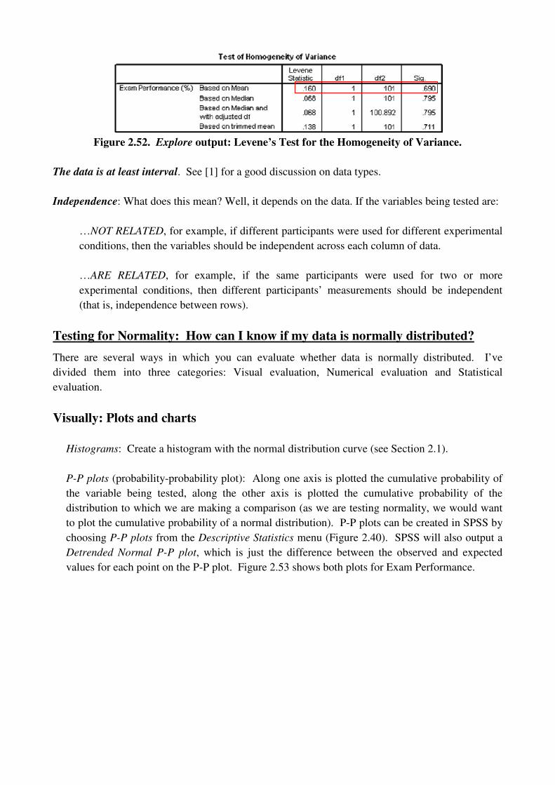
Figure 2.52. Explore output: Levene’s Test for the Homogeneity of Variance.
The data is at least interval. See [1] for a good discussion on data types.
Independence: What does this mean? Well, it depends on the data. If the variables being tested are:
…NOT RELATED, for example, if different participants were used for different experimental
conditions, then the variables should be independent across each column of data.
…ARE RELATED, for example, if the same participants were used for two or more
experimental conditions, then different participants’ measurements should be independent
(that is, independence between rows).
Testing for Normality: How can I know if my data is normally distributed?
There are several ways in which you can evaluate whether data is normally distributed. I’ve
divided them into three categories: Visual evaluation, Numerical evaluation and Statistical
evaluation.
Visually: Plots and charts
Histograms: Create a histogram with the normal distribution curve (see Section 2.1).
P-P plots (probability-probability plot): Along one axis is plotted the cumulative probability of
the variable being tested, along the other axis is plotted the cumulative probability of the
distribution to which we are making a comparison (as we are testing normality, we would want
to plot the cumulative probability of a normal distribution). P-P plots can be created in SPSS by
choosing P-P plots from the Descriptive Statistics menu (Figure 2.40). SPSS will also output a
Detrended Normal P-P plot, which is just the difference between the observed and expected
values for each point on the P-P plot. Figure 2.53 shows both plots for Exam Performance.

Figure 2.53. Example output for P-P plot and Detrended P-P plot for Exam Performance.
Q-Q plots (quantile-quantile plot): Along one axis observed values are plotted, along the other
axis expected values are plotted (as we are testing normality, we would want to plot the expected
values based on a normal distribution). Q-Q plots can be created in one of two ways in SPSS,
depending on what you want to test:
Testing the normality of one variable (i.e. all observations for one variable): Select Q-Q
plots from the Descriptive Statistics menu under Analyze (Figure 2.40).
Testing the normality between groups within one variable: In Explore, click on the Plots
button and check Normality plots with tests (Figure 2.48).
As with the P-P plots, SPSS will output a Q-Q plot as well as a Detrended Q-Q plot (again, the
difference between the observed and expected values for each point in the Q-Q plot.
Figure 2.54. Example output for P-P plot and Detrended P-P plot for Exam Performance.

Numerically: I’ve named this category Numerical, even though technically statistics will be used,
because no statistical tests will be employed, only numerical values will be compared.
In a numerical evaluation, statistical characteristics of the sample distribution can be compared
against those of a normal distribution, e.g. skewness and kurtosis (obtained by either
Frequencies or Descriptives from Descriptive Statistics, see Figure 2.40).
Statistically: Test what you find numerically and see visually to determine if your conclusions
are statistically significant or not.
Kolmogorov-Smirnov (K-S) Test: Although we are only interested in testing normality here, the
K-S test can be used to test the distribution of the sample against distributions other than the
normal distribution. In addition, it can be used on small samples.
Null Hypothesis: the distribution of the sample is NOT different from a normal distribution
(accept if p > .05, i.e. not significant).
Alternate Hypothesis: the distribution of the sample IS different from a normal distribution
(reject null in favour of alternate if p < .05, i.e. is significant).
The K-S test can be run in one of two ways, depending on what you want to test:
Testing the normality of one variable (i.e. all observations for one variable): Use the 1-
Sample K-S under Nonparametric Tests in the Analyze menu (Figure __). Move the variable
of interest into the Test Variable List. The example in Figures __ and __ show the results of
the K-S test for Exam Performance (Exam Anxiety.sav)
Options: You can choose to output statistics and specify how missing values are handled.
Exact: Leave this as Asymptotic only for now.
Interpreting and reporting results: The output of the K-S test for Exam Performance
(Exam Anxiety.sav) is shown in Figure __. The distribution of Exam Performance is
NOT statistically significant as D(103) = 1.365 and p < .05. Thus, there is strong
evidence to suggest that Exam Performance is not normally distributed.
Testing the normality between groups within one variable: In Explore, click on the Plots
button and check Normality plots with tests and choose the Untransformed option (Figure
2.48). Using the example from Figure 2.48, we can test the normality of the distribution of
Exam Performance for male and female participants separately.
Interpreting and reporting K-S test results: The output of the K-S test for Exam Performance
grouped by Gender is shown in Figure __. The distribution of Exam Performance for males is
statistically significant as D(52) = .136 and p < .05 (p = .018), thus there is strong evidence to
suggest that the distribution of Exam Performance for males is not normal. Likewise, the
distribution of Exam Performance for females is statistically significant as D(51) = .132 and p <
.05 (p = .028), there is strong evidence to suggest that the distribution of Exam Performance for
females is also not normal. Note that 52 and 51 are the degrees of freedom the male and female
samples, respectively.

Figure 2.55. The 1-Sample K-S accessed viva the Nonparametric Tests and Analyze menus.
Figure 2.56. The 1-Sample K-S test accessed via the Nonparametric Tests menu.
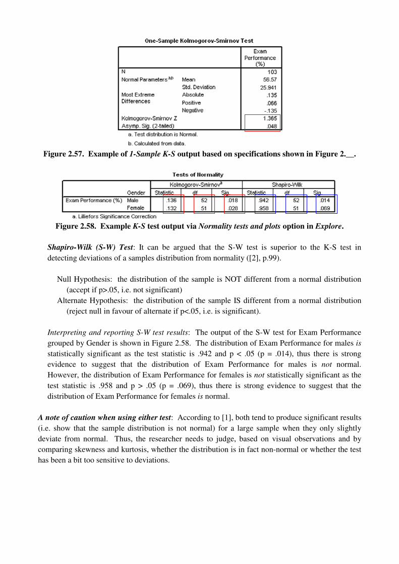
Figure 2.57. Example of 1-Sample K-S output based on specifications shown in Figure 2.__.
Figure 2.58. Example K-S test output via Normality tests and plots option in Explore.
Shapiro-Wilk (S-W) Test: It can be argued that the S-W test is superior to the K-S test in
detecting deviations of a samples distribution from normality ([2], p.99).
Null Hypothesis: the distribution of the sample is NOT different from a normal distribution
(accept if p>.05, i.e. not significant)
Alternate Hypothesis: the distribution of the sample IS different from a normal distribution
(reject null in favour of alternate if p<.05, i.e. is significant).
Interpreting and reporting S-W test results: The output of the S-W test for Exam Performance
grouped by Gender is shown in Figure 2.58. The distribution of Exam Performance for males is
statistically significant as the test statistic is .942 and p < .05 (p = .014), thus there is strong
evidence to suggest that the distribution of Exam Performance for males is not normal.
However, the distribution of Exam Performance for females is not statistically significant as the
test statistic is .958 and p > .05 (p = .069), thus there is strong evidence to suggest that the
distribution of Exam Performance for females is normal.
A note of caution when using either test: According to [1], both tend to produce significant results
(i.e. show that the sample distribution is not normal) for a large sample when they only slightly
deviate from normal. Thus, the researcher needs to judge, based on visual observations and by
comparing skewness and kurtosis, whether the distribution is in fact non-normal or whether the test
has been a bit too sensitive to deviations.
2.6 Correcting Problems
What do I do about:
…outliers? There is not a procedure in SPSS to do this for you. Field (2009) describes several
options available to you – basically, it’s a judgement call on your part as the researcher.
…non-normal data? Try a transformation. Data can be transformed by recoding the variables into
new variables, as described in Section 2.1. For more information on which transformation you
should try see [1] (p.155). Just remember, if one variable is transformed, the same transformation
must be applied to every other variable to which comparisons are being made and tests being run.
…data that violates the assumption of homogeneity of variance? As with non-normal data, try
transformations. When testing this assumption, there is another option for transforming the data: it
can be transformed during the execution of Levene’s test (see Section 2.4).
References
[1] Field, Andy. Discovering Statistics Using SPSS, 3rd
Edition. SAGE Publications Ltd: London,
2009.
[2] Field, Andy. Discovering Statistics Using SPSS 3rd
Edition Addition Material. 2009.
http://www.uk.sagepub.com/field3e/additionalwebmaterial.htm. Accessed: 01 February 2010.


