17
IN WHAT WAYS DOES YOUR MEDIA PRODUCT USE, DEVELOP OR CHALLENGE FORMS AND CONVENTIONS OF REAL MEDIA PRODUCTS CHARLES HARRIS
| Date post: | 20-Feb-2017 |
| Category: |
Education |
| Upload: | charris369 |
| View: | 89 times |
| Download: | 0 times |

IN WHAT WAYS DOES YOUR MEDIA PRODUCT USE, DEVELOP OR
CHALLENGE FORMS AND CONVENTIONS OF REAL MEDIA
PRODUCTSCHARLES HARRIS

• IN MAKING MY MEDIA PRODUCTS I MAINLY LOOKED AT THE ADVERTISING CAMPAIGNS FOR THE FILMS “INSIDIOUS,” “THE BLAIR WITCH PROJECT,” AND “THE WOMAN IN BLACK,” SO THAT I COULD GET THE CONVENTIONS OF A HORROR ADVERTISING CAMPAIGN. I ALSO LOOKED AT THE FILMS “DEMONIC,” “THE PACT,” “THE PURGE,” “YOUR NEXT,” “AFFLICTED,” “ANIMAL,” “DARK WAS THE NIGHT,” AND “THE RING.” FROM THIS I WAS ABLE TO CREATE A LIST OF CONVENTIONS FROM WHICH I COULD USE, DEVELOP AND CHALLENGE THEM IN ORDER TO CREATE AN EFFECTIVE PRODUCT.

THE STRUCTURE
• IN MY TRAILER, THE 1ST SCENE IS SCARY TO GRIP THE AUDIENCE AND TO GET THEM HOOKED
• THIS DEFIES CONVENTIONS AS IN THE TRAILERS I’VE LOOKED AT THEY NORMALLY START BY INTRODUCING THE CHARACTERS THEN GET SCARY TOWARDS THE END OF THE TRAILER
• THIS MEANS THAT I’VE DEVELOPED THE CONVENTION BY ADDING AN INITIAL SCARE

TICKING
• I HAVE USED THE CONVENTION OF SOMETHING TICKING TO GIVE PACE TO THE TRAILER
• IN INSIDIOUS THEY USE A METRONOME BUT I DEVELOPED THIS AND USED A CLOCK WITH IS MORE EVERYDAY AND RELATABLE

INDUSTRY LOGOS
• I’VE FOLLOWED THE CONVENTION OF HAVING INDUSTRY LOGOS AT THE START OF THE TRAILER
• THIS IS A GOOD WAY TO BUILD A TRUST WITH A VIEWER IF THEY RECOGNISE THE LOGO FROM OTHER FILMS THAT THEY’VE LIKE
•

BACK STORY AND ALCOHOL/ DRUGS
• I FOLLOWED THE CONVENTIONS OF SHOWING THE CHARACTERS BACK STORY TOWARDS THE START OF THE TRAILER, THIS MEANS THAT THE VIEWER FEELS INVESTED IN THE CHARACTERS LIFE'S AND CARES ABOUT WHAT HAPPENS TO THEM
• I ALSO FOLLOWED THE CONVENTION OF SUPPLYING YOUTHS WITH ALCOHOL, THIS CONVEYS THE MORALS OF IF YOU DRINK AND ACT IRRESPONSIBLE… BAD THINGS HAPPEN TO YOU – WHICH IS A POSITIVE MESSAGE TO PUT OUT

SEX APPEAL
• I CHALLENGE THE CONVENTION OF HAVING THE FEMALE CHARACTER BE REPRESENTED IN A SLUTTY FASHION BECAUSE MY QUESTIONNAIRE SAID THAT OVER 40% OF THE PEOPLE WATCHING WERE WOMAN AND A LOT OF PEOPLE DIDN’T LIKE THE NEGATIVE REPRESENTATION AND STEREOTYPES.
• TO COMBAT THIS, I PUT THE MALE ACTOR IN ONLY A TOWEL IN ORDER TO ADD SEX APPEAL TO LADY VIEWERS AND PORTRAY THE MALE AS BEING SLUTTY

CHILDISH
• I ADDED THE MINION TOY TO THE BACKGROUND OF THE SHOT TO MAKE THE PROTAGONIST SEEM CHILDISH. I FOLLOWED THE CONVENTION OF A NAIVE PROTAGONIST AS IT MAKES THE VIEWER PITY HER – MAKING THEM ENGAGE WITH THE FILM

CHILD ENDANGERMENT
• A HORROR FILM CONVENTION IS TO PUT CHILDREN AT RISK OR IN DANGER, I DEVELOP THIS CONVENTION IN ‘WILL’ BY PUTTING AN UNBORN CHILD IN DANGER
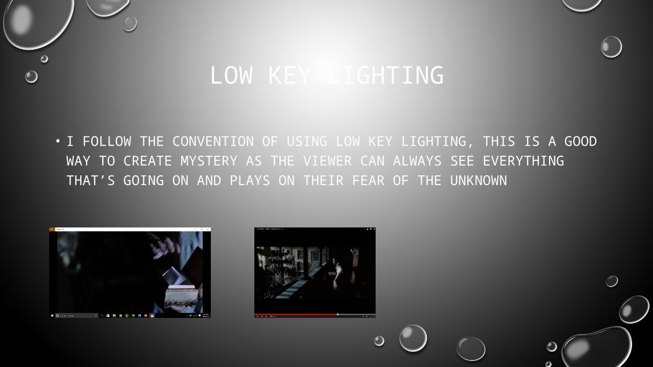
LOW KEY LIGHTING
• I FOLLOW THE CONVENTION OF USING LOW KEY LIGHTING, THIS IS A GOOD WAY TO CREATE MYSTERY AS THE VIEWER CAN ALWAYS SEE EVERYTHING THAT’S GOING ON AND PLAYS ON THEIR FEAR OF THE UNKNOWN

FEMALE EMPLOYMENT
• AS PART OF MY QUESTIONNAIRE, I FOUND OUT THAT PEOPLE DON’T LIKE THE NORMAL REPRESENTATIONS IN HORROR FILMS, THIS IS WHY I CHALLENGED THE CONVENTION OF FEMALE PROFESSIONALS AND HAD A FEMALE LAWYER – A VERY WELL EDUCATED AND RESPECTABLE JOB

JUMP CUTS
• I FOLLOWED THE CONVENTION OF USING JUMP CUTS TO DISORIENTATE THE VIEWER, I FEEL LIKE ITS AN EFFECTIVE WAY TO MAKE THEM CONFUSE ABOUT WHAT'S GOING ON AND THEREFORE MAKE SCARES MORE SCARY.
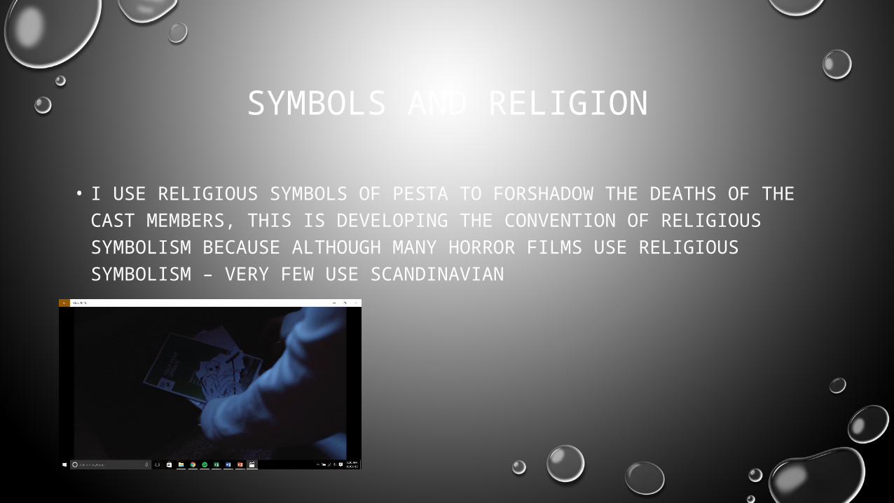
SYMBOLS AND RELIGION
• I USE RELIGIOUS SYMBOLS OF PESTA TO FORSHADOW THE DEATHS OF THE CAST MEMBERS, THIS IS DEVELOPING THE CONVENTION OF RELIGIOUS SYMBOLISM BECAUSE ALTHOUGH MANY HORROR FILMS USE RELIGIOUS SYMBOLISM – VERY FEW USE SCANDINAVIAN

THE AUTHORITIES CAN’T HELP
• I FOLLOWED THE CONVENTION OF HAVING THE AUTHORITIES BE UNABLE TO HELP THE SITUATION, I DID THIS BECAUSE HAVING THE PEOPLE WHO’S JOB IT IS IT PROTECT US, UNABLE TO PROTECT US SHOULD STRIKE FEAR INTO THE VIEWER

DIRECTORS VANITY
• I FOLLOWED THE CONVENTION OF PUTTING THE DIRECTORS NAME BY THE TITLE, I FEEL LIKE IT MAKES THE PRODUCTION COME ACROSS MORE PROFESSIONAL

THE POSTER
I followed the convention of putting a slogan onto the
poster in order to give more information about the film.I followed the convention of putting reviews on the
poster, so that people know it’s a good film and
will want to see it
I challenged conventions as I put social media links on
the poster, this allows a consumer to find out
more information about the film easier.
I developed the convention of having the release date on the poster by changing the mode of address by saying “everywhere” this fits with the genre more
because it’s like the antagonist is everywhere.
I followed the convention of having the cast, crew and production company
on the poster, so that people who like their work will want to see the film,
thinking it will be of equal quality.
I followed the convention of having the age rating on the
poster, however I developed it by having it be bigger than
expected, this makes it more clear the film is an 18 but the
larger size looks more astatically pleasing with the
composition
You can’t always see the antagonist in my poster,
depending on lighting and angle, this gives the poster
the effect that the antagonist is real therefore
scaring a viewer making them want to see the film.The poster is more gory
than with conventional horror posters, this was
done so the poster stands out and make the genre
more clear
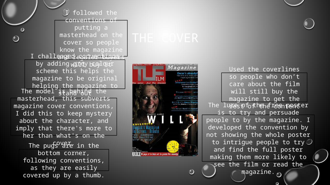
THE COVER
I followed the conventions of
putting a masterhead on the cover so people know the magazine and
regular buyers will buy itI challenged conventions by
adding grey colour scheme this helps the magazine to be original helping the magazine
to stand out
Used the coverlines so people who don’t care about the film will still
buy the magazine to get the rest of the content
The lure of the free poster is to try and persuade people to by the
magazine. I developed the convention by not showing the
whole poster to intrigue people to try and find the full poster making them more likely to see the film or
read the magazine.
The pugs are in the bottom corner, following
conventions, as they are easily covered up by a
thumb.
The model is behind the masterhead, this subverts
magazine cover conventions, I did this to keep mystery about the character, and imply that
there's more to her than what's on the cover.


